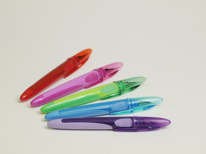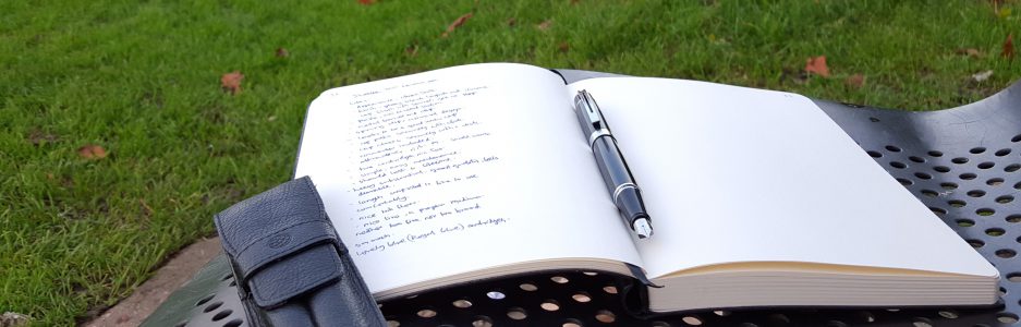
Paperchase cartridge pen and coloured ink.

wp-1490478585289.jpg

Happy Mothers’ Day, from London. Also, the clocks went forward today. Spring is officially here and we are now in British Summer Time and enjoying lighter evenings.

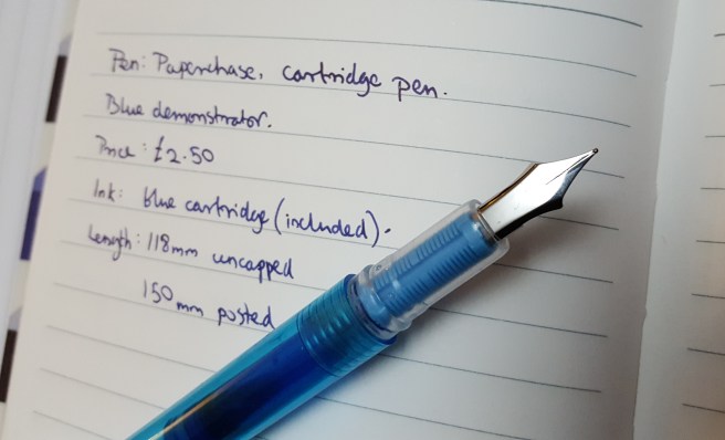
Today’s splash of colour comes from a recent visit to my local Paperchase stationery shop. As well as selling Cross, Kaweco, Lamy and Parker fountain pens they have a few of their own brand cartridge pens. I have tried three different models since July 2016, costing up to £6.00. This current blue demonstrator model is just £2.50 including three blue cartridges.

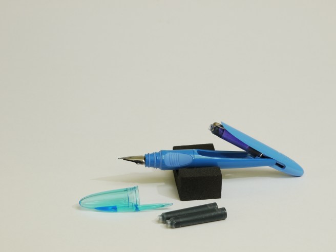
For this, you get a lightweight, plastic pen with a snap-on cap. The plastic pocket clip is quite springy and functional. The cap posts securely, giving a posted length of 150mm. The steel nib has no markings or breather hole but does have tipping material. It also has a wick between the nib and feed to help with ink supply. I would describe the nib as a medium.

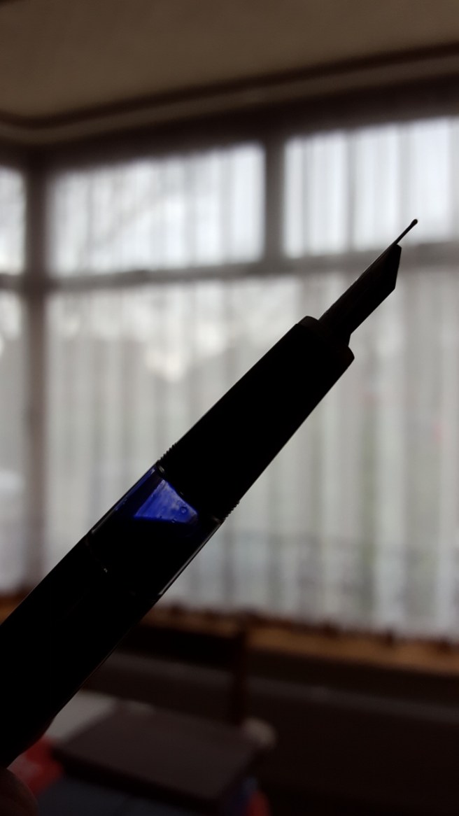
The section is clear plastic and through this you can see the feed which is of a light blue plastic.

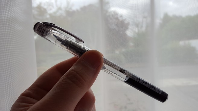
The pen takes a standard international cartridge but does not have room for a spare. The barrel has a hole at the end and so unlike the Platinum Preppy, this pen could not be converted to an eye-dropper fill.

Inking it up for the first time, it took a while and a bit of shaking before ink reached the nib but once it did, the writing experience was surprisingly smooth and I had no complaints about the ink flow. In fact it wrote with hardly any pressure. Do not expect a flex nib but you can get a little bit of line width variation, between sideways strokes with no pressure and downward strokes with some pressure.

wp-1490478934657.jpg

The pen also does reasonably well at starting up again after a few days of non-use, despite the absence of an inner cap.

At this price, it seems unfair to find fault but there is a sharp-edged step from the barrel down to the section which is rather uncomfortable, just where most people would grip the pen. Perhaps this was necessary in order to form the seal between the barrel and the snap-on cap but the comfort would be much improved if the moulded barrel could have a smooth edge.

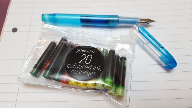
Other than that, it is a colourful, handy and satisfactory little pen. I found that Paperchase also sells cute re-sealable bags of 20 coloured ink cartridges for £1.50 (as well as all black or all blue options) and so for a grand total of £4.00 you would be able to get by for a few months if you suddenly found yourself separated from any other writing implements. More likely perhaps, if you arrived in town and found that you had forgotten your preferred fountain pen, then a quick visit to Paperchase would get you back up and running for a minimal outlay.

wp-1490478645523.jpg

For accuracy, I should say that the coloured ink pack did not include blues, but there were three included with the pen. There were actually two more greens in the pack of 20, but instead I used the remaining blues for the rainbow.

I have not yet tried all the coloured inks. What I have learned though, is that “standard international cartridges” means standard in size and not ink quality and so if you have a preferred brand of ink cartridge of the same size, you may prefer to use an ink that you know. However, at just seven and a half pence per cartridge, you cannot really go wrong with these and there is a certain pleasure to be had from experiencing such a modestly priced combination of pen and ink.


Inky pursuits: my weekend round-up (2)

This weekend has seen some more inky goings-on which, taken on their own, might not be blog-worthy but together seem worth sharing in a round-up.

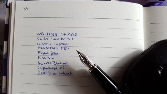
I am still delighted with the Cleo Skribent, piston filler fountain pen, four weeks in. I can genuinely say that I feel happy every time I remember it. The first fill, with Aurora Blue was still not quite finished when I ordered a bottle of Monteverde Napa Burgundy and decided to flush the remains of the blue, to have an ink change.

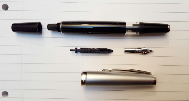
While flushing the pen, I decided to try removing the nib and feed. I had not yet found any guidance on doing this and was anxious not to cause any damage. I found that they are friction fit and came out very easily, when gripped together in tissue paper and pulled out straight. It is great to be able to rinse a nib and feed or remove the nib for any minor adjustments. To replace them, you just need to line up the nib and feed correctly, holding the nib on top of the feed centrally and with the right length of tines protruding beyond the end of the feed and then gently rotate them in the grip section until you locate the right way to push them back in.

20170319_233749.jpg

Whilst the pen was empty, I dipped it in three different inks to see how they would each look from the fine (more like extra fine) nib of the Cleo Skribent. I tried Pelikan Edelstein Tanzanite, Waterman Harmonious Green and then Diamine Conway Stewart Tavy, which is one of my favourite blue-black inks. I tried these on three different papers in turn. The Tavy gave a slightly bluer shade than the Tanzanite.

I then had the idea of seeing whether any of my pens had nibs which were interchangeable with the Cleo Skribent. The nib looked to be about the same size as the nib on a Kaweco Sport, a Cross Apogee or a Monteverde Artista Crystal. All of these are friction fit and are removed just by a careful pull of the nib and feed together, taking care not to damage the delicate feed. The nib on the Cross Apogee is 18k gold with a silver-coloured plating. However, once removed from the pens, the nibs of the Cross Apogee and the Kaweco Sport were both shorter than that of the Cleo Skribent.

The nib on the Monteverde Artista Crystal appears to be same length as the Cleo Skribent and so I think it would be possible to use that in the Cleo, if I wanted a Medium nib option. However, for now, I kept to the Cleo’s own nib.

wp-1489966399601.jpg

On Friday, I received an exciting package from Cult Pens, including the Monteverde Napa Burgundy ink that I had ordered. It came in a 90ml bottle and boasts a special formula, which they call ITF (Ink Treatment Formula). This, it is claimed, “drastically improves ink-flow quality, extends cap-off time, lubricates and protects the ink-feeding systems from corrosion and clogging and improves ink-drying time on papers.”

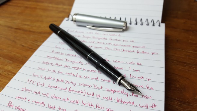
Whilst this all sounds very commendable, I soon found that the colour when paired with the very fine nib of the Cleo Skribent, looked a rather pale pinky-brown rather than the rich dark burgundy red that I had hoped for. I will try it in a pen with a broader and wetter nib but meanwhile decided to flush it from the Cleo.

wp-1489968067149.jpg

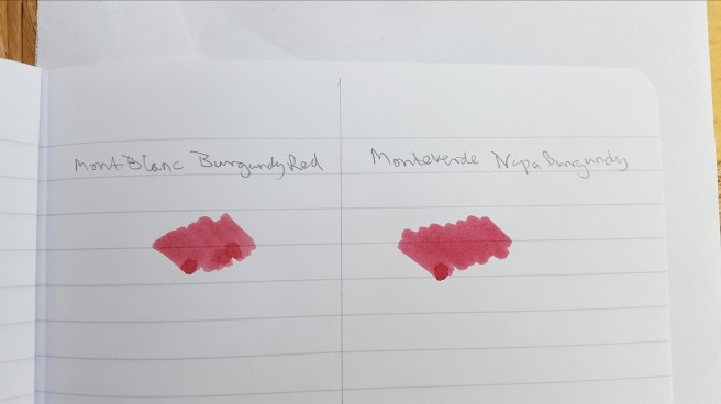
Furthermore, I did a very quick swab test comparison of the Monteverde Napa Burgundy with a Mont Blanc Burgundy and found that they appear pretty much the same colour. Others may conduct a proper and thorough comparison but to my eyes there is little to distinguish them in terms of colour on the page and if I was shown a sample of only one of them, I would be hard put to say which one it was. Of course, the other qualities listed above should also be evaluated and not only the colour. Anyway, happiness was soon restored once I refilled the Cleo, with the Tavy ink that I had sampled earlier.

wp-1489966853824.jpg

On Saturday, I spent the day at a church in Flackwell Heath, Buckinghamshire, hearing first hand about all the excellent work of a UK registered charity, Jubilee Society of Mongolia. The talk was hosted by the church which has supported the organisation since it was founded. Two Mongolian ladies from the organisation had come over to give a presentation, celebrating its 15th anniversary.

After hearing about all the very important and valuable work that the charity is doing in Mongolia, it seems rather shallow to tell you only that I took notes all day, using a Sheaffer Sagaris in the morning and then the Cleo Skribent in the afternoon. Both pens were excellent for note-taking and did not dry out if uncapped for a while.

Also in that package from Cult Pens, as well as the burgundy ink, was my new Lamy AL-star in the Pacific Blue, special edition for 2017. I had not seen these in the shops yet. The colour and finish are very appealing. Cult Pens offers a choice of nibs, in Extra Fine, Fine, Medium, Broad and Left Handed. I was rather intrigued by this last option and telephoned to ask what it meant, before ordering. Was it an oblique nib? Or one which was adjusted to write wetter for lefties? And what nib width was it? I was told that it is simply a bit more rounded and forgiving for people to hold the pen at different angles. Being a leftie, I decided to try one. I also ordered a pack of the matching Pacific Blue cartridges.

I tried the new pen and ink as soon as they arrived. I love the colour of the pen and the ink. I thought the ink to be quite similar to Pilot Iroshizuku ama-iro. However on comparing them side by side, the Pacific Blue is clearly lighter than the Ama-iro.

wp-1489967142656.jpg

As for the nib, I had  close look at it under the loupe. It has the letters LH on. There is generous amount of tipping material and the nib was usable straight out of the box, but a little skippy. I suspect it just needed to wear in. However, being impatient to enjoy the new pen and ink, I swapped over the LH nib for a medium nib from one of my Safaris and this is now writing very nicely and is the nib used for the writing sample pictured.

With this new Pacific Blue AL-star to brighten my pen cups, I now have seventeen fountain pens currently inked and need to bring this down.

This week I have one day out on a continuing professional development course. I am looking forward to taking notes with the Cleo Skribent again and possibly the Lamy AL-star Pacific Blue for annotating the handouts.

wp-1489966543149.jpg


Cross, but no longer alone.

Here is a short, true story with a happy ending.

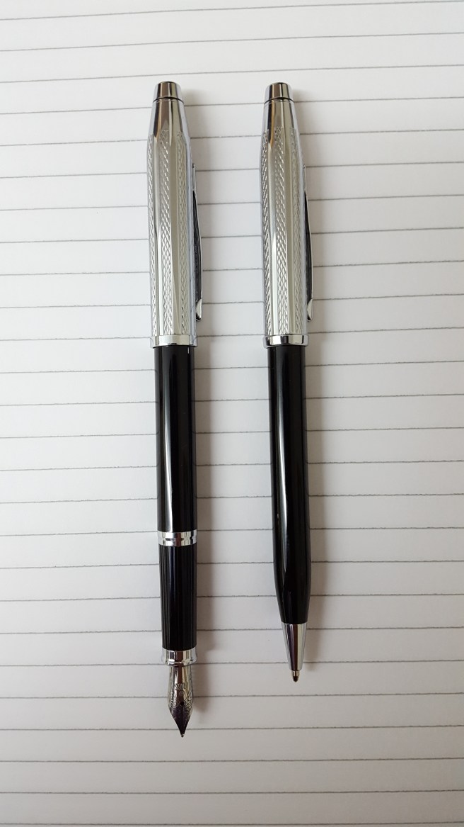
Back in November, I bought a Cross Century II fountain pen, the black lacquer with chrome cap version. This was the subject of my blog post of 30 November (see link:  Cross Century II, black lacquer and chrome cap ). I had bought only the fountain pen, although I had seen them offered for sale previously with a matching ballpoint pen.

I loved the look and the weight of the fountain pen and enjoyed using it, despite the very slender grip section. Currently, I have it inked with Waterman Mysterious Blue. The nib seems to have a rather narrow sweet-spot and so is better for sustained use, where you can hold it at a consistent angle, rather than for picking up, writing little notes and putting down again frequently.

A month or so later, I visited the same shop where I had bought it and spotted the matching ballpoint pen offered for sale, at £40.00. I thought about it for a while but resisted.

However, on later trips to the shop, I kept checking to see whether the ballpoint pen was still there and kept seeing it at the back of a glass display case, gleaming under the little spot-lamps. It began to bother me, that I had the fountain pen but not the ballpoint.

I rather surprised myself at how much this bothered me, such that after three months, I finally decided to buy the ballpoint and got out my £40.00. However, the assistant was unable to find the box and without this to show the necessary bar code, was unable to process the sale. Another lady came downstairs to help but despite a thorough search of the pen cupboard, they could not locate the missing box.

It occurred to me that I might have it, since the fountain pen that I had bought in November does come as part of a set. I told them this and they asked that I please bring in the box to show them.

And so the following day, I brought in my Cross Century II box and there found that the sticker on the box and the receipt (which I had put inside) clearly referred to the item being a fountain pen and ballpoint pen set. And so it turned out that my box was the one that it should have been in. Not only that, but I had already paid for the set. Yes, I should have studied the receipt more closely.

Faced with this evidence, the staff cheerfully told me that the pen was mine and that no further payment was required. The fountain pen and ballpoint pen had been separated for three months but are now reunited.

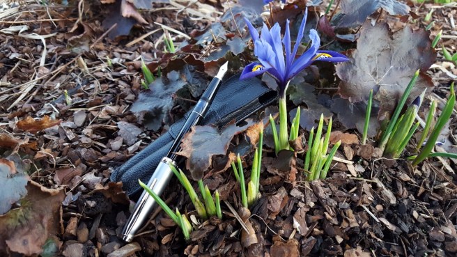
See how nice they look together.

wp-1488289755557.jpg


Cleo Skribent Classic Metal, Piston fountain pen review.

cleo-1

It was a joy for me to find another German brand of very nice fountain pens recently. If  you have not heard of these pens before, then I recommend them to you.

My story begins a week ago when I was browsing on Cult Pens’ web site, looking at the long list of brands and noticed the name and logo of Cleo Skribent. Clicking on this out of curiosity I was taken to the page showing some of their range of pens.

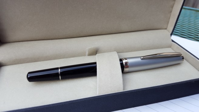
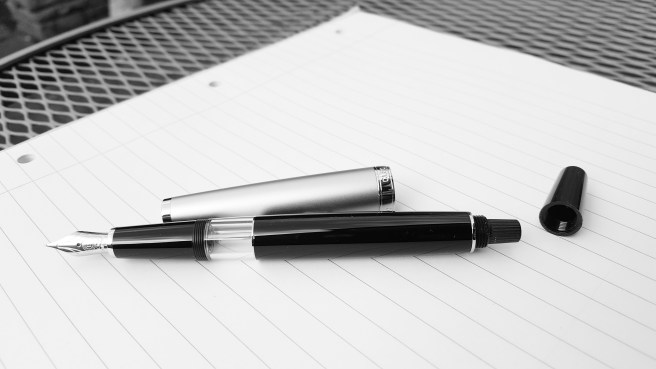
The one that caught my eye particularly, (and which is the subject of this review) was a piston filler, with black barrel and brushed stainless steel cap, described by Cult Pens as a beautiful lightweight piston-filling fountain pen.

Some decision making is required as there were three options. The steel cap version comes with a stainless steel nib. But for a little extra, you may buy the 14k gold nib version. However, you no longer get the brushed stainless steel cap and instead have an all black pen with palladium fittings. This will not match the gold nib (if that is important to you)  but there is a further option, for another increase in price, to have the 14k gold nib, all black pen and gold coloured fittings.

All three versions have the same large clear ink window, which appealed to me. What was not apparent from the Cult Pens pictures is that the pen has a blind cap which you unscrew to access the piston turning knob inside.

20170218_141157_001

I successfully resisted ordering the pen on first viewing, to weigh up the pros and cons of the three similar models. Instead, I added a Cleo Skribent to my “wish list”. (This is not just a figure of speech but is now a spread in a bullet journal where the Cleo Skribent had to compete with, amongst other things, a Kaweco Dia 2 and a Pelikan M120N).

Meanwhile I looked for more information about Cleo Skribent. I found some favourable reviews where the stainless steel nibs were given particular praise. I found on Amazon that there was also a bordeaux option and some cartridge-converter options although I preferred the piston filler. I also found the company’s own web site and another very informative article by Jim Mamoulides on PenHero.com including the company’s history.(See link: Cleo Skribent history).

The choice of gold or steel nib, particularly given the fairly modest difference in price, was a case of head versus heart (head saying go for gold but heart saying that I prefer the brushed steel cap with steel nib) but in the end it was the brushed steel cap paired with the black barrel which won me over. Although this meant settling for the stainless steel nib, the positives were (a) I had read good reviews of the stainless steel nib, (b) its colour would match the brushed stainless steel cap (c) it was in my eyes, the most pleasing of the three to look at and (d) also the least expensive.

After the Cleo emerged victorious from its brief stay in the wish list, I looked again at the Cult Pens site. The prices of all three piston filler models had come down, since I had last looked! So on the Thursday night, I put in my order.

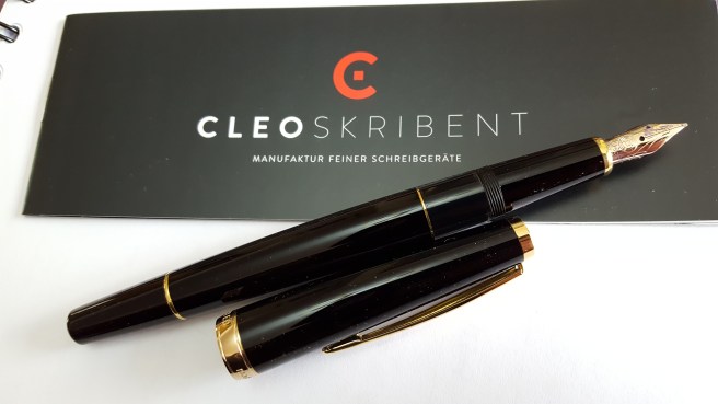
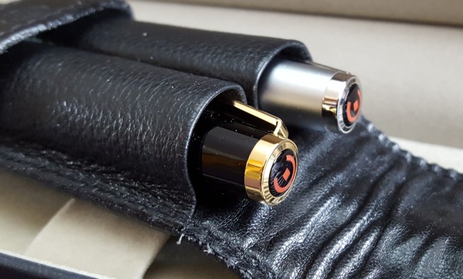
The parcel arrived on Saturday morning, which was ideal. First impressions were all very favourable. There is a nice black gift box with plush grey lining and colour booklet.The glossy black barrel does look very handsome paired with brushed stainless steel cap. In the cap, there is a finial with the Cleo Skribent logo in red on a black background. The pocket clip is usefully tight with a generous range of movement. The polished cap band, contrasting with the brushed finish of the cap itself, reads “CLEO  made in Germany”.

cleo-5

The cap unscrews with two twists, to reveal the plastic threads on the section and the large clear ink window, which is fully concealed when the cap is on. The black, grip section tapers down towards the nib, ending with a chrome decorative ring.

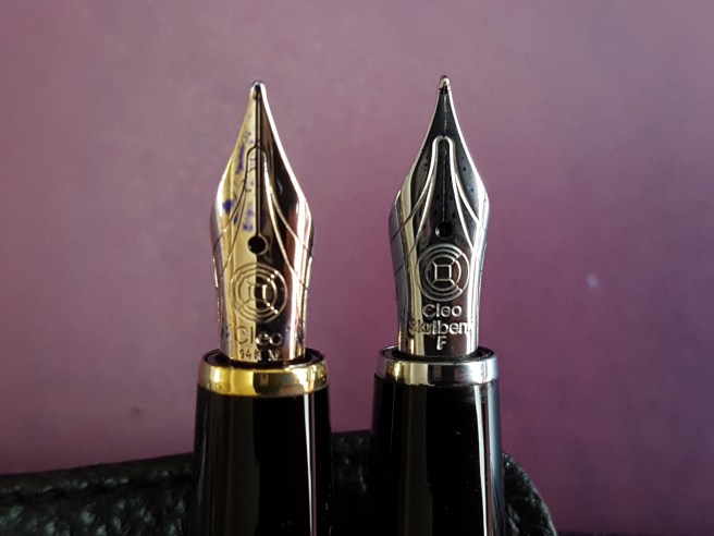
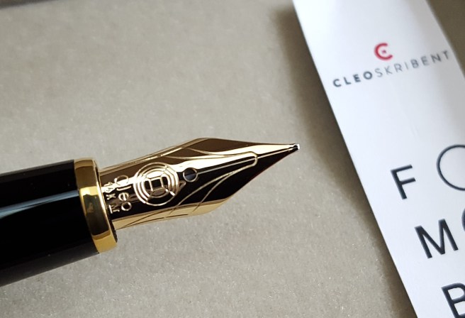
The nib looked very nicely made. I had chosen a Fine. There is some attractive scroll work and the markings “Cleo Skribent F” beneath the logo. All looked good. The tines were even and symmetrical and the slit narrowed from the breather hole down to the tip. The black plastic feed looked streamlined with the delicate fins housed on the inside so that the exposed side of the feed was smooth. I do not yet know whether the nib and feed are friction fit and can be pulled out for cleaning or nib swapping but if so, then the absence of delicate fins on the feed reduces the risk of damage.

This is an unusually long pen. Capped, the pen stands at around 145mm which is taller than a Lamy Safari. Uncapped, the pen measures around 135mm which, for me, is very comfortable in the hand to use unposted. If you find that holding a pen helps you concentrate, then this one seems ideal for that. Somehow, holding the long slender instrument with its fine precision nib seems to aid the thought processes. It very quickly becomes comfortable and familiar in the hand. I tend to grip it with my thumb over the ink window and my first finger on the threads, which are not at all sharp.

The blind cap unscrews to reveal the knurled, black plastic turning knob of the piston. The cap can be posted, securely and deeply but does grip the blind cap and so you need to be careful not to turn the cap once posted, which would either unscrew the blind cap or over-tighten it with a  risk of damage. With care, you can avoid this but I have found that the pen is very comfortable to use unposted.

The pen weighs a total of 25g inked, but remove the cap and it is then just 11.5g, which is light for a pen but with its length and build quality it does not feel insubstantial.

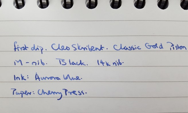
I tried dipping the pen first, in a new bottle of Aurora Blue. My initial reaction was that the nib was smooth but on the dry side, not because there was any downward pressure needed or any lack of lubrication but simply because the line appeared so fine and pale. I had expected the line to be a darker, more vibrant royal blue. I then flushed the pen, and filled it enjoying the first sight of the blue ink in the window.

cleo-8

The paleness of the line troubled me at first and I feared that this may be one of those nibs that is not perfectly tuned “out of the box” but needs some adjustment to perform correctly. However I found the pen extremely enjoyable to use and  could produce very small, intricate lettering with the beautifully crafted steel nib.

I then examined the nib closely with a x7 illuminated loupe whilst writing. I realised that the nib was not dry at all. It lays down ink effortlessly and you can observe the ink glistening for several seconds before it dries. The line variation and shading are all there. The steel nib is smooth but has a little, pleasant feedback. It is firm but has just a little flex to give some variation with downward pressure. What I had wrongly thought to be due to dryness, is just a very fine line with an ink flow proportionate to the narrowness of this nib.  You might class this as an extra fine if accustomed to more generous western fines.

cleo-7

This nib is as wet as it needs to be and if it were any wetter, it may not produce such a fine line and small lettering without ink pooling in all your loops. I concluded that there is nothing wrong with the nib at all and that the good people at Cleo Skribent know better than I. Thankfully I had not tinkered with the nib to make it any wetter, before coming to this conclusion.

I am enjoying every opportunity to use the pen. The fine point is great for making small marginal notes in printed text. It is also nice to have something a little less commonplace. Mine is currently the only one that I have seen.

It would be good to find out whether the nibs are easily interchangeable. And if not, there is always the gold nib option for next time.

cleo-4


The Bic EasyClic: a brief review (in which we find a novel posting suggestion)

p1100982

Having written about my Pelikan M400 vintage tortoise for three posts in a row last month, I thought today, for balance, I would celebrate a pen from the lower end of the price spectrum.

So, how would you like to see a pen that loads like a shotgun? I thought so. Take a look at the Bic EasyClic.

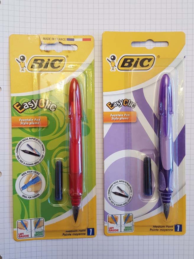
I first learned of these from one of Stephen Brown’s YouTube videos, in which he reviewed the red “Hello Kitty” version, giving it the same systematic treatment as he might give a Visconti. I was intrigued enough to seek one out and found them in our local Ryman stationer, sold in a blister pack, for just £3.99.

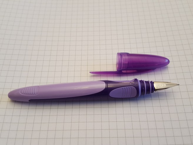
This is primarily a child’s pen, available in a range of colours and measuring about 12.7cm capped and 11.8 uncapped. It has matching, transparent coloured push-on cap, the plastic pocket clip of which looks rather fragile.

The section has two rubbery facets, left and right of centre, to aid grip. Between these, if you look closely, (I only spotted this today) is the Bic logo. The plastic barrel is in two parts, with a sliding section which you pull back using the ridged gripping areas and then tilt by about 30 degrees, to expose the cartridge holder. Inside this sliding section, there is a metal insert to hold a cartridge. You simply push in a standard international cartridge, push the narrow end into the metal collar and then tilt and push the holder back into place with an easy click which gives the pen its name. It is tempting to point it at the sky and shout “Pull!”


p1100985

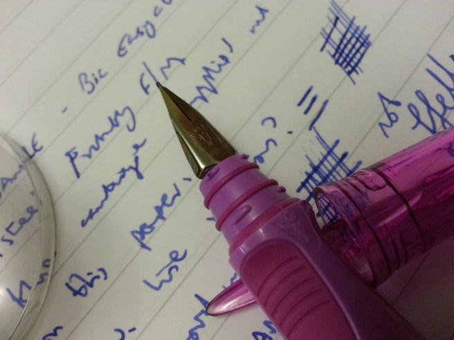
The nib is  stainless steel  with the Bic name and logo but no other markings. There is no breather hole. This is a butterfly nib with the tip formed by folding the ends of the tines back on each other, rather than having a pellet of tipping material. However, if the tines are level, the nib is capable of writing very smoothly.

Over the following few weeks, I amassed four more of these in other colours. On checking the nibs with a loupe, some needed slight adjustment to align the tines but this was easily accomplished. Two of my five models have TUNISIA on the barrel, while the other three have FRANCE.

20151018_163722

The pen, being designed for a child’s hand, is short  when uncapped. The cap can be placed on the back but does not post securely. As an adult with medium to large hands, and what with the tapering of the barrel, I found the pen too short to be comfortable for all but the briefest of notes.

However, after trying on a few different caps, I found that the cap of a Lamy Safari posts deeply and securely giving a posted length of 14cm and making this little pen much more comfortable and easier to control. The Safari cap also gives it more weight, without upsetting balance and stops the pen from rolling off a desk. So pleased was I at this simple discovery that I wrote to tell Stephen Brown, who said it was a cool suggestion. Of course, it does mean that you have an unused Lamy Safari and arguably you may have a better writing experience using the Safari which costs four times as much but that is not the point.

The pen weighs around 9.5 grams inked and uncapped, but posting a Lamy Safari cap brings this up to a comfortable 17 grams.

For disassembly, if desired, you can detach the section by pulling it hard, while holding the barrel firmly by the sides, (the non-sliding part) in the other hand. It snaps on and off. Beyond this I have not tried to remove the nib and feed from the section.

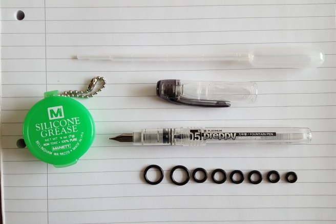
Mine have given various levels of success. I paired them up with matching coloured ink cartridges. The blue pen has the smoothest nib and this has been inked constantly. It is particularly impressive at starting immediately, even after a week or more without use. This is due to the cap forming a good airtight seal, with some rubber O rings on the section. You can easily slide open the barrel to check the remaining ink.

20150511_204218

Clearly this pen will not appeal to those whose interest is only in higher end pens for serious grown ups. But if, like me, you do not discriminate on price or target age group and enjoy the merits of the pen, I think it is a fun pen and well worth a look. I like that it is a re-usable pen at this price and cheap to run on a bag of 50 cartridges for £2.00. For me the unusual loading mechanism alone is already worth the purchase price. And to find one which writes well with good flow and no hard starts at such a low price is great. If you are prepared to use better quality ink cartridges such as Diamine, Graf von Faber-Castell or Kaweco, this will improve the writing experience.

I do enjoy keeping an eye on what fountain pens are available, including school pens, in stationery shops and supermarkets both here and when travelling. It is great when you find a bargain which is also a good performer.

20151018_164023

Combo of the week: Lamy AL-star and Sailor Kiwa-guro

p1100999

I have begun to appreciate that a good ink is just as important as a good pen, in finding  an optimum writing experience. It is great when you do find a combination of pen and ink that not only works, but enables both pen and ink to bring out the best in themselves and each other.

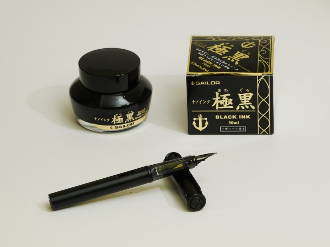
After reading great things about Sailor Kiwa-guro black pigment ink from other bloggers, I was excited to try it for myself and ordered a bottle from The Writing Desk.

This is said to be safe to use in fountain pens and has several useful attributes. First, it is largely waterproof. Secondly, it resists feathering, where other inks fail. Thirdly, it also resists bleeding and show-through.

As well as all this, it seems to be a clean and well-behaved ink, that does not leave a residue on the insides of the converter.

The bottle contains a plastic conical insert, which is filled by turning the bottle upside down and then righting it again, for ease of filling your pen when the ink level is low.

When you look at the ink in the open bottle and swill it around a little bit, it does not leave any trace on the plastic insert but keeps to itself, rather like mercury back in my school science class days.

I decided to try the ink first in my black Lamy AL-star. The matte-black barrel and cap, the black nib and black clip all pointed to this pen being a good choice.

The ink flow of the Lamy is known for being on the dry side and my medium nib is smooth and firm. Paired with the Sailor Kiwa-guro, the lubrication of the nib is wonderful, rather like the feel of a plastic spatula in a non-stick saucepan and with no skipping.

Naturally I was eager to try the ink for water resistance. I wrote a few lines and then immersed the paper in a basin of water. There was a very slight lift-off of ink but when removing the paper and allowing it to dry, the writing looked as good as new. This would be a great ink to use for addressing envelopes or any use where there is a risk of the paper getting wet.

My next test was to try the pen on an unused notebook, (a Paperchase Agenzio soft black, ruled notebook) that I had previously given up on, as being unusable with fountain pens.To my great delight, there was no bleeding with this ink. I recommend this ink if you have notebooks that you cannot use (for writing on both sides of the paper) with other inks.

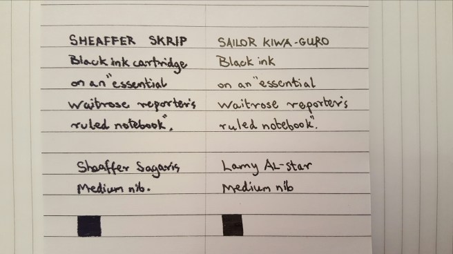
As for feathering, I had tried a new black Sheaffer Sagaris recently with the supplied black Sheaffer Skrip cartridge and was surprised at how much this feathered on a reporter’s inexpensive spiral bound note book. This same paper had been good to use with a Lamy blue ink cartridge.

Sure enough, when trying the Kiwa-guro on this paper, there was no feathering. The lines remain very crisp, whereas the Skrip black ink has gone very woolly. Admittedly the Sheaffer Sagaris is a wetter writer than the AL-star so this is not a level playing field.

20170208_214405.jpg

I have used the black AL-star with Sailor Kiwa-guro at work for over a week now, for writing notes, forms and documents and signing letters and enjoy the silky feel of the nib gliding over the paper.

On the downside, I had hoped that it might be possible to go over the writing with a yellow highlighter pen without smudging but this was not entirely successful. There is an element of the ink that is not waterproof and which will smudge if you go over it with a highlighter pen even though the writing remains very dark. Some black ink will transfer to the felt tip of the highlighter. For this reason it is probably not suited to  being used for drawing in conjunction with water colour paints, but then this is not its intended use.

The other downside is the price, at £21.60 for the 50ml bottle, making this a premium ink, but given its useful properties I have no regrets about the expense.

I have not yet tried it in any other pen. As a pigment ink, I still thought it best to keep it to one pen at a time which I then use regularly. However, it may well be that my concerns over ink drying out in the pen and being difficult to clean up, are unjustified. From my brief experience of  this ink so far I am certainly tempted to try it in a different pen next time, particularly one of those which might benefit from a more lubricating ink.


My current EDC fountain pen

wp-1485863015024.jpg

Today’s post is dedicated to my current Every Day Carry pen, a Sheaffer Sagaris. More particularly, I was reflecting upon what are the necessary qualities that we require in an EDC. Of course, people’s needs will differ and almost any pen could be carried for use every day although with differing levels of suitability. Here is my list.

Reliable. First and foremost, you will need a pen that will not leak in your bag or pocket whilst in transit, will not let you down and will not hard-start. If you get out your pen to make a quick note, you do not want to wait for two minutes while you coax the ink down to the nib. I was once at a charity event when a well-known TV actress was asked for her autograph and I overheard her reply that she had not got a pen. Standing nearby, I offered her my blue  1990’s Waterman Expert, prompting her to say “This is a posh pen, this must be a posh man!” Thankfully the pen wrote.

Robust. The pen must be tough enough to withstand being carted around in the wild, rather than being cosseted in a plush cabinet or pen cup.  It should within reason be able to survive being accidentally dropped or sat upon.

Secure. It must not come apart in your pocket, either coming adrift from its cap or the barrel unscrewing itself from the section.I have had a pen with a screw cap, which lacked bite so that the pen once came loose in my pocket, which can be messy. Note that this does not entirely rule out carrying the pen, as you can of course use a pen pouch or case. Also the pocket clip is important, as it needs to be sufficiently tight to keep the pen in your jacket pocket, in the event that you remove your jacket in a dark theatre and in folding it, turn the pocket upside down. But the clip should not be so aggressive as to chew holes in your clothing.

Expendable. Although too awful for pen-enthusiasts to contemplate, your EDC could, despite your best efforts, be lost or damaged in the call of duty. It is sensible not to carry your most valuable pens around unless you happen to be very careful.

Comfortable. The pen should not be too heavy or bulky. If it is to be carried in a shirt pocket, it will need to be short enough to fit. In a jacket, a slimmer pen has the advantage of not making unsightly bulges in your smart business attire. I was told in a store that the slender Diplomat Traveller was popular with gentlemen for this very reason.

Re-fillable. It is very useful to be able to check the level of ink before you leave your home or work place where your supplies of ink are kept. Cartridges are easy to bring, if you remember. If your pen is filled from a bottle, then you can always refill it beforehand, if it might otherwise run dry while you are out.

Presentable. Depending upon where you plan to use the pen, it will need to strike the right balance of quality and professionalism but without being ostentatious.

Enjoyable. Let’s not forget how much we enjoy using a fountain pen and so bring with you, one that brings you joy and brightens your day.

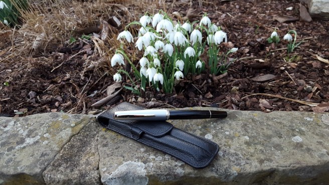
I think my Sheaffer Sagaris embodies all these attributes. It is a fairly simple, slim metal bodied pen with a laquer finish (I think the colour was called grape) with a steel medium nib which never fails to delight. The cap snaps on firmly to give confidence that it will not come off. I have been using the pen regularly for over a year. I used it a lot as a journal pen with Skrip blue cartridges, one of my favourite blue inks, but currently am using the converter with Caran D’Ache Idyllic Blue. The pen also reminds me fondly of my late mother, who had a Sheaffer Touchdown in a similar colour.

20151228_184740-1

Pelikan M400 vintage tortoise, update.

wp-1485635103598.jpg
Pelikan M400 vintage tortoise, with a Voigtlander Vito IIa

This week I performed my first successful transplant on an elderly tortoise. Or was it a pelikan?

That is to say, I have given my recently acquired and much prized, Pelikan M400 vintage tortoise, a new nib. The one that it arrived with was a Rover, 14k gold, extra fine, which had wonderful flex to it and was great fun to experiment and doodle with. On removing this, the full inscription on the nib could be seen as Rover 585 EXTRA PO.45. I had wrongly assumed that the concealed lettering beneath the “EXTRA” would say “FINE” and had not guessed that it would say PO.45.

I do not have any information on Rover nibs and would be interested to know when and where they were made. I believe my pen dates from the early 1950’s and it has not yet yielded up all its secrets, nor is it likely to. It would be fascinating to know who had owned it and where it has been all my life. All I know is that it arrived at Hampstead Auctions, had been well cared for and had vestiges of a blue ink from its last use.

Much as I enjoyed this nib, it was not well suited to my way of writing. I found that I could write in an upright hand, quite smoothly, but if writing in my more usual slanting style and with any speed, the soft extra fine nib was rather scratchy. Not a pen to be rushed.

As I wanted to use the pen at home for letter writing and journaling and so forth, it seemed a good idea to acquire an additional nib and I ordered a modern Pelikan Fine, M200 stainless steel nib in the gold-coloured finish, from The Writing Desk. Yes, I know this sounds like a downgrade, but it is a Pelikan nib, it is the right colour, Pelikan stainless steel nibs are excellent (in my limited experience and from what I have read), plus it was an economical way of adapting the pen for regular practical use.

The new nib arrived within three working days and I was impressed and grateful that it had been checked and tested. A test card was signed and dated – a great service for a modest order and really helpful when buying online.

This time, my pen was already inked, with Conway Stewart Tavy from Diamine  as I unscrewed the nib with its fragile ebonite feed unit and replaced it with the Fine nib with its modern plastic feed, carefully keeping the pen upright. It is more accurate to say that I held the nib and feed still, firmly gripped in tissue paper, while unscrewing the barrel from the nib.  Having done this once already, it came out easily and the new stainless steel nib went in perfectly. Both pen and nib are doing well.

I am delighted with my choice. The Pelikan Fine seems to be nicely proportioned to my size of writing. I have generally thought of myself as a Medium nib person, but over the years as my writing has become faster and less legible, all the loops tend to get inked in and it is a treat to see some white space back in them again.

20170128_201430.jpg
Writing sample from Pelikan M400 with stainless steel Fine nib and Tavy ink

Admittedly the pen is still new to me, but at present I get a buzz at every opportunity to pick it up and write something with it.

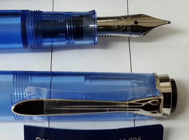
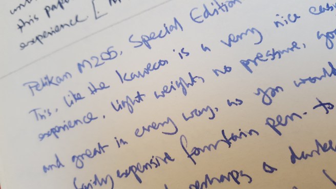
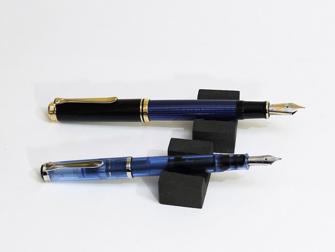
My only other Pelikan stainless steel nib is on my M205 blue demonstrator from 2016 with which I chose a Broad which is beautifully smooth and one of the nicest nibs that I have ever used.

With its capacity of around 2ml, I expect one fill of ink to last me ages. Even in the M205 with its Broad nib, I got over 50 pages of an A5 notebook to one fill and so with a fine nib, I can expect a fair bit more than that. The extra fine nib might give double that mileage, so long as I do not get carried away with the broad wet flourishes that are readily available on applying a little pressure.

I did find that on the vintage M400, the cap did not post firmly. It rests on the back of the barrel quite deeply, to over half its length but did not grip and so tended to slide about. This was very easily remedied, simply by tucking a scrap of paper in the cap when posting, about half the size of a postage stamp and the problem is solved instantly. As I said, the pen is elderly. One has to make some allowances and treat it with care and respect.


Rover 14k Extra Fine nib: a writing sample

Further to my post yesterday about the vintage Pelikan M400, here is a writing sample to show the versatility of the extra fine nib.

The nib is a Rover, 14k gold, in extra fine. (update: a “Rover 585 EXTRA PO.45” to be precise).The ink is Conway Stewart Tavy by Diamine, which I like a lot.


The paper is from a Silvine exercise book. It was written on my knee in the park in Golders Green, basking in 5 degrees Celsius today, while last night’s frost and ice lingers in the shade.

Having a wonderful pen and ink combination like this makes me yearn for better handwriting.

Studying the classics – the Pelikan M400 vintage tortoise.

wp-1485019007978.jpg

Just over a week ago, a friend emailed me a link to a forthcoming local auction and mentioned that there were some fountain pens included. I had a browse at the online catalogue and began to get moderately excited at the prospect of acquiring a vintage  Pelikan M400 tortoise.

Still a newbie to the process, it was a novelty to log in to the sale room web site and submit  a bid. The auction was due to take place on Tuesday at 10:30am. With around 500 lots to get through and the fountain pen lots all coming towards the end of the sale, it was likely to be late afternoon before the Pelikan came up. On my only previous  experience with this auction, I had been hopeful of buying a burgundy Parker Duofold Centennial but was unprepared when the bidding sped past the estimate and I let it go.

I was quite expecting to be unsuccessful again and so had a back-up plan of bidding on one or two other pens, in the event that the Pelikan went to someone else.

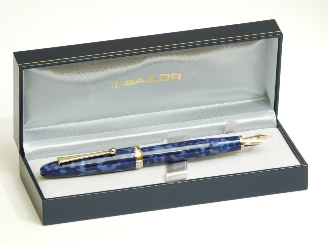
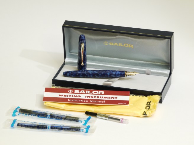
In the event, when the Pelikan came up, as I listened online to the auctioneer, there were no higher bids placed and it went to me. (I should have walked away from the computer at that point content with my success. However I lingered online to see how the other pens sold. When a blue resin limited edition Sailor came up, I found my mouse hovering over the “Bid” button and, seeing off some half-hearted opposition, I found myself owning this pen as well, more of which another time).

I had been reading up online about the vintage Pelikan. On the following morning, I received the invoice for my two pens, by email from the auction rooms, which I thought was very speedy and efficient of them. I arranged to collect my pens later that day.

The Pelikan was fitted with a Rover 14k gold nib, extra fine, as the catalogue had stated. The pen was apparently an export model. I do not know the history of Rover nibs and am not sure whether the pen was first sold with this nib option (the piston turning knob does have the letters EF printed) or whether it might have been a later replacement of a Pelikan nib.

At home that evening, I was able to have a closer look at my purchase. The pen looked to be in a reasonably good condition for its age, which I believe dates from the early 1950’s.

wp-1485019057395.jpg

On the barrel, barely legible unless with a loupe, are the words EXPORT and PELIKAN GUNTHER WAGNER.  The nib reads ROVER 585 EXTRA. (Presumably the word FINE is concealed by the section).(Update: No, on later removing the nib, I was surprised to see that below the word EXTRA, it reads “PO.45”)

Looking at the cap, there is no inscription on the cap band. I have read that this puts it as being an early model. There were plenty of shallow scratches on the cap, signs of general use, but these are not visible to the naked eye and are only cosmetic and do not worry me at all. There are a couple of tiny cracks no more than 2mm long just below the pocket clip ring, possibly due to shrinkage but again, of no concern.

The nib looks to be in good condition with some wear, as a smooth, rounded foot can be seen to the tipping material. I was excited to try the extra fine nib but had to be patient.

The feed is an ebonite one, with “longitudinal fins” which all looked intact. These can become brittle with age and are easily cracked. I had read up on the informative “The Pelikan’s Perch” blog, how to go about removing the nib and feed, taking great care not to damage the feed.

First I wished to establish whether the nib and feed were screw fit or friction fit. Again, I learned this week that some rare early models were friction fit and that this design was briefly repeated later when the model was re-introduced.

I tried operating the piston. This was very promising. The piston traveled up and down and still felt reasonably stiff. The attractive tortoise-shell coloured, striped resin barrel gave a good view of the piston, when held up to the light.

I wanted to measure the take up into the reservoir. I have contrived my own simple device for this, being a syringe, with the plunger removed and with the nozzle plugged with a match stick. This I attach to a vertical object (the bathroom clock!) with an elastic band, and fill the syringe with water using a pipette, up to the 5ml mark.

I then held the Pelikan nib down in the syringe, and filled it with water, as you would with ink. I was pleasantly surprised to see the water level drop down to 3ml, indicating a good 2ml capacity in the Pelikan.

Ejecting this first lot of water, produced some old blue ink residue from the pen and I flushed it a couple more times, before then leaving the pen filled with water and standing in a jar of water up over the nib to have a good soak.I left it for 24 hours.

The following evening, flushing the pen a few more times, I then tried for the first time to remove the nib.Gripping the nib and feed firmly, wrapped in several layers of tissue paper, I held these still while attempting to rotate the barrel towards me, thus unscrewing the nib anti-clockwise. I was delighted when the nib began to unscrew, with no difficulty at all and I was able to remove and wash the nib and feed unit. I gather that these are interchangeable with modern nib and feed units for the M200 and M400 series pens, so that I could try the 14k gold EF in my modern M205 blue demonstrator, or the steel broad from the M205 in the vintage tortoise.

Before I filled the pen for the first time, I had to make the choice of a suitable ink. I decided to go either for Waterman Serenity Blue, or Diamine’s Conway Stewart Tavy, for this first fill. Dipping the pen in each of these ink in turn, I settled upon the Tavy, as a darker more legible line in the extra fine nib. I also like the dark blue-black tones of this ink which seemed fitting for the vintage pen, such that you might find on a letter from the 1950’s.

I was concerned as to how well the old cork piston seal might work, on a pen of perhaps over 65 years of age. The piston had drawn up water to a very satisfactory capacity, but I did not know whether it might leak from the back once filled with ink. I had spent an evening reading about removing piston assemblies from these pens, by means of a dowling rod inserted through the nib end and this sounded much too advanced and risky for me to attempt.  I very much hoped that the piston would be usable. If not, then I had an attractive and rather expensive dip pen or a nib unit that I could use in other pens.

And so that night, the pen suffered the indignity of being stood in a glass jar to check for any accidents overnight. Happily (and this really has been a lucky story so far) there were no signs of any leakage.

So how does it write? Well, the nib is far softer than any I had experienced. A little pressure spreads the narrow tines to produce a lovely characterful broad wet stroke. Without pressure the pen writes a very fine line. I was pleased with my ink choice. The nib wrote smoothly when writing with my left elbow tucked in to my side (I am left handed) but when writing in my ungainly, overhand slanting style, with paper tilted and my left hand above the line (a bad habit from childhood to avoid smudging wet ink), then the nib was a bit scratchy. So I will go with what it likes best.

I amused myself trying the pen on every available type of paper. It suits smooth papers best. And I discovered a new source of amusement, in writing with the reverse side of a vintage extra fine nib, to give an extra extra fine line! This enables you to write in such miniscule letters, aided by a magnifying glass as you go, that you can achieve up to six lines of writing in one row of an exercise book. I then attempted the Lord’s Prayer which I managed to fit into three rows,  which is less than one inch deep. This is of limited application I know, but fun to try nevertheless.

wp-1485019073710.jpg