The new year diary, 2021.

One of life’s great pleasures is writing with a fountain pen. My lifelong habit of journaling, or keeping a diary, is another and to combine these two makes for a great start to a day. Just having ten minutes, to collect my thoughts and reflect on the previous day and then record it in ink and “offload” this into my archive, is something I cannot do without.

I have been keeping a personal diary in one form or another since 1976. The size has varied over the years from chunky A6 page-a-day books in the seventies and eighties (in which I used “reverse writing” with my Sheaffer No Nonsense pens to get extra fine lines), to A4 volumes, 5 year diaries, and even tried typing for a few years. In recent years I have settled on A5 as being the format that works best for me. For some days, I write in longhand and for others, typically work days, I prefer to do a balloon diagram with bullet point notes, of what progress was made on my various ongoing tasks.

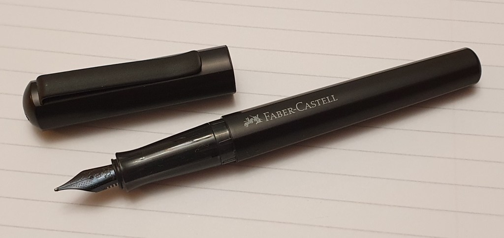
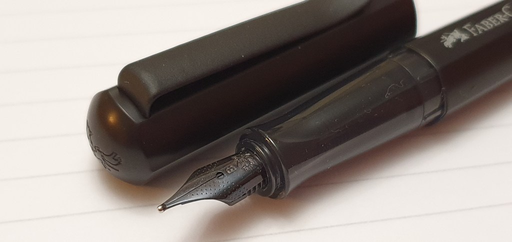
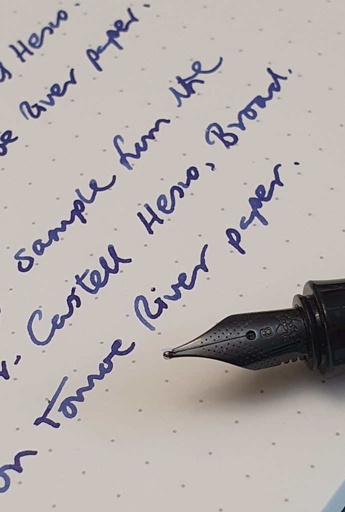
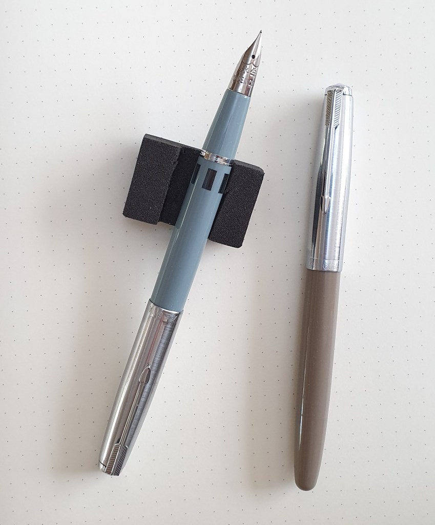
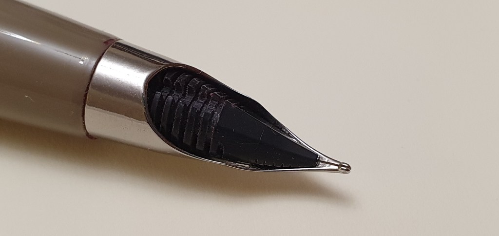
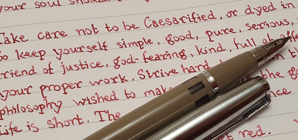
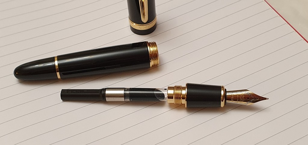
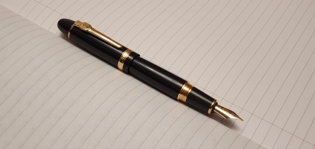
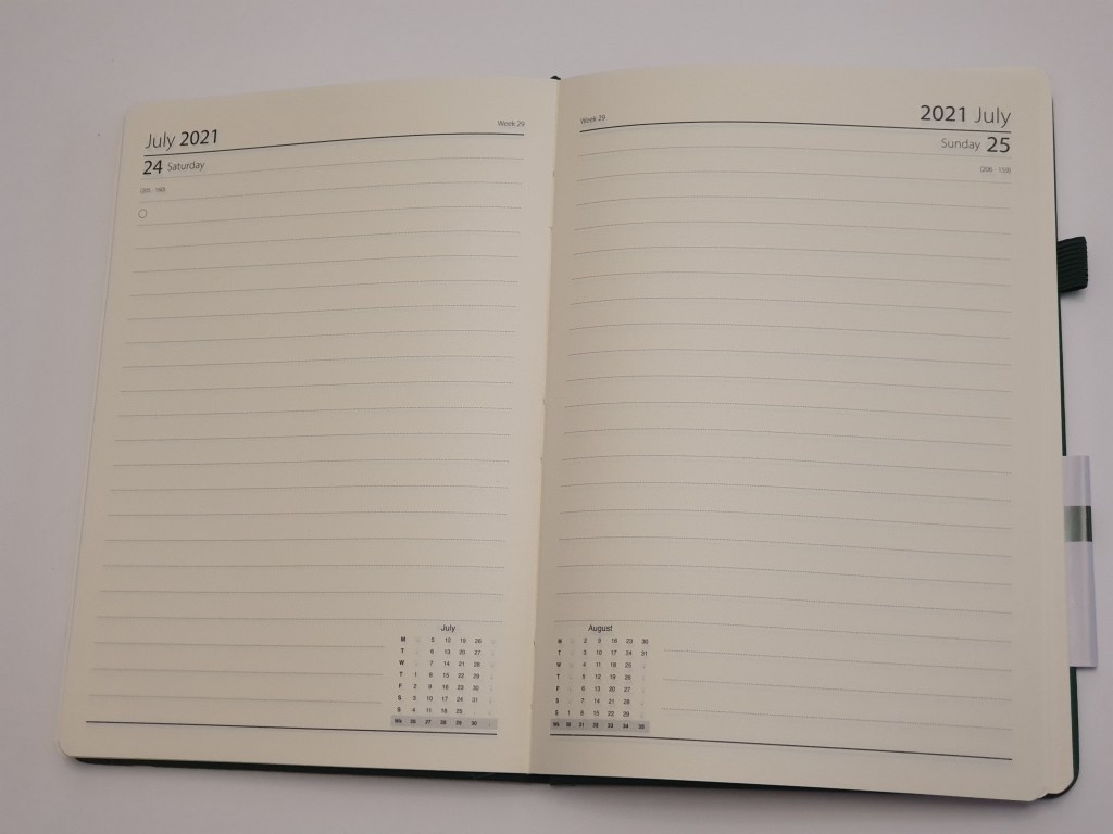
This year, I have enjoyed using an A5, page-a-day diary from Rymans. It has what they call a “Soft Cover” but is a stiff cover but finished in a soft texture material that feels like leather. The cream coloured pages give you 23 rows with a row height of 7.9mm which is reasonably wide and I find this ideal. Currently, I use my Diplomat Excellence A Plus, with a Fine steel nib and Pilot Iroshizuku Shinkai, blue-black ink. It is one of those combinations that is a marriage made in Heaven and which you never want to end.

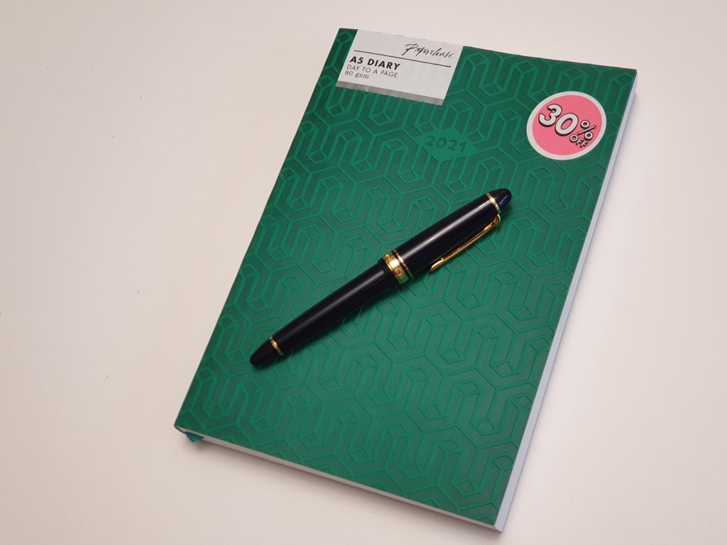
Last week, while browsing in Paperchase, I spotted an A5, page-a-day diary in an attractive viridian patterned, textured soft-back cover . On a quick flick through, I noticed that the line spacing was wide (actually 7.5mm), that it was neatly bound with stitching and opened flat. It was also in a sale with 30% off and I decided to buy it.

Paperchase A5 Day to a Page diary. £7.50 in a sale, With a Sailor 1911 Standard for scale (not included in the price).

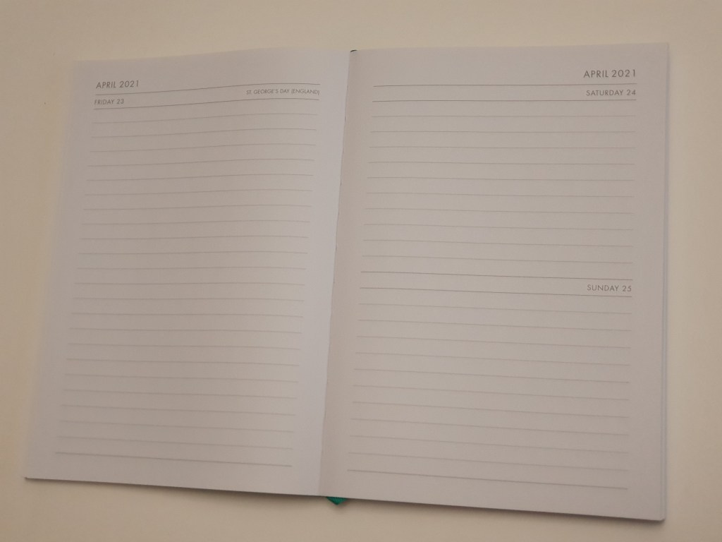
Only when I got home did I notice that the “page-a-day” description was a bit misleading for the weekends , as Saturday and Sunday had to share a page. At least this meant that you could always find your weekends on the right-hand page of a spread, but I was disappointed. My wife helpfully suggested that I “just don’t do as much” at the weekends to have less to write about but I was not convinced.

Paperchase diary: in fact Half a Page a Day when you get to the weekend.

Today, in a Goretex jacket for the rain, I trudged out to Golders Green High Road to visit Rymans to see if they had any diaries. I found the diary section and looked at a Ryman hard back, A5 page-a-day diary at £7.50 but the line spacing was clearly narrow, unlike my 2020 version so I dismissed it.

But then I noticed nearby, the Ryman Soft Cover Diary, also a page-a-day but a little more expensive at £10.99. I found a beautiful forest green one but could not inspect the line spacing or the weekend arrangements as it was sealed in cellophane. Other colour options were an equally lovely dark red or yellow ochre, which would have been great with my Diamine Cherry Sunburst ink, or perhaps a KWZ Honey or Diamine Honey Burst.

Since these were all sealed, I could not inspect any of them for row height or to check that Saturdays and Sundays were still afforded a page each as in my 2020 diary. Call me reckless, but I took a gamble and bought it anyway. I went for the green. The sales assistant favoured the yellow ochre version but when I said that I preferred the dark green he said “Like your jacket!” to which I had to admit that my colour choices were rather predictable.

Ryman, Soft Cover Diary, Page a Day.

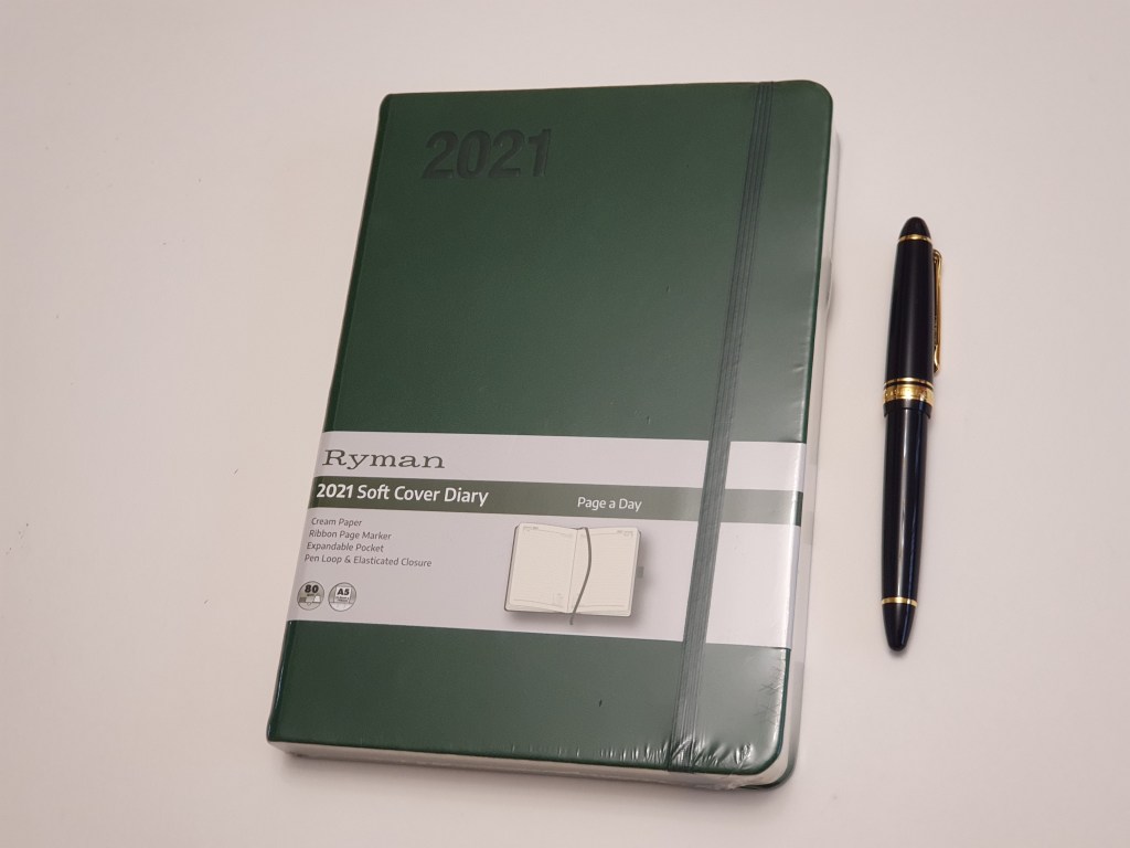
Back home, I sliced off the cellophane for the moment of truth. Would there be wide line spacing and would there be whole pages for Saturdays and Sundays? Yes, to both! I can look forward to another year of journaling with my lovely Diplomat. It has a pleasant, fountain pen friendly paper. Other features are a ribbon book mark, an expandable pocket inside the back cover, and elastic pen loop (which I do not use) and an elastic closure – which is useful.

The Ryman diary, with a full day each for your Saturdays and Sundays. Happiness restored.

Today I have just seen the sad news that Sir Sean Connery has died, at the age of 90. How I loved all those early Bond films, and going to the local cinema with my late father. “Do you expect me to talk?” “No Mr Bond, I expect you to die!” So that is a piece of news for today’s entry in my diary. RIP.

This has been an unique year, “unprecedented” in our lifetimes as many have said and we still have two months to go. My year 2020 and lockdown activities are well recorded. Flicking through the blank pages of my next year’s diary it is hard to imagine what I might be doing in the months to come. Let’s all hope for better times ahead.

Early thoughts on the Faber-Castell Hexo fountain pen.

A friend overseas alerted me to this new model. After taking a look on Cult Pens, I was eager to order one, in black. I had not yet seen one in the flesh.

Faber-Castell Hexo, matt black.

I have been a fan of Faber-Castell’s entry level pens for several years. I found their “school pen” for sale in a Waterstones book shop at about £4.95 (including a box of blue cartridges) and bought a pair, in red and blue. A reader informed me that there was also a black carbon fibre-effect version, which sounded exciting and I eventually tracked one down in a hypermarket in Dubai. These wrote well but all featured nibs which drooped downwards, perhaps to improve resistance to being sprung by over-eager young hands. Also the grip sections were rubber and faceted.

I have also enjoyed the Faber-Castell Loom, in the shiny gunmetal finish which proved a good choice for a work and every day carry pen – convenient, reliable, robust and with space for a spare cartridge in the barrel. In recent years I have also used an Essentio (also called the Basic) and the Grip – good value at around £18.00 now. All of these had medium nibs.

The Hexo seems to slot into the line-up, somewhere between the Grip and the Essentio and Loom. Cult Pens’ current price for the Hexo is £31.50 which is a little less than the RRP. That puts the price slightly higher than the Lamy AL-Star, which looks a close competitor.

Two aluminium stealth pens: the Lamy AL-Star and the Faber-Castell Hexo.

The Hexo looked to be a worthwhile addition, sporting a hexagonal body in matt black anodised aluminium and a nice girthy grip section in plastic. Other options were silver or rose gold.

It arrived in a small, simple green cardboard box. The sticker calls it the Hexo 2019 Fountain Pen. It is made in Slovenia.

Construction and appearance.

The cap is a snap-on one and is firm but not overly so. The cap finial has the Faber-Castell logo of jousting knights, although not very easy to see unless you have a magnifying glass and have the logo the right way up.

There is a very sturdy metal pocket clip which grips well but at the expense of being a little hard to operate. You may need to lift the clip before sliding it over a pocket.

The barrel features the Faber-Castell name in white with the logo again. This aligns with the nib. As there is only one entrance to the barrel threads, the name is always in line with the nib, albeit upside down if you are left handed like me.

The cap facets always align with the barrel facets. If you do try to push the cap on with the facets not aligned, the cap and barrel repel each other like opposing magnets. This is due to raised ridges inside the cap, which I had taken to be for decoration at first.

Ridges on the barrel (left) find the gaps inside the crenellated cap to ensure that facets align.

The cap closes almost flush with the barrel and to a snug fit, with no wobble. Examined very closely there are mold lines down the length of the plastic section, at front and back but not prominent enough to be a problem. Also, a tiny gap can be seen between the barrel and section when tightened, but only apparent when inspected under a loupe.

The grip section is very pleasing: no rubber, no facets, just a gentle taper towards the nib and flared out at the end to provide a comfortable finger rest.

Removing the barrel, the threads look to be of a soft grey molded plastic. However, it turns out that these and the grip section are translucent although it takes a bright light source from behind to see through this.

The effect of a bright light behind the section.

The threaded collar, where the cartridge or converter goes, has an unusual cutaway. I think this may be part of a locking mechanism, as you feel a definite click at the end, when you screw the barrel back onto the section. If you use standard international short cartridges, there is room for a spare in the barrel, very useful if you are out and about. It fits in snugly without rattling but does not get stuck inside.

The unusual cutaway in the section threads.

The nib.

The nib is steel with a stealthy black plating. I chose a broad for a change, hoping for stellar smoothness. I flushed the nib and feed first and dried them, then inserted a cartridge of Graf von Faber-Castell Cobalt Blue. The pen wrote well once the ink started to flow, which needed a squeeze of the cartridge. However, for a broad, it was not particularly wide and not much wider than a typical medium. It looked to be well set up and wrote smoothly, with just a slight roughness in side strokes from right to left which I take to be nothing that writing-in will not solve. The tines and tipping material looked level. Judging by the writing experience at the sweet spot, the nib is of the buttery smooth variety, not a feedbacky one.

The dimpled and black-coated nib. Also, a glimpse of the cap finial logo.

Size and weight.

Being made mainly of aluminium, the pen is light. It weighed in at 20g (including two cartridges on board) comprised as to 13g for the pen uncapped and a further 7g for the cap alone. It measures 134mm when closed, 122mm open and 151mm posted.

Some size comparisons from Faber-Castell’s range: from left to right:- School pen, the Grip, the Essentio (Basic), the Loom and the Hexo.

The writing experience.

The broad nib writes well, although on the medium side. Out of the box it was not quite perfect but has the potential to be a smooth writer. I look forward to putting some mileage on it to run in to my writing angle. Some smoothing with micromesh would do the job quicker, which I may yet try, but there is a risk of taking too much off the tipping.

Writing sample on Tomoe River. Cobalt Blue ink.

Finding an optimum writing experience depends not just on the pen and nib, but on having a smooth, lubricating ink and a compatible, smooth paper that does not cause drag. Tested on Tomoe River paper, the nib does provide effortless writing. On some less suitable papers, there is a feeling of friction which becomes wearing once you are aware of it.

Likes and dislikes.

My favourite feature of the pen is its comfortable large section. I prefer plastic to the Grip’s rubber, gently faceted section. But as well as this, we have the stealthy black finish, the lightweight hexagonal body, the aligning cap and barrel facets, the barrel lock and a host of other boxes ticked: plastic inner cap, a good fitting cap which posts deeply and securely and a strong pocket clip. And that Faber-Castell smoothness in the nib.

I do not have any real dislikes. It is tempting to say that the nib was not quite perfect out of the box, but like a pair of shoes, steel nibs often require a little wearing in. The nib is perhaps a little narrower than expected for a broad. But overall, for its price, I am happy enough with the pen.

Conclusions.

This pen has a lot going for it. It is an attractive and interesting shape, whilst at the same time being plain and unflashy. There are a few surprises: the automatically aligning facets; the clicking lock at the end of the barrel threads; the section which looks black but turns clear with a light behind it. Best of all, it has a comfortably wide grip section which is not rubbery or faceted and a typically smooth Faber-Castell steel nib. Lightweight yet robust, with a capacity for a spare cartridge up the spout, it meets all my requirements for an EDC pen.

The stealthy Hexo in use, with a box of cartridges.

Tinkering with the Wing Sung 601A fountain pen.

The moral of today’s tale is that things can go wrong quite quickly when you try to improve a fountain pen nib, if you are not an experienced nibmeister.

I am a fan of Chinese fountain pens. I was thrilled when I first discovered the Wing Sung 601, a pen in the classic style of the Parker 51 but with a steel nib and costing just a few pounds. Not long after that, in December 2018 I learned that there was a model 601A, similar on the outside but featuring a conical nib, in the style of some vintage Sheaffers. I simply had to try it and ordered three of these online.

A pair of Wing Sung 601A fountain pens.

Last month, I got one of these out to ink up again. Lately I have been copying the book “Meditations”, by Marcus Aurelius, with fountain pens, in a slow and laborious print style like a type face, or Times New Roman font. This was not an original idea but inspired by Kimberly, of @allthehobbies on Instagram after seeing her updates of attractive page spreads written with a different pen and ink combo each time.

Some days, it can be soothing to unwind with a fountain pen and ink and to write someone else’s words without having to think too much. And so it was in such a state of mind that I found myself late yesterday evening, using a Wing Sung 601A, inked with the lovely Graf von Faber-Castell Garnet Red.

Unfortunately, this combo with its fine nib was not the best of matches for my notebook paper and after a couple of paragraphs, I put the pen down and reached for the brass shims.

It is simple enough to floss the nib a few times with the thinnest grade and then examine it again with a loupe. I was hoping to open up the tine gap just enough to increase ink flow and lubrication and to get a slightly wider line in the process.

The steel nib proved quite stubborn to adjust. I shifted up a grade with my brass shims, poking a corner into the breather hole and drawing it down to the tip a few times. When this did not seem to be making much impression, I lowered a blade into the tine gap to wriggle gently from side to side, with a confidence born of recent success with my Aurora 88.

However, when I next examined the Wing Sung’s conical nib, the tines had separated rather too much and the pen looked unlikely to write at all. A Wing Sung is not an expensive pen but I was determined to fix it and set about trying to push the tines back together again.

“It was the best of tines, it was the worst of tines.”

This, it turns out, is harder than separating them. Even if you can push them back together, hurting your thumbs and fingers in the process, the tines simply spring back again when you let go.

By this time a fair bit of Garnet Red had transferred to my fingers and it seemed sensible to flush the pen. Also I thought that it would be easier to adjust the nib if I could detach it from the pen.

I was not sure how to disassemble the nib section on this pen. I tried pulling the nib off but instead, just the feed and breather tube came out. Then, with the feed removed, I was pleased to find that the conical nib simply unscrews from the section.

At the other end of the pen, I used the supplied Wing Sung wrench to unscrew the plunger and remove it, then unscrewed the barrel so that it could be flushed through.

With nib and feed removed. Nib is threaded.

Then with the pen cleaned and dried and in bits, I looked again at the nib with the loupe. The tines were still woefully far apart and the pen did not look usable.

I found that one way to try to narrow the tine gap, was to push one tine both upwards and across, so that there was bit more space for it to move before springing back – and then repeating with the other tine. However my finger tip efforts were not having much effect.

I then remembered SBRE Brown’s tip of bending the tines downwards against a surface. This did work better and, as the tines bent down slightly, so the gap narrowed.

Disassembled.

I then re-assembled the pen. Doing this for the first time involved a bit of trial and error. If you place the feed into the section before putting the nib on, you need to align it with the position in which the nib will be once it is screwed back on. Alternatively, it seems easier to screw the nib on first and then push the feed through the nib and into the section taking care not to break it.

Once reassembled, I tried dipping the pen in Garnet Red. It wrote! It was not the smoothest experience as the tine gap was still a bit too wide, but at least it wrote and just needed careful handling to keep to the sweet spot, with both tines in even contact with the paper.

Nib and feed re-assembled.

Having established that the pen had been brought back from the brink, I then inked it fully and finished my two page spread of Meditations in my A4 notebook. The pen holds a massive amount of ink and this Garnet Red will be with me for a while. I was pleased that the line was wetter and wider than those first two paragraphs, although I had forfeited some smoothness in the process.

I am still learning. Nib-tinkering needs a certain amount of courage and confidence and a willingness to take risks. But over confidence is dangerous and this was a timely reminder that care, caution and patience are key to success. I like to think that Marcus Aurelius would have approved of my tenacity.

An extract from Book 6, paragraph 30 of the Meditations of Marcus Aurelius.

Early thoughts on the Jinhao 159 fountain pen.

I have been fairly good at resisting the temptation to buy new pens this year, although there have been a few. But it is nice to have a new thing. My latest pen acquisition was not an expensive one. It cost just £8.99 but don’t let that put you off reading, as this is an extraordinary pen.

I first laid eyes on one of these a year or so ago, when Annie, from our London fountain pen club, produced a bright yellow one from her bag. It is a mighty beast. It put me in mind of those batons that ground crew use when directing passenger aircraft.

This is a Chinese pen. Jinhao produces a range of fountain pens, at prices which are astonishingly good value by western standards. Previously I have purchased an X-450 which was a heavy, lacquered metal pen with rounded ends, similar in shape and size to a Montblanc 146 but a bit shorter and much heavier.

The unboxing.

This will be a short paragraph, as there was no box. The pen arrived in a well padded envelope and inside a polythene sleeve. A soft black pen sleeve was included. It is quite refreshing not to have a gift box. I was impressed that I ordered the pen from Amazon on a Sunday afternoon and that it arrived the very next day.

Jinhao 159 uncapped

Appearance and construction.

If the Jinhao X-450 looked like a Montblanc 146, then the Jinhao 159 is a bigger version, like a Montblanc 149. It is a traditional, cigar shaped pen with rounded ends, very smooth and tactile. It is available in various colours or even in twos or threes of different colours, but I chose a classic, glossy piano-black finish with gold coloured fittings.

The cap unscrews, in just under one full rotation. The threads on the pen are metal, also gold-coloured but not sharp. The section is of the same glossy black and, thankfully, not faceted. The section is of a generous girth, widening from the nib from around 12mm to 14mm. The pen barrel has a maximum width of around 16mm at its widest point just after the threads.

The barrel unscrews, with metal-on-metal threads. A cartridge converter was included.

The inner threads of the cap are plastic. Peering into the cap with a torch, there appears to be an area of bare metal after the plastic threads, and then an inner cap. I do not yet know whether the 159’s cap can be disassembled. I just mention this because on the X-450, the inner cap screws into the cap using a long Hex key. I only know this because I once pulled off the cap only for it to leave the inner cap still clipped over the nib. I had to buy a set of Hex keys whereupon the problem was easily fixed although the Hex keys cost more than the pen.

The cap can be posted. It needs a firm push and a twist to grip securely onto the barrel. Be warned that this does make for a heavy pen although I rather like it.

Another thing I do not know is what the black finish on the pen is. It could be a lacquer over a metal body, but I do wonder whether it might be an acrylic layer, perhaps to give a warmer more pleasing feel to the pen rather like a Kaweco Dia 2, where different materials are used in combination. But whatever it is, the finish looks very handsome and is nicely done giving this pen an impressive presence.

The nib and filling system.

The nib is a bicolour, stainless steel, number 6 and mine is a medium. It features the Jinhao horse-drawn chariot logo, the name Jinhao and 18KGP, indicating this to be gold plated. The patterned border in silver between the gold plated areas, is attractive.

Nib-pic. As smooth and well-tuned as you could wish for.

What is remarkable though, is that the nib appears so beautifully finished and tuned, for super-smooth effortless writing. The tines and tipping material were level and symmetrical, there was a tine gap, tapering from the breather hole down to the tip but still leaving the tiniest of gaps at the tip, which is exactly as I like them, for a good ink flow and well-lubricated writing experience.

The pen uses standard international cartridges but came with a converter. I flushed both the nib section and the converter before filling and was pleased to find that the converter worked smoothly and well. The twisting knob for the converter is flat on two sides, like on a Lamy converter.

The supplied, Jinhao-branded, push-in converter.

Size and weight.

This is a big pen! Capped, it is around 148mm long: uncapped, a chubby 125mm.

Some size comparisons: Left to right: Lamy Lx, Sailor 1911 standard, Aurora 88, Montblanc 146 (75 years anniversary edition!), Jinhao X-450 and the Jinhao 159.

But it is the weight of the pen, that is the elephant in the room. It is a Jumbo sized pen. A cruise ship of a pen. Metaphors abound. The pen uncapped weighs around 30.5g. The cap weighs around 19.5g, giving a total for the pen capped or if posted, at a hefty 50g.

The writing experience.

This Jinhao nib is very smooth and produces a good medium line. It is not a feedbacky nib but my experience so far shows that it copes well with smooth papers, with no skips. There is no downward pressure needed, to make for tiring writing. Interestingly, the pen’s weight seems to make it easier to use rather than harder as you might think. The pen feels substantial and solid and not skittish or prone to jerky writing, that you might encounter on a lightweight model. Perhaps, like the cruise ship, it has greater stability and needs more planning to change direction.

I have been using this for only a week so far but am greatly enjoying it. I have tried writing with it posted and unposted and tend to prefer the former unless just for a brief note. This also has the advantage of providing the pocket clip as a roll-stop.

Jinhao 159 posted. “That’s not a knife. THAT’S a knife” (Crocodile Dundee).

Conclusion.

It is too early to give a more extended use review, but I can confirm that it is a comfortable well built pen that writes well and is fun to use. I have not had any hard-starts so far, using it with Conway Stewart Tavy, blue black ink from Diamine. Time will tell how the finish stands up to longer term use and how the pen feels after long writing sessions, although I have had no problems when writing a couple of A4 pages.

For anyone contemplating a larger pen, such as a Montblanc 149, this could be an inexpensive test to see how the size feels, although admittedly the weight and luxury will both be very different. But you might just find the Jinhao 159 meets some needs without investing in a 149 at all 🙂