Inky Pursuits: October 2021 round-up.

Whilst work has been quite busy recently, it has been particularly good to have my stationery hobby as a backdrop for some much needed R & R. This has also been eventful, including some unexpected gifts and a satisfying bit of pen-tinkery. It is time for another round-up.

Frogmore Paper Mill, Hemel Hempstead.

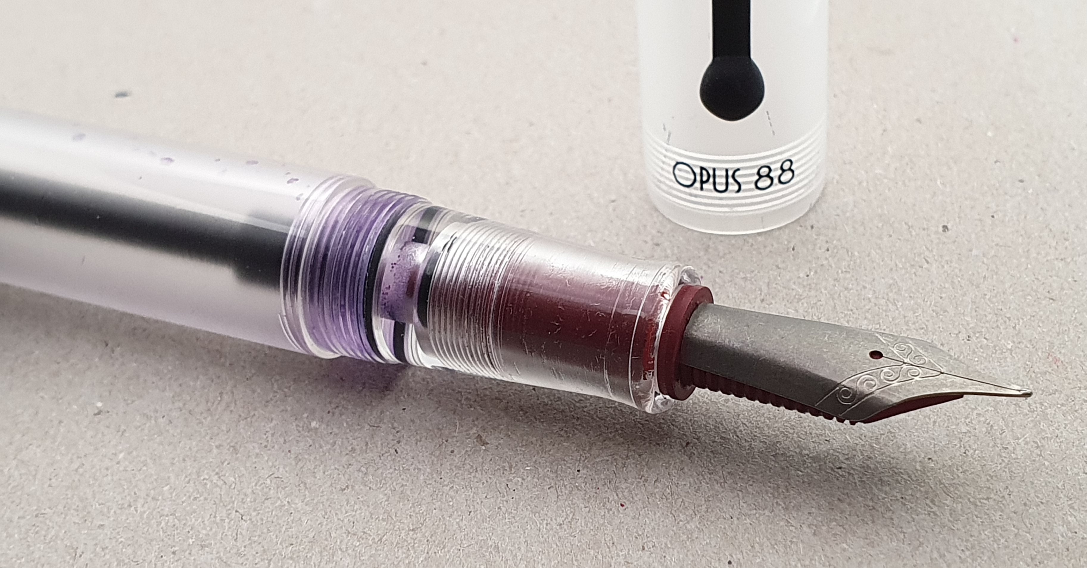
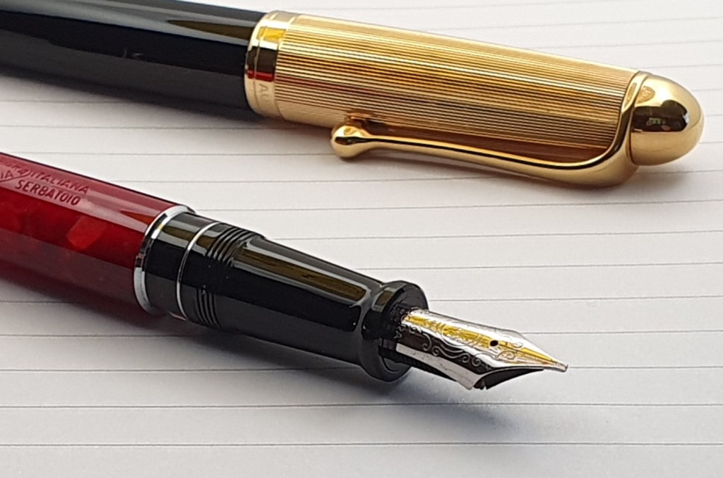
This working paper mill is home to two Fourdrinier paper machines, over a hundred years old. Named after the brothers Henry and Sealy Fourdrinier, the world’s first successful machine for making a continuous reel of paper was operated at the mill in 1803. My wife visited their museum and gift shop and brought me back an A4 sample pad of their various heritage papers that are made there, of various colours, weights and textures, some quite fibrous. It occurred to me that they would make good backgrounds for some pen photography with my lightbox. (See photo of Opus 88 nib and cap further below as an example). I hope to visit there myself in a little while. The shop is open only on weekdays.

Sailor multi-pen.
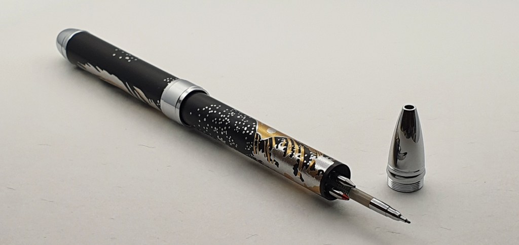
A new gadget. “Now pay attention 007.”

Another surprise was this lovely Japanese Sailor multi-pen in metal, featuring artwork by Katsushika Hokusai (1760 – 1849), his famous images of Mt Fuji and waves off the coast of Kanagawa, depicted in silver and gold colour against a matt black background. The pen comprises a black and a red ballpoint refill plus a 0.5mm mechanical pencil, each selected by a twist of the barrel. I do love a gadget and operating this one is very enjoyable. The pen ball-point refills are D1. It has a pencil eraser under the finial cone. But what is so touching is the fact that it was an unexpected gift picked out for me at the Tokyo National Museum, by Yoshino, a charming Japanese music student in London, whose parents have been friends of our family for many years. As a Japanese gift, this is as authentic as it gets!
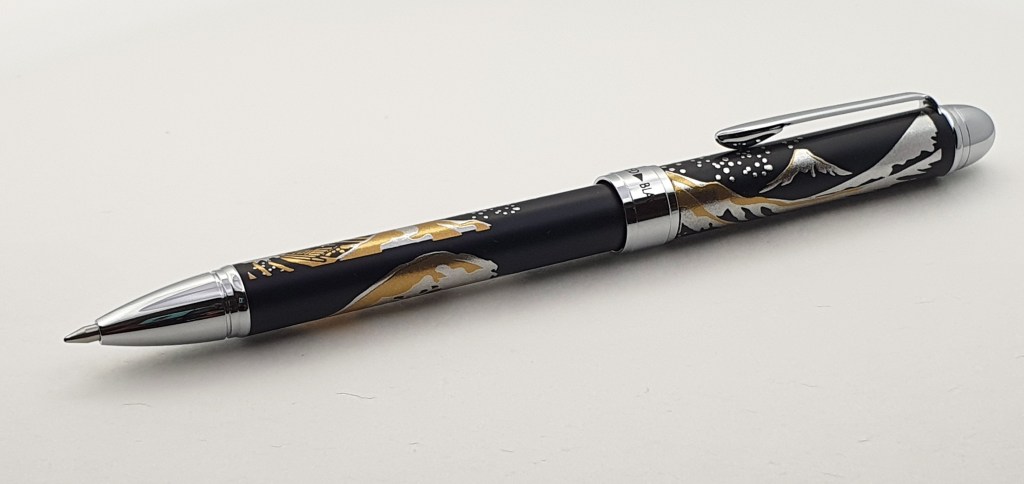
Sailor multi-pen (black and red ball points and pencil).

Agenzio Notebook, Paperchase.

I am aware that I have a tendency to buy stationery items for myself as a souvenir of an enjoyable day out. There was my Lamy 2000 fountain pen for example, which will forever remind me of a day trip to Brighton in May 2014. Recently my wife and I spent a happy day in Henley, enjoying a walk along the riverside in the autumn sunshine, a pub lunch at The Angel and then a browse around the shops.

I found a branch of Paperchase, and was drawn to an enticing and colourful display of new notebooks. The slightly odd thing is that I have found their Agenzio notebook paper to be not fountain pen friendly and to have a line width spacing a little narrower than I prefer. Yet despite knowing this I found myself purchasing one, half-eager for a challenge of finding an ink which it would like. Sometimes you can get away with using iron gall or permanent inks. Then, paying for the notebook, the young lady on the till informed me that if you buy two, you get 20% off the total price. So I chose a second one, in a different colour and with plain paper rather than ruled.
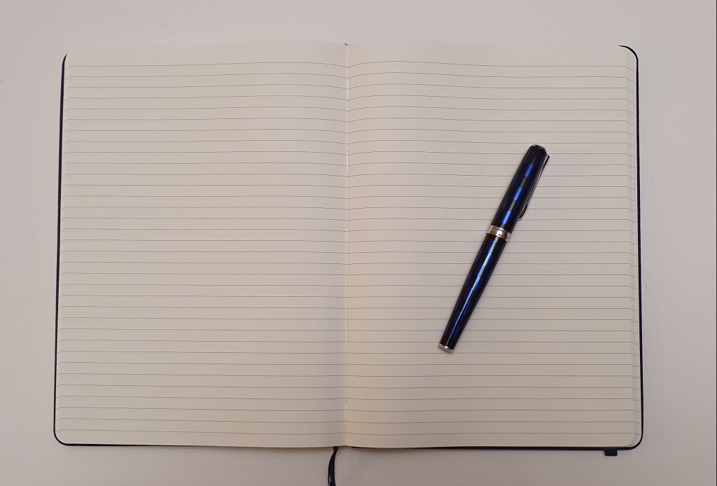
Agenzio hard cover notebook.

It is not all bad. The ruled version gives you 240 pages of very smooth and pleasant Champagne paper, with 33 rows to a page and with a row height of 6.9mm. The book is nicely bound with a stiff card cover, rounded corners, a single ribbon bookmark, an expandable pocket in the back cover, and an elastic closure. The binding is neatly sewn and the book opens flat, without risk of pages popping out. Interestingly, the pages are about 7″ wide by 10″ long, making the book a handy compromise between the usual A5 and A4 sizes:-

Agenzio notebook in blue, sandwiched between A4 and A5 notebooks.

The paper is pleasant to write on but (and I knew to expect this) almost every pen and ink combination I have tried so far, results in bleed-through, the line width, whilst roomier than some, is rather restricting for wider nibs. Also the book smells of glue.

Nevertheless I had an enjoyable time testing out the back sheet with my currently inked and then numbering the pages in pencil (yes there were the correct 240 pages). It IS pleasant to write on and with some trial and error you can find a combination of tools to use with it. For example my Sailor Procolor 500 with a fine steel nib and Noodler’s Bulletproof black does not bleed through, and you can even highlight over this if you are careful and do not overdo it.

A new notebook. Yes please. Homeward Bound as Paul Simon might say.

Update on the Opus 88 fitted with titanium nib.

Readers will recall that I bought a size 6, fine, Jowo-fit nib in titanium with an ebonite feed and housing, at the London Pen Show earlier this month. It is very enjoyable to use. I have had it in my Opus 88 Demonstrator, eye-dropper pen, whose original Broad nib was super smooth, great for laid papers but proved a little bland and lacking feedback. The titanium nib has injected a new lease of life into the pen which I was not using much. It is feedbacky, fine and wet, with just a little bounce but pretty firm, as I like. It never skips or hard-starts. Paired with the large Opus it is a wonderful pen, perhaps a poor-man’s Conid bulkfiller, but a great long-haul writing tool.

Opus 88 now fitted with titanium nib and ebonite feed.

The only issue which stood in the way of my total happiness, was that the titanium nib, when seated as deep as it would go into the section, still managed to touch the end of the cap in the final twists of the four-and-a-quarter turns to cap the pen (not for the impatient). I could see the tip of the nib actually writing a little arc of ink on the inside of the clear acrylic cap.

Titanium nib. Tell-tale ink arc inside cap. Also, heritage paper background from Frogmore Paper Mill!

Obviously I did not want to risk damage to the nib but was always a bit worried when capping the pen. I thought that it would be good to drill out the acrylic cap, just by about half a millimetre to get a little more headroom for my new nib. This would be a precision job. Alternatively I thought that it may be possible to grind the inside acrylic of the cap, with a Dremel or similar electric tool (if I had one, which I don’t). But then a breakthrough came unexpectedly late last night when I realised that the cap finial may be removable. There appeared to be screw threads there. I tried to unscrew it. At first it would not budge but when I tried again with some grippy material, it began to move and I was soon able to get it off. Inside the acrylic finial, I could more clearly see and reach the conical recess at the end. It looked to be quite simple to grind this deeper, very minimally, to accommodate a longer nib.

But in the absence of the right tools, I decided to try adding an O ring between the finial and the rest of cap, just to make it sit a little higher. This worked well, although I did not have an O ring of the ideal size but it does the job for now. I removed the pocket clip whilst I was at it, since I do not use it and the O ring alone still gave the necessary added height clearance. So now I can screw the cap on safe in the knowledge that it will not crush my nib.
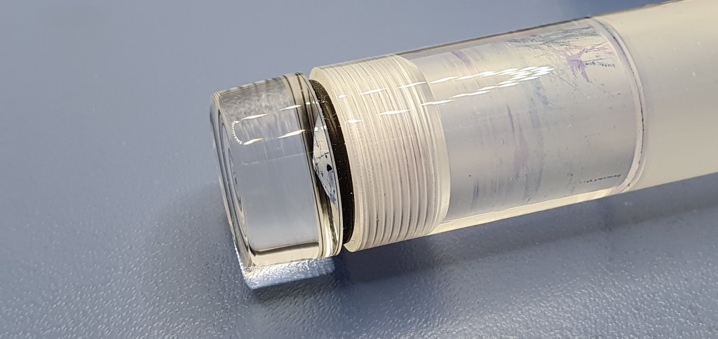
An O ring below the cap finial gives a bit more clearance for a long nib.

Throughout the year I have been changing fountain pens each month for my daily journal. In October I used a white, Cross Bailey Light with Noodler’s Bulletproof black. It writes well but I found some flow issues and the pen has needed to have the feed re-charged with the converter, then all is well again. Next month I may switch to the Opus with its titanium and ebonite goodness.

Fine titanium nib writing sample.

Handbound letter.

This week I received a letter from a good friend in Sweden. To my surprise and delight it was carefully hand-sewn into a card stock cover to make a little booklet. I learned that it was written on Clairfontaine 120gsm paper, with a Sailor Pro Gear Realo with Naginata Togi nib and Rohrer & Klingner Salix iron gall blue black ink. Together with the news that the letter brought of my friend and his family, this was a wonderful and thoughtful piece of mail to receive.
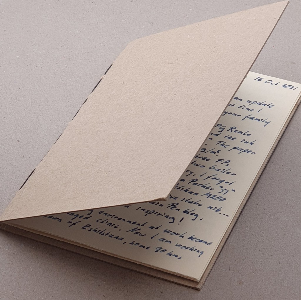
An impressive hand-sewn letter. Being a doctor must help.

This reminds me that I am a little behind in replying to my correspondence. I will relish an opportunity to sit with a fountain pen of my choice, for an hour or so when the energy and inspiration levels are both favourable.
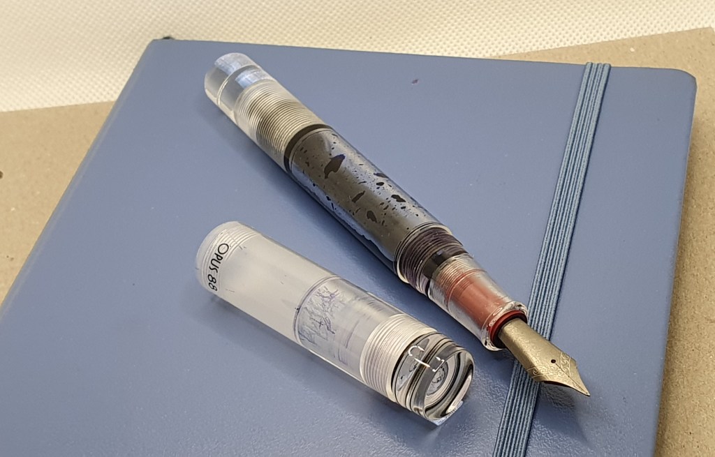
My current dream-team: Opus 88, titanium fine nib, ebonite feed, Cobalt Blue ink and a Leuchtturm journal.

Showing some love to the Waterman Expert fountain pen.

When I look at the Index of pen posts in this blog’s menu, I see that there are some glaring omissions, of pens that I own and like but have not got around to reviewing. It is remiss of me not to have covered the Waterman Expert in the years since this blog was launched. This is a consequence of the ad hoc nature of these posts, not from any decision to give the pen the cold shoulder.

It is sometimes said that the Waterman Expert is an under-rated pen. Certainly it is not one of those that gets reviewed and talked about very often. Perhaps this is due to it being an old model and from one of the mainstream brands, like Cross, Parker and Sheaffer that can be found in department stores here, without the cachet of having to be sourced from an online dealer in Spain or the Netherlands or being the latest new thing.

Waterman Expert, with cap posted.

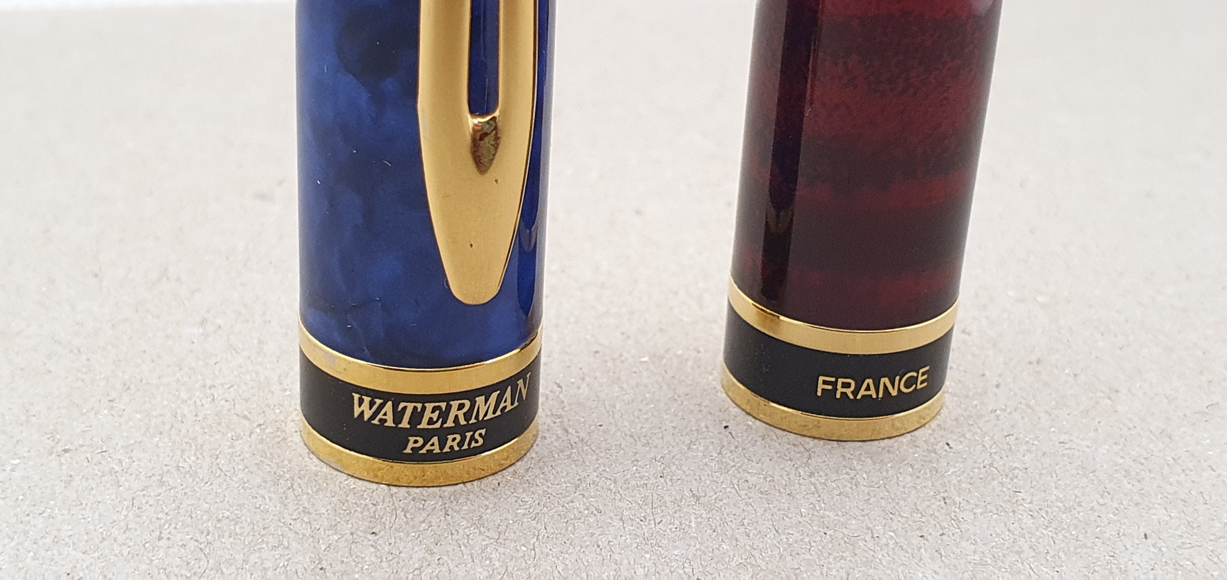
I remember where I was when I bought my first one. It was in John Lewis, at London’s Brent Cross shopping centre whose pen counter I never tired of checking out. This would have been in about the early 1990’s. They had a selection of colours and I chose the marbled blue one. I remember being impressed by its heft, being a metal pen with a lacquered coat. I cannot remember the price any longer but it was a not insignificant amount to me at that time, for a fountain pen.

My first Waterman Expert – still stunning at around 25 years old.

I was to use that pen as a daily carry and in my office, for several years.

The Expert was, and is, a good solid pen, of a decent medium size which should be comfortable for the majority of people and nothing particularly fancy. It is a cartridge converter pen, with a pull-off cap, that can be posted deeply and securely (with a little click). It has a steel, bicolour nib, a grip section which is of a sensible girth, no irritating facets, and no uncomfortable cap threads or step to spoil the comfort.

A little bit of modest luxury from Paris

I found it an ideal pen to use for work, as being reliable and well-behaved, but not too precious and ostentatious.

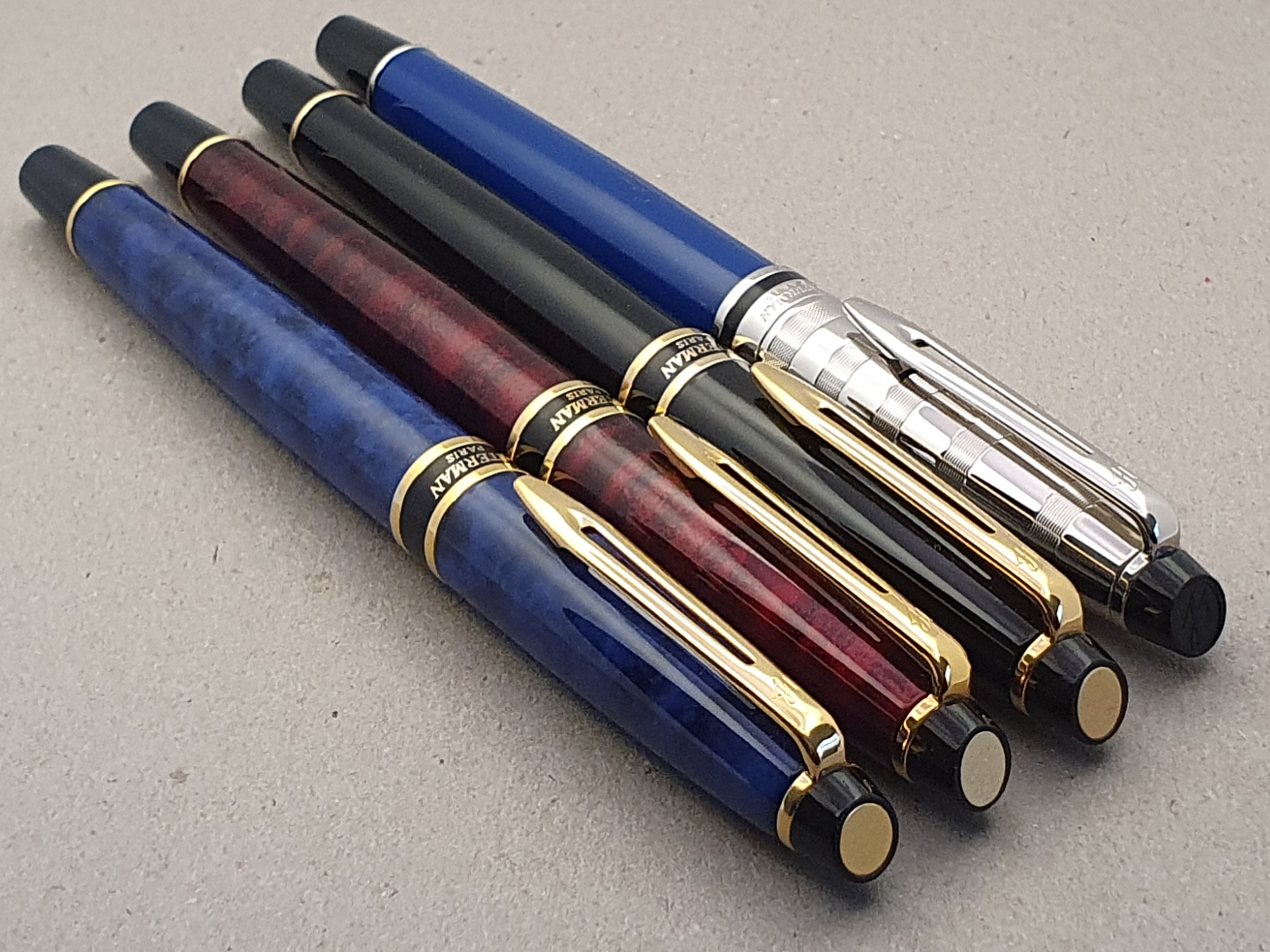
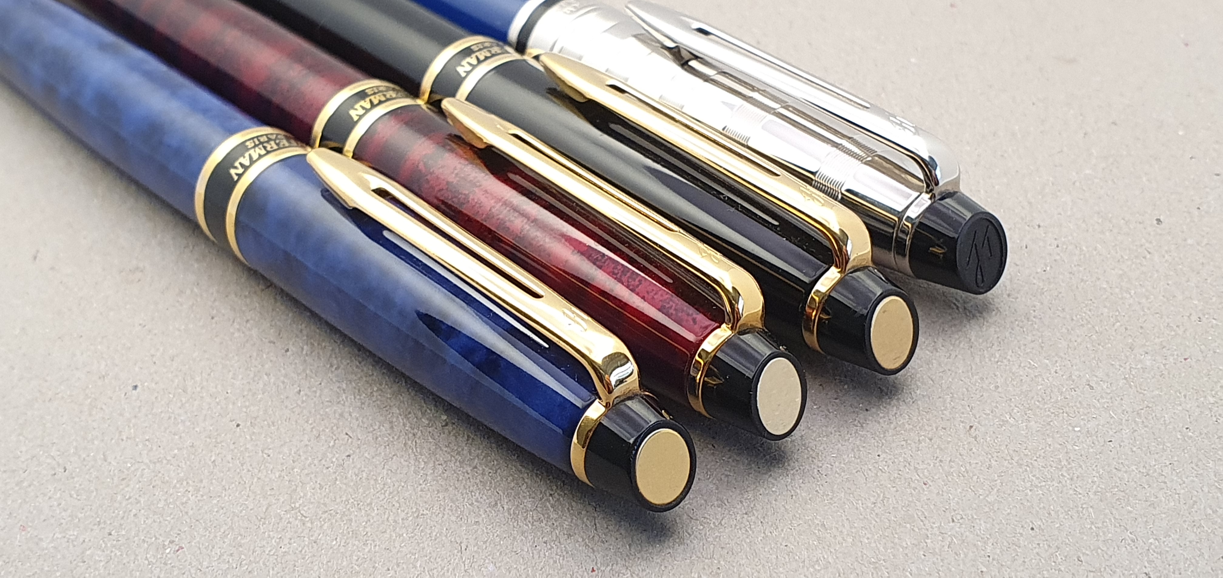
My first Expert came with a medium nib, which suited me very well. I went on to buy two more, (one red also with a medium nib and one black, with a fine nib). For some reason these were not able to match the success of my first blue model for its smooth writing performance. However I am glad to have kept them all as the steel nibs need only a bit of tuning, perhaps a slight opening of the tine gap and a little smoothing with micromesh pads, which in recent years I have discovered how to do and am now equipped with the necessary tools: a set of micromesh pads of different grades and a set of brass shims of various thicknesses.

Ask four experts, get four different opinions.

In recent days I have been reminded of my secondary school for several reasons (including an invitation to an old boys’ lunch next month) which set me thinking again about the pens that I used at school. I recall using mostly Parker 45’s as they were available at the time and not totally out of reach cost wise. I wondered what pen I would take back with me from my present accumulation, if I had to be 11 years old again. Leaving aside the risk of loss, I think perhaps a Waterman Expert would have made a good pen for school lessons: durable, comfortable, suitable for long writing sessions, a great steel nib and a quick release snap cap.

I tend to associate different pens with different stages of my life. After leaving school, I went to college and entered the Sheaffer No Nonsense era. Then in my early professional life, you would find me using the Waterman Expert.

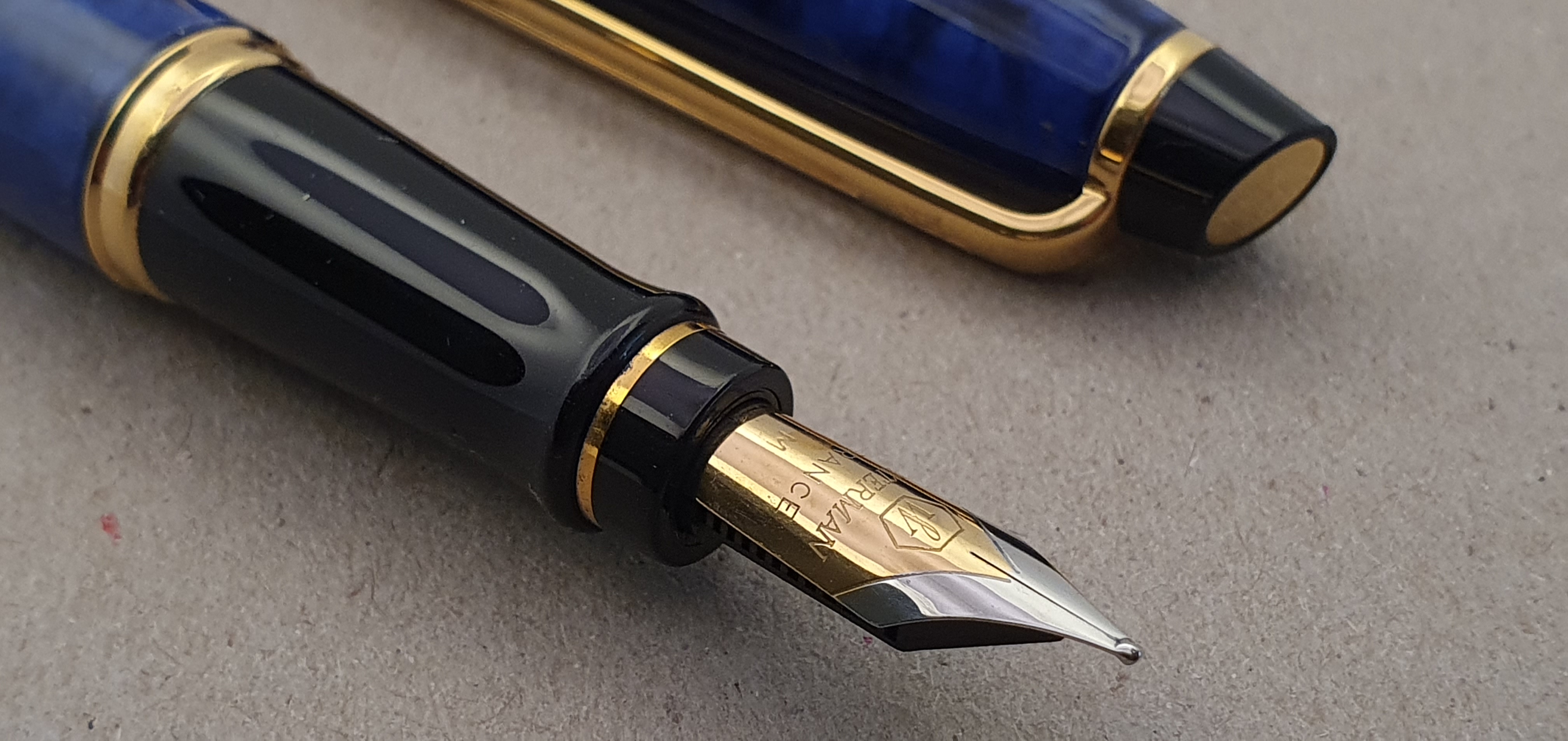
A stainless steel, bi-colour nib.

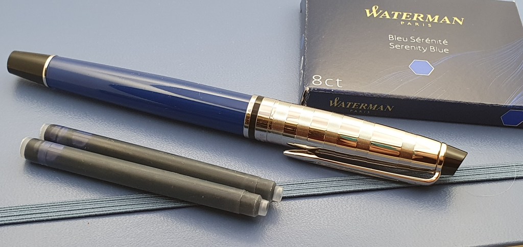
It is a testament to their good design, that Waterman Experts are still sold and largely unchanged except for some cosmetic changes. Perhaps it was partly out of nostalgia, as well as being a bargain, but in January 2019, I found myself again in John Lewis Brent Cross where I bought a new Expert in light blue with a shiny chrome cap. It came in a gift set with a carrying pouch but was reduced in the January sales to around half of its previous price and so once again I was in the right place at the right time.

My most recent Expert, with chrome cap.

I have this pen inked at the moment, with a Waterman Serenity Blue cartridge. Its rounded tipping writes very nicely with a good medium line, which is not distinctive but smooth and easy. In September, (traditionally the back to school month) I used it every day for my journal.

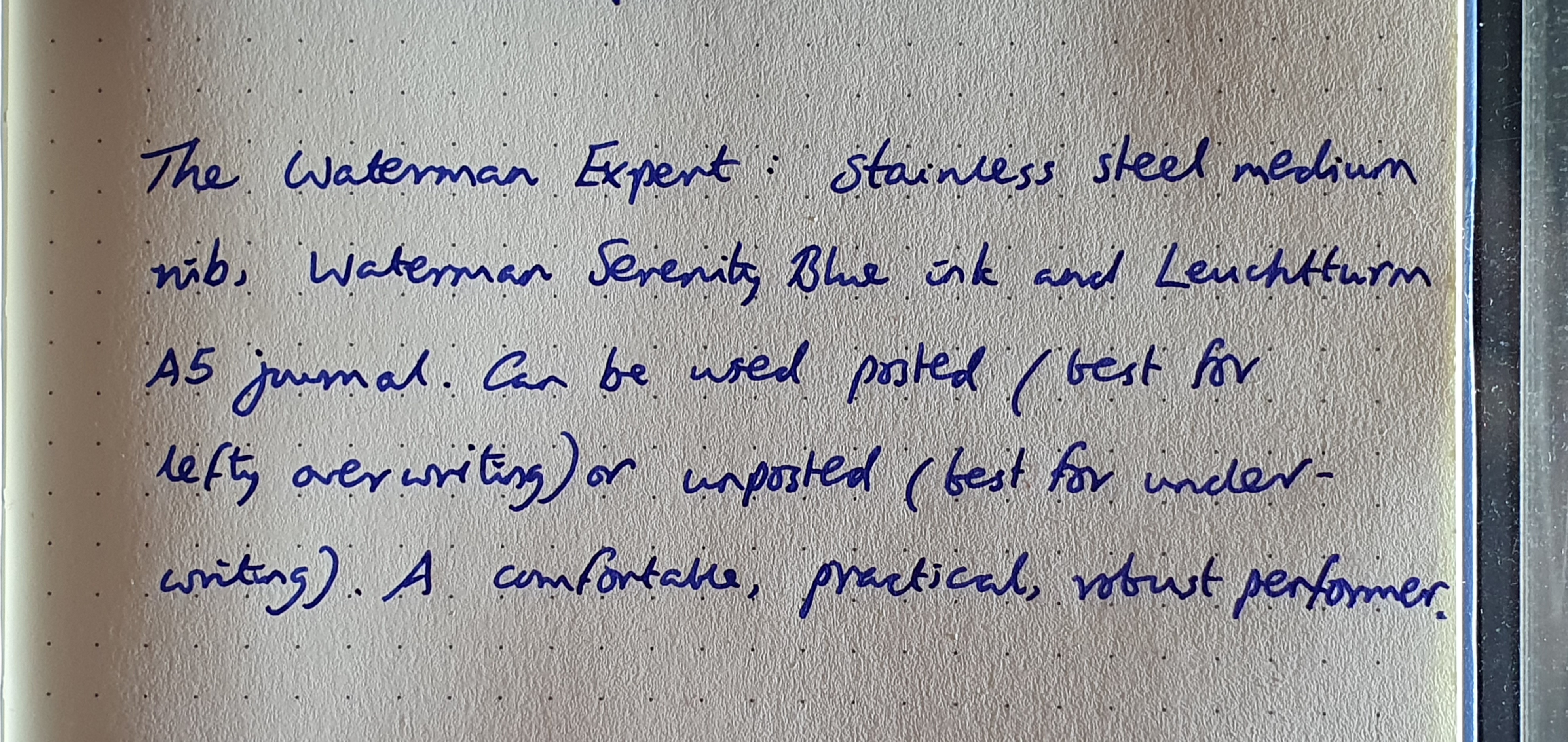
A writing sample of the Waterman Expert, medium nib on Leuchtturm paper. Waterman Serenity Blue ink.

I am very glad that I do not have to go back to being 11 years old again, but if I did, having a Waterman Expert this time round would be some consolation.

Ladies and Gentlemen The Four Tops!

The Post Pen Show Post: London Autumn 2021.

Last week I wrote The Pre Pen Show Post, in anticipation of the show on Sunday 10 October 2021. Now that it has passed, it is time to reflect on the day.

In short, it was wonderful and I had a great time. My wife was to have come, but changed her mind on the day and so I was left to make decisions unaided. I set off cheerfully, taking the London Overground train to Kensington Olympia and enjoyed a stroll to the venue, at the Novotel, Hammersmith.

The venue, Novotel London West.

With UK Pen Shows in new but very capable ownership, membership of the Writing Equipment Society no longer gets you free admission but I heard that this might change. However, visitors were given a free tote bag with the handsome UK Pen Shows logo and names of sponsors, which came in handy for my subsequent haul.

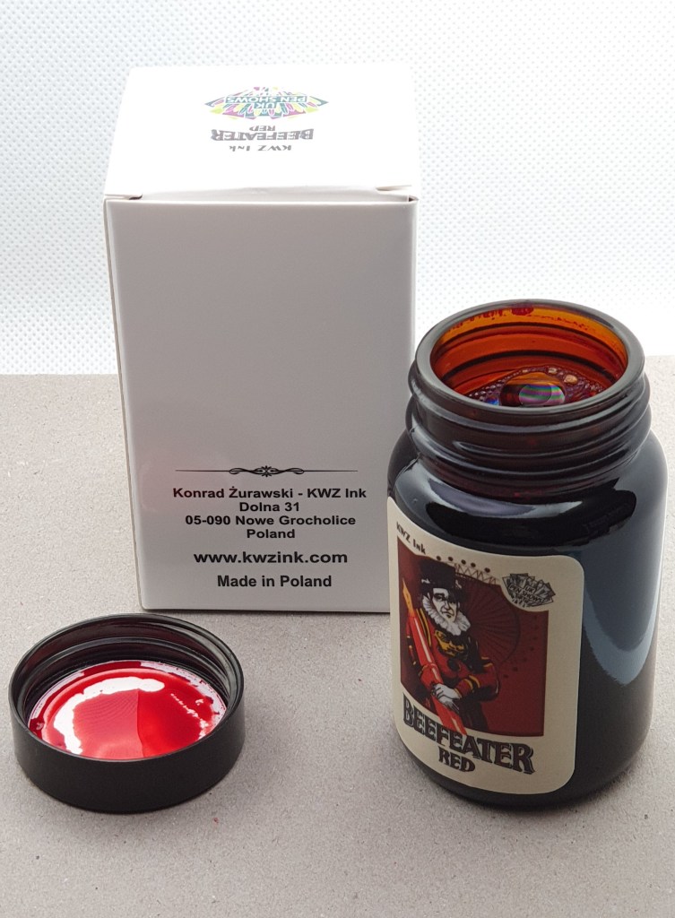
I soon found there to be a special ink for the show, namely a bottle of Beefeater Red from KWZ Ink of Poland. I purchased a bottle immediately without pausing to check what colour red it was. It turned out to be a very pleasing one, a rich dark beetroot tone which strangely reminded me of my favourite wax crayon in the colouring box at primary school.

Beefeater Red, the new show Ink from our friends in Poland, KWZ Ink.

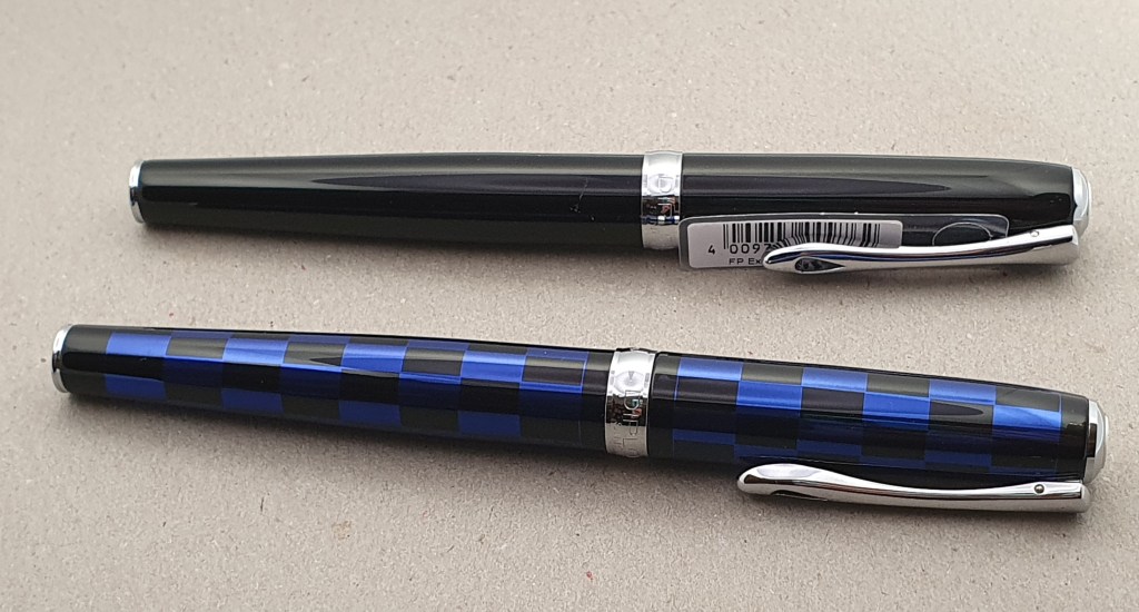
Also within minutes of arriving, I spotted an enticing table of Diplomat fountain pens at generously discounted prices and pounced on a couple of Diplomat Excellences, being one of my favourite steel nib pens of all time. I will not dwell on them here as I have reviewed them previously in this blog.

Two Diplomat Excellences. The one at the front has a nifty quick release screw cap.

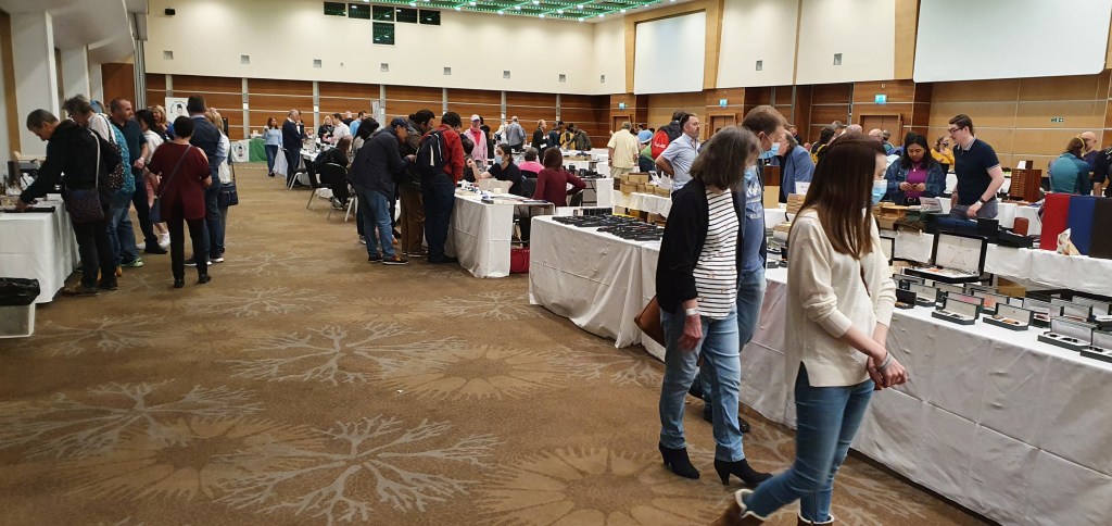
Having come through a period of 18 months with very little social interaction, it was a treat to catch up with friends, about a dozen from our London Pen Club, over the course of the day, as well as to chat to the friendly vendors. The venue was bright, spacious and airy and this all made for a very pleasant and enjoyable atmosphere.

The main hall.

Others have written about how to prepare for a pen show, to get the most out of the day and some good tips are to (a) have a budget, (b) make a list of anything in particular that you want to look for. I like to bring a loupe to inspect nibs. You might want to bring a bottle of ink, a notebook, a little bottle of water to clean pens that are dipped, and some paper towels.

This time, I had not got any particular fountain pens in mind to hunt down and was aiming to “be good” and not get carried away in a spending spree, but to keep an open mind and see what was available.

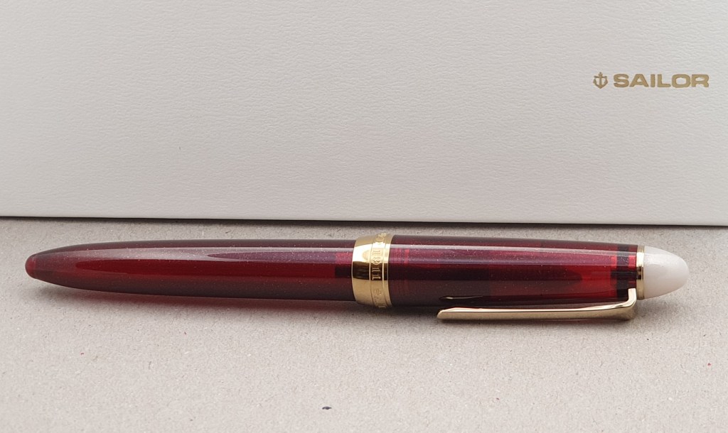
Of the pens that I acquired at the London Spring Show earlier this year, the one that I had enjoyed picking up and using the most, turned out to be a Sailor Procolor 500, a steel nibbed pen about the same size as a standard 1911 and with a Fine (very fine) nib. It has been filled ever since with Noodlers’ bullet proof black. I had found this pen for sale on John Twiss’s table. I asked John if he had any more of these. Sure enough he had a few and I chose a nice sparkly dark red one, (now called the Shikiori), perhaps a good pairing for the Beefeater red ink.

Sailor Shikiori in burgundy with sparkles.
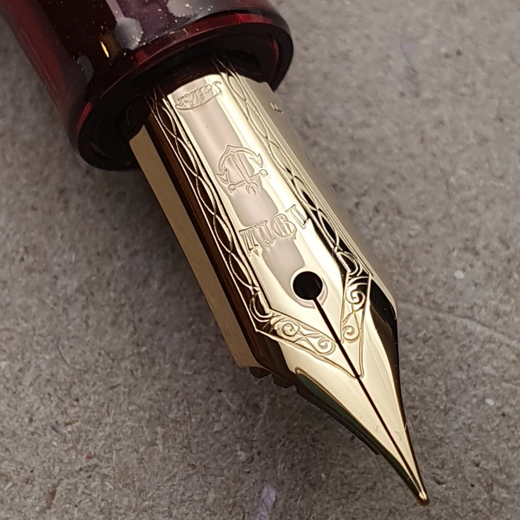
An exquisite steel nib on a Sailor Shikiori.

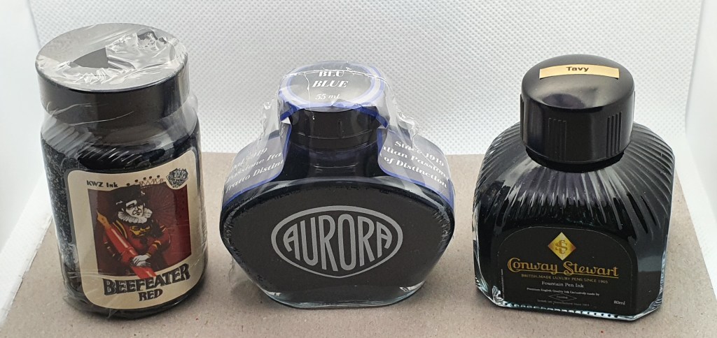
As for inks, I also bought a bottle of Aurora blue in the nice special edition bottle, from Kirit Dal’s Aurora table. I have become a fan of Aurora’s lovely fountain pens, since finally owning an 88 and an Optima.

I also picked up an extra bottle of Diamine’s Conway Stewart Tavy, a blue black ink that I am keen on, having bought and emptied previous bottles from pen shows.

My ink haul.

It is not the pens but the people that make a pen show: I enjoyed visiting so many tables, in particular John Hall of Write Here, John Foye (whose pen photos I enjoy daily on Instagram), John Twiss, Derek of Stonecott Fine Writing Supplies Limited who was selling pens from Narwal, Benu and Venvstas (pronounced Ven-oost-as), the Onoto table and Den’s Pens.

There were some tables that were new to me this time. Scrittura Elegante from the Netherlands, had a good display, where I handled an Edison Collier in the lovely burnished gold finish and saw some Opus 88 eye-dropper demonstrators that I had not come across before, as well as some Laban pens from Taiwan with German nibs in some attractive colours.

I spoke to William Shakour who showed me his impressive Titan fountain pen, made by 3D printing (which I do not understand). He had some rough grey, unpolished examples for people to test four different nib sizes, with Titanium nibs. I was intrigued. The pens are piston fillers with a huge reservoir. He had been working on making a slightly slimmer version but this meant having thinner walls on the ink reservoir, which he was able to show me.

At The Good Blue, I tried their unique design of flex nib pen, with a metal body and one flat side to stop it from rolling.

By late morning I was glad of a coffee break with friends Jon of Pensharing.com and Vijay – both of whom are on Instagram, where we had a catch up and tried a few of each other’s pens.

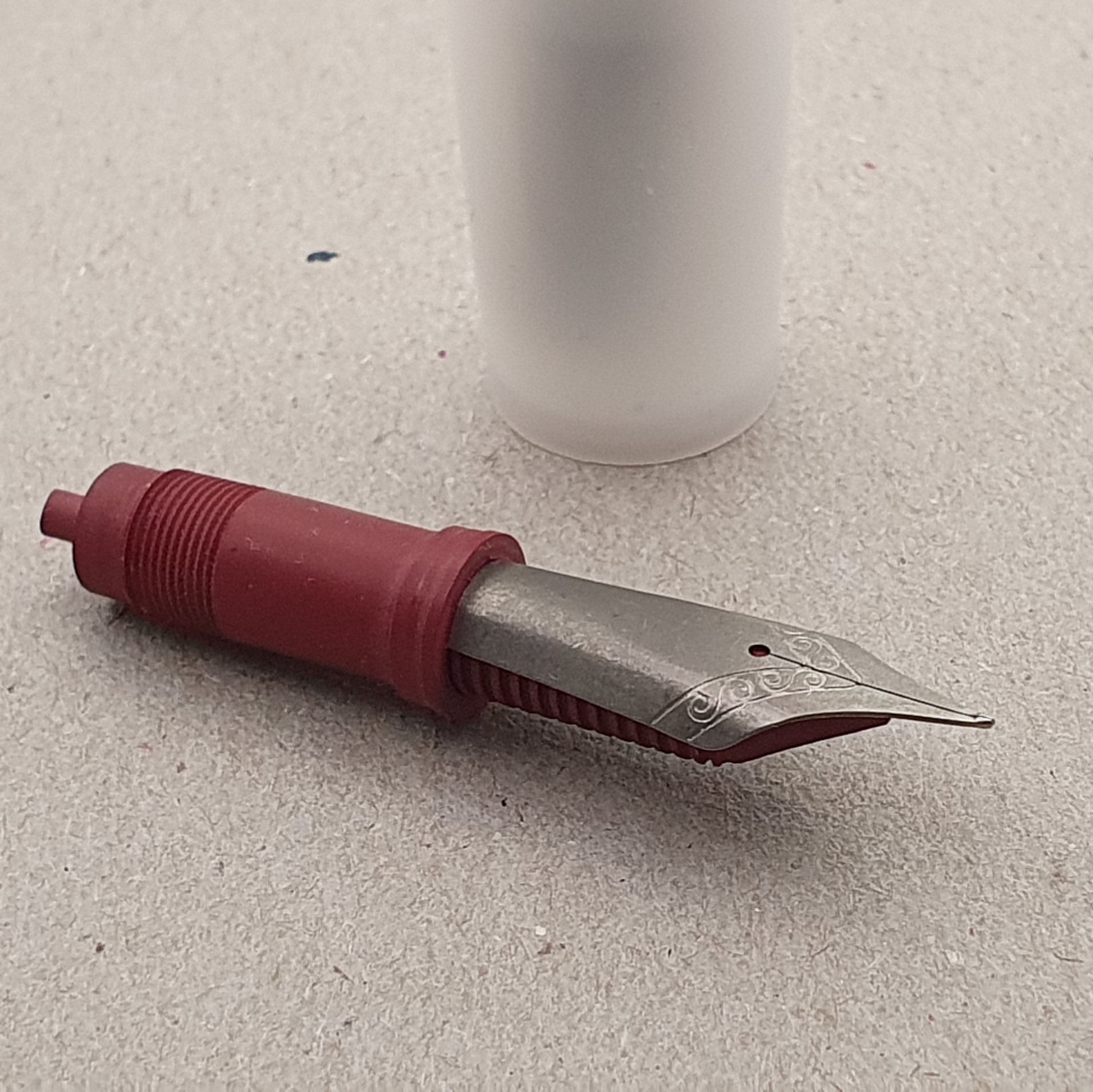
Vijay and I then went to find the nib units, being sold at John Twiss and Vincent’s table with titanium nibs and ebonite feeds in various widths and with a choice of Jowo or Bock fittings and even a choice of colours for the feeds! I chose a Titanium fine nib, with red feed and Jowo fitting, hoping to fit it in a large Opus 88 Demonstrator that I had bought three years earlier with a steel broad.

A Titanium nib in an ebonite feed and housing, Jowo fit. Very popular at the show.

After making several more circuits of the tables and testing my self restraint to its limits, it was time to go home. My final tally was three new pens (two Diplomats and a Sailor at irresistible prices), three bottles of ink (KWZ Beefeater red, Diamine Conway Stewart Tavy and Aurora Blue in the fancy bottle) and one Titanium nib.

Overall I was very content with my purchases. The choice is phenomenal and easily overwhelming, particularly if you are more used to a quick browse at the pen shelf in Rymans or WH Smiths! There are pens to suit all budgets. I came away feeling that I had got the balance about right and had not gone mad. You cannot go to a restaurant and not eat.

At home I tried out the Titanium nib in my Opus 88. I was a good match and the clear acrylic grip section allows the dark red ebonite feed to be seen and appreciated. I inked up the pen with Graf von Faber-Castell Cobalt Blue (you need a colour that you will not get bored of in this pen) and the nib is a nice, feedbacky firm Fine. This was my first ever experience of having a Titanium nib so that is a novelty.

The new nib in my Opus 88, eye-dropper demonstrator. You must remember to put the pen’s rubber O ring on the back end of the housing.

Thanks as always to the organisers and vendors and fellow visitors who make these events so enjoyable. See you all again next year, if not before.

The Pre Pen Show Post

This is a brief, mid-week post and intended largely as a reminder to myself that I do not NEED any more fountain pens. I shall therefore be able to look back at this post next week and see how I did in reality, compared to my resolve.

I have been looking forward to the London Autumn Pen Show, taking place this coming Sunday, 10 October 2021. Once again it will be at the spacious new venue, the Novotel in Hammersmith. The London Spring Pen Show, having been delayed, did not take place until July and so it is unusual to have two shows just three months apart.

What I currently look for and enjoy in a fountain pen, is for it to be comfortable to hold, to write well (smooth and with good flow) and to lay down the line that I want, which is interesting and flattering to my handwriting.

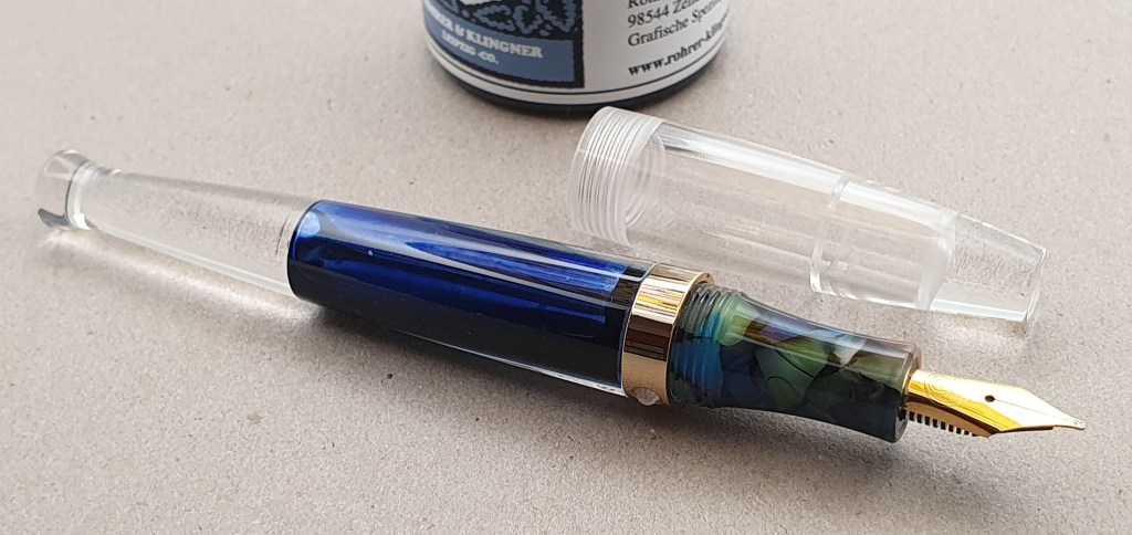
I discovered all of these qualities in the Moonman S5 eyedropper pen. I now have one on my desk in my office and an identical one at home.

Moonman S5 fountain pen.

When I pick this up, it always writes without hesitation. The smoothness and the line variation just blow me away every time. I love using it.

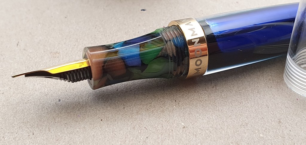
Moonman S5, multi-coloured section

A feature of the pen is the multi-coloured grip section. I felt that this was a bit odd at first given that the rest of the body is clear, but actually I have grown to like it and it looks better in macro! Also, because every pen is slightly different, it helps to distinguish them, if you have more than one.

The real star of the pen, for me at least, is its oblique broad nib although this might not be everybody’s cup of tea. The pen came with three nib units and you also have the choice of an extra fine and a medium.

I have raved about this pen before but it is worth saying again, that it has all these qualities and more, and yet costs only £27.50. I have spent a lot more on a pen and will probably do so again, but I need to keep in mind that the comfort and writing experience, whilst they might match my S5, are unlikely to be appreciably better.

That is a very subjective opinion of course, but my own needs are dictated by my being a lefty-overwriter. The goal for us all is to find a pen that ticks all our boxes. Good sense tells us that when we find one, we should then stop amassing more pens and enjoy the fruits of our search, but we shall see!

In other news, I am very much enjoying my latest gadget, namely the Puluz 23cm mini-lightbox that I reviewed in my last post. Here are a few more gratuitous examples of my recent photos with it:-

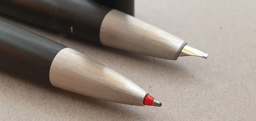
Lamy 2000 fountain pen with the matching multi-pen.
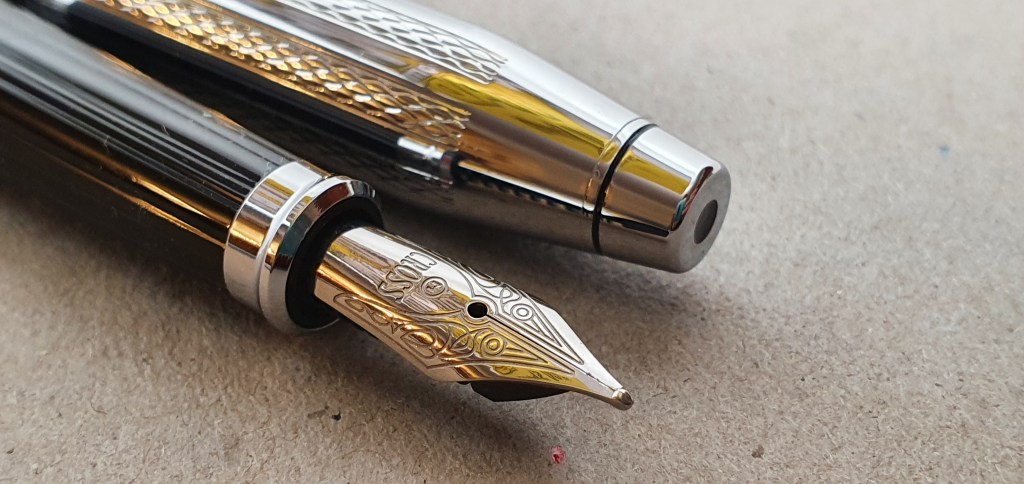
Cross Century II with the chrome guilloche cap.
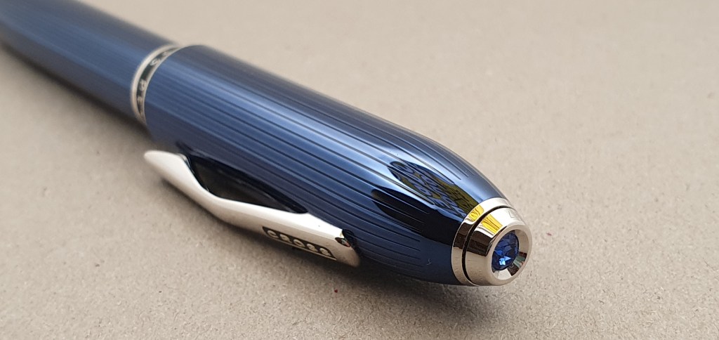
A detail of the Cross Peerless 125.

Well, wish me luck everybody at the coming pen show. I hope to gather a bottle of ink or two. As for the temptation to buy more fountain pens, I shall cross that bridge when I come to it!

Early thoughts on the Puluz ring LED portable photo studio.

One of the challenges of running a fountain pen blog, is taking good quality photographs of the pens. We want our images to be well composed, sharply focused, with faithful colours and well lit.

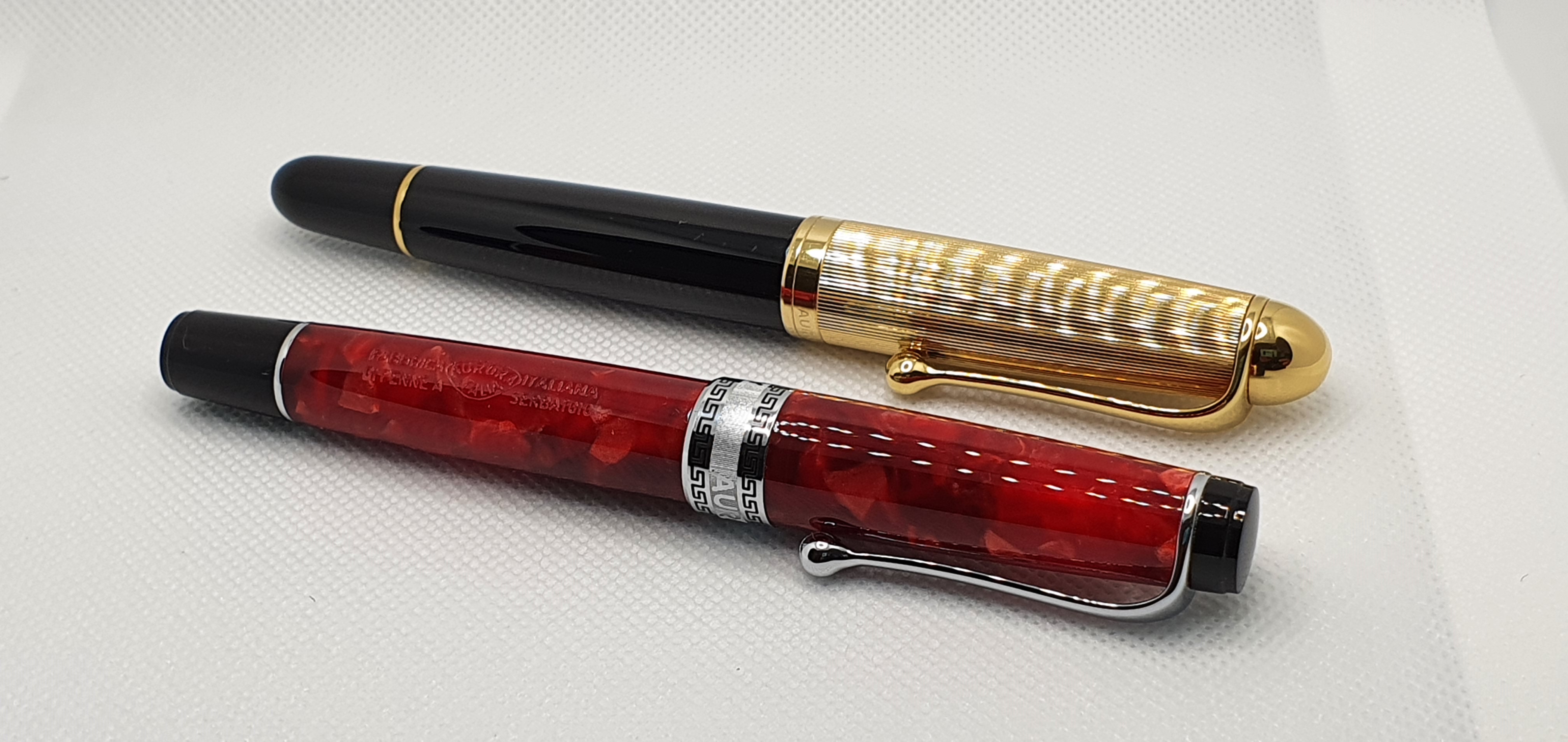
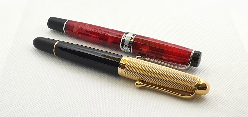
Aurora 88 and Aurora Optima, now photographed with a lightbox.

It is very convenient to use the camera on a smart phone, which allows uploading of photos to the blog’s media library through WiFi, without connecting the camera to a computer to download the files. Smart phone cameras have improved enormously, in resolution and many other features.

It is easy to forget that our subjects need to be well lit, particularly if indoors using available light. A case in point is the photograph of my pen cups in my last post, The state of the pen cups, September 2021, where I over-estimated the quality of the lighting in the room and used an image which had areas of dark shadow.

One solution is to invest in studio lighting or a ring-flash for your SLR camera. Another more practical option for the amateur, is to try a portable “light box” with LED lights, powered by a USB cable.

My good friend Jon of Pensharing.com, provides advice for members on his website for photographing their pens for hire and recommends investing in a simple light box and a tripod. I bought a light box about a year ago, a self-assembly cube of white plastic, which had rows of many bright LEDs in the front and the back of the top section. The problem I soon found was that it was difficult to avoid reflections of all of these LEDs in the pens. Also the model I had bought was rather a faff to put up and take down, which also deterred me from getting it out much.

This weekend I found myself looking again on Amazon at the vast range of such lightboxes available. I wondered whether a model with a ring of LED lights might be easier to use. Also, I wanted to try one which was smaller, and more convenient than the one I had bought. The name Puluz was one that I kept noticing. Also, they had one in their range, which was small (about 9 inches across), had a ring LED pattern, boasted three different colour temperatures, an adjustable brightness, six different coloured backdrops, and cost only £14.99. Impressively, it arrived within a day of ordering.

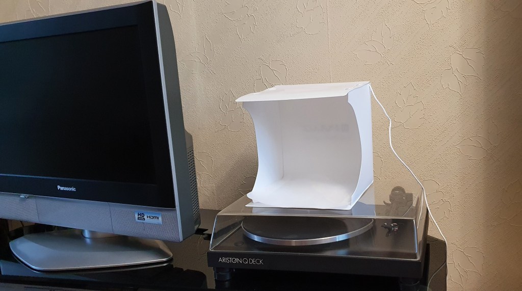
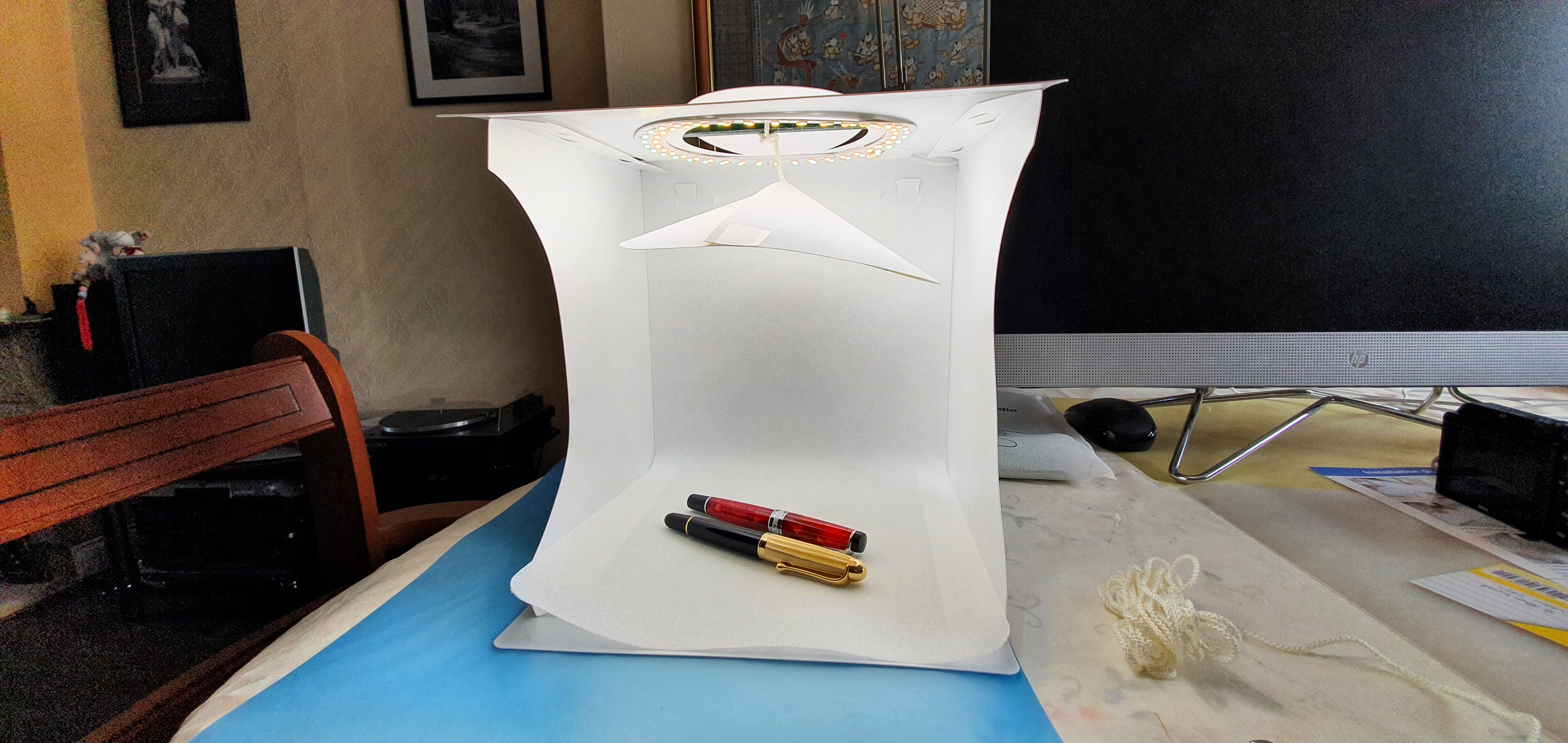
The Puluz 9″ Ring LED light box. (“And the award for best turntable in a supporting role, goes to…”)

Description.

The Puluz “Mini Photo Box” is an open-fronted box measuring 23cm or 9″ wide. It is made of a white semi-rigid plastic. The five sides are all joined together and fold flat into a bag. To set it up, you just need to unfold it and assemble it into the box shape, clipping the sides to the base and to the top. They cleverly slot into each other and so there are no separate parts needed. It comes with six coloured backdrops, in black, white, blue, red, green and yellow.

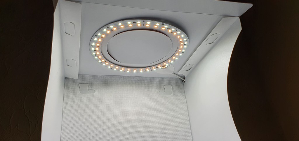
The lighting comes from 72 LEDs arranged in two rings around the top (where a round flap can be opened for direct overhead shooting). One outer ring provides a cool, bluish light and the other, inner ring provides a warmer, orangey tone. These are powered by an attached USB capable, which needs to be connected to a power socket, PC or a portable USB power bank.

The two rings of LEDs, both lit

In use.

The box, the cable and the backdrops are all supplied in a handy white tote bag and weigh very little, making a very portable piece of kit.

The light box is straightforward to assemble and this takes only a couple of minutes. If you want to use one of the backdrops, you just hook it on to the tabs. It is easier to do this before you fold it all together.

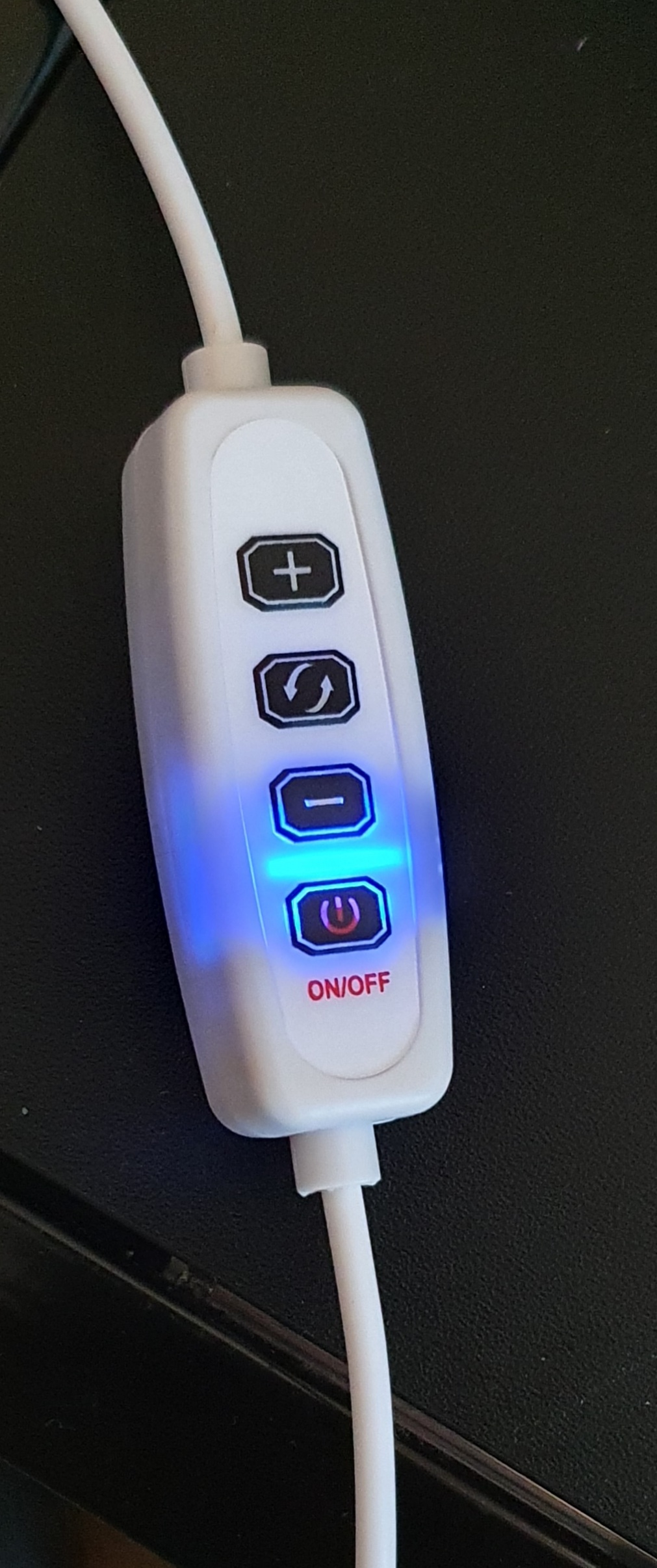
The USB power cable is fixed in place and about 2 metres long. About half way along the cable is the control switch. This has an on-off button. When plugged into a power source, but not switched on, a blue light glows to show that it is in stand-by mode.

There are three more buttons: the middle one alternates between the three colour temperature options, which, in simple terms, give you a lighting which is white, orange or blue (or which can be expressed as cool or warm tones). The other two buttons are plus and minus, to go up or down through the 10 brightness levels, in whatever colour you have selected. And so you have choice of 30 different settings all together.

On/off switch, plus colour selector and brightness controls.

To power the lightbox, I first connected the USB cable to a mains plug (usually reserved for my mobile phone). This is fine if you have a power socket nearby. But the control switch might then be dangling off the edge of your table. A more convenient method is to plug the cable into a rechargeable USB power bank (not supplied). I had an old one, with a 2,200 mAh capacity and charged it up for its new duties. With one of these, you can take your light box out and about, and use it anywhere without being tied to a power socket. I do not know how long a charge would last but there are models now with much higher capacity.

I spent a bit of time experimenting with the settings. The different colour tones are achieved by activating either the inner ring, outer ring or both. So far, I tend to prefer the white light (using both rings), but I found that when using the green backdrop, my Samsung Galaxy S10’s camera was a bit confused when trying to sort out the white balance. The green flickered between yellowy-green and bluey-green. Things were easier with the white backdrop. I have not tried the other backdrops yet.

As for the brightness settings, whilst you can see the lighting getting brighter or darker as you click through the steps, I found on looking back at my test photos, that it was hard to see much difference in the image, because the camera automatically compensates. Perhaps going for a mid-level brightness is the answer and then decide whether you need to go either brighter or darker from there.

Photographing pens.

I tested the lighting first on my Aurora Optima, whose red Aureloide barrel would reflect the LEDs. Even though the LEDs are in a ring, you still find ugly reflections on the barrel, if you photograph the pen sideways on. You can reduce this to some extent by having the pen diagonal to the camera, but it is hard to eliminate it completely.

Unsightly reflections. Before adding a lamp shade.

It occured to me that what was needed, was a light shade, to block off the LEDs and instead deflect the light to the white sides of the light box where it can be reflected down softly, rather like using a bounce-flash pointed at the wall or ceiling instead of your subject.

The hack.

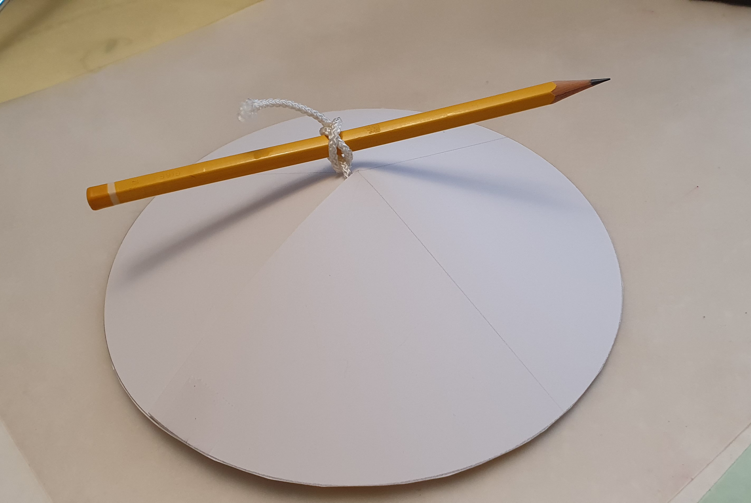
I cut out a circle of white card, having drawn around a plate. I then cut out a small wedge shape, like a piece of pizza, then drew the sides together so that the disc was pulled into a cone. I tied this to a pencil, which I then used to suspend the disc through the hole, just below the LED’s.

My home-made lamp shade!

I then re-took the photos of my Auroras and found, to my delight, that the harsh reflections were eliminated and I now had the capability to take pen photos, day or night, with lighting under my control!

No unsightly reflections! Using home-made lamp shade below the LEDs.

Conclusions.

It is early days, but provided that the LEDs and the control switch don’t break, this is a very useful accessory, for photographing fountain pens, or jewellery or other small items. It is modestly priced and with a little practice and experimentation, can help produce some excellent photos to enhance a blog.

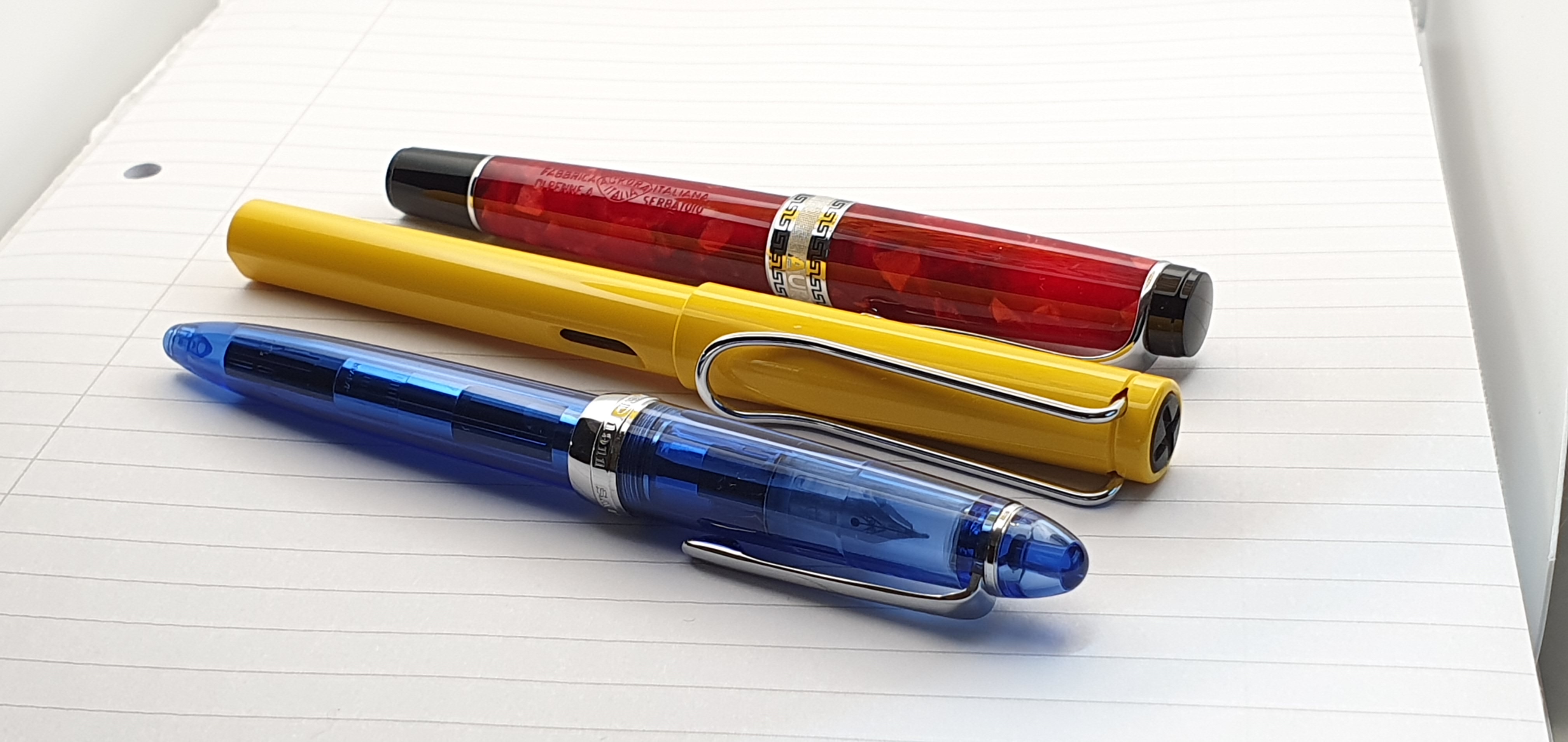
Another practice shot, using primary colours to check white balance.

Personally I think it would be better still if it came with a simple lamp shade, perhaps made from the same material as the lightbox and with a means of attaching and removing it. This makes a vast improvement if photographing pens or other reflective items.

With my custom lamp shade in place.

All photos taken with Samsung Galaxy S10 smartphone. All pens photographed in a Puluz Ring LED mini light box.