Inky Pursuits: a recent round-up.

Time for another episode of Inky Pursuits, an occasional series of round-ups of my fountain pen related news. I have had an eventful week pen-wise, including the arrival of five more fountain pens.

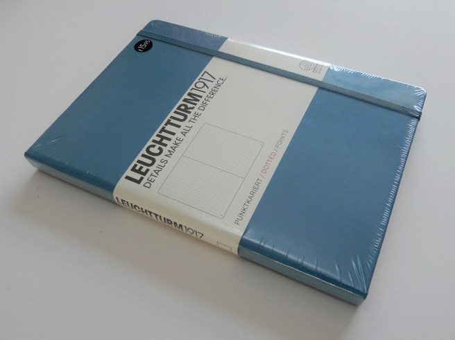
Last weekend, I had the task of registering a marriage in our local church in Golders Green, at which I am the “Authorised Person” for such duties. This means having a fountain pen inked with the regulation Registrar’s Blue Black iron gall ink from ESS (Ecclesiastical Stationery Supplies). I chose to use my TWSBI Classic in white with medium nib to complete the register and for the signing. The ink comes in 110 ml bottles and now needs to be used up within about 18 months of first opening, before it starts to lose its properties of darkening to a rich near black shade.

On Tuesday, I had the excitement of a New Pen Day, with the arrival of a Wing Sung 601 that I had ordered from China a couple of weeks earlier. This is the one that is based upon the Parker 51, with a hooded nib (although in stainless steel) with a stainless steel cap, but with a clear demonstrator body and section and a vacumatic filling system. There is a metal filling button, visible under the blind cap.

20180624_225513879535959.jpg
Wing Sung 601, clear demonstrator, vacumatic. View from the 32nd floor of the Shard, London.

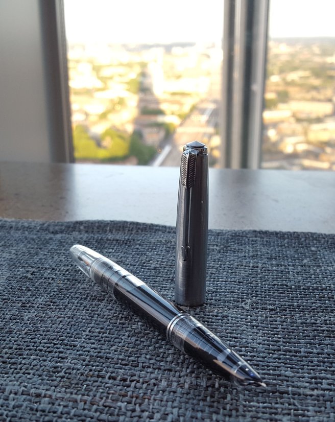
I am embarrassed to admit that I was stumped at first, on unboxing the pen, by something which looked like a red plastic converter, but which was filled with a clear liquid. Where does this go? Is it part of the vacumatic filling mechanism? No, it turned out to be a useful container of silicone grease for when you come to disassemble and clean the pen.

20180624_2253181696510011.jpg
The Wing Sung 601 partly disassembled. Oh no, where does the red bit go? (It is a container of silicone grease, confusingly supplied in a converter that a vac filler does not need).

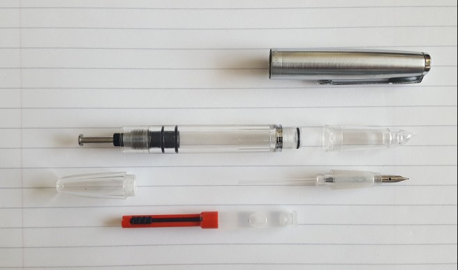
I played around with the pen at first, examining the nib under a loupe. The nib needed a little help to align the tines but this was fairly easily remedied, the only challenge being that the accessible part of nib is so tiny to hold. I then tried disassembling the section and learned that, when screwing it back on again, you need to remember to keep the nib so that it lines up, centred under the long lip of the section.

On inking the pen for the first time, I was surprised to see just how quick and efficient the filling system is. You just immerse the nib in the ink, give the button a few presses and the demonstrator body enables you to watch ink come rushing into the barrel. With each press of the button, the ink level rises higher. I gave it about seven presses by which time I had a really good fill, with far less air space remaining than I have ever achieved with a TWSBI Vac 700 (although I know that there is a technique for that, if you are feeling brave).

The pen then wrote pretty well. I was very pleasantly surprised. I had filled it with Conway Stewart Tavy, by Diamine (my go-to blue black ink) and was delighted with the wet, fine line that it produced. No skips or hard starts. I squiggled in all directions and was unable to get it to miss a beat. The nib is pleasantly feedbacky and copes well with smooth papers. It is firm though, and does not give any significant line width variation. But I love the look and feel of the pen and am really pleased with it. It is amazingly good value.

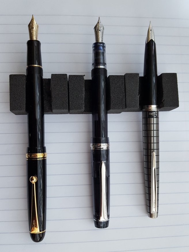
Later this week I met up for a coffee with one of the readers of my blog, who brought along a wonderful selection of his fountain pens to show me, gathered over years of travel to Germany, Singapore, Japan and other places. Now preparing to move to Australia in a few months and wishing to pass on some of the pens that he no longer uses regularly, he had been giving many away to pen enthusiasts.  He offered me three of his Pilots and very generously, gave me a Custom 74, a Custom Heritage 92 and a third pen that I did not know, called the Pilot Elite, – a stylish pocket pen that becomes full length when posted and has an elegant 18k gold nib.

20180624_1942431204836445.jpg
Pilot Custom 74, Pilot Custom Heritage 92 and a Pilot Elite pocket pen.

You can imagine my delight! I had never owned any of these models before, although I have long been interested in the C74 and CH92. Both had medium 14k gold nibs and were inked with Pilot Iroshizuku tsuki-yo, a lovely blue black. I have been much enjoying them both all weekend, slightly more so the CH92 as I prefer the shape and the nib is particularly wonderful. Meanwhile I have flushed the Elite and am taking a pause to enjoy pondering what ink to try in it!

20180624_194449584576819.jpg

My friend also gave me the bottle of tsuki-yo plus a bottle of Diamine Sargasso Sea, a Schneider Rave XB retractable ball point pen and a few interesting Lamy fineliners which I had never seen in this country.

20180623_204620873148602.jpg
Everything you could ask for in a nib. The Pilot Custom Heritage 92, 14 gold, medium, and rhodium plated

Finally, as if that was not enough fountain pen action for one week, I happened to find the Lamy Safari All Black, 2018 special edition today, in a blister pack with a box of black cartridges. I have been looking out for one in our local stationery shops ever since about February and despite searching in all the usual places, this was the first one that I had actually seen in the wild. It came with a medium nib, in black. I plan to keep it for use as a black ink pen, which is always useful to have. I do like the black-everything look, including the textured matte black body and black clip. Even the threads are jet black. A good stealthy pen to use in jungle warfare. Or in my office.

20180624_225945824000131.jpg
My current Safari and AL-Star stash. The new Safari All Black is ninth from the left.


In praise of the Leuchtturm 1917, A5 notebook.

Those who enjoy writing with fountain pens like to find ideal combinations of pen, ink and paper where the nib glides effortlessly over the page, leaving a beautiful line of fresh ink without feathering or bleed-through.

DSCN2188
Ah, that new notebook feeling!

I am a relative newcomer to the Leuchtturm range, although the company was founded in 1917. I started using their A5 size notebooks about a month ago when my Taroko Design “Breeze” (Tomoe River) notebook was full. The Leuchtturm notebooks are readily available in our local Rymans stationers and although the paper is not Tomoe River, I find it very pleasant.

Available in a wide range of bright coloured hard covers, there are also options for plain, ruled or dot grid pages. In each case, you get around 250 numbered pages. Depending upon which you chose, you get a number of good features (listed on the distinctive wrap-around flyer inside the cellophane), such as:

  • a table of contents;
  • some perforated sheets (8 in the plain or ruled page version, or 12 in the dot grid version);
  • an expandable pocket in the back cover;
  • two ribbon page markers;
  • an elastic loop, for those who want closure;
  • stickers for labelling;
  • thread bound, to open flat and for durability;
  • ink proof paper (that is, fountain pen friendly);
  • 80 g/m2 acid-free paper.
DSCN2193
There is no mistaking the Leuchtturm notebooks with their distinctive wrap-around flyers, which help in finding the paper type that you are after.

I began with the plain paper version. This included a guide sheet to place behind the page you are using, with 18 rows at a width of 10mm, or, on the reverse, a grid of 5mm x 5mm squares.

I have been using the 10mm space guide. This is quite wide and if your handwriting is not large, the spacing may look too wide in relation to your writing size . Of course, you can experiment and make you own guide sheet, ruling your lines at whatever width you choose. For me, an 8mm width is about right and is what I am most used to for general writing and note taking, when using pads of file paper. But I have now made up a few guide sheets of approximately 8, 9 and 10mm for use with different nib widths. You could do this with your perforated pages.

DSCN2207
Line spacing at 10mm. TWSBI Classic (medium nib) with Registrar’s blue black ink.

With so many book colour options and paper options, there is something for everyone. I bought a ruled page version, but found that its line spacing of just 6mm, was too narrow for me. And if I wrote on every other line, 12mm was rather too wide.

The dot grid paper, with dots at 5mm spacing, is a good option and can be used easily to write on alternate rows with a comfortable 10mm row height.

One of the readers of my blog told me that he buys these notebooks when the less popular colours are on sale and then uses them for letter writing, slicing out the pages when the letter is written. This had not occurred to me and sounded quite a good idea.

Likes

The extra features listed above are all very welcome, but it is the paper itself that is the real draw here. It is a creamy, off-white paper, with a pleasant silky matte finish, having a smooth surface, not glossy or coated such as to cause drag.

A fountain pen may struggle to work on a paper that is too glassy-smooth. But a rough, fibrous textured paper is not good either and may clog the nib. Then, there is the issue of absorbency. A paper that soaks up the ink like blotting paper is no good for fountain pens as the ink will “feather” and spread out. And you do not want the ink to bleed through to the other side, so that you can use only one side of the paper.

There are many factors to juggle, depending too on whether your pen and ink writes on the dry or wet side.

DSCN2209
Writing sample with Diplomat Esteem (Medium) with Graf von Faber-Castell Garnet Red. Paper copes well, with even this juicy wet writer. Note also the minimal degree of show-through from the other side.

Dislikes

There is very little to dislike. If I were being picky, I could say that the page numbers could be a bit bigger. However, they are slightly clearer on the dot grid version than the plain.

DSCN2194
Pre-paginated pages.

A degree of “show through” or “ghosting” is inevitable unless the paper is very thick. With this notebook, whilst it is noticeable, I find it perfectly acceptable. There is a certain amount of compromise involved here as thicker papers, whilst reducing show-through, are heavier and make the notebook bigger.

Conclusion

As someone who currently has around fifteen fountain pens inked with a variety of nibs and ink types, I am finding the Leuchtturm notebooks very satisfying. The main problem that I have with them is that I keep wanting to buy another one whenever I pass the shops.

DSCN2190