Early thoughts on the Jinhao 80 fountain pen.

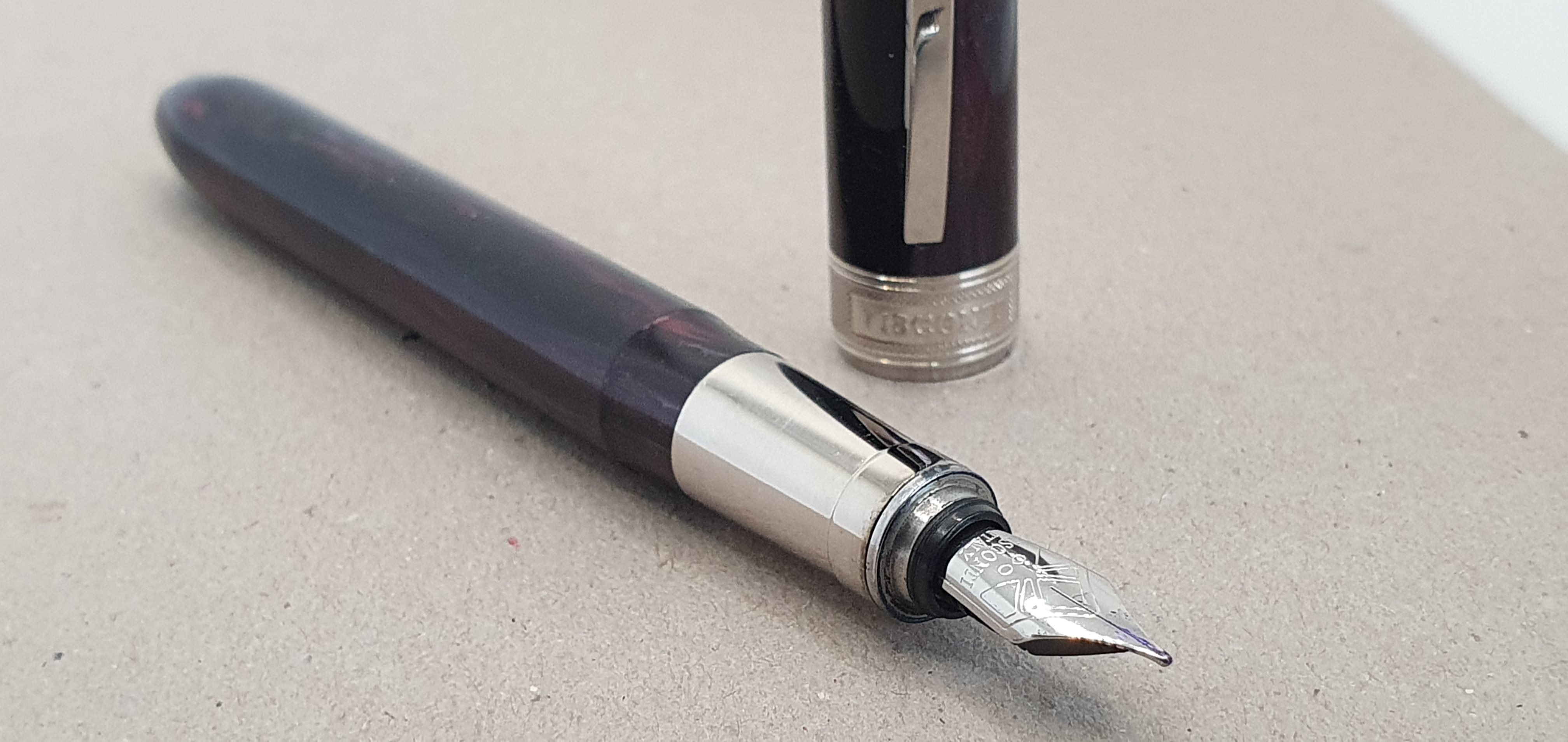
Don’t judge me. I found this by accident whilst innocently scrolling for pens, on Amazon (don’t judge me, again).

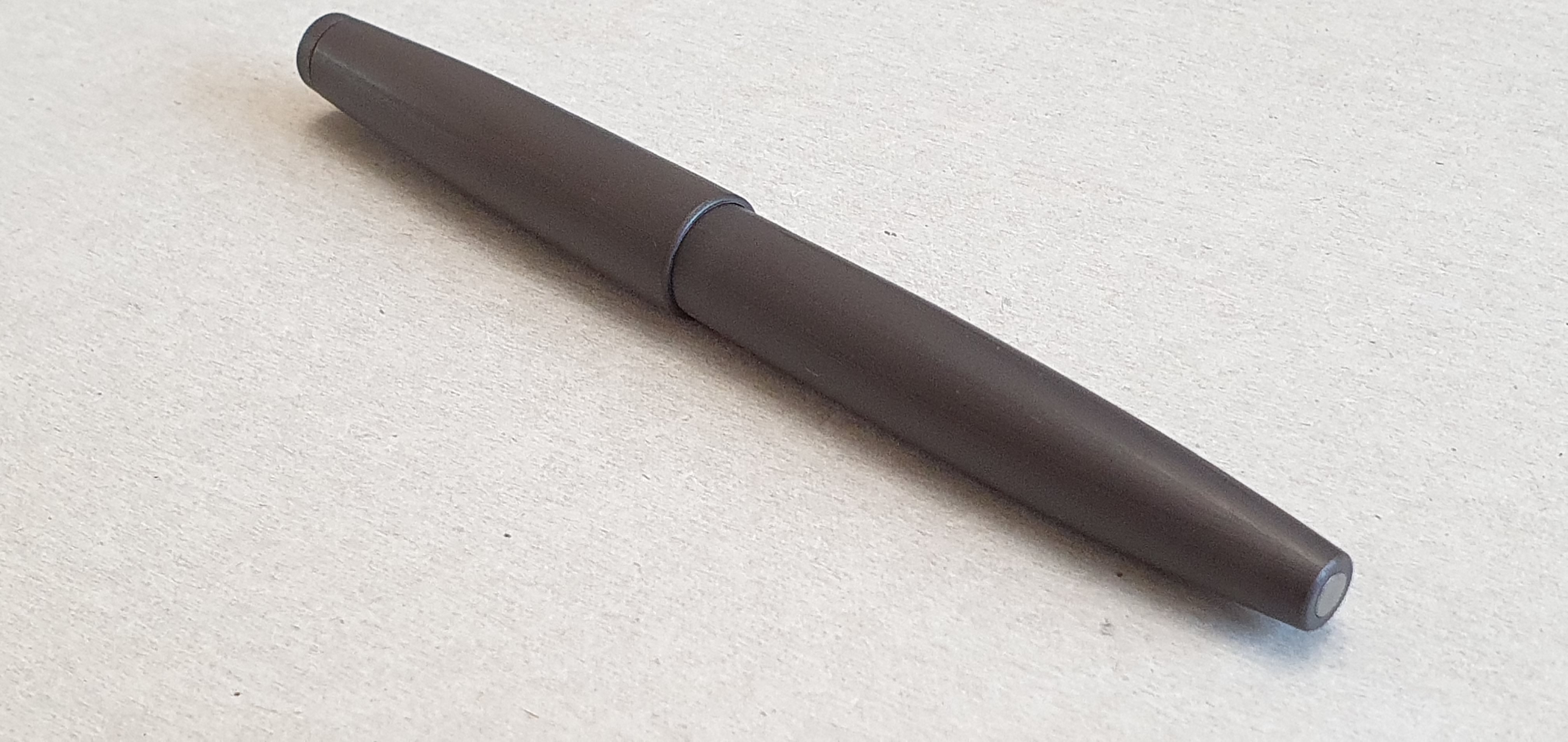
To give it its full description, this is the Jinhao 80 Gray Fiber Brushed Fountain Pen. I chose the Fine nib version. There were also options for a black pen with either a silver coloured or black clip and options of Fine or Ultra Fine nib.

Jinhao 80 fountain pen.

To acknowledge the elephant in the room, this is clearly based upon a certain well known iconic, much loved German fountain pen designed in the 1960’s although there are many key differences, including as to body material, nib and feed design, grip section material and filling system. The snap capping is also simplified.

Conveniently leaving aside the ethical considerations of purchasing such a pen, I will describe the pen and give you my opinion of it on its own merits. Let’s call this a homage to the Lamy 2000.

Matte finish finial, and solid steel, sprung pocket clip.

I was curious as to how the pen would feel, compared to the unique, tough and textured Makrolon of the Lamy. I have to say, that the plastic used does look and feel good and there is a textured finish in the plastic, which is pleasant to the touch.

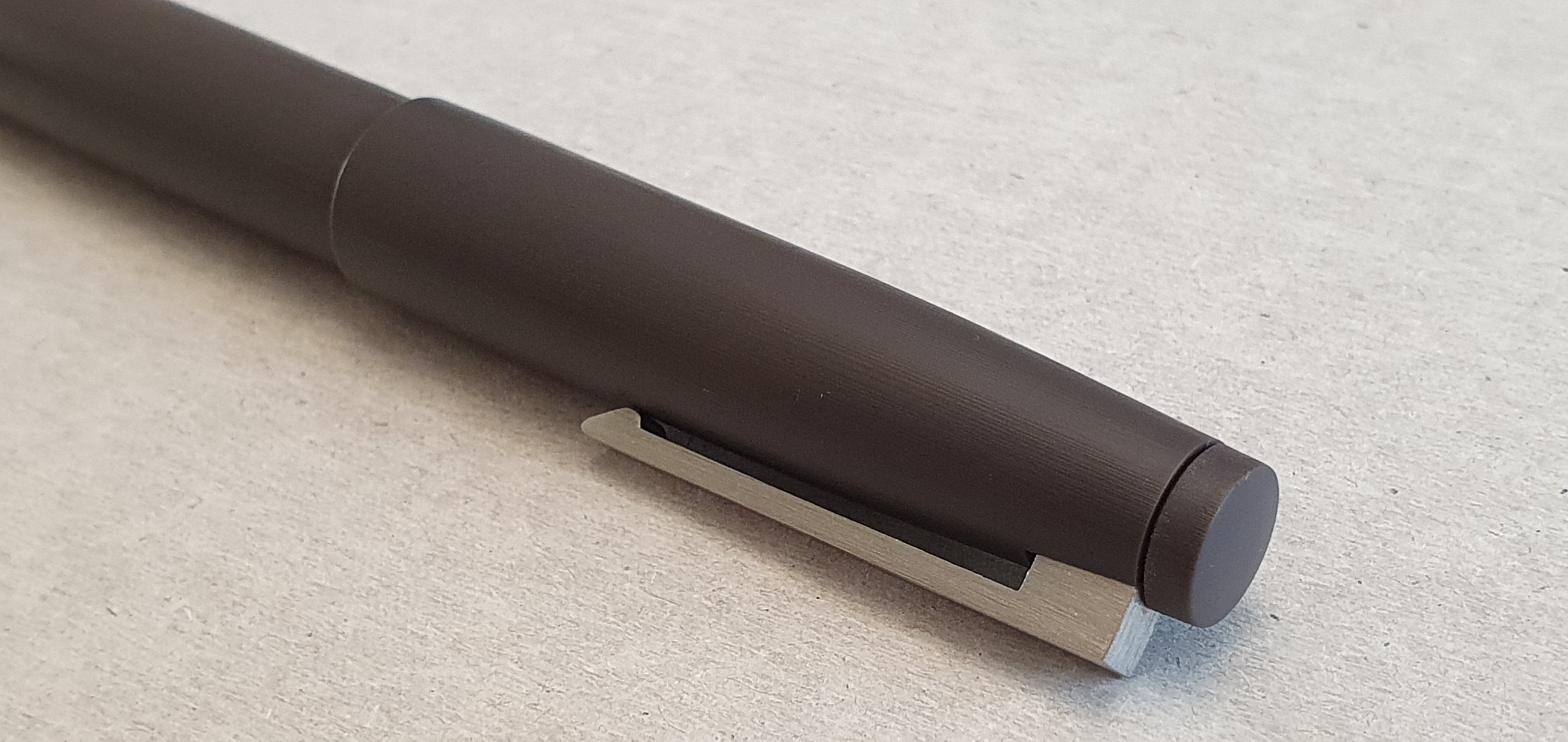
The cap features a chunky, brushed steel clip which is sprung and works very well and is really quite astonishing given the price by western standards. There is no visible branding on the pen body or the clip, until you get to the nib. The cap finial is also just like that of the Lamy 2000, except in a matte finish rather than glossy.

Uncapped.

The cap pulls off with a click. It is secured by the raised lip at the at the nib-end of the grip section clicking into the inner cap, as opposed to the horse-shoe metal ring (with its two protruding ears) of the Lamy. There is a plastic inner cap and I have not encountered any nib-drying and hard starting so far.

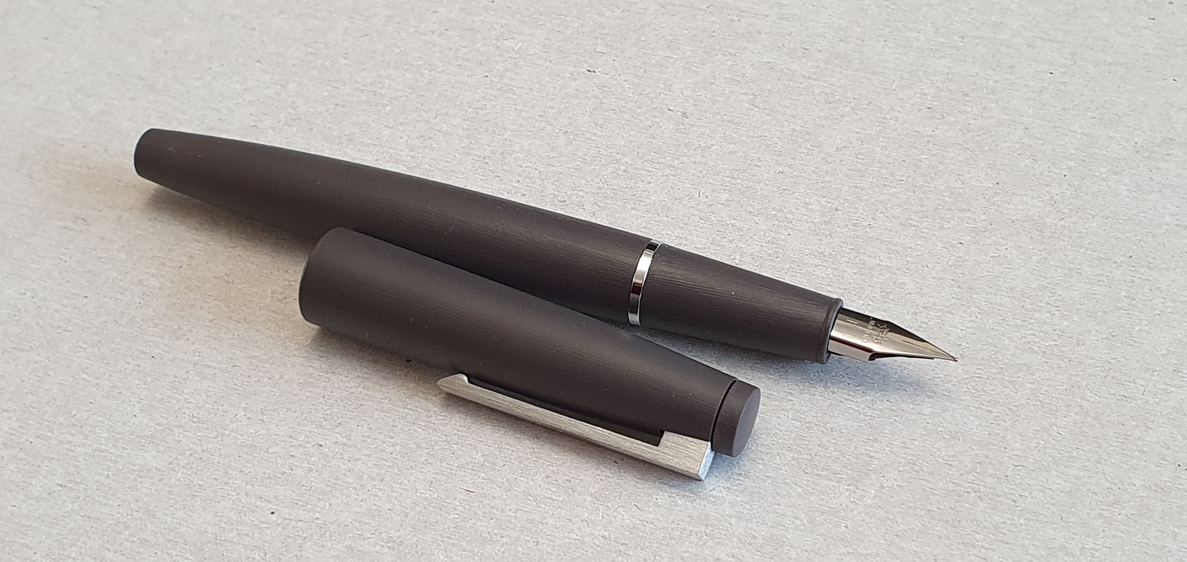
The grip section is of the same textured plastic as the cap and barrel and is very comfortable to hold. Where it joins the barrel, there is a shiny plated metal ring on the barrel. The absence of any step makes for a comfortable grip, wherever you wish to grip the pen.

On the Lamy 2000, the join between the barrel and piston knob is famously almost invisible. On the Jinhao 80, you cannot see the join either, but this is because there is none: it is a cartridge-converter pen, not a piston filler.

At the foot of the barrel, there is a steel disc inset, which presumably is just cosmetic here but gives the pen a distinctive look on a desk and shows attention to detail in this homage.

Metal disc in the end of the barrel.

Unscrewing the barrel, the pen comes with a converter which works ok although I would have liked it to contain a metal coil ink agitator. This would help prevent ink sometimes sticking at the back end with surface tension rather than sloshing down to the nib and feed. But I was pleasantly surprised to find that the barrel had metal screw threads inside and so you have metal-to-metal threads for the barrel to grip section.

Metal threads in the barrel.

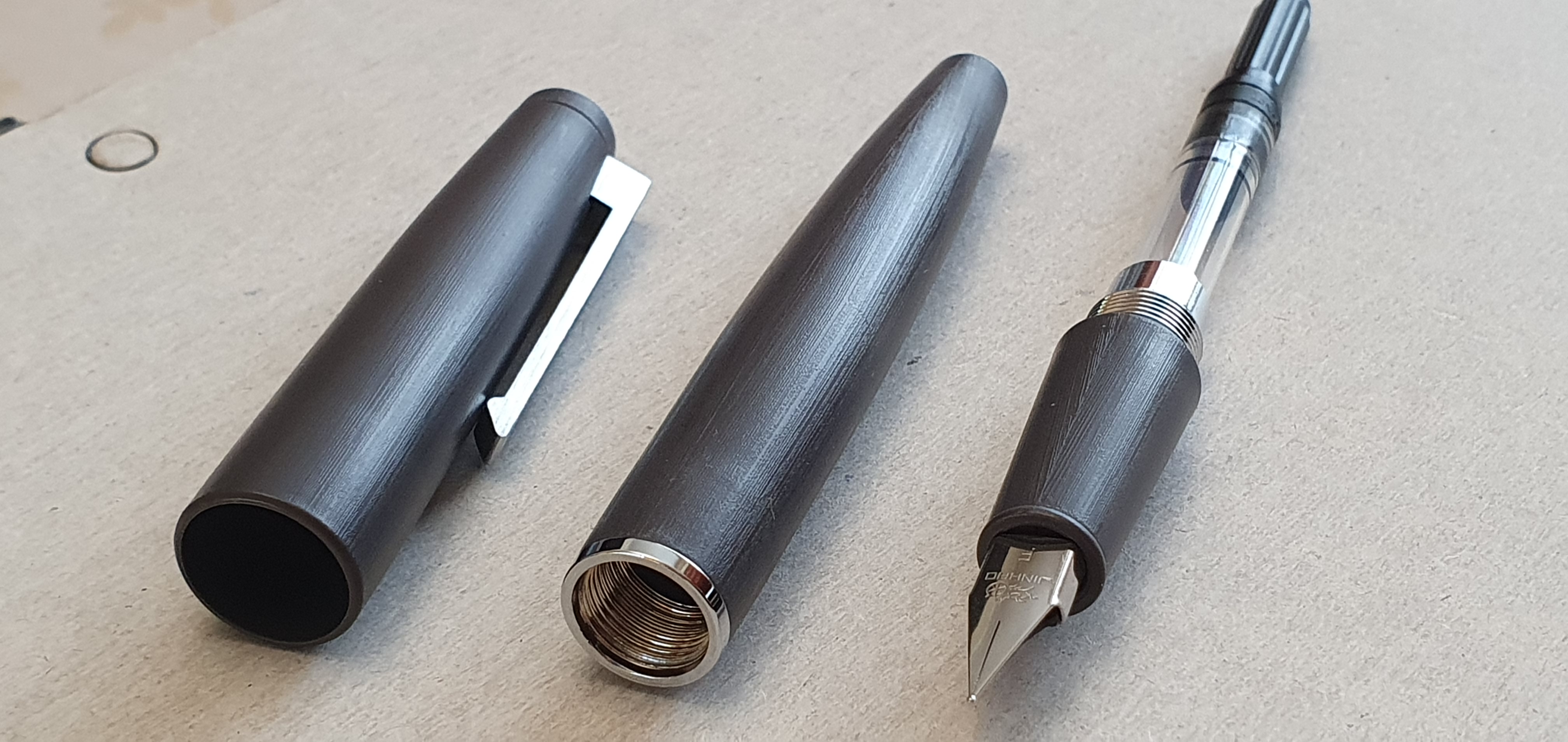
And so to the nib. The pen came with a Jinhao steel Fine nib. There is no pretence of making a Lamy 2000 style semi-hooded nib, but rather Jinhao has adopted the design of a Lamy Safari or Al-Star nib, which has its advantages.

Jinhao nib, Fine.

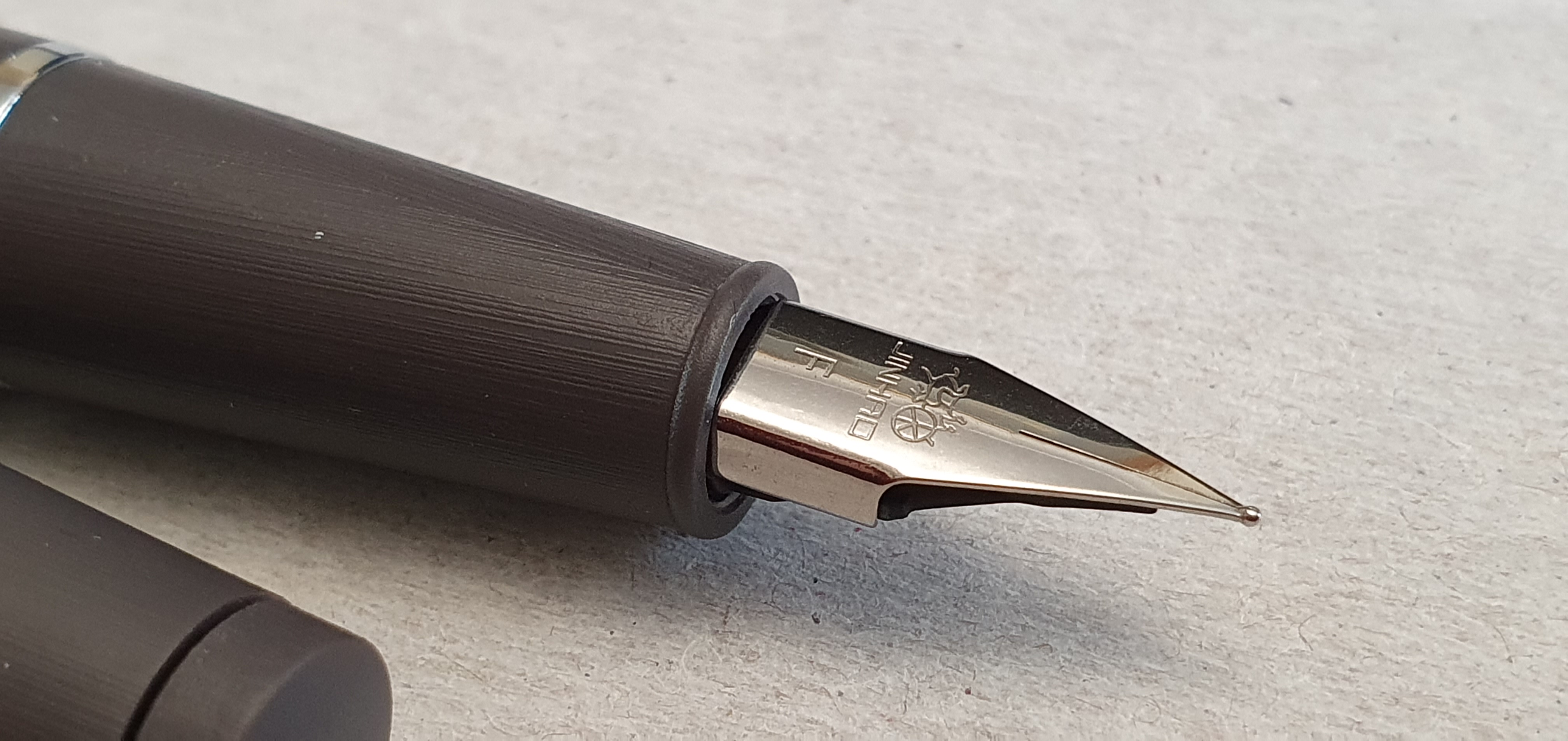
On mine, the nib wrote a fine line which was very dry. The nib was smooth with nice even and level tines but they were too tightly together for my taste. As I had chosen an ink that was also new to me (Rohrer & Klingner Isatis, limited edition of 2021) I soon found that in such a dry nib, the very thin single coat of Isatis, with no back-wash, looked very pale indeed.

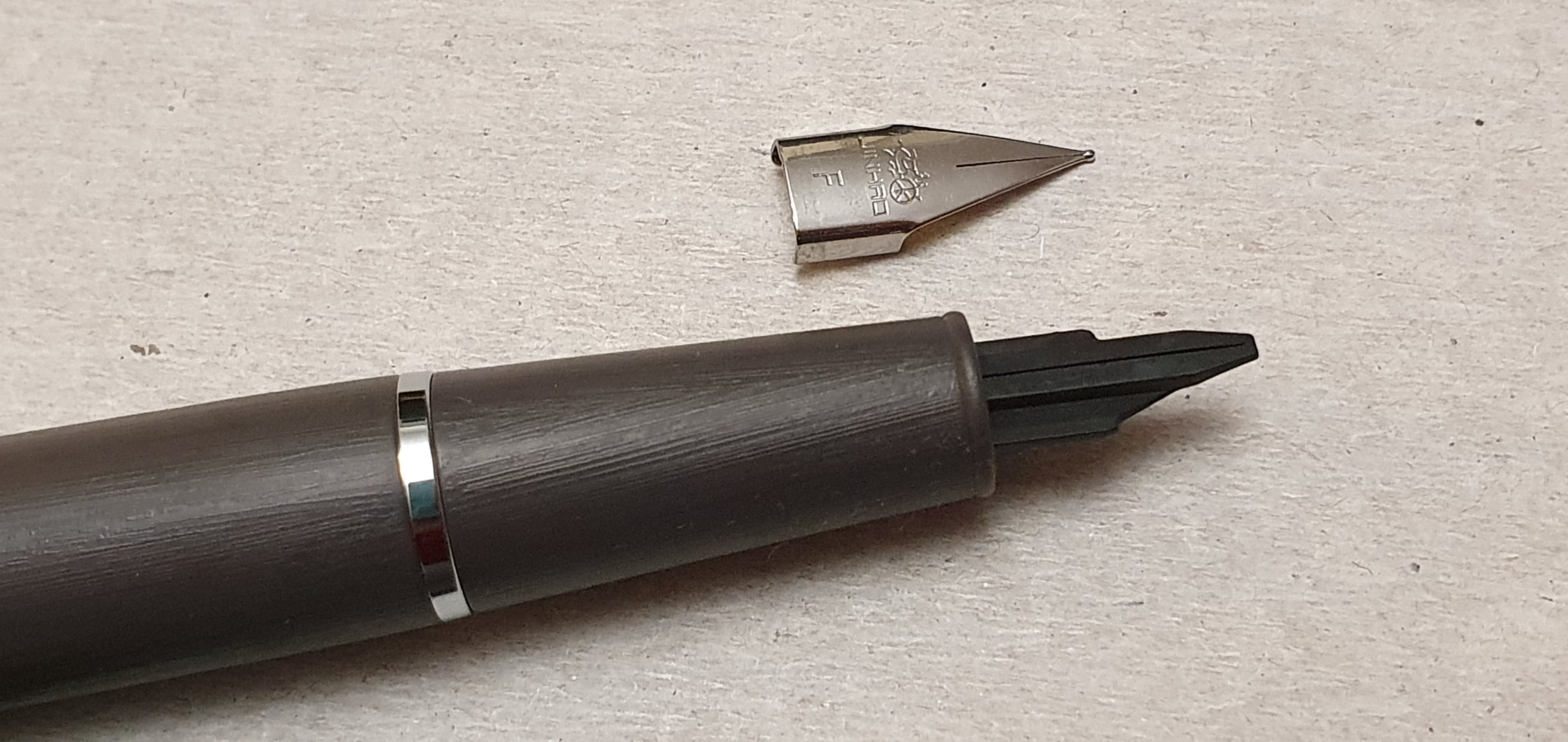
It may be that the nib set-up would have suited someone with a more conventional writing style, but as a lefty overwriter needing a wetter flow, I tried to ease the tines a little, with brass shims. This proved to be quite difficult, there being no breather hole and the face of the nib being flat, rather than curved over the feed. After struggling with this for some minutes, I gave up and instead swapped the nib for one from a Lamy Al-Star. This operation was quite easy, using a piece of Selotape wrapped over the nib to pull it directly off the feed.

With nib removed, prior to installing a Lamy nib.

Now, with a Lamy steel nib, the pen is writing very nicely. I have refilled it with Waterman Serenity Blue, filled from a bottle, which is the ink that I normally use when trying out a new pen.

The cap posts, both deeply and securely and the pen feels comfortable and well balanced whether the cap is posted or not. It feels comfortable, lightweight and solid and writes very well.

Giving credit where it is due, the pen has been made to a good standard of quality. Whilst the supplied nib was a bit too dry for me, the pen makes an excellent vehicle for a Lamy Safari-style nib which can be enjoyed without the Safari’s faceted grip. You could even fit a Lamy gold nib if you were so minded.

For its very modest price, which was just £9.49, the pen is undeniably good quality and value. The only issue is whether your scruples allow you to live with yourself for supporting what some would call a “knock-off”. In my case, I did not buy it because I wanted people to think I have a Lamy 2000. I can flaunt my own Lamy 2000 to do that. But for a low cost writing tool and now benefiting from a Lamy nib, this is, leaving aside the ethical debates, a great pen. There are plenty of examples of pen homages for those who would like a low-cost alternative to a Parker 51 or Duofold, Pilot Capless, a Montblanc Rouge et noir, or even a Lamy Safari, perhaps to use as body double whilst our originals stay at home.

A London walk in a time of national mourning.

Today there was a special atmosphere in London. With blue skies and warm sunshine, thousands came to central London to see Buckingham Palace and The Mall, Green Park or St James’s Park, some to lay flowers in memory of HM The Queen. Others have come to queue to see her coffin lying in state at Westminster Hall, ahead of the state funeral at Westminster Abbey on Monday 19 September 2022. It is a moving sight, even on television, with guards in splendid uniforms standing in silent vigil, 24 hours a day, whilst members of the public pay their respects.

For those wishing to see the lying in state, there is a huge queue stretching back to Southwark Park. The authorities are prepared for this to reach 10 miles long. There are constant updates online but at one time today there was an estimated queuing time of 24 hours, and as I write this the current estimate is 13 hours. A colleague of mine at work joined the queue on Thursday evening and reached Westminster Hall at around 7am on Friday. Total estimates were of 400,000 people filing past the coffin, over four days, some travelling from great distances to do so.

I did not wish to visit Westminster Hall but wanted to come to London to mark this rare occasion and experience the atmosphere. I began at Trafalgar Square and joined the many people walking along The Mall. There were a lot of families with young children, and many bringing flowers. Much of the area was closed to traffic. In the quiet without the usual traffic noise, I found myself noticing the architecture of so many grand buildings and it was poignant to see so many flags flying at half-mast.

The police were doing a good job of controlling the crowds. You could not simply wander about where you liked and could only cross some roads at special crossing points, and there were some one-way systems in place for pedestrians. People accepted this and cooperated, chatting to the police. There was a sense that we were all there for the same reason, united by our common loss.

We paused to watch a group of mounted guardsmen ride past, with a police escort. Often helicopters could be heard high overhead. There were tv cameras and reporters everywhere and it seemed as if the attention of the world was focussed on London at this time.

The Mall: preparations for the state funeral.

Because of the volume of people, we could not walk directly up the Mall to Buckingham Palace but had to cross St James’s Park and join long queues down one side of the road and back up the other for those wishing to go to the Palace. With even this queue likely to take a few hours I was feeling a little bit hemmed in by the sheer number of visitors, although there was no pushing and shoving. I decided to change direction and take a path of less resistance away from the main attractions.

Buckingham Palace from St James’s Park.

From Birdcage Walk, I continued on to Buckingham Gate passing the Rubens hotel (where I had enjoyed a weekend break a few months ago) opposite The Royal Mews. Souvenir shops had portraits of the Queen in the window with her dates. There were mugs with the Queen’s picture and dates 1926 to 2022 and messages such as “Forever in our hearts.”

I cut through to Victoria Street, where there was more space to walk normally and headed towards Parliament Square. I was sorry to note that the landmark department store, House of Fraser on Victoria Street had closed down. I ventured down Artillery Row and came to Horseferry Road and found a cafe for some lunch. A man at the next table had just been to Westminster Hall after queuing for 14 hours. A group of police came in for coffee and takeaway lunches, taking these back to their minibus.

At Lambeth Bridge I saw sections of the epic queue heading for Westminster, like a pilgrimage. Not being a part of this, I could walk freely along Millbank and see the Houses of Parliament and Big Ben as I neared Parliament Square.

Houses of Parliament.

It was extraordinary to see and hear Parliament Square without any traffic. I passed Westminster Abbey where all eyes will be on the proceedings in two days’ time. There are already stands erected for tv camera crews.

Big Ben in the autumn sunshine.

Once inside Parliament Square, there was a pedestrian one-way system again and so it was necessary to go with the flow. First though, I enjoyed sitting in the sun to write down some impressions of the day, with my new Tibaldi fountain pen and the “traveller” style notebooks from Flying Tiger. I like the Tibaldi more and more and appreciate everything about it, particularly the retro zest green colours, its generous size, firm nib and the ebonite feed.

My journaling companion today, the Tibaldi N.60.

A young woman busker named Harmonie London set up a keyboard and began to sing the national anthem and soon drew a big audience. Without the traffic noise, her beautiful voice and playing could be heard from quite a distance and her set captured the collective mood perfectly. Many videoed her with their phones.

I made my way up Great George Street, passing the impressive Treasury building, and along Horse Guards Road, before cutting across Horse Guards Parade to emerge in Whitehall and back to where I had started.

Whitehall at entrance to Horse Guards Parade.

Before returning home, I headed up to Leicester Square to visit Choosing Keeping at Tower Street, surely one of London’s most delightful stationery shops. I browsed the Japanese pencils, Tomoe River paper notebooks, and a display case of fountain pens including Sailor, Pilot, Lamy, Kaweco and Pelikan. Resisting these I still found myself buying a bottle of Rohrer & Klingner ink in a dark blue or blue black called Isatis tinctoria, their limited edition of 2021. In my relaxed state I had forgotten all the golden rules of ink buying, which are to ask yourself “Do I actually need any ink at the moment?”; “Do I need this colour?”; “Is this sufficiently different from all the other inks that I already have?” and “Would my spouse approve?” and “What is WRONG with me?!” However, it is lovely ink, and it is important to support such wonderful shops.

All in all it had been a remarkable and memorable day. And my phone tells me I walked 7.87 miles so that’s good.

Early thoughts on the Tibaldi N.60 fountain pen.

I do not buy an expensive pen so often now. This has been only my third in 2022, the others being my Esterbrook Estie and then an Aurora Talentum, both of which proved successful purchases.

Purchase backstory

I first saw a Tibaldi N.60 in the flesh, whilst browsing in Selfridges some months ago. They had the Ruby red edition on display. It was a little too pricey for an impulse buy, and felt too similar in specification to my marbled red Leonardo Momento Zero. But the memory of it stayed with me. I read some reviews online which further whetted my appetite. I found that the pen was also available in Emerald green, Amber yellow, Samarkand blue or Rich black, with Palladium trim.

And then came the tempting Iguanasell summer sales. I had already bought three Aurora fountain pens online from Iguanasell. Their keen prices and fast service are hard to resist and receiving the parcel from FedEx is exciting. It was whilst scrolling through their sale pens, that I spotted the Tibaldi N.60, but not in any of the versions I knew of: this was called Retro Zest green and featured an 18k gold plated nib and trim, instead of the Palladium. I was immediately taken with this edition. In the photos the cap looked a lighter green than the body. After a few days I eventually and inevitably caved in and pulled the trigger. I opted for a medium nib.

The history

Tibaldi was founded in Italy in 1916 by Guiseppi Tibaldi, being amongst Italy’s earliest pen manufacturers. I believe it continued in business until 1965. I found images of a vintage Tibaldi online, which my pen closely resembles, save that the original was made of celluloid, had a solid gold nib and was a piston filler. Like many pen companies, for example Esterbrook, the company brand was later reborn. The headquarters was moved from Florence to Bassana del Grappa in 2004, which readers may recognise as the home of Montegrappa fountain pens. I gather that Tibaldi shares the same management as Montegrappa, in the Aquila family. Other models in the Tibaldi line are the Bononia, the Infrangible and the Perfecta.

Unboxing

The pen comes in a simple but sturdy black cardboard box, with a tray sliding out from an outer black sleeve, all within an orange paper outer sleeve. The pen cushion lifts out, to reveal a 2 year warranty card and a sealed pack containing two Tibaldi branded cartridges.

Tibaldi N.60 Retro Zest fountain pen.

Description

The Retro Zest green material was far more spectacular in real life than in the photos. On my model, the cap was not a lighter green than the barrel, but there are stripes of light and dark tones, from a very light green-gold to a dark green that is almost black. The colours look stunning as you rotate the pen in your hands. The pen body has the appearance of being faceted, yet is not and is entirely rounded and polished.

Catching the chatoyance in the cap.

It is a large pen. There is a distinctive, pointed finial in the same green acrylic material as the body, surrounded by a gold trim ring; a very stiff, tie-shaped pocket clip; three gold plated cap bands; Tibaldi on the front and Made in Italy on the back. The cap unscrews in one full rotation.

Uncapped

The section is of the same coloured material as the cap and barrel on this edition, whereas on the other colours mentioned earlier there is a black section. The section is rather short, before meeting the cap threads on the barrel but these are not sharp or uncomfortable if you grip the pen there. The section and barrel are very girthy however at around 12mm at its widest point.

The barrel unscrews and there is a gold-plated metal mount for a cartridge or converter. A Tibaldi branded converter is supplied, which is screw fit, a feature which I always enjoy. The other end of the barrel ends with another finial with a green acrylic “jewel” matching that on the cap.

Tibaldi screw-fit converter included.

Nib and feed

The stainless steel nib is gold plated and has the name Tibaldi, the bird’s wing logo and an M for medium. A particularly welcome feature at this price point, is the ebonite feed rather than plastic. This is semi-porous and partly absorbs ink, helping the flow of ink between nib and feed and also helps to ensure that the nib stays ready to write, even if the pen is unused for a few days.

Nib and the cap finial.

On my model, the nib was smooth and wrote right out of the box. It is a very firm nib. My early trials with the nib found it to be rather on the dry side. This may suit the majority of right-handed under-writers but I prefer a slightly wetter nib for greater lubrication and a darker line even when writing without any downward pressure, this being my usual lefty over-writer syle. I therefore set about easing the tines apart just minimally, first with brass shims and then with a gentle wiggle of a craft knife. This had the desired effect and I am now enjoying good flow and effortless writing.

Size and Weight

The pen measures 148mm end to end, including the raised finials. Uncapped it remains a generous 132mm which is plenty long enough to use unposted. The cap can be posted but brings the length to 173mm. It weighs aground 27.5g, 17g uncapped and 10g for the cap alone.

Size comparison with the Montblanc Meisterstuck 146.

Likes and dislikes

On the plus side, the colour and finish of this pen’s material has a big appeal for me. To a casual glance in poor light it might look like a black or very dark green, but on closer inspection as you turn the pen in the hand the polished feel and the strips of different shades of green reveal themselves having the appearance of an exotic vintage celluloid of pens of old. The pen is of a generous length and girth, without being unduly heavy. The ebonite feed (as found on my Aurora Talentum, Optima, and 88) is a rare delight in a steel nibbed pen at this price. Having a steel nib keeps the cost down.

On the negative side, the section is short. Some may find it too wide. The pocket clip is very stiff which means it grips securely but is not so easy to use. I would have liked to see “Tibaldi Model 60, Made in Italy” engraved on the barrel, in the manner of an Aurora Optima or Parker Duofold but I am probably asking too much now. Finally, one could argue that the pen is pretending to be something it is not, with a body which looks like celluloid and a nib which looks like gold. I do not see it that way and think that even without comparison to the pre-1965 model which it resembles, the pen stands up well in its own right for a modern, safe and convenient equivalent.

I recently saw a review by SBRE Brown of the Tibaldi N.60 in Emerald green. His only complaint was that the grip section was black, not of the same colour as the rest of the body. That is not an issue on the Retro Zest edition.

Size comparison with a (dusty) Montegrappa Fortuna

Conclusions

It is sometimes said (at least, in fountain pen circles) that if you find a pen you like and in a finish that you like, then buy it! Tibaldi pens are not very easy to find in the UK. Cult Pens sells them, including the N.60 but not currently the Retro Zest edition. Iguanasell has served me well now on several occasions even including a surprise free gift with this order and I would recommend them.

Perhaps some comparables below £200.00 might be an Edison Collier, a Conklin All American, Leonardo Momento Zero or a Montegrappa Fortuna. In terms of size and girth, the N.60 could be a good test of whether you will get along with such a large pen, before splashing out on a Pelikan M1000 or Montblanc 149.

Some final thoughts. This has been a momentous and sombre week in the UK: HM Queen Elizabeth II died on 8 September 2022 at the age of 96, after serving as monarch for over 70 years and just two days after greeting our new Prime Minister Liz Truss and inviting her to form a new government. The Queen was of my parents’ generation and hugely loved and respected. She had been the Queen for all of my life and so there is a sense of loss here. The N.60 was the last pen I bought whilst our Queen was alive. We are in period of mourning, which I will record in my journal. We have a new King and a new Prime Minister. Amidst all this change the N.60 Retro Zest is a good tool for such reflections and an echo of another age.

Long term thoughts on the Visconti Rembrandt fountain pen.

It has been four years since I wrote a post The Visconti Rembrandt v The Pineider Avatar fountain pen (8 September 2018). At the time, I had owned the Rembrandt for less than a week. I think my comments then were fair and still hold good. As to which one of those two pens you prefer, that is subjective and each has its merits.

It has been my habit for decades, to write a daily entry in my diary. Currently I use an A5 page-a-day diary from Rymans. This year, it was my intention to use a different pen and ink combination each month. I started out with a Cleo Skribent Classic Gold in January but was enjoying it so much that I continued with it for February too. Then, forcing myself to have a change, I started March with the Visconti Rembrandt. I am still using it now. By the end of August, I had been using the Rembrandt almost every day for six months, barring a few days when I went away and took other pens for holiday journaling.

My Visconti Rembrandt Twilight, at four years old.

As for ink, I have been using it with Kaweco blue cartridges. I had a stash of these, acquired on buying Kaweco pens, particularly the Perkeo of which I have several. With each purchase, there would be four new Kaweco blue cartridges, with the Kaweco name along the side. I particularly liked this ink and kept these cartridges in a Kaweco tin, separate from my hoard of generic blue standard international cartridges.

This adorable Kaweco tin lives on my desk and held my stash of Kaweco blue cartridges.

Since 9 February 2022, I have filled the Rembrandt eight times with these cartridges and am down to my last one. I plan to switch to Kaweco midnight blue next, as I have a box waiting. I will never get through all my ink, but it feels satisfying to have used up these Kaweco blues, at least.

Whilst using a standard international cartridge, the Rembrandt has space to carry a spare. The spare cartridge does rattle around though, and to stop this I cut a small cube of rubber from an eraser and dropped it into the back of the barrel. Be careful with this however: too large a piece and it will jam inside and you will not be able to get it out again unless you break it up with a cocktail stick.

I should mention the chrome section of the Rembrandt. Generally, I am not a fan of slippery metal sections. For this reason I have avoided the Lamy Studio (apart from the brushed steel version with the black rubberised grip section). But in all fairness, the Rembrandt’s shiny plated metal section has not been a problem for me at all. My grip on the pen does not slip. I do not have trouble controlling the nib or stopping it from rotating left or right. I think that this may be partly because the section and the nib are both relatively short and when I hold the pen, my thumb still rests on the purple barrel, serving to anchor the pen and stop it from rotating in my hands.

The shiny plated business-end of the Rembrandt.

When I first got the pen, I preferred using it with the cap posted, but my habit has changed and I now use it unposted. If I had been put off buying the Rembrandt because of its metal section, then I would have missed out. The magnetic cap fastening still works well and is quick and convenient. It makes for a grip area free of any sharp step or screw threads.

Above, all, the pen writes really well. I get no hard starts. I did adjust the nib slightly when it first arrived, to ease open the gap between the tines to improve flow to my taste, but having done this in the first few days, the pen has written smoothly and effortlessly ever since and works well with the Kaweco blue cartridges.

As for the Pineider Avatar in its vibrant Lipstick Red, I still have it and it is a beauty. It has the “Wow factor” which the Rembrandt lacks and got the best admiring looks at our London pen club. Yet the Rembrandt has proved itself a solid performer over time and deserves credit for that.

It is hard to show that it is actually purple, with subtle “brush strokes” of lighter colours in the material.