In my previous post (Italy, Part I, Rome), I listed the six fountain pen shops that I came across, during a recent short break in the city.
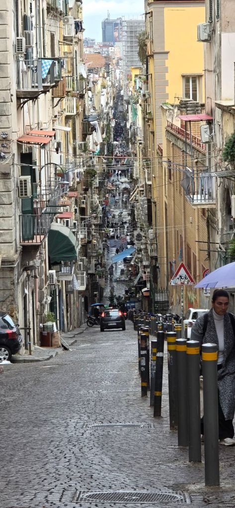
After Rome, my wife and I journeyed on to Naples by train. It was our first visit there. We stayed in a B&B on the third floor of an elegant building on the via Chiatamone, close to the sea front. I later read that the via Chiatamone used to be the coast road until the late 19th century when a new road was built on reclaimed land, now comprising waterfront hotels and restaurants.
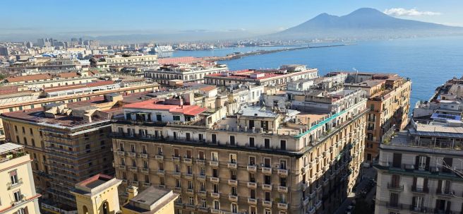
Near one end of our road was an entrance to a tunnel through the cliffs giving a fast route across the city to the docks. At the other end, an elevator ride takes you to Monte Echia, the cliff with a viewing terrace, giving spectacular panoramic views over the city and the bay.
Cliff-top view across the Bay of Naples.
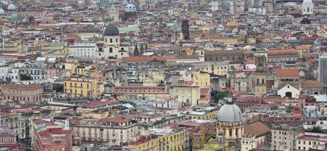
Another very scenic spot can be reached by a funicular railway ride, to the Castel Sant’Elmo. From there you get a wonderful view of the city and in particular the Spanish Quarter and the old town. We took the scenic walk back down, on a 14th century pedestrian pathway with over 400 steps, the via Pedamentina a San Martino, which zig-zags down the hill.
A view of Naples from Castel Sant’Elmo. Mount Vesuvius in the distance. Zooming in.
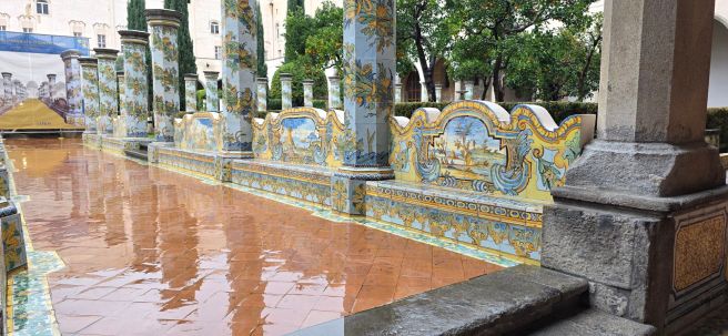
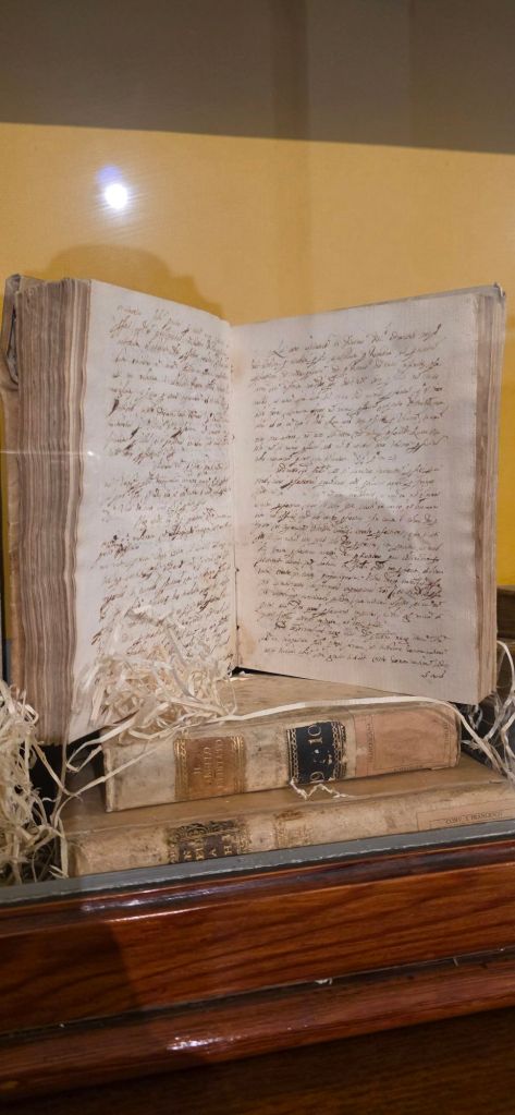
We had three nights in Naples, although it seemed longer and we walked constantly. There are numerous quiet churches which can be visited. One particularly memorable oasis of calm was the Santa Chiara Cloister, a monastery in the city centre with a large church and an adjoining garden with colourfully decorated tiled columns. In the adjoining museum, I read that the church had been bombed in 1943 and burned for six days. A lot of treasures were destroyed but it was restored and re-opened in 1953.
Gardens at the cloister of Santa Chiara.Some penmanship in the monastery’s museum.
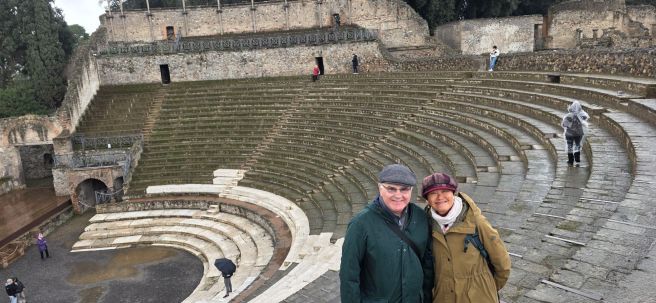
Whilst in Naples, we could not miss visiting nearby Pompeii, a Roman city destroyed in the eruption of Mt Vesuvius in AD 79. Thousands of residents died from a sudden thermal shock. The city was buried under about 4 – 6 metres of volcanic ash which hardened over the centuries. Modern excavations (which are ongoing) have revealed a vast, well preserved site. Our archaeologist tour guide Anna, gave us a fascinating insight into day to day life in Roman times.
An amphitheatre in Pompeii. Some chiselled seat numbers can still be seen in places.
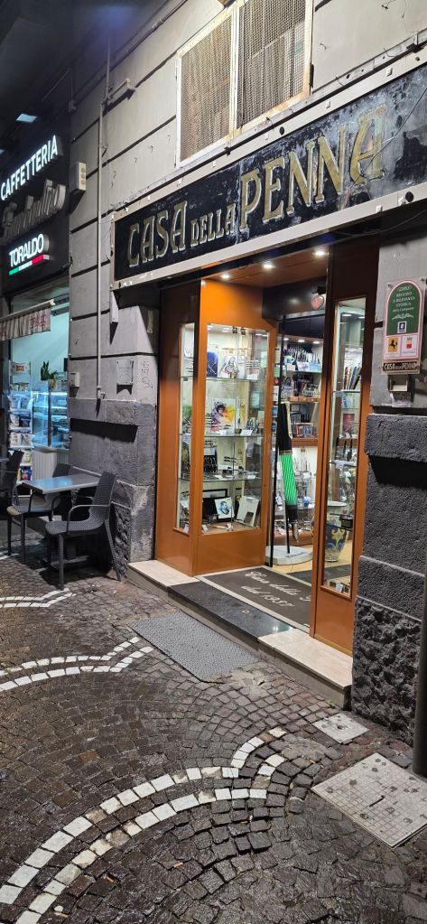
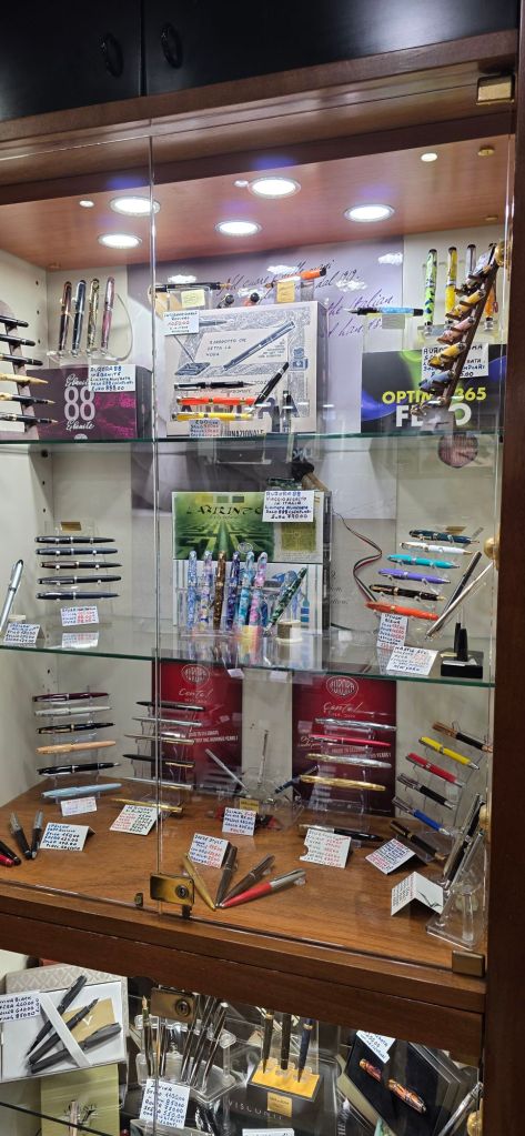
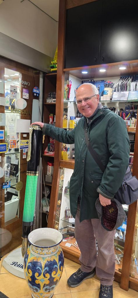
I did visit one delightful fountain pen shop in Naples, Casa della Penna at C.so Umberto I, 88, 80138 Naples, dating from 1937. The friendly proprietor was happy for me to take photographs of his attractive display cabinets, and also switched on the illumination in a giant green Pelikan pen which stood at the entrance. I mentioned that I was visiting from London and had found his shop on an internet search. Whilst there I bought two more boxes of cartridges for my Aurora Style pen – as these are hard to come by at home. He kindly gave me a gift of a 2026 calendar and an accompanying ball pen both bearing the shop’s name.
Casa Della Penna, Naples.Too many pens to absorb, so I had to take photos of each cabinet.Me with an oversized Pelikan and possibly an inkwell.
As with Rome, there was a lot to see in Naples and we did our best to see a representative sample of the sights in the time available. A visit to the region is highly recommended.
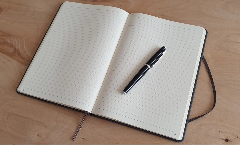
In my previous post I talked about starting the NaNoWriMo challenge, as well as reviewing the notebook that I was using. Today the challenge ended and I thought I would check in here to share my thoughts on it.
To recap, this was the National Novel Writing Month, an annual event which was launched back in 1999. The basic idea was for participants to write a novel, of not less than 50,000 words, in the month of November. I had never taken part and only when looking into it this year, did I learn that it had closed down in 2025.
Nevertheless, I decided to take up the challenge to write 50,000 words in a month, without signing up to any online community. It would be NaNoWriMo ByMoSelf. Also, I was not going to write a novel (never having written any fiction and not having any plot in mind). That would have to wait for another year. Instead I would be a “rebel” and write on 30 daily topics from a list of writing prompts that I made. These were loosely biographical on such topics as parents, grandparents, holiday memories, childhood tv, hobbies and so on. I had a nice new notebook at the ready. I had pen cups full of eager fountain pens. A headful of memories. I just needed a writing project like this to put them all together.
This can be done by anyone at any time, of course. November seems a good month. It is getting cold and dark (in my hemisphere). Starting at the beginning of a 30 day month makes it convenient to always know how many days you have done and how many you have left.
Today I reached the end. I had kept it up each day, although once or twice I had a couple of pages left to complete from the day before. I got to the end of my notebook today. I had allowed eight pages per day of the B5 notebook until about half way through the month when I adjusted this to seven pages. Being handwritten, I do not have a word-count, but it is certainly over 50,000. From a few sample pages I have counted and averaged, I think the total is around 63,500.
I can recommend the notebook that I used – the Ryman, B5 Soft Cover Notebook (although I appreciate that this is not helpful if you are outside the UK). I liked the texture of the paper, (especially when low, wintry sunlight fell on the page, showing up the texture). The cream coloured paper was easy on the eye and the 8mm row height suits my preference.
Most of all, it has been a real joy to have this self-imposed task to complete each day and to spend some structured time with my fountain pens. For me, writing with a fountain pen was a big part of the draw. Thinking about which pen I would use, gets me out of bed in the morning!
Would I recommend the challenge? Yes, definitely – if you are like me. That is, if you are someone who likes:
Fountain pens; spending a solid couple of hours using a pen to see how it feels and performs and how well the ink flows; seeing filled pages at the end of the session.
Working on your handwriting;
Dipping into and exploring your memories;
Practising (or finding and developing) your writing style.
The NaNoWriMo challenge enables you to indulge all of these simultaneously.
I found that I am a morning person for all of this. Much has been written about the benefits of journaling or “morning pages” to free up the mind for the day ahead. Writing to a specific topic gives a basic starting point and theme although I often found myself digressing. I have not read it back yet and may wait a while before doing so!
I think also that this practice, as well as being a valuable habit to nurture, also meets a need to communicate. As a recently retired person, no longer having the society of my office colleagues, a notebook can take the place of someone else’s ears.
Finally, a word about the pens. I usually picked a different one from my pen cup each day, except for the new Asvine V800 vacuum filler, that I filled and used for five days in a row. Several of the pens used, and which were already filled, were also recent acquisitions such as my Arclayer double helix, eye-dropper, three vintage Parkers and the Aurora Style from the October pen show. One pen that I particular enjoyed using was the Faber-Castell Ondoro with smoked oak barrel that I bought in September. One of the beauties of fountain pens is that they are all different: picking up a different one each day was one of the pleasures of this exercise.
Back in June, I attended the Birmingham Pen Show for the first time. My decision to go was made only a day before, on a long drive home to London from a week’s holiday in North Devon. It meant an early start but I could rest on the two hour train ride to Birmingham.
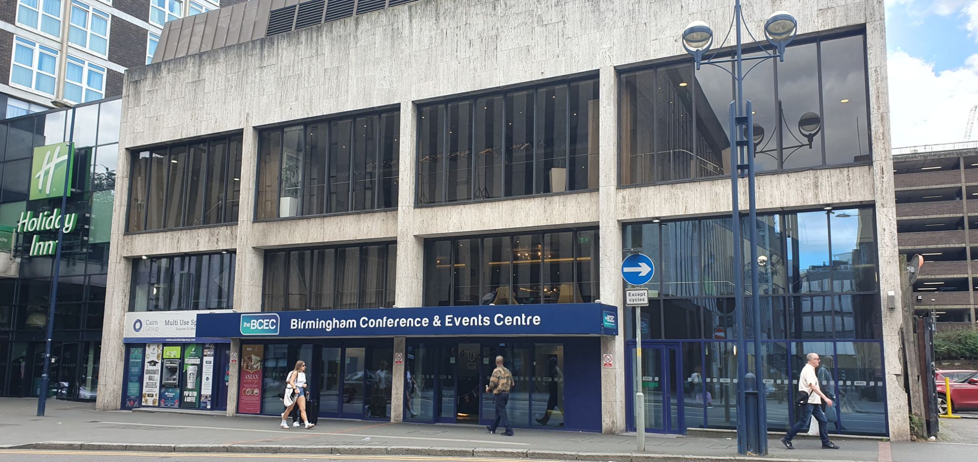
My train got me to Birmingham city centre by 10.20am and it was a short walk to the venue, the Birmingham Conference and Events Centre. The show is smaller in scale than the London pen shows, but bridges the gap between the London Spring and Autumn pen shows held in March and October.
The venue for the Birmingham Pen Show.
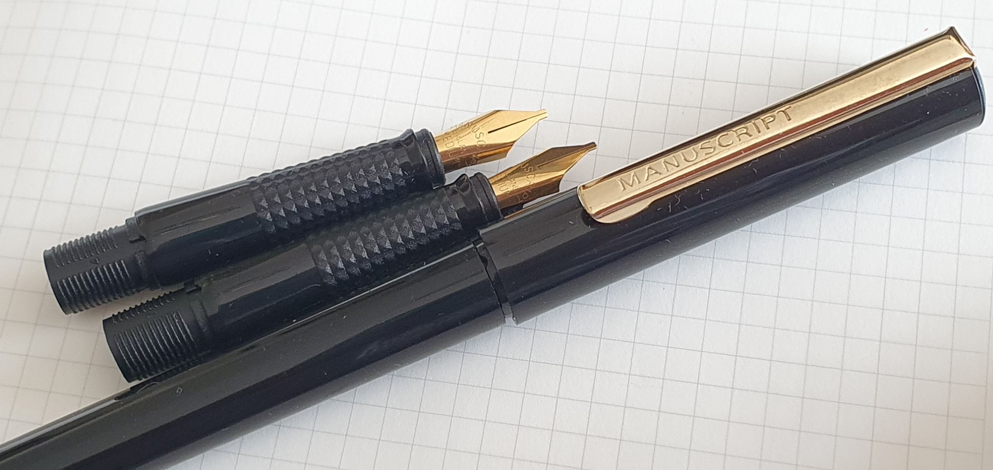
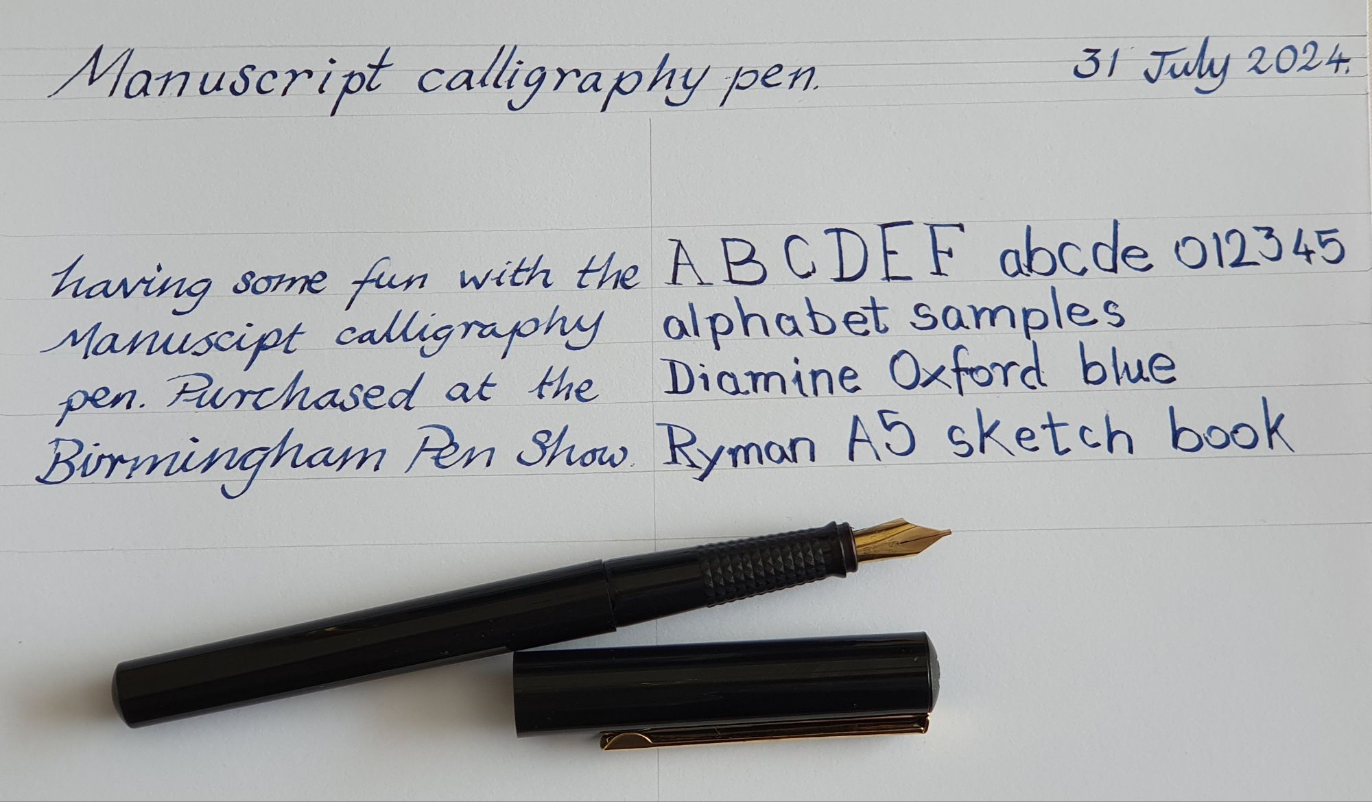
The website for UK Pen Shows promised “lots of vintage pens and new pens from world famous brands, ranging in price from £2.00 to many hundreds of pounds.” Sure enough, I found a table with Manuscript Calligraphy pens at £2.00. Unfortunately I do not recall the sellers’ names. Apparently, the pens been acquired for calligraphy classes at school but were surplus to requirements. The pen I chose was fitted with a Fine italic nib and came with two Medium italic nibs (complete grip sections with nibs and feeds). This was an irresistible bargain but the seller was pleased to clear them out of her cupboards.
Manuscript Calligraphy Pen, with two additional nib units.
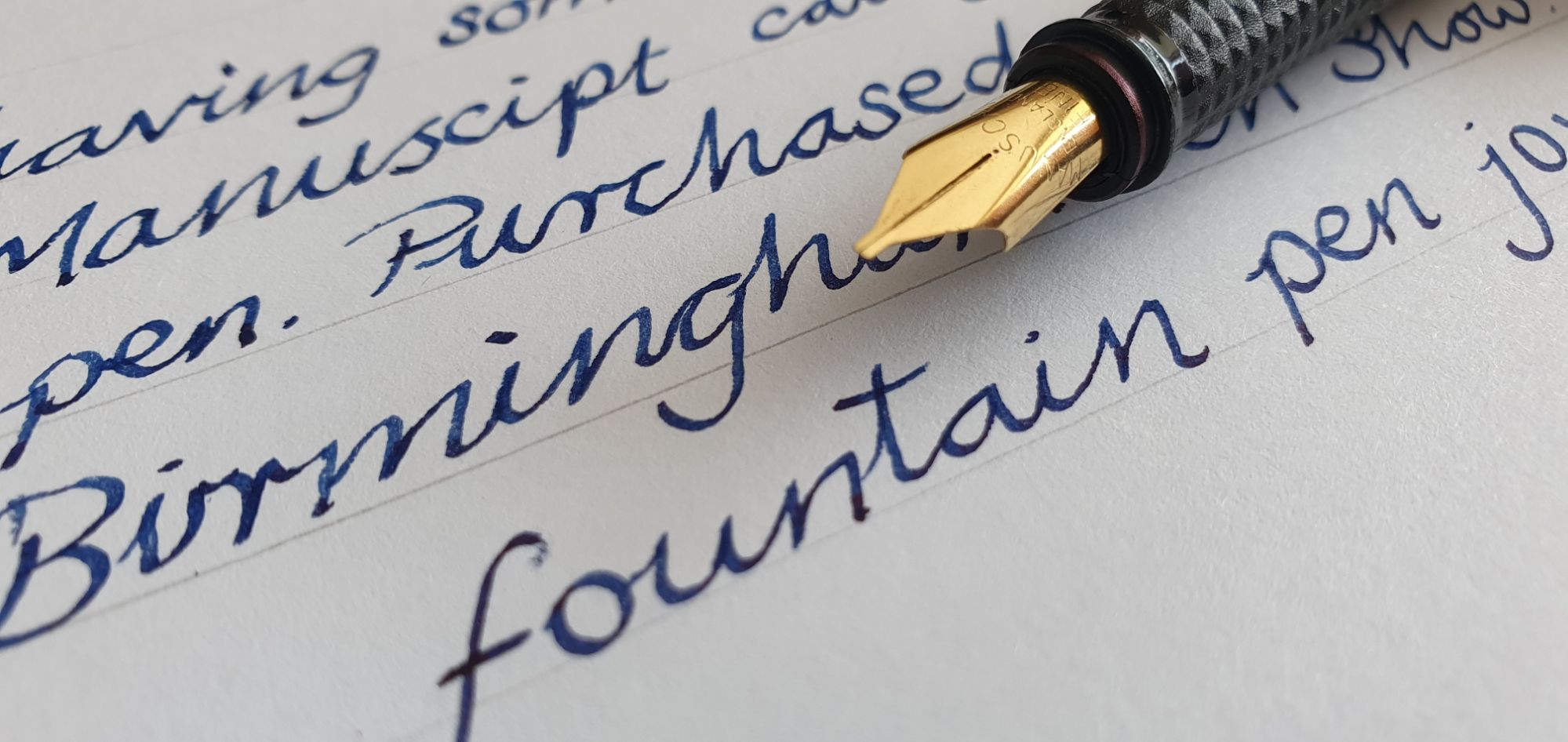
As I came away with a few other pens and inks, it was a few days before I got round to inking the Manuscript. I filled it with Diamine Oxford Blue, using a standard converter that I had already. Otherwise, the pen takes standard international cartridges.
I have had a few Manuscript fountain pens before, with varying degrees of success. They are made in England. This one is a simple cylindrical shape in glossy black plastic with a snap cap and a metal pocket clip bearing the name MANUSCRIPT and plated in a gold colour. The clip is firm and would fit over thick materials if need be. Also the clip is attached at the top of the cap so that the pen will not protrude out of a pocket.
Cap with pocket clip. Two extra nib units.
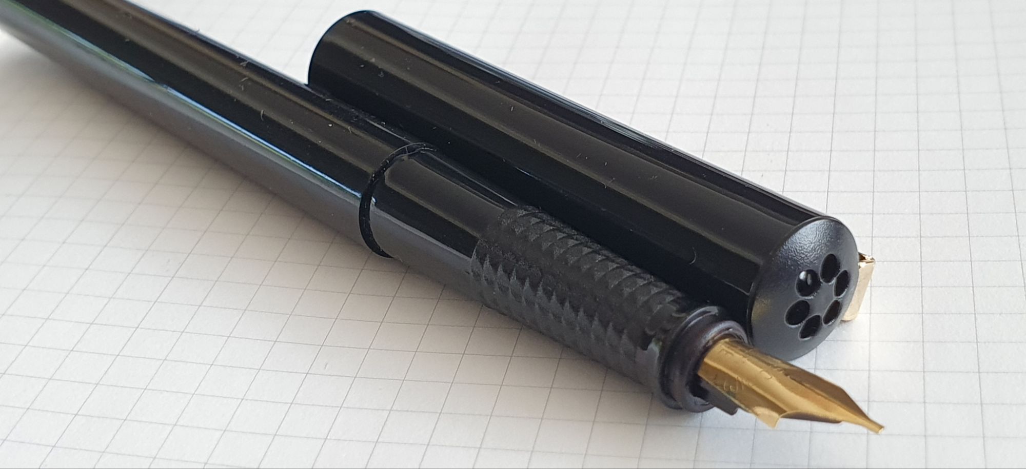
The cap finial is also black plastic and has six holes arranged in a circle, like petals. The cap is not airtight. You can blow air through it and feel it coming out at the other end. Perhaps this is an anti-choking measure for young calligraphers, or else a breather hole to avoid pressure changes to the ink reservoir on capping or uncapping the pen.
Six vents in the cap finial.
This is a smallish pen, at 135mm capped or 123mm uncapped. It weighs just around 13g in all, (8g uncapped and 5g for the cap). The cap can be posted (with a bit of pushing) but then makes the pen very long at 172mm. I prefer to use it unposted. The grip section is on the slender side but is decent enough, with no annoying facets. The knurled section (knobbly bits) provide a secure grip. There is a little flange at the end of the section, to secure the cap firmly with a click.
A Fine italic nib is a lovely thing to have and is a popular choice of fountain pen enthusiasts as it can be used for general writing, adding distinction to one’s handwriting through the natural line width variation between the broad down stroke and fine cross stroke. The broader lines show off the ink colour to good advantage, as well as any shading that the ink provides.
Writing samples. See how I skipped an “r” in Manuscript the second time!
The disadvantage of an italic nib is that the corners of the nib are sharp and can dig in to the paper if you are not careful. Hence it is necessary to write slowly. But slowing down is perhaps the single most effective step in improving one’s handwriting: the benefits are
allowing the nib to be kept in the same orientation with the sweet spot flat on the paper to avoid catching;
more time to form each letter correctly, paying attention to keeping the loops open, keeping to the row guides, keeping ascenders and descenders parallel, keeping letter height (the “x height”) consistent, keeping spaces between words consistent and
writing at an even, measured pace, not in fast and slow bursts, but at rate which allows time to think what you are going to write next, to avoid mistakes (particularly in skipping or adding pen strokes) and also remembering the other tips to improve neatness and legibility above.
Thinking of all these things as you write with a pen, is a form of mindfulness, the practice of which calms the mind. You may also think about your posture (are you sitting with your back straight, not hunched?) and your breathing.
I do not profess to be a calligrapher but I do believe that in general, we write better with a fountain pen. A calligraphy pen such as this one may “help you to create beautiful writing” (as the box proclaims) and may also help you to relax in the process. For just £2.00 this was a no-brainer but even at full price, a calligraphy pen is a useful addition to your kit.
In recent weeks we have witnessed the disappearance of another well-loved chain of shops from our high streets and shopping malls. Now the UK’s Paperchase stationery stores have closed.
This means the loss of 106 stores, 28 concession stands (in shops such as Next and Selfridges) and the loss of some 820 jobs. As well as being a familiar presence in the shopping centres, there were Paperchase shops at some railway stations too.
At the eleventh hour, the supermarket giant Tesco stepped in and acquired the Paperchase brand. It remains to be seen what they will do with it. The Paperchase shops are gone. If you click on Paperchase’s web site, you are now diverted to Tesco and greeted with a message that Paperchase online and UK Paperchase stores are now closed and that “we look forward to bringing this well loved brand to Tesco.”
Paperchase was founded in 1968 and grew to be a familiar sight, along with stationers Rymans and WHSmiths. The branches were not all identical but were bright and inviting to browse in, featuring a large selection of greeting cards, shelves offering numerous styles of notebooks in all shapes and sizes, tables of toys and novelty products appealing to children, loads of stationery accessories, pots of colourful pens and, in some stores, displays of fountain pens in glass cabinets. These might included Parker, Cross and Kaweco and a few others although generally none too expensive for an impulse buy.
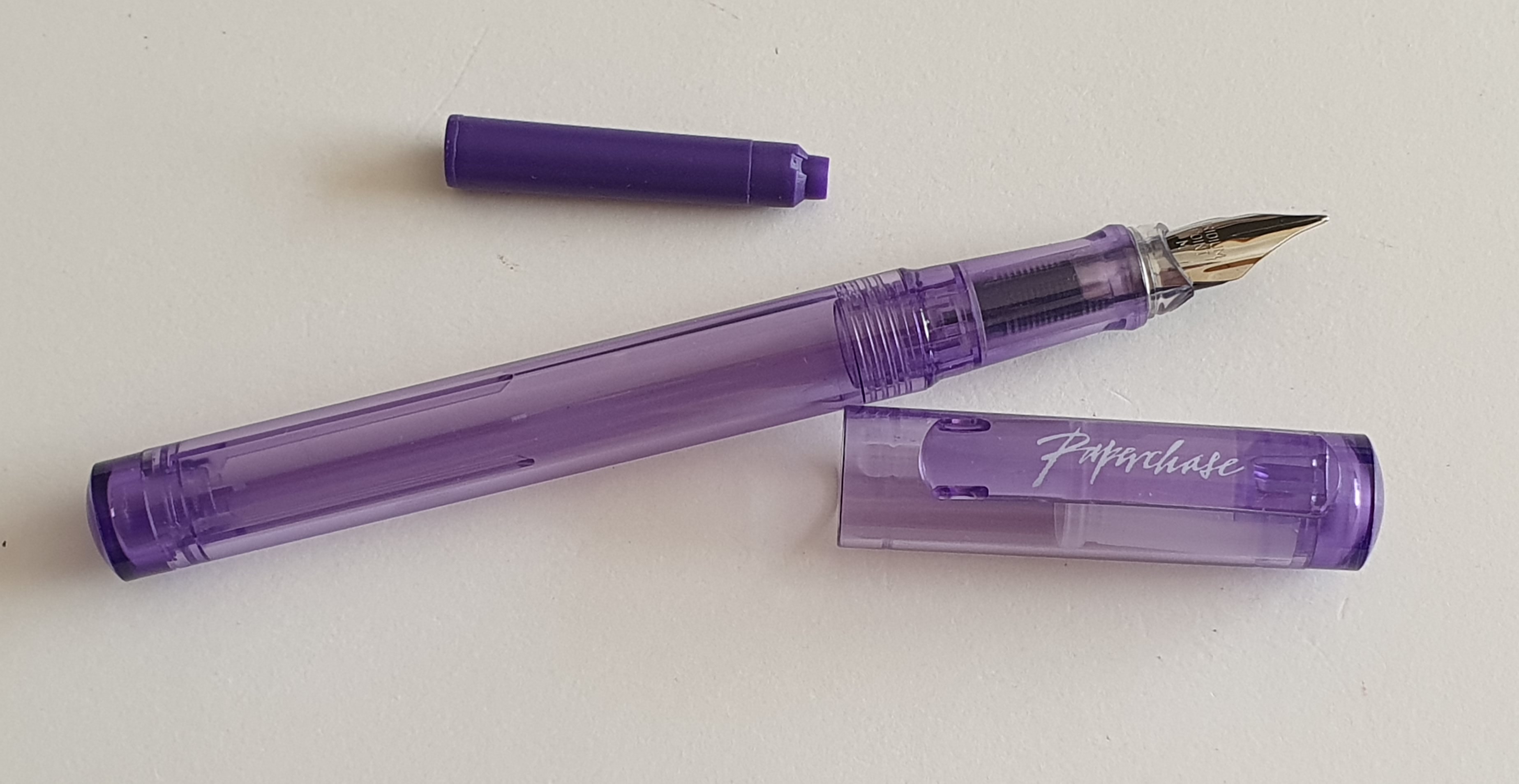
The Paperchase logo on the back of a journal.
Over the years, I visited Paperchase a lot. If my wife and I came across a Paperchase we would pop in for a look round and often buy something.
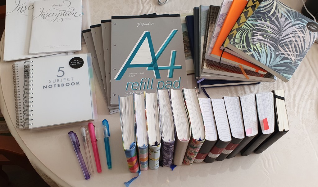
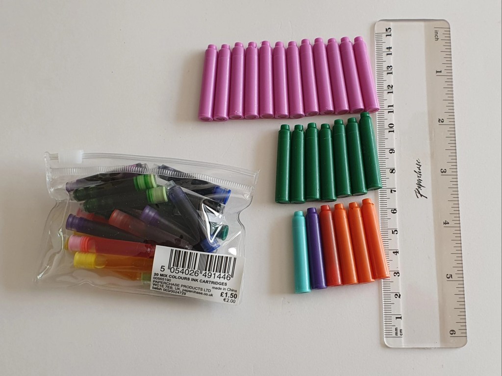
Today, looking around my writing space (aka the dining room) I rounded up just some of the products that had come from Paperchase, for a team photo. These ranged from packets of standard international cartridges in a variety pack (I seem to remember that they had once cost £2.50 for a bag of 50), through literally dozens of notebooks, pads of writing paper and file paper, to a few memorable pen purchases.
A quick round up of just some of my Paperchase purchases over the years.
If you chose a fountain pen from the display cabinet, the staff often struggled to locate the box. My favourite Paperchase story (told here before) is of once buying a handsome Cross Century II fountain pen in black with a chrome cap, at the price marked on the display. Several months later, I was in the same shop and saw the matching Cross ball pen and asked to buy it. This time, they were unable to find the box and its code in order to sell it. Eventually, it transpired that it could be sold only as part of a set with the fountain pen. After proving that I had bought the fountain pen already, they agreed that the ball pen was mine too!
Loose cartridges from my first variety pack. I have a lot of pinks left.
I remember where I was when I bought my first Kaweco Perkeo: it was the Paperchase shop in St Peter Port, Guernsey. The pen was a success and I later stocked up on about five more, in various colours. This pre-dated my same behaviour with the Cross Bailey Light, although those were not from Paperchase.
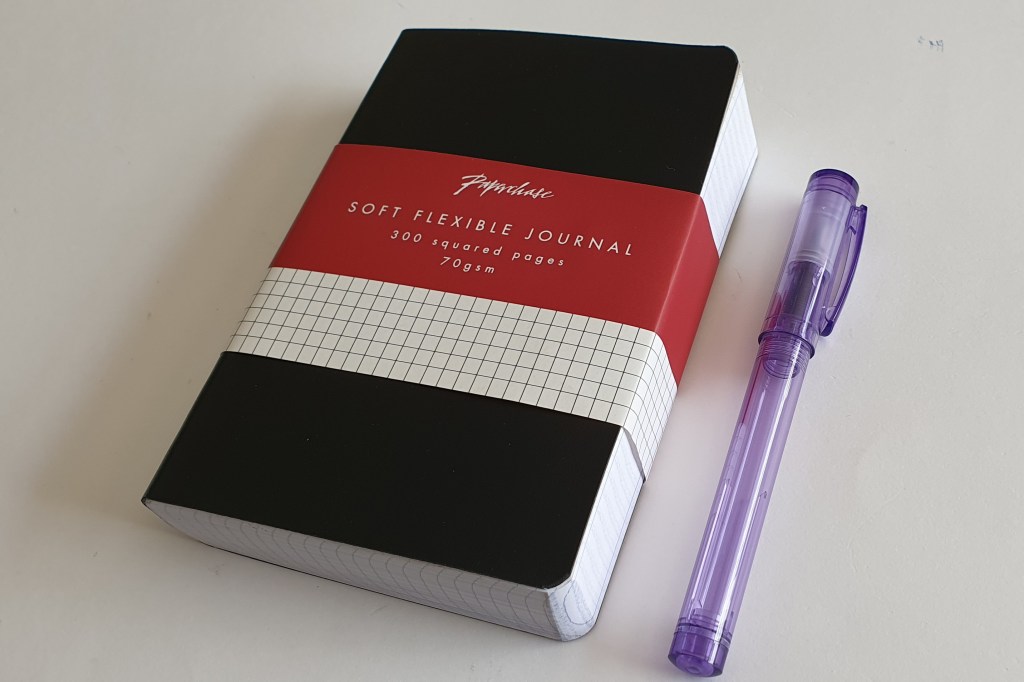
However, my greatest dependence on Paperchase, was for notebooks and journals. I remember discovering the little chunky black A6 journals with a staggering 600 pages of squared, fountain pen friendly paper. I bought a couple of those and was sorry when on a later visit, they seemed to have ceased selling them. But then I later found them back in stock again a year or two later, I binged on another three! They were great, such as for jotting down trivia when watching tv or listening to music online. They would last for ages.
One of my favourite Paperchase products. Actually 600 pages.
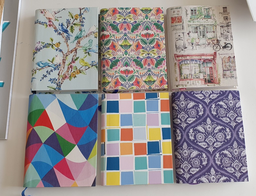
Paperchase had a wide choice of journals. Some had paper that was not fountain pen friendly. I liked the A6 flexi-covered books, nicely stitched, with 320 pages of either lined paper (8mm line spacing) or plain paper, both of which were great for fountain pens. They were usually £8.00 each and occasionally reduced in a sale. I tended to buy more than I needed (an understatement).
Paperchase A6 journals, of various designs.
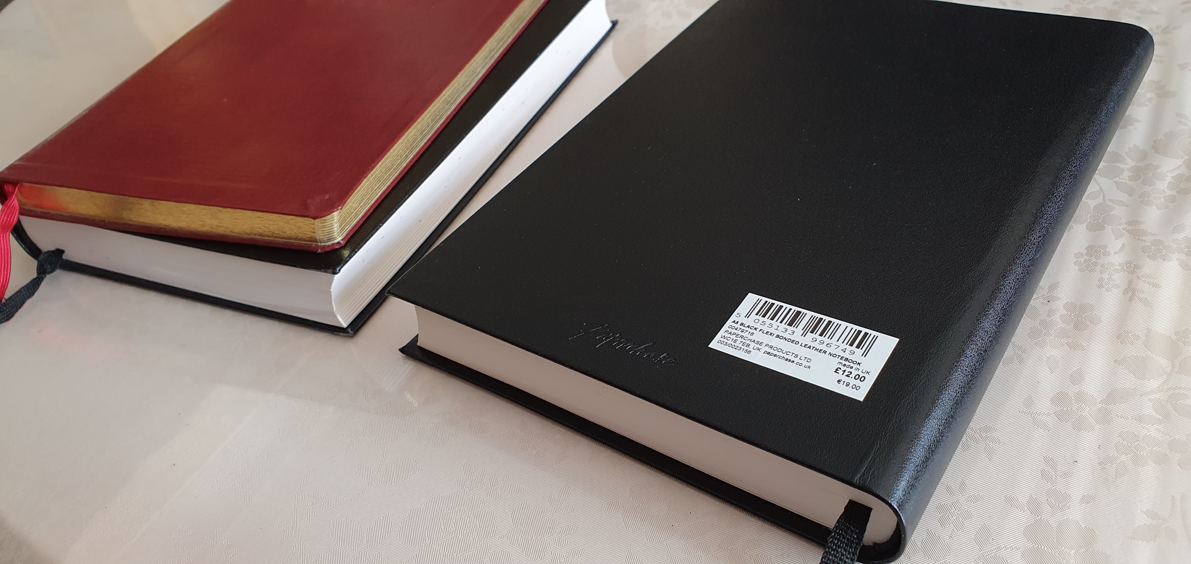
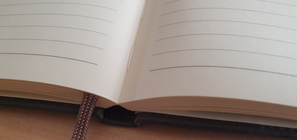
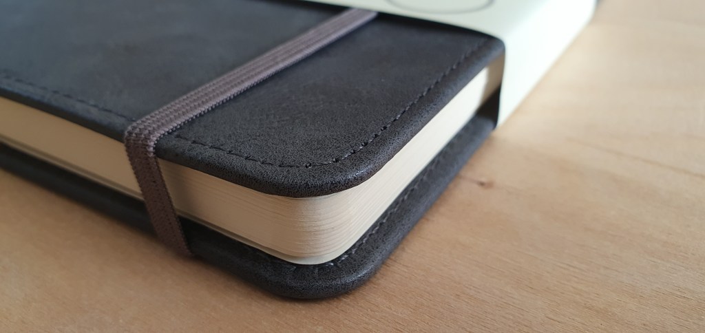
For larger, A5 journals, Paperchase once sold journals with bonded black leather covers, with 384 pages of smooth, lined paper, with a generous 10mm row height. I used these for more lasting projects, such as memories of my school days and would enjoy writing in these with various fountain pens and inks.
A few of the more luxurious, bonded leather covered journals.
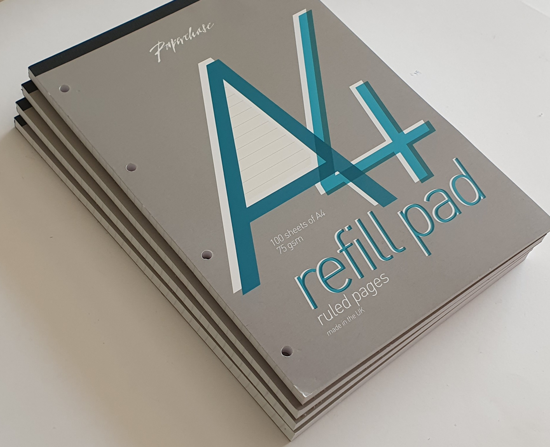
Paperchase also had an online service, although I did not use it as I was well served with branches in London. But I did make use of their loyalty card. If presented when making a purchase, you would be given an offer with your receipt, for a discount on your next purchase, subject to various conditions. I once bought some pads of file paper, only to be told that there was nothing to pay as it was all covered by accrued benefits. I was very fond of their pads of file paper, which I use at home and at work. Not only was the paper of good quality but also, the pages could be torn off the pad easily without ripping the paper, unlike some I have used.
Paperchase pads of white A4 file paper. They also had yellow paper.
The final months of Paperchase’s departure have been sad to see. I visited the branch in Windsor and bought a few more pads of file paper. The staff had just heard the news of the closures and did not know what the future held for them.
I was at the O2 Centre in Swiss Cottage when I saw the massive black-on-yellow posters in the shop window, announcing the closing down sale. I went in to look round, but most of the stock had gone. What was left was all discounted and it was unclear what the final price would be. I picked up a few small items, such as Lamy ball pen M16 refill, marked at £3.75 but which came to only fifty pence when rung on the till. Similarly, a clear plastic ruler was only a few pence.
One of Paperchase’s occasional, own-brand cartridge pens.
On visiting Bracknell recently, and also Southampton, the Paperchase stores were dark with their shutters down. I almost took a photo of the sad looking shop fronts, but it seemed like gloating.
I have been sorry to see Paperchase go. I will miss them. I read that the company had suffered years of plummeting sales and soaring costs and was a victim of the Covid lockdowns and the growing shift to online shopping.
But we had many good years. I will wait to see what becomes of Tesco’s involvement. If some of the better notebooks and journals can be offered through Tesco’s many stores, this will be some consolation.
Our local WH Smith stationery shop in Brent Cross shopping centre has had another revamp recently and is looking a bit more inviting and spacious as you enter. Whilst browsing, and after circling the racks of roller-balls and fine-liners to check out the fountain pens (mostly Lamy, Parker and Sheaffer), I ventured on to the shelves of journals.
My eyes were drawn to their Moderno B5 notebook, with 96 ruled ivory sheets (192 pages) of 80gsm paper. It has the ubiquitous inside back pocket and an elastic closure.
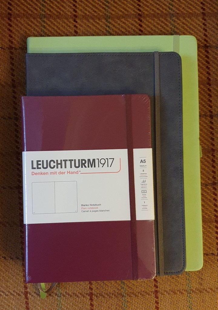
Moderno B5 journal, next to an A5 Leuchtturm for size comparison.
I did not have any immediate need of a notebook (an understatement, tbh) but was nevertheless tempted by this one, mainly I think due to the interesting B5 size which sits as a nice compromise between A4 and A5. I had no idea whether the paper would be fountain pen friendly or not (which is partly why I am writing this brief review: spoiler alert – yes it is) but found myself making my way to the self-service checkouts to part with £11.99. The lure of a new journal is a strong one.
The notebook has a pleasing grey plastic leather-look cover. I do not yet know whether this plastic will crack and flake in the long term. The book is stitched. The lyrics of Paul Simon pop into my head – every page is neatly bound, “for a poet and a one-man band”, or something.
Nice strong open-flat binding.
Getting it home, I could examine the features more closely:
96 ruled ivory sheets; (not paginated but I do that myself);
80gsm paper;
rounded corners;
inside back pocket;
elastic closure: (a bit slack but usable);
8mm row height; (Yay! my favourite)
29 rows to the page; (close, but not quite a month’s worth of days);
one ribbon bookmark;
produced in China.
One of the first things to be done of course when trying a new notebook, is to test the paper for fountain pen ink. I usually select a handful of pens from my “currently inked” pots and write a line or two with each, to see how the pen feels on the paper, whether it feathers, and crucially whether it bleeds through the paper or shows through too much. I am happy to report that with all the inks I tried, these tests were a success. There was no bleed-through with any of them and very little show-through either.
Plastic leather-look cover in smart charcoal colour and neatly rounded page corners.
In terms of usefulness, a B5 journal is rather nice to have. It could be used as a bullet-journal or “bu-jo”. The only caveat is that with 29 rows to the page, you are a couple of days short of a month (or a few sandwiches short of a picnic) but you could add an extra row at the top and another at the bottom of the page, if this is your chosen use. I have done this before on another book, in which I created a three year bu-jo with a double page spread for each month.
I am not one for stickers and washi-tape but do find a bu-jo very useful. For example, unlike a one year diary, you can insert dates for a future year, or even two or three years ahead, such as car insurance renewal dates, MOT expiry dates, or maturity dates for ISAs or fixed term saving accounts.
A double page spread with 29 rows per page.
Then there are the rest of the pages, not allocated to monthly views, which you can use for all sorts of other things. For example I like to make lists of albums from particular artists, and then tick them off after I have listened to them, – which I find so much more satisfying than track-hopping on Spotify.
Above all, I am pleased that I can use fountain pens with the book. The 8mm row height hits the spot for me. I do not think I will use this one for a bu-jo as I am already set up for that, but I shall enjoy having it in stock until a suitable function presents itself. I realise that one should have a NEED of a notebook before buying one, not the other way round, but such is the life of a stationery addict.
My notebooks fall into two broad categories: those which I would want to keep once they are full, and those which I would not (which are typically full of pen and ink samplings and notes of no lasting interest). Having a book which has a durable cover would tend to indicate that it should be used as a “keeper”. In the past I used a Ryman A4 journal as a bu-jo but after several years’ service, the cover material is now flaking off and leaving bits everywhere on my table. If planning to use a notebook for a multi-year bu-jo, then it is wise to consider how the cover might wear.
The B5 size has the advantage of giving you more space on the page than an A5 journal, (of which I use a lot of Leuchtturms) whilst not needing as much space in a bag as an A4 if you wished to take it out and about, to do some writing in a coffee shop, as I like to imagine myself doing, but have not done much of late.
When I next need a B5 journal, which is suitable for fountain pens, I will be ready.
This picture might be more useful, to show the B5 size, in between an A5 and an A4 notebook.
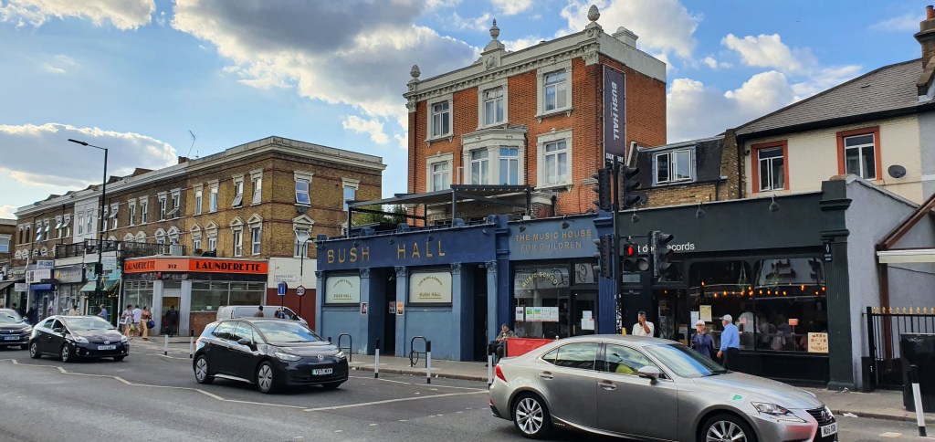
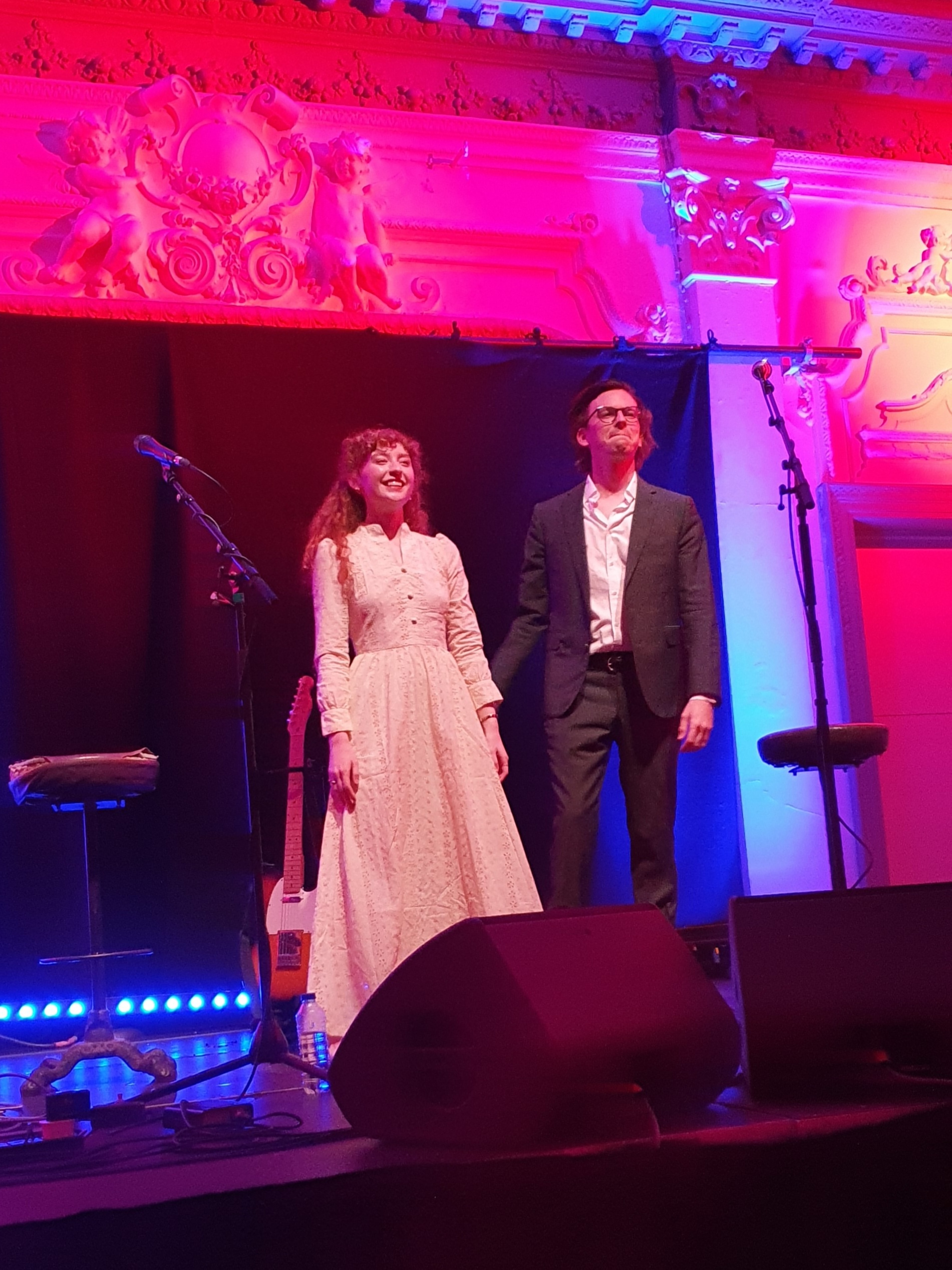
Although this blog is usually about fountain pens, today’s post is off-topic, to reflect on an excellent gig at London’s Bush Hall in Shepherds Bush, on Friday 15 July 2022. This was the first of a seven date UK tour and was also the first performance of this new duo to a live audience.
Joshua is well-known from YouTube as one half of the duo The Other Favorites, with Carson McKee. His videos have seen him collaborate with numerous other talented musicians, including Allison Young whose own work includes singing with the Post Modern Jukebox band.
I have raved in this blog before about The Other Favorites (An evening with The Other Favorites, and Another evening with The Other Favorites: this time it’s virtual). I continue to do so, to anyone who will listen. It is hard to think of any other musician as versatile as Josh, not only as a multi-instrumentalist but in crossing pretty much every musical genre, plus being a song-writer and having the IT skills to produce and promote his work.
My wife and I arrived unfashionably early at the venue. The doors were still shut and there was no-one about. A passing couple stopped to look at the poster of Joshua and Allison on the front door, and asked us if this was who we had come to see and how we had heard about the event. “What type of music is it, Americana?” This put me on the spot. How do you pigeon-hole Josh Turner who can not only turn his hand to, but excel at so many types of music from pop, rock, country, folk, bluegrass, singer-songwriter, gypsy-jazz, great American songbook standards, and more. I thought of Allison Young, whose videos of songs such as “Crazy” and “Fever” I had seen – and came out with a fumbled response of “Jazz”. “But that’s not a jazz guitar” said my enquirer, pointing to the Spanish guitar in the poster. “No, but he can play any stringed instrument you put in front of him”, I gushed. I hope that they came back and bought tickets.
Bush Hall, Shepherds Bush, London.
As show time drew closer, a decent sized queue built up behind us. Many in the know had gone to the bar next door before the show. We chatted to another couple: Dave had been watching The Other Favorites on Youtube for a considerable time but not made it to a live show before.
With no allocated seating, we were able to pick the front row. It was our first concert since lockdown restrictions were lifted and good to be able to enjoy live music again.
There was a full house later, with extra chairs at the back.
Josh and Allison took to the stage, each holding a guitar. They launched into “Shadows on the Wall”, also the opening song on their recent EP entitled “May 9-12” comprising six tracks written between those dates. Josh told the audience that they had realised as the tour approached, that they did not have many songs, – due in part to not quite believing that the tour would happen. They had recorded new material, not that we would have known they were new, as the songs from the EP blended right in with the rest of the set, as if they had been performing them for years.
What took place was an evening of pure joy and a masterclass in musicianship. The two performers remained on stage together throughout, although a few of the numbers were solo. There were some teething problems with Allison’s mic initially which crackled and popped. Josh paused in playing to give the mic a deft tap, which cured the problem temporarily until it was soon replaced by the sound engineer. Allison appeared not in the least fazed by the episode, which endeared them both to us all the more.
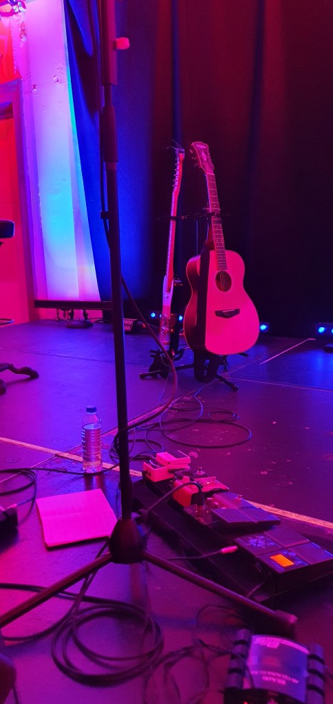
Josh’s finger-style guitar playing always amazes me, in his musicality and confident mastery of the fingerboard – be it on an acoustic or his starburst Fender Telecaster seen in many videos, or his ukulele, all of which featured in the show. There is never a beat missed or note out of place as he uses these instruments to their full potential. (I am thinking here of my own baritone ukulele, and a new mandolin, which would love to be played properly).
Josh’s rig.
Allison’s voice is beautiful and has a timeless warmth and quality which was showcased perfectly on such classics as Hoagy Carmichael’s “Stardust”, or Diana Krall’s “Autumn in New York” as well as “Fever” and “Crazy”. She cites Patsy Cline as a major influence. Her natural charm, expressive movements and the twinkle in her eyes in performing all of these, brought them to life. She also sang and played a few of her own songs not yet recorded, which can be a test for an audience but were well received.
Josh played some songs from his back catalogue. “Nineteen and Aimless” was a song he had written about being nineteen and aimless. He honoured his 93 year old grandmother, in playing an instrumental that he had arranged at her request back when she was only 91, an impressive and foot-tapping rendition of “St Louis Blues” and was the envy of all the wannabe guitarists in the room. But it was his song “Cross-eyed Love” with its rousing speeded up, drop-tuned, gallop at the end, which brought the house down.
Josh and Allison played a guitar instrumental duet on La Valse d’Amelie, Yann Tierson’s “Amelie’s Waltz” from the 2001 French language film Amelie. Josh told us that both he and Allison were fans of the film. This slow piece was one of my wife’s highlights of the night.
I avoided taking photos whilst they were performing.
They played over 20 songs in all. After the encore as the lights came up, two ladies sitting behind us asked how we had heard of the event. I explained that I had seen it online (and jumped on the tickets). They asked me if I played an instrument. I said that I played guitar, or used to think I could! Watching Josh is humbling but I admire these great musicians with so much ability and potential, following their dream.
I looked up Hoagy Carmichael afterwards. On Wikipedia is says that he “was among the first singer-songwriters in the age of mass media to utilise new communication technologies such as television, electronic microphones and sound recording.” Sound like anyone? To this Josh and Allison have harnessed Youtube and Instagram. As Josh put it, social media is not all a hell-hole. Good things come out of too, such as how he and Allison came to “follow” each other, to meet, record videos and the EP and now put together this tour. Josh had made good use of the lockdown to write and record an album and perform some livestream gigs all from his New York apartment. Allison had also been writing.
As I left the theatre, into the sultry warm London night, I had a spring in my step and was still grinning at the joy of the evening and the knowledge that such talent exists in the world.
Edit: 23 July 2022. Below is the setlist (compiled from a combination of my list made during the show, a photo of the list on the stage floor, plus the website Setlist FM.
For our mid-summer break this year my wife, mother-in-law and I spent a week in the woods. This was not camping, but staying in one of the comfortable, self-catering cabins on a site run by Forest Holidays.
Whereas last year we had chosen a location near Winchester, Hampshire, as recounted in my post Travelling with ink: Blackwood Forest, this time we chose the Forest of Dean, Gloucestshire, and also went for a full seven days rather than three. It proved to be a good choice and we had also picked a week of warm sunny weather.
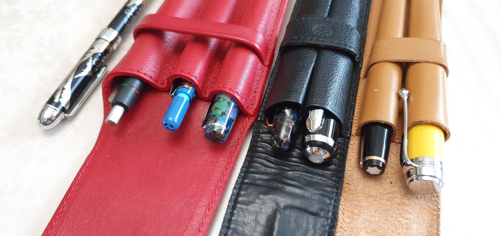
With the happy prospect of having some time to write, I enjoyed picking the line-up for a week away. After much deliberation (or dithering) I settled upon the yellow Aurora Talentum (my most recent pen purchase), a vintage Montblanc 34, Esterbrook Estie, Delike New Moon, and a Duke 552 bamboo barrel pen. Also I brought the Lamy 2000 multi-pen, a Sailor multi-pen/pencil and finally a Pentel 120 A3 0.7mm pencil, making eight writing implements in all.
The 8 writing implements for the trip.
To write on, or in, I brought a fresh Leuchtturm A5 notebook for daily journal writing, another A5 notebook for everything else, one A4 notebook (good for planning and drafting) and finally a small Silvine pocket notebook – which is always handy for jotting down addresses, phone numbers, directions or any notes made while out and about.
The fountain pens were inked with various colours but I decided to bring only one bottle of ink, Pelikan 4001 Konigsblau and so if any of them needed refilling, it would be royal blue or nothing. In the event, I did refill the Talentum mid-week. Whilst I like the Konigsblau, I did notice that the pen seemed to write a little drier and with less lubrication than with the Montblanc Royal Blue that it had started with. But it is useful to have a drier ink sometimes, to compensate for pens that might otherwise write very wet.
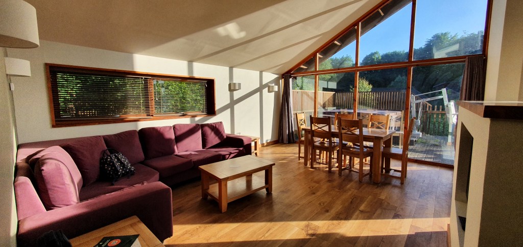
Our cabin was very spacious and slept six people, (as my sister and her family were to join us for part of the week). The open plan sitting/dining room had a large oak table with floor-to-ceiling windows and was a lovely bright place to sit, especially in the early morning when the room was cool. It did become very warm in the afternoons but we were generally out then.
The living area. There is a hot tub (with a chair lift) outside.
From our base, it was about a two-mile walk, through tranquil forest paths, to the stunning views from Symonds Yat rock, looking down on a beautiful section of the Wye Valley.
The Wye Valley, at Symonds Yat.
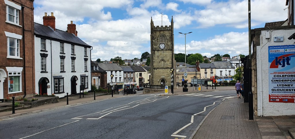
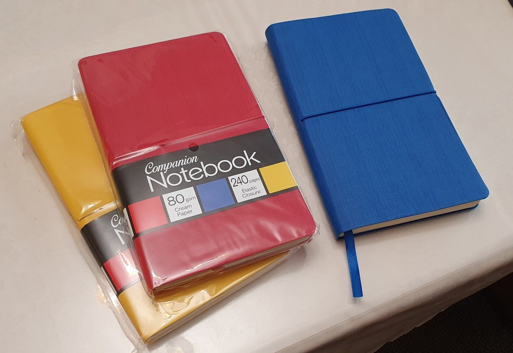
Our nearest small town was Coleford. Here in a local newsagents, I was pleased to find some A5 notebooks called Companion, with nicely textured soft covers in bright colours, and 240 pages of unlined, 80gsm cream paper. I knew of these from purchasing one in blue last year in a post office in Surrey. It turned out to be very pleasing and I wished I had picked up the other colours (red and yellow). Here was the chance to rectify that oversight.
Coleford town centre.
For a larger town, we were about 20 minutes drive from Ross-on-Wye. Whenever visiting another town and exploring the shops I do keep one eye open for any fountain pen shops. It is rare to find one of course, although Ross-on-Wye has a WH Smiths. I had a cursory look at the Fountain Pen section, in particular to see whether they had the newish Parker Vector XL, which I had seen recently in London – not that I would necessarily have bought one, but just as a bit of research. I was not to find one all week.
New notebooks to add to the stash.
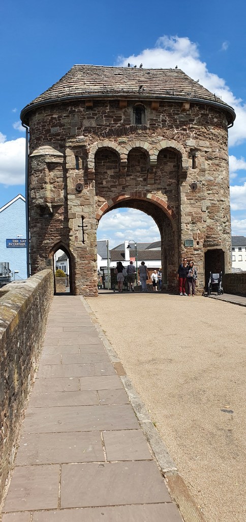
A similar distance drive took us to Monmouth, another pretty and colourful high street, and lined with bunting for the Queen’s platinum jubilee, and with some attractive side streets and river views and plenty of history, although not the best choice for fountain pen shopping.
Monmouth’s famous medieval gate tower, on the Monnow Bridge.
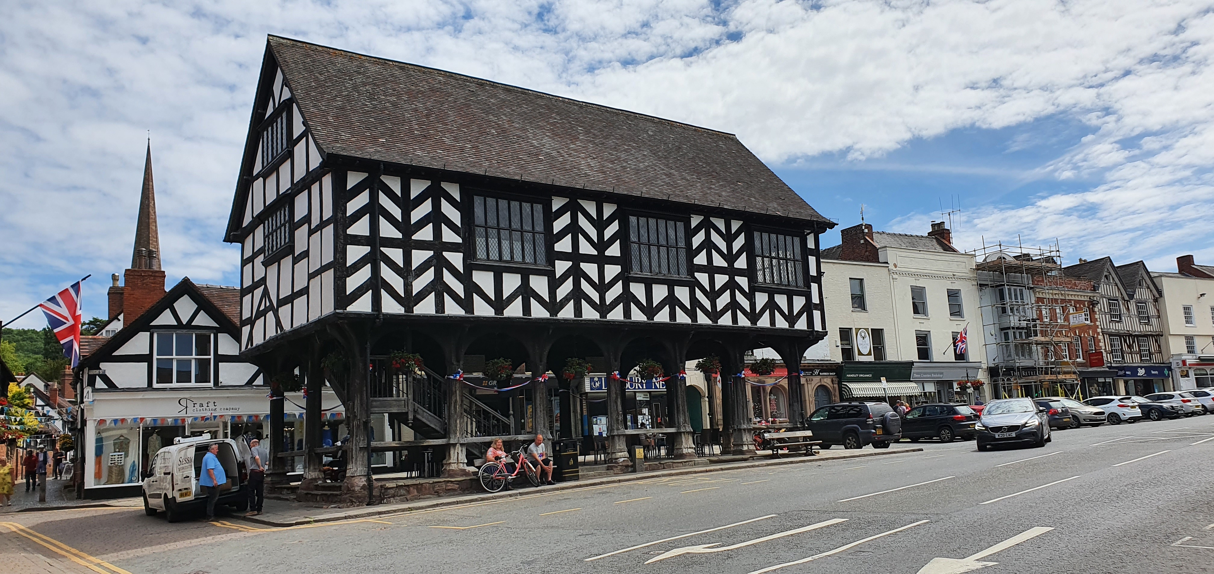
A bit further afield, along scenic country roads, we also spent a day in Ledbury, Herefordshire. This is a very attractive town, famed for its half-timbered buildings and historic market building and some nice independent shops for books and clothes, but I did not find any specialist fountain pen shops in evidence.
Ledbury’s market building.
On our last full day, we visited Tintern Abbey, the impressive ruins of a Cistercian monastery beside the Wye River with wooded hillsides making a picture postcard backdrop. Once there, it seemed silly not to drive on for the short distance to visit Chepstow.
A view inside Tintern Abbey
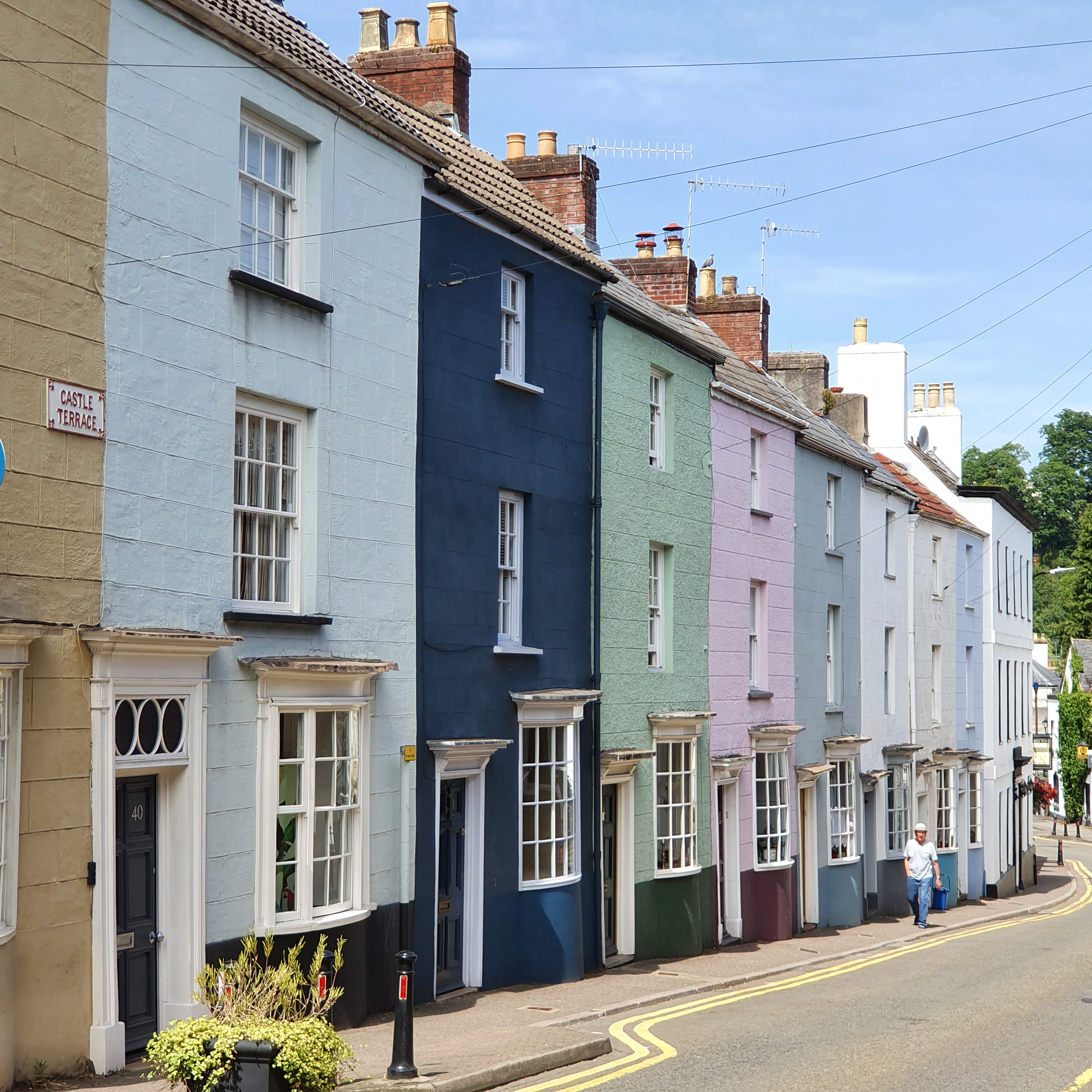
Here, I did find a shop called First Stop Stationery, with displays of Lamy, Schreiber and other pens and a large glass display cabinet for the more expensive pens. On closer inspection, these were from Cross, Parker, Waterman, Sheaffer, Lamy, Pilot, Faber-Castell and possibly some others. Some notable examples were the Waterman Carene, Faber-Castell Ondorro, several pilot Vanishing Points, a smart Lamy Accent in the glossy black with ringed section and even the newly revived Parker 51 gold nib version which I had not previously seen in the flesh although I was not sufficiently tempted to buy one. I did at least buy some Parker cartridges in blue black.
A row of houses on Castle Terrace, Chepstow.
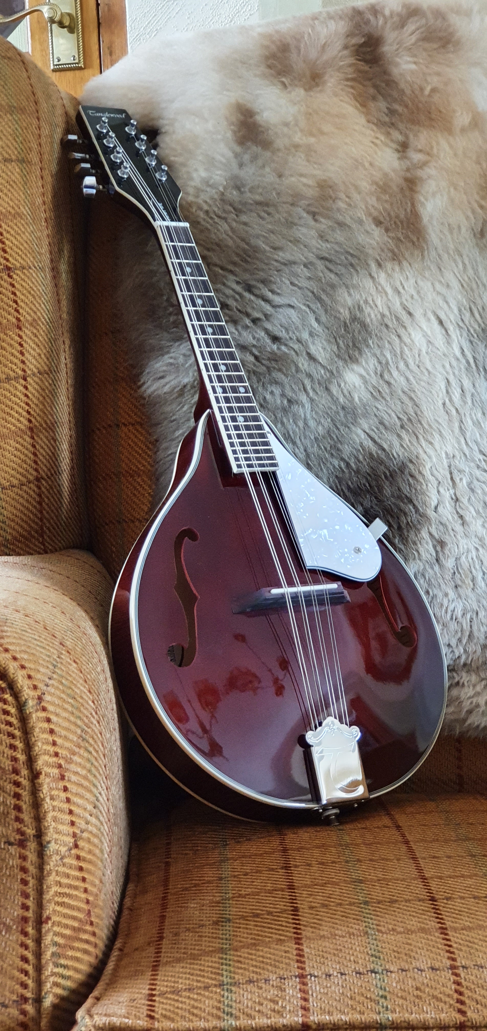
In our final hours of retail therapy, we headed back up to Ross-on-Wye where I had spotted a mandolin a few days earlier, in the window of River Music, in Broad Street. It was still there. I had felt in need of a mandolin, having accidently broken my old one recently when falling off a stool, whilst passing items up to the attic. It had fallen down the stairs, in its soft gig-bag but the neck was broken in two and I adjudged it to be a write-off.
The music shop had a display of ukuleles and a banjolele but it was the Tanglewood mandolin in “Wine red” that tempted me. I am very much a beginner and can play only a few chords, but recently have been captivated watching musicians such as Sierra Hull, Josh Turner, Sam Bush and Chris Thile and whilst they are all in another league, there is a lot of fun to be had from making music, trying to improve and getting to know your way around the fingerboard.
The shop owner told me how he had lowered the action on this instrument, by paring off some wood from the base of the bridge so that the strings sat closer to the neck. He had done a good job, making it much nicer to play, but without overdoing it so that the strings buzzed on the frets. This was a real bonus, rather like buying a fountain pen when the nib has been expertly tuned. At a similar price to an Esterbrook Estie, you get a lot for your money, (although he had me at “Wine red”). And so it was to come home to London with me.
A Tanglewood mandolin in Wine red.
It is probably just as well that there were not more fountain pens shops in this lovely part of the world and I am glad not to have purchased any more. But when a mandolin calls you, somehow nothing else will do.
For those new to the hobby, some of the terminology encountered on fountain pen blogs and forums may seem confusing. Here in a brief introduction, is a bluffer’s guide to get you started or to toss in to conversations with pen enthusiasts over the holiday period. Doubtless there are many others that I have omitted.
Acrylic A transparent thermoplastic often used in pen making. Short for Polymethyl methacrylate. So, plastic then.
Architect A type of nib grind to produce narrow down-strokes and wide cross-strokes, so named as used reputedly by architects in those elegant annotations of technical drawings and plans. The opposite of a stub nib.
Baby’s bottom The shaping and over-polishing of a nib’s tipping material which results in the pen failing to write or skipping.
Barrel Usually the long bit of the pen, that screws onto the section.
Bleedthrough An annoying tendency of ink to soak right through a sheet of paper to the other side, when unfortunate combinations of pen, ink and paper are used.
Bounce A certain softness to a nib, which writes with a spring in its step. Opposite of a nail.
Bricks and mortar A shop/store that you can physically walk into and talk to a human being, as opposed to online shopping.
Broad The next size of nib width after fine and medium.
Bullet proof A term applied to inks that have a high level or water resistance.
Buttery A term applied to certain nibs which are extremely smooth, as in “like a knife through butter.”
Buyer’s remorse An unpleasant sense of regret at having bought a pen, often when expensive and bought in haste and/or when found to be less satisfactory than one you already own costing one tenth of the price.
Currently inked The term conventionally used when providing a list of those of one’s fountain pens which contain ink, at a given time.
Cursive Joined up writing.
Demonstrator A pen which is comprised of a transparent or semi-transparent material through which you may observe the ink sloshing around and the inner workings of your pen.
Dry time The length of time taken for ink to dry on paper to avoid smudging. May also be used to describe a period of abstinence from purchasing additional pens.
Ebonite A brand name for a hard rubber, made from vulcanizing natural rubber, for prolonged periods.
EDC Every Day Carry. A pen that is carried on a daily basis.
Eyedropper A device comprising a tube with a squeezable rubber bulb on the end used to lift ink from a bottle and deposit it into the barrel of a pen. Term also applied to describe pens that fill in this way.
Facets Flat surfaces on a pen, sometimes found on the grip sections of pens intended for novices to aid “correct” placement of the fingers symmetrically either side of the nib. Loathed by those who do not conform to this way of holding a pen, as their fingers rest on uncomfortable sharp ridges. For example, Lamy Safari.
Feed The part of the pen that regulates the supply of ink from the barrel (ink reservoir or cartridge) to the nib. Usually plastic but sometimes Ebonite in older or a few high end fountain pens if you are lucky.
Feedback The sensation of feeling, and sometimes hearing, your nib on the paper surface as you write. Too much of this or too little can be a bad thing. A particular feature of some nibs from Aurora, Montblanc and Sailor.
Finial A decorative feature at the top of a pen cap. Serves to help identify a pen in a Pen cup.
Fire hose A metaphor applied to nibs which write with an over enthusiastic flow of ink.
Forgiving A nib which will still allow you to write when the nib is at less than the ideal angle to the paper.
Fountain pen friendly Paper which can be used enjoyably for fountain pens, having a pleasant writing surface and a resistance to bleedthrough. Not paper which is too shiny or coated, or which is too rough textured.
Ghosting When you can see one page of writing from the opposite side. Also called showthrough. Not as bad as bleedthrough but may sometimes be bad enough to limit use to one side of the paper.
Girthy Having a wide diameter. Typically applied to the grip section or barrel of a pen.
Grail Term used to describe, typically, an extremely desirable high end pen that owing to its price or rarity is almost unobtainable.
Grind A reshaping of a nib to create a different writing experience and line from its original design.
Gusher A nib that emits an excessive amount of ink; see also Fire hose.
Hard start The frustrating tendency of some pens not to write immediately when required, after an interval in use of a few days.
Homage A polite term for a pen that is a blatant copy of a respected pen design from a different manufacturer. A euphemism.
In the wild The natural habitat of fountain pens not yet in your own household. Where you might hope to encounter a pen, hitherto seen only on the internet.
Inner cap Usually plastic; an interior layer inside the pen cap to create an air tight seal around the nib when the pen is capped, to prevent ink evaporation, nib dry out and hard starts.
Italic A slanting style of writing.
Lefty A person who is left handed.
Line variation The attractive quality of writing which exhibits both narrow and broad strokes, achieved either by using a flex nib and applying pressure on the down strokes or by using a stub or architect grind nib and keeping the nib at a constant angle as you form the letters.
Loupe A magnifying lens, usually of higher magnification than a typical magnifying glass and sometimes illuminated, used by jewellers and watchmakers but also essential for inspecting the nib.
Medium A good comprise between a fine and a broad nib. Suits average writing size. Note that in some Japanese pens, a medium nib may equate to a western fine.
Micromeshe Abrasive pads for smoothing nibs.
Nail A metaphor for a very stiff nib with no bounce or flex.
New Pen Day A term often used to announce an additional fountain pen acquisition on social media.
Nibliography A term believed to be first attributed to Jon of Pensharing.com to describe a list of pens and inks used in a handwritten letter.
Nibmeister A person highly revered in the fountain pen community who is skilled in the craft of altering or repairing a nib.
Oblique A nib in which the tip is cut at an angle, usually at 15 degrees, typically from top right to lower left.
Overwriter One who writes with a pen held above the line on which he is writing, with the nib pointing towards himself.
Pen cup A receptacle to hold the “Currently inked” fountain pens in a vertical position with nibs upwards.
Pen loop A device to hold a pen attached to a notebook or notebook cover, usually made of elastic or leather.
Piston A type of filling mechanism. A plunger which is lowered to expel air from the ink reservoir and then raised to draw ink up from a bottle by vacuum. Most converters also work in this way.
Post Verb, to attach the pen cap to the back end of the barrel, to add length and weight to a pen whilst writing and for safe stowage. Noun: an article written on a blog or verb, to publish such an article.
Precious resin: The material from which many Montblanc fountain pens are made.
PVD Physical Vapour Deposition: a type of coating applied to nibs or other furnishings of a pen.
Rhodium A silver coloured metallic element, highly reflective and resistant to corrosion. Sometimes used to coat nibs and furnishings of a pen.
Roll stop A protrusion on a cylindrical pen to prevent it from rolling off a surface.
Safari A model of fountain pen made by Lamy and often used for size comparison photographs of other pens.
Saturation A quality used to describe ink. Highly saturated inks have a high purity of colour.
Section The part of the pen that you grip. Also called the grip section.
Shading A pleasing quality in an ink, to produce light and dark tones, caused by ink pooling in the indentations formed by applying pressure to the paper.
Sheen A quality of some inks to appear a different colour from different angles. For example a blue ink might exhibit a red sheen.
Shellac A natural resin, which was used to form a glued seal in the making of some fountain pens.
Shimmer A sparkling quality in ink.
Shims Brass sheets of various thickness which are very useful for cleaning and adjusting nibs.
Showthrough When the writing on one side of a page is obtrusively visible on the other side. See also ghosting.
Sidewriter A person, typically left handed, who writes with his hand moving along from the side of the page rather than from below the line of writing (Underwriter) or above it (Overwriter).
Silicone grease A lubricant and seal against ink leakage. Also used by scuba divers and hence available in diving shops. Particularly useful for eyedropper pens.
Skip The frustrating tendency of a pen to move across paper without laying down ink.
Stealth Term applied to an all black pen with a matte finish, after the aircraft designed to evade detection by radar.
Step The difference between the level of the barrel and the section of a pen, sometimes creating a sharp ridge which may be uncomfortable.
Stingy Mean or ungenerous. Term used to refer to nibs which write on the dry side, causing reduced lubrication of the nib on the paper and a less enjoyable writing experience.
Stub A nib shape which produces broad down strokes and narrow side strokes. Often expressed in millimetres for the broadest strokes, such as 1.1mm, 1.4mm etc.
Sumgai The unknown person who gets the best deals at a pen show.
Sweetspot The part of the nib which when held to the paper at the optimum angle provides the smoothest writing experience.
Tine gap The narrow space between the tines of a nib. Usually narrowing from the breather hole towards the tip. The gap down which ink is drawn as the pen writes.
Tines The two sides of a nib, separated by the nib slit or tine gap.
Tipping A pellet of hardwearing material applied to the end of the tines and then shaped and polished to form the writing surface.
Tomoe River A brand of fountain pen friendly paper from Japan, a favourite of many fountain pen users.
Tooth An ability of a pen to provide a degree of feedback from the paper surface and to write even on shiny coated papers.
Underwriter One who writes with his pen below the line of writing and with the nib pointing away from himself. A fortunate person for whom fountain pens behave better and exhibit smoother writing.
Wish list A list of pens that one is thinking of buying and craves, instead of focusing on those which he already owns. An aid to deciding whether to splurge on one particular pen or another.
Workhorse An unglamorous pen that is used day in day out for general purposes and menial tasks.
So there you have it. There are probably lots of terms that I missed, as I only thought of this today. Any errors are purely my own and may be corrected in future editions.
Well, that wasn’t too terrible. Being confronted with my own greed and folly was never going to be comfortable. But it was not as bad as I feared.
During the week I took part in Anthony’s online survey of the pen community, on UK Fountain pens. One of the multiple choice questions was how many bottles of ink you have. I honestly did not know and had not counted but suspected it might be nudging past the hundred mark. I resolved to find out.
I used to own only a few bottles of ink, Parker Quink generally. Getting through a whole bottle of ink takes time, particularly if you often use cartridges instead. Assuming, very roughly, that a 50ml bottle might give you fifty fills and that each fill would last you for, say 20 pages of A4 writing, that is 1,000 pages. Fortunately most bottled ink keeps well. The exception, ironically, is iron gall ink which needs to be used up within around 18 months of opening the bottle, or else it loses its colour and darkening properties.
I have a couple of old bottles of Monbtblanc ink, still in their boxes with a price sticker saying £4.95. Now they cost about £18.00 I think.
It was perhaps around 2014 that things escalated with my fountain pen hobby getting hooked on pen reviews on the internet. That was the first year in which I attended the London Pen Show, coming away with a TSWBI Vac 700 and a bottle of Omas blue ink. Should I have stopped there? In November 2016 this blog was launched to share the journey.
Since then I have been adding steadily to the fountain pen stash and accumulating a fair amount of ink along the way. I was curious to see quite how bad it had become.
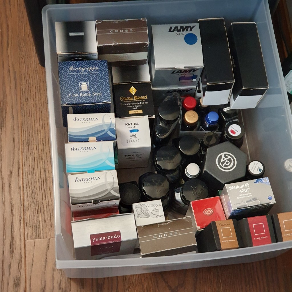
A couple of years back I bought a plastic storage unit, with four nice deep drawers for my stationery stash. The top drawer has some accessories, like pen wraps and pouches, micromesh kit, some dip pens and a few boxed pens. The second drawer is my stock of unused journals, mostly A5 size but with a few smaller ones. And then the third and fourth drawer down are for ink. That is not to say that all of my ink is in these drawers: some frequently used bottles are on my desk (AKA the dining table) and others on the book shelves behind me.
The bottom drawer
It was not difficult to do a stock take. They are all in one room, (except for an emergency bottle of Cross black which lives in my desk drawer at work).
I created a spreadsheet, with columns for the Brand, the Colour or name, and finally, a simple name for the group which that colour falls into (for example Graf von Faber-Castell Cobalt Blue, Waterman Serenity Blue and KWZ Azure number 4 all come under “Blue”).
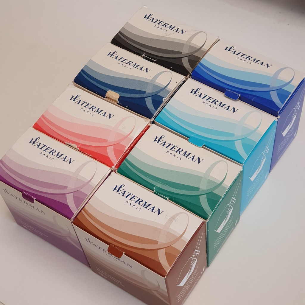
It was interesting (to me at least) to see them sorted by brands too and which were the most represented brands in my stash. It turns out to be Montblanc with nine bottles, closely followed by Waterman with eight and then Pelikan Edelstein with five (mostly gleaned from the annual Pelikan Hub events).
These should cover most eventualities for a normal person.
My final tally came to 65 bottles. As I was expecting it to be around one hundred I was pleasantly surprised. So I have enough ink for 65 years and not 100! Phew!
By colour group, it came as no surprise to me that I had 16 bottles of blue ink plus another 11 of blue black, almost enough to form a Democrat government. Next were 8 browns, 7 blacks and 7 greens, 6 reds, 3 pinks (What?!) 2 Burgundies, 2 green-blacks, and finally 1 each of Magenta, Purple and Orange.
What lessons can I learn from this?
I need no more ink for a while;
It is good to know what you have;
I have been buying ink faster than I have been using it.
I have not included a stash of ink cartridges in this count. Nor have I included a half dozen or so ink samples which are not in original bottles.
It is satisfying to finish a bottle ink. Last week I came to the end of a very enjoyable bottle of Pilot Iroshizuku Shin-kai blue black which I had been given by a friend. Once it got down to the last 5ml or so, I decanted it to my Pineider Travelling Inkwell, so that I could go on filling my Diplomat Excellence easily, without wasting a drop.
For anyone in a similar boat who has put off counting, I recommend it. It might not be as bad as you think.
Who doesn’t love a mechanical pencil? I already have several but could not resist this one when it was less than half price in our local Rymans.
Recently, I have been enjoying a revitalised enthusiasm for photography, prompted by the acquisition of a new Nikon Coolpix A900. New camera day! I was attracted by a host of exciting features, particularly the articulated screen, the ability to shoot macro from 1cm, a massive x35 optical zoom with Vibration Reduction, (Nikon’s anti-shake), 4K video, 20 million pixels, Wi-Fi connectivity and many more. It was some years since I last bought a new camera, if you do not include mobile phones and things have move on a lot in that time.
There are a few things that it doesn’t have, such as the ability to shoot in RAW, or a touch screen, which I decided that I could live without. Exposure compensation settings are readily to hand, as are white balance settings and colour adjustment. It is wonderful to be able to have white paper looking white, even if taken under artificial light in the depths of winter.
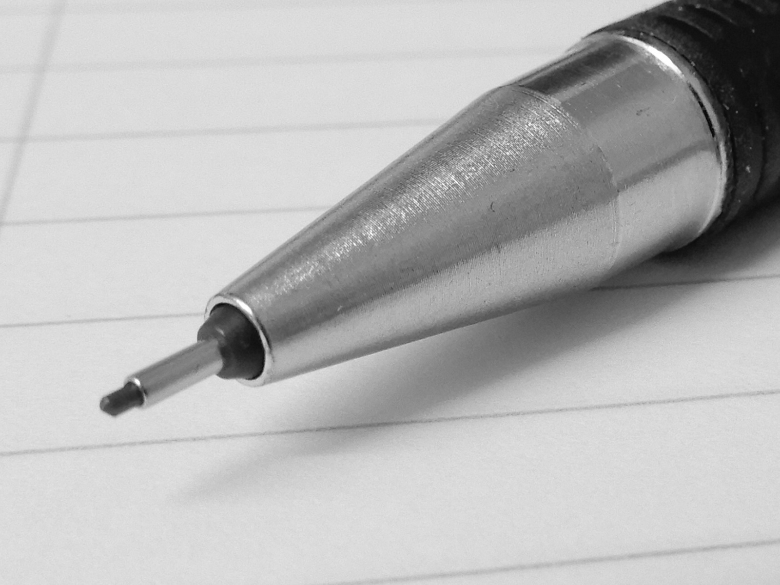
It is the ability to take macro shots with such ease, that I have found most exciting. Even hand-held shots seem acceptably sharp but with a small tripod, combined with a two second self-timer delay setting it is better still. Here is my new pencil again.
Getting up close with the Staedtler mars 0.7mm mechanical pencil.
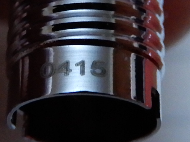
Here is the production date stamp on the elegant black and chrome guilloche Cross Century II fountain pen:
Date stamp on the collar of a Cross Century II fountain pen.
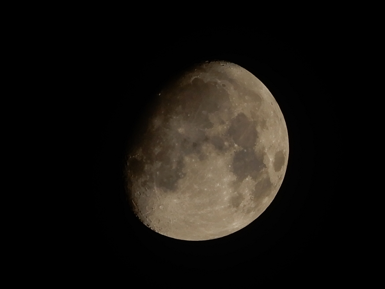
Obviously it is tempting to try the other extreme and see how the telephoto performs. I tried a quick shot of the moon, with a manual exposure and a few stops of under exposure. This was the result:
The moon over London. The farthest subject that I have photographed so far.
Finally, one of the subjects that I wanted to photograph better, was paper. Not ideal with a mobile phone. I wanted to be able to capture the texture that you see, particularly under high magnification and with a low wintry sun slanting in to add contrast to the ups and downs of the paper surface. I shall continue experimenting with this but am always impressed and appreciative of the professional looking close-up photography that I see on fellow bloggers’ sites. Working during the week, there is limited time to enjoy the daylight hours at this time of year but sometimes it all comes together with a bit of sunlight at the weekend. Here was one of my early efforts. I used to think that Paperchase soft flexi notebooks had very smooth paper but under high magnification, the surface looks more like a newly plastered wall. Most of my fountain pens love it.
Paperchase note book. Conklin Mark Twain Crescent Filler, with Jinhao X450 medium nib and Aurora Blue Black ink.