This pen came to my attention through reading a post on Margana’s “An Inkophile’s Blog” on 9 February 2022, entitled 20 Refills Without Cleaning My Pen. I was impressed, also in that she had found a relatively modest fountain pen that she liked using so much that she had used it every day for 6 months and written 200 pages with it.
I tracked down the pen in question on Amazon and ordered one immediately, such was the persuasive force of reading Margana’s blog post. It took a bit of searching on the web site, as the pen seems to be attributed to Majohn, Langxivi and Delike. I have not worked out quite what the connection is between brands. Also the pen is available in a few different colours and with either a “bent” nib or a regular one. I particularly wanted to try the bent nib version and went for the marbled green colour, with silver trim. The seller was JianHang Office and the price, £21.49 plus £3.00 postage from China.
I was delighted when it arrived, considerably earlier than estimated and just as my wife and I were about to depart for a weekend hotel break in Old Windsor.
Description.
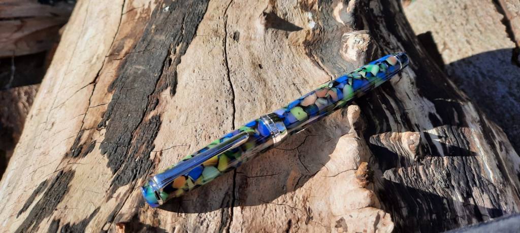
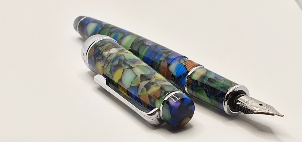
This is an acrylic pen, in a striking green marbled effect with flakes including blue, brown and purple which come to life in good light. There is an acrylic finial, a silver coloured ring for the sturdy, very stiff, metal pocket clip, a cap band which reads DELIKE New Moon and another silver coloured decorative ring near the end of the tapered barrel.
The cap unscrews, needing just over three full rotations, to reveal a section in the same marbled acrylic pattern and that bent nib and metal ring at each end of the section.
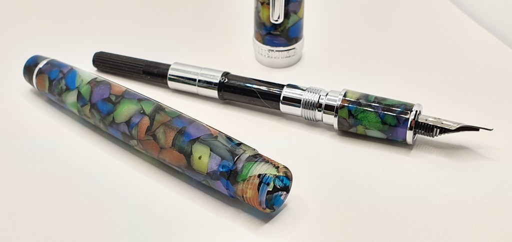
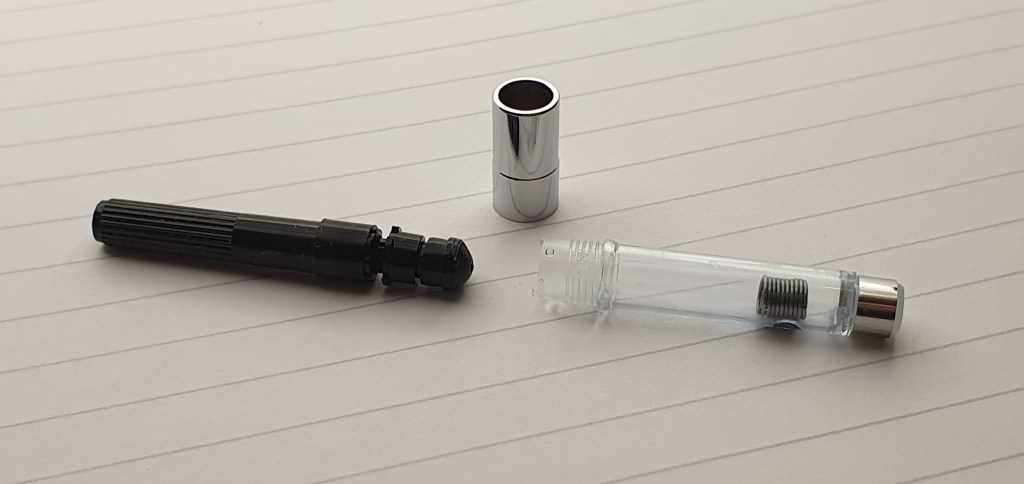
Under the barrel, a cartridge-converter was included. I was impressed that the converter included a metal collar which could be unscrewed to disassemble the converter, should you wish to clean and grease the plunger. It also contained a small metal coil agitator, which avoids the annoying problem of ink starvation, whereby ink clings to the far end of the reservoir. The pen also came with a small soft black velvety pouch. For a pen of this price, the materials and finish all seemed to be of a very pleasing quality.
Size and Weight.
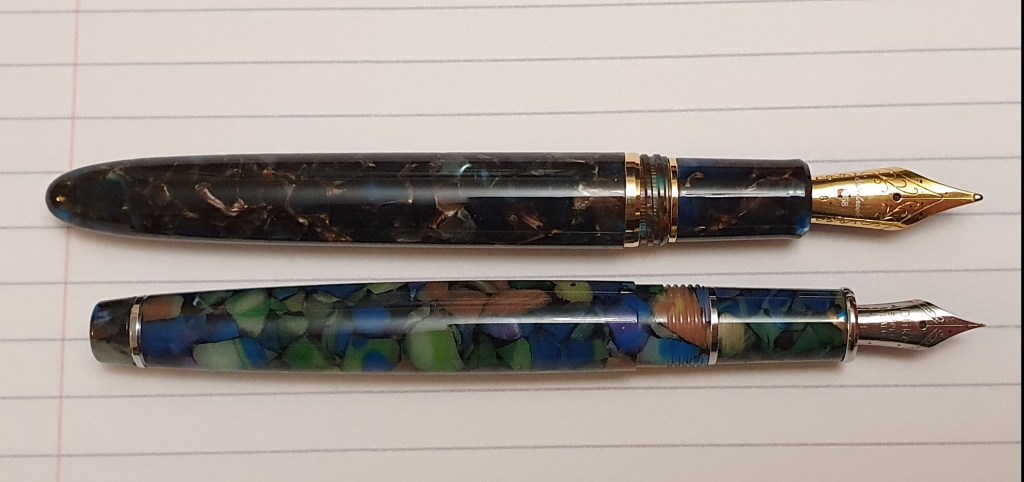
I measured the pen to be approximately 133mm closed, 120mm open or 157mm posted. The cap can be posted securely (with a little twist to grip the barrel) and I prefer to use it posted, as I then grip it higher up and the pen lays more comfortably in the hand. I would call it a small to medium sized pen.
It weighs around 22g including the converter, comprised as to 15g uncapped and 7g for the cap alone. For comparison, a Esterbrook Estie which is larger, weighs around 26g.
The nib and writing performance.
I had not used a deliberately bent nib before and was excited to see what it could do. The silver coloured nib has a little decorative scroll work and the text “Dlike” (sic) “SUPER QUALITY, EF”.
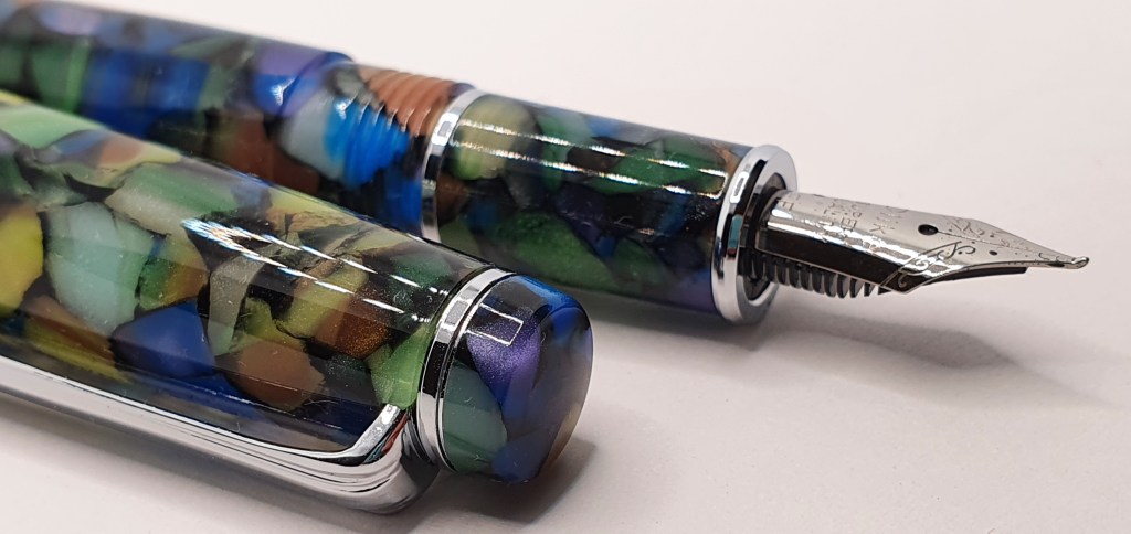
The magic is in the up-turned tip of the nib. Angled upwards, and very smooth and rounded, it presents a flat surface to write with. The effect of this on paper depends how you hold your pen. Used in the conventional “underwriter” style, the nib will give you narrow down strokes, and broad cross strokes. This is rather like the effect of an architect-grind nib and is the opposite of a more common stub nib which would give broad down strokes and narrow cross strokes.
Then again, if you are a lefty and an overwriter, (like me most of the time) the effect is different as you get broad ascenders and descenders, and narrower lines when you make strokes such as to cross your T’s.
Whichever way you hold your pen in relation to the paper, you have the options to have the pen lay back in the crook of your hand finding a sweet spot where the bent nib writes smoothly and lays a broad line from side to side, or more vertically, where the line becomes a medium or a fine. There is also a third option, which is to flip the pen over and use “reverse writing”, using the tip of the upturned nib to give an extra fine line. I easily found three distinct line widths available.
Also, by varying the amount of pressure on the nib, I found that a little heavier pressure could be applied (except with reverse writing) to produce a darker line, assuming that you have a nice shading ink. I am using Montblanc toffee brown at the moment which shades well. Looking back over my notebook, I find that I had, after experimenting with different line widths and shading, written “all of this with ONE pen! Easy line variation all from ONE nib! Just experiment – to find out how to get the BEST out of it. Be familiar with your tools. Know how to USE them.” (The capital letters were where I was pushing the nib a bit to get bolder darker lines. I could not put it down. Later I wrote “Just how much fun is it possible to have from one nib?”

Conclusions.
All in all, the nib is very versatile and is a huge amount of fun. Certainly, more fun than I had any right to expect for the price. The quality too seemed excellent and I could not fault the nib at all.
Occasionally, in this fountain pen hobby, we can lay out a large sum of money for a pen which disappoints. But occasionally the opposite occurs and the resulting joy should rightfully be recognised and celebrated.
