Pelikan M400 vintage tortoise, update.

wp-1485635103598.jpg
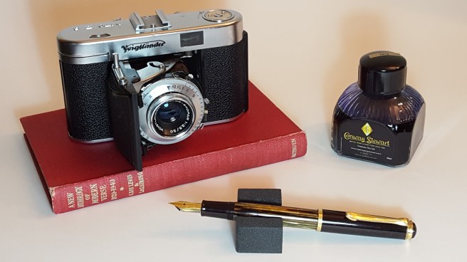
Pelikan M400 vintage tortoise, with a Voigtlander Vito IIa

This week I performed my first successful transplant on an elderly tortoise. Or was it a pelikan?

That is to say, I have given my recently acquired and much prized, Pelikan M400 vintage tortoise, a new nib. The one that it arrived with was a Rover, 14k gold, extra fine, which had wonderful flex to it and was great fun to experiment and doodle with. On removing this, the full inscription on the nib could be seen as Rover 585 EXTRA PO.45. I had wrongly assumed that the concealed lettering beneath the “EXTRA” would say “FINE” and had not guessed that it would say PO.45.

I do not have any information on Rover nibs and would be interested to know when and where they were made. I believe my pen dates from the early 1950’s and it has not yet yielded up all its secrets, nor is it likely to. It would be fascinating to know who had owned it and where it has been all my life. All I know is that it arrived at Hampstead Auctions, had been well cared for and had vestiges of a blue ink from its last use.

Much as I enjoyed this nib, it was not well suited to my way of writing. I found that I could write in an upright hand, quite smoothly, but if writing in my more usual slanting style and with any speed, the soft extra fine nib was rather scratchy. Not a pen to be rushed.

As I wanted to use the pen at home for letter writing and journaling and so forth, it seemed a good idea to acquire an additional nib and I ordered a modern Pelikan Fine, M200 stainless steel nib in the gold-coloured finish, from The Writing Desk. Yes, I know this sounds like a downgrade, but it is a Pelikan nib, it is the right colour, Pelikan stainless steel nibs are excellent (in my limited experience and from what I have read), plus it was an economical way of adapting the pen for regular practical use.

The new nib arrived within three working days and I was impressed and grateful that it had been checked and tested. A test card was signed and dated – a great service for a modest order and really helpful when buying online.

This time, my pen was already inked, with Conway Stewart Tavy from Diamine  as I unscrewed the nib with its fragile ebonite feed unit and replaced it with the Fine nib with its modern plastic feed, carefully keeping the pen upright. It is more accurate to say that I held the nib and feed still, firmly gripped in tissue paper, while unscrewing the barrel from the nib.  Having done this once already, it came out easily and the new stainless steel nib went in perfectly. Both pen and nib are doing well.

I am delighted with my choice. The Pelikan Fine seems to be nicely proportioned to my size of writing. I have generally thought of myself as a Medium nib person, but over the years as my writing has become faster and less legible, all the loops tend to get inked in and it is a treat to see some white space back in them again.
20170128_201430.jpg
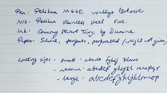
Writing sample from Pelikan M400 with stainless steel Fine nib and Tavy ink

Admittedly the pen is still new to me, but at present I get a buzz at every opportunity to pick it up and write something with it.

My only other Pelikan stainless steel nib is on my M205 blue demonstrator from 2016 with which I chose a Broad which is beautifully smooth and one of the nicest nibs that I have ever used.

With its capacity of around 2ml, I expect one fill of ink to last me ages. Even in the M205 with its Broad nib, I got over 50 pages of an A5 notebook to one fill and so with a fine nib, I can expect a fair bit more than that. The extra fine nib might give double that mileage, so long as I do not get carried away with the broad wet flourishes that are readily available on applying a little pressure.

I did find that on the vintage M400, the cap did not post firmly. It rests on the back of the barrel quite deeply, to over half its length but did not grip and so tended to slide about. This was very easily remedied, simply by tucking a scrap of paper in the cap when posting, about half the size of a postage stamp and the problem is solved instantly. As I said, the pen is elderly. One has to make some allowances and treat it with care and respect.


Rover 14k Extra Fine nib: a writing sample

Further to my post yesterday about the vintage Pelikan M400, here is a writing sample to show the versatility of the extra fine nib.

The nib is a Rover, 14k gold, in extra fine. (update: a “Rover 585 EXTRA PO.45” to be precise).The ink is Conway Stewart Tavy by Diamine, which I like a lot.


The paper is from a Silvine exercise book. It was written on my knee in the park in Golders Green, basking in 5 degrees Celsius today, while last night’s frost and ice lingers in the shade.

Having a wonderful pen and ink combination like this makes me yearn for better handwriting.

Studying the classics – the Pelikan M400 vintage tortoise.

wp-1485019007978.jpg

Just over a week ago, a friend emailed me a link to a forthcoming local auction and mentioned that there were some fountain pens included. I had a browse at the online catalogue and began to get moderately excited at the prospect of acquiring a vintage  Pelikan M400 tortoise.

Still a newbie to the process, it was a novelty to log in to the sale room web site and submit  a bid. The auction was due to take place on Tuesday at 10:30am. With around 500 lots to get through and the fountain pen lots all coming towards the end of the sale, it was likely to be late afternoon before the Pelikan came up. On my only previous  experience with this auction, I had been hopeful of buying a burgundy Parker Duofold Centennial but was unprepared when the bidding sped past the estimate and I let it go.

I was quite expecting to be unsuccessful again and so had a back-up plan of bidding on one or two other pens, in the event that the Pelikan went to someone else.

In the event, when the Pelikan came up, as I listened online to the auctioneer, there were no higher bids placed and it went to me. (I should have walked away from the computer at that point content with my success. However I lingered online to see how the other pens sold. When a blue resin limited edition Sailor came up, I found my mouse hovering over the “Bid” button and, seeing off some half-hearted opposition, I found myself owning this pen as well, more of which another time).

I had been reading up online about the vintage Pelikan. On the following morning, I received the invoice for my two pens, by email from the auction rooms, which I thought was very speedy and efficient of them. I arranged to collect my pens later that day.

The Pelikan was fitted with a Rover 14k gold nib, extra fine, as the catalogue had stated. The pen was apparently an export model. I do not know the history of Rover nibs and am not sure whether the pen was first sold with this nib option (the piston turning knob does have the letters EF printed) or whether it might have been a later replacement of a Pelikan nib.

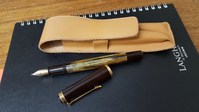
At home that evening, I was able to have a closer look at my purchase. The pen looked to be in a reasonably good condition for its age, which I believe dates from the early 1950’s.

wp-1485019057395.jpg

On the barrel, barely legible unless with a loupe, are the words EXPORT and PELIKAN GUNTHER WAGNER.  The nib reads ROVER 585 EXTRA. (Presumably the word FINE is concealed by the section).(Update: No, on later removing the nib, I was surprised to see that below the word EXTRA, it reads “PO.45”)

Looking at the cap, there is no inscription on the cap band. I have read that this puts it as being an early model. There were plenty of shallow scratches on the cap, signs of general use, but these are not visible to the naked eye and are only cosmetic and do not worry me at all. There are a couple of tiny cracks no more than 2mm long just below the pocket clip ring, possibly due to shrinkage but again, of no concern.

The nib looks to be in good condition with some wear, as a smooth, rounded foot can be seen to the tipping material. I was excited to try the extra fine nib but had to be patient.

The feed is an ebonite one, with “longitudinal fins” which all looked intact. These can become brittle with age and are easily cracked. I had read up on the informative “The Pelikan’s Perch” blog, how to go about removing the nib and feed, taking great care not to damage the feed.

First I wished to establish whether the nib and feed were screw fit or friction fit. Again, I learned this week that some rare early models were friction fit and that this design was briefly repeated later when the model was re-introduced.

I tried operating the piston. This was very promising. The piston traveled up and down and still felt reasonably stiff. The attractive tortoise-shell coloured, striped resin barrel gave a good view of the piston, when held up to the light.

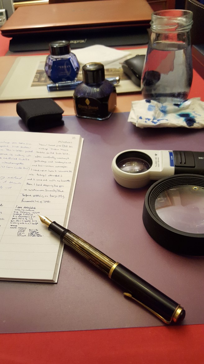
I wanted to measure the take up into the reservoir. I have contrived my own simple device for this, being a syringe, with the plunger removed and with the nozzle plugged with a match stick. This I attach to a vertical object (the bathroom clock!) with an elastic band, and fill the syringe with water using a pipette, up to the 5ml mark.

I then held the Pelikan nib down in the syringe, and filled it with water, as you would with ink. I was pleasantly surprised to see the water level drop down to 3ml, indicating a good 2ml capacity in the Pelikan.

Ejecting this first lot of water, produced some old blue ink residue from the pen and I flushed it a couple more times, before then leaving the pen filled with water and standing in a jar of water up over the nib to have a good soak.I left it for 24 hours.

The following evening, flushing the pen a few more times, I then tried for the first time to remove the nib.Gripping the nib and feed firmly, wrapped in several layers of tissue paper, I held these still while attempting to rotate the barrel towards me, thus unscrewing the nib anti-clockwise. I was delighted when the nib began to unscrew, with no difficulty at all and I was able to remove and wash the nib and feed unit. I gather that these are interchangeable with modern nib and feed units for the M200 and M400 series pens, so that I could try the 14k gold EF in my modern M205 blue demonstrator, or the steel broad from the M205 in the vintage tortoise.

Before I filled the pen for the first time, I had to make the choice of a suitable ink. I decided to go either for Waterman Serenity Blue, or Diamine’s Conway Stewart Tavy, for this first fill. Dipping the pen in each of these ink in turn, I settled upon the Tavy, as a darker more legible line in the extra fine nib. I also like the dark blue-black tones of this ink which seemed fitting for the vintage pen, such that you might find on a letter from the 1950’s.

I was concerned as to how well the old cork piston seal might work, on a pen of perhaps over 65 years of age. The piston had drawn up water to a very satisfactory capacity, but I did not know whether it might leak from the back once filled with ink. I had spent an evening reading about removing piston assemblies from these pens, by means of a dowling rod inserted through the nib end and this sounded much too advanced and risky for me to attempt.  I very much hoped that the piston would be usable. If not, then I had an attractive and rather expensive dip pen or a nib unit that I could use in other pens.

And so that night, the pen suffered the indignity of being stood in a glass jar to check for any accidents overnight. Happily (and this really has been a lucky story so far) there were no signs of any leakage.

So how does it write? Well, the nib is far softer than any I had experienced. A little pressure spreads the narrow tines to produce a lovely characterful broad wet stroke. Without pressure the pen writes a very fine line. I was pleased with my ink choice. The nib wrote smoothly when writing with my left elbow tucked in to my side (I am left handed) but when writing in my ungainly, overhand slanting style, with paper tilted and my left hand above the line (a bad habit from childhood to avoid smudging wet ink), then the nib was a bit scratchy. So I will go with what it likes best.

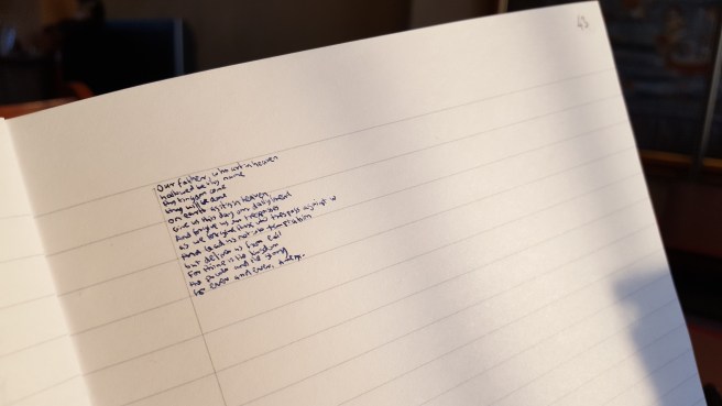
I amused myself trying the pen on every available type of paper. It suits smooth papers best. And I discovered a new source of amusement, in writing with the reverse side of a vintage extra fine nib, to give an extra extra fine line! This enables you to write in such miniscule letters, aided by a magnifying glass as you go, that you can achieve up to six lines of writing in one row of an exercise book. I then attempted the Lord’s Prayer which I managed to fit into three rows,  which is less than one inch deep. This is of limited application I know, but fun to try nevertheless.

wp-1485019073710.jpg


AL-star pick me up

wp-1484434036767.jpg

Thank you to everyone for their suggestions and sympathy, with regard to my pen case dye-stained, yellow and pink Lamy Safaris (Pen cases: a cautionary tale, 5 January 2017). I have not yet found an antidote. I have not given up hope of restoring them but am yet to find an economical remedy.

Both the yellow and pink Safaris are still available to buy in my local shops and so it would be a quick and easy matter to throw some money at the problem and replace them both. But if I were to do that, would I then throw away the stained barrels and caps and forget them? I don’t think so. And even if I did, I suspect that I would remember them every time I looked at their replacements.

On reflection, I was particularly fond of the yellow one, but had never really taken to using the pink one. The yellow colour for the Safari is my all time favourite, just as the yellow colour suited the Saab 900 convertible. If I were to replace just one, it would be the yellow one.

Both of the pens are still usable with their black stained barrels and caps, at home at least. It seems wasteful to throw them away.

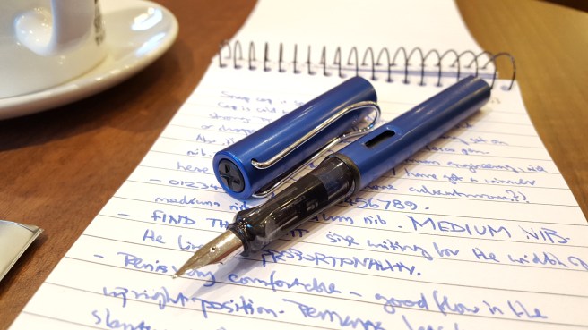
I pondered these things in my heart as I gazed at the Lamy rack today. Eventually however, I was won over by the idea of not trying to replace them but rather, of compensating myself with a shiny new Lamy AL-star in vibrant metallic blue, which had caught my wandering eye, a few pens along the row. I rather liked the idea of using it with Omas blue ink which seemed equally vibrant. So I went with the AL-star option.

A few doors away, is a nice coffee shop on the high street, where I then sat with a Regular Mocha and examined my new purchase. I guiltily entered it on my app database of fountain pens, not unaware that this was my first pen purchase of 2017 despite my resolution to ease back on the pen-buying,  after the shock of 2016’s end of year tally.

Guilty thoughts aside, I unscrewed the barrel, popped in the  supplied Lamy blue cartridge and pushed it home. I had a reporter’s ruled spiral notebook in my bag and was eager to try the pen. To my pleasure and delight, ink started to flow within a couple of touches of pen to paper and was one of the most silky smooth, new pen experiences in recent memory. The royal blue ink glistened under the bright spot-lamps in the coffee shop ceiling.

One of life’s pleasures, I think, is to sit in a coffee shop, watching the world go by in the busy high street outside the window and the comings and goings within, with a nice pen and notebook on the table before you.

I made the observation that the ink drying time was around the five second mark on that paper. I was very happy with the ink flow. Sometimes, these nibs are said to be on the dry side but mine seemed to be tuned to the optimum balance of lubrication, smoothness and drying times.

I also observed, when writing a few lines with my Sheaffer Sagaris, filled with Caran d’Ache Idyllic Blue, that the colour was not wildly dissimilar from the Lamy blue ink in the cartridge, which is also a very uplifting royal blue.

And so, with the upset of my disfigured Safaris behind me, a new chapter of blue AL-star ownership begins. And I have broken my 2017 pen fast already, even before the sun had set on the fourteenth day.


Diplomat Esteem fountain pen, a brief review

wp-1483550535732.jpg

A common topic on Fountain Pen Network for lively reaction, asks what pen you would keep if you could only keep one.  Looking over at my pen cup, I thought perhaps the Diplomat Esteem may be my current answer to this question. This was one of my 2016 buys and my first pen from this long-established German brand.

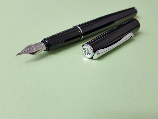
The pen is of a glossy black lacquer over a gently tapered metal barrel and cap, with silver coloured fittings. It has a snap-on cap, a black plastic molded section and a stainless steel nib. Mine is a medium. It takes standard international cartridges or a converter, which is not supplied. There is room to carry a spare cartridge in the barrel, so that you may never run out if you are away from your supplies.

The thin metal cap is not embellished with a ring and so looks a little unfinished with a rim which is a bit sharp to the touch. But the beauty of this lies in the fact that when capped, the barrel and cap are perfectly flush and yet there is barely any noticeable step, between the barrel and the section where you grip the pen. Also, it means that the cap, when posted onto the slightly tapered barrel, again fits flush to the barrel and makes for an attractive, if simple, well-balanced pen in the hand.

The barrel has a shiny metal end stop which has a slight “muffin top” rim which allows the cap to post securely with a click.

The only adornment on the pen, is the Diplomat logo, a symmetrical design like eight flower petals in black on a white background on the finial. It is covered by a clear plastic dome. This distinctive logo does stand out well if searching for the pen in a bag or pen cup. A single black petal emblem is neatly reprised by a cut-out towards the lower end of the curvaceous pocket clip.

The real gem however, is the stainless steel nib. It also has the Diplomat logo and reads DIPLOMAT, SINCE 1922,  M.  It is unusual in several respects. There is no breather hole. The very long, sweeping curves of the nib put me in mind of the prow of sleek motor launch on a lake. Also, viewed in profile, the feed is very shallow and has no fins and so is rather like the feed of a Lamy Safari.

The nib performance on my pen was superb. It was smooth, with a good flow, right from the start. The long nib also has a bit of softness to it, allowing for some line width variation, all making for a very pleasant writing experience.

There are so many examples of metal bodied, lacquered pens with stainless steel nibs but this seems to be a cut above the rest, in terms of the simplicity, comfort, quality and performance.

This is a medium sized pen. The length of the pen when uncapped (124mm) or when posted, (155mm) are both the same as for the Pelikan M600.

The Esteem is the mid-sized version and Diplomat also make a slimmer version, called the Traveller or a broader one, called the Excellence, neither of which I have yet tried. However, I have read very good reviews, particularly about the nibs.

Finally, the packaging of the Diplomat Esteem was rather surprising. Inside the large white cardboard box which bore the Diplomat name and logo, there was a stiff cardboard box tray with a sliding metal lid, again bearing the Diplomat name and logo. When you remove this, a cardboard flap (again with the name and logo) can be lifted to reveal the pen on a soft white pad, beneath which you find the warranty booklet, with a guarantee for five years. All this packaging is enough to produce your very own shop window display if you so wish.wp-1483550743348.jpg

The pen weighs approximately 28.5g including two cartridges or 17.5g when uncapped. This seems an ideal weight, to feel sufficiently substantial but without being tiring.

And so why might I chose this as my only pen? Whilst very understated and not particularly exciting to look at, this belies a pen which has for me, a comfortable size, shape, weight, balance and performance. The metal construction feels robust and reassuring. I find very little not to like about it.


Pen cases: a cautionary tale

Having a number of fountain pens uninked at any one time, I was in need of a storage case. At the London Pen Show in October 2015, I bought a black, 24-pen zip case, which had elasticated slots for 12 pens on each side and a flap to separate the two sides when the case was closed.

The case was only £15.00, in a padded, leather-look, finish and appeared to be quite a good practical design. The zip extended for a few inches beyond the rim of the case, to facilitate opening it flat on a table and had a popper to fasten the zip down when in the closed position. It had no apparent brand name and so I cannot tell you who makes it or where it comes from. I liked it so much that I bought another identical one at the same show in October 2016.

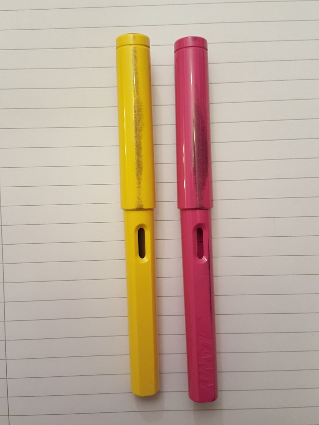
All was well until yesterday when I took out a yellow Lamy Safari, thinking that I might ink it up and put it into use. I was shocked to find a stain on the back of the cap and barrel where it had been held tightly against the lining of the pen case. I took out a Pink Safari which had the same problem.

wp-1483622982812.jpg

An old, white Sheaffer No Nonsense was also affected, to a lesser degree. Happily, the lacquered pens or metal finish pens such as a Lamy Logo were unaffected. It seems that just the light-coloured Lamy Safaris had suffered.

I tried rubbing the mark off with my thumb but this had no effect. I washed them in water with concentrated washing up liquid, scrubbing them with a soft brush but again this had no effect.

It appears that the stain has got deep into the material from which Safaris are made. Perhaps it is some sort of reaction between this material and the black dye used for the thin inner lining of the pen case.

I have since had a brief look for a remedy on Fountain Pen Network and found a thread where people had experienced staining to the chrome finish of pens, such as a Waterman Carene and reference was made to “chrome tanned leather”. Someone had success resolving that problem using a sort of polish.  I do not think my pen case was leather and it seems to be a different problem.

I am writing this first in order to warn others against making the same mistake and secondly in the faint hope that someone might know of a solution, to lift this stain out. It is not the end of the world and the pens are still usable. But they are adorable pens and I am sorry not to have taken better care of them.

2016: some of my fountain pen highlights

Now that 2016 has ended, it seems a fitting time to look back at where this hobby has taken me, over the past 12 months.

First, to get the figures out of the way, I bought a total of 40 fountain pens for myself. Many of these were inexpensive and bought in twos or threes or in different colours. If we can deduct all the pens costing £6.00 or less, of which there were fourteen, then the total comes down to a slightly less greedy 26.  A very few of the purchases turned out to be regrettable and lessons were learned. On the other hand, some of the inexpensive pens turned out to be surprisingly good, which was marvellous.

However, the pen-buying was only part of a larger picture and I now see that there have been many highlights over the course of the year. Let me list a few here, in no particular order.

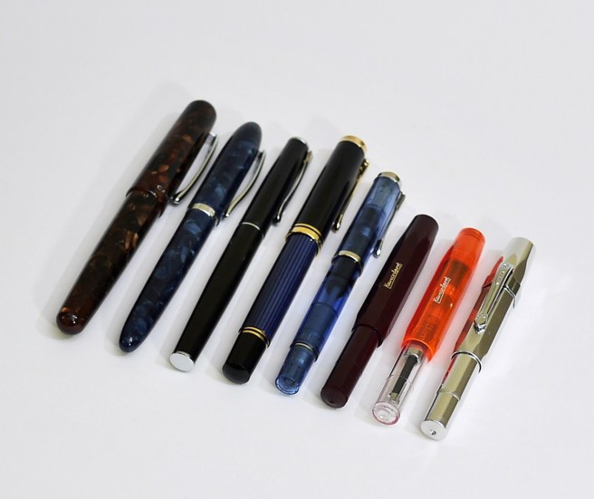
1. Trying brands that were new to me. I bought pens from several brands that I had not tried before, including Campo Marzio, Diplomat, Kaweco, Noodlers and Pelikan which all proved very worthy buys.

new-in-2016

2. Visiting the beautiful city of Bruges, Belgium in March. Whilst there, I did a Google search for fountain pen shops which led me to Iris De Corte, a third generation pen shop, in a cobbled street just off the main square at Sint Amandsstraat. When I visited, the shop was closed with the shutters half down. I peered through the metal grille at the attractive window displays which included Kaweco, Cross, Visconti, Parker, Faber Castell and Hugo Boss. I then noticed some people working inside. A charming woman then came out. I asked her if the shop was open. “No, but I can be open.” It transpired that this was Iris and she was busy taking photographs of products for a web site. She kindly let me look around, having my own private shopping experience. I bought two leather pen cases for my Kaweco pens.

3. Buying my first Parker “51”. This was at the London pen show in October, a cedar blue Aerometric dating from 1949 which is now the elder statesman of my pen cup. I am grateful to Graham Jasper, the vintage pen collector who sold it to me. Now that I own one, I have enjoyed reading up on the Parker “51” with added interest. Using this pen feels very special and unlike any other that I own.

4. Making use of the internet. Throughout the year I have been both entertained and informed by the many You Tube reviews, WordPress blogs, Instagram posts and FPN threads by fountain pen enthusiasts all over the world. These eventually led me to start my own blog through which I have become acquainted with some inspiring like-minded people, whose work I much admire.

5. Getting more organised: Having allowed a growing number of fountain pens and their entourage of boxes, inks and accessories to spread unchecked throughout the house, it became necessary to find a better way of storing inks, tools, empty pen boxes, new notebooks and pen cases. I found a plastic storage tower, consisting of four nice deep drawers which has been an improvement on the previous state of affairs.

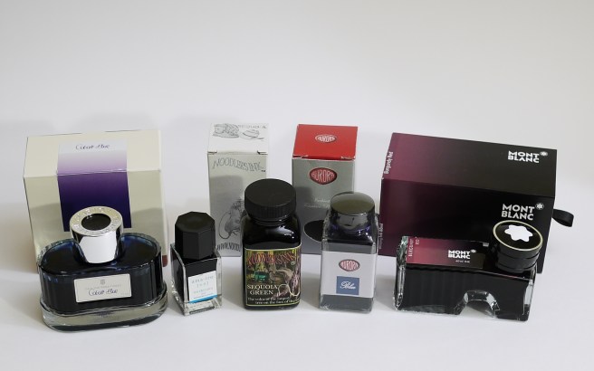
6. Being more adventurous with inks. Having gone for many years using a limited palette of mainly blue and black inks, I am now exploring some of the huge range of other coloured inks available and enjoying the pursuit of inks to match particular pens. This has now got to the stage where I might see a car in the street and remark that I know just the ink that would go with that.

inks-bought-in-2016

7. Experiencing a fountain pen auction. Whilst visiting an antiques emporium in Hampstead and enquiring whether they had any fountain pens, I was told of a forthcoming silver, jewellery and general antiques auction which would include pens.  I took a catalogue. Flicking through, I found several lots consisting of a selection of fountain and ball pens. One item that caught my eye was listed as a “Parker, a burgundy marbled resin fountain pen, with medium 18 carat gold nib, cartridge converter mechanism, no box or paperwork” with an estimate of £20 to £30. I went to the viewing and handled the pen, which was a very pretty Duofold Centennial. I registered to bid by telephone in the auction which was a few days away. In the ensuing days, I thought about how high I might go, allowing for the commission and vat payable on top of the hammer price. In my head the pen was mine.

When the day of the auction came, (which was by telephone and internet or previously lodged bids only) I was able to log on to a saleroom web site and hear the auction progressing through the various lots. It was not until about four hours in, that the burgundy  Duofold came up. The much anticipated telephone call from the auction room came, a couple of lots before hand. I was told that there had been a lot of interest on the internet, on this item. And then the bidding started and within seconds had gone over £100, to £120 and I chickened out. It sold at £140.00 plus commission. This was an interesting new experience but lessons were learned as to (a) not assuming that a pen is yours until you have bought it and (b) not expecting an item to be sold to you for the estimated price.

8. Trying new pens. Getting a new pen home, it is exciting to examine it and try it out, with various inks and on various paper surfaces and determine its role. Finding the right ink can sometimes happen first time but can be an ongoing process of experimentation, trial and error.

9. Washing out pens. Having bought rather too many pens in the past year and wanting to make use of them all, I am suffering from having too many inked at a time (currently over 20). A few of these will suffer from hard starts if not used regularly and so there is a continuous process of lifting a few out of the pen cup to be flushed and rested for a while. A few of them seem immune to hard starts, such as the Pelikans and the Platinum 3776 Century with its slip and seal inner cap. Whilst not really a highlight,  I do find enjoyment and relaxation from washing the pens from time to time and rotating the selection although I struggle to keep the numbers down and do not like to flush them if it means wasting a lot of ink.

10. Writing with the pens. Not to forget the obvious, it is putting the pens to good use that should be the goal. I have varied my office pen from time to time but currently use a TWSBI Vac 700 clear demonstrator with Graf von Faber-Castell Cobalt Blue, for signing letters and documents. My Every Day Carry pen is currently a Sheaffer Sagaris, which I also used for most of the year as my 2016 daily diary pen. In 2015 it was the Italix Parson’s Essential, that I used almost every day for the year with Waterman Serenity Blue ink.

Aside from work use, I have enjoyed setting aside an hour or more a week, to write up such things as memories of parents or school days, for my own satisfaction before memories fade.

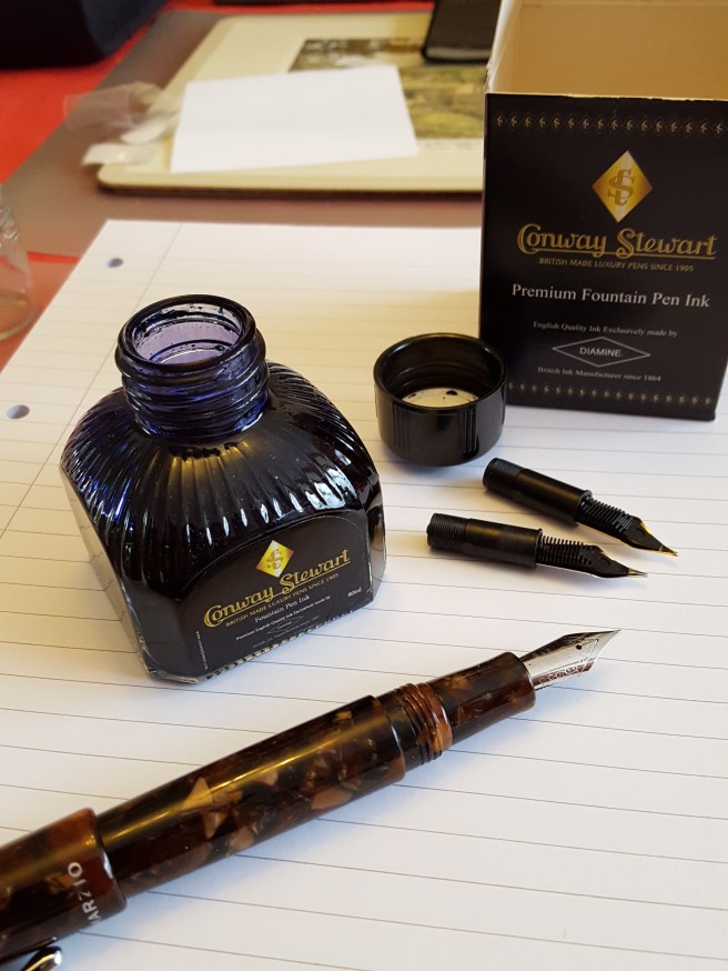
In the final hours of 2016 I took another pen to flush, picking up the Campo Marzio Ambassador in brown marbled resin. I have been using it with one of my favourite inks, Conway Stewart Tavy, by Diamine which is a classic looking blue-black. Having washed the converter and rinsed the nib and feed with running water and then with water squirted through a bulb blower, I then left the section to sit in a basin of water. As the water became still, I watched a ribbon of deep blue ink, slowly issuing out of the feed and fading into the water. It seemed rather symbolic of the final hours of the year, ebbing away.

I have been very fortunate to have a hobby that gives so much pleasure. It is useful to look back over the year to see what lessons can be learned. My main one is that, without a strategy, my occasional and often spontaneous pen purchases resulted in rather a shocking number and I expect to buy a lot less in 2017 and to make more use of the many delightful pens that I now own.

A Happy New Year to all.

20160904_171635