The state of the pen cups, September 2021.

It has been a quiet month on the blogging front. This niggles at me occasionally, as being wasteful, rather like having a car parked outside but not driving it. I do also have a car parked outside which I am not using much either. We currently have a situation with queues at petrol stations, as a shortage of fuel deliveries led to some panic buying.

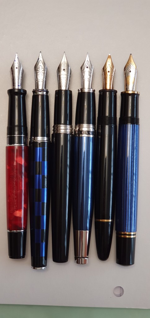
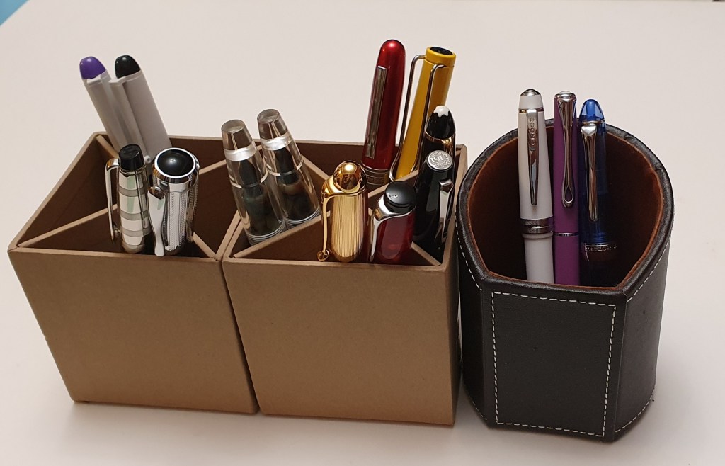
For a change today, I thought to round off the month with a short tour of my “currently inked” fountain pens. I have fifteen, spread across three pen cups at home. This number is fairly typical for me. I enjoy the variety, but also wish I could be more minimalist and just have a couple on the go. Having the simplicity of just one pen and one ink, is a fantasy that I sometimes create by going thus-equipped to a coffee shop and spending an hour writing with whatever I have taken with me.

I should point out that the fifteen inked pens at home is not quite the end of the story and that I counted a further four fountain pens in my pen cup at work. These are a Parker Duofold, a Cross Bailey Light, a Moonman S5 with oblique broad nib and a Pilot V pen with red ink. The first three are filled with blue black, black and blue ink, respectively. These meet all my needs at work – for writing notes, signing letters and documents or amending drafts.

At home it is a different story as I am constantly picking up a pen and writing a paragraph or two just for relaxation and the sheer joy of the flow of ink on the paper, hence the variety. So here they are, roughly from left to right:-

The pen cups – a snap shot of my currently inked.

Pilot V pens in black and purple. These are both quite a few years old. For a long time they lived in a separate pot behind the sofa and were seldom touched. I felt that I should bring them into circulation. They write adequately, never hard start and seem to last forever (particularly with such little use). The downside is that the ink bleeds through paper badly. Also the colour of the purple ink is now well past its best.

Italix Captain’s Commission, Fine italic. This is a gorgeous pen, which did not cost a lot. At the time, I think it was under £60.00 and included a hand-ground nib, which writes like a dream, incredibly smooth and with generous flow. I since bought a couple more, with the same nib as gifts. Mine is inked with Onoto Mediterranean Blue.

Waterman Expert, Chrome cap. My history with Waterman Experts goes back to the 1990’s when I bought my first one, in marbled blue lacquer and used it for years at work. I added a couple more, one black and one red although I never made as much use of them as my blue one, as the nibs were not so joyous. And then a couple of years ago I bought this handsome blue model with a chrome cap, in a gift set with a pen case and some ink. I did a little bit of tinkering with the nib, with some brass shims to improve flow and now it writes wonderfully. It has been my journal pen, with Serenity blue cartridges for the whole of September. Like many of my pens, it is one of those which I could manage with on its own.

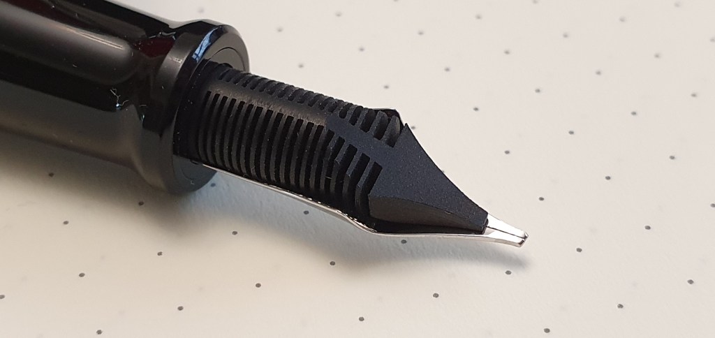
Moonman S5s, with oblique broad and with medium nib. This little pen has been a revelation, turning my pen world upside down. It is a clear demonstrator, eye-dropper filler and comes with three nib units which can be swapped around. The oblique broad is my favourite and seems well suited for my lefty overwriter, slanting handwriting. It is super-smooth, gives a nice line variation and is not too wide (given that the nib is held at an angle so you do not get its full width most of the time). It is fun to fill, holds masses of ink, is supremely comfortable and costs only £27.50. I just love it.

Platinum Plaisir. I bought this pen on impulse and out of curiosity, when browsing in Selfridge’s stationery department a few weeks ago. It is very good at not hard-starting, with its Platinum slip’n’seal inner cap. It writes well enough and would make a robust EDC but I have not been sufficiently excited to want to write with it for long periods.

Lamy Safari, yellow. What can I say? I do not consider myself a fan of the Safari as I dislike the faceted section. And yet I have a dozen or so of them in all different colours, with a Vista, some AL-Stars and even a Lamy Lx. They are well made, write well and are inexpensive. And the different colours make them strangely collectable. Yellow is my favourite. I had one which got ruined by absorbing the black dye from a pen case, but recently I bought a replacement, tempted by a 25% discount in Rymans. It writes very nicely and is also filled with Onoto Mediterranean Blue. No pen cup is complete without one!

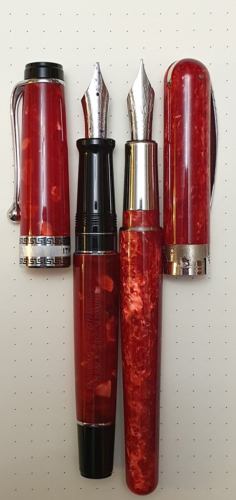
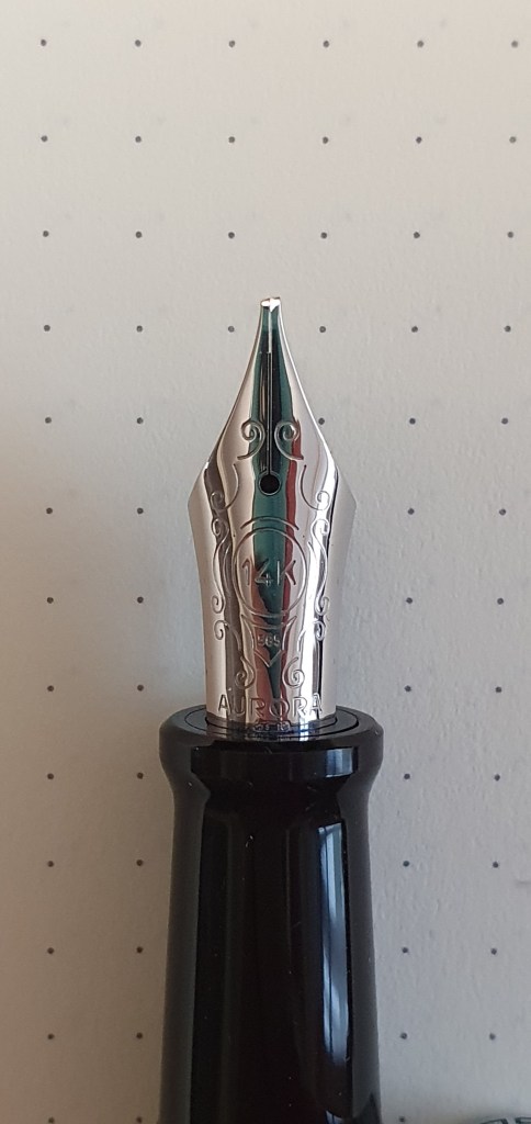
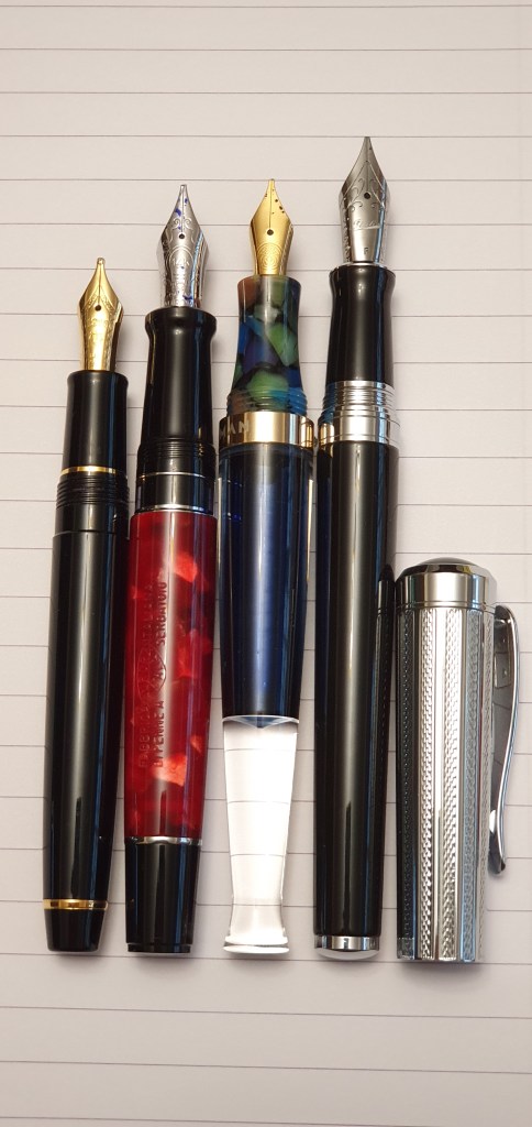
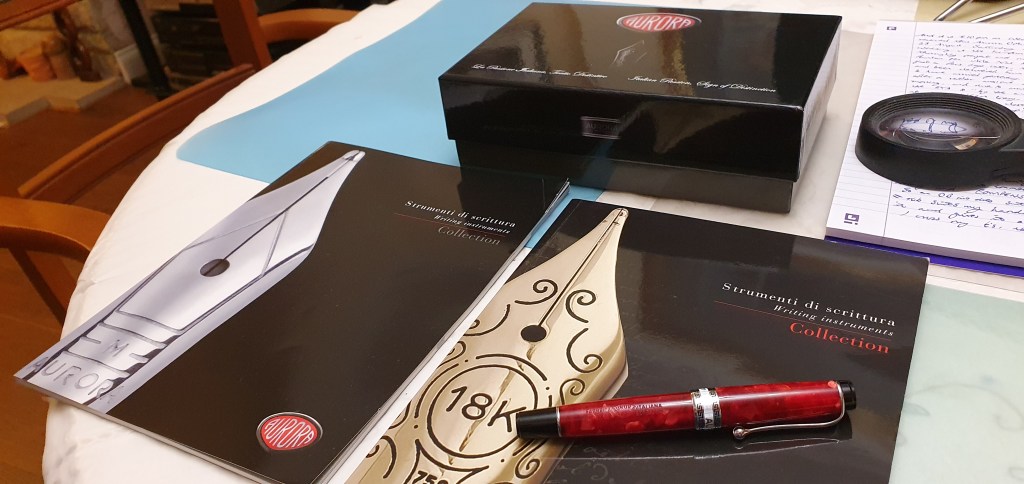
Aurora 88. This is most probably my favourite pen, one of a very small number on which I have ever splurged more than £300.00, (and this was heavily discounted in a summer sale) but has everything you could wish for: black resin barrel and section, gold plated guilloche cap, 14k gold nib, (easily removable), ebonite feed, piston filler and a large clear ink window. It is very comfortable and very handsome. Filled with Aurora Blue.

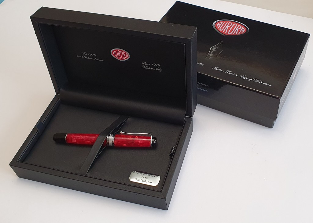
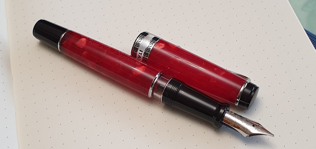
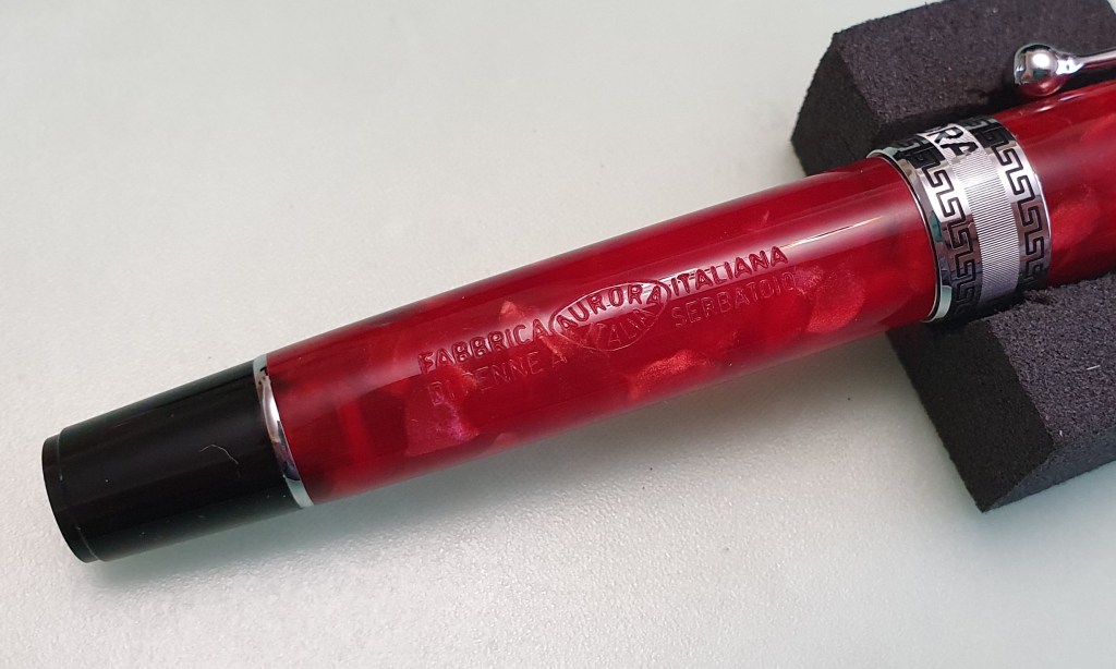
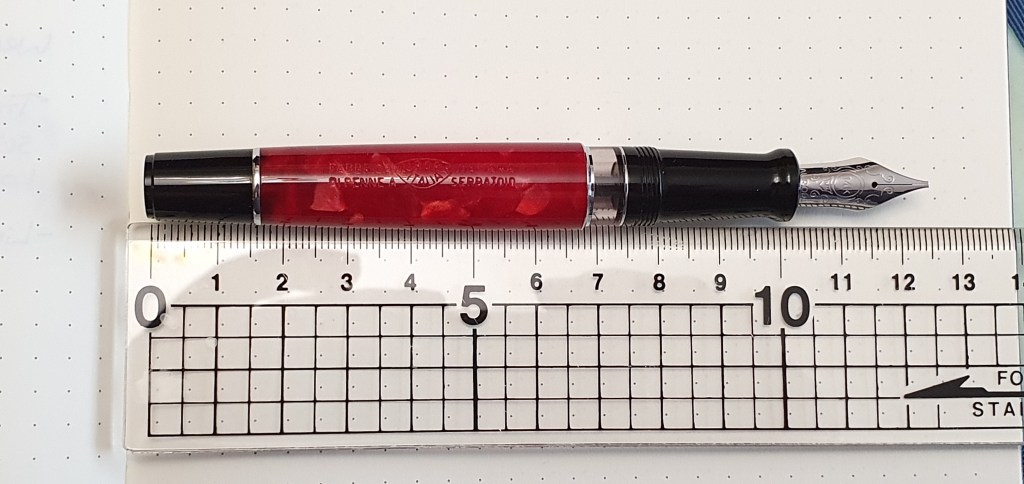
Aurora Optima rossa, OB nib. This is my latest significant purchase – in which I was hoping to combine the joy of my Aurora 88 with the joy of my Moonman S5 oblique broad nib! It is a lovely pen and I am very happy with it but to be honest its OB nib does not perform any better than the Moonman’s. It probably needs to wear in a bit more. But the materials are beautiful to look at and to feel.

Montegrappa Fortuna, black. This is my only Montegrappa. It is a steel nibbed pen, not quite “entry level” for the brand but fairly basic. It came with a very enjoyable medium nib but I bought a spare nib in Selfridges in a Fine and now have this in the Fortuna, which is beautifully firm and precise. I have it inked with Pelikan Smoky Quartz, which seems to suit it well.

Montblanc Meisterstuck 146. This is a 1970’s model with a wonderful soft broad stubby nib, an ebonite feed and a large grey ink window unlike the current models. It was a generous gift from a pen friend in Australia and is one of my best writers. I use only Montblanc Royal Blue in this one.

Cross Bailey Light, white. My fondness for these pens is well known, to anyone who follows this blog. Shortly after they were first introduced, I devoured all the available colours. The white model I have kept for waterproof inks – such as Rohrer & Klingner Salix iron gall ink or, as currently filled, Noodlers bullet proof black. This ink was a purchase from the London pen show last July and I am delighted with it. It seems very well behaved and has a pleasing silver-grey-black tone. I love that you can use a highlighter over it, or use it for addressing envelopes for wet weather delivery!

Diplomat Traveller, lapis raspberry, medium nib. This little pen is the smallest in the Diplomat line up, but still sports a very pleasing steel nib. I was extremely fortunate to stumble across this when it was reduced to £5.00 in a Rymans sale. Once you adapt to its slender girth and shortish barrel (it does not post) then it is a real treat. Mine is paired with Pilot Iroshizuku Yama-budo – the lovely magenta ink like no other.

Sailor Procolor 500, blue demonstrator. And so finally, to this pen which was a London Pen Show purchase in July. Of the four pens that I bought that day, it turned out to be the one I have enjoyed picking up and using the most. This was due, to a large part, to my pairing it with the Noodlers bulletproof black. It has a fine nib, which, being Sailor, equates to an extra fine in European terms. It has a lovely, pencil-like feedback. But it writes like a pencil in more ways than one: the line from the Noodlers ink from this very fine nib also looks like the work of a sharp HB pencil. Used on the smooth satin-matte finish of the Leuchtturm A5 journal paper – and then with the ability to go over your notes with a highlighter, you will appreciate what a delight this is.

And so there you have it – a quick canter through my current random selection of pens in use. Here in London we are now blessed with two pen shows a year, having both a Spring and an Autumn show. The Autumn event is on 10 October 2021. Whilst my needs are more than satisfied by what I have on the table right now, I expect to be there and will probably be tempted by something.

Early thoughts on the Aurora Optima Rossa fountain pen.

This week a new Italian beauty came into my life. Was this sensible? How did this happen? Does it end well? Read on to find out.

It was exactly one week ago today, that I placed an order for an Aurora Optima. This was rather sudden but not entirely without reason. The splendid Aurora 88 that I bought two years ago became one of my favourite pens. I had been curious to try an Optima which has the same range of nibs, same piston filling system but housed in a body with rather more of that Italian flair. I knew it to be a favourite of Laura, whose blog fountain pen follies I greatly admired. (See her review here). But the triggering factors were (a) I noticed that it was available with an Oblique Broad nib and (b) it was in the Iguanasell summer sale with 20% off.

The wait was an anxious time. I fretted over whether I had made the right nib choice. Would it be suitable? Would it be to my liking? Would it be too broad, too firm, too feedbacky, too dry? I know of only a handful of pen companies offering pens with oblique nibs now, including Montblanc and Lamy. Aurora pens are not readily found in shops in the UK. It is therefore necessary to take a chance on ordering online and to hope that you pick a suitable nib from the 11 options. Iguanasell do offer easy returns if you change your mind.

The pen arrived, from Spain via FedEx, in just four days which was impressive. My order, placed on a Saturday, was despatched on Monday and with me by Wednesday.

The unboxing.

Once the pen arrives the anxieties of the wait are soon forgotten. The package was in a sturdy brown cardboard box, protected in bubble wrap. Inside this, was the glossy black Aurora cardboard box, with a fold-down flap at the front. Finally, inside this is the large, black gift box with a hinged lid and a padded black interior. The pen rests on a black padded tray, in a cellophone sleeve. A little metal badge proclaims 14K solid gold nib. Under the tray is the booklet, comprising the instructions for use, care guide and guarantee (two years against any defective materials and workmanship). It is certainly a very impressive and presentable package and gives confidence that you have bought a top quality item.

The Aurora Optima rossa in its gift box.

Design and construction.

The model I chose features a barrel and cap made of red “Auroloide” which is Aurora’s name for its modern celluloid material, cellulose acetate. Some more information about this can be found in Pen Review: Aurora Optima Auroloide by Matt Armstrong of The Pen Habit . It has a marbled or variegated pattern which looks very pretty as you turn it in your hand to see the different tones. It is also slightly translucent so that, when held against the light, you can make out the shape of the nib inside the cap. There is a darker area in the barrel when the pen is inked although it is not so obvious as to be unsightly.

The cap has a glossy black plain finial. There is a sturdy and firm metal pocket clip ending in smooth hollow ball of folded metal. It is very functional but I would worry about letting it spring back violently against the cap in case of cracking the material.

The red temptress.

The cap band is a feature of the pen, with two rows of Greek key pattern filled in black, between which are the names AURORA at the front and ITALY on the back, in smooth and shiny relief against a lined, textured background. The cap ring blends very smoothly with the cap.

The cap unscrews in about one and a quarter turns. The threads of the Auroloide cap meet the threads of the black resin grip section.

Removing the cap, you find Aurora’s famously in-house made 14k gold nib, (Rhodium plated on my model), an ebonite feed and a long comfortable grip section. This ends in a large clear ink window, with chrome rings either side. The ink window is concealed by the cap when the pen is closed, which I find tidier than having the ink window visible when the pen is capped.

The barrel, in red Auroloide, has some text engraved, a feature that I like very much. This has the Aurora logo with “AURORA ITALIA inside and the words “FABBRICA ITALIANA, DI PENNE A SERBATOIO. This last slogan can be found on advertising images of old and translates, I think, to something like “the tank pen” or “the pen with a reservoir.” As an added bonus, the words can be read with the pen in the left hand! This is a rare and joyous thing. (Good luck finding any left handed pencils).

The barrel engraving for lefties!

At the end of the barrel, is a black resin piston knob, separated from the Auroloide by another chrome ring.

The Auroloide is produced from coloured pellets. I am not certain whether it is then injection moulded to make the barrels and caps or whether it is formed into solid rods which are turned on a lathe. I expect someone can help me out on this. In any event, there are no discernible seams in the barrel, cap or section and the finished product is beautifully smooth and polished.

Filling system.

The pen is filled from a bottle by turning the piston knob, to expel the air and then draw up ink. The piston operates very smoothly.

The instructions advise letting go of three drops of ink at the end of filling, turning the pen upright and then turning the piston back to the home position to draw up any surplus ink. This will help if you do not want the feed too saturated after filling. Personally I do not find this essential as the feed seems to do an excellent job of regulating the flow of ink to the paper.

The Aurora piston filler has another feature, a hidden reservoir or reserve to use if you “run out” of ink. Simply operate the piston up and down again and the reserve is released into the feed and you have enough ink for another page or so, to keep you writing until you can get to your ink bottle.

This reminds me of the feature in Parker Quink cartridges, called “tap tank” whereby you were to give the cartridge a gentle flick to dislodge the ink reserve and let it run down into the section. In the Aurora, with its large ink window, a reserve seems a bit unnecessary as you are unlikely to get caught out with no ink when you have an ink window. Unless changing ink colour, you do not need to wait until it is empty and can refill before a trip. I worry that the hidden reservoir means a trap for ink when you are flushing the pen, although operating the piston a few times, with the nib immersed in warm water should be enough. For a quicker clean, you can unscrew the nib and feed unit and wash them separately or leave them to soak overnight, but you need to take great care not to grip them too tightly to alter the alignment or tine gap, or damage the delicate ebonite feed, when doing this.

According to Aurora the pen needs no special maintenance, other than to flush the pen with warm water if you are to change ink colour or if the ink should stop flowing. They advise that the pen be kept with nib pointing up if travelling by car or aeroplane but “If you bear this little advice in mind your Aurora will be your faithful writing companion throughout your life,” a very appealing sentiment.

Size and weight.

I measured the pen to be around 127mm long when capped, or 123mm uncapped. The cap posts very nicely to bring the length up to around 152mm. The girth is about 14mm maximum at the barrel.

The pen is light, at around 15g uncapped (including about half a tank of ink in my case), plus 7g for the cap or 22g in total.

At 123mm, the pen is longer than it looks.

In Matt Armstrong’s review, he mentions his initial disappointment at finding the pen “so short”. The pen does appear short but I think that, to some extent at least, this is an optical illusion, caused by the coloured Auroloide being sandwiched between a very long black section and black piston knob. The girth is quite wide, which might also make the pen look short and chubby. On paper, an uncapped length of 123mm is not unduly short. I have been using the pen unposted, very comfortably. When compared with other pens, it is interesting to see that that the uncapped length is not so different from a Montblanc 146 or a Montegrappa Fortuna, and these are not usually accused of being short pens. In any event, Matt’s pen “grew” to become one of his top five pens.

Size comparison with the Pineider Avatar. See how the Opitima’s black ends and wider girth exaggerate the shortness.
Some more size comparisons: with Diplomat Excellence, Montegrappa Fortuna, Cross Peerless 125, Montblanc 146 and Pelikan M800.

The nib and writing performance.

One of the main draws of this pen for me, was the option to choose an oblique broad nib. For the past 9 months, I have been enjoying an OB nib on a humble Moonman S5, a Taiwanese eye-dropper pen costing just £27.50 (including two other nib units!) and have found it to be wonderfully suited to my way of writing. I have been curious to try another OB from Montblanc or Lamy although with some trepidation in case these might not prove as great for me as the Moonman! Finally the opportunity to buy the pretty Optima came along and I took the plunge.

The Aurora OB nib is a left-foot oblique, a stub with the tip cut at a slant of about 15 degrees. Aurora nibs are known to be firm (except the flex nib) and to have a distinctive feedback, which is not to everyone’s taste.

Aurora 14k gold, Rhodium plated, OB nib.

My last experience, of the 14k gold medium nib on my Aurora 88 was that it was smooth but a little on the dry side and not as wide as I had expected. However I had been able to adjust it myself to widen the tine gap marginally, which made just enough difference and now it writes wonderfully. Filled with Aurora Blue, the ebonite feed keeps the nib in a permanent state of readiness.

Ebonite feed, a rare luxury.

The OB nib on my new Optima was great, right out of the box and has not needed any such tinkering from me. Under the loupe, there was a very slender gap between the tines, even at the tip which promised good flow with no pressure required. The line it produces varies according to the angle of rotation: the principle is that you hold the pen at a constant angle, with the tip of the nib flat on the paper (the “sweet spot”) and then enjoy effortless line width variation according to the direction of the stroke. If you make a cross stroke, left or right then you get the thinnest possible line. If you move directly down, you get the widest. There are degrees of thickness to be had between these extremes according to the angle. I found that I could produce about 5 different thicknesses, from 1 to 5. In ordinary writing you might not see the extremes of this range 1 to 5 but more likely a more subtle range from about 2 to 4.

Range of line widths available from OB nib.

The edges of the nib are a bit sharp, as an italic nib. Care is needed to keep the nib on the sweet spot for smooth writing and so the corners do not dig into the paper. As the nib is Rhodium plated, it is hard to tell where the gold nib ends and the Iridium tipping material begins, but I hope that the nib will hold up well and last me a good long time.

The nib was chosen for my specific needs when writing in my “lefty overwriter” mode, a rather awkward habit which involves rotating the paper 90 degrees anti-clockwise and then writing with my pen over (above) the line, rather than below it. This style evolved for me as an alternative to bending my wrist to avoid smudging and has been called by some people, “writing up-hill”.

A few favourite stubby nibs: Sailor Pro-Gear slim music nib, Aurora Optima OB, Moonman S5 OB, and Italix Captain’s Commission Italic Fine.

I have practised writing in an underwriter style too when occasion requires but experience tells me (including copying out Marcus Aurelius’ book Meditations) that I cannot write very uniformly in this style and my ascenders and descenders tend to lean all over the place.

Conclusion.

I am enjoying my new toy. I am happy with my choice of OB nib. It may be that an OM or even an OF (both of which were available) might have suited me too and it would have been good to try them all in a bricks and mortar shop, as you can with Montblanc’s range at their boutiques. Compared to my Moonman, I am glad to say that that the Aurora stands up well in comparison (with its 14k nib, ebonite feed, piston filler and Auroloide body and exquisite finish and elegance) but I love them both.

New pen, with some old Aurora catalogues.