A look at the TWSBI Classic fountain pen.

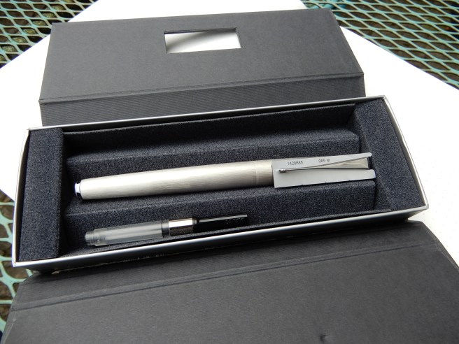
This pen was part of my haul from the London pen show last October and has now been in light use for over six months.

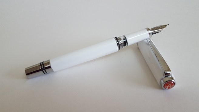
I am very fond of TWSBI’s fountain pens and already owned a Vac 700, a Diamond 580 and an Eco, all of which I enjoy using.  The London show was my first time to handle the newly modified Classic. I had to make a swift decision whether to go for the white or the light blue (which was adorable) but settled on the white version on the ground that it might be less jarring on the eyes in a workplace scenario.

RSCN1505
TWSBI Classic fountain pen

For its first inking, I chose a new bottle of KWZ Azure #4, also bagged at the same pen show. However, I had been playing with the pen prior to filling it, disassembling the section and evidently had not tightened it enough on putting it back together again, as the ink oozed out of the gaps and over my fingers.

This was very easily remedied, by flushing and cleaning the pen, tightening it up a little bit harder this time and re-inking. Note, that when unscrewing the section, there is a little rubber O ring at one end, which might be mistaken for a smear of black ink. Take care not to lose this.

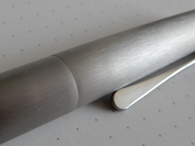
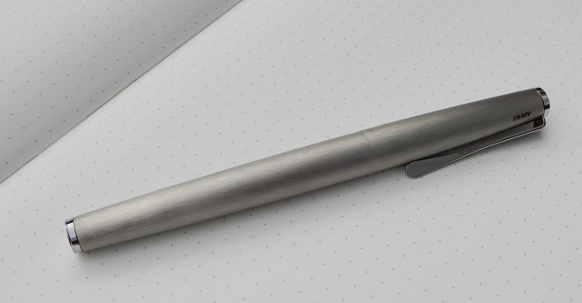
Like the Diamond 580 or the Eco, this is another piston filler, but not a demonstrator. Instead there is a modest sized ink window, next to the metal threads for the cap. The cap also has metal threads, which might make you worry about causing scratches when posting the cap. However, there is no need for concern, as the cap has been re-designed to post very neatly over the piston knob, where it clicks into place above a couple of rubber O rings. Used in this way, the pen is a very comfortable weight and length (about 166mm). You can however use it without the cap posted, being around 125mm in length.

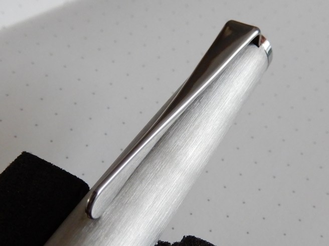
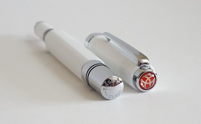
The material is a pleasant, hard-wearing resin of some sort which, in the white finish, almost looks like porcelain. The cap, the barrel and the cap band are octagonal. The shiny chrome furniture makes a nice contrast and there is the distinctive red TWSBI logo in the finial, which makes the pen stand out in the pen cup. The pocket clip is strong and firm. I always find myself wanting to align the flat surfaces whenever I post the cap.

20171007_100121
Nice looking from both ends.


The steel nib on this model is smaller than that of the VAC 700 or Diamond 580 but looks proportionate to the size of the pen. I chose a medium and it writes very well – smooth and with good flow, but fairly firm.

As with other TWSBIs, this comes with a little wrench to enable you to unscrew the piston mechanism should you wish to do so. I did this, only for the first time, late at night, whilst tired and a bit reckless and impatient. I made the “Classic” mistake of finding out the hard way that I did not know how to put the piston back together.

This set me thinking about the term “penmanship” which should denote not only good handwriting, but other qualities including care, wisdom, patience and appreciation for one’s fountain pens. Happily with the aid of one of SBRE Brown’s disassembly line videos on Youtube, I was soon able to reassemble the pen.

For much of the last six months, I have been using this pen with Sailor Kiwa guro, a black pigment ink which is safe for fountain pens. It is very useful to have a waterproof ink sometimes for such duties as writing addresses on envelopes.

However, having recently received a new 110ml bottle of Registrar’s Ink (a blue black iron gall ink) I decided to try this in the TWSBI. I am delighted with the results. I may use this pen when I next register a marriage at our local church. The white pen should look nice in the “signing the register” photos. I will make sure that the pen is properly assembled this time.

Likes and dislikes.

In summary, this is an attractive, medium sized fountain pen, which performs well. I particularly like the ink window. It is useful that you can (if you wish), strip the pen for cleaning and maintenance, like a Bren gun,  although there is no necessity to do so, particularly the piston, which should serve well for years without maintenance.

My only criticism would be of the section in that it would perhaps be more aesthetically pleasing if it were not so perfectly straight. Looked at in profile, it does not look quite right. A slight curve to make a nice finger rest or a slight tapering towards the nib would help the look, although it is comfortable to hold as it is.

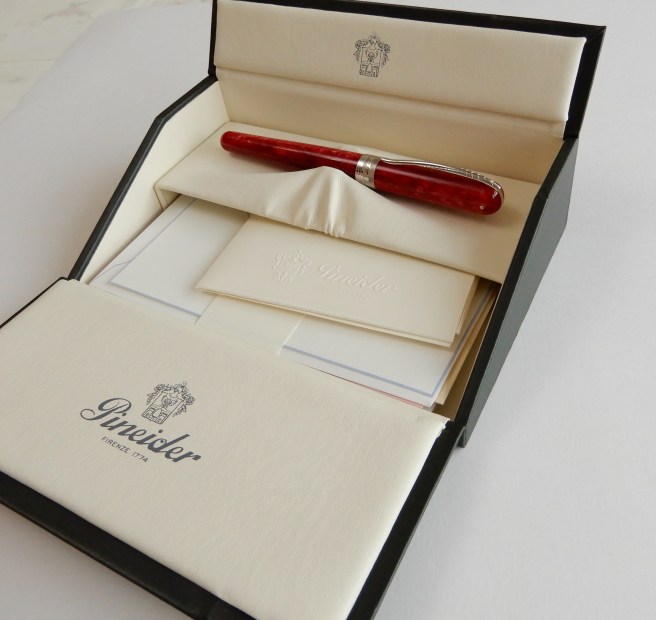
The price at the London pen show was £40.00, which makes it a little more than the Eco but less than the Diamond 580 or Vac 700. I like it a lot.

20171007_095723

Pineider Avatar fountain pen review.

After attending our monthly pen club meet in London recently, I took myself off to Harrods to have a browse around The Great Writing Room. It is wonderful to see their large selection of luxury fountain pens from so many leading brands.

A new name to me, was Pineider, an Italian brand established in 1774, whose pens and stationery were displayed in a corner of the large room. Under the glass counter, one pen was shown in a gift box which immediately caught my eye as it opened like a miniature writing desk. I asked to see the pen, with an attractive green marbled body and a silver section. However, it had an 18k gold nib and was five hundred and something pounds and so I hastily handed it back.

But next to this pen was a display of, what I now know to be the Pineider Avatar fountain pens, in their four available colour options of saffron yellow, pacific blue, lipstick red and coal grey. These looked very striking, particularly the yellow and the red versions.

DSCN2173
Pineider Avatar in gift box including samples of Pineider stationery.

I must say, I am generally wary of pens with shiny metal sections as they can be slippery to hold. The salesman got the red one out to show me and produced some ink and paper. I fell in love with it pretty much instantly.

As this is a relatively new pen on the market and there do not seem to be all that many reviews or photographs online I will attempt an FPN-style review, save for giving marks out of ten.

RSCN2029
The long steel, Rhodium plated nib of the Pineider Avatar. After my early worries about scratching the barrel, I soon decided that the pen felt better with cap posted.

First impressions, appearance and design.

This is a stunning-looking pen. The highly polished, bright red marbled resin with contrasting silver coloured clip and cap band, with rounded ends, make the pen a joy to hold and to look at. The resin has light and dark shades which give a beautiful chatoyance as you turn the pen in your hands.

The pocket clip (in marine steel) is long and slender, engraved to suggest a quill. It is bowed in the middle and is sprung, giving a good reach to clip onto thicker material if needed although the spring tension is not very firm.

DSCN2175
Distinctive clip in the shape of a quill.

A surprise awaits when you come to remove the cap. It is a pull-off cap, but secured by a magnet inside the cap which meets a metal ring around the barrel. When you cap the pen, offering it up slowly as it nears the barrel, it jumps into place with a little click. The magnetic power is enough to keep the cap in place. Removing the cap requires perhaps rather less force than you might be used to and I would not be overly confident about carrying the pen in a suit pocket for fear that the pen may slip out of the cap.

Another lovely feature is the cap band, which features the name Pineider above a stylised engraving of the Florence skyline recalling to mind the many domes and towers of that beautiful city.

DSCN2158
Better than just writing “Florence” on the cap band.

Under the cap, you have a long, sleek, elegantly shaped nib and some attractive engraving, which includes on closer inspection, the name Pineider in capital letters, written normally along one edge of the nib and in mirror image along the other edge. Put like that, it might sound off-putting but it is only noticeable when examined under a magnifying glass.

The section is of a shiny metal finish, and gives the front end of the pen a pleasant weight, which you notice and appreciate as soon as the cap is removed. The metal section tapers slightly save for the last five millimetres or so where it straightens, to give a barely visible but effective, curved, finger rest, when the pen is held in the writing position.

Construction and Quality.

The pen seems very nicely made and I have no complaints with my model. The resin barrel screws firmly onto the metal threads of the section. Everything fits together well. If looking for faults, you could say that the rim of the cap band is a little sharp to the touch, but this has not been noticeable in normal use. The pocket clip, whilst attractive, looks rather delicate (compared, for example to the mighty and barely lift-able clip on my Montegrappa Fortuna), but this is not a problem for me as I carry the pen in a leather pen case, not a pocket.

Weight and dimensions (approximate).

Capped: 142mm

Uncapped: 130mm

Posted: 161mm

The pen weighs around 27.5g, capped or posted. Uncapped, it is about 17g and the cap alone weighs 10.5g.  These weights are ideal, being neither too heavy nor too light.

The uncapped length of 130mm makes this about the same as a Lamy Safari. But whilst I find the Safari comfortable to use unposted, I much prefer to use the Avatar with the cap posted. Perhaps this is because I hold it higher up, (due to the shiny section) or due to the fact that the barrel tapers slightly, but it feels very comfortable posted. It is long, but the cap is light and does not upset the balance. I worried a little at first about whether posting the cap with its magnet inside, would leave scratches on the barrel. However, I found the pen so much more comfortable when posted and soon decided not to worry about this. The pen is meant to be used. I think it does actually cause some scratches but they are only visible under a loupe.

Nib and Performance.

I love this nib! It is Rhodium plated steel, with no breather hole and having a very polished finish that matches the section. The long sweeping curves look stylish. Mine is a medium. A fine is also available. I had tried the pen before buying and was delighted that it wrote so smoothly. It is on the finer side of medium and ideal for me. Flow is wet, but not gushy. Overall, it provides a really pleasant writing experience with some feedback. There is some softness or flex available to give some pleasing line variation in normal writing, and this suits me nicely as my handwriting style is not compatible with more flexible nibs.  I like that the nib is steel and not gold as this keeps the cost down.

DSCN2183
Writing sample, medium nib. Ink is Conway Stewart Tavy.

Filling system and maintenance.

This is a cartridge converter pen taking standard international cartridges, or bottled ink from the Pineider branded, push-fit converter that is included.  Cleaning of such pens is straightforward: you just run water through the section until it comes clear, or leave the whole section, with nib and feed inside, to soak in water overnight if needed before rinsing again.

I have not tried going any further, removing the nib from the section. The fins on the underside of the feed look quite fine and delicate and I would be worried about damaging them or upsetting the nib alignment.

Cost and value.

The price in Harrods was £148.00, which I thought was fair. I was thrilled to learn that it came in the same type of gift box as the much more expensive model. A converter is inside, but the box also includes a sample of Pineider’s famous stationery – a set of six cards with matching envelopes.  It is probably towards the top end of what you would want to pay for a steel nibbed pen before moving up to a gold nib.

DSCN2180
Free stationery!

Conclusion.

This pen was an impulse buy from a brand that was unknown to me, and therefore bought entirely on its own merits and on the basis of what I learned in the store. This absence of homework is not always recommended but on this occasion I am really pleased with the pen. Trying the nib in the shop makes a big difference in lowering the risk.

I have since learned a little bit more about the company behind the pen. The Pineider company was founded in Florence in 1774, and for many years was known for its high quality stationery, which it supplied to the Vatican and to royalty.  Luciano Pavarotti was also a customer. The company also sold luxury leather goods, but was not noted for its pens. However, Dante Del Vecchio, pen designer of Italian brand Visconti left that company and moved to Pineider where for the last year,  he has set about making the fountain pen line more prominent. Thus it is no accident that the Avatar bears similarities to the Visconti Rembrandt. There are some differences too, and whilst I do not have experience of the Rembrandt, I rather preferred the Avatar’s overall flair.

I am greatly enjoying the pen. There are few pens that actually make you want to get up in the morning, to write with. This one is a keeper and I look forward to writing with it for many years to come.


A fresh look at the Lamy Studio 65 fountain pen.

This is not so much a review, as an admission that our first impressions are not always correct and we can change our minds about pens.

The Lamy Studio is a pen that, for a long time, I did not think I needed. Certainly, I liked the idea of the pen, namely a nib of a Lamy Safari or AL-Star, but housed in a more business-like and slightly more up market body. I do possess numerous colourful Safaris and several AL-Stars, as they are good value, decent sized without posting and perform well, despite my not being a fan of the faceted section.

DSCN1977
Lamy Studio 65 fountain pen, with Lamy Safari above

So when I first learned of the Studio, having all the benefits of the stainless steel nib that I like but without the faceted section, I was quite keen. But then I handled the pen and was put off by the shiny chrome tapering section, which I could imagine being slippery to hold. Apart from that, when handling the pen in a shop, I noticed that the rim of the cap seemed rather sharp (almost as though you could use it to cut holes in leather) giving the impression that it was unfinished.

So I was able to put the Studio out of my mind quite easily, without hankering to own one.

However, fast-forwarding several years, I realise now that not all Studios are equal. Whilst the dark Imperial Blue or the Black versions (named the 67) have the shiny chrome section, there is also a steel version with a black section (called the 65).  And whilst I had assumed these to be priced the same, it transpires that the steel version without a chrome section, actually costs a little less.

RSCN1975
Lamy Studio 65, with soft-touch grip.

When in our local WH Smiths recently, I saw the steel Studio offered for sale at just £39 and decided to take a closer look. And there I discovered that the black grip section on this model is not finished in metal but in a rubbery material which is not at all slippery. And so for this modest outlay, I gave it a go.

DSCN1969
Unboxing. A cartridge and a converter are included.

First, about the grip: I cannot tell you exactly what it is made of. It could be a plastic with a soft-touch finish. But I rather suspect that the rubbery feel might be formed from a thin transparent skin of silicone or similar synthetic rubber. I have another fountain pen with a similar feel to the grip, an old Parker Frontier in brushed stainless steel finish, which served me well for several years, but the grip material eventually wore away in places, leaving a very smooth (and slippery) plastic underneath.

So the Studio 65 might have a similar material. If so then a more normal moulded plastic, perhaps textured like some of the Safaris, (but without the facets) would I think have been preferable.

But the purpose of this post is to say that I have been using the Studio now for several weeks, and am finding it to be great as a day to day work pen and an EDC. It is comfortable to hold. It is pleasant to use either posted or not posted. Yes, the rim of the cap is a bit thin and sharp but I appreciate that this is a consequence of the pen having a cap which is perfectly flush with the barrel when capped, and with just a minimal step down from barrel to section when the cap is removed.

RSCN1984
Cap forms flush fit with barrel. Also, thin cap material means a minimal step between barrel and section.

Any post about the Lamy Studio would not be complete without some mention of the pocket clip. It is attractive and unusual and sometimes described as being like a blade of a propeller (although this is not strictly correct). It is appealing to look at and does well at stopping the pen from rolling on a flat surface. But as a pocket clip, (to actually clip the pen into a pocket) it is awkward to lift over material. It does not bother me as I carry it in a pen case. Some may like it but I fear that it was a triumph of looks over function.

RSCN1979
The famous Lamy Studio clip.

Having said all of that, I do enjoy using the pen. I found recently that I had accumulated a dozen or so pens over the years with an all steel finish, including the Parker Frontier mentioned above, but I think that this Studio 65 may prove to be my favourite of these, in terms of size, writing performance, reliability and comfort.

DSCN1972