Early thoughts on the Ryman soft cover notebook.

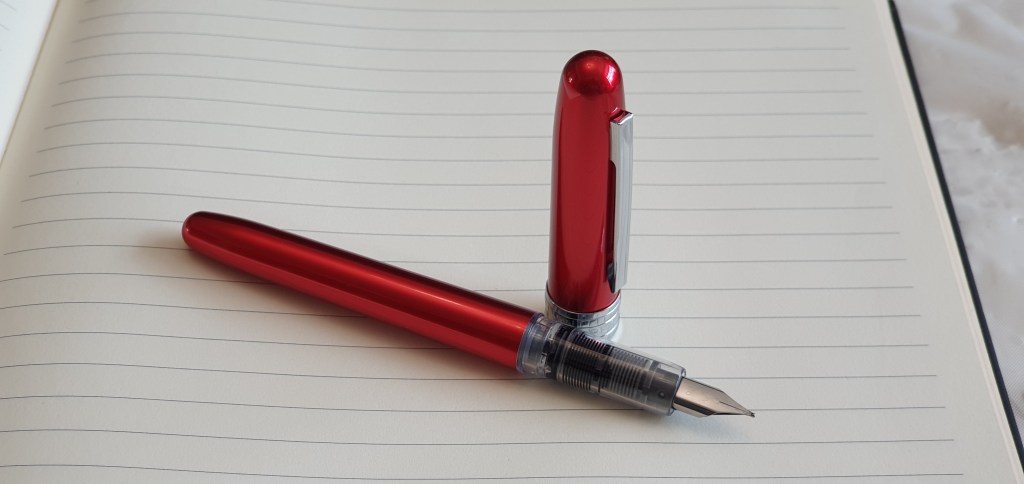
Let me begin by saying that I am a big fan of Leuchtturm A5 journals. I like the format, the paper, the quality and the wide range of colours. They are readily available from my local branch of Ryman stationers. Over the last three years, I have filled about ten of them.

The one issue that I have with them, is that the line spacing is a bit too narrow for me. They have versions with dot grids, but these are at 5mm intervals and so would give you either a 5mm row height, which I find too narrow or 10mm if using two rows, which is a bit too wide. About 8mm would be just right. I prefer to buy the Leuchtturm with plain pages and then use a guide sheet or rule my own pencil lines, when and where I want them.

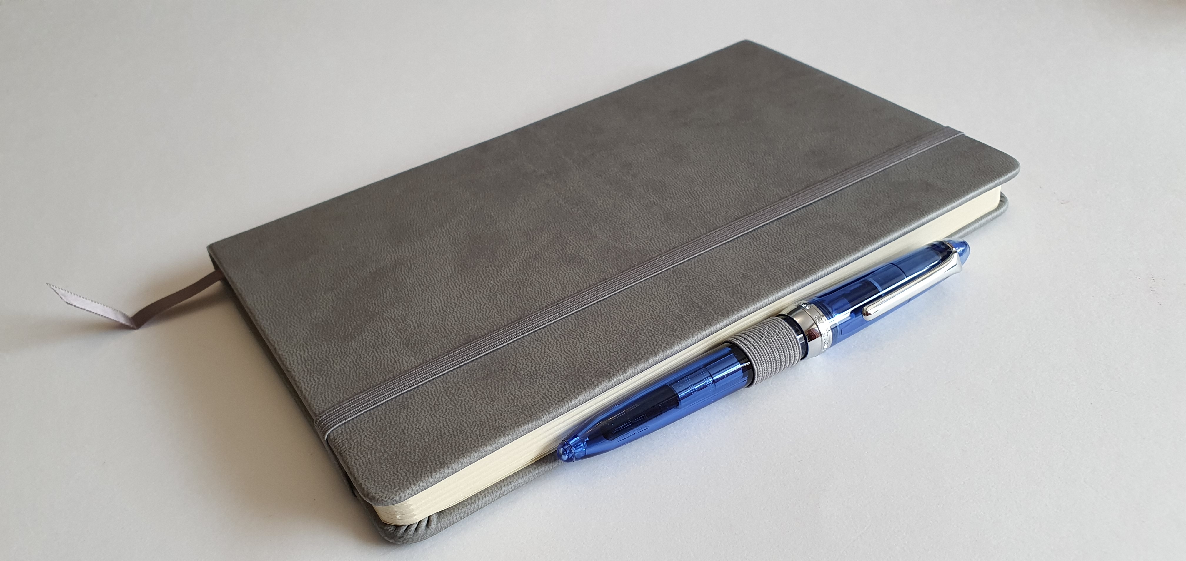
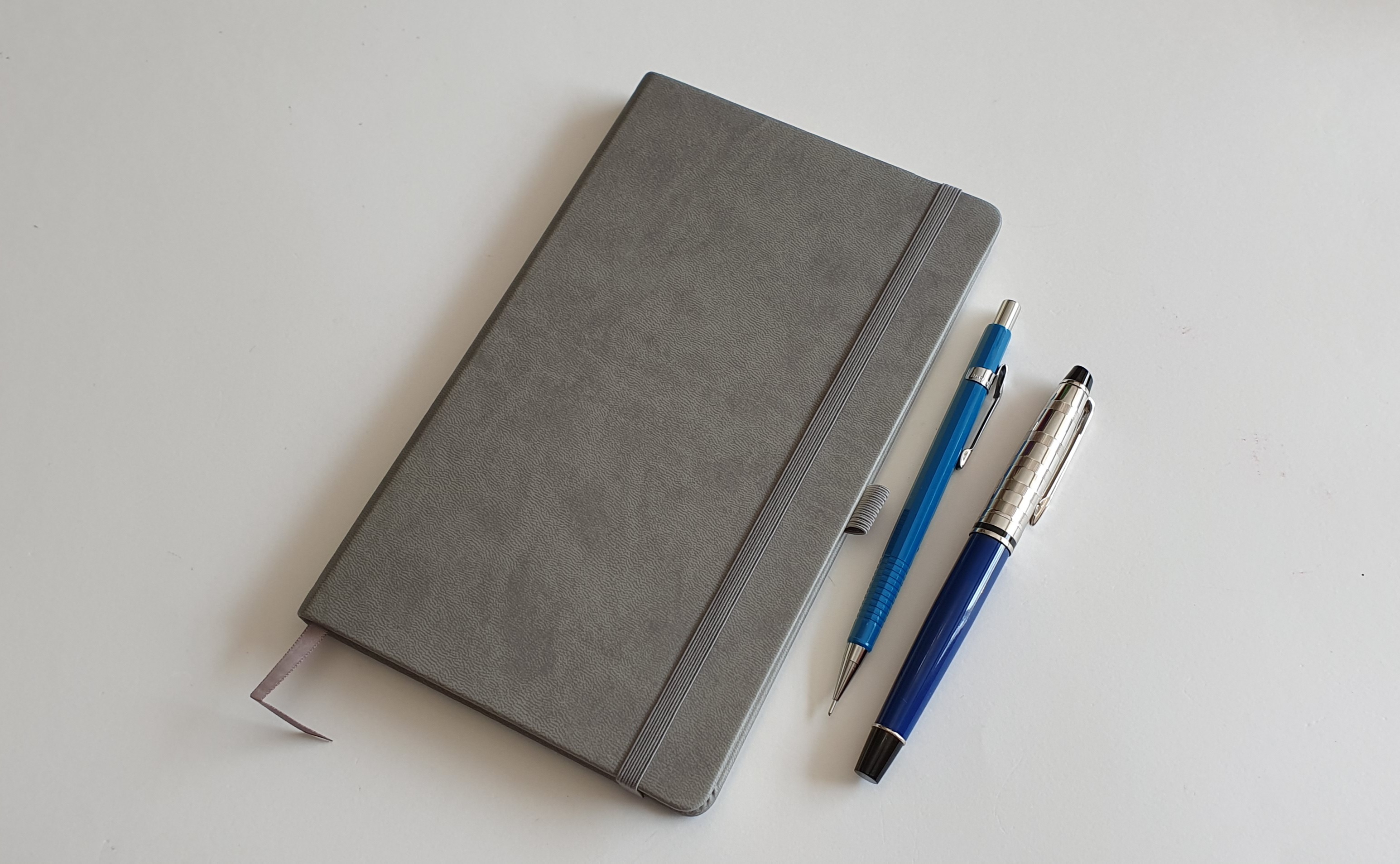
Yesterday, on a visit to Rymans I decided to try one of their own brand journals. Whereas the Leuchtturm journal costs typically around £16.99, the Ryman alternative is just £7.99. Ryman also make a larger one, which is approximately A4 size.

Ryman small, soft cover notebook.

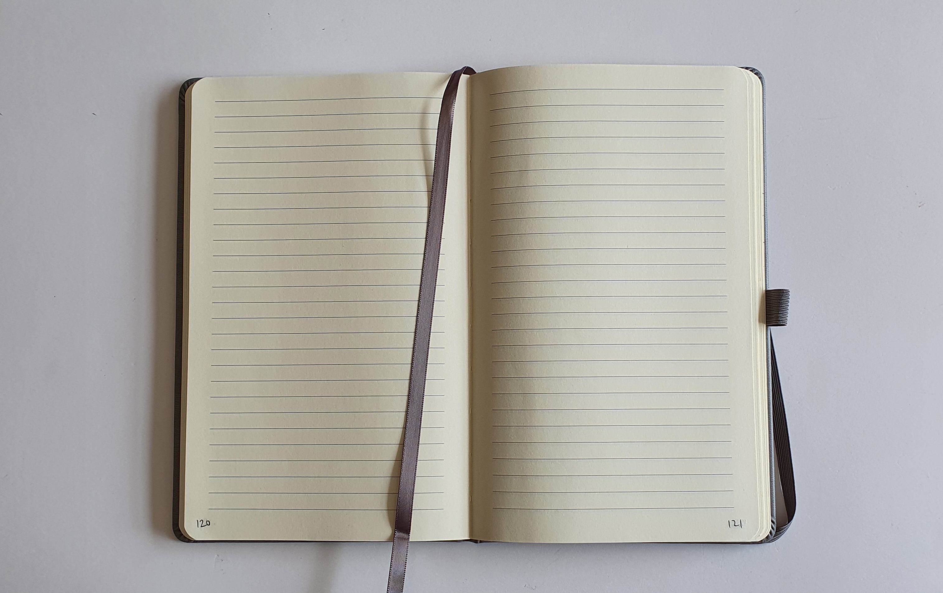
As it is sealed in plastic shrink-wrap, you cannot inspect it fully. The labelling tells you that it has 192 pages of lined, cream, 70gsm paper.

Features.

  • 192 pages;
  • cream paper;
  • 70 gsm paper;
  • ruled lines (7mm row height)
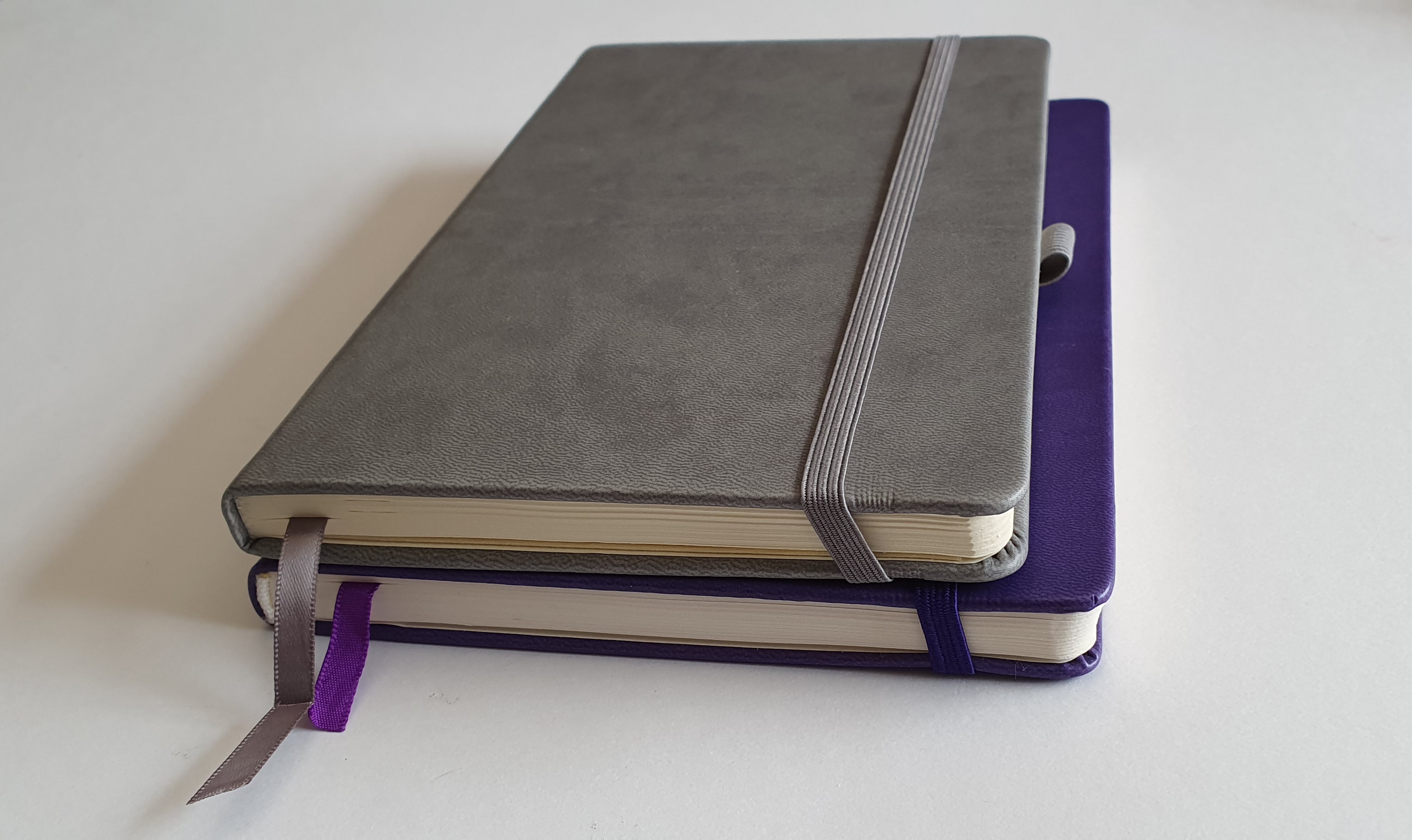
  • one ribbon page marker;
  • expandable pocket in rear cover;
  • hardback;
  • soft-touch finish;
  • a selection of colours;
  • stitched binding, (book can be opened flat);
  • elastic pen loop.

When they say “soft cover”, this means soft-to-the-touch, not soft as in floppy like a paperback. It is a soft touch hard cover. It has the look and feel of leather.

The pages are not paginated. I did not mind and quite enjoyed paginating the book myself in pencil, especially when reaching the end and finding that I also arrived at 192, rather than, as sometimes happens, having to go back and look for where I had made a mistake.

Each page gives you 26 rows at 7mm spacing. The page numbers are my own.

The colours for the Ryman book included a pastel pink, and a pastel turquoise which did not particularly appeal to me and which I thought would get grubby in time. I chose the grey which seemed the most inoccuous.

The size.

The book is not A5 size and does not claim to be. An A5 page would be 148.5mm wide, by 210mm. This book’s pages are considerably narrower, at around 126mm and so your rows are around 22.5mm (almost one inch) shorter than A5. The page height is 207mm, which is only slightly less than 210mm A5 size. It is about the same as the Moleskine format.

When I compared the Ryman notebook with one that I had bought from the same shop about 7 years ago, I was surprised to see that the old one had much wider pages. I preferred the old one. I cannot see any advantage to the consumer in making the book narrower, except perhaps that it would be easier to fit in a coat pocket. It seems that, like many familiar chocolate bars, products are now being sold in smaller sizes.

Ryman notebook 2021 version, with an old version below for size comparison.

The paper quality.

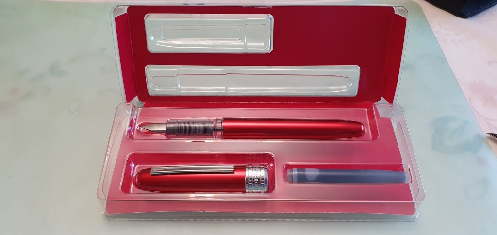
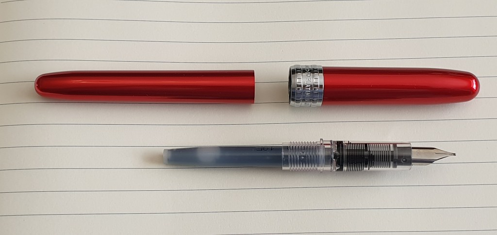
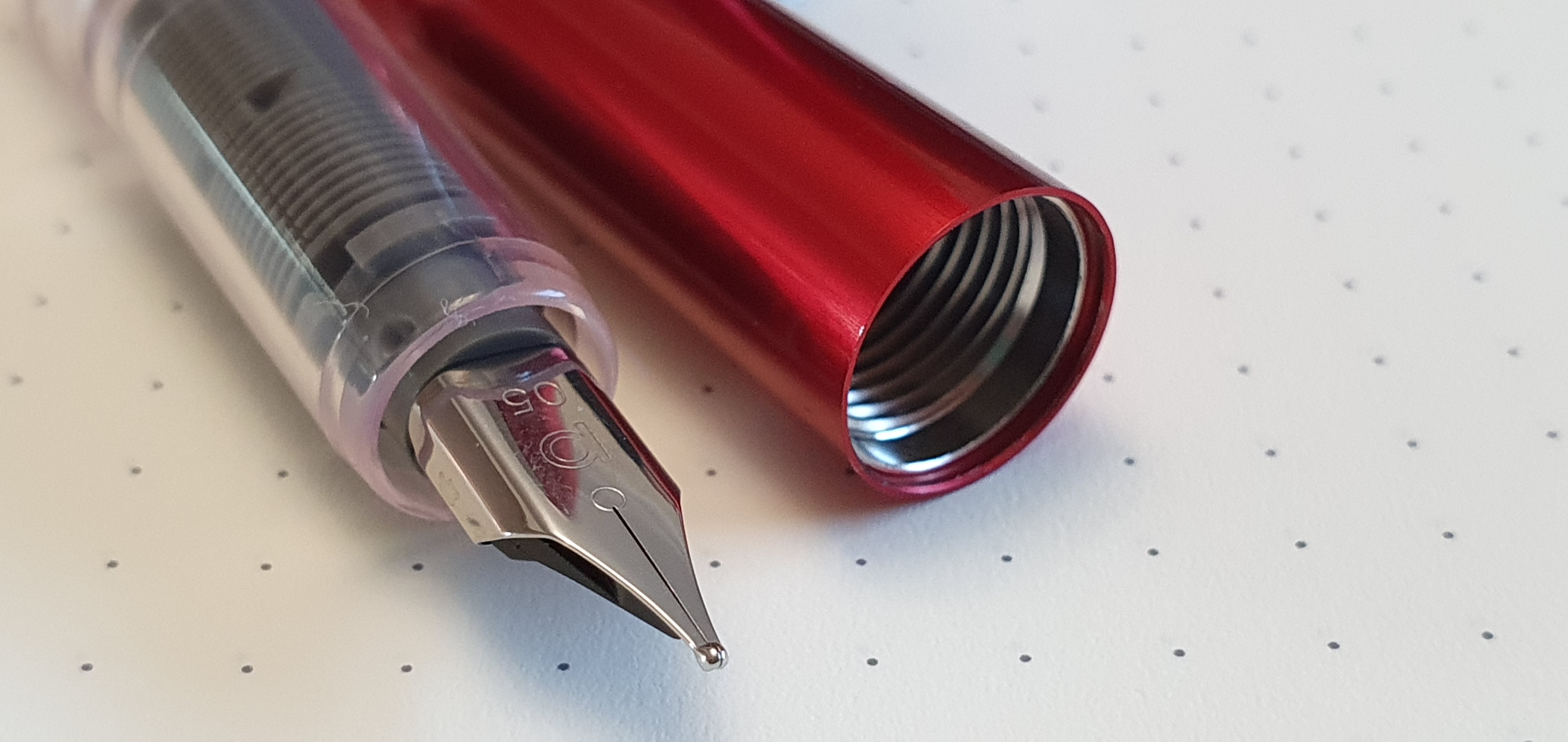
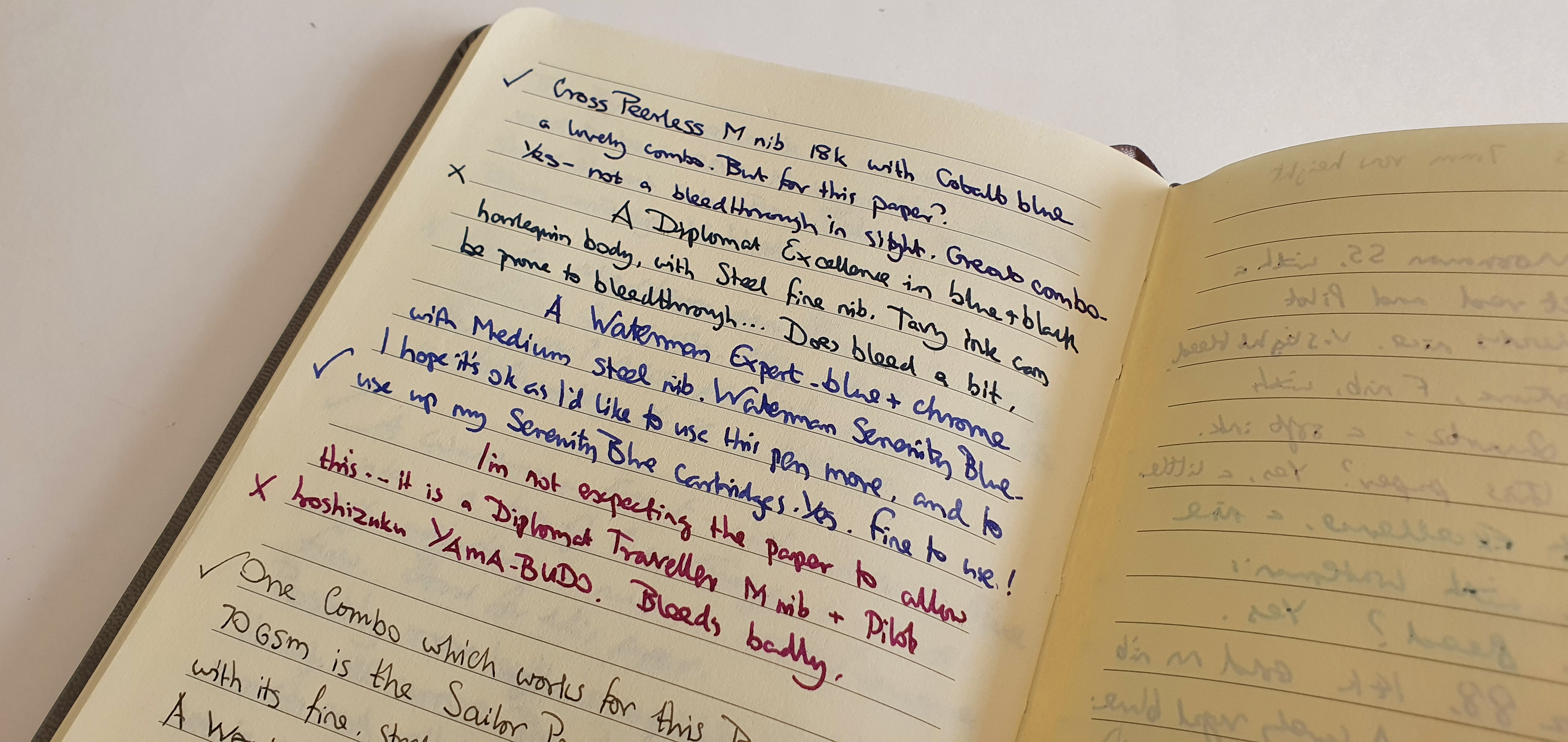
The cream paper, with grey lines, is pleasant enough to write on with a fountain pen. The weight of 70gsm means it is a little on the thin side, and so you can expect some show-through. However it is bleed-through that renders a paper unsuitable for double-sided writing with a fountain pen. I tested a selection of pens and inks from my currently inked pen cups, to see which could be used and which could not.

Some bleed-through with certain inks. You need to choose your inks with care.

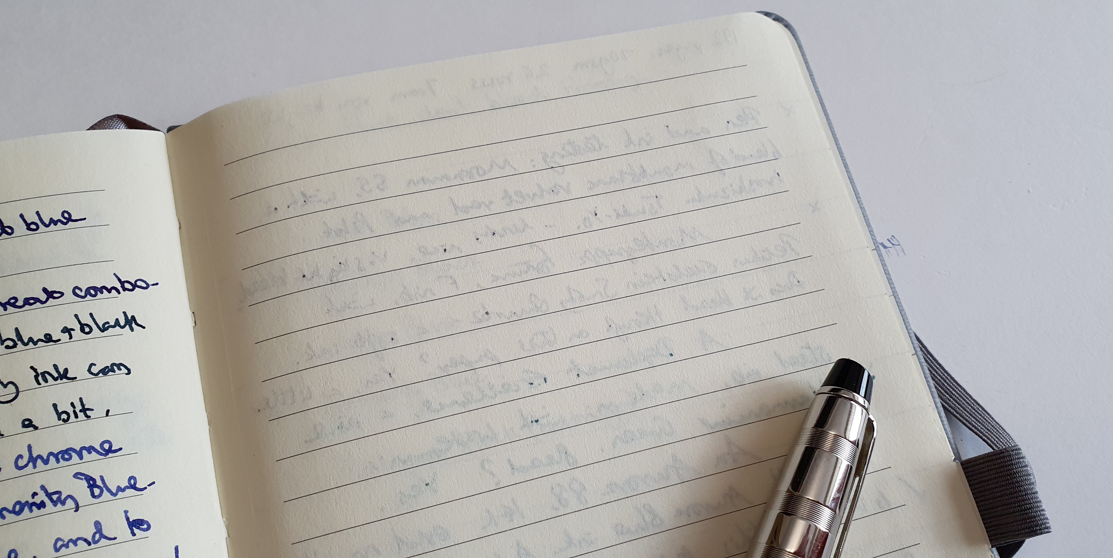
Those (from my initial test batch so far) that did not exhibit any bleed-through were Aurora blue, Graf von Faber-Castell Cobalt blue, Waterman Serenity blue, Noodler’s black and Platinum black cartridge.

On the other hand, those inks that the paper did not cope with so well, were Waterman Harmonious green, Conway Stewart Tavy by Diamine, Pilot Iroshizuku Yama-budo, and Onoto Meditteranean blue.

I realise that it is not just the ink that determines whether it will bleed through papers, but how wet it is applied, which depends upon the individual pen.

I quite enjoyed sampling a few different pens and inks on the back pages of the notebook to see which I could use without bleed-through. This was no hardship and I anticipate that most fountain pen enthusiasts can find several combinations that work well from their own selections. It may be disappointing if you have a particular ink that you want to use in the notebook and then find that you cannot, or at least that you cannot use both sides of the page. It is necessary to test out the ink first.

Ticks for pen and ink combinations that do not bleed through. Crosses for those that do.

Conclusions.

Compared to the Leuchtturm, the pages are smaller, there are less of them, and the paper is less resistant to bleed-through from certain inks. Whilst it might look superficially to be an alternative to the Leuchtturm, (with its elastic closure and expandable pocket), it loses out to the Leuchtturm in size, paper quality and the number of pages.

Still, if you have lots of fountain pens and enjoy writing, then you need notebooks to write in. I shall enjoy using this one. It is not perfect for me. I would prefer that the line spaces were 8mm rather than 7mm and that the page width not been cropped since the last version I bought.

I have in mind to use it to write up some memories, little fragments of life remembered. Sitting down with one pen and one notebook, and one hour of quiet time, is something I find relaxing. Perhaps it is my equivalent of going to the pub for a pint.

The not-quite A5 journal with a Sailor Procolor 500 fountain pen.

A London odyssey and early thoughts on the Platinum Plaisir fountain pen.

This weekend, with Covid restrictions having eased in the UK of late, I enjoyed an excursion into London’s West End for the first time in many months and visited a few of my favourite haunts.

Beginning at Choosing Keeping, a wonderful store for stationery, I found that they have an exciting range of fountain pen inks, including Pilot Iroshizuku, Sailor, and Rohrer & Klingner, a refreshing change from the usual chain store selection. I was able to handle a Sailor Pro-Gear Slim Blue Dwarf limited edition pen, of which they have plenty in stock with a range of nibs. This is a great shop for attractive journals and for boxes of Japanese pencils too.

I visited some guitar shops in Denmark Street. Rose Morris has a good range of Taylor acoustic guitars on display. Another shop across the road sells Martin guitars. For mandolins and a huge variety of other stringed instruments, Hobgoblin Music in Rathbone Place is a gem and it was good to have a browse. I discovered and bought my baritone Ukulele there a few years ago.

Also in Rathbone Place, is Park Cameras, where I tried some Nikon Monarch binoculars and compared them with the Zeiss Terra ED, 10×42, of similar price. Either would be an upgrade from my current Nikon Prostaff 10×30 binos although I am very happy with them and they are excellent value.

Walking along London’s Oxford Street on a Saturday afternoon, weaving through the crowds of shoppers, it was good to find things getting back to normal. A lot of American Candy stores have appeared in Oxford Street, which I do not remember seeing before. At John Lewis, I had a look at the stationery department on the lower ground floor. The island of fountain pen display cases seemed to have shrunk a bit from days of old, but the usual suspects (Cross, Sheaffer, Waterman and Parker) were all there.

Finally I reached Selfridges. The Fine Writing department is also on their lower ground floor although it had moved position sometime before the pandemic. Montblanc has its own area. A short glide down on the escalator and you enter a world of Montegrappas, Graf, Caran d’Ache and other exotica.

There is also a stationery corner for more ordinary items and it was here that I found a row of Platinum Plaisir fountain pens, hanging on a rack in a selection of colours, with matching coloured packaging. It was the first time I had seen them in a bricks and mortar shop. My usual source for such items would be Cult Pens.

Not having tried the Plaisir before, and given that they were only £13.00, it was simply a question of choosing between black, dark blue, red, orange, citrus yellow, light frosty blue or silver. All had the same Medium (0.5) nib. I went with red.

Platinum Plaisir. It is very red.

Description.

The Platinum Plaisir is an aluminium pen, making for a more attractive and durable body than Platinum’s entry level plastic demonstrator Preppy, but with the same nib and a feed which is visible through the transparent grip section. You get a strong metal pocket clip, a shiny chrome cap band and a barrel which is not covered with text and bar code.

The cap pulls off, needing a very determined effort, made more difficult by the hard-to-grip finish of the barrel and cap. The cap features the Platinum “slip and seal” sprung inner cap which supposedly allows the pen to be left inked for up to a year without drying out.

Unboxing. Each colour pen has its own colour package but not one that you would want to keep.

The pen came with one Platinum black cartridge but no converter. Cult Pens sell Platinum converters separately in either silver or gold coloured finish but with a notice that whilst they will fit inside a Preppy or Plaisir, ink will only be drawn into the feed and not the converter and so you may need to fill the converter separately, outside the pen. Another filling option is to purchase an adaptor to enable use of standard international cartridges.

With cartridge inserted.

Size and weight.

The Plaisir is a good medium size, at 142mm long capped, or 122mm uncapped. The cap posts well bringing the length up to around 151mm whilst still remaining very light. Capped or posted, it weighs about 17.5g with a cartridge, or uncapped 9.5g and 8g for the cap alone.

The nib and writing experience.

The steel nib is of the wrap-around variety, like a Lamy Safari nib. It has no breather hole. The nib set-up looked promising under the loupe, with nice symmetrical tipping and a visible but minimal gap between the tines right down to the tip. I pushed in the supplied black cartridge. It popped in decisively and ink immediately splattered onto the feed. I put pen to paper and it started to write almost straightaway. Ink flow to the nib was consistent and ample, even for lefty-overwriting but without being too wet.

The M05 nib. Plenty of tipping.

The medium nib with rounded tipping provided a very smooth writing experience. It has a little bit of give but no “tooth” to give feedback. Like a Preppy nib, it works well. On the Leuchtturm and Rymans notebook papers I have tried so far, it did not skip but might struggle with very shiny papers. It did not have the same “Wow” factor as the medium nib on my Platinum Curidas which seemed more crisp and stubby, but as a general purpose writing tool at this price it provides a very adequate service.

The writing is as you would expect from a round tip medium nib. A fine line can be obtained from the reverse side.

Likes and dislikes.

Before being critical, it is worth remembering that this is a £13.00 pen which is probably about as good as it can be at that price.

At first I was a bit disappointed by the cap being so hard to pull off. However this is probably necessary to help create an air tight seal around the nib in conjunction with the slip and seal inner cap. It does shut firmly with no wobble. Also, I have a knack for this, to minimise the effort and avoid mess: grip pen firmly with thumb tips side by side and parallel to the barrel; then push two forefingers against each other in a controlled pull, and stop as soon as the cap clicks (not ripping the pen and cap apart and sending ink splashing on clothing and surroundings etc).

The proprietory ink cartridges are a bit limiting but there are other options as mentioned above. Also the nib, whilst smooth and reliable, is rather bland and basic.

On the plus side, you get a good sized pen, competitively priced, well made in Japan, with durable metal body, in a wide choice of colours, a grip section which is not marred by facets or a sharp step, which writes reliably, with the admirable slip and seal capping feature, all making for a pen that is robust and ready to be carried around as an EDC or chucked in a bag without worry. It is a good rival to the Lamy Al-star, for those opposed to faceted grips.

A good true red, high gloss finish.

Before getting the tube home, I walked over to see the new Marble Arch Mound, a green hill that has been created in a corner of Hyde Park, next to Marble Arch. It has been in the news this week as the project costs ran to double its initial budget, finishing up at £6 million and the minister in charge at Wesminster City Council resigned. It is not, as I first thought, a huge mound of earth but a hollow structure made from scaffolding poles and then with an outer shell and covered with turf and real grass. An external metal staircase allows visitors to climb up to a viewing platform at the top. It is well worth the climb to gain a new viewpoint over the London skyline. It is a temporary installation and currently free to visit although tickets are booked online.

A view from the Marble Arch Mound. Looking down on Park Lane, with the London Eye and the Shard on the horizon.

I do not doubt that it must have taken a lot of work to design and create this empty hill. I am glad that I was able to go up it without pre-booking (it was late afternoon) and that it was free. Also, it made the new Platinum Plaisir in my bag seem even better value for money.