2020: Some of my fountain pen highlights.

I feel very fortunate, to have derived so much enjoyment from my fountain pen hobby for another year. It has been a different year in many ways – no pen shows or pen club meets since March, no journaling on foreign holidays or discovering interesting pen shops overseas – but there have been plenty of other compensations.

Acquisitions.

I spent far less money on fountain pens this year. I acquired 16 pens of which six were given to me leaving 10 which I bought for myself. I began the year with a hope of becoming “fountain pen neutral” – selling or giving away as many pens as I bought. This did not happen although I did give away five and sell one. The sale was of my Delta Fantasia Vintage in dark green celluloid, one of only 25 made in that colour. The sale came about as a fortuitous bit of matchmaking by my friend Jon, of pensharing.com who saw on Instagram that someone was looking for this model. Knowing I had one, he put us in touch. My Delta has now been rehomed to Taiwan.

Taking account of this sale, my total net spend on fountains this year was a comparatively frugal £499, a healthy reduction on last year’s £2,000.

Pen favourites of 2020.

It was the same Jon who alerted me to an event in February at the delightful London stationery shop, Choosing Keeping, for the launch of the Platinum Curidas, an exciting new retractable fountain pen from Japan, before they were available from other dealers here. I bought one. I loved how it wrote and the rather intricate way of filling the pen, but found it more comfortable with the metal pocket clip removed. The clip was detachable but this left a keel-like bump of acrylic, making it impossible for me to grip the pen comfortably. After a few days, I filed it off. This act and my blog post about it brought me to the attention of The Pen Addict podcast and I got a surprise mention in Episode 399. I think it is a terrific pen although I am aware that some people had problems of the feed cracking beneath the nib.

After buying the Curidas I bought my first Pilot Capless in the stealthy matte black finish with a medium nib. The nib is a joy. It is a remarkable pen but again, for my lefty overwriter style the clip is in my way. I can use it in underwriter mode. In overwriter mode, I cannot rotate the nib to the paper as I normally would to find the sweet spot, but the 18k nib is so soft and forgiving that it writes almost as well. I would still prefer it without the clip. I have read up on the “clipectomy” procedure but this requires tools and is rather more tricky than I can do myself.

I am still discovering what I like and what I do not like in a fountain pen. I have said before, that it is nice to be able to use and experience pens of all shapes and types. But this year I was given a Diplomat Excellence A Plus by my wife for my birthday and it is one of those pens that feels just the right size, shape and weight for me and also has a superb steel nib (a fine) which is smooth and firm. I enjoy picking it up every day for my diary.

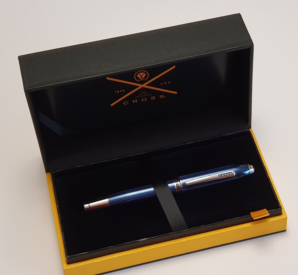
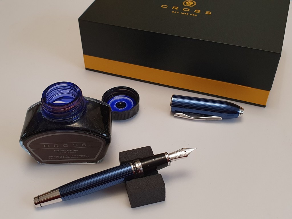
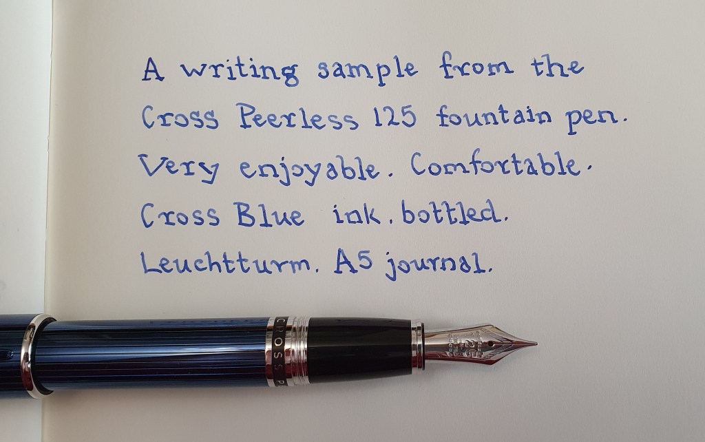
Another pen which is similar to the Diplomat and equally comfortable is the Cross Peerless 125 but with an 18k gold nib made by Sailor. The quartz blue model is both gorgeous to look at and to hold! This year I also bought my first Sailor Pro-Gear classic and later, a 1911 standard, having been so impressed by the Pro-Gear Slim that I acquired last year.

The Cross Peerless 125 in quartz blue (left), next to the Cross Townsend.

Favourite inexpensive pens of 2020.

I still have a weakness and optimism for inexpensive pens. This year’s intake included a Lamy Nexx, Waterman Allure, Faber-Castell Hexo and a Jinhao 159. I was given a Platinum Prefounte and converter, with a fine 0.3mm nib which is a very useful addition. My most successful find was the Moonman S5, clear demonstrator eyedropper pen which comes with three nib units. One of these was an oblique which I found beautifully smooth and enjoyable and flattering to my handwriting. I have learned this year that for me, (speaking as a lefty overwriter), pens fall into two categories: there are those that make you adjust your grip and your handwriting to conform to them: the Pilot Capless and the Lamy Safari are examples. Then there are other pens that conform to the way I write and bring out the best in my writing: the Moonman S5 with oblique nib is an example of this. It has nothing to do with price.

The Moonman S5 acrylic demonstrator eyedropper. With a to-die-for oblique nib.

Other highlights.

Having additional time at home during the lockdown allowed me more time for pen-related activities. I acquired a set of brass shims and set about trying to improve a few problem nibs. The most notable success was with my Aurora 88, a stunning pen which should be the pride and joy of my accumulation but which wrote rather more fine and dry than I liked. With a few minutes of tweaking and a fortuitous bit of controlled recklessness (which included wriggling a craft knife blade between the 14k gold tines) I was able to transform the nib into a slightly wetter and more truly “medium” but still smooth writer, which I now love using.

During this strange time I was able to be a bit more productive with the blog. Whilst on furlough from work from April to June inclusive, I published 16 posts. The blog has been a lifeline – a source of satisfaction, relaxation and enjoyment and a bit of escapism I suppose, during the troubling year. I enjoy receiving comments and am always glad and flattered to be asked for help from readers on their pen-related issues. Two separate readers both had the same problem of being unable to fit a converter in the barrel of a new Cross Bailey Light: the solution was to remove the supplied second cartridge which gets wedged tight in the back! Questions about the best starter fountain pen, or a suitable good fountain pen for a Christmas gift are often harder to answer than you might think but I do my best.

With pen club meets disbanded, there have been a few Zoom meetings to catch up and to talk pens, although of course without being able to try each other’s. It has been good to keep in touch in this way, with a few pen friends from Instagram as well.

Personally though, I feel better able to marshal my thoughts in a letter and I have enjoyed some old fashioned pen and ink correspondence with pen friends here and abroad over the year. For the latter, I write the letter by hand and then scan and send it by email.

Another writing project has seen me copying out Marcus Aurelius’ book “Meditations” in my pseudo-typewriter font style of underwriting. I enjoy reading and copying the text and changing pens after every two page spread. I am about three quarters of the way through.

Conclusions.

So, that was my year in pens. Thanks once again to my fellow bloggers, correspondents and instagrammers for their friendship. My year ended as it began with surprise gifts from my pen friend in Australia. In January I received two lesser-spotted Pelikans: a “P55 Future” and a “Go!” neither of which I knew about and I have enjoyed trying them. Then a few days ago, I was given the pre-loved Graf von Faber-Castell Classic Anello, which I had been keeping until such a time as he could get over to collect it. I am yet to match such feats of generosity. But I am learning that the pursuit of even more pens for oneself, as a path to happiness, is destined to be endless and doomed to failure. The real trick is to learn contentment with, and to enjoy using fully, what you have.

In the wild: a beginner’s glossary of fountain pen terms and phrases.

For those new to the hobby, some of the terminology encountered on fountain pen blogs and forums may seem confusing. Here in a brief introduction, is a bluffer’s guide to get you started or to toss in to conversations with pen enthusiasts over the holiday period. Doubtless there are many others that I have omitted.

  • Acrylic A transparent thermoplastic often used in pen making. Short for Polymethyl methacrylate. So, plastic then.
  • Architect A type of nib grind to produce narrow down-strokes and wide cross-strokes, so named as used reputedly by architects in those elegant annotations of technical drawings and plans. The opposite of a stub nib.
  • Baby’s bottom The shaping and over-polishing of a nib’s tipping material which results in the pen failing to write or skipping.
  • Barrel Usually the long bit of the pen, that screws onto the section.
  • Bleedthrough An annoying tendency of ink to soak right through a sheet of paper to the other side, when unfortunate combinations of pen, ink and paper are used.
  • Bounce A certain softness to a nib, which writes with a spring in its step. Opposite of a nail.
  • Bricks and mortar A shop/store that you can physically walk into and talk to a human being, as opposed to online shopping.
  • Broad The next size of nib width after fine and medium.
  • Bullet proof A term applied to inks that have a high level or water resistance.
  • Buttery A term applied to certain nibs which are extremely smooth, as in “like a knife through butter.”
  • Buyer’s remorse An unpleasant sense of regret at having bought a pen, often when expensive and bought in haste and/or when found to be less satisfactory than one you already own costing one tenth of the price.
  • Currently inked The term conventionally used when providing a list of those of one’s fountain pens which contain ink, at a given time.
  • Cursive Joined up writing.
  • Demonstrator A pen which is comprised of a transparent or semi-transparent material through which you may observe the ink sloshing around and the inner workings of your pen.
  • Dry time The length of time taken for ink to dry on paper to avoid smudging. May also be used to describe a period of abstinence from purchasing additional pens.
  • Ebonite A brand name for a hard rubber, made from vulcanizing natural rubber, for prolonged periods.
  • EDC Every Day Carry. A pen that is carried on a daily basis.
  • Eyedropper A device comprising a tube with a squeezable rubber bulb on the end used to lift ink from a bottle and deposit it into the barrel of a pen. Term also applied to describe pens that fill in this way.
  • Facets Flat surfaces on a pen, sometimes found on the grip sections of pens intended for novices to aid “correct” placement of the fingers symmetrically either side of the nib. Loathed by those who do not conform to this way of holding a pen, as their fingers rest on uncomfortable sharp ridges. For example, Lamy Safari.
  • Feed The part of the pen that regulates the supply of ink from the barrel (ink reservoir or cartridge) to the nib. Usually plastic but sometimes Ebonite in older or a few high end fountain pens if you are lucky.
  • Feedback The sensation of feeling, and sometimes hearing, your nib on the paper surface as you write. Too much of this or too little can be a bad thing. A particular feature of some nibs from Aurora, Montblanc and Sailor.
  • Finial A decorative feature at the top of a pen cap. Serves to help identify a pen in a Pen cup.
  • Fire hose A metaphor applied to nibs which write with an over enthusiastic flow of ink.
  • Forgiving A nib which will still allow you to write when the nib is at less than the ideal angle to the paper.
  • Fountain pen friendly Paper which can be used enjoyably for fountain pens, having a pleasant writing surface and a resistance to bleedthrough. Not paper which is too shiny or coated, or which is too rough textured.
  • Ghosting When you can see one page of writing from the opposite side. Also called showthrough. Not as bad as bleedthrough but may sometimes be bad enough to limit use to one side of the paper.
  • Girthy Having a wide diameter. Typically applied to the grip section or barrel of a pen.
  • Grail Term used to describe, typically, an extremely desirable high end pen that owing to its price or rarity is almost unobtainable.
  • Grind A reshaping of a nib to create a different writing experience and line from its original design.
  • Gusher A nib that emits an excessive amount of ink; see also Fire hose.
  • Hard start The frustrating tendency of some pens not to write immediately when required, after an interval in use of a few days.
  • Homage A polite term for a pen that is a blatant copy of a respected pen design from a different manufacturer. A euphemism.
  • In the wild The natural habitat of fountain pens not yet in your own household. Where you might hope to encounter a pen, hitherto seen only on the internet.
  • Inner cap Usually plastic; an interior layer inside the pen cap to create an air tight seal around the nib when the pen is capped, to prevent ink evaporation, nib dry out and hard starts.
  • Italic A slanting style of writing.
  • Lefty A person who is left handed.
  • Line variation The attractive quality of writing which exhibits both narrow and broad strokes, achieved either by using a flex nib and applying pressure on the down strokes or by using a stub or architect grind nib and keeping the nib at a constant angle as you form the letters.
  • Loupe A magnifying lens, usually of higher magnification than a typical magnifying glass and sometimes illuminated, used by jewellers and watchmakers but also essential for inspecting the nib.
  • Medium A good comprise between a fine and a broad nib. Suits average writing size. Note that in some Japanese pens, a medium nib may equate to a western fine.
  • Micromeshe Abrasive pads for smoothing nibs.
  • Nail A metaphor for a very stiff nib with no bounce or flex.
  • New Pen Day A term often used to announce an additional fountain pen acquisition on social media.
  • Nibliography A term believed to be first attributed to Jon of Pensharing.com to describe a list of pens and inks used in a handwritten letter.
  • Nibmeister A person highly revered in the fountain pen community who is skilled in the craft of altering or repairing a nib.
  • Oblique A nib in which the tip is cut at an angle, usually at 15 degrees, typically from top right to lower left.
  • Overwriter One who writes with a pen held above the line on which he is writing, with the nib pointing towards himself.
  • Pen cup A receptacle to hold the “Currently inked” fountain pens in a vertical position with nibs upwards.
  • Pen loop A device to hold a pen attached to a notebook or notebook cover, usually made of elastic or leather.
  • Piston A type of filling mechanism. A plunger which is lowered to expel air from the ink reservoir and then raised to draw ink up from a bottle by vacuum. Most converters also work in this way.
  • Post Verb, to attach the pen cap to the back end of the barrel, to add length and weight to a pen whilst writing and for safe stowage. Noun: an article written on a blog or verb, to publish such an article.
  • Precious resin: The material from which many Montblanc fountain pens are made.
  • PVD Physical Vapour Deposition: a type of coating applied to nibs or other furnishings of a pen.
  • Rhodium A silver coloured metallic element, highly reflective and resistant to corrosion. Sometimes used to coat nibs and furnishings of a pen.
  • Roll stop A protrusion on a cylindrical pen to prevent it from rolling off a surface.
  • Safari A model of fountain pen made by Lamy and often used for size comparison photographs of other pens.
  • Saturation A quality used to describe ink. Highly saturated inks have a high purity of colour.
  • Section The part of the pen that you grip. Also called the grip section.
  • Shading A pleasing quality in an ink, to produce light and dark tones, caused by ink pooling in the indentations formed by applying pressure to the paper.
  • Sheen A quality of some inks to appear a different colour from different angles. For example a blue ink might exhibit a red sheen.
  • Shellac A natural resin, which was used to form a glued seal in the making of some fountain pens.
  • Shimmer A sparkling quality in ink.
  • Shims Brass sheets of various thickness which are very useful for cleaning and adjusting nibs.
  • Showthrough When the writing on one side of a page is obtrusively visible on the other side. See also ghosting.
  • Sidewriter A person, typically left handed, who writes with his hand moving along from the side of the page rather than from below the line of writing (Underwriter) or above it (Overwriter).
  • Silicone grease A lubricant and seal against ink leakage. Also used by scuba divers and hence available in diving shops. Particularly useful for eyedropper pens.
  • Skip The frustrating tendency of a pen to move across paper without laying down ink.
  • Stealth Term applied to an all black pen with a matte finish, after the aircraft designed to evade detection by radar.
  • Step The difference between the level of the barrel and the section of a pen, sometimes creating a sharp ridge which may be uncomfortable.
  • Stingy Mean or ungenerous. Term used to refer to nibs which write on the dry side, causing reduced lubrication of the nib on the paper and a less enjoyable writing experience.
  • Stub A nib shape which produces broad down strokes and narrow side strokes. Often expressed in millimetres for the broadest strokes, such as 1.1mm, 1.4mm etc.
  • Sumgai The unknown person who gets the best deals at a pen show.
  • Sweetspot The part of the nib which when held to the paper at the optimum angle provides the smoothest writing experience.
  • Tine gap The narrow space between the tines of a nib. Usually narrowing from the breather hole towards the tip. The gap down which ink is drawn as the pen writes.
  • Tines The two sides of a nib, separated by the nib slit or tine gap.
  • Tipping A pellet of hardwearing material applied to the end of the tines and then shaped and polished to form the writing surface.
  • Tomoe River A brand of fountain pen friendly paper from Japan, a favourite of many fountain pen users.
  • Tooth An ability of a pen to provide a degree of feedback from the paper surface and to write even on shiny coated papers.
  • Underwriter One who writes with his pen below the line of writing and with the nib pointing away from himself. A fortunate person for whom fountain pens behave better and exhibit smoother writing.
  • Wish list A list of pens that one is thinking of buying and craves, instead of focusing on those which he already owns. An aid to deciding whether to splurge on one particular pen or another.
  • Workhorse An unglamorous pen that is used day in day out for general purposes and menial tasks.

So there you have it. There are probably lots of terms that I missed, as I only thought of this today. Any errors are purely my own and may be corrected in future editions.

Early thoughts on the Cross Peerless 125, quartz blue fountain pen.

Well, this is a bit sudden. This attractive pen has just arrived today, but as it was ordered and received all within 21 hours, it seems fitting to continue the momentum with some initial impressions.

I have had my eye on a Peerless 125 since they were first introduced a few years ago. I saw them first in Fortnum & Mason, where the gold plated guilloche version was on display under the bright lights. I looked at a black resin version in Harrods once. A few years passed. I acquired my Cross Townsend in quartz blue and wished that a Peerless would be made in that finish.

Seeing on a friend’s Instagram post this weekend that there is now a quartz blue option, my interest was reawakened. I wrestled with the usual conflicts. Did I need it? No. Would it be better than, say my Aurora 88? Probably not. But it had enough differences from my Townsend to make it a worthwhile purchase, namely a wider more comfortable girth, a screw on cap, a Sailor nib, the top-of-the-range kudos and a sparkly blue Swarovski jewel in the finial! Also, on offer at £235 it seemed good value at half the price of a Montblanc Classique, always a dangerous line of argument.

The unboxing.

The pen arrives in a large, clamshell type cardboard box with a cardboard outer sleeve. First impressions seen in real life and natural light, are favourable with the beautiful rich blue glossy finish looking very handsome against the polished silver coloured fittings. Unscrewing the cap I was eager to examine the medium nib. It looked nicely tuned with a narrow tine gap visible under the loupe and the customary Sailor tipping which was flattened to form facets on the face of the nib and at the sides where the tipping is pointed like a spear head.

Cross Peerless 125 in quartz blue.

Beneath the pen tray, was a little foam compartment with a Cross, screw-fit converter, two black cartridges and a little velvet draw-string pouch for the pen. The pen no longer comes with an acrylic block display stand.

Description.

Although the cap and barrel feel smoothly lacquered at first, there is actually a texture from the striations beneath the lacquer which run down the length of the blue barrel, all the way round. On the cap, they do not quite go all the way round; there is a gap, of about one sixth of the diameter on one side of the cap where the lines are absent, not that you would notice unless you looked hard. If you put your finger nail against the barrel or cap and rotate the pen, you can feel the little grooves, which make for an interesting finish.

The cap finial has a little crater, like a volcano with a blue Swarovski faceted crystal set inside, which is quite lovely. I also found a serial number laser etched around the finial. Mine was ATX46987. I take it that the ATX stands for A. T. Cross Company LLC. Alonzo Townsend Cross was the son of Richard Cross who had founded the business in 1846. The truncated, bullet shaped cap top is unmistakably Cross. The pocket clip has CROSS in a black enamel background and is very firm. This makes it very secure for a shirt pocket although rather hard to use easily if you wish to show off that crystal. I am more likely to use a pen case.

Swarovski crystal. I don’t usually buy jewellery.

The cap unscrews in just over two full turns, a much nicer experience than uncapping the Townsend, although taking a moment longer.

The section is smooth and quite broad, where the pen rests on your middle finger. I find it very comfortable to hold although I have yet to try a long writing session. You may find yourself gripping near the cap threads but these are not sharp or uncomfortable. The barrel has a band saying “CROSS PEERLESS 125” on a black enamel background which is still visible even when the pen is capped although mostly hidden when held for writing. At the other end of the barrel, there is an impressive shiny ferrule, with a black groove near the end which I think secures the cap when posted.

Pairing with Cross blue ink for the first fill.

The cap, despite its large size, is thin and feels lighter than expected and posts well, to a depth of about 35mm, more than half of the cap’s length. Early tests show that I can write comfortably with the cap posted or unposted. I rather like the added length and girth at the back end, particularly with barrels that taper like this. When posted, the pen lays back nicely in the web of the hand.

To my delight, there is a date code around the metal collar for the cartridge or converter. Mine reads 1219.

With Cross blue ink on Leuchtturm paper.

The nib and writing performance.

I flushed the nib and feed with water a few times, before filling with Cross blue bottled ink and then tried the pen on Leuchtturm paper. This is an 18k nib, marked as a medium but writes rather more like a medium – fine by usual western standards. It is a firm nib. The Sailor feedback is there. I found that as a lefty-overwriter, the pen is smoother in underwriter style since the nib soon moves from the sweet spot when in my overwriter mode and you feel the edges of the faceted tipping. Ink flow was good, neither too wet nor too dry. I tried the Cross blue ink for the first fill, although paler than say a Montblanc royal blue.

18k medium nib, made by Sailor.

Likes and dislikes.

I do appreciate the extra girth of this pen and the screw cap. It is very attractive and tactile and the weight is substantial without being burdensome. I was intrigued to get one and try it for myself after reading good reports online. The nib made by Sailor feels very different from the Townsend’s nib made by Pelikan which was smoother and more forgiving, but the Sailor feedback is distinctive and special and, paired with the Peerless’s more girthy barrel, makes a comfortable and luxurious writing instrument.

Size comparison with the Cross Townsend (left).

For dislikes, I would only suggest that the pocket clip could be improved if sprung and a little easier to operate, but having said that, I never took to the Cross Apogee style of sprung clip, which slipped around from side to side. The Peerless clip will at least grip your clothing like its life depended on it.

Conclusions.

I had little hope of resisting the charms of this beautiful stately pen and will look forward to trying some longer writing sessions and different inks, in the months to come, God willing.

Gratuitous finial shot.