Early thoughts on the Flying Tiger traveller notebook.

On a recent visit to London’s Canary Wharf, I found a branch of Flying Tiger Copenhagen, and popped in for a browse.

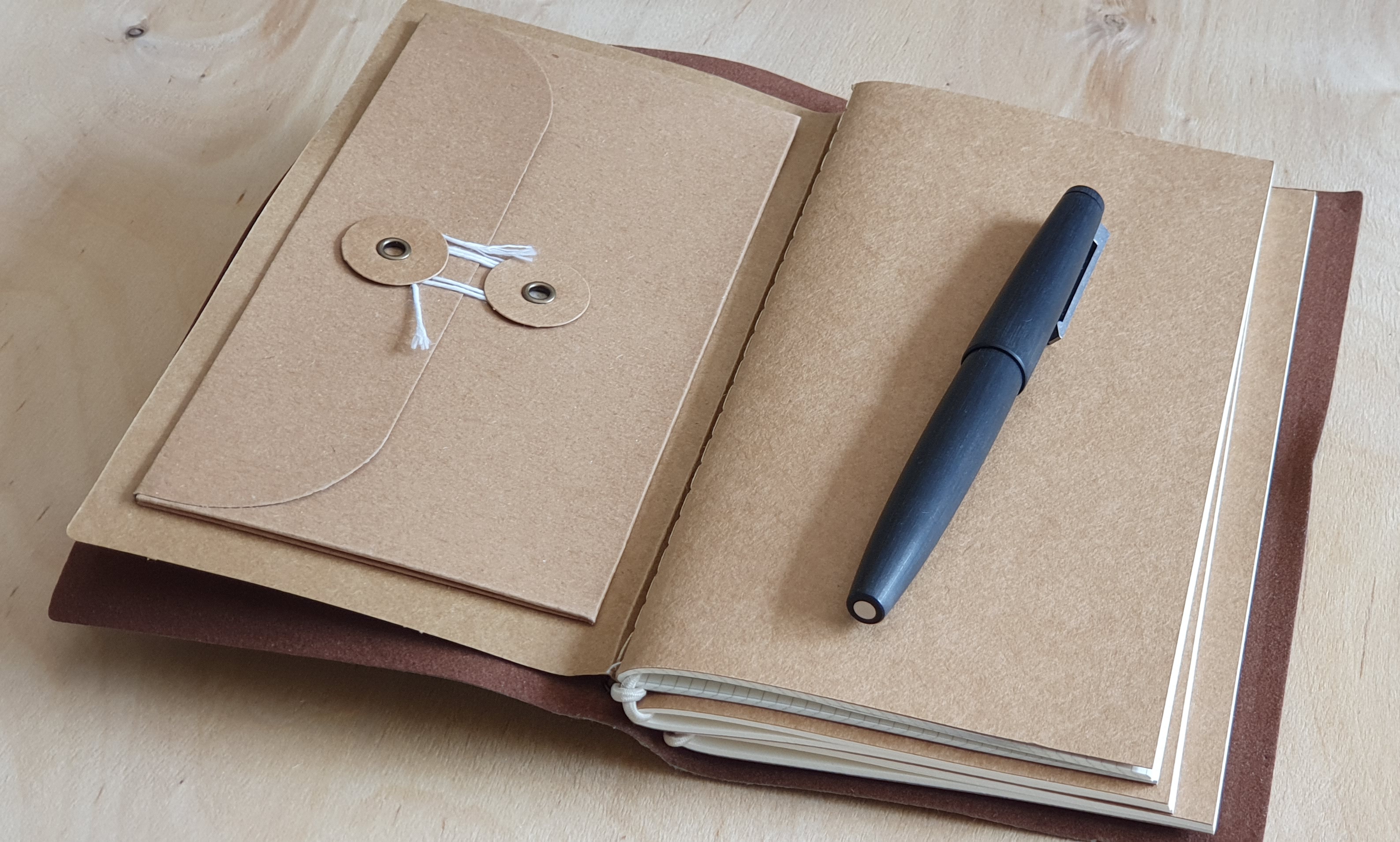
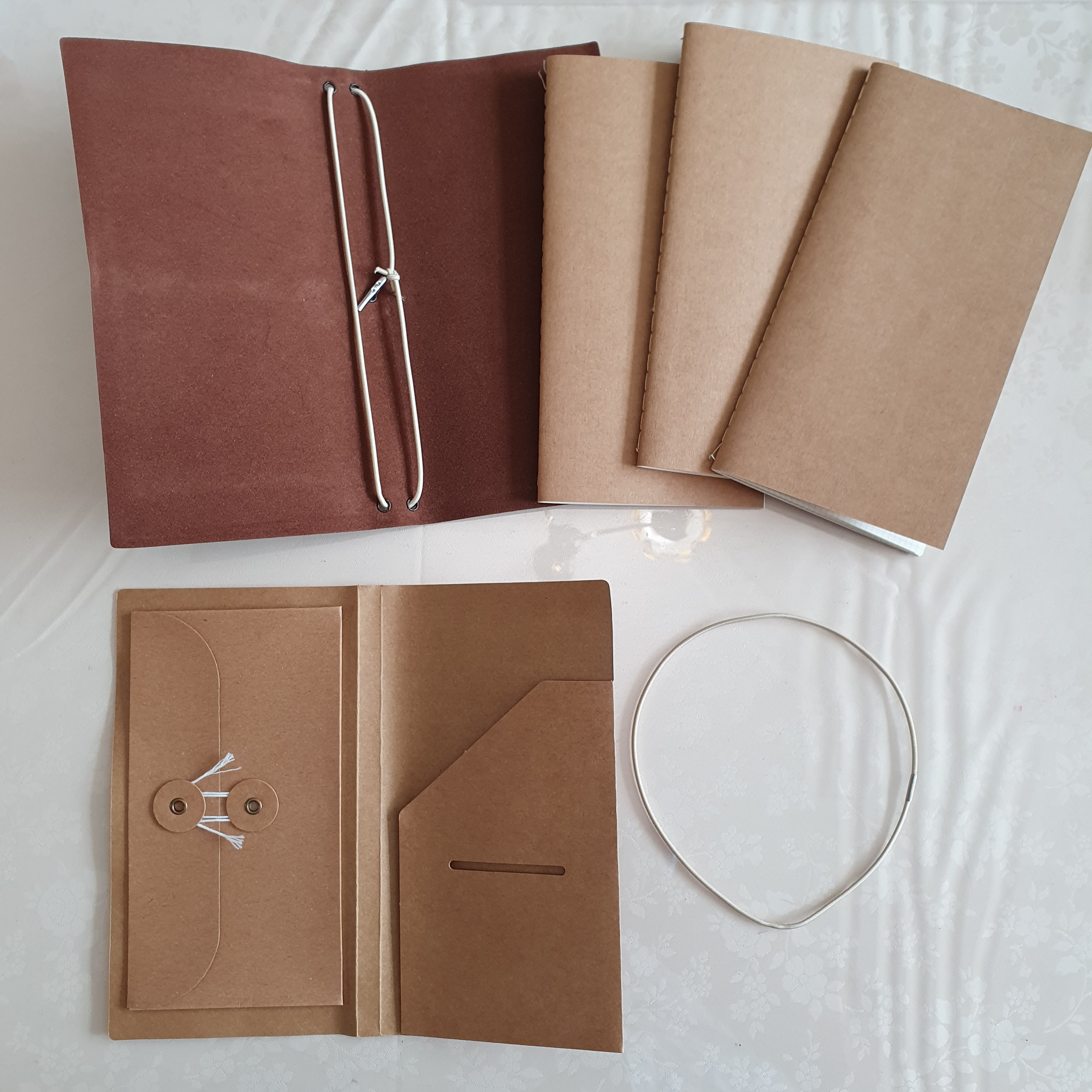
Right near the entrance, I spotted an olive colour, traveller-style notebook cover with elasticated loop, containing three notebooks, each with different paper. It was simply labelled Notebook, or Notesbog in Danish. The cover was not leather, but felt like a soft, fibrous cardstock with a brown faux-suede backing. Inside this, a removable brown card (which slips in behind the notebooks, between the books and the outer cover) provides an expandable wallet with cotton fastening on one side and another little pouch, to keep tickets or receipts or such like on the other side. As the ticket pouch needs to be the right way up, this has to be at the back, whilst the expandable wallet will be at the front of your notebooks. However if you do not need these, or prefer not to feel the uneven lumps and bumps below the paper when writing, you can slide it out.

Traveller-style notebook from Flying Tiger. Delike New Moon fountain pen for scale.

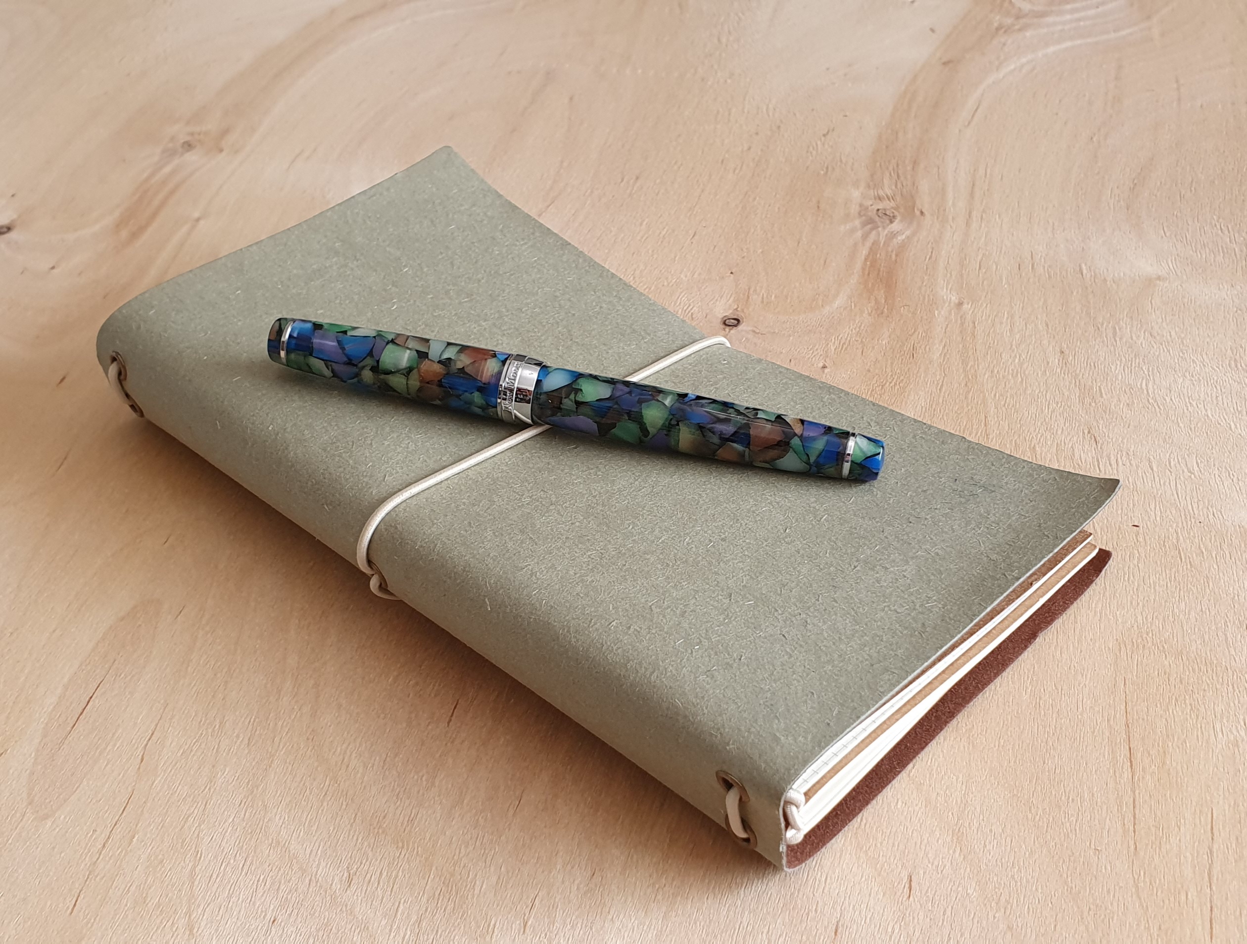
I was very taken with this, especially the olive colour. The notebooks looked tall and slim, rather taller than the red Silvine memo book that I usually carry when out and about, but the same page width. The paper in the first notebook was squared, the second book had lined pages and the third had dot grid. The paper felt reasonably thick and good quality. The notebooks were each stitched, rather than stapled and with plain brown card covers. Each book was held in place with an elasticated loop.

Size comparison with my usual carry, a Silvine pocket notebook.

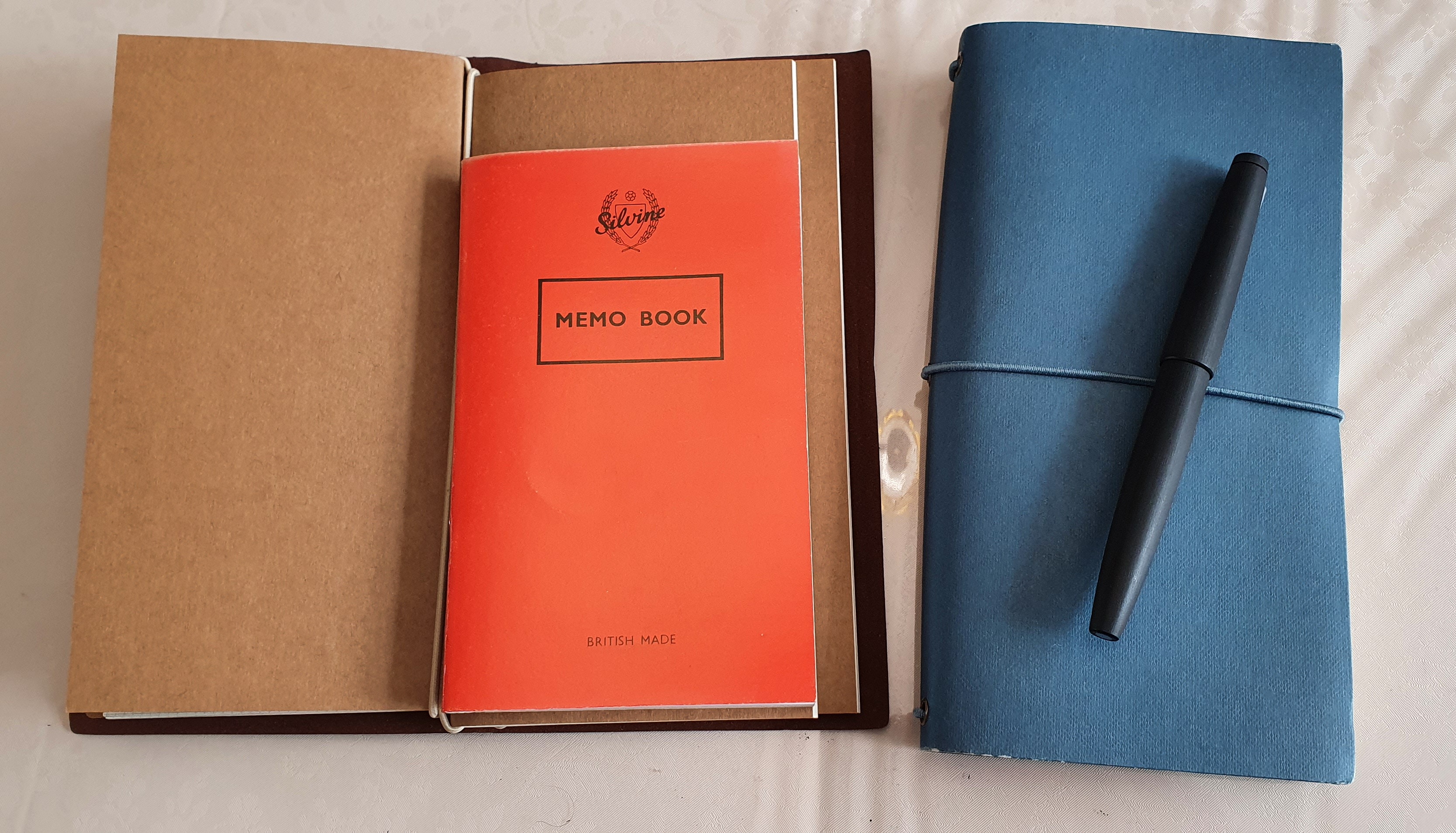
The cover includes two elasticated loops inside the spine. You could slide one notebook under each loop if you just wished to carry two. However there are three notebooks in total, the first two attached to each other by a separate elasticated loop and then slid under the first of the two loops attached to the cover.

Three slim notebooks inside.

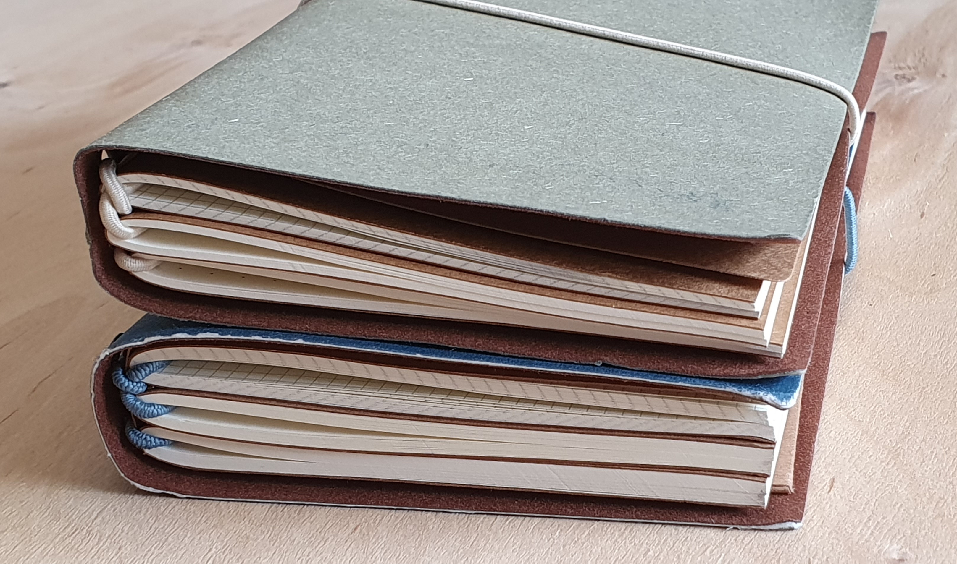
Having picked up one to buy, I made my way toward the cash tills, following the one-way route around all the aisles so that you get to pass every item in the shop. I soon found another display of these notebooks, but this time the covers were available in blue-grey, (which I will call blue) or dark green. This threw me slightly, and to confuse matters further, these blue or green versions were fatter and heavier. On closer inspection, I noticed that whilst the covers were all of the same size, there were more pages in the blue and the green cover notebooks, than in the olive one that I had seen first. Yet they were the same price, still only £4.00. Was the olive one over-priced, or were the blue and the green ones underpriced? I decided to hedge my bets and buy one of each size.

I’ll take these two please.

Specifications:

Olive green version:

  • 1 x outer cover, olive green with one elasticated loop closure and two loops in the spine
  • 1 x cardboard insert, with expandable pouch and a slot for tickets;
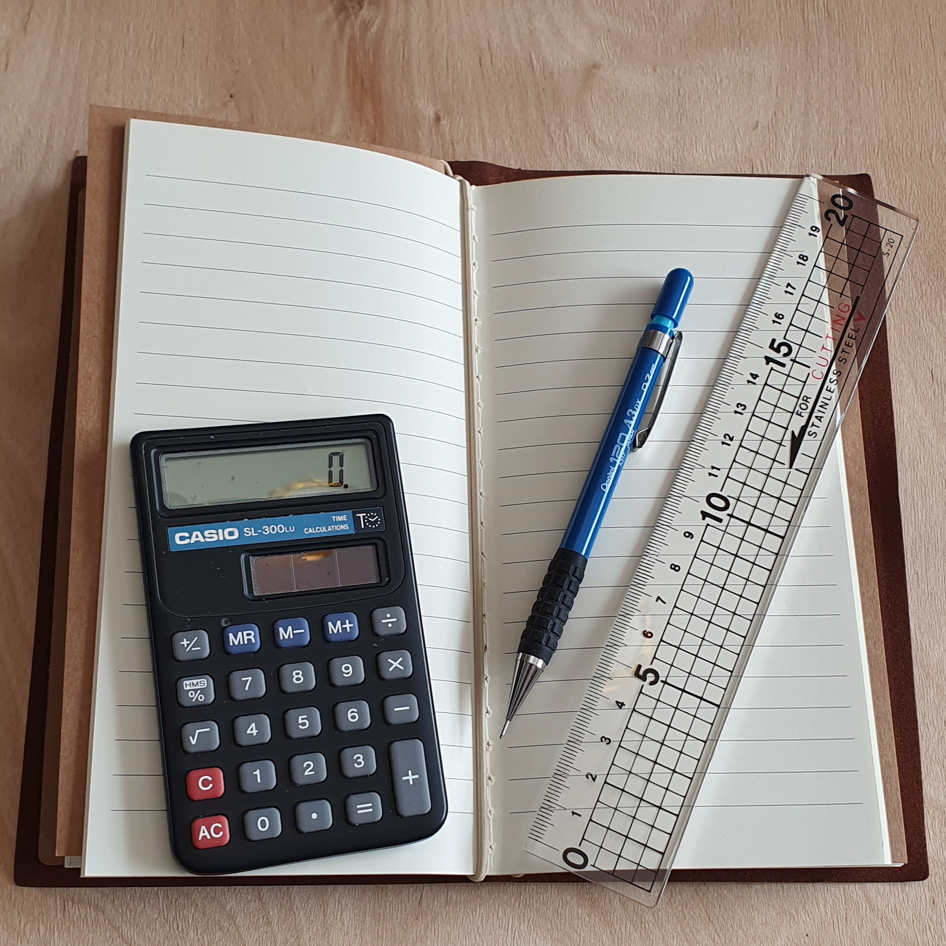
  • 1 x notebook with squared paper, 48 pages, squares are 2.7mm, or 10 squares = 2.7cm;
  • 1 x notebook with lined paper, 48 pages, 20 rows per page, 8.2mm row height;
  • 1 x notebook with dot-grid paper, 48 pages, 5mm squares;
  • The notebook size is 19.5cm x 9.5cm. The paper is 80 gsm.
  • Total 72 leaves, or 144 pages. Total weight: approximately 177 grams.

Blue version:

  • 1 x outer cover, blue, with one elasticated loop closure and two loops in the spine
  • 1 x cardboard insert, with expandable pouch and a slot for tickets;
  • 1 x notebook with squared paper, 64 pages, squares are 2.7mm, or 10 squares = 2.7cm;
  • 1 x notebook with lined paper, 64 pages, 20 rows per page, 8.2mm row height;
  • 1 x notebook with dot-grid paper, 64 pages, 5mm squares;
  • The notebook size is 19.5cm x 9.5cm. The paper is 80 gsm.

Total 96 leaves, or 192 pages. Total weight: approximately 258 grams.

Traveller notebook. Lined pages are 8.2mm row height.

Finally, the difference in weight of these two options is not entirely due to the extra number of pages: the cover of the blue version feels slightly thicker and stiffer than on the olive one. This led me to disassemble both sets to weigh the component parts individually. Even I felt a bit nerdy doing this. But sure enough, the olive cover weighed approximately 26.5 grams, whilst the blue cover weighed around 30.5 grams.

The component parts. All for a very reasonable £4.00.

So in summary, you have a choice, one with a total of 144 pages, and one with 192 pages and a stiffer cover.

The paper is pleasant to use and is fountain pen friendly. The set will be great to chuck in my green canvas shoulder bag. It remains to be seen how each cover will fare over time, after being carried about. The elastic loop may in time bite into the covers – more likely with the thinner cover of the olive version. You get more for your money with the blue version, whilst the olive version is thinner and lighter to carry. Of course, you can mix and match the contents or replace them as you wish. But both seemed good value to me. Buying one of each in order to reap the average value seemed the right choice.

I’ve got the notebook. Now I just need the travel.

Travelling with ink: Suffolk, August 2022 edition.

How many pens do you need for a two night hotel break in Suffolk. One? Yes, possibly. And how many pens did I need? Answer: five fountain pens, plus a Lamy 2000 multi-colour ball pen and a Pentel P207 mechanical pencil (just in case I ran into difficulties with the Wordle).

The cap bands. (The Lamy 2000 sat this one out).

I always enjoy thinking about what pens to bring on a holiday. Whilst there is an attraction in the simplicity of bringing just one, I rarely (or never) take that option. This time, I chose the following:-

Lamy 2000 (Fine): recently back from a nib exchange with Lamy and newly filled with Graf von Faber-Castell Moss Green. I am loving this pairing especially on my holiday journal which is a Leuchtturm A5 hard cover notebook. (The hard cover helps if you do not want to sit at a table and need to write with the book on your knees).

The Lamy 2000 fountain pen and multipen, plus a Pentel pencil.

Aurora Talentum, Oblique Medium: a recent purchase this summer and one that I am delighted with. Now that a little initial skipping has been cured, the pen is a joy and I think it may be one of the best buys around in its price range. Currently inked with Pelikan 4001 Konigsblau. The OM nib is a game changer for me as a lefty overwriter. The pen works for my style, and I do not have to adapt my writing style to suit the pen.

Parker Duofold International, Big red edition, Medium nib: now inked with a Quink blue black cartridge. Recently I had inserted a blue black cartridge in my new Vector XL. Flow problems ensued and I removed the cartridge to investigate. It turned out to be a simple case of the plastic which gets punched out when you puncture the cartridge, had not broken off completely and was still blocking the flow. I poked it away with a toothpick. Then I had the thought: why put this cartridge back in the Vector when I have a Duofold sitting idle? And so it went in the Duofold, with great results. This is a “forever ink” for this pen.

Oranges and lemons: the Duofold and Talentum.

Delike Newmoon, green marbled acrylic pen with fude nib and Waterman Harmonious Green. I am thrilled with this pen, out of all proportion to its modest price. The nib is so enjoyable, being usable in a variety of styles and having four distinct line widths up its sleeve, depending on how you hold it. For these reasons, it would actually be a good choice if you were to take only one pen with you.

That was nearly enough, and then at the last minute I spotted my Sailor Pro-Color 500 blue demonstrator steel nibbed pen, in my pen cup. This has a fine nib (extra fine by western standards) and is filled with Noodlers Bulletproof Black. Another “forever-ink” pairing. People speak of Sailor nibs having a pencil-like feedback, in terms of feel and sound on the paper. But this combo goes a step further and the line also looks like the writing from a sharp, soft pencil. And it has the added quality of being waterproof and so you can go over it with a highlighter is you so wish, without it smudging.

Delike Newmoon and Sailor Pro-Color 500.

In the event, despite having the choice of five fountain pens, it was the new Lamy 2000 that I chose to use for the quiet half hour of writing before the days got started.

But the Sailor came into its own as a shirt-pocket pen when out during the day, excellent for a quick note to aid the memory, in my red Silvine A6 pocket notebook which lives in my shoulder bag when out and about.

Barely there. The Sailor Pro-Color 500 slips into a shirt pocket.

When visiting seaside towns, I always enjoy coming across an RNLI lifeboat station and will visit them if they are open. It is good to know that they are there, even if you do not need them – which was a little bit like the rest of my fountain pens on this trip. As for the pencil, I did not need it for the Wordle. But I did buy a souvenir notebook from the wonderful Suffolk Owl Sanctuary which I might just paginate.

Whether you bring pens or not, a few days’ break in Suffolk to visit the lovely coastal towns or to drive around the beautiful countryside and enjoy the landscape, is strongly recommended.

Big skies and laid back beachy vibes at Aldeburgh.
Southwold. The seafront is just beyond the shops.

My big red ink swab fest.

In recent posts, I have been looking at my fountain pen ink accumulation. Today it is the turn of my red inks to be in the spotlight.

I like red ink but do not use it very much. As somebody who uses mostly blue or blue black inks, it came as a surprise to see quite how many different bottles of red ink I have. This is due to the temptation to try new shades of red, combined with the fact that finishing a bottle, at my rate of use, takes forever.

Every fountain pen enthusiast needs at least one bottle of red ink. A Waterman Audacious Red, for example, would probably do. You cannot go wrong with Waterman ink. Rummaging through my ink drawers, I had forgotten that I owned a bottle of Lamy red and cannot now remember buying it. Others triggered happy memories – such as buying the Beefeater Red from KWZ Inks at the London Pen Show one year, or the Pure Pens Cadwaladr Red, also at the Pen Show.

The little bottle of Campo Marzio Bordeaux was purchased at the delightful Campo Marzio shop in Piccadilly which I recently heard sadly may not be there any more.

The Montblanc Corn Poppy Red was an ink that I had heard about a lot on the internet and had to buy for myself – probably from Harrods, whilst Graf von Faber-Castell’s lovely Garnet Red came either from Harrods or Selfridges in London. I was thrilled with Garnet Red when I first discovered it. It was just what I had been looking for as it had a very pleasing orangey brown hue to it. But when using it more recently, it seemed to have lost this feature that I particularly liked and seemed to have changed from how I remembered it, to a Burgundy. I fear that I may have accidentally contaminated my bottle by filling a pen which still had traces of another ink inside. Time to buy another bottle perhaps.

However, I later purchased a bottle of Montblanc’s William Shakespeare Velvet Red, a premium ink in a 35ml bottle, which I was fortunate to bag at a London Pen Show for a mere £10.00. This also has the special orangey hints that I had liked so much in the Garnet Red.

Today, to illustrate the differences (and also the similarities, to be fair) in my red inks I have swabbed them all. This was an exercise that turned my writing desk briefly into something resembling a science lab. I swabbed the inks with cotton buds, onto a spread in a Tomoe River paper note book which I keep for ink sampling. Also for good measure I swabbed them on a SemiKolon Grand Voyage journal, which uses a cream coloured laid paper and is, I was told, related to Leuchtturm.

Red ink swabs on Tomoe River paper.

I used a Moonman glass nib dip pen for the writing samples, although this is not a good representation of how an ink may appear from the more controlled flow of a fountain pen nib

While gathering my red inks together for this exercise, I thought that I would include a few ink samples that I was given, such as a scented ink by Campo Marzio, given to me by a dear friend in the fountain pen community and a sample of Diamine Sunset, a well regarded ink, given to me by Jon of Pensharing. The Onoto Passion Red was one of three inks, generously given to me by James Boddy of Onoto.

Red ink swabs on a SemiKolon Grand Voyage journal as well as a Tomoe River journal.

Ironically, the only pen in which I have red ink at present, (out of around 18 fountain pens inked) is an Online Campus Fluffy Cats edition, in which I am using the excellent Kaweco Ruby Red in cartridges, not bottled ink. I was therefore unable to do a swab but have included it in the spread nonetheless.

I am conscious of there being a great many excellent red inks that I do not have and am yet to try, such as Sheaffer Skrip red, or Diamine Red Dragon, to name but two, but you can’t have them all. It is the wanting that has led to my present predicament and I am already at saturation point and ready for any eventuality calling for a massive amount of red ink writing.

Some of my bottled red ink stash.

My current top 5 inks.

It is not very often that I take stock of what bottled inks I have. Until now, the most recent count up was in 2020, which I posted about in The Great Bottled Ink Count on 21 November 2020. At that time I had 65 bottles. It has since grown to around 82 bottles.

Whilst it is nice to have such a variety to choose from when inking a pen, there is also a nagging feeling that I have got more than I need and will never use it all. If we chop and change inks every time we fill a pen, and have multiple pens inked at once, we very rarely manage to finish a bottle. It takes sustained use and many repeat fills, to drain a typical 50ml bottle.

When I got all my inks out recently, it was hard to make them all fit back in their drawers again. Having them stacked on top of each other in drawers means that you forget what is underneath. It leads me to fantasise about having just one ink, or say one of each main colour. How much simpler that would be. The same goes for fountain pens and notebooks. Imagine having only one pen, one ink and one notebook. No difficult decisions about which to take! You can temporarily create a such a position by going on a retreat or even just going to a coffee shop, bringing only one pen, one ink and one notebook with you.

This was me last weekend, sorting the ink stash by colour.

I am unlikely to reduce my ink stash unless I have to. I am set up for life! But meanwhile it can be a fun exercise to reflect on which inks I would select, if I could keep only five of them. Currently, if it came to this, I would nominate the following.

Waterman Serenity Blue

An attractive royal blue ink, that is readily available, inexpensive, and behaves well. An excellent general purpose ink. It flows well in a pen, dries quickly, doesn’t stain and is easy to wash out of a pen. It can also help to clean a pen that has had something less well-behaved in it before. If I could keep only one ink, this would probably be it. But I would miss not having Graf von Faber-Castell Cobalt blue.

Conway Stewart Tavy, by Diamine

This is blue black ink and named after the River Tavy in the county of Devon where Conway Stewart at one time was based. I first discovered the ink at a London Pen Show and it became an instant favourite. I recall later buying a spare bottle.

But the memory plays tricks on us. When laying out all my inks on view recently, I discovered that I actually had three bottles of Tavy. I had written their dates of purchase inside the lids: October 2017, March 2019 and October 2021. All were at pen shows. But when I opened the bottles recently to check how much was left, I could not understand why they were all full, or nearly full. And then I spotted an empty Tavy ink bottle on the book shelf behind my desk, and remembered that I had been through a whole bottle. It turns out that after that first bottle of Tavy, I had bought three spare bottles, not one.

It turns out that every two years I buy another bottle of Tavy.

Montblanc William Shakespeare Velvet Red

This is a gorgeous orangey red, like a Venetian red and is a premium ink from Montblanc in a 35ml bottle. I was fortunate to find a bottle for £10.00 at a pen show. For a long time I used it exclusively in my Montblanc 145 Classique, although now I am a little more relaxed about letting other pens share it.

Graf von Faber-Castell, Moss Green

As green inks go, this is a dark, rich green which shades well, rather than the viridian shades of some others.

Pelikan Edelstein, Smoky Quartz

This ink was a free gift at the London Pelikan Hub gathering one year. It is a distinctive earthy light brown, very different from say the Montblanc Toffee Brown. It is described on the box as a softer ink and has a tendency to bleed through certain papers and so needs to be used with care but is a gorgeous colour and shades beautifully too.

As well as being very pleasing inks used on their own, these five also have the advantage of looking good on a page together, as if they all came from the same set.

But trying to decide which Inks I would keep and which I would part with, is surprisingly painful. I am clearly not yet ready to let go.