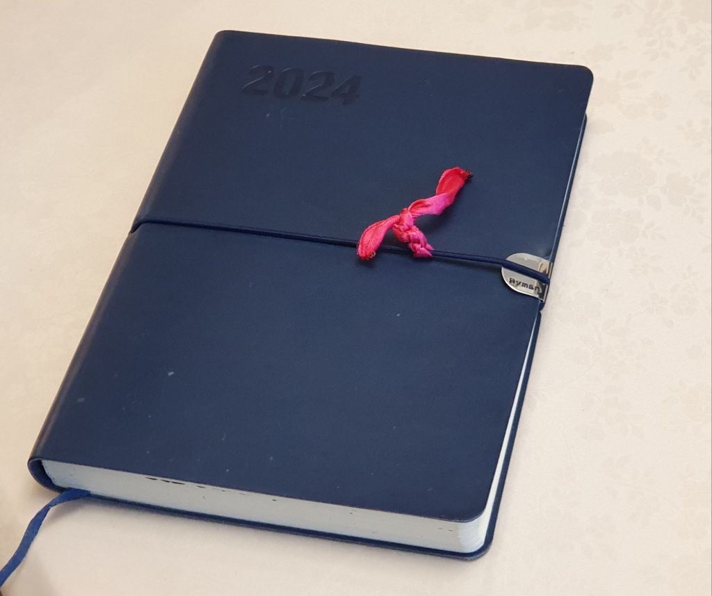
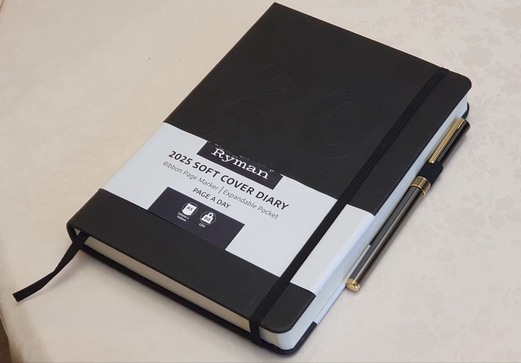
The new year diary, 2024.

Last year, my daily journaling was done in a page a day, Moleskine 18 month volume. I bought it too late to make use of the pages for July to December 2022, but was happy to have them as a sort of bonus notebook.

I persevered with the book although it was not particularly enjoyable to use. This was not, as you might think, due to paper quality which was actually quite pleasant and fountain pen friendly, but rather because I did not like the line spacing of only 6mm row height. Added to this, I found the width of the pages, at 130mm, a bit narrow. An A5 page is 148mm wide and losing 18mm makes a big difference, particularly on days when I wished to use a balloon diagram, to confer some retrospective order on the previous day’s events.

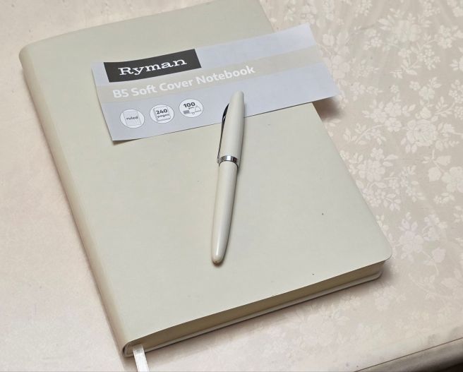
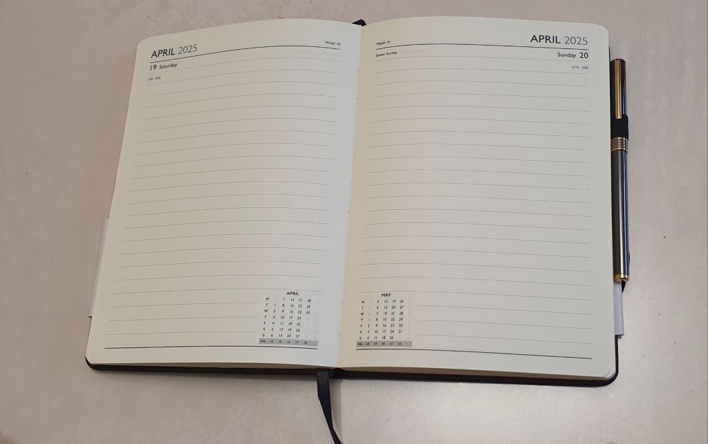
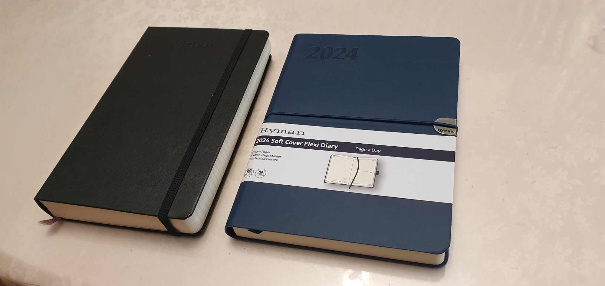
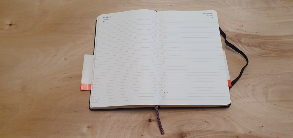
For 2024, I have gone back to my more usual Ryman A5 Page a Day diary. This does not suffer from either of my two complaints above: the row height is 7.6mm and the page width is the full A5, 148mm size. These two features make it more comfortable for me to use. However, it is not perfect. On removing the cellophane at the start of the year, my first discovery was that the covers were thin and bendy and not stiff as I had been used to. To be fair, the description on the belly band states “2024 Soft Cover Flexi Diary, Page a Day”. The word “Soft” refers to the texture which is like a faux leather, whilst “Flexi” means “bendy”, rather than “versatile“.

Whilst on the subject of the description, the words “Page a Day” apply only to Monday to Friday. Saturdays and Sundays have to share a page, which is always a pity. Rather than add the words “but only Half a Page a Day at Weekends!”, Ryman has instead chosen silently to include an image of a double-page spread with a Friday, Saturday and Sunday in view if you look closely.

New Ryman A5 diary for 2024, alongside last year’s Moleskine book.

Other than that, there is not much to add. The Ryman paper is a cream colour, 80gsm with a pleasant texture and fountain pen friendly. The binding is sewn to help the book open flat and there is an elastic closure. Given the rather insubstantial cover, there is a metal reinforcement at the edge, to prevent the elastic from wearing away at the cover. But (a) the metal is not stuck down on the front and so leaves a sharp edge, and (b) there is no metal reinforcement for the back cover. I would have preferred that there be a hardback cover so that reinforcement is not necessary.

This will be used for my daily journal, usually written up after breakfast, recalling the events of the previous day. This is an opportunity to enjoy a few minutes with a fountain pen, as well as a memory exercise.

It has also been a recent custom of mine to stick to one fountain pen and ink per month for my diary entries. For January I have started with the Parker 45 (14k gold, medium nib) with Waterman Serenity Blue that I wrote about rather gushingly in my previous post.
A Page a Day is for Mondays to Fridays only.

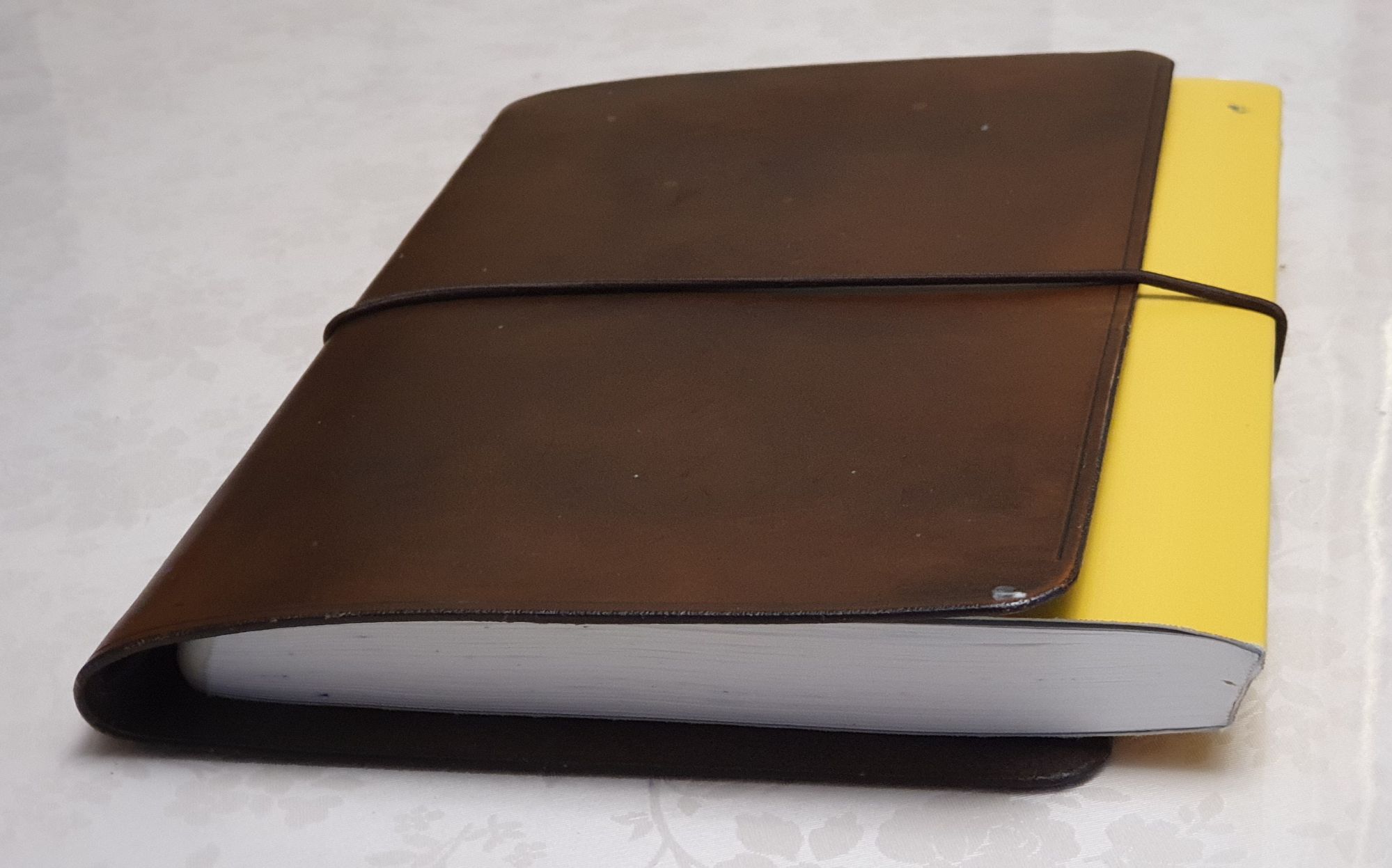
Aside from the diary, I write on most days, in a Stalogy 018 Editor’s Series 365 Days Notebook A5 size. I love the paper in these. I carry this to pen club meets and when out and about, in a stiff leather cover with elastic closure. The cover is a very simple single board, not quite A5 in width and is so stiff that it wants to slam closed all the time. I liked the fact that it did not have any pen loop, credit card pockets or other features, as I found that these make for a lumpy surface if you are writing with the book open inside the cover. However, in practice I found that the cover works much better for me, with my notebook tucked in the other way around, purely to protect it and keep it closed in transit.

My backwards “traveller notebook” set-up.

Writing with a nice fountain pen in a Stalogy notebook, is one of my favourite things to do. I use it for all sorts of things, although mostly for enjoying my pens and inks for the sheer fun of it and not for writing anything profound. This is an inexpensive form of relaxation and we all need one of those.

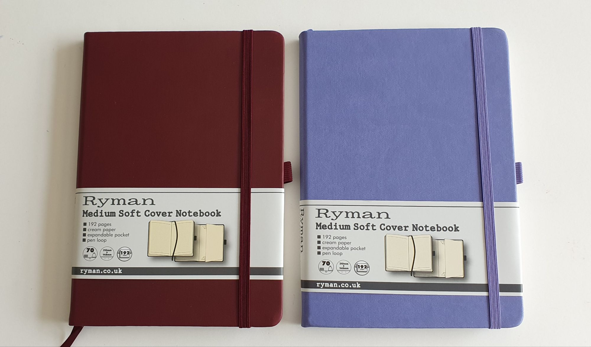
I do also have an A4 Ryman notebook which serves as a bullet journal, or bujo. This is a simple book of lined pages, 37 rows per page, on which I have listed dates for a month down each left-hand page, leaving the right-hand page clear for notes, often divided into two columns. This had enough pages for 2020 to 2025 inclusive, although after four years the cover is getting a bit tatty and flaky now. I find the bujo very useful for diarising dates that are far ahead, such as insurance renewals, road tax and car MOT and service due dates and a few others. Having six years at 24 pages per year, required 144 pages. As the book has 192 pages, this left plenty of double page spreads for lists, such as books read (or to be read), albums to listen to, TV episodes to watch, monthly steps counted and so forth. The possibilities are endless. I have not adorned it with washi tape or ink stamps like the photogenic ones we see on Instagram, but each to his own. I may however create a page for “Fountain pen wish list 2024”, although what I really need to do is to practice not wanting more things. As always, we shall see.

The new year diary, 2023.

I have been in the habit of keeping a diary since I was about 18. For about the last 10 years, I have used A5, page a day diaries and usually write my entry after breakfast the next day.

In recent years, I have bought these from Rymans stationers, which had 23 rows per page, with a row height of 7.9mm. These are still available for £13.99. My new year diary 2022 was reviewed here.

However, for 2023 I have tried something different. I am now using a Moleskine 2022-23 Daily Diary / Planner. Again this has a day per page and is ruled. A big difference is that it covers 18 months, from July 2022 to December 2023.

My Rymans page a day diary for 2022 and the Moleskine 18 months’ diary 2022-23.

This was an impulse buy, on visiting the Moleskine store in London’s Covent Garden, in early November. Admittedly, I was lured by the fact that it was reduced in a sale, from £24.99 to £17.50. I presume that this was due to the fact that it was November and over four of the 18 months covered by the diary had already passed. This did not worry me as I was quite happy to start the diary in January and to have the previous six months’ pages free to use like a notebook, as I wished.

I did have some reservations, first as to the paper quality. My experience of Moleskine A5 notebooks had been that the paper was generally not fountain-pen friendly, as most inks bled through the paper making the other side unusable. However, I thought that I might overcome this by finding an ink which would not bleed. My other concern was as to the line spacing. This Moleskine diary pages have 29 rows, with a row height of 6mm which is much narrower than my preferred spacing of around 8mm. On the other hand, you get more rows per page. Also, I often use balloon diagrams in my diary entries for work days, and so the row height is a bit less important.

Narrower pages and narrow line spacing (6mm) than I would like.

Ultimately, the reduced price, extra notebook pages, as well as the rather pleasing chunky proportions of the diary, sealed in its shrink wrap, made me overcome my reservations and I bought it.

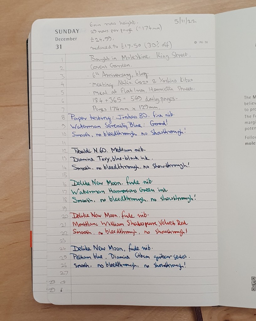
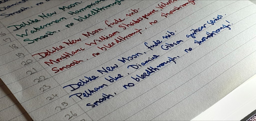
When I got it home and had the opportunity to test the paper, I was pleasantly surprised and relieved to find that the paper is not the same as I had seen in Moleskine A5 notebooks. The paper in the diary IS fountain pen friendly and very pleasant to write on! I tried writing a paragraph with five different inks (Waterman Serenity blue, Diamine Tavy, Waterman Harmonious green, Montblanc Velvet Red and Diamine Pelham blue. All performed beautifully on the silky smooth paper with no bleed through and very minimal show through.

Testing the paper for fountain pen friendliness. Success!

As for the line spacing, whilst I still prefer to have a bit more breathing space, I think I can manage with it. I noticed that the Moleskine diary page is quite a bit narrower than the Rymans diaries, (130mm instead of 145mm) but the shorter length actually helps make up for the narrower row height. (I sometimes rule a page into two columns, in notebooks with narrow line spacing).

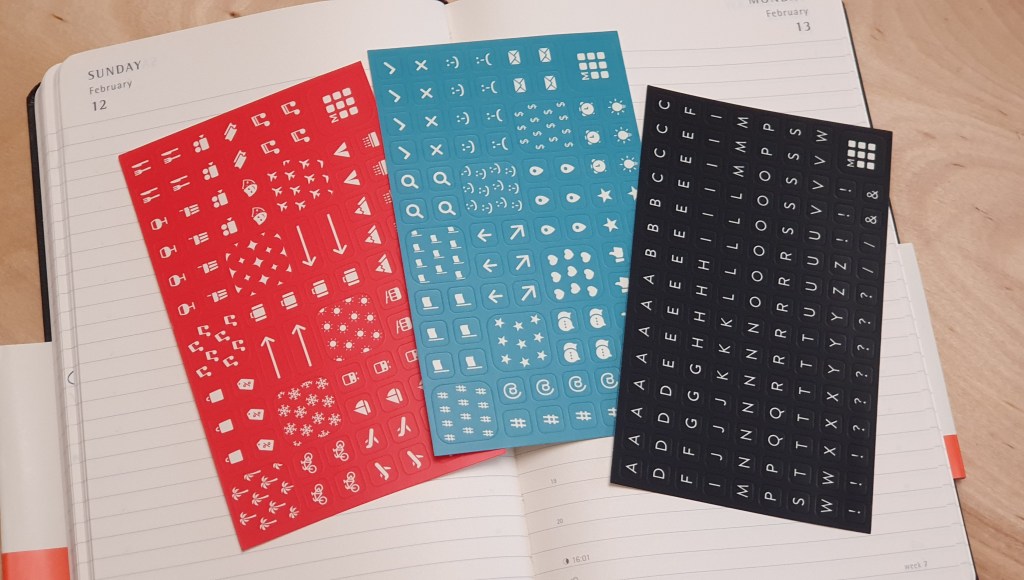
Three sheets of stickers included.

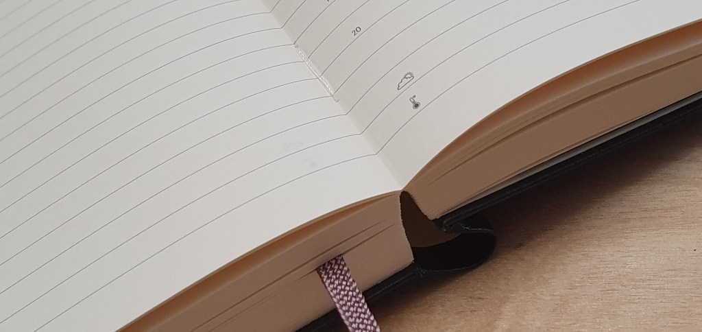
Other features of the Moleskine diary include neatly sewn binding and so the book lays open flat, without risk of pages falling out. There is a ribbon bookmark, an expanding pocket in the back cover, an elastic closer, and three sheets of sticker symbols which can be used in the diary, or elsewhere. There are plenty of information pages at the beginning, with yearly calendars and monthly planning pages, world time zones, national holidays and dialing codes.

Nice stitched binding.

So, off we go again for another year. Already 2023 looks set to be marked by the awful continuing war in Ukraine, industrial action for pay disputes and the current fall-out of Prince Harry’s tell-all biography, plus challenging times for household finances. We all live in hope for better days ahead.

Crucially, the paper in the Moleskine 18 months’ diary is very fountain pen friendly.

Early thoughts on the Flying Tiger traveller notebook.

On a recent visit to London’s Canary Wharf, I found a branch of Flying Tiger Copenhagen, and popped in for a browse.

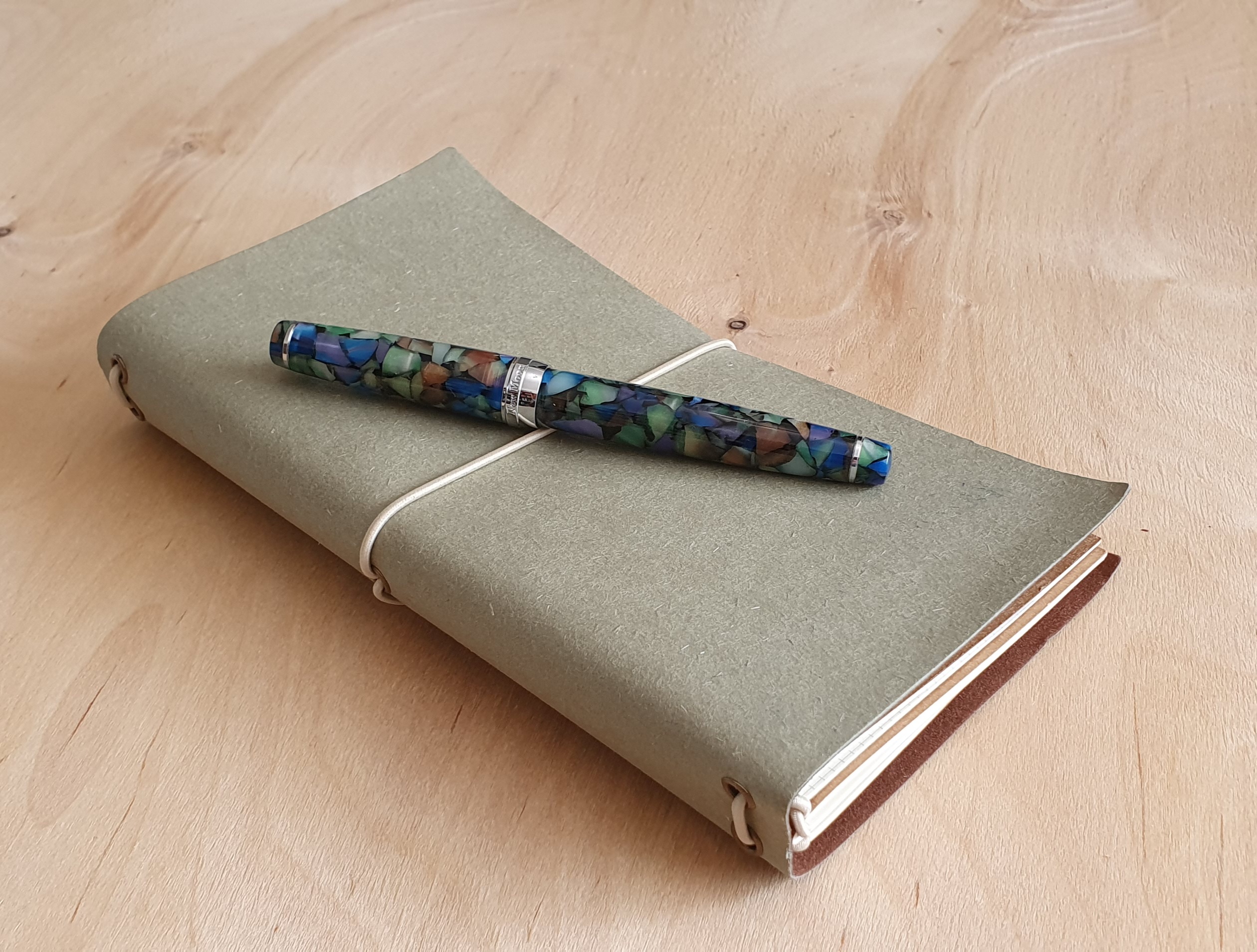
Right near the entrance, I spotted an olive colour, traveller-style notebook cover with elasticated loop, containing three notebooks, each with different paper. It was simply labelled Notebook, or Notesbog in Danish. The cover was not leather, but felt like a soft, fibrous cardstock with a brown faux-suede backing. Inside this, a removable brown card (which slips in behind the notebooks, between the books and the outer cover) provides an expandable wallet with cotton fastening on one side and another little pouch, to keep tickets or receipts or such like on the other side. As the ticket pouch needs to be the right way up, this has to be at the back, whilst the expandable wallet will be at the front of your notebooks. However if you do not need these, or prefer not to feel the uneven lumps and bumps below the paper when writing, you can slide it out.

Traveller-style notebook from Flying Tiger. Delike New Moon fountain pen for scale.

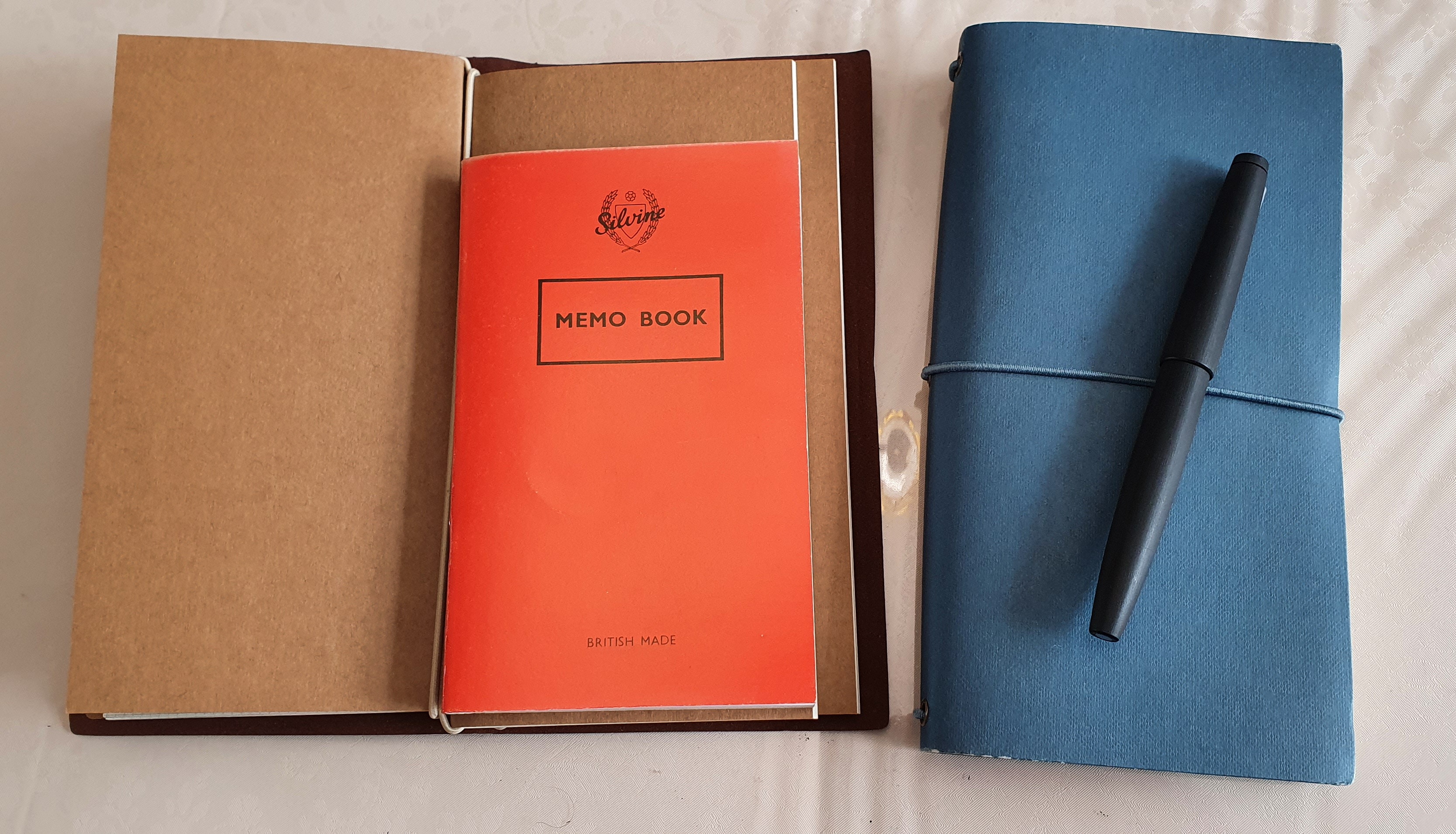
I was very taken with this, especially the olive colour. The notebooks looked tall and slim, rather taller than the red Silvine memo book that I usually carry when out and about, but the same page width. The paper in the first notebook was squared, the second book had lined pages and the third had dot grid. The paper felt reasonably thick and good quality. The notebooks were each stitched, rather than stapled and with plain brown card covers. Each book was held in place with an elasticated loop.

Size comparison with my usual carry, a Silvine pocket notebook.

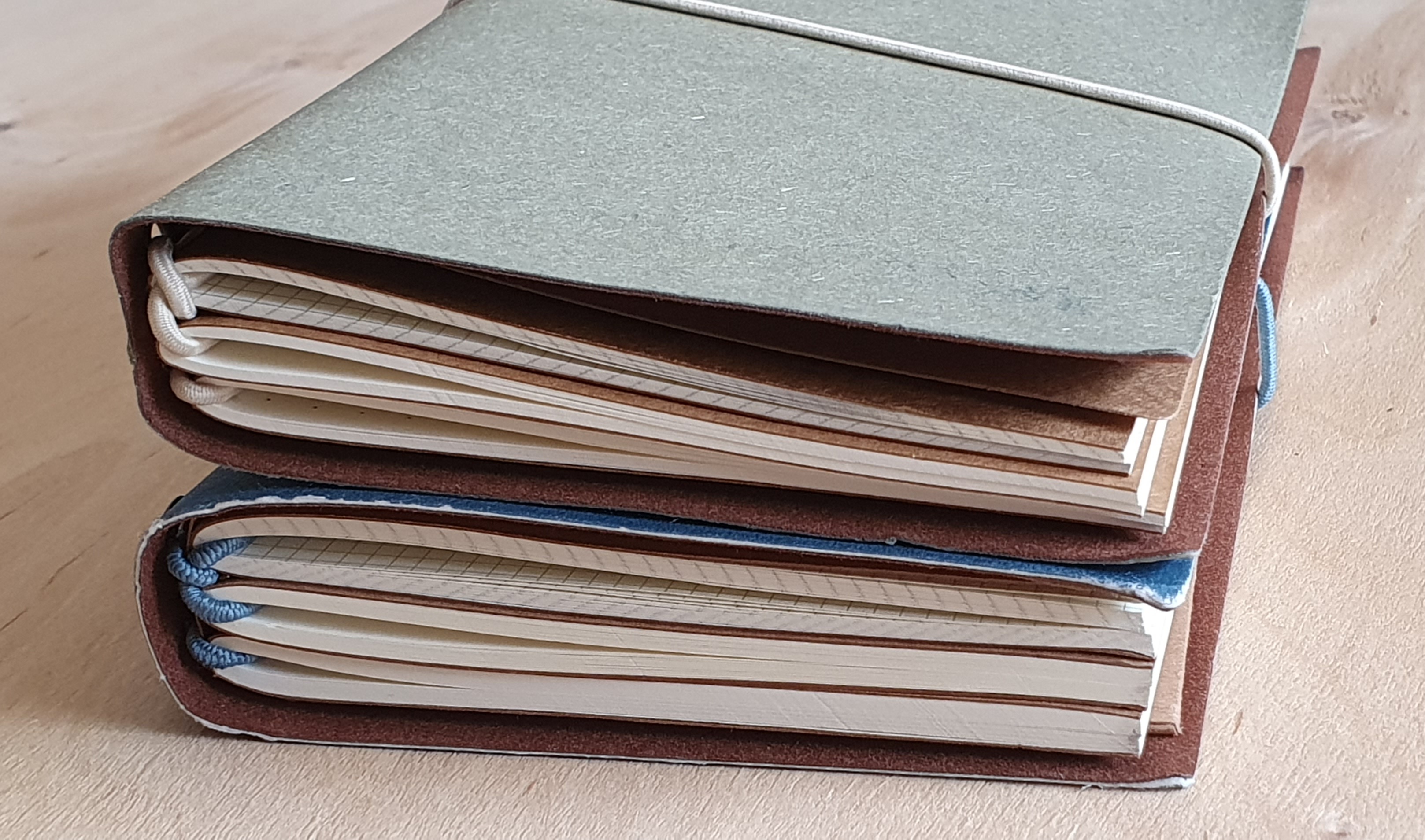
The cover includes two elasticated loops inside the spine. You could slide one notebook under each loop if you just wished to carry two. However there are three notebooks in total, the first two attached to each other by a separate elasticated loop and then slid under the first of the two loops attached to the cover.

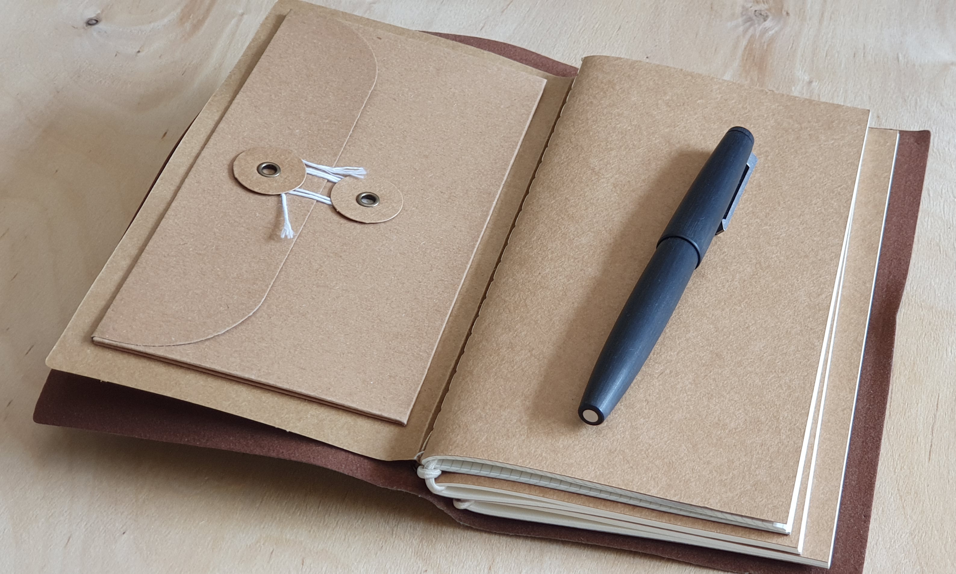
Three slim notebooks inside.

Having picked up one to buy, I made my way toward the cash tills, following the one-way route around all the aisles so that you get to pass every item in the shop. I soon found another display of these notebooks, but this time the covers were available in blue-grey, (which I will call blue) or dark green. This threw me slightly, and to confuse matters further, these blue or green versions were fatter and heavier. On closer inspection, I noticed that whilst the covers were all of the same size, there were more pages in the blue and the green cover notebooks, than in the olive one that I had seen first. Yet they were the same price, still only £4.00. Was the olive one over-priced, or were the blue and the green ones underpriced? I decided to hedge my bets and buy one of each size.
I’ll take these two please.

Specifications:

Olive green version:

  • 1 x outer cover, olive green with one elasticated loop closure and two loops in the spine
  • 1 x cardboard insert, with expandable pouch and a slot for tickets;
  • 1 x notebook with squared paper, 48 pages, squares are 2.7mm, or 10 squares = 2.7cm;
  • 1 x notebook with lined paper, 48 pages, 20 rows per page, 8.2mm row height;
  • 1 x notebook with dot-grid paper, 48 pages, 5mm squares;
  • The notebook size is 19.5cm x 9.5cm. The paper is 80 gsm.
  • Total 72 leaves, or 144 pages. Total weight: approximately 177 grams.

Blue version:

  • 1 x outer cover, blue, with one elasticated loop closure and two loops in the spine
  • 1 x cardboard insert, with expandable pouch and a slot for tickets;
  • 1 x notebook with squared paper, 64 pages, squares are 2.7mm, or 10 squares = 2.7cm;
  • 1 x notebook with lined paper, 64 pages, 20 rows per page, 8.2mm row height;
  • 1 x notebook with dot-grid paper, 64 pages, 5mm squares;
  • The notebook size is 19.5cm x 9.5cm. The paper is 80 gsm.

Total 96 leaves, or 192 pages. Total weight: approximately 258 grams.

Traveller notebook. Lined pages are 8.2mm row height.

Finally, the difference in weight of these two options is not entirely due to the extra number of pages: the cover of the blue version feels slightly thicker and stiffer than on the olive one. This led me to disassemble both sets to weigh the component parts individually. Even I felt a bit nerdy doing this. But sure enough, the olive cover weighed approximately 26.5 grams, whilst the blue cover weighed around 30.5 grams.

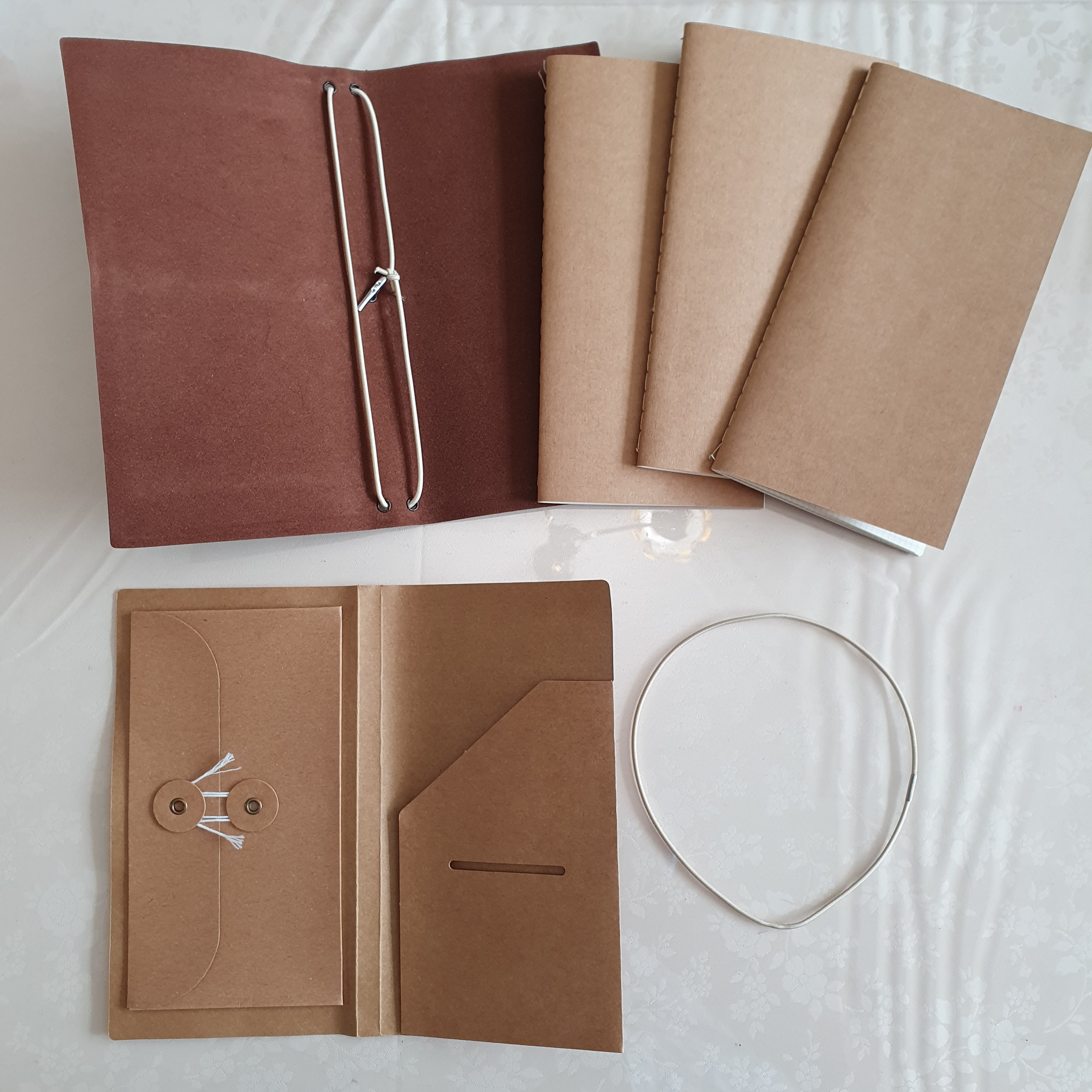
The component parts. All for a very reasonable £4.00.

So in summary, you have a choice, one with a total of 144 pages, and one with 192 pages and a stiffer cover.

The paper is pleasant to use and is fountain pen friendly. The set will be great to chuck in my green canvas shoulder bag. It remains to be seen how each cover will fare over time, after being carried about. The elastic loop may in time bite into the covers – more likely with the thinner cover of the olive version. You get more for your money with the blue version, whilst the olive version is thinner and lighter to carry. Of course, you can mix and match the contents or replace them as you wish. But both seemed good value to me. Buying one of each in order to reap the average value seemed the right choice.

I’ve got the notebook. Now I just need the travel.

Travelling with ink: Blackwood Forest

One of the things I hope for when travelling, is a desk by a window, with natural light and preferably a nice view. Perhaps this desire comes from spending my working days in an office with no natural light.

Having come through a particularly busy few months at work, I was looking forward to a long weekend break in a forest cabin. Set in the heart of Blackwood Forest, Hampshire I am not sure if this still counts as part of the New Forest, but I am on holiday so who cares?

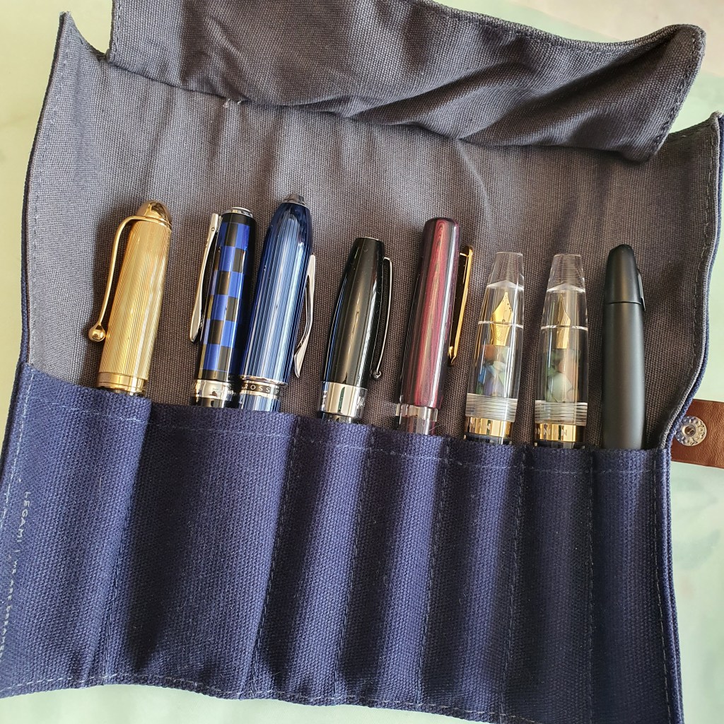
Picking some fountain pens for the trip is one of the pleasures. However this time I found myself a bit torn between (a) the usual urge to bring a selection of pens to enjoy, with different nibs, different inks, different sizes, weights and materials or (b) to go minimal, travel light and just pick one pen, perhaps even one that I did not like very much, to get more use from it. In the event, the usual option of bringing a selection was the winning one.

The final eight.

This was my first experience of a forest cabin holiday and I had not expected our cabin to have such a “Wow” factor on arrival. Imagine my delight on finding it to have such a spacious living room/ kitchen/ dining room with an entire wall of windows, looking onto the beech tree forest, beyond the decking (with table and chairs, and even our own outdoor hot tub).

Our forest cabin

I am a morning person and enjoy my writing most in the morning when my brain is fresh and rested. That tends to be the time I find best for journaling, usually off-loading the events of the previous day. One of the ironies of journaling is that when life is at its most busy and eventful you have the least time and energy to write about it, but if you are freed from the pressure to get through endless to-do lists of tasks, you have plenty of time to write about very little. I then like to refer to my lists of writing prompts, neatly and alphabetically saved on a notepad app on my phone called Colornote – often comprising a few words or phrases which I can come back to and write up when I feel like it.

Our cabin in the woods.

I set my alarm early, hoping for some time when the household (that is my wife and mother in law who was holidaying with us) had not yet risen and I could sit at my window and pour out thousands of words like an imagined Ernest Hemingway, the creative juices running at full throttle. Obviously that did not happen. But I did enjoy some light tinkering with the pens, reminding myself which ones I had brought along, which inks they had and then having just enough time to summarise each day in a few brief headings. Sitting out at the table on the decking, enjoying the tranquility was restful and restorative.

A short drive from our base, was the city of Winchester, which we visited for a sunny afternoon’s excursion. My wife spotted a stall at the outdoor market with leather goods including some lovely notebook covers, for A5 or A4 notebooks. I use both sizes but have been looking unsuccessfully for about five years for a nice leather A5 size cover, after passing up a chance to buy one once in the Cotswolds. I did once buy a cover which did not work for me as it featured a pen loop which got in my way and had bulky and unnecessary credit card slots which meant that pages would not lay flat. In short it was unusable and was returned.

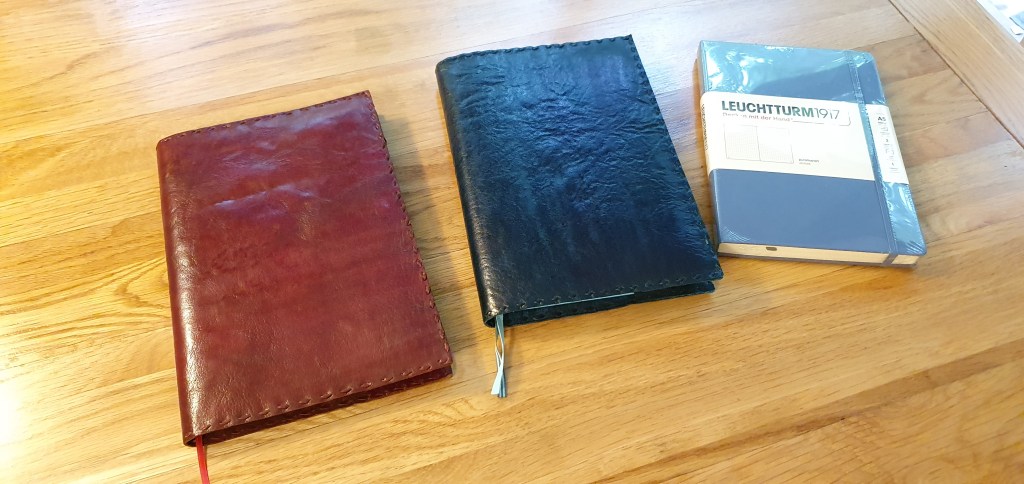
In contrast these market ones from “redleathers”, an ethically sound business run by Kirk Newton, (@redleathershandmade) were attractive, simple and functional. Unable to narrow down my choice between a dark green and a cherry colour, I opted for both.

Oooh! New leather notebook covers.

Another pleasure for the stationery enthusiast in Winchester, is Warren & Co, a stationery shop at 85 High Street, selling a good selection of stationery and pens mostly from Lamy and Cross, plus inks from Parker, Waterman, Cross, Pelikan and J Herbin. The display of Lamy pens was comprehensive, with racks of Safari and Al-Stars, Vistas, Nexx and then glass cabinets of Studios, 2000s, CP1s and even a few Imporiums. I toyed with the idea of buying the Aion again as the dark green edition looked so appealing, with either M, F or EFnibs, but I had found the black one too slippery to grip and gave mine away. I resisted and told myself that I had been down that road before. As it was almost time for the shop to close for the day, I left without buying anything this time but it is a wonderful shop to visit and was a real joy to see so many pens in the flesh rather than just online for a change and to chat with the charming proprietor.

Warren & Co of Winchester.

Back in the secluded forest, it was fun to put notebooks in the new leather covers. The Leuchtturm 1917 A5 books fit in very well and I shall enjoy using them.

We enjoyed a very restful weekend stay – with good food and walks and let the forest work its magic in sending us home rested and refreshed.

With my trusty Nikon Prostaff 10×30 bino’s.

And as for that desk by the window, the truth is that I did not sit there writing all that much. Sometimes it is nicer just to lift up your eyes to what is around you. Perhaps it is one of those things where the anticipation is better than the reality. There will be time to reflect and to write when the holiday is over.

Inky Pursuits: some notebook tales.

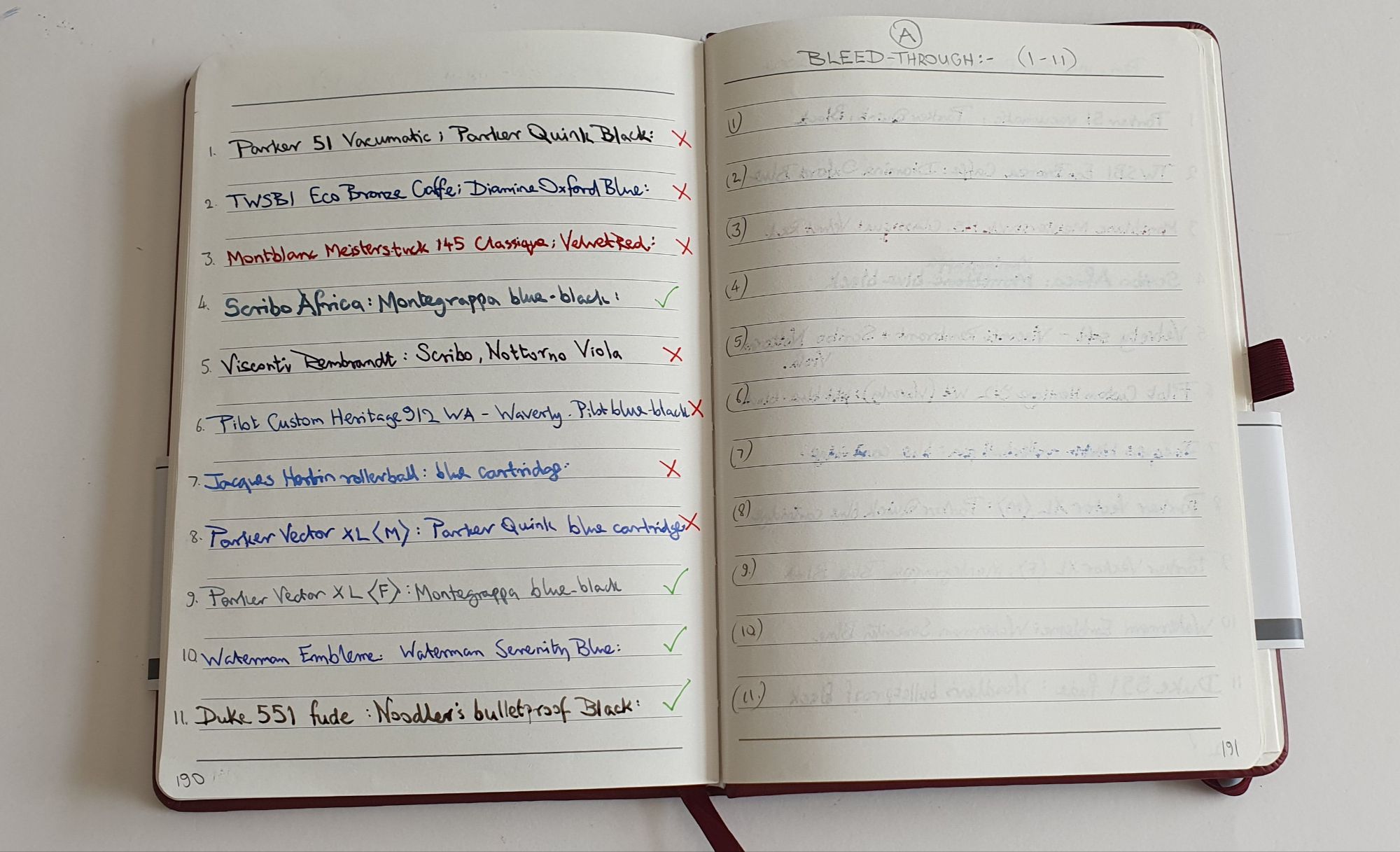
I have always enjoyed getting a new notebook. I start on the back page with a range of pens to test the paper, primarily for bleed through. I also like to paginate my notebooks, if they are not paginated already.

Lately I have also taken to paginating new pads of A4 paper. I use this all day for work notes and sometimes find when gathering up a pile of loose sheets, it helps me assemble them back in order. It is also handy for seeing how many pages you have used and therefore, how many remain – a bit like an ink window on a pen.

My notebooks fall into two broad categories: those that are expendable, filled up with pen and ink sampling, handwriting practice and writing for its own sake, and those that I want to keep, filled with more purposeful writing such as collected memories or other writing projects.

Finding your palette.

The logical consequence of testing a new notebook for which inks it likes, is to arrive at a list of those which can be used without bleed through or excessive show through or feathering and those which cannot. This is useful, particularly if you buy the same type of notebook regularly or if you have bought a few spares to keep “in stock”.

Taking this a step further, I thought it may be useful to arrive, for a given notebook, at a core palette of say four colours – a blue, red, green and brown, which not only behave well individually on the paper but also look good together, and compliment each other, as if part of the same range. For example, for a Radley A5 notebook that I bought last February, I made at the back, a list of inks that could be used and a list of those which could not. For my core four, I have almost got this down to (1) Rohrer & Klingner Salix; (2) Montblanc William Shakespeare Velvet Red; (3) Graf von Faber-Castell Moss Green: and (4) Pelikan Edelstein Smoky Quartz.

This is not quite as simple as it sounds. I found that I had entered Smoky Quartz in both the “can use” and “cannot use” columns. This might suggest that the paper is not consistent throughout the notebook but more likely, is because the paper’s ability to resist bleed through with a given ink, depends also upon how wet the pen writes.

I had hoped to be able to use Conway Stewart Tavy, my go-to blue black in the Radley notebooks but this ink bleeds through on some papers – Radley included. Honing my palette is a work in progress and constantly evolving. But since I picked up three spares of the Radley red notebook whilst they were in a sale, it is worth pursuing – before I fill them all!

The notebook stash.

Buying more notebooks than you immediately need, might sound a bit crazy. I seem to have accumulated a whole drawer full of mainly A5 size journals. When you find one you like, it is best not to buy too many spares in case you later find one you prefer.

However, with the UK now in lockdown again, with non-essential shops closed, I am now unable to roam through Rymans or Paperchase for supplies. Suddenly my drawers of journals and inks are not so crazy after all. Although I still have far too many to sit out any conceivable period of lockdown, to be fair.

The telephone table diary.

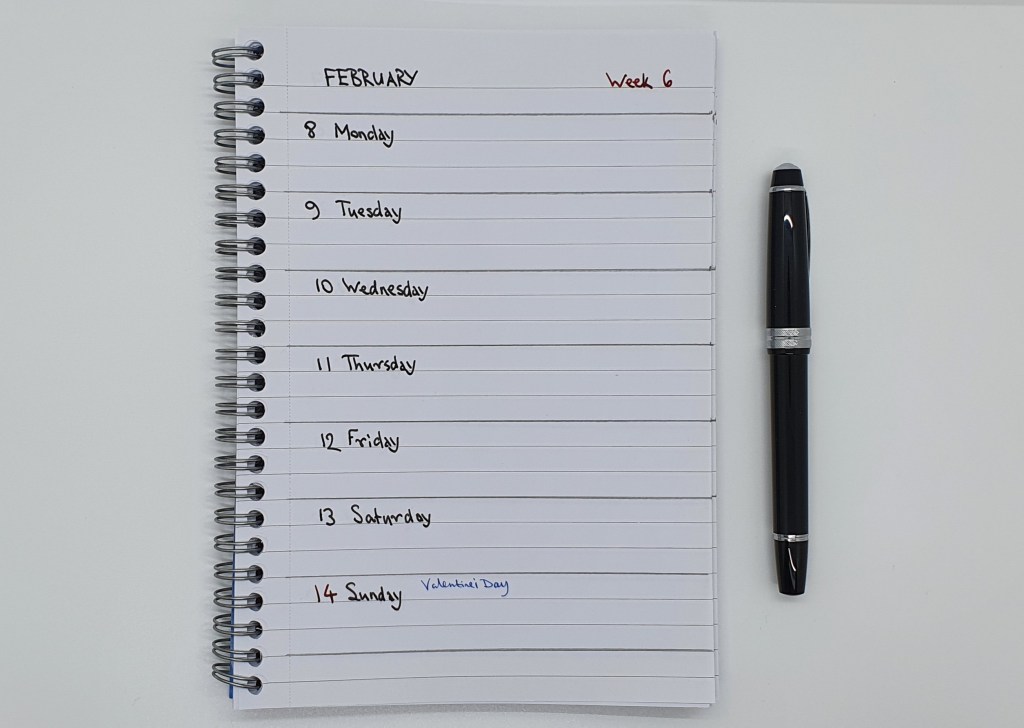
One thing that I had not bought before lockdown, was a 2021 diary to keep next to the home telephone. For the past few years, I have used a Letts Royal tablet diary from Rymans, with a week to a page, spiral bound A5 size and with the spiral at the top. Instead, for this year, I made my own from one of the spiral side-bound notebooks in my stash. I ruled pencil lines at three row intervals and then spent a merry few hours writing Monday to Sunday on each page and inserting the dates. I broke this up over two evenings as the process was a bit monotonous to be honest but it was satisfying to reach Week 52 eventually and put away my Cross Bailey Light, with its black ink cartridge. The Letts diary cost £8.49. My notebook was £2.00. A saving of £6.49 if you do not factor in my time.

Voilà! The new home-made diary. Somewhat crude but it works.

The daily diary.

Writing my page-a-day diary is a routine which I honestly could not be without, such is the satisfaction of recalling the previous day and condensing it into note form. For working days, I now find that balloon diagrams work best. It is very easy to stress oneself with “to do” lists for work but healthy to pause sometimes and reflect on what daily progress was achieved… a sort of “done” list.

There was a time when I would settle upon a fountain pen and use it for my diary for the entire year. My current plan is to change over at the start of each new month. For January I used my lovely new Cross Peerless 125, with Tavy ink. For February I am using my Aurora 88, with Aurora blue. I am very fortunate to have gathered a collection of fountain pens, of which so many are wonderfully enjoyable.

The new year diary, 2021.

One of life’s great pleasures is writing with a fountain pen. My lifelong habit of journaling, or keeping a diary, is another and to combine these two makes for a great start to a day. Just having ten minutes, to collect my thoughts and reflect on the previous day and then record it in ink and “offload” this into my archive, is something I cannot do without.

I have been keeping a personal diary in one form or another since 1976. The size has varied over the years from chunky A6 page-a-day books in the seventies and eighties (in which I used “reverse writing” with my Sheaffer No Nonsense pens to get extra fine lines), to A4 volumes, 5 year diaries, and even tried typing for a few years. In recent years I have settled on A5 as being the format that works best for me. For some days, I write in longhand and for others, typically work days, I prefer to do a balloon diagram with bullet point notes, of what progress was made on my various ongoing tasks.

This year, I have enjoyed using an A5, page-a-day diary from Rymans. It has what they call a “Soft Cover” but is a stiff cover but finished in a soft texture material that feels like leather. The cream coloured pages give you 23 rows with a row height of 7.9mm which is reasonably wide and I find this ideal. Currently, I use my Diplomat Excellence A Plus, with a Fine steel nib and Pilot Iroshizuku Shinkai, blue-black ink. It is one of those combinations that is a marriage made in Heaven and which you never want to end.

Last week, while browsing in Paperchase, I spotted an A5, page-a-day diary in an attractive viridian patterned, textured soft-back cover . On a quick flick through, I noticed that the line spacing was wide (actually 7.5mm), that it was neatly bound with stitching and opened flat. It was also in a sale with 30% off and I decided to buy it.

Paperchase A5 Day to a Page diary. £7.50 in a sale, With a Sailor 1911 Standard for scale (not included in the price).

Only when I got home did I notice that the “page-a-day” description was a bit misleading for the weekends , as Saturday and Sunday had to share a page. At least this meant that you could always find your weekends on the right-hand page of a spread, but I was disappointed. My wife helpfully suggested that I “just don’t do as much” at the weekends to have less to write about but I was not convinced.

Paperchase diary: in fact Half a Page a Day when you get to the weekend.

Today, in a Goretex jacket for the rain, I trudged out to Golders Green High Road to visit Rymans to see if they had any diaries. I found the diary section and looked at a Ryman hard back, A5 page-a-day diary at £7.50 but the line spacing was clearly narrow, unlike my 2020 version so I dismissed it.

But then I noticed nearby, the Ryman Soft Cover Diary, also a page-a-day but a little more expensive at £10.99. I found a beautiful forest green one but could not inspect the line spacing or the weekend arrangements as it was sealed in cellophane. Other colour options were an equally lovely dark red or yellow ochre, which would have been great with my Diamine Cherry Sunburst ink, or perhaps a KWZ Honey or Diamine Honey Burst.

Since these were all sealed, I could not inspect any of them for row height or to check that Saturdays and Sundays were still afforded a page each as in my 2020 diary. Call me reckless, but I took a gamble and bought it anyway. I went for the green. The sales assistant favoured the yellow ochre version but when I said that I preferred the dark green he said “Like your jacket!” to which I had to admit that my colour choices were rather predictable.

Ryman, Soft Cover Diary, Page a Day.

Back home, I sliced off the cellophane for the moment of truth. Would there be wide line spacing and would there be whole pages for Saturdays and Sundays? Yes, to both! I can look forward to another year of journaling with my lovely Diplomat. It has a pleasant, fountain pen friendly paper. Other features are a ribbon book mark, an expandable pocket inside the back cover, and elastic pen loop (which I do not use) and an elastic closure – which is useful.

The Ryman diary, with a full day each for your Saturdays and Sundays. Happiness restored.

Today I have just seen the sad news that Sir Sean Connery has died, at the age of 90. How I loved all those early Bond films, and going to the local cinema with my late father. “Do you expect me to talk?” “No Mr Bond, I expect you to die!” So that is a piece of news for today’s entry in my diary. RIP.

This has been an unique year, “unprecedented” in our lifetimes as many have said and we still have two months to go. My year 2020 and lockdown activities are well recorded. Flicking through the blank pages of my next year’s diary it is hard to imagine what I might be doing in the months to come. Let’s all hope for better times ahead.

Radley A5 notebook. A mini review.

As fountain pen users know, finding another dream combination of pen, ink and paper is one of life’s pleasures. And we could all use some of those now.

A month ago, whilst spending a weekend away in Cambridge my wife was browsing the sales in Radley, the handbag shop, when I came across a display of A5 notebooks. These were reduced from a rather ambitious £28.00, to £6.00 and so I cheerfully added a couple to our purchases.

It turned out that the notebook was remarkably good and I wished I had bought a few more to keep in stock. Many reading this post may not have access to a Radley shop, but nevertheless I hope some comments about my approach to notebooks may be of interest.

Description.

This is an A5, soft cover journal, with 160 ruled pages (80 sheets). The pages provide 21 rows at 8mm line spacing, which I find ideal. The lines are dotted, in grey, on a cream paper and so not obtrusive. Each page features the little Radley dog logo at the foot of the page, which is not in the way.

Radley A5, 160 page notebook. With Cross Bailey Light fountain pen.

The cover is a vibrant red with rounded corners and a pleasing texture that feels like leather but is not. “Radley, London” is stamped elegantly in gold letters on the front. The cover can be flexed although it offers some support and protection. Of particular benefit, the pages are stitched, so that the book can be opened flat without risk of pages popping out. There are two page markers, in matching red ribbon. However there is no elastic band or expandable pocket that you would find with a Leuchtturm notebook.

Neatly sewn pages with lined, cream paper.

Paper quality.

Trying a different notebook can be a risk, if you intend to use a fountain pen. Those first few strokes will tell you whether the paper is “fountain pen friendly” or not. Does the ink bleed through? Is there feathering? Is there show-through at levels which mean you can use only one side of the paper? How does the pen feel on the paper surface? Is it too rough, or too smooth, or is there a squeaky coating and feeling of resistance?

Happily, I was delighted with the paper in all of these respects. I tried first with my recently bought Platinum Curidas, with a Japanese medium nib and Platinum blue black ink. The paper surface felt silky smooth. There was no feathering, no bleed through and although some show-through, this was perfectly acceptable. The nib is on the fine side for a medium.

The one point to note however, was that the line width was slightly wider on the Radley paper, than with the same nib on my customary Leuchtturm journal paper. This implies that the paper is perhaps more absorbent, or less or differently coated than Leuchtturm. Yet when I looked with the loupe, there was no feathering to give the tell-tale woolly edges as if writing on blotting paper.

Saturday morning activity.

I do enjoy buying a new notebook. For the last few years I have been using Leuchtturm journals a lot, which are paginated and available with plain paper, ruled (rather too narrow for me) or dotted or square grid. For unpaginated notebooks, I often paginate them, measure the line spacing, and test out the paper on the back page with a variety of inks and pens from my “currently inked” pen cups to see what works and what does not.

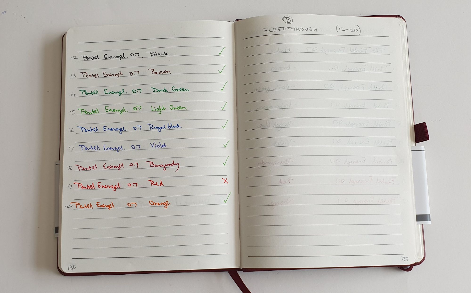
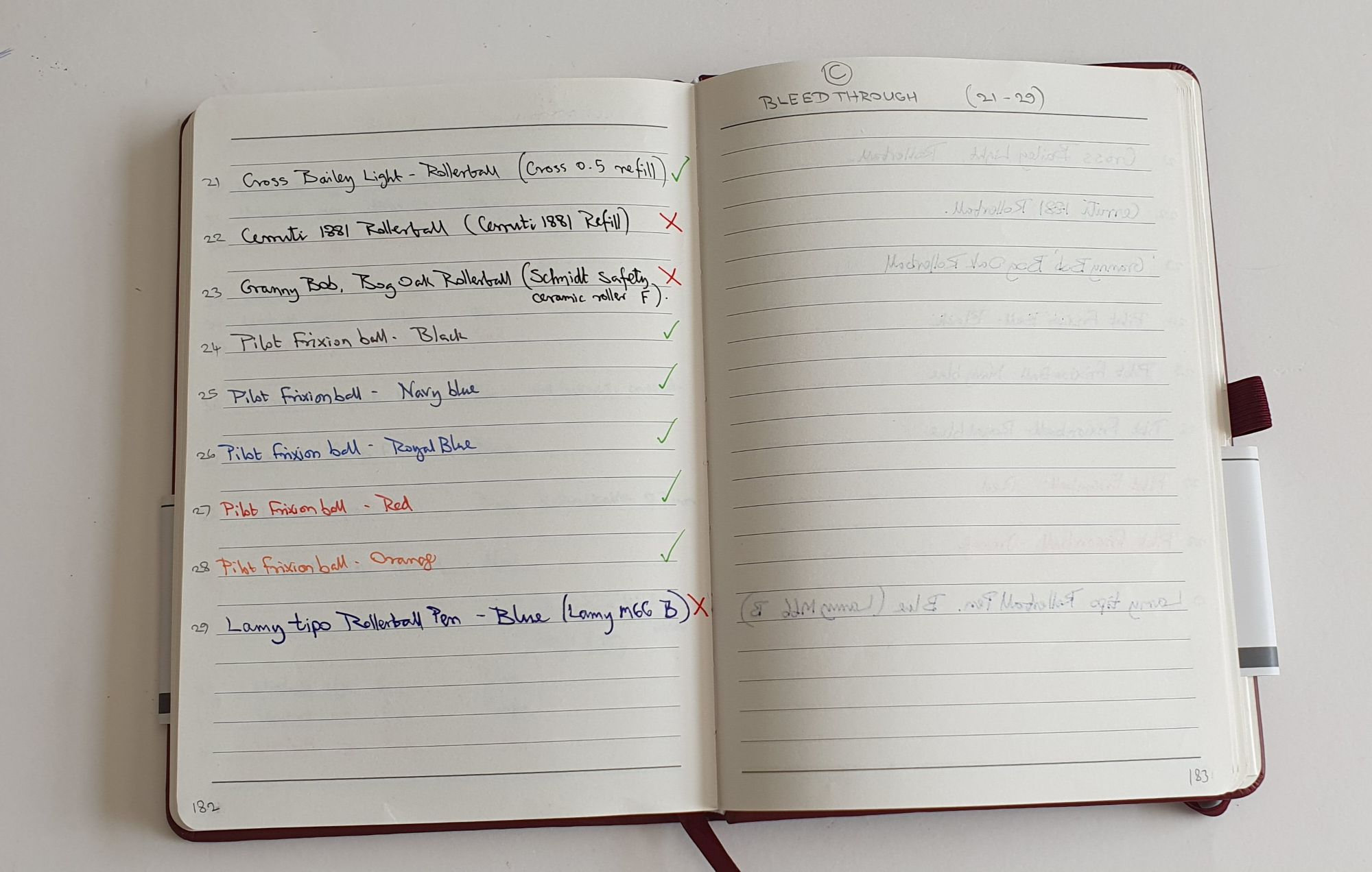
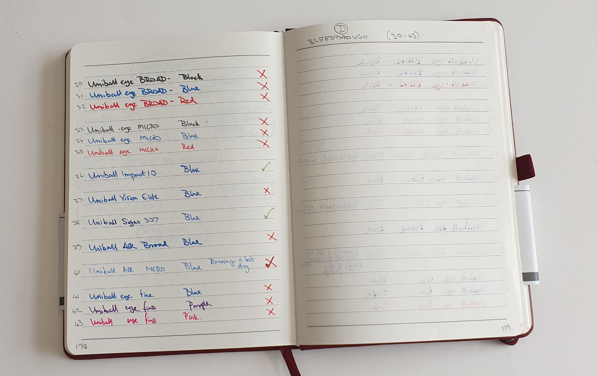
I tried the Radley notebook paper with various other pen and ink combinations. There was no bleedthrough with Waterman Serenity blue. Monblack Irish Green did bleed through quite badly in places where pressure was applied. Some roller-ball pens also did not do so well: the Uniball Air micro black ink did bleed through, whereas the Uniball Signo 307 retractable gel pen did not.

Rohrer & Klingner, Salix iron gall blue black ink.

So, what was that dream team combination that I mentioned? I recently discovered Rohrer & Klingner’s Salix, an iron gall blue black ink, sold in London at Choosing Keeping, in Covent Garden. I have been using it at work recently, in one of my Cross Bailey Light cartridge pens. (Ahem, confession: I bought six of these pens, a few months ago as soon as I heard about them!)

The Cross Bailey Light is a fairly humble entry level Cross cartridge- converter fountain pen with a steel medium nib. I have been careful to check the nibs on all those I bought and they have all been smooth, wet writers. This works particularly nicely with Rohrer & Klingner’s Salix ink, a classic blue-black which darkens as it oxidises, as the blue turns to a grey-blue black.

Random poem selection, from William Wordworth. Cross Bailey Light with Rohrer & Klingner Salix, iron gall blue black in.

The Salix ink is also water resistant, a useful quality when addressing envelopes but also giving some protection against spills or other liquid related incidents.

A water resistant ink will often perform well on papers which at first do not seem fountain pen friendly due to bleedthrough and so it is worth trying this before giving up on the notebook for fountain pen use. Another advantage of R&K Salix is that you can go over it with a highlighter pen, which is great for study notes. It also flows well, looks nice and gives a lovely shading and performs well on the Radley notebook paper.

Discovering that you can go over R&K Salix ink with a Sharpie highlighter, without smudging.

Finally, I went back to the Cambridge Radley shop another day but they were out of these notebooks. But then I later came across another Radley store in London’s O2 Arena shopping centre (a brand outlet mall) where, not only did they have plenty in stock but they were discounted even further to £4.00. Let’s just say I bought a reasonable number.

Early thoughts on the Pilot Synergy Point 0.5 rollerball.

The Paperchase store near my office no longer has a glass display cabinet of fountain pens. Its fountain pen offerings are now limited to a good selection of Lamy Safaris and Al-Stars, Kaweco Perkeos and Faber-Castell Grips, although it is good that these are still available. I enjoy browsing around the shop and often buy notebooks there.

Whilst visiting the shop one lunchtime recently, I came across a cup full of Pilot retractable pens, in a mix of blue or black, called the Synergy Point. These are not new pens but were new to me. I now gather that in other places they are called the Pilot Juice Up.

The Pilot Synergy Point.

To my naked eye, the writing tip looked so fine that I thought it was a fineliner, although it is in fact a tiny rollerball and one of Pilot’s gel pens. I liked the look of the pen, with its rubber grip section and rather superior metal nose cone. I bought one each in blue and black.

Features.

So, this is an inexpensive, retractable, gel pen, with a fine point. It delivers a smooth line (depending upon the type of paper you are using) with minimal pressure. Pilot’s catalogue entry states “A unique pen which, thanks to the innovative “Synergy tip”, combines a fine line with a very smooth writing experience.” Although labelled as 0.5mm, this is the tip size. The line width is said to be 0.25mm. It is also refillable, (using Pilot’s BLS-SNP5 refill).

Synergy Point, 0.5mm tip gives a 0.25mm line.

The gel ink in the blue version, is a pleasing shade of blue, which dries almost instantly and is also waterproof and so does not smudge.

When the tip is retracted, the push-button does not rattle, but it goes slack once the tip is deployed, which means that the button will rattle if you shake or turn the pen up and down. Also, there is an indicator window at the top of the barrel, just below the clip, comprised of five square dots, arranged like on a dice. If you look closely these are white when the nib is retracted and then go dark when the button is pressed down. As an indicator of whether the tip is out or not, you are better off looking at the tip itself or even the position of the button.

The pocket clip is plastic and rather soft and bendy and so not very secure and best not relied upon.

Size and weight.

The pen is about 140mm long when in writing mode. It weights about 12g. The girth is about 9mm. However the rubbery grip section and stepless barrel design make this a comfortable pen to use. The metal nose cone also places the centre of gravity further down towards the tip.

The writing experience.

The comfortable rubber grip, combined with the weighty metal nose cone and the lack of any wobble from the very narrow writing tip, all make for a feeling of precision when you are writing. Also, very little downward pressure is needed, although you do need a little to avoid skipping.

Some writing comparisons.

I have tried the pen on about half a dozen different notebooks. It is best suited to smooth papers without much texture as you do not have a large tip area to ride the bumps. However the ink flowed well. On all the papers I tried, any showthrough was minimal and there was no bleedthrough, even on papers which often struggle with ink. For example an Agenzio notebook (from Paperchase) has paper which suffers bleedthrough even with Waterman Serenity blue, but not with Montblanc Permanent Blue, Sailor Kiwa-guro or Platinum blue black, all of which are waterproof inks. The Synergy Point now gives me another bleed-free option for this brand of notebook.

A new option for bleed-prone papers. The Synergy Point on an Agenzio by Paperchase soft cover A5 notebook.

Disassembly and refilling.

At first, before checking online, I tried to unscrew the nose cone. However I later learned that the pen unscrews at the barrel, and you just hold the grip section in one hand and the smooth plastic barrel in the other. It was tight the first time and I was worried about destroying the pen, but was encouraged by seeing photos online of the two parts separated. I anticipate that the refill will last for ages but it is good to know that refills can be purchased.

Unscrews at the barrel, not the nose.

Likes and dislikes.

Plus points are the attractive design, sturdy build (aside from the flimsy clip and the rattling button) and the unusually fine writing tip for fine work. Having a waterproof ink is also useful. The familiar retractable design is obviously convenient and practical.

On the negative side, there is the feeble pocket clip and the rattling buttton. Also I would have preferred not to have a permanent bar code and a 13 digit number on the barrel but these are minor issues.

Pricewise, the blue model registered £4.25 on the cash till but then the black one registered as £5.00 which was slightly annoying. I would expect them to be the same price, whichever figure is correct, but it seemed fruitless to pursue this.

Conclusion.

I use ballpoint pens a lot for notes at work and a gel pen makes a pleasant alternative. The writing looks nicer and there is typically less pressure required yet you have all the convenience of a ballpoint pen. It is not a substitute for a fountain pen, which is still far ahead for line variation, shading and general writing pleasure. But the gel pen is a very useful writing tool to have and has its own merits.

The new diary. Paperchase A5 Diary, Day to a Page review.

It has been a habit of mine since I was 18, to keep a diary. For the last few years my preferred format has been an A5 book, with a page a day. A daily ritual is to write this, using a fountain pen, typically straight after breakfast, recounting the events of the previous day. This little ten minute appointment for myself, is really valuable.

However it is not always easy to find a suitable diary. Last year I used one from Rymans but was disappointed to discover that the line spacing had been reduced to 6.5mm in 2018, from 7.91mm in 2017. Also, with the new diaries sometimes sealed in clingfilm, you do not have an opportunity to see what the line spacing will be before buying. For 2019, with Rymans’ diaries still being sold in clingfilm, I looked eslewhere. In WHSmith, there were A5 page a day diaries but the line spacing looked far too narrow for my liking.

And then in Paperchase, I found a few 2019 diaries left on the shelf, in A5 page a day format. The cover with its pattern of blue and yellow flowers and rainbows of blue, yellow and light green was not my ideal, but was undeniably cheery. The price was £14.00 but turned out to be reduced in a sale, to £9.75. I was set up for the year.

Happily, the line spacing is a wonderfully generous 8.4mm per row (10 rows = 84mm) which suits me fine. This give 21 rows per page. The book feels nice in the hand, with a sort of linen cover. I am not sure whether it really is linen, but it feels pleasantly textured and grippy. The covers are flexible but protective. It is well bound, with stitched binding, dark blue endpapers and one blue ribbon page marker.

It turns out that it is not quite a day to a page. On Saturdays and Sundays you get only half a page. Thus, for two out of every seven days the description ‘Day to a Page’ is untrue and misleading. It is almost as if Paperchase is saying ‘What you do in your leisure time is of no consequence.’ However, I forgive them on this occasion as the book is so nicely made plus it was generously discounted in the sale.

The real joy is the paper: 100gsm off-white paper that my fountain pens love. It is smooth, but if examined under a loupe, there is some texture there which gives purchase to well polished nibs and provides a lovely feedback. I have been using the diary with a Parker Reflex (pictured), medium nib and Conway Stewart Tavy blue black ink. This inexpensive pen is a light weight and effortless writer. The writing experience of this combination of pen, ink and paper is such a joy, that it is a great way to start the day.

In praise of the Leuchtturm 1917, A5 notebook.

Those who enjoy writing with fountain pens like to find ideal combinations of pen, ink and paper where the nib glides effortlessly over the page, leaving a beautiful line of fresh ink without feathering or bleed-through.

DSCN2188
Ah, that new notebook feeling!

I am a relative newcomer to the Leuchtturm range, although the company was founded in 1917. I started using their A5 size notebooks about a month ago when my Taroko Design “Breeze” (Tomoe River) notebook was full. The Leuchtturm notebooks are readily available in our local Rymans stationers and although the paper is not Tomoe River, I find it very pleasant.

Available in a wide range of bright coloured hard covers, there are also options for plain, ruled or dot grid pages. In each case, you get around 250 numbered pages. Depending upon which you chose, you get a number of good features (listed on the distinctive wrap-around flyer inside the cellophane), such as:

  • a table of contents;
  • some perforated sheets (8 in the plain or ruled page version, or 12 in the dot grid version);
  • an expandable pocket in the back cover;
  • two ribbon page markers;
  • an elastic loop, for those who want closure;
  • stickers for labelling;
  • thread bound, to open flat and for durability;
  • ink proof paper (that is, fountain pen friendly);
  • 80 g/m2 acid-free paper.

DSCN2193
There is no mistaking the Leuchtturm notebooks with their distinctive wrap-around flyers, which help in finding the paper type that you are after.

I began with the plain paper version. This included a guide sheet to place behind the page you are using, with 18 rows at a width of 10mm, or, on the reverse, a grid of 5mm x 5mm squares.

I have been using the 10mm space guide. This is quite wide and if your handwriting is not large, the spacing may look too wide in relation to your writing size . Of course, you can experiment and make you own guide sheet, ruling your lines at whatever width you choose. For me, an 8mm width is about right and is what I am most used to for general writing and note taking, when using pads of file paper. But I have now made up a few guide sheets of approximately 8, 9 and 10mm for use with different nib widths. You could do this with your perforated pages.

DSCN2207
Line spacing at 10mm. TWSBI Classic (medium nib) with Registrar’s blue black ink.

With so many book colour options and paper options, there is something for everyone. I bought a ruled page version, but found that its line spacing of just 6mm, was too narrow for me. And if I wrote on every other line, 12mm was rather too wide.

The dot grid paper, with dots at 5mm spacing, is a good option and can be used easily to write on alternate rows with a comfortable 10mm row height.

One of the readers of my blog told me that he buys these notebooks when the less popular colours are on sale and then uses them for letter writing, slicing out the pages when the letter is written. This had not occurred to me and sounded quite a good idea.

Likes

The extra features listed above are all very welcome, but it is the paper itself that is the real draw here. It is a creamy, off-white paper, with a pleasant silky matte finish, having a smooth surface, not glossy or coated such as to cause drag.

A fountain pen may struggle to work on a paper that is too glassy-smooth. But a rough, fibrous textured paper is not good either and may clog the nib. Then, there is the issue of absorbency. A paper that soaks up the ink like blotting paper is no good for fountain pens as the ink will “feather” and spread out. And you do not want the ink to bleed through to the other side, so that you can use only one side of the paper.

There are many factors to juggle, depending too on whether your pen and ink writes on the dry or wet side.

DSCN2209
Writing sample with Diplomat Esteem (Medium) with Graf von Faber-Castell Garnet Red. Paper copes well, with even this juicy wet writer. Note also the minimal degree of show-through from the other side.

Dislikes

There is very little to dislike. If I were being picky, I could say that the page numbers could be a bit bigger. However, they are slightly clearer on the dot grid version than the plain.

DSCN2194
Pre-paginated pages.

A degree of “show through” or “ghosting” is inevitable unless the paper is very thick. With this notebook, whilst it is noticeable, I find it perfectly acceptable. There is a certain amount of compromise involved here as thicker papers, whilst reducing show-through, are heavier and make the notebook bigger.

Conclusion

As someone who currently has around fifteen fountain pens inked with a variety of nibs and ink types, I am finding the Leuchtturm notebooks very satisfying. The main problem that I have with them is that I keep wanting to buy another one whenever I pass the shops.

DSCN2190