
I have always enjoyed getting a new notebook. I start on the back page with a range of pens to test the paper, primarily for bleed through. I also like to paginate my notebooks, if they are not paginated already.
Lately I have also taken to paginating new pads of A4 paper. I use this all day for work notes and sometimes find when gathering up a pile of loose sheets, it helps me assemble them back in order. It is also handy for seeing how many pages you have used and therefore, how many remain – a bit like an ink window on a pen.
My notebooks fall into two broad categories: those that are expendable, filled up with pen and ink sampling, handwriting practice and writing for its own sake, and those that I want to keep, filled with more purposeful writing such as collected memories or other writing projects.
Finding your palette.
The logical consequence of testing a new notebook for which inks it likes, is to arrive at a list of those which can be used without bleed through or excessive show through or feathering and those which cannot. This is useful, particularly if you buy the same type of notebook regularly or if you have bought a few spares to keep “in stock”.
Taking this a step further, I thought it may be useful to arrive, for a given notebook, at a core palette of say four colours – a blue, red, green and brown, which not only behave well individually on the paper but also look good together, and compliment each other, as if part of the same range. For example, for a Radley A5 notebook that I bought last February, I made at the back, a list of inks that could be used and a list of those which could not. For my core four, I have almost got this down to (1) Rohrer & Klingner Salix; (2) Montblanc William Shakespeare Velvet Red; (3) Graf von Faber-Castell Moss Green: and (4) Pelikan Edelstein Smoky Quartz.
This is not quite as simple as it sounds. I found that I had entered Smoky Quartz in both the “can use” and “cannot use” columns. This might suggest that the paper is not consistent throughout the notebook but more likely, is because the paper’s ability to resist bleed through with a given ink, depends also upon how wet the pen writes.
I had hoped to be able to use Conway Stewart Tavy, my go-to blue black in the Radley notebooks but this ink bleeds through on some papers – Radley included. Honing my palette is a work in progress and constantly evolving. But since I picked up three spares of the Radley red notebook whilst they were in a sale, it is worth pursuing – before I fill them all!
The notebook stash.
Buying more notebooks than you immediately need, might sound a bit crazy. I seem to have accumulated a whole drawer full of mainly A5 size journals. When you find one you like, it is best not to buy too many spares in case you later find one you prefer.
However, with the UK now in lockdown again, with non-essential shops closed, I am now unable to roam through Rymans or Paperchase for supplies. Suddenly my drawers of journals and inks are not so crazy after all. Although I still have far too many to sit out any conceivable period of lockdown, to be fair.
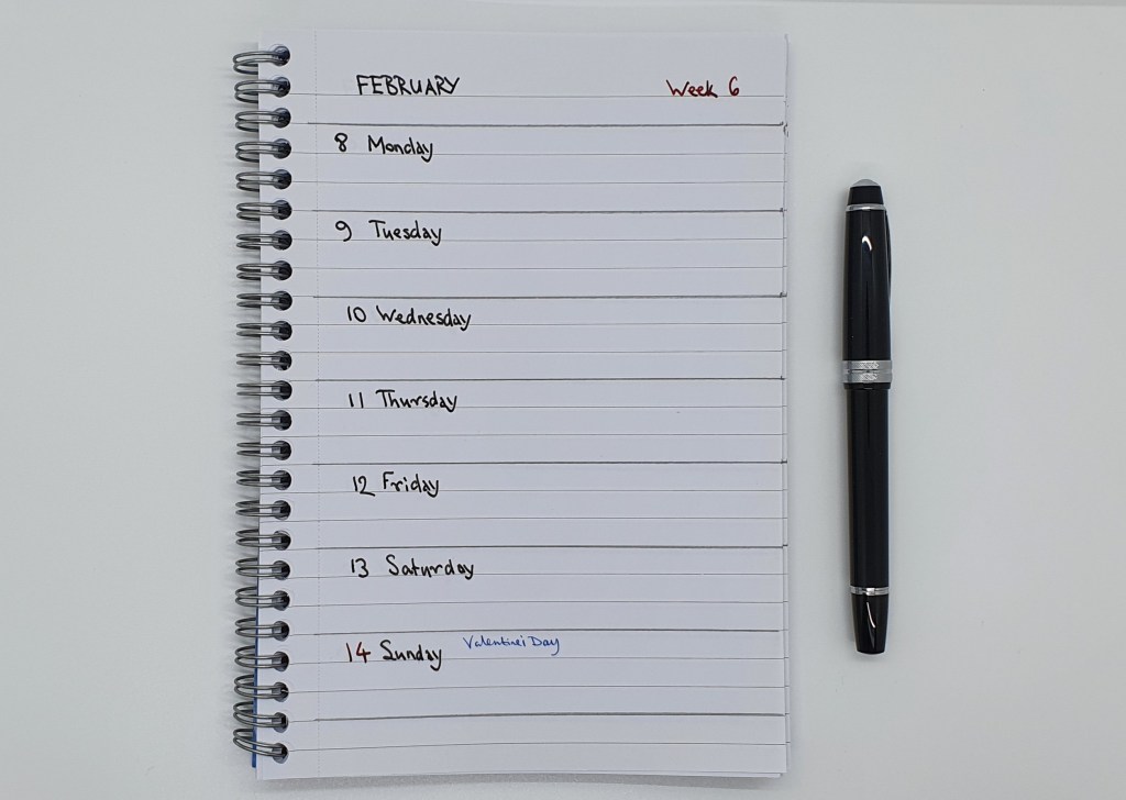
The telephone table diary.
One thing that I had not bought before lockdown, was a 2021 diary to keep next to the home telephone. For the past few years, I have used a Letts Royal tablet diary from Rymans, with a week to a page, spiral bound A5 size and with the spiral at the top. Instead, for this year, I made my own from one of the spiral side-bound notebooks in my stash. I ruled pencil lines at three row intervals and then spent a merry few hours writing Monday to Sunday on each page and inserting the dates. I broke this up over two evenings as the process was a bit monotonous to be honest but it was satisfying to reach Week 52 eventually and put away my Cross Bailey Light, with its black ink cartridge. The Letts diary cost £8.49. My notebook was £2.00. A saving of £6.49 if you do not factor in my time.
The daily diary.
Writing my page-a-day diary is a routine which I honestly could not be without, such is the satisfaction of recalling the previous day and condensing it into note form. For working days, I now find that balloon diagrams work best. It is very easy to stress oneself with “to do” lists for work but healthy to pause sometimes and reflect on what daily progress was achieved… a sort of “done” list.
There was a time when I would settle upon a fountain pen and use it for my diary for the entire year. My current plan is to change over at the start of each new month. For January I used my lovely new Cross Peerless 125, with Tavy ink. For February I am using my Aurora 88, with Aurora blue. I am very fortunate to have gathered a collection of fountain pens, of which so many are wonderfully enjoyable.

Rupert, Hope you are safe and well. Another very interesting post. What a methodical approach to your notebooks. I do agree about paginating, extremely useful and allows, if needed, cross referencing.
I haven’t reached your level of thoroughness in my notebook preparation but do agree that without some it just doesn’t seem to work properly whether personal or work.
I have been using squares beside tasks as they can be ticked once completed, bullet points for notes, exclamation mark for ideas and a crude ‘eye’ drawing for research/further exploration – seems to work for me most of the time. I did try the ‘Strikethru’ approach quite satisfying seeing everything on a page struck through but it didn’t really stick!
Completely off topic but have to say that following your review before Christmas of the Diplomat Excellence A+ I bought one. What a fabulous pen so nice to write with, comfortable and the nib is amazing. I’ve paired it with Diamine Earl Grey for now – so thank you.
LikeLiked by 1 person
Thanks Charles! I can’t say I’m this methodical with my notebooks all the time. A lot of the time I am just writing rubbish and enjoying my pens! But the pagination is something I find useful and satisfying. I learned that lesson from a very experienced barrister, when I was just starting out, who told me that when he received a set of papers, he would paginate the whole lot in pencil for ease of reference. I do that too, but often have to put client’s papers in order before I start.
The system you mention sounds useful – a sort of bullet journaling. There are no rules – just use whatever works for you.
I am thrilled that you got a Diplomat Excellence A plus. It quickly became one of my favourites last year.
LikeLike
I like your idea of keeping a core of colours to use in each particular notebook and I can see the finished notebooks being visually pleasing to look through in the future. I started the year intending to limit my planner pages to Cobalt Blue and Red inks, but I’ve strayed from that the past couple of weeks and I’m not sure whether I’m happy with the results. Time will tell and I’m only a week away from a return to my original plan.
LikeLiked by 1 person
Thanks! It is natural that these systems evolve, with trial and error.
With my Leuchtturm journals it is easier. The Radley notebook is a bit more picky about inks.
LikeLike
>Buying more notebooks than you immediately need, might sound a bit crazy. I seem to have >accumulated a whole drawer full of mainly A5 size journals.
Let’s be perfectly clear here: a whole drawer full of journals is called A Good Start.
LikeLiked by 2 people
Thank you. I am glad that we are on the same wavelength here.
LikeLiked by 1 person
Like Pamela above, I love the idea of a palette of colours for a specific notebook and would have liked to see how you organise your columns for those that work and those that don’t. And yes, I too have a notebook stash, so much so that my “closet of doom” is now actually a small room…
LikeLiked by 1 person
Thanks for visiting the blog and for your comments.
As to my columns for recording pen, ink and paper combinations, you may find helpful the system shared in my blog post of 10 July 2020, “My new approach to notebooks”. However there are no rules, just use whatever method works for you.
For the resulting list of pens and inks that suit the paper, I just have a simple list, nothing clever. Likewise I have a second list of what not to use.
Finding a pallette is enjoyable. I found that Tavy (a blue black) looked lovely next to Velvet Red, Moss Green and Smoky Quartz as they all looked as if they were from the same series. But anyone can enjoy experimenting with what he has.
LikeLike
Great readd thank you
LikeLike