Paperchase cartridge pen and coloured ink.

wp-1490478585289.jpg

Happy Mothers’ Day, from London. Also, the clocks went forward today. Spring is officially here and we are now in British Summer Time and enjoying lighter evenings.

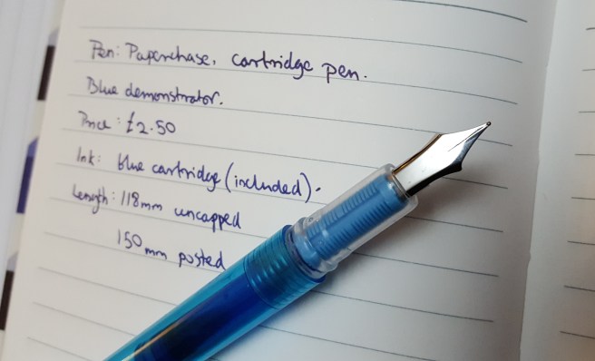
Today’s splash of colour comes from a recent visit to my local Paperchase stationery shop. As well as selling Cross, Kaweco, Lamy and Parker fountain pens they have a few of their own brand cartridge pens. I have tried three different models since July 2016, costing up to £6.00. This current blue demonstrator model is just £2.50 including three blue cartridges.

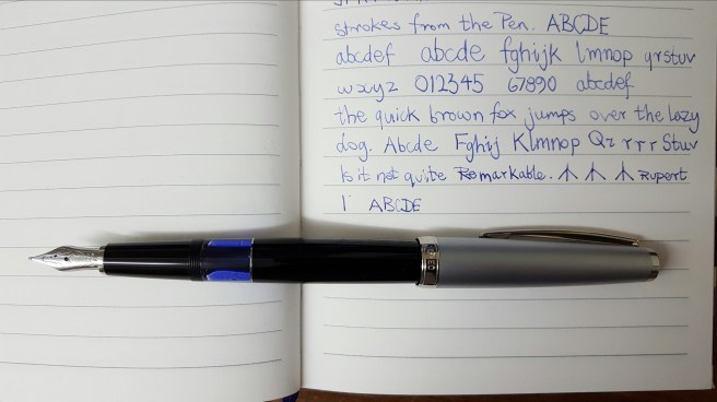
For this, you get a lightweight, plastic pen with a snap-on cap. The plastic pocket clip is quite springy and functional. The cap posts securely, giving a posted length of 150mm. The steel nib has no markings or breather hole but does have tipping material. It also has a wick between the nib and feed to help with ink supply. I would describe the nib as a medium.

The section is clear plastic and through this you can see the feed which is of a light blue plastic.

The pen takes a standard international cartridge but does not have room for a spare. The barrel has a hole at the end and so unlike the Platinum Preppy, this pen could not be converted to an eye-dropper fill.

Inking it up for the first time, it took a while and a bit of shaking before ink reached the nib but once it did, the writing experience was surprisingly smooth and I had no complaints about the ink flow. In fact it wrote with hardly any pressure. Do not expect a flex nib but you can get a little bit of line width variation, between sideways strokes with no pressure and downward strokes with some pressure.

wp-1490478934657.jpg

The pen also does reasonably well at starting up again after a few days of non-use, despite the absence of an inner cap.

At this price, it seems unfair to find fault but there is a sharp-edged step from the barrel down to the section which is rather uncomfortable, just where most people would grip the pen. Perhaps this was necessary in order to form the seal between the barrel and the snap-on cap but the comfort would be much improved if the moulded barrel could have a smooth edge.

Other than that, it is a colourful, handy and satisfactory little pen. I found that Paperchase also sells cute re-sealable bags of 20 coloured ink cartridges for £1.50 (as well as all black or all blue options) and so for a grand total of £4.00 you would be able to get by for a few months if you suddenly found yourself separated from any other writing implements. More likely perhaps, if you arrived in town and found that you had forgotten your preferred fountain pen, then a quick visit to Paperchase would get you back up and running for a minimal outlay.

wp-1490478645523.jpg

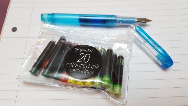
For accuracy, I should say that the coloured ink pack did not include blues, but there were three included with the pen. There were actually two more greens in the pack of 20, but instead I used the remaining blues for the rainbow.

I have not yet tried all the coloured inks. What I have learned though, is that “standard international cartridges” means standard in size and not ink quality and so if you have a preferred brand of ink cartridge of the same size, you may prefer to use an ink that you know. However, at just seven and a half pence per cartridge, you cannot really go wrong with these and there is a certain pleasure to be had from experiencing such a modestly priced combination of pen and ink.


Inky pursuits: my weekend round-up (2)

This weekend has seen some more inky goings-on which, taken on their own, might not be blog-worthy but together seem worth sharing in a round-up.

I am still delighted with the Cleo Skribent, piston filler fountain pen, four weeks in. I can genuinely say that I feel happy every time I remember it. The first fill, with Aurora Blue was still not quite finished when I ordered a bottle of Monteverde Napa Burgundy and decided to flush the remains of the blue, to have an ink change.

While flushing the pen, I decided to try removing the nib and feed. I had not yet found any guidance on doing this and was anxious not to cause any damage. I found that they are friction fit and came out very easily, when gripped together in tissue paper and pulled out straight. It is great to be able to rinse a nib and feed or remove the nib for any minor adjustments. To replace them, you just need to line up the nib and feed correctly, holding the nib on top of the feed centrally and with the right length of tines protruding beyond the end of the feed and then gently rotate them in the grip section until you locate the right way to push them back in.

20170319_233749.jpg

Whilst the pen was empty, I dipped it in three different inks to see how they would each look from the fine (more like extra fine) nib of the Cleo Skribent. I tried Pelikan Edelstein Tanzanite, Waterman Harmonious Green and then Diamine Conway Stewart Tavy, which is one of my favourite blue-black inks. I tried these on three different papers in turn. The Tavy gave a slightly bluer shade than the Tanzanite.

I then had the idea of seeing whether any of my pens had nibs which were interchangeable with the Cleo Skribent. The nib looked to be about the same size as the nib on a Kaweco Sport, a Cross Apogee or a Monteverde Artista Crystal. All of these are friction fit and are removed just by a careful pull of the nib and feed together, taking care not to damage the delicate feed. The nib on the Cross Apogee is 18k gold with a silver-coloured plating. However, once removed from the pens, the nibs of the Cross Apogee and the Kaweco Sport were both shorter than that of the Cleo Skribent.

The nib on the Monteverde Artista Crystal appears to be same length as the Cleo Skribent and so I think it would be possible to use that in the Cleo, if I wanted a Medium nib option. However, for now, I kept to the Cleo’s own nib.

wp-1489966399601.jpg

On Friday, I received an exciting package from Cult Pens, including the Monteverde Napa Burgundy ink that I had ordered. It came in a 90ml bottle and boasts a special formula, which they call ITF (Ink Treatment Formula). This, it is claimed, “drastically improves ink-flow quality, extends cap-off time, lubricates and protects the ink-feeding systems from corrosion and clogging and improves ink-drying time on papers.”

Whilst this all sounds very commendable, I soon found that the colour when paired with the very fine nib of the Cleo Skribent, looked a rather pale pinky-brown rather than the rich dark burgundy red that I had hoped for. I will try it in a pen with a broader and wetter nib but meanwhile decided to flush it from the Cleo.

wp-1489968067149.jpg

Furthermore, I did a very quick swab test comparison of the Monteverde Napa Burgundy with a Mont Blanc Burgundy and found that they appear pretty much the same colour. Others may conduct a proper and thorough comparison but to my eyes there is little to distinguish them in terms of colour on the page and if I was shown a sample of only one of them, I would be hard put to say which one it was. Of course, the other qualities listed above should also be evaluated and not only the colour. Anyway, happiness was soon restored once I refilled the Cleo, with the Tavy ink that I had sampled earlier.

wp-1489966853824.jpg

On Saturday, I spent the day at a church in Flackwell Heath, Buckinghamshire, hearing first hand about all the excellent work of a UK registered charity, Jubilee Society of Mongolia. The talk was hosted by the church which has supported the organisation since it was founded. Two Mongolian ladies from the organisation had come over to give a presentation, celebrating its 15th anniversary.

After hearing about all the very important and valuable work that the charity is doing in Mongolia, it seems rather shallow to tell you only that I took notes all day, using a Sheaffer Sagaris in the morning and then the Cleo Skribent in the afternoon. Both pens were excellent for note-taking and did not dry out if uncapped for a while.

Also in that package from Cult Pens, as well as the burgundy ink, was my new Lamy AL-star in the Pacific Blue, special edition for 2017. I had not seen these in the shops yet. The colour and finish are very appealing. Cult Pens offers a choice of nibs, in Extra Fine, Fine, Medium, Broad and Left Handed. I was rather intrigued by this last option and telephoned to ask what it meant, before ordering. Was it an oblique nib? Or one which was adjusted to write wetter for lefties? And what nib width was it? I was told that it is simply a bit more rounded and forgiving for people to hold the pen at different angles. Being a leftie, I decided to try one. I also ordered a pack of the matching Pacific Blue cartridges.

I tried the new pen and ink as soon as they arrived. I love the colour of the pen and the ink. I thought the ink to be quite similar to Pilot Iroshizuku ama-iro. However on comparing them side by side, the Pacific Blue is clearly lighter than the Ama-iro.

wp-1489967142656.jpg

As for the nib, I had  close look at it under the loupe. It has the letters LH on. There is generous amount of tipping material and the nib was usable straight out of the box, but a little skippy. I suspect it just needed to wear in. However, being impatient to enjoy the new pen and ink, I swapped over the LH nib for a medium nib from one of my Safaris and this is now writing very nicely and is the nib used for the writing sample pictured.

With this new Pacific Blue AL-star to brighten my pen cups, I now have seventeen fountain pens currently inked and need to bring this down.

This week I have one day out on a continuing professional development course. I am looking forward to taking notes with the Cleo Skribent again and possibly the Lamy AL-star Pacific Blue for annotating the handouts.

wp-1489966543149.jpg


Paperchase A6+ Flexi Linen Notebook review.

wp-1489261822080.jpg
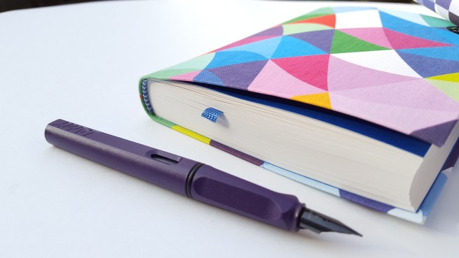
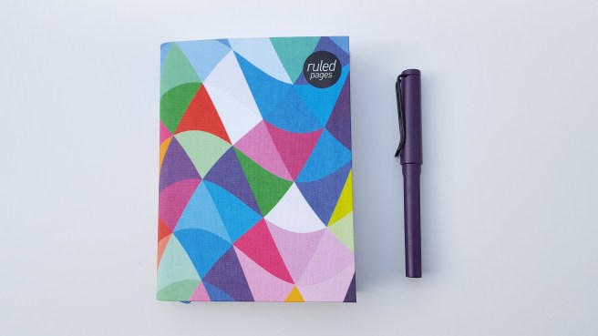
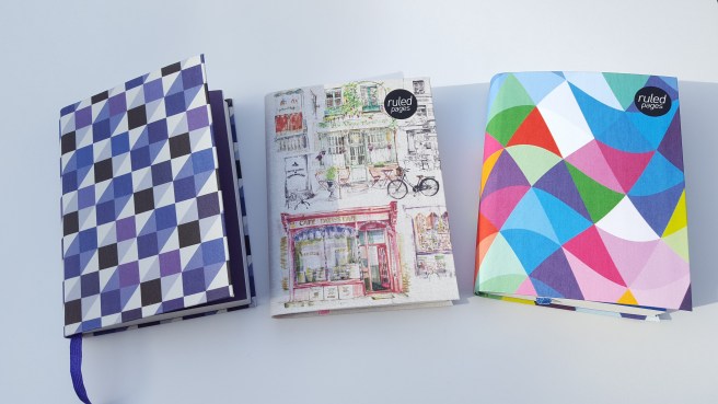
My liking for notebooks goes back to childhood when it was a treat to visit Arthur Birds, our local independent stationer and book seller in Ickenham, a villagey suburb on the outskirts of London. Then, as now, I appreciated good quality and for a notebook, that included having stitched binding so that you could open the book flat without risk of the pages breaking loose.

Today I am looking at a notebook from Paperchase. A sticker on the back cover describes this a COLOURED SQ GEO A6+ FLEXI LINEN NOTEBOOK. They are made in the UK and sell for £8.00. Happily I picked up mine for £4.00 during a sale.

The “coloured sq geo” refers to the cover design and there are several other options. This one consists of a geometric pattern of squares in shades of purple and white. It also  has purple endpapers, a matching purple bookmark and purple headband (the pretty piece of material like a small caterpiller at the top and bottom of the binding).

wp-1489261874981.jpg

The book contains 320 ruled pages of almost white (ivory?) paper, with a pleasantly generous line spacing. There are 17 rows to a page, measuring 137mm (not including the top and bottom margins) and so this means each row has a height of 8.059mm. Personally I find this ideal as I am not so keen on narrow line spacing.

I should mention that the book is actually larger than A6. I assume that this is why it is called A6+. The pages measure 163mm x 119mm and the covers are slightly larger all round, to protect the paper. This is a very useful and convenient size to carry in a bag or large coat pocket without being too bulky and heavy.

The cover material is hard to identify. It does have a pleasant texture and the covers are flexible, but I am not sure if it is linen. Whilst it has a cloth-bound feel, I would guess it to be some sort of man-made material, but whatever it is, it is nice to hold and feels tough and hard wearing.

wp-1489261835547.jpg

The binding, I am delighted to say, is very well done, with 10 sewn batches of folded leaves and a pleasing, rounded fore edge to the leaves. The book can be flexed in the hand as you flick through the pages, yet the cover seems sturdy and protective. All in all it feels very well made.

The paper is very smooth to the touch and of an ideal weight, being neither too thin and see-through nor too thick and stiff. The weight is not stated. I would guess it to be a little heavier than your typical 70 or 80gsm office paper and so perhaps somewhere around 100gsm.

For the fountain pen user, the paper is smooth and I have not experienced any feathering or bleeding with any pen and ink combinations that I have tried so far. Show-through is minimal. I would describe this as fountain pen friendly paper.  I would just caution that if you have a very smooth, highly polished nib, it may skate around on this paper and struggle to lay ink down. I think it needs a nib which is a little “toothy” to make the best use of this paper. Recently I have been enjoying a new Cleo Skribent piston-fill fountain pen with a stainless steel, fine nib. The paper is not overly absorbent and the ink does not spread and so a very fine nib does produce a very fine line. The nib on the Cleo Skribent is quite amazing and with no pressure will lay down a line on even the smoothest of papers.

When I buy a new notebook I like to try out a few different pens on the back page to check for feathering and bleeding and general fountain pen friendliness. I then like to paginate it, with pencil or ballpoint pen so that I can go through the whole book quite quickly.

I was sufficiently delighted with this book to go back for two more, even though these were back at the usual price of £8.00. For the many hours of use that I will get from 320 pages, I think this is great value these days.

wp-1489261889968.jpg

Inky pursuits: my weekend round-up.

20170306_190226.jpg

It is remarkable how soothing and therapeutic, the simple act of using a fountain pen can be. It does not even have to be proper writing. Just putting pen to paper and enjoying the flow of the ink from the tines is enough. A particular delight is to observe the ink flowing as you write, with a  magnifying glass or illuminated loupe.

For the past two weeks I have been greatly enjoying my new Cleo Skribent piston filler fountain pen (shown above). It is still on its first fill, of Aurora Blue, but I am wondering whether to try a darker ink next time, as the nib is so fine. I will try to be patient and wait until it runs dry.

After a busy week I also find it relaxing to ponder what ink changes to make next. On Friday evening, I decided to put Sailor Kiwa-guro black pigment ink in my black Platinum Preppy. The Preppy has a good inner cap and seemed an ideal choice for this ink. Not long ago I had syringe-filled a cartridge with this ink for a Berol Handwriting pen, but was not altogether happy with the writing experience, but it was easy to switch the cartridge into the Preppy and flush the Berol. I then pottered about trying the ink on various papers and notebooks and was much happier with it in this pen.

On Saturday morning, I decided to try a black ink in my burgundy Platinum 3776 Century. I had for many months been using Waterman Harmonious Green ink in this pen, which shades beautifully. However, some time last week I had switched to Mont Blanc Burgundy Red in the 3776, thinking that this would be a clever match for the burgundy pen. I was not very taken with the result. The ink did have some shading but overall the rather subdued, lighter pinky-brown tones did not look as exciting as I had hoped.

So, I wanted to try a black ink that would replicate the shading that I had enjoyed from the Harmonious Green, but provide a few (ahem) shades of grey. I spent a happy hour or so dipping the 3776 in Parker Quink Black, then Waterman Intense Black and finally, Cross Black archival ink and examining the results on some different papers. I settled upon the Waterman ink and filled it up. The shading was not as pronounced as I had envisaged but the writing experience was very smooth and satisfactory.

On Saturday afternoon, I took the underground to the West End to meet my wife and to have a look around a few pen shops, which I had not visited for a while. First, I took her to  Campo Marzio at 166 Piccadilly, (near The Ritz Hotel), where we enjoyed browsing their colourful displays of pens and inks and accessories. I was tempted to buy another Acropolis fountain pen as the green marbled resin version looked so appealing, (imagine this filled with Harmonious Green!) but held back for now. My blue version is a favourite.

Next we walked up the Burlington Arcade to visit Penfriend. I had brought along my Sailor fountain pen bought at auction in January, hoping to get their help to identify the model and year. I was shocked to find that the shop had closed down and the inside was bare. I looked on Google and found an announcement stating “We have now closed both our shops in Burlington and Fleet Street however we are defining what the next steps are for our business” and giving an email address to keep in touch.

Back in Piccadilly, I went to have a browse in the pen department of Fortnum & Mason. The pen department had been rearranged a little when I was last there, before Christmas, but this time it had moved from the first floor completely. I met one of the sales assistants, who told me that the fountain pens had been moved up to another floor. I went up to have a look but the pen counters seemed to have been reduced to a couple of displays, although still included Visconti and Yard-O-Led.

After a nice fish and chips lunch off Regent Street, we took the tube from Oxford Circus to Knightsbridge, to have a look at Harrods. Their Great Writing Room, is probably one of the finest fountain pen departments in London. At the Visconti table, I was able to handle the Homo Sapiens, bronze model and was surprised that it did not feel at all as I had expected. I thought it would be more like pumice stone but it was smooth and rubbery. The sales assistant showed me how flexible the 23k Palladium Dreamtouch nib was, by pressing it down gently against the glass counter to spread the tines.  It was not inked but you could imagine the lovely broad strokes that might be achieved from such a nib. She told me that the material absorbed moisture and might discolour in time but that you could treat it with handcream! That sounded rather unusual advice for fountain pen care but then this is a unique pen.  I must admit, I was tempted to treat myself to one on the spot but it seemed too impetuous for such a costly pen and I managed to refrain from buying one, (for now).

At the Faber Castell corner, I spotted the Garnet ink in its gorgeous bottle and tried to remember the gist of a friend’s recent review that I had read of it. Finding the review, I was reminded that it had many good qualities but was perhaps not sufficiently different from the Mont Blanc Burgundy Red (that I already owned), to justify a purchase.

Back home that evening,  I found a couple of good YouTube reviews on the Visconti Homo Sapiens from Stephen Brown and Brian Goulet . Interesting though it was to learn more about the pen, its nib and filling system, I was pleased that I had not rushed to buy it in the afternoon before doing more research and looking at other options. Sometimes, buys which seem such a good idea at the weekend can leave me feeling a bit guilty and regretful come Monday.

This is where a wish list comes in very handy as a sort of holding reservoir, where I can let my desired pens sit for a time, while I weigh up the pros and cons. This way, I hope to make more considered decisions and to make purchases that  will give lasting enjoyment.

On Sunday afternoon, I had to pop in to our local shopping centre to return a new rain coat. I do not always get that right first time, either.