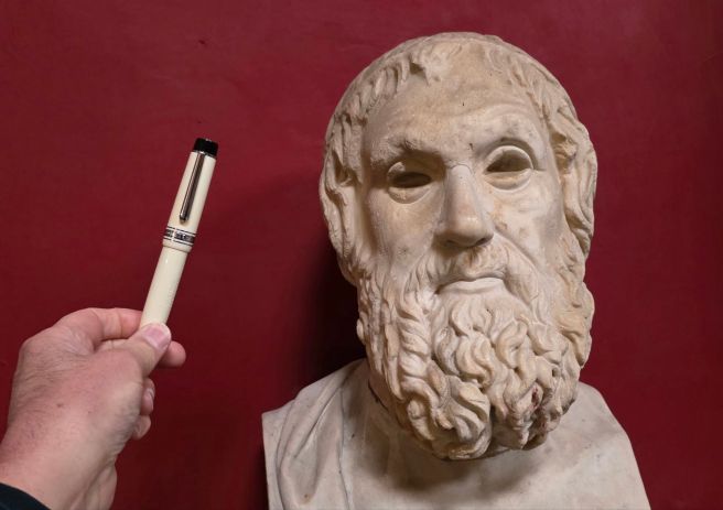
Buying a gelato from Venchi in Rome, liquid chocolate is first applied around the inside before it is filled with chopped nuts. These are then poured out: the nuts that remain stuck in the chocolate are yours. In a similar way, visiting fountain pen shops in Italy carries a risk that some pens may stick to you, as I was to discover.
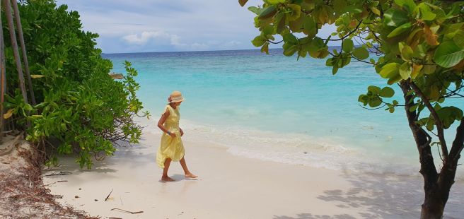
In January, visiting Rome for the first time I was keen to see the famous sights and get to know the city a little. For some holiday journaling I brought a Leuchtturm A5 journal and a couple of fountain pens: a large Asvine V800 vac filler and an even larger Junlai 930, piston filler. Both were newly filled and unlikely to run dry but I brought along a bottle of Robert Oster “Aqua” ink just in case.
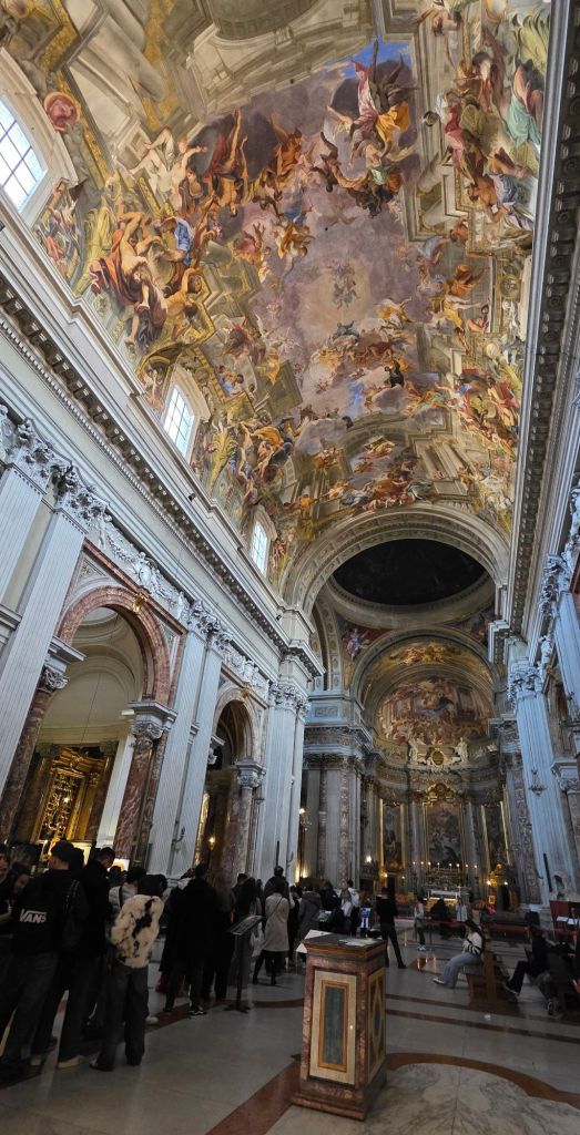
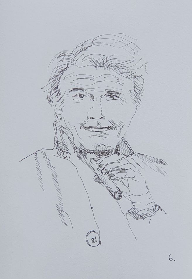
The Junlai 930 was my last pen purchase of 2025 and I had opted for the white version with the name of the previous Pope “JORGE MARIO BERGOGLIO, 1936 – 2025” inscribed on the barrel. It therefore seemed fitting to carry this pen during a tour of the Vatican to see the museums, the Sistine Chapel and St Peter’s Basilica.
In addition to the “must see” sights, I had hoped to spot a few fountain pen shops while out and about. In the course of our five-night stay in Rome, I managed to come across six pen shops. There are others that I missed but this was enough, without trying my wife’s patience too much. These are the ones that I visited:
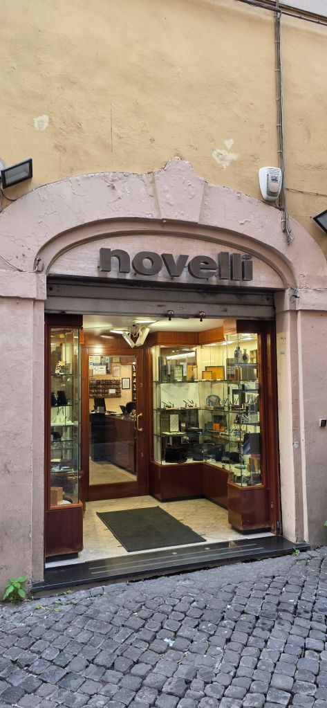
Novelli Penne e Pipe: via di S. Marcello 21, 00187 Roma
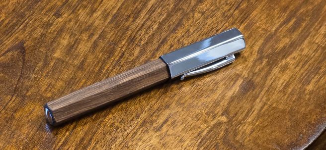
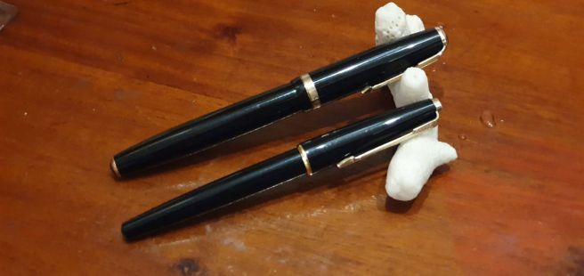
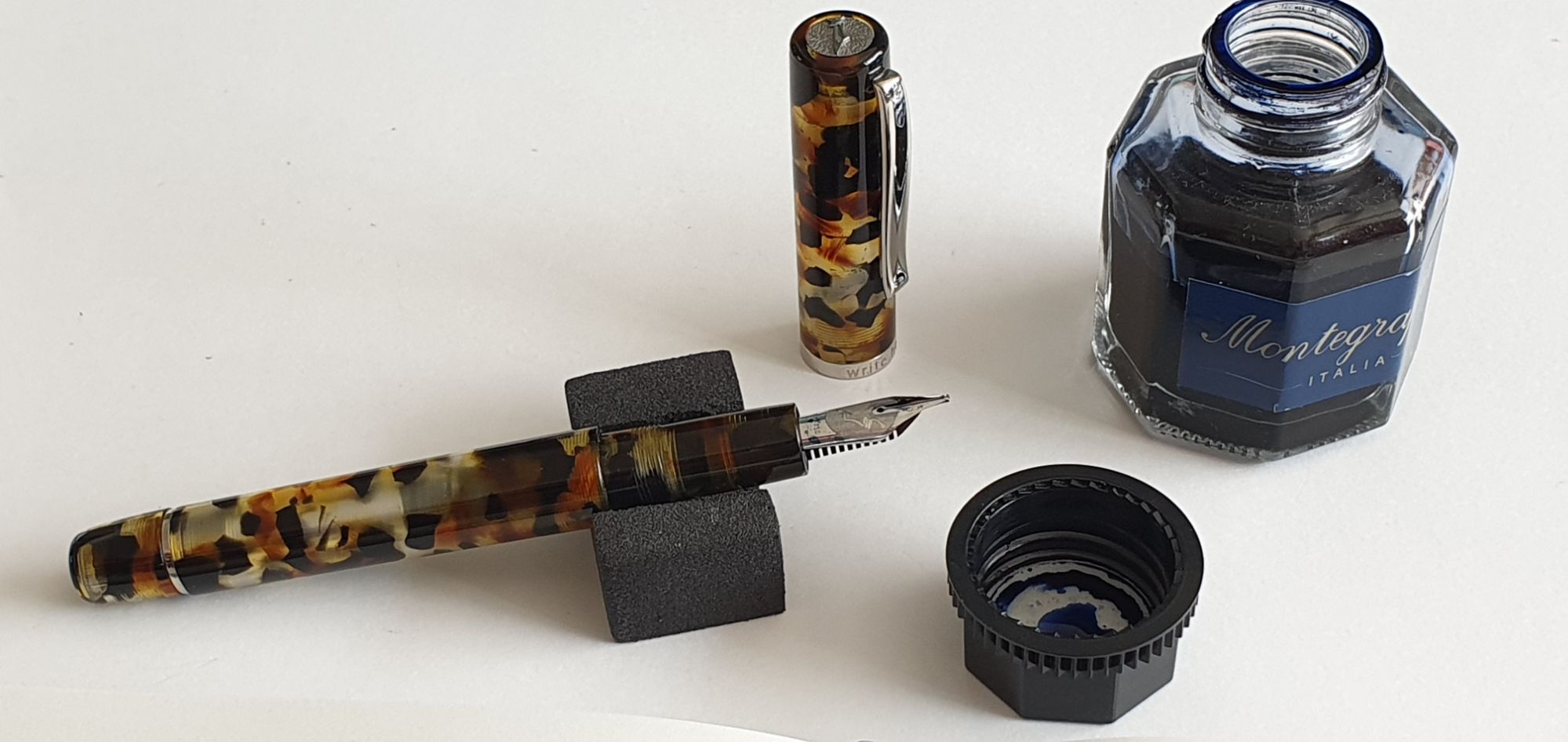
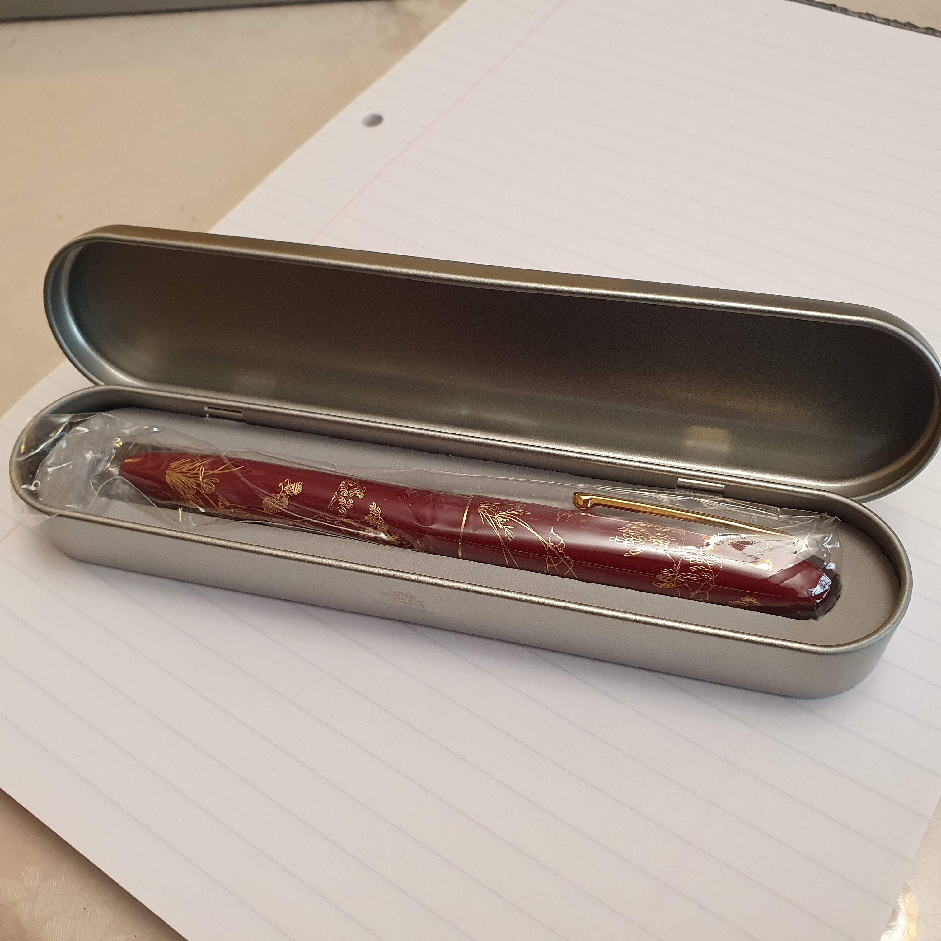
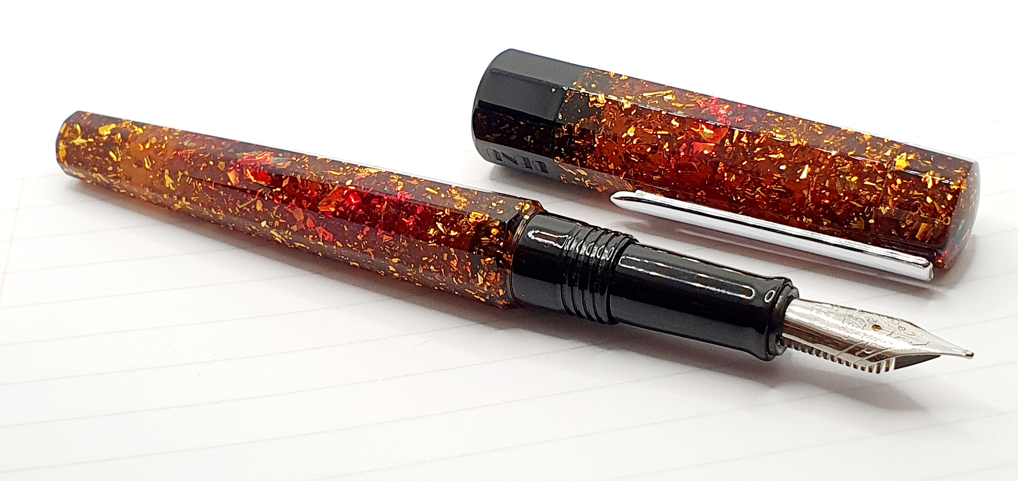
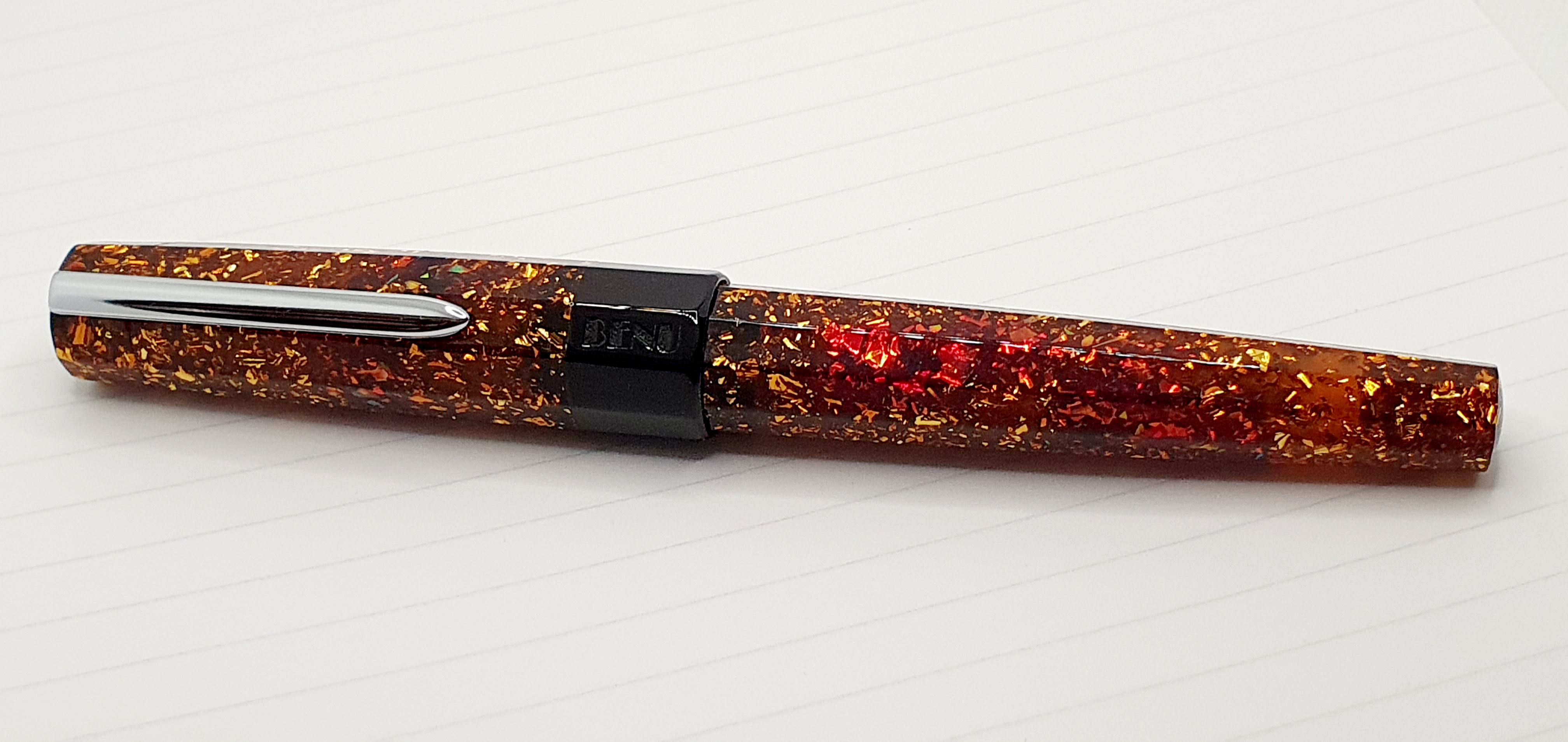
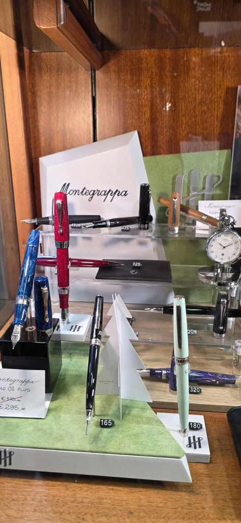
Located a couple of minutes walk south from the Trevi Fountains, we reached Novelli just twenty minutes or so before it was due to close for lunch. I had time for a quick browse of the display cases and was drawn to a fountain pen from Radius 1934, in a black marbled resin. I had seen a Radius pen only once before, in a solid black resin, while visiting Write Here in Shrewsbury. This one however, had flakes of blue, brown, white and gold which sparkled under bright lights and I was smitten. I decided to buy it, whereupon the proprietor kindly gave me a generous discount (without my asking), before advising me how to reclaim the tax at the airport.
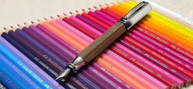
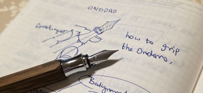
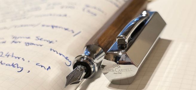
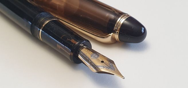
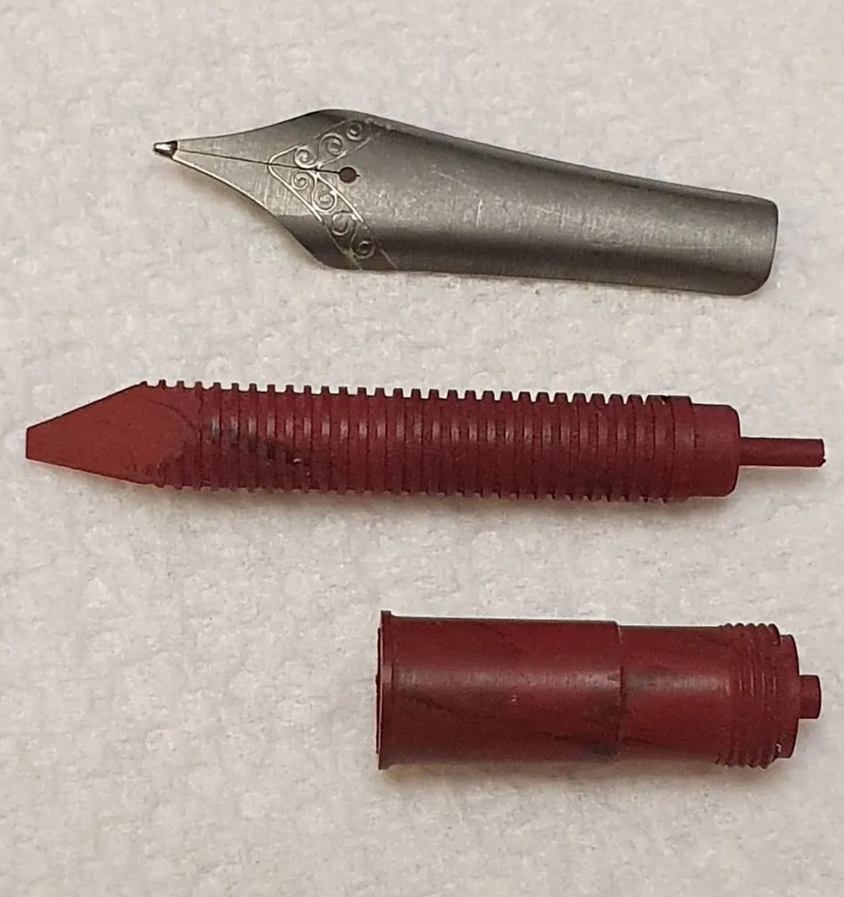
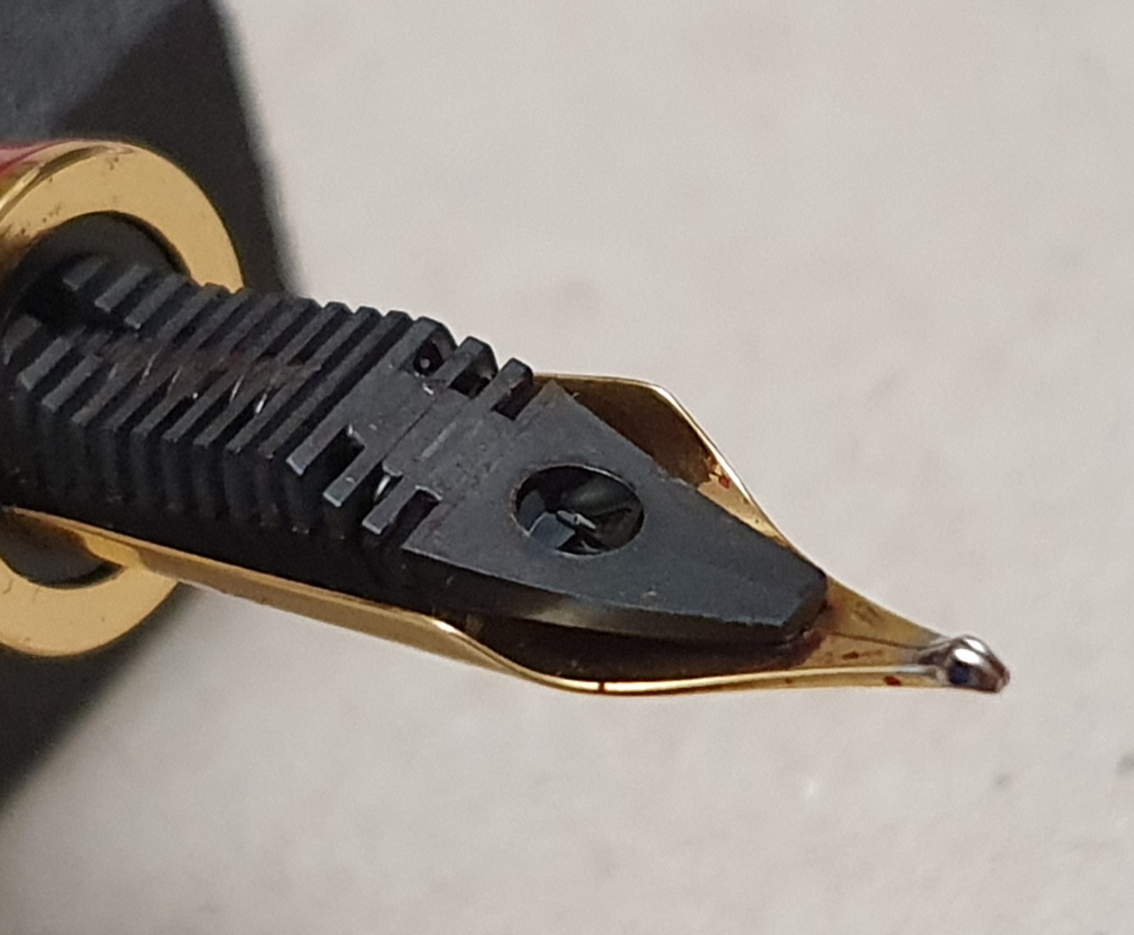
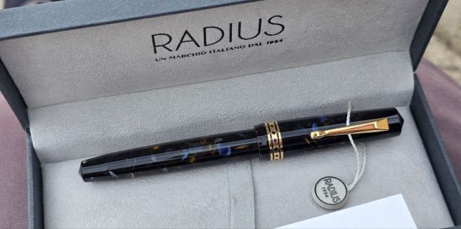
I later learned that the pen’s full name is the Radius Settimo, roccia marina, meaning “seventh” and “sea rock.” It came with a screw fit converter and I later filled it with my Aqua ink to test it out. It is a very comfortable pen for me and the steel nib writes smoothly, with a fine/medium line. On the box is a statement “Produced in Italy in the Leonardo workshops.” I am delighted with the pen and the only negative I found is that the cap rim is sharp to the touch without any chamfer. This might be uncomfortable for someone who posts caps but does not worry me. Also I found that the pen would hard-start after being carried around clipped upright in my shirt pocket. I suppose that this is just gravity doing its thing, but it seems that this pen is happier being kept on its side.
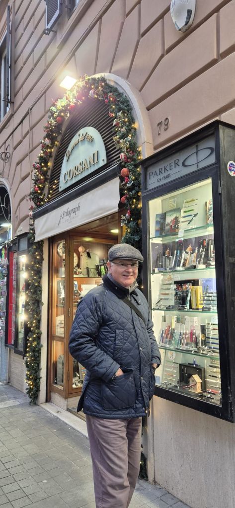
Stilograph Corsani: via Ottaviano 79, 00192 Roma.
During a morning tour of the Vatican, I got a photo-opportunity with the Junlai 930. Needless to say, the area is amazing and it was fabulous to see the painted ceiling of the Sistine Chapel.
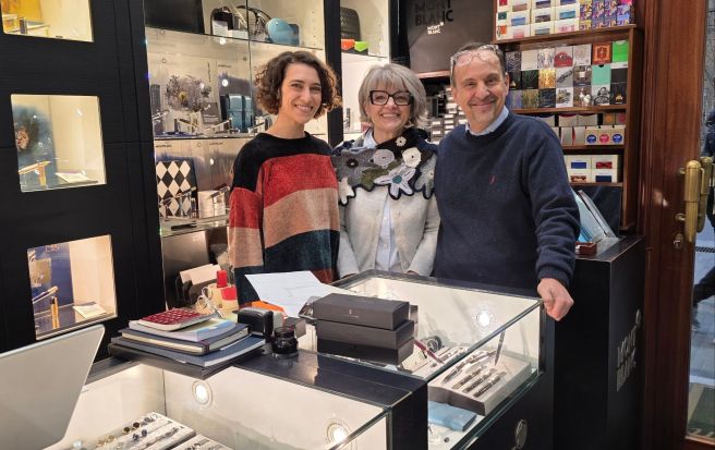
After the tour, we strolled up the via Ottaviano and found Stilograph Corsani. I had met the proprietor Stefano Corsani before, some years ago at the London Pen Show. It was good to see him again on his home turf. The shop is compact and our visit coincided with a delivery and so the walkway was obstructed with boxes but Stefano and team were most friendly and welcoming.
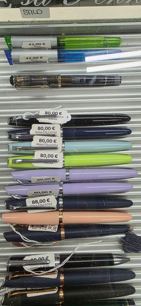
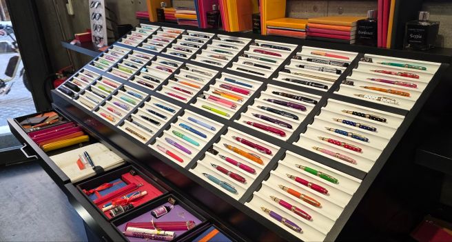
S.E.C. Cartoleria: via Arenula 85, 00186 Roma
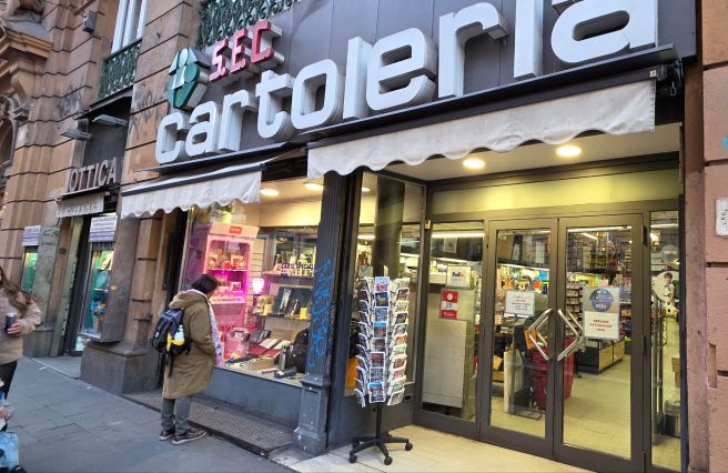
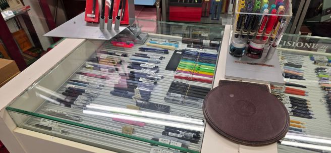
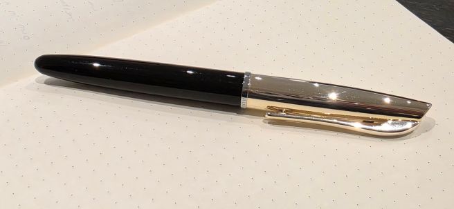
Our accommodation was in the via Arenula, close to the river and opposite a government building, the Ministry of Justice. Just up the road from our accommodation, I found this large stationery shop, a bit like our Rymans but with a greater selection of fountain pens, many of which we do not find in shops in the UK. As well as Lamys and Kawecos, there were pens from Stabilo, (a display of the Grow pens in oak, cherry or beech), Rhodia (a hexagonal pen), Pelikan, Recife and others. However, the displays that most caught my eye were the Auroras, mainly the Style and Ipsilon models but in a wide range of colours. I already have one Aurora Style in white resin and had thought about buying another in the pale pastel blue if I found one. They did have it, but also an elegant Aurora Style Metal, (black resin barrel and a gold plated cap). I have since learned that there are numerous versions of the Style, but I was particularly enamoured with this combination: the cap and pocket clip are a very pale gold colour, just making a subtle contrast with a chrome cap ring. I decided to take this one home with me. The shop was not set up for tax reclaims but did kindly give me a box of Aurora cartridges as a present. How nice, to be able to walk into a shop, hand over some money and walk out with a new Aurora fountain pen!
The Aurora now lives in my shirt pocket, follows me everywhere and does not suffer from the hard start issue that the Radius has.
Stilo Fetti Penne: via degli Orfani 82, 00186 Roma
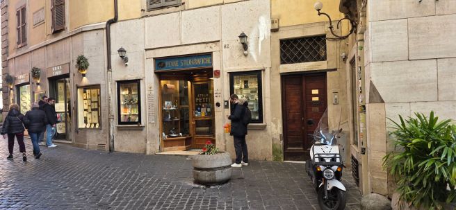
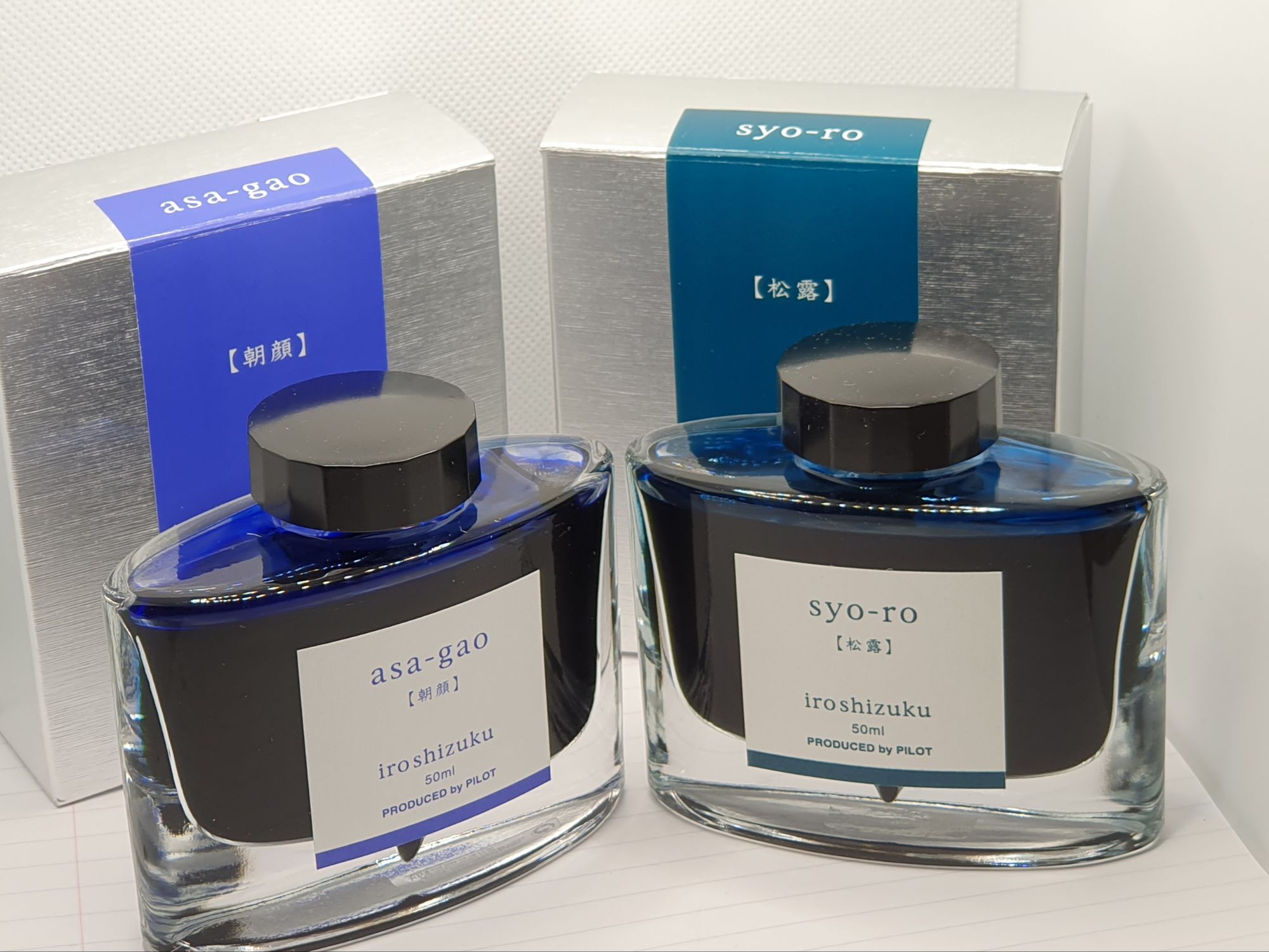
This is another traditional, elegant pen shop with glass panelled displays. It is in a central location, close to the Pantheon. I had time for only a brief browse of the cabinets and of the inks which were in the back portion of the shop. The prices were not particularly cheap compared to the UK. For example, a bottle of Pilot Iroshizuku ink was 31 euros, but there is a good selection of pens and inks that we do not have at home and you may be able to reclaim the tax on departure.
Campo Marzio: via di Campo Marzio 41, 00186 Roma
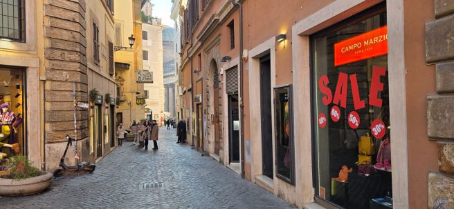
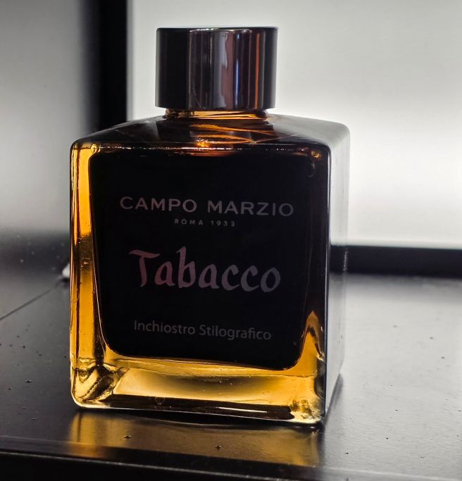
I recalled that the Campo Marzio shop in Piccadilly, took its name from the Rome street where it originated. The Piccadilly branch has since gone and I used to enjoy its colourful displays of pens and inks and stationery. I am still using some 30ml inks that I bought there, and especially fond of their “Tabacco” brown.
In Rome, I happened to pass the store, also near the Pantheon on a busy pedestrian artery. I had an opportunity to buy a whopping 150ml bottle of Campo Marzio Tabacco ink and for just 22 euros. Reluctantly I passed it up, as we had very limited luggage capacity. It was probably just as well as this would have been enough to last even Leonardo di Vinci for several years.
Pineider: via del Leoncino 25, 00187 Roma
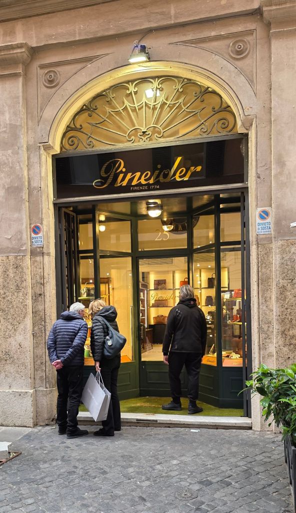
Another chance discovery was the Pineider shop, located not far from a main shopping street via Corso. I had gone to the area to find the tax reclaim office. I enjoyed a browse of the pens, amongst the leather goods and stationery. A couple of colours of their model called Rock, blue or brown, were in a sale and I had to restrain myself.
Rome has so much to see and can largely be explored on foot. I left with many photos and memories, tired feet and two new fountain pens. After Rome, we moved on to Naples by train but I will save that trip for a separate post.