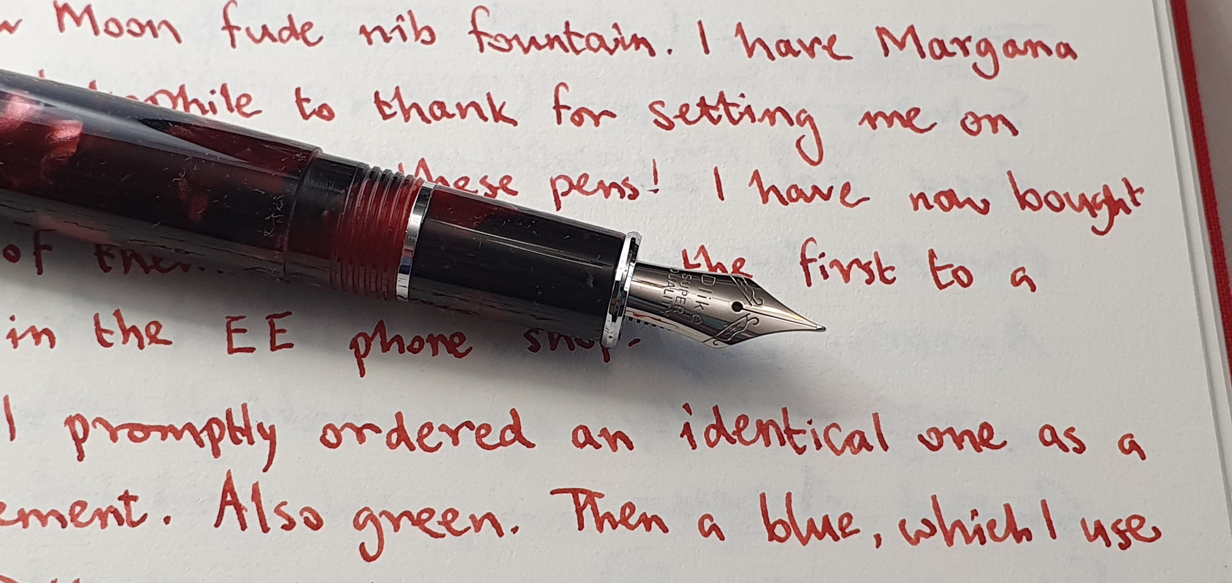
My number of currently inked fountain pens stands at 17, which is about average for me. But what is a bit unusual at the moment is that three are the same. They are my Delike New Moons.
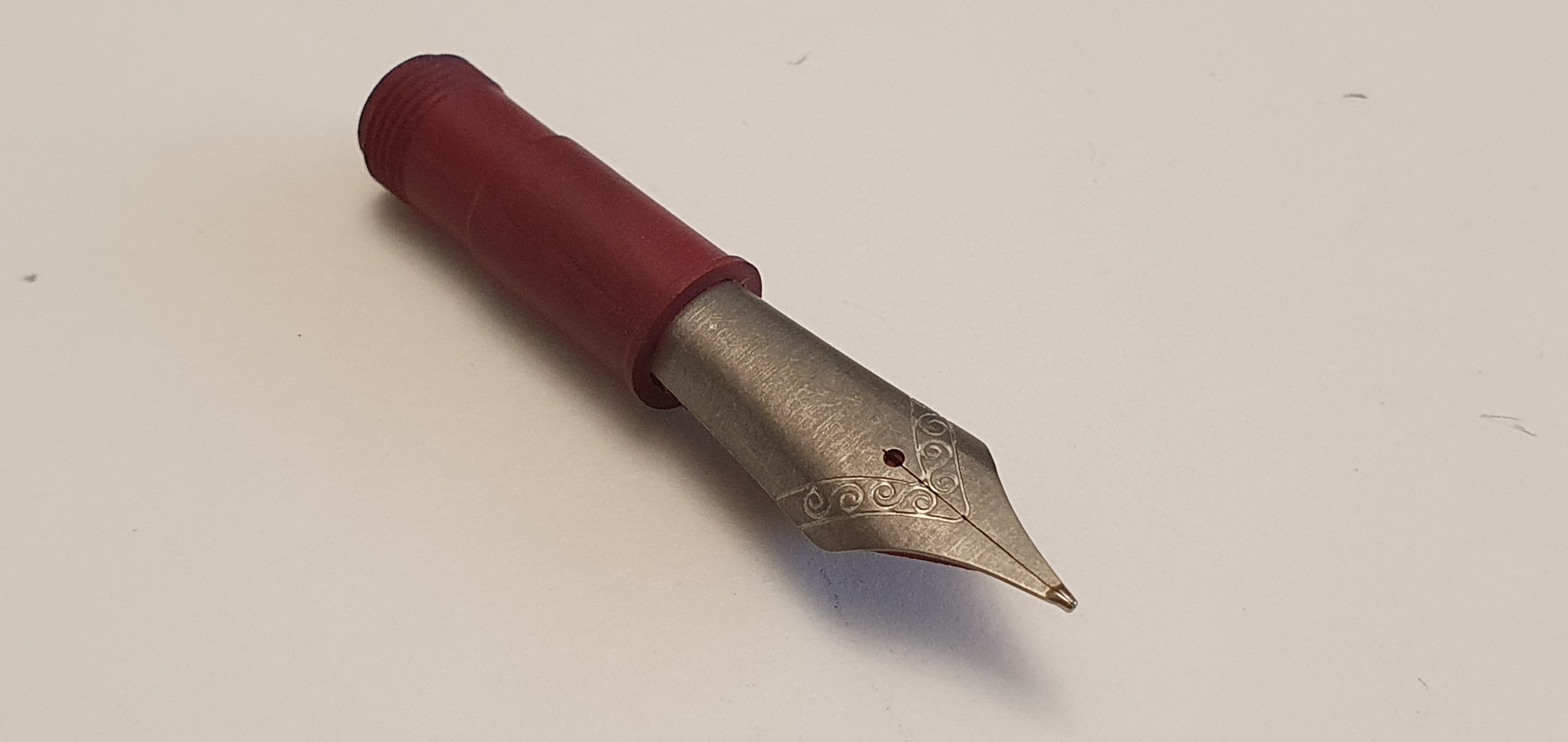
Delike New Moon fountain pen with fude nib.
I have already written an Early thoughts and a More thoughts post on this model, in March and April this year so there is little more to say. At that time I had bought one, loved it, given it away and bought a replacement. That was my marbled green acrylic version. Since then, I added the marbled blue and then, just recently, the marbled red.
Team photo.
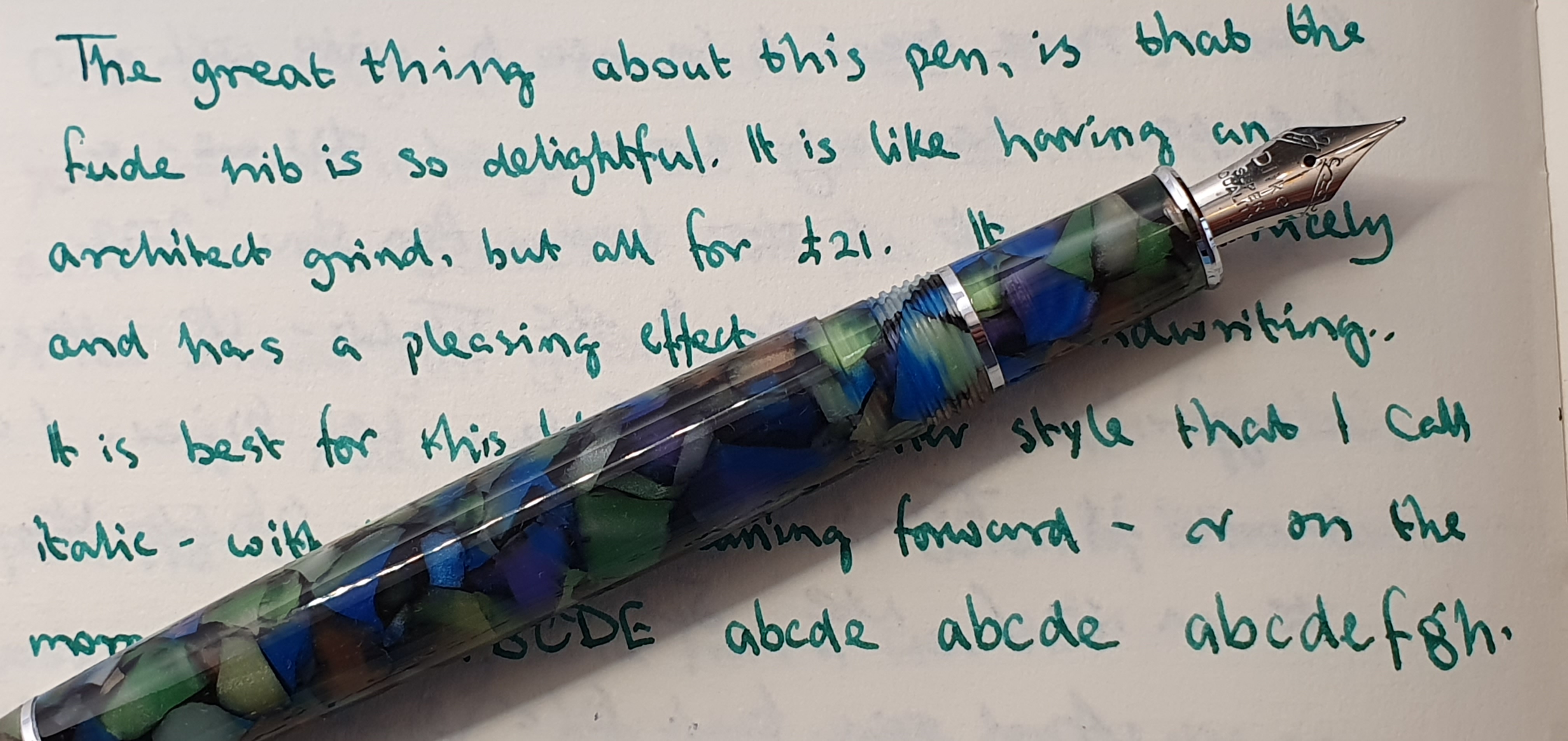
What is so good about these inexpensive pens? Well, the fact that they are inexpensive is one benefit. They are well made, they have screw caps, they have attractive colours (which includes the grip section), three shiny plated metal bling rings on the uncapped pen, plus two more on the cap, they are uncomplicated, comfortable and come with a converter which has a spring coil ink agitator. But what makes them so enjoyable, and versatile, is the fine “bent nib”.
Marbled green acrylic version.
On all four of the Delike New Moons that I have purchased, the nibs have been faultless, out of the box. They all write smoothly, with a good flow and all have that capability of writing four distinct line widths, depending upon how you hold the pen.
Marbled Blue version.
I have never been proud of my handwriting. I am no calligrapher and have not studied or been trained in those skills. On my fountain pen “journey” I have owned countless standard nibs, of fine, medium or broad tips (mostly mediums) which are easy to use, practical and forgiving, but which do little to produce a line which can be distinguished, one pen from the next.
A marriage made in Heaven.
And then this year I discovered the fude nib: a tip which bends upwards giving a flat area to write with. If the pen is held in a conventional way (an under-writer style) this will produce a narrow down stroke and a wide cross stroke and various widths in between. This is the opposite effect of a stub nib. It is how I imagine an “architect grind” nib might be.
Waterman Harmonious Green. Semikolon Grand Voyage journal, 100gsm laid paper.
Flicking back through the pages of my notebooks, for once I like how my writing looks with these pens. I can use them in my lefty, over-writing style which feels the most natural to me, either with the pen laying back in my hand to give a medium line, or held more vertical like a ball point, which then produces a finer line. But I tend to prefer to use the pen in my under-writer style. This slows me down and I form each letter and word more carefully and deliberately. I delight in the line variation such as in the two sides of the capital A.
The capital A is an opportunity for line width variation
As you might have guessed, I now have these three pens inked with a matching ink. The green has Waterman Harmonious Green, from a bottle that I have had since 2015. The newer, blue pen is filled with Diamine Pelham Blue, a very pleasing shade from the generous flow of this nib. My latest New Moon addition, the marbled red one, is now filled with Montblanc William Shakespeare Velvet Red, which is possibly my GOAT red ink.
Matchy matchy.
I expect a lot from my pens. Not only must they look good and feel good. They must write and behave well. They must (most of them) be good value. They must be enjoyable to use – by which I mean that the act of putting pen to paper is a pleasure, but also that the resulting script is expressive, neat, attractive, legible and satisfying. And as if that were not enough, I depend upon my pens for their role in maintaining my mental health, as a source of relaxation and unwinding to counter the stresses and strains of daily life. Writing with pen and paper lifts my spirits.
Diamine Pelham Blue. (Wetters?!)
I realise that this is a lot to ask of a pen, particularly one that you find on Amazon and which costs under £25.00 including shipping. But when you find one (whatever yours might be), buying three of them does not sound so silly after all.
Here in London, our Pen Show took place on Sunday, 9 October 2022, held again at the spacious Novotel London West, Hammersmith. I have been attending pen shows now for 9 years and still find them a bit overwhelming and a challenge to make the most of the day.
What makes for a good pen show experience? It helps to go with a list of anything in particular that you want to buy and cash for your budgeted spending, although it is equally enjoyable to go with an open mind and to see what catches your eye. This year I hoped to find another Titanium nib unit with ebonite feed, in a Bock fitting. Previously I had bought one with a Jowo fitting, which I had installed in my Opus 88 Demonstrator to good effect. I also hoped to take a look at an Onoto Scholar in the flesh. I hoped that the Semikolon Grand Voyage journals would again be available. Finally, I planned to take a look at some vintage Parkers. Spending enough, but not too much money, and wisely, helps avoid being left with regrets.
My mini-haul: Titanium nib unit, Parker 17 Lady, Onoto Scholar and case, plus a Semikolon journal.
Of course, it is the wonderful people of the fountain pen community that make the day special. This year I met in real life for the first time, Pamela of pamalisonknits.com attending her first pen show. Also, from Instagram, @amuse.bouch8 was here with her family, and Phil of @theinkscribe. There were the regulars, penultimatedave, Gary of dapprman https://dappr.net/ and Jon of https://www.pensharing.com/ with his Pensharing table, signing up new members. I met many of the well-known dealers – John Foye, John Hall of Write Here, John Twiss, Vince Coates, Dennis (of Den’s Pens) and Kirit Dal at whose Aurora table I tried a Talentum with a medium nib.
My wife came too. She made her purchases early, finding a handsome Diplomat (Excellence, brown guilloche rollerball), plus a Troika fineliner and a few Troika tool pens (ballpoint pens with screw drivers, ruler and spirit level) that she chose for gifts. Soon after, she discovered some colourful Semikolon twist action ball pens in matching colour plastic boxes and chose a selection of them, telling me excitedly “I have spent £80.00!” The game was on!
From wife’s haul: Diplomat Excellence rollerball.And some Semikolon ball pens for gifts.
I went to find Vince, to ask about a Titanium nib unit. I bought one, in a Medium with red feed. It did not fit in the Campo Marzio Ambassador which I had planned to put it in, but I hoped it might fit in something else at home.
Magna Carta Pens, titanium nib unit.
We went to see the Onoto table, manned by Feng Li and James Boddy, Shirley and Emma. I was yet to own an Onoto pen but had long admired the Magna Classic, reputed to have one of the best stainless steel nibs around (or a gold nib if you wish to upgrade). I was able to handle both the Magna and the recently introduced Scholar, which is similar in shape but slightly smaller but which comes with the same number 7, bicolour stainless steel nib that you would receive on the Magna. Onoto were offering the Scholar at a tempting show price of £150.00 reduced from the usual £195.00. I was hooked. With a choice of red, yellow, navy blue or black, I chose navy blue and with a medium nib. Rather stupidly, I passed up the splendid, sumptuous leather Onoto pen roll pouch included in the price, to have a simpler flat leather pen case which I could more see myself using.
Happily, I was able to buy another Semikolon journal (reviewed here in my last post) which I will greatly enjoy using.
During the day I had many interesting conversations with the friendly dealers. I saw some lovely Conway Stewart pens from Bespoke British Pens, of Emsworth. I saw the 20mm square rods from which their pens are turned, on a lathe. The Churchill is the most popular. I wondered if in years to come, people would buy pens called the Johnson, or the Truss. Don’t answer that.
Derek at Stonecott Fine Writing showed me the Venustas carbon fibre pen with a Titanium nib. It looked like no other pen. I met, for the first time, Emy of Pen Venture. At his table I handled a marvellous Leonardo Mosaico with a size 8 gold nib, exclusive to the show and for £500.00 I think, but well outside my comfort zone for an impulse purchase. A lady at Sparks Nibs had a table of pieces showing me the various stages in making a fountain pen nib.
I browsed at Graham Jasper’s table of vintage Parker pens. I was tempted by the elegant Parker 51 in black with a gold cap, of which there were half a dozen or so examples, with prices not shown but ranging from £60.00 to £200.00, he said. I would have needed to inspect them all to check the nib and the aerometric filler, as well as the general condition of the caps and barrel, which showed differing degrees of wear as expected from these elderly pens. There was a bit too much choice and I could foresee that after this exercise, I would have chosen the one that was the highest price and so I moved on, this time.
After a very enjoyable day of meeting friends and browsing the tables, it was time to go. On a last walk round the tables, I found more trays of vintage Parker pens, but marked as either £40.00, £20.00 or finally, a miscellaneous box in which every item was £10.00. Here, I bought a little Parker 17 Lady, with a hooded nib, in dark green with gold furniture. The nib looked promising, and I could see myself enjoying it.
Parker 17 Lady, made in England.
The aftermath.
Back at home, I tried the Titanium nib in a succession of pens but could not find any that it would fit, so far. I will enjoy paginating the Semikolon journal. I knew that the Onoto Scholar fountain pen would be perfect and left that to try last. Surprisingly I found that it was the Parker 17 Lady that I was most eager to examine and which was to dominate my evening.
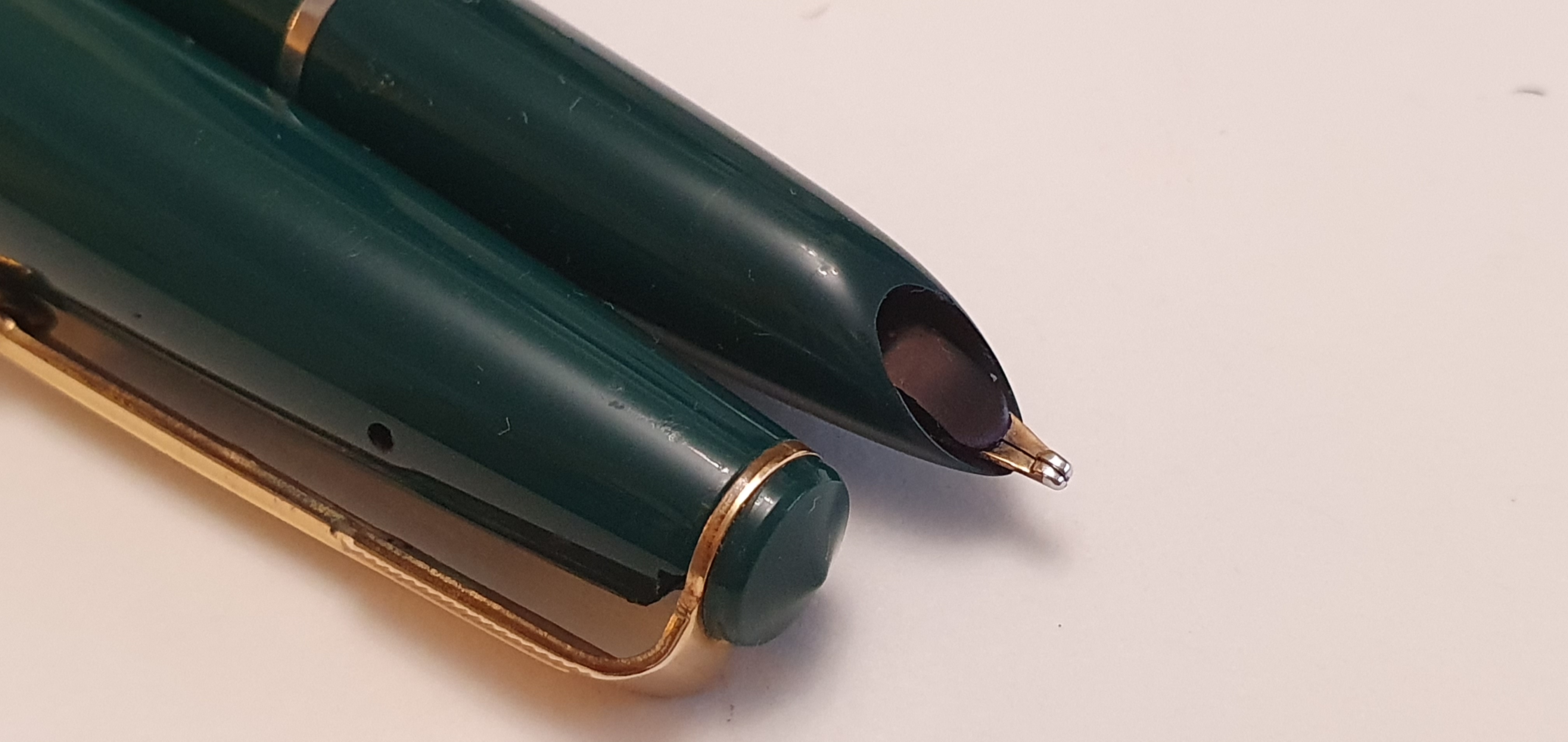
I soon spotted a large chip in the cap, just below the finial. However, when unscrewing the green plastic finial, I found that I could position the pocket clip in front of this, and also that when the finial was screwed in, there was no daylight showing from the chip and so hopefully it would still be reasonably airtight (not counting the deliberate hole found in the side of the cap). There were scratches on the barrel and cap. I then found that some of these were actually cracks, but I still clung to the hope that these were cosmetic only. The nib unit and aerometric, squeeze-bar filler were in good usable condition. I filled and wrote with the pen. The nib was a smooth, soft juicy broad.
Uncapped. The cracks start to appear. But the 14k gold nib is lovely.
Using the pen, I noticed an increasing amount of ink on my fingers. It transpired that the section, or shell over the nib unit was not only scratched but cracked and that ink was leaking out from the shell. By this time, I had already had my £10.00 worth of enjoyment and education from the pen. My wife suggested putting it in the bin. I could not bring myself to do so. No one can bear to see a broken Lady. I pondered filling the pen by first unscrewing the nib and filler unit from the shell. This did not seem very practical but I decided to keep the pen and perhaps find another Lady or some spare components at a pen show to rebuild her some day.
Nib and aerometric filler unit unscrewed from the section and reusable. Chip to the cap.
And so finally to the Scholar. This was predictably excellent. The steel nib was faultless and the pen felt very comfortable. You even get a brass tubing liner to add weight to the barrel, which is an optional extra on the Magna. Yes, the Magna at double the price would have been a little bit longer and broader, but then I have that size covered already by my recent Tibaldi N.60. I was no scholar myself but coincidentally the silver and the gold colours of the steel nib, and the gold coloured finial, clip and cap ring, next to the navy blue are reminiscent of my school uniform colours at the Reading Blue Coat School in the 1970s. I am thrilled with this beauty.
Onoto Scholar. An exquisite steel nib.
A few days after the show, I learned from Onoto that I was one of several lucky runner-up winners of a Coffee Dusting Stencil with the Onoto logo, so that was good!
With hindsight, I should have taken a little more care in choosing the Parker and spent a bit more money there to buy a pen without so many issues. I could also have passed up the Titanium nib after finding that it was not the right fit for my Campo Marzio. At least I stopped myself from buying any more ink. It takes years of practice to make the best use of a pen show and I am not quite there yet.
With the London Autumn Pen Show just a week away, it is natural that my thoughts may turn to what I might buy there.
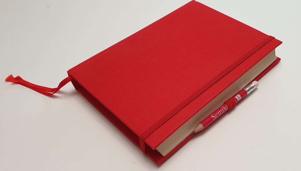
In London we are fortunate to have two pen shows a year. At the Spring show on 6 March 2022, my modest haul included a notebook from a brand that was new to me, called Semikolon. It was a chunky A5-ish size, offered in a selection of colours and for a tempting show price of £10.00.
Specifications.
152 sheets (304 pages) of Swedish, fine laid watermarked, plain, cream-coloured paper;
Page size: 135mm x 180mm;
Stiff board covers, and cloth-bound;
Stitched spine – opens flat;
Two ribbon bookmarks (matching the cover);
Elastic closing loop;
Elastic pen loop with a Semikolon pencil;
Expandable pocket in the back cover;
World map with time zones, inside the front cover.
Semikolon Grand Voyage notebook.
I was informed that Semikolon is a sister brand of Leuchtturm, whose hardback A5 notebooks I have used a lot. However the cloth-bound notebook from Semikolon feels rather more luxurious in comparison and the paper feels heavier (although I have not found a reference to the weight in gsm).
How have I used mine?
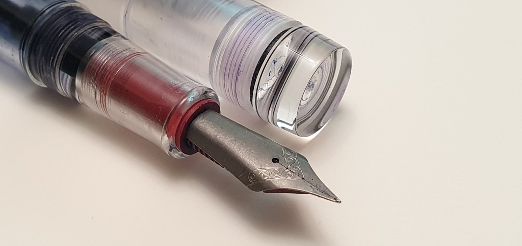
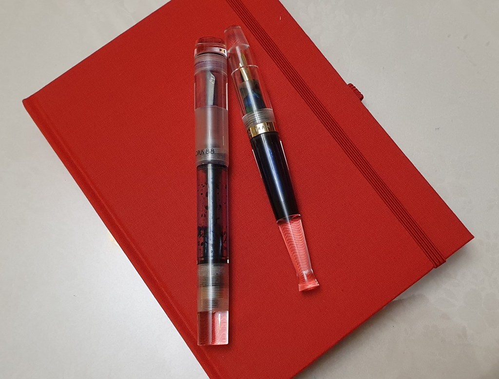
Naturally, I began by paginating the book, in pencil. I sampled the paper by trying one of my purchases from the same pen show: an Esterbook Estie Nouveau Bleu with a broad nib filled with Waterman Serenity Blue. I also tried an Opus 88 demonstrator pen, in which I had installed a new Jowo-fit Titanium nib in an ebonite feed and housing, from the London pen show last year. This was (and still is) filled with Graf von Faber-Castell Cobalt Blue ink. I would be keen to pick up another of these nibs, in a Bock fit housing next time to upgrade another steel nibbed pen.
Replacement Titanium fine nib with ebonite feed, installed in my Opus 88 demonstrator.
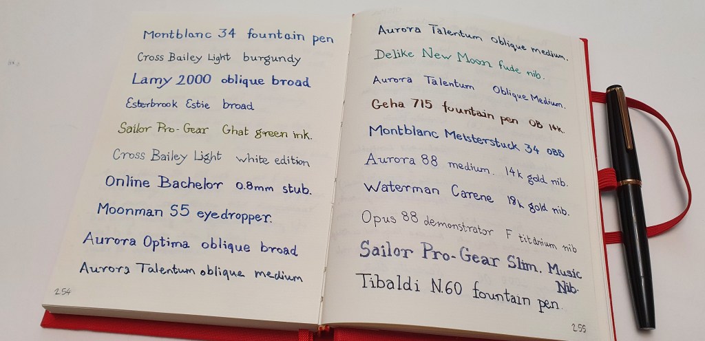
I was very pleased with the notebook. There was no bleed through from my fountain pens and also very little show through. I generally use a row guide sheet behind the paper, used from a pad of Basildon Bond writing paper. Flicking back through the pages, I see that I started with the paper-testing writing samples on the back pages and then just carried on with the pen and ink sampling, working from the back of the book all the way down to page 72 which is where I am now. The page numbers therefore tell you the number of pages remaining. This was not intentional, but illustrates that this is a notebook that I pick up often when just wanting to write a paragraph or two from whatever pen catches my eye in the pen cups. My tally of currently inked pens at home is at twenty (after flushing three this morning).
A few pen and ink samples in the Semikolon notebook.
I have also started filling the book from the front too, where I had the idea of inserting the date at the top and writing a page about the events of the day, using a different pen and ink each time. For example, on 2 June I wrote down some reflections on HM The Queen’s birthday parade – the Trooping of the Colour in Horseguards Parade, watched on TV. Little did I know that she was to pass away a little over three months later.
Admittedly I have filled far more pages with idle paragraphs of pen and ink sampling from the back, than I have with any meaningful writing from the front, but then it has been a source of recreation, reached for often when tired from the working day and in need of some pen-time escapism, writing simply for the joy of using a fountain pen on nice quality paper and seeing paragraphs of handwriting from different pens, nibs, and inks and in different writing styles.
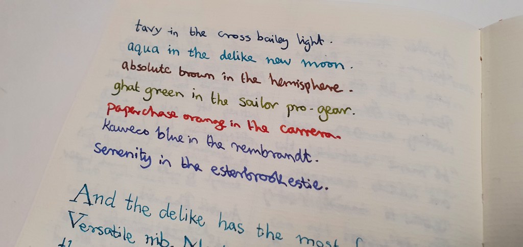
A colourful paragraph from the currently inked pen cups.
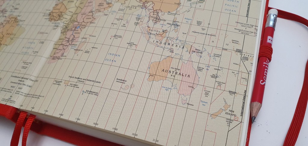
The “Grand Voyage” theme is supported by the expandable pocket inside the back cover for tickets, post-cards or travel souvenirs, and by the world map in the front cover. I had not studied the map closely and it was literally only today, that I noticed the Semikolon Islands lying to south west of Australia! This is a notebook that does not take itself too seriously.
With a casual glance, you could easily miss the Semikolon Islands, and their punctilious inhabitants.
I am looking forward to next weekend’s pen show and would be happy to pick up another of these notebooks if the opportunity arises and in a different colour next time. How would you use yours?
Observe how these demonstrator pens cleverly adopt the colour of their surroundings.