Paperchase Soft Flexible Journal, a brief review.

paperchase-soft-flexible-journal

I have recently come to the end of my first one of these. I had written the date in the front, 10 October 2015, so it has lasted me over a year. To give it its full title, this is the A6 Black 300 Page Leatherlook Note Book. It is made in Spain and sold by Paperchase, a chain of stationery shops here in the UK.

However, according to my dictionary, a “leaf” is the term for a portion of a book of which each side is a page. What they should have called this, is a 600 page note book.

600 pages! That is too many to paginate, but also too many not to paginate. I did in fact chose to paginate mine, although this takes a certain amount of fortitude and patience. You might not want to tackle it all in one sitting.

A6 size is approximately 6″ x 4″ or 150mm x 100mm and the book is 25mm thick. The black cover has a pleasant matte, leathery feel and is soft and flexible, like a paperback novel. The paper is white, with squares comprised of pale grey lines (yet on very close inspection these turn out to be more like a blue or purple). The line spacing is a little too narrow for single line writing unless you have very small handwriting but you may write on every other row, to give a generous wide line spacing if preferred.

The best thing about it though, is that the paper is remarkably fountain pen friendly. It is a 70gsm paper, smooth without being overly glossy and does not suffer from feathering or bleed-through. Show-through is minimal and so you can write on both sides and really make use of those 600 pages. For the purpose of this post, I did try using Pelikan Edelstein Tanzanite (which is my “most-prone-to-bleed-through” ink) with a glass dip pen and having shaded a block of six squares in a pool of wet ink, I was able to produce just the beginnings of some bleed-through on the reverse, but you would not do this in normal writing conditions.

The pages (or leaves) appear to be glued rather than stitched, but the binding is strong and after a year’s use I have not had any pages breaking loose. You need to be a little careful not to crack it open too flat but the cover and spine are flexible and floppy. The cover will get a little creased and dog-eared with time. It is a good size to write with, on your knee.

I have enjoyed using it very much. Flicking back through, I see that I used it mostly for sampling various fountain pen and ink combinations, occasionally writing a list of what pens were inked and with which inks, records of purchases at pen shows, music that I had listened to, notes from TV documentaries, names of contestants and their professional dance partners in “Strictly Come Dancing” (doesn’t everyone do that? Oh.), colour samples of inks, doodles and sketches and just gratuitous fountain pen writing for no reason other than the joy and therapy of putting pen to paper.

wp-1479762444350.jpg

Once I realised how much I liked this notebook, I went to another branch to buy a spare and was disappointed to find that there was none in stock. I looked on line at Paperchase’s web site and found a statement that it was a  favourite but out of stock at that time. They seemed to disappear for a while. Back in the branch last December, I bought the closest equivalent that I could find, which was an Agenzio soft black, ruled notebook, with the same leather-effect cover, sewn (yay!) and with 384 pages,  but crucially for me, was not fountain pen friendly and every pen and ink that I tried bled through (with the exception of a Platinum Preppy extra-fine 0.2mm nib with a black cartridge) and so you could not use both sides of the paper with a fountain pen.

I kept an eye open for the 600 page notebook whenever I was in one of their stores and happily, they did reappear in time for me to buy another before finishing my first one. I was so delighted that I bought two of them. And then, inexplicably, another two.

paperchase-soft-flexible-journal-1280x960

Here are the new notebooks, still with their protective sleeves, next to a Parker IM (new version) which I have included for scale. Keen-eyed readers may recognise that the pen rests are crafted from blocks of sponge which are part of the packaging of Pelikan Edelstein inks.

The notebooks are priced at £7.00. Finally, I have no affiliation with Paperchase (although I spend rather too much time in their shops) and am not paid or compensated in any way for this review. But these are great notebooks. Credit where it is due.


Some Sunday reflections

20160406_123010

It being Sunday, I felt in a reflective mood today. I rose early and enjoyed writing for an hour in the quiet of the morning. From the pen cup, I picked a Kaweco Sport Classic, newly  filled yesterday with Noodler’s Sequoia, as I was keen to see how this ink would perform in a wetter pen.

I then went for an hour’s walk, taking in a circuit around Golders Hill Park. It was still only around 9.00am and very empty. It was cool, a bit misty and damp with lots of wet leaves on the ground and wonderfully quiet.  I particularly like one section of footpath which winds uphill, between the trees and glades. It occurred to me that I was in my favourite part of Golders Green, in my favourite time of day. There is an animal enclosure, a free zoo in the park and I always enjoy stopping to look at the pair of Eurasian Eagle Owls, standing quietly in their open fronted hut.

Over at the duck pond there was some commotion. One mallard was fighting another, beating the water with his wings and chasing the other one quite persistently and aggressively. Even in such lovely tranquil surroundings, there is always something to spoil perfection.

As Christmas and the year end approaches, I counted that I had acquired around 40 fountain pens over the year. I know this because I keep a record of them on a handy App called “Memento Database”. Most were inexpensive and so this is not as extravagant as it sounds but the number came as a bit of a shock even to me. These pens all have one thing in common, namely, that they seemed like a good idea at the time. And I do enjoy the vast majority of them.

Being very fond of writing with a nice pen, it becomes addictive to acquire a different pen, in the hope that it might be even better. By “nice pen”, I do not mean only expensive ones as I get huge pleasure from using some which cost literally only a couple of pounds, if they write well.

Having accumulated (“collected” implies a more purposeful and focused approach) quite a number of pens, I suppose an obvious question is what is the best? The favourite. That is hard to answer. I suppose my Pelikan M205 blue demonstrator (pictured) is certainly up there in the top few, simply because I like demonstrators, I like piston fillers, I like that you can easily unscrew and clean the nib unit, that it has a large ink capacity, that the nib never seems to dry out and be unready to start and above all, it has the most wonderfully smooth and slightly springy stainless steel broad nib and writes like a dream. A joy to use.

With just about any pen, you can list some things that you like about it and things which you dislike. One person’s list will be different from another’s. But there is no such thing as the perfect pen. Of course, the range of fountain pens caters for all ages and tastes and uses. In comparing factors, there is no ideal pen which has every conceivable attribute and sets the standard by which all others are judged. Yes, there may be some pens which have very little to dislike about them. But these often lose out on the grounds of being very expensive. Once you factor in the cost, it becomes harder to chose and everyone will have his own views on what is a reasonable amount to spend, to get the best. But then who really needs (as opposed to wants) the best?

And so I wrestle with these conflicting ideas – the addictive urge to acquire another good pen – with a small voice of reason telling me that I do not need it. I am very bad at resisting.

And so these ideas were going around in my head on my walk today. Ironically I had no pen and paper to hand to capture them! All of these pen purchases were at home. I almost always carry at least one fountain pen and a notebook and perhaps there is a principle which says that inspiration will only come when you have nothing with which to write it down.

Is there a common thread to these meanderings?  My point is that pens are not perfect. But neither are we. How boring it would be if the perfect pen was invented, all the others disappeared and there was no choice. And how boring too if we were all the same. Like pens, we all have some good points and some not so good. Perhaps this is how God sees us.

On my way home, I did stop to glance in the window of Rymans. Their fountain pens are on the wall right by the window and so you see them all hanging up, the Cross Bailey Medalist, the Cross Aventura, the Parkers (Vectors, Urbans and IM’s) and of course the Lamy Safaris and Al Stars in a range of colours. I hope that they will all find appreciative owners and that new generations continue to enjoy the fountain pen life. I would like to say that in the New Year I will write more and buy less but time will tell.

And that Noodler’s Sequoia goes well with the Kaweco. The green-black shades nicely and makes a nice change from my more usual blue-black in this pen.


Parker IM, black lacquer and gold trim. New version. First impressions

I was quite excited when news reached me recently, that Parker had launched a new version of the IM fountain pen. I have the basic, earlier model in gun metal finish as well as the twin metal chiselled (chrome cap) version which is in the premium range. Both are quite worthy, work-horse type pens although I was not overly keen on the design of the grip section. Also the nib is basically the same as you get on the Parker Vector. I have had mixed fortunes with these nibs. Sometimes they perform beautifully from day one, but otherwise you need to tinker and persevere with them to get better flow.

wp-1481567495392.jpg

This is a metal bodied pen with stainless steel nib. The new version however, has a much nicer, wider diameter grip section in matching metal with black lacquer finish and what appears to be a totally new nib, in stainless steel and available in medium or fine. I have seen online that there is a range of colours although so far in London I have found only the black with gold trim, black with silver trim or the brushed stainless steel version.

They sell for £39.99 in London. However a current promotion in Rymans means that with every new Parker pen, you get a gift box with a hard-backed note book bearing the Parker name.

I had read reviews of the old version IM black and gold version on Amazon, where people reported the gold plating coming off. Nevertheless, being a sucker for black and gold pens and in the interests of science, I decided upon this finish for my new IM and a medium nib. I shall watch for wear in the gold coloured fittings with interest.

I had read on FPN that the IM stands for Instant Modern, although I have found no verification of this as yet on Parker’s packaging. You would think it would say this on the box if you buy one, without having to find out from FPN.

The pen came in a small cardboard pack with a transparent plastic front, with a plastic tag to enable it to hang up on a display. However it was too difficult to open the box and see the pen in the shop without tearing the cardboard and so I took a chance on the nib being ok, hoping optimistically that with the new design, there might have been greater attention to quality control.

At home, magnifying glass to hand, the pen looked very attractive with a beautiful high gloss black lacquer finish and the gold decorative clip and rings contrasting nicely with the stainless steel nib. The nib had three chevrons vaguely reminiscent of the Parker arrow emblem on the Duofolds of old.

wp-1481567559758.jpg

I was very pleased to find that the production date code on the cap ring was IY, the Y denoting 2016 (hurray!) from the QUALITYPEN year codes (starting from Q for 2010) and the “I” meaning (I think) the third quarter of the year. As I understand it, the code III means first quarter (on the basis that there are three quarters of the year left to go); II is the second quarter, I is the third quarter and no mark means the fourth quarter (no quarters left to go). When I bought my previous IM in July 2015, the date code showed it to have been made in 2011 and so it had been waiting around for a while before I gave it a home.

As for the nib, there was a visible slit, albeit very small, running from the breather hole all the way to the tip such that you could see light between the tines even at the tip. This can make for a very wet writer. Also the pellet of tipping material seemed, under high magnification, to be very round, not flattened on top and so looked a bit like a clown’s nose, although you do not notice this with the naked eye.

I was slightly apprehensive on dipping the pen that the nib was going to produce an overly wet line. I chose a half full, trusty bottle of Parker Quink, black ink which seemed the obvious choice. The cap is a slip on one, as with the old version and posts securely to give a very comfortable length and weight. To my relief and delight, it wrote very nicely indeed and one prolonged dip kept me going for a good couple of pages of an A5 notebook. I have not yet filled the pen properly but do not expect any problems now. The pen comes with one blue cartridge but no converter and so this would need to be bought separately.

I had read of people encountering hard starts with the IM and suggestions that this might be due to a rectangular hole in the cap which is hidden beneath the top end of the pocket clip. I think this might be an anti-choking measure so that the hole stays open even if you find yourself having swallowed your cap. One reviewer said that he managed to stop the hard starts by taping over this. If the pen is in regular use there should not be a problem but I shall watch out for this.

As for the gift box, this has inserts for your new Parker pen and for the complimentary notebook. This is an attractive and sturdy cardboard box to keep for pen-related bits and pieces if you remove the plastic insert. The hardback pocket notebook, with cloth cover and elastic closing loop,  is almost too nice to use and I have not seen one before with the Parker name embossed on the cover. Beneath the notebook, is a small booklet with a nice rubberised cover, with some diagrams and filling instructions and nice affirming messages from Parker about your new purchase.

The price seems compatible with other metal bodied steel nibbed pens such as the Cross Bailey. It is more than double the price of the old basic version IM but for the improvements in nib and section alone, I think this is a fair price to pay.

wp-1481567535301.jpg


Pelikan M800, some initial impressions

wp-1481221062466.jpg

You don’t need to spend long surfing in Fountain Pen Network to learn that the Pelikan M series are many people’s favourite fountain pens. It took me a while to catch on and to understand their attributes, while people wrote lovingly of their M200, or M1000 or whatever. The mystery was not helped by the fact that most regular stationery shops do not sell these and you will need to go to a specialist shop or a high end department store to see them in the flesh.

I first found a display of Pelikans in Selfridges a few years ago and was able to handle them. I watched as an M800 was dipped for me in Graf von Faber-Castell Cobalt Blue and the sales assistant produced a smooth and effortlessly elegant line of handwriting. I was smitten.

Having read much about the range in the mean time, I had an urge to own one, which refused to go away. In April, I bought a blue demonstrator M205 and chose the broad nib option. It proved to be an absolute joy to use. I filled it first with Waterman Serenity Blue and have been doing so ever since. The ink seems to match the sky blue pen perfectly and there was no need to experiment with anything else. The broad nib was silky smooth and springy and delivered a pleasant feedback. I took it on a two week holiday in the following month and I recall that it managed over 50 pages of an A5 journal on one fill. Also there were no problems at all with leakage on the flights.

I love the piston filling design and the ability to unscrew the nib and feed unit easily (even when the pen is inked if you want) to wash it or swap nibs.

I continue to enjoy my M205 but my only minor gripes were that it is a very light pen,  that the piston mechanism is plastic not brass and that the nib was a stainless steel one. And of course here, you have the options to look at the M400, M600, M800 and M1000.

As most readers will know, the M400 is the same size as the M200 and will also accept the same size nibs although it comes with a 14k gold nib. The M600 is a little larger, also with 14k nib. Then the M800 and M1000 bodies and nibs are each progressively larger still, with 18k nibs and brass piston mechanisms, making for a heavier pen.

Spurred on by predictions of imminent price increases in our post-Brexit era, I decided upon purchasing the M800. The choice of model involves a certain amount of guesswork as I purchased online with Cult Pens, (whose service I have found to be unfailingly excellent by the way) and so you do not have the chance to sample all the different sizes back to back, or to try out various nib widths.

The choice of an M800 model was the easy part. As to colour, I settled on blue over the more traditional and retro-looking green although would have been happy with either. But the nib choice is a tricky one. My handwriting tends to be on the medium to small side and I invariably find that the loops of my a’s and o’s are all filled in, and may have suited a fine or an extra fine more than my mostly medium nibs. Then on the other hand, I have the broad already in my M205 and love it. As someone who appreciates his inks, I like to see a good line of colour and some shading. And so after a little pondering, when it came to ordering, I settled upon a medium as being, hopefully, a good all rounder, a bit of a compromise but the best of all worlds.

The other choice to make is whether to opt for the standard gold coloured (plated) clip and rings and two tone nib, or to have the M805 version on which which all are silver coloured finish, which looks very smart. However I decided upon the gold plated version. With the blue, black, silver and gold combination this put me fondly in mind of my old school colours.

And so it was that just over two weeks ago now, my M800 arrived, literally as I was checking the tracking reference number online to see where it was. I became a two Pelikan man. It arrived in a large cardboard box, surrounded by copious amounts of protective polystyrene packaging and bubble wrap. And then the white cardboard outer box and another box inside that. Lifting the lid, revealed an attractive woodgrain-effect box with a white, leather effect bed, on which lay a white “penvelope” with brown elastic and a plastic seal. Finally inside that, in a clear plastic sheath, was the pen.

wp-1481221022788.jpg

I must say, it looks absolutely stunning. I had not been prepared for how pretty, smooth and polished the blue striped barrel is, since each stripe of blue seems to reflect light in a different way. Between the blue strips, as you hold the pen up to a light and rotate it slightly, you can see through it and this allows you to see the ink level. (The ink level is not immediately obvious as it would be in a demonstrator model. I found that you need to hold the pen tilted slightly, for about 10 seconds to allow ink to clear from the walls of the barrel and then rotate it to see the height of the ink in the barrel. It holds 1.35ml which is a goodly amount).

I had a bottle of Cobalt Blue on my desk, and gingerly dipped it in. Panic. At first it seemed not to write at all. Heart in mouth moment. No, it didn’t seem to like this and so I gave it a proper fill, too excited and impatient to bother with flushing first.

I wondered whether my Cobalt Blue might have got a little bit contaminated by silicone grease from being used to fill my TWSBI Vac 700. Close inspection of the ink in the bottle with an illuminated magnifying glass did reveal a slightly oily-looking surface. I wondered whether this was what was stopping the M800 from writing.

However, once filled (the piston was super-smooth) the pen did indeed write and I tried several types of office copier paper that were to hand.

However, when trying it out at home with three different types of letter writing pad, Basildon Bond, John Lewis Script and Paperchase Inscription, I found that it skipped dreadfully. Ironically, it seemed to be happier on photocopier paper rather than heavier, smooth writing paper.

I looked online and soon found lots of advice about running in a new Pelikan nib. One article recommended writing two pages with it, every day for two weeks. I started doing this, as well as using it generally whenever I could. Happily, well before the two weeks was up, the initial skipping problem subsided and then disappeared and it seems therefore to have been simply a case of highly polished rounded nib clashing with highly smooth paper. Now that the nib has adapted a little to the angle at which I hold it to the paper, it writes just beautifully.

As for the weight, it is considerably heavier than my M205 and a good bit wider and longer too. Here they are side by side.

wp-1481221076129.jpg

To me the pen just oozes quality, class and luxury from end to end. The Pelikan Souveran online catalogue makes good reading and has some lovely photography. Needless to say, a great deal has been written about the Pelikan 800 and there is no need for me to attempt a review of its specifications here.

Just one niggle recently. In a rare opportunity to enjoy writing on a Sunday morning with some wintry sunshine, slanting in low to my dining room table as I wrote, I became aware of a halo around my nib on the page.   I was writing in a sort of golden ellipse like a comet across the night sky. It soon dawned on me that this was the sunlight reflecting on the gold plated ring at the lower end of the grip section and casting a golden reflection on the paper. I tried to photograph this with one hand as I held the pen and so, apologies for the blurry image, but you will see what I mean.

This was short lived as the winter sun does not last long. However, it struck me that if a golden halo from your new M800 is your biggest irritation in life, you are a very fortunate man.

wp-1481221194830.jpg


What to consider when trying a new pen

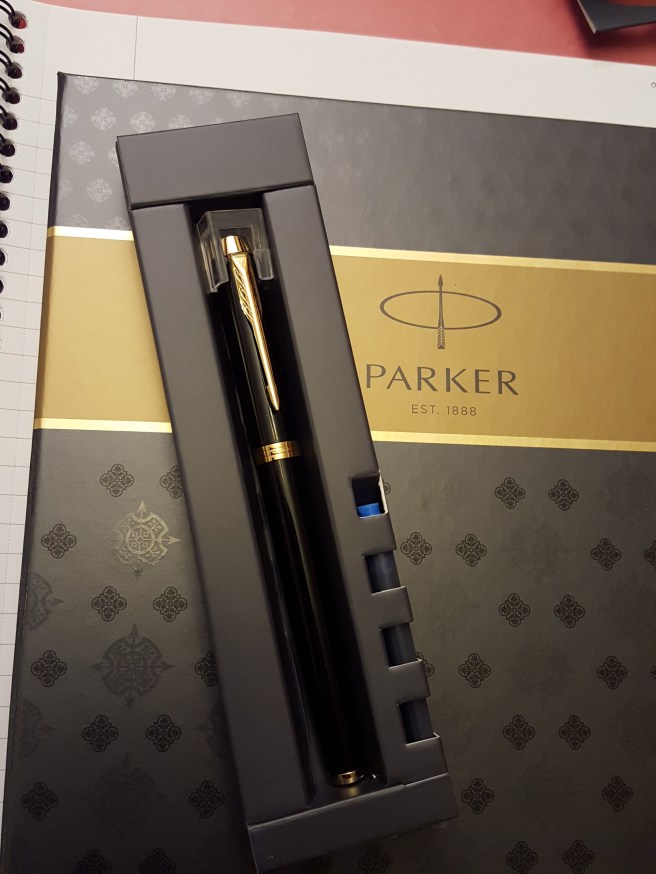
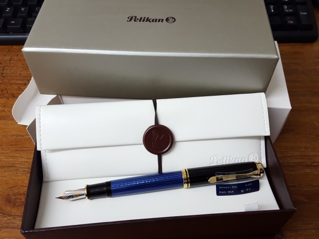
Picture the scene. You are in a shop and are considering a purchase of a new fountain pen. You have circled the pen display a few times and are now at the stage of asking to see the one that has caught your eye.

I am assuming that the pen is not in a sealed blister pack and that you are actually able to handle it. The pen is put on the counter for your inspection. You turn it over in your hands. Assuming that there is nothing that immediately puts you off, the next step is to ask to try the pen.

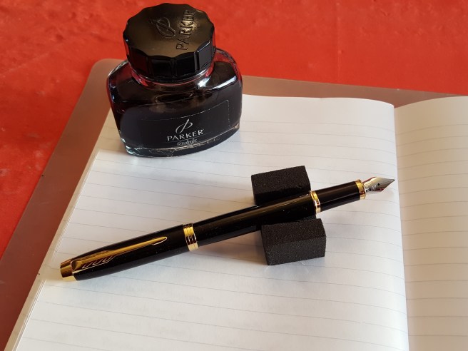
A bottle of ink and a test pad are produced. You dip the pen and then comes the moment of truth. The pulse quickens. How does it write?

It occurs to me that you then have a tricky task of weighing up multiple factors and reaching a decision within a matter of, perhaps, less than a minute. Clearly you are not able to carry out an exhaustive inspection and writing tests, at your leisure. You have one pen, one paper and one ink. You need to be fully focused and aware of what you are looking for and what you are looking to avoid. And so today,  I thought it may be of assistance to collect together a few thoughts on some of the factors that you might want to have in mind.

Having jotted down a list of random points, these seemed to fall into two groups, namely, How does it Feel? And How does it Perform? Of course, these are only my suggestions and you may wish to create your own list.

How does it Feel?

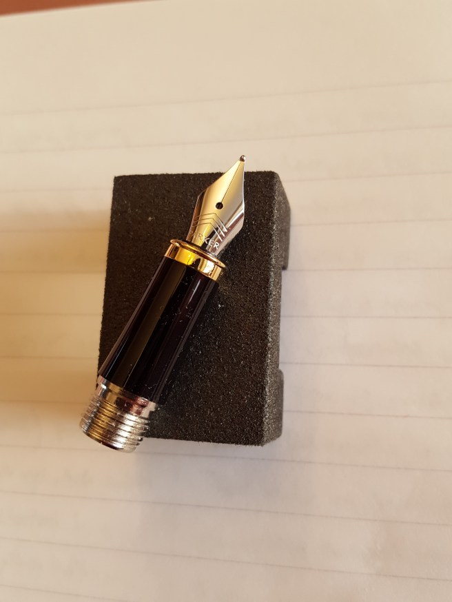
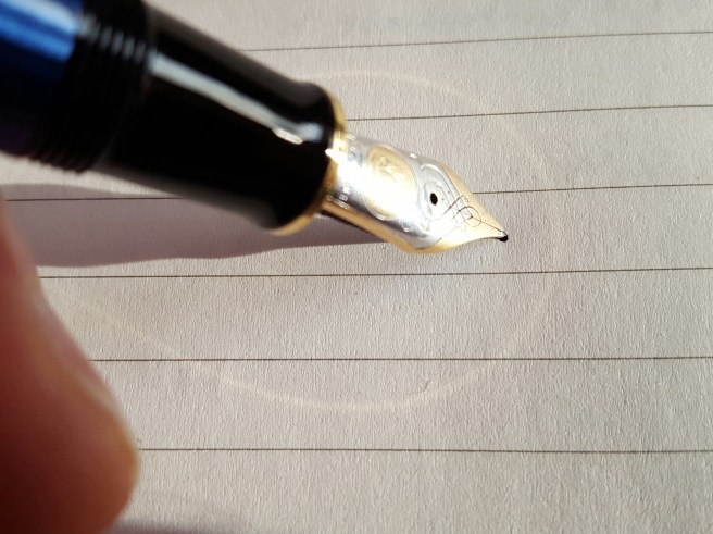
Smoothness. This is probably the first and for many, perhaps the only, factor considered when test-driving a pen. How the pen feels as the  nib moves across the paper depends on several factors. Are the tines aligned? Misaligned tines is a common issue even with new pens and fortunately one that is usually possible to correct yourself. Also, is the nib well polished? You will soon notice if it is not as the tip feels as if is caked in rust. The effect of maximum smoothness is often described as “buttery.” The opposite extreme is “scratchy”. If your pen-purchasing trip was pre-meditated, bringing a loupe to inspect the nib tines alignment is very useful although you may look a bit like a diamond merchant.

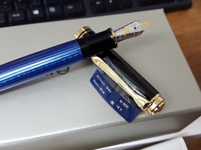
Give. Or Springiness. Or Softness. This is a lovely quality in a nib. Whether you wish to have it, may depend upon what you are used to and how you write. Nibs differ in firmness, from a very rigid and unyielding nib sometimes termed “a nail”, to the very soft, flexible nib, sometimes called “a wet noodle”.  If your experience has always been to write with a firm nib and you do not apply a lot of pressure expecting line width variation  and shading this may not be an issue for you. But a softer nib gives a more cushioned ride and allows for easier application of pressure to generate a wetter and broader line here and there as you write. This in turn lays down more ink in places, creating darker lines and thus adding variety and expression to your writing. It is said that generally, gold nibs are softer than stainless steel. This may be true if both were made exactly the same way. But with good design, it is also possible to have a stainless steel nib that is on the softer side and I have found this with the Parker Sonnet and the Pelikan M205. And not all gold nibs are soft.

Feedback. This refers to the information that the nib sends back to you as you write. The feel of the nib on the paper. Rather like the handling and feel of your car tires on the road. It is rather more difficult to describe and is easier to identify when comparing a few different pens at the same time.  Basically you want a pen that gives a little feedback, letting you know that it is in contact with the paper, but not too much or too little. Too much, means that you are uncomfortably aware of resistance and scraping. Too little and it is like skiing in a white-out, you barely know whether your nib is touching the paper at all.

Tooth. Some of these terms have different meanings for different people. To me it refers to a catchiness, or digging in of the pen to the paper, too much of which is an undesirable feature and a symptom of misaligned tines, where the inner edge of a tine catches on the paper when you move the pen in a certain direction. It could also mean the nib having a slightly rough surface to grip on paper and help the pen to lay down ink. That is, the opposite of being over-polished and struggling to write on smooth paper.

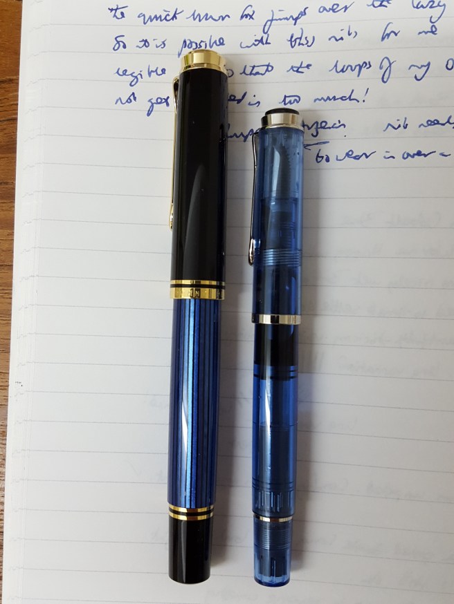
Length. Is the pen long enough for you? A pen that is short when un-capped, can often be lengthened by placing the cap on the back of the barrel (“posting”) which adds length but also adds weight and may upset balance if the cap is heavy and does not post deeply. A pen which is too short feels a little awkward as the back of the barrel does not reach back far enough to rest comfortably on the crook of your hand between thumb and first finger.

Weight. You will want a pen that is a pleasant weight as you write. Pens with a metal body are generally more heavy than those made of resin, other things being equal. Feel the weight as you write. Are you going to use the pen posted or non-posted?  Here, you  may wish to avoid a pen that is unusually heavy if you plan to use it for very long writing sessions.  But a pen that is too light may sometimes feel insubstantial. Then again, people wrote with a quill in the past which was as light as a feather! A good fountain pen should write under its own weight, with little or no extra downward pressure required and so a bit of weight is a good thing. Having said that, I have a few pens that weigh next to nothing and I also enjoy writing with them very much.

Balance. Slightly harder to explain than weight, this usually refers to whether a pen feels back heavy or not. First, think whether you are going to use the pen posted or non posted. Here, you first need to check whether the cap does actually post. Does it fit nicely on the back of the barrel? Is it secure or does it fall off or slide around? If you plan to write with the cap posted, then it is important to see how the weight distribution feels in your hand. A poorly balanced pen may feel a bit like writing with a 12 inch stick with a tennis ball on the back. Once you become aware of discomfort in this respect, it becomes more annoying. (All is not lost however. You may rescue a short and unbalanced pen by finding another light weight cap that fits, to post instead).

Comfort. This, like many of these points, is a personal thing and depends on several factors, such as section width, material and finish, position and sharpness of screw threads if any, the presence of a “step” down in diameter from barrel to section,  and balance as mentioned earlier. As to section width, try to decide whether this is too wide for you or too narrow. I was initially put off buying the Sheaffer Sagaris which has a fairly skinny section but overcame my prejudices and love it now. Also, I was aware on buying a Cross Century II in black lacquer and chrome, that it was a very slender pen but the appeal of its sheer attractiveness outweighed this for me.

How does it Perform?

Write a few lines with the pen in your usual handwriting. How does it look?

Nib width. The width of the tip is mostly what determines the width of the line and the basic choice, if any, is usually between Fine, Medium or Broad. Rarely, there are extra fine and extra broad (or double broad) options. Then there are stubs and italics. Most pens seem to be sold with Medium nibs.  If your writing is small, a Fine may give a line that is more in proportion to the height of your letters and help to keep some white space in the loops of your letters and so improve neatness and legibility.  Conversely a Broad nib gives a thicker bolder line, suited to larger writing.

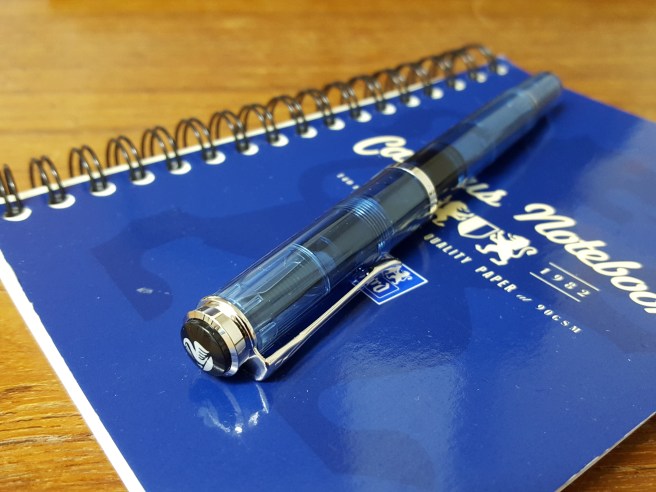
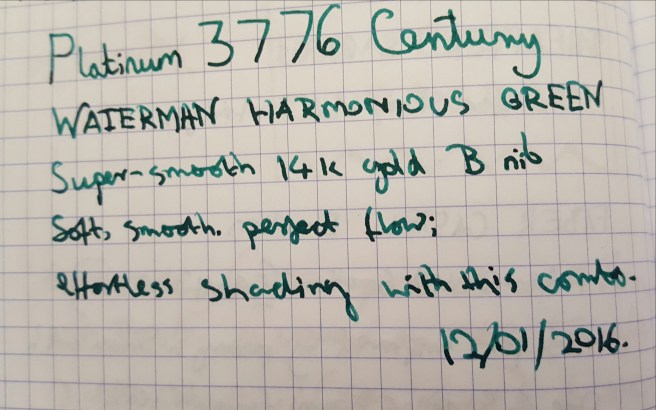
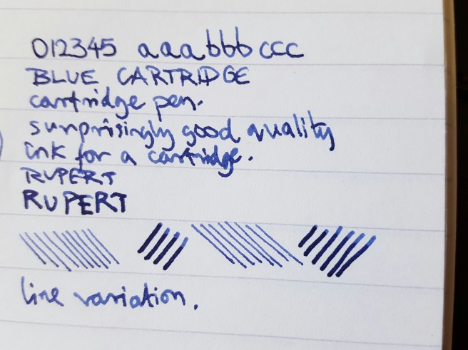
Shading. The attractive effect of ink being put down in your letters in varying densities, giving light and dark shades. Applying a little pressure perhaps on your downstrokes or the tails of your g’s and y’s for example, spreads the tines, lays down more ink, which pools in the indentation created in the paper thus giving the effect of two coats of ink instead of one. Not all inks do this. A nib that has some flex to it is a help. My Platinum 3776 Century with a 14k gold Broad nib, paired with Waterman Harmonious Green Ink seems to produce effortless shading.

20161127_192128.jpg

Line width variation. Pressing down on the nib a little spreads the tines and widens the line of ink. If you go too wide, you may produce two separate parallel lines (“railroading”) or if you go really too far, you may bend (“spring”) and ruin the nib, such that it will not resume its normal shape. Also, variation in line width is a product of the nib producing a narrow  line if moved in one direction (say, from side to side) or thicker if moved in another direction (up and down) and so if you hold the pen at a consistent angle to the page as you write, this will occur naturally. A calligraphy nib or a stub nib does this.

wp-1480857146199.jpg

Flow. The degree of ink flow to your nib, is crucial. Too little, and the pen does not write. If there is not enough ink getting to the tip of the nib, there is also insufficient “lubrication” of the nib on the paper, to provide a pleasant writing experience. It is not just a smooth nib that gives a smooth writing experience, but having a cushion or layer of ink, on which to glide across the page. Without this, you would then be aware of resistance and drag as you move the pen, which makes for a tiring and unpleasant writing experience. Too much flow on the other hand, and you have a “gusher”, a pen that lays down very wet ink, which stays wet even after you have written another three or so lines. This is more likely to “bleed” through or least show through, to the other side of the paper and to “feather” (spread out) on the side that you are writing on.

Unfortunately it is difficult to gauge how good the ink flow will be, when you have just dipped a pen, as the nib and feed will be wet and this is not representative of how the pens will write when inked normally. A pen that may look very wet and off-putting, may in fact have a good flow when filled properly and once the feed is working in normal conditions and not saturated.

Skipping. Also difficult to gauge in shop counter conditions with the pen only dipped and not yet run in to your writing angle. This is the annoying tendency of a nib to miss out part of a letter or word as you write, so that you have to go back and write it again. This may be due to a combination of an overly polished nib plus very smooth paper, or the nib being too rounded and not yet having any flat surface with which to make contact with the paper. Happily this sometimes resolves itself once you have had a pen a few weeks and written it in, gradually forming a flat surface at the angle at which you hold you nib to the paper.

Hard starts. Again, dipping a pen and then trying it straightaway, is not going to tell you whether the pen will suffer from hard starts. This refers to the pen not being ready to write when you want it to. If a pen has been standing, nib-upwards, for a few days or longer, or been carried upright in a pocket ink drains down away from the nib and so takes time to reach the tip of the pen again, when you try to write with it. Also, pens which have a good seal when capped, usually by means of an “inner cap”, are better at staying ready to write and avoiding drying out. Pens with large nibs may fare worse at this. I don’t like to think of it as a fault, as it is just gravity really and I don’t know how it is that some pens (my Pelikan M205 for example) always seem primed and ready to go even after weeks of inactivity.

Conclusion.

This is a long list of factors. Each of these topics can be a dissertation on its own. So, who considers all these things in the heat of the moment when buying a pen? Probably nobody. Even as a keen pen enthusiast myself, I am usually too blinkered and excited to make a considered judgment when faced with a  shiny new pen. For larger purchases, it is good to do your homework beforehand, perhaps weighing up reviews and a few of the many useful resources now available from the internet, except for those spur of the moment purchases. But from my experience, it is good at least to be aware of a few of the main factors which are of particular importance to you and your writing needs and preferences. Do also check whether there is a guarantee and keep your receipt. Happy Shopping!