
You don’t need to spend long surfing in Fountain Pen Network to learn that the Pelikan M series are many people’s favourite fountain pens. It took me a while to catch on and to understand their attributes, while people wrote lovingly of their M200, or M1000 or whatever. The mystery was not helped by the fact that most regular stationery shops do not sell these and you will need to go to a specialist shop or a high end department store to see them in the flesh.
I first found a display of Pelikans in Selfridges a few years ago and was able to handle them. I watched as an M800 was dipped for me in Graf von Faber-Castell Cobalt Blue and the sales assistant produced a smooth and effortlessly elegant line of handwriting. I was smitten.
Having read much about the range in the mean time, I had an urge to own one, which refused to go away. In April, I bought a blue demonstrator M205 and chose the broad nib option. It proved to be an absolute joy to use. I filled it first with Waterman Serenity Blue and have been doing so ever since. The ink seems to match the sky blue pen perfectly and there was no need to experiment with anything else. The broad nib was silky smooth and springy and delivered a pleasant feedback. I took it on a two week holiday in the following month and I recall that it managed over 50 pages of an A5 journal on one fill. Also there were no problems at all with leakage on the flights.
I love the piston filling design and the ability to unscrew the nib and feed unit easily (even when the pen is inked if you want) to wash it or swap nibs.
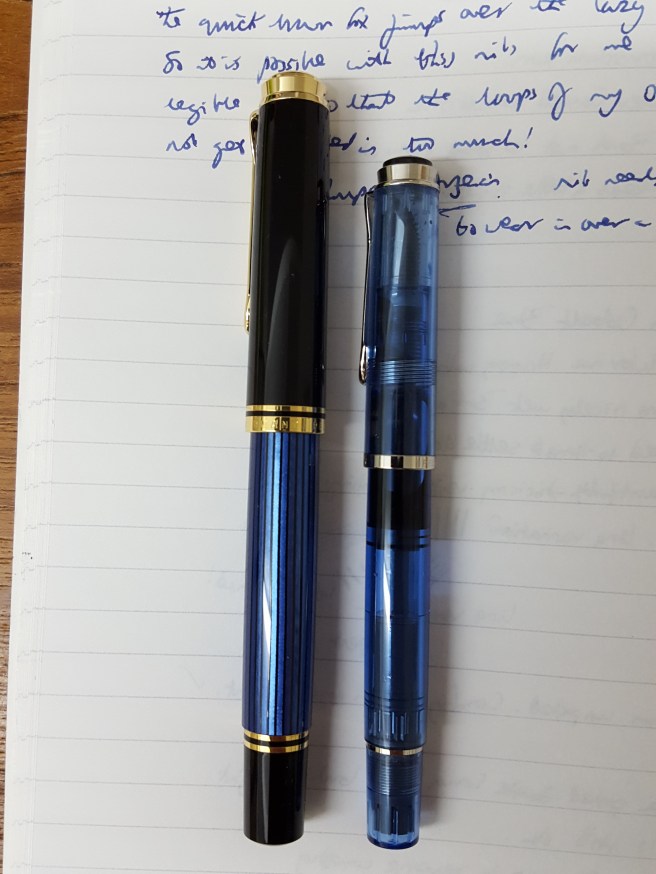
I continue to enjoy my M205 but my only minor gripes were that it is a very light pen, that the piston mechanism is plastic not brass and that the nib was a stainless steel one. And of course here, you have the options to look at the M400, M600, M800 and M1000.
As most readers will know, the M400 is the same size as the M200 and will also accept the same size nibs although it comes with a 14k gold nib. The M600 is a little larger, also with 14k nib. Then the M800 and M1000 bodies and nibs are each progressively larger still, with 18k nibs and brass piston mechanisms, making for a heavier pen.
Spurred on by predictions of imminent price increases in our post-Brexit era, I decided upon purchasing the M800. The choice of model involves a certain amount of guesswork as I purchased online with Cult Pens, (whose service I have found to be unfailingly excellent by the way) and so you do not have the chance to sample all the different sizes back to back, or to try out various nib widths.
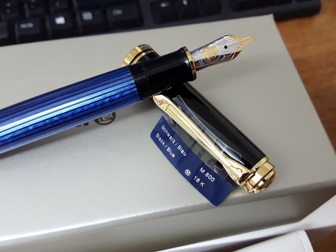
The choice of an M800 model was the easy part. As to colour, I settled on blue over the more traditional and retro-looking green although would have been happy with either. But the nib choice is a tricky one. My handwriting tends to be on the medium to small side and I invariably find that the loops of my a’s and o’s are all filled in, and may have suited a fine or an extra fine more than my mostly medium nibs. Then on the other hand, I have the broad already in my M205 and love it. As someone who appreciates his inks, I like to see a good line of colour and some shading. And so after a little pondering, when it came to ordering, I settled upon a medium as being, hopefully, a good all rounder, a bit of a compromise but the best of all worlds.
The other choice to make is whether to opt for the standard gold coloured (plated) clip and rings and two tone nib, or to have the M805 version on which which all are silver coloured finish, which looks very smart. However I decided upon the gold plated version. With the blue, black, silver and gold combination this put me fondly in mind of my old school colours.
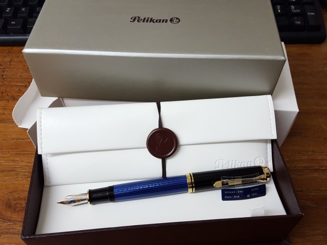
And so it was that just over two weeks ago now, my M800 arrived, literally as I was checking the tracking reference number online to see where it was. I became a two Pelikan man. It arrived in a large cardboard box, surrounded by copious amounts of protective polystyrene packaging and bubble wrap. And then the white cardboard outer box and another box inside that. Lifting the lid, revealed an attractive woodgrain-effect box with a white, leather effect bed, on which lay a white “penvelope” with brown elastic and a plastic seal. Finally inside that, in a clear plastic sheath, was the pen.
I must say, it looks absolutely stunning. I had not been prepared for how pretty, smooth and polished the blue striped barrel is, since each stripe of blue seems to reflect light in a different way. Between the blue strips, as you hold the pen up to a light and rotate it slightly, you can see through it and this allows you to see the ink level. (The ink level is not immediately obvious as it would be in a demonstrator model. I found that you need to hold the pen tilted slightly, for about 10 seconds to allow ink to clear from the walls of the barrel and then rotate it to see the height of the ink in the barrel. It holds 1.35ml which is a goodly amount).
I had a bottle of Cobalt Blue on my desk, and gingerly dipped it in. Panic. At first it seemed not to write at all. Heart in mouth moment. No, it didn’t seem to like this and so I gave it a proper fill, too excited and impatient to bother with flushing first.
I wondered whether my Cobalt Blue might have got a little bit contaminated by silicone grease from being used to fill my TWSBI Vac 700. Close inspection of the ink in the bottle with an illuminated magnifying glass did reveal a slightly oily-looking surface. I wondered whether this was what was stopping the M800 from writing.
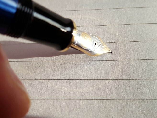
However, once filled (the piston was super-smooth) the pen did indeed write and I tried several types of office copier paper that were to hand.
However, when trying it out at home with three different types of letter writing pad, Basildon Bond, John Lewis Script and Paperchase Inscription, I found that it skipped dreadfully. Ironically, it seemed to be happier on photocopier paper rather than heavier, smooth writing paper.
I looked online and soon found lots of advice about running in a new Pelikan nib. One article recommended writing two pages with it, every day for two weeks. I started doing this, as well as using it generally whenever I could. Happily, well before the two weeks was up, the initial skipping problem subsided and then disappeared and it seems therefore to have been simply a case of highly polished rounded nib clashing with highly smooth paper. Now that the nib has adapted a little to the angle at which I hold it to the paper, it writes just beautifully.
As for the weight, it is considerably heavier than my M205 and a good bit wider and longer too. Here they are side by side.
To me the pen just oozes quality, class and luxury from end to end. The Pelikan Souveran online catalogue makes good reading and has some lovely photography. Needless to say, a great deal has been written about the Pelikan 800 and there is no need for me to attempt a review of its specifications here.
Just one niggle recently. In a rare opportunity to enjoy writing on a Sunday morning with some wintry sunshine, slanting in low to my dining room table as I wrote, I became aware of a halo around my nib on the page. I was writing in a sort of golden ellipse like a comet across the night sky. It soon dawned on me that this was the sunlight reflecting on the gold plated ring at the lower end of the grip section and casting a golden reflection on the paper. I tried to photograph this with one hand as I held the pen and so, apologies for the blurry image, but you will see what I mean.
This was short lived as the winter sun does not last long. However, it struck me that if a golden halo from your new M800 is your biggest irritation in life, you are a very fortunate man.

That’s a dream pen, and this is a lovely post about it.
I would take that halo as a good sign. 🙂
LikeLiked by 1 person