
I was quite excited when news reached me recently, that Parker had launched a new version of the IM fountain pen. I have the basic, earlier model in gun metal finish as well as the twin metal chiselled (chrome cap) version which is in the premium range. Both are quite worthy, work-horse type pens although I was not overly keen on the design of the grip section. Also the nib is basically the same as you get on the Parker Vector. I have had mixed fortunes with these nibs. Sometimes they perform beautifully from day one, but otherwise you need to tinker and persevere with them to get better flow.
This is a metal bodied pen with stainless steel nib. The new version however, has a much nicer, wider diameter grip section in matching metal with black lacquer finish and what appears to be a totally new nib, in stainless steel and available in medium or fine. I have seen online that there is a range of colours although so far in London I have found only the black with gold trim, black with silver trim or the brushed stainless steel version.
They sell for £39.99 in London. However a current promotion in Rymans means that with every new Parker pen, you get a gift box with a hard-backed note book bearing the Parker name.
I had read reviews of the old version IM black and gold version on Amazon, where people reported the gold plating coming off. Nevertheless, being a sucker for black and gold pens and in the interests of science, I decided upon this finish for my new IM and a medium nib. I shall watch for wear in the gold coloured fittings with interest.
I had read on FPN that the IM stands for Instant Modern, although I have found no verification of this as yet on Parker’s packaging. You would think it would say this on the box if you buy one, without having to find out from FPN.
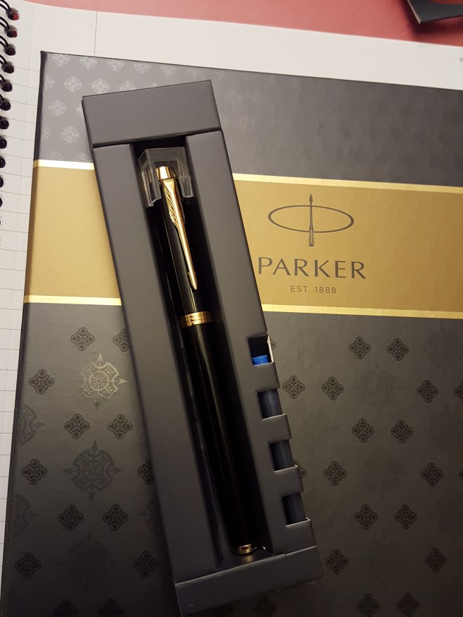
The pen came in a small cardboard pack with a transparent plastic front, with a plastic tag to enable it to hang up on a display. However it was too difficult to open the box and see the pen in the shop without tearing the cardboard and so I took a chance on the nib being ok, hoping optimistically that with the new design, there might have been greater attention to quality control.
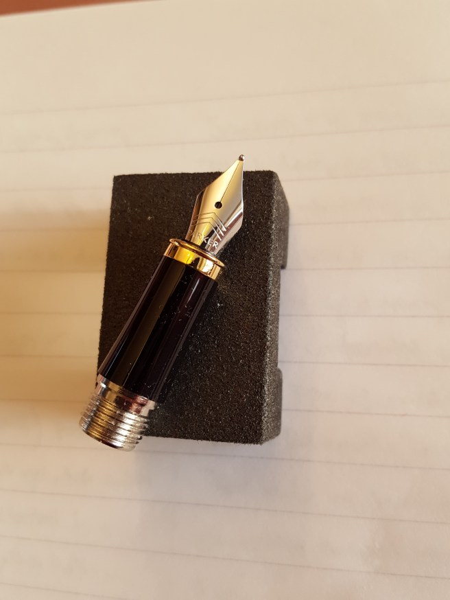
At home, magnifying glass to hand, the pen looked very attractive with a beautiful high gloss black lacquer finish and the gold decorative clip and rings contrasting nicely with the stainless steel nib. The nib had three chevrons vaguely reminiscent of the Parker arrow emblem on the Duofolds of old.
I was very pleased to find that the production date code on the cap ring was IY, the Y denoting 2016 (hurray!) from the QUALITYPEN year codes (starting from Q for 2010) and the “I” meaning (I think) the third quarter of the year. As I understand it, the code III means first quarter (on the basis that there are three quarters of the year left to go); II is the second quarter, I is the third quarter and no mark means the fourth quarter (no quarters left to go). When I bought my previous IM in July 2015, the date code showed it to have been made in 2011 and so it had been waiting around for a while before I gave it a home.
As for the nib, there was a visible slit, albeit very small, running from the breather hole all the way to the tip such that you could see light between the tines even at the tip. This can make for a very wet writer. Also the pellet of tipping material seemed, under high magnification, to be very round, not flattened on top and so looked a bit like a clown’s nose, although you do not notice this with the naked eye.
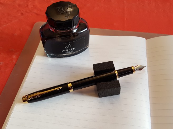
I was slightly apprehensive on dipping the pen that the nib was going to produce an overly wet line. I chose a half full, trusty bottle of Parker Quink, black ink which seemed the obvious choice. The cap is a slip on one, as with the old version and posts securely to give a very comfortable length and weight. To my relief and delight, it wrote very nicely indeed and one prolonged dip kept me going for a good couple of pages of an A5 notebook. I have not yet filled the pen properly but do not expect any problems now. The pen comes with one blue cartridge but no converter and so this would need to be bought separately.
I had read of people encountering hard starts with the IM and suggestions that this might be due to a rectangular hole in the cap which is hidden beneath the top end of the pocket clip. I think this might be an anti-choking measure so that the hole stays open even if you find yourself having swallowed your cap. One reviewer said that he managed to stop the hard starts by taping over this. If the pen is in regular use there should not be a problem but I shall watch out for this.
As for the gift box, this has inserts for your new Parker pen and for the complimentary notebook. This is an attractive and sturdy cardboard box to keep for pen-related bits and pieces if you remove the plastic insert. The hardback pocket notebook, with cloth cover and elastic closing loop, is almost too nice to use and I have not seen one before with the Parker name embossed on the cover. Beneath the notebook, is a small booklet with a nice rubberised cover, with some diagrams and filling instructions and nice affirming messages from Parker about your new purchase.
The price seems compatible with other metal bodied steel nibbed pens such as the Cross Bailey. It is more than double the price of the old basic version IM but for the improvements in nib and section alone, I think this is a fair price to pay.

That’s a handsome pen, at a great price. I’m glad it writes well.
Here is a link to something about the IM’s history, which suggests it originally stood for “Instant Message,” which just seems nutty, given the internet-centered meaning of that expression. But maybe that’s why Parker dropped it. 🙂
LikeLiked by 1 person
Thanks Laura. The site in the link looks very comprehensive.
LikeLike