This was my last pen purchase of 2018 and I mentioned it at the end of my 2018 round up.
Background.
This is not a new model. The Carene has been around for a while but I have not had one before and am late to the party. It is made of brass, with an attractive lacquer finish, an inlaid nib in 18k gold and gold coloured fittings.

I remember looking at a number of reviews of the pen, a few years ago. These were mixed, with many commenting on the smoothness of the nib but a few reporting problems such as leaks or a barrel end finial which did not line up with the nib. One particularly enticing review recently was by Paul Godden in his blog Writing For Pain and Pleasure, in September 2018.
They are available in our local John Lewis, Brent Cross in north west London and I continued to keep an eye on them. I once handled a gorgeous black version with a handsome Palladium cap but stopped short of buying it. Currently the marine amber model is still at John Lewis at around £235.00, which is the maximum damage you can do to your wallet in their fountain pen department (not counting the Parker Fifth Generation which I would not class as fountain pens). A Cross Townsend in quartz blue is about the same price. In November, John Lewis offered a generous 30% off most fountain pens but at the time, I chose to buy a Cross Townsend instead. A week or two later, when I was still hankering after a Waterman Carene, the offer had ended.
But as luck would have it, Cult Pens then offered the Carene for sale at £149.00 and had a promotion, giving a further 10% off. The bad news was that they were waiting for stock, but you could register your interest to receive an email when they were back in stock. I did so and about a week later, got the notification. Without a moment’s hesitation I put in my order.

Description.
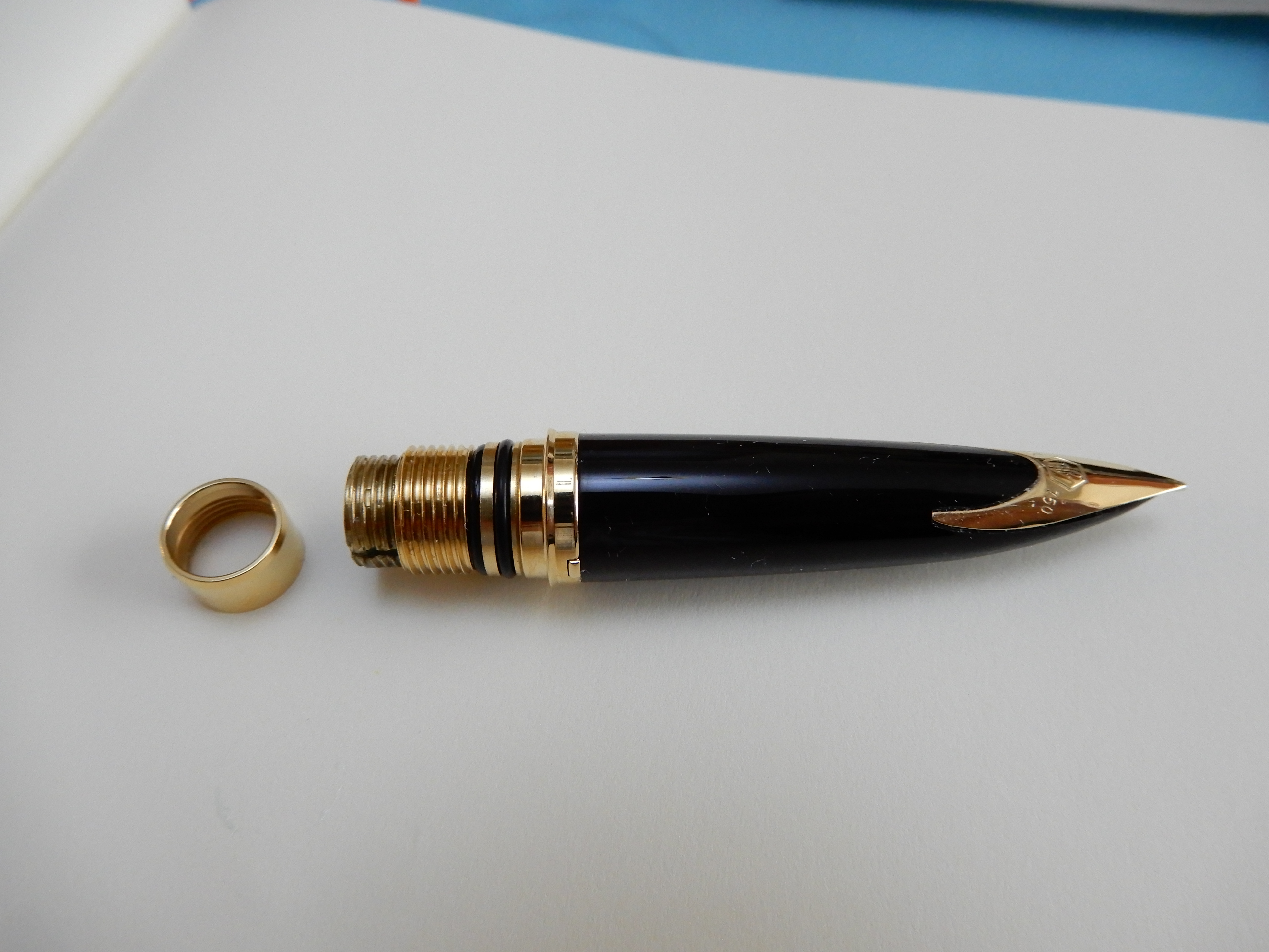
The main feature of the pen is its inlaid nib, which is uncommon these days. Also the profile of the pen with its sweeping prow and corresponding slope of the barrel end finial, is said to evoke the contours of a luxury yacht. It is a medium sized pen, elegant rather than flashy and the lacquered finish adds appeal. Other finishes are available, including black, blue or red but only the marine amber finish offers this mottled effect.
The snap on cap is bullet shaped and no bigger than it needs to be, to fit the contours of the tapering grip section and nib within. The pocket clip is simple but with a gentle wave form and is sprung. A gold plated cap ring bears the name Waterman and (on the reverse side), France.
The cap can be posted on the barrel. You do not need to and many will find the pen long enough without posting. Personally I prefer to post and grip the pen higher up, although the cap then hides the gold plated end button and you lose part of your “boat”.
The barrel unscrews with nice metal threads. Two rubber o-rings give a reassuring hold as you tighten it in place. This prevents the barrel from coming loose but also deters me from undoing the barrel too often as the o-rings may perish eventually.
The pen came with a Waterman converter although you may also use Waterman cartridges. (I believe standard international cartridges may also fit but have not tried). One slight mystery is that the housing for the cartridge or converter has a separate, smooth surfaced gold plated collar which can be unscrewed and removed. I am not sure of the purpose of this.
Weights and measurements (approximate).
- Closed: 144mm
- Open: 128mm
- Posted: 148mm
- Grip section, max: 11mm.
- Weight uncapped: 23g
- Weight cap only: 10g
- Weight posted: 33g
These figures all look close to ideal, for me. The weight has some heft but is not burdensome. The grip section is very comfortable, having no cap threads and only a minimal step down from the barrel. There are two tiny lugs to secure the cap but these are less noticeable than those of the Lamy 2000. The section tapers and so the grip is slightly narrower if you hold closer to the nib.
The nib and writing performance.
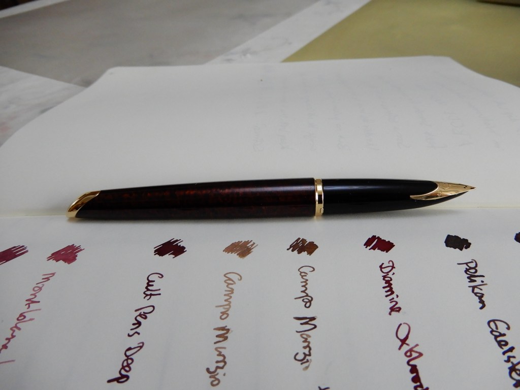
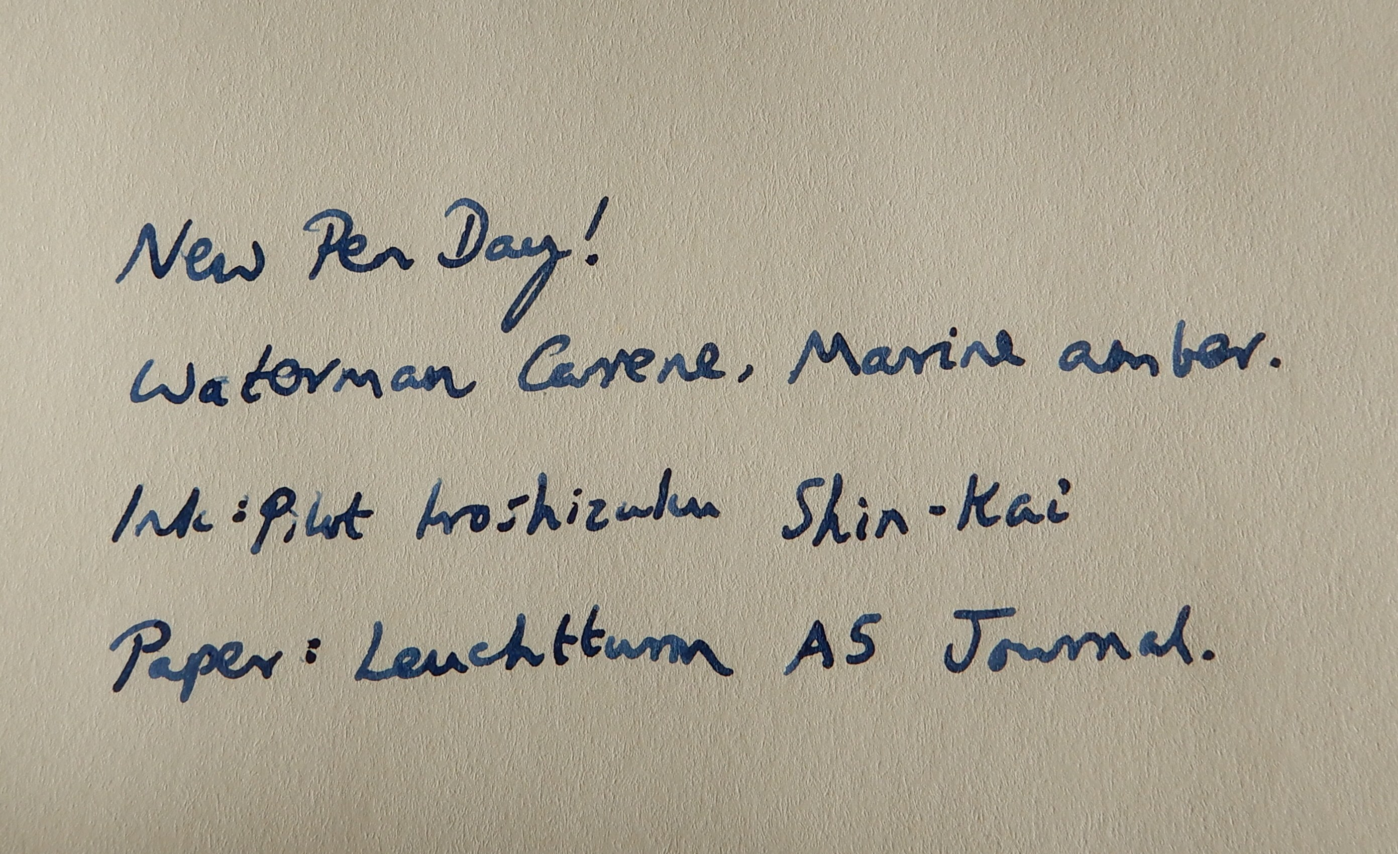
As almost every reviewer says, the nib is very smooth. Mine is a Medium although writes on the broader side of a medium. It also writes a little stub-like having narrow side strokes and wider down strokes. And it has a luxurious softness to it. It is not stingy with the ink and the flow is on the generous side but not gushy. The smoothness of the nib, the lubrication from the ample ink flow and the softness of the gold nib all make for a wonderful writing experience. I have been using Pilot Iroshizuku Shin-kai ink.
Likes and dislikes.
This pen seems to have it all: beautiful looks, (uncapped), exceptionally comfortable to hold and with an impressively enjoyable writing experience. And it does not have the disadvantage of being overly expensive.
I have only my one example to go on but I have not had any of the issues that some have complained of. There have been no leaks. I did worry for a moment that the barrel end would not align with the nib but soon realised that I had not tightened the barrel enough. Once you get to the very end of the threads, it all lines up perfectly.
Conclusion.
For some reason, this pen does not seem to get a lot of attention from fountain pen reviewers. Perhaps it is considered too mainstream or not exotic enough. Perhaps some examples do have issues and I have been lucky to get a good one. Personally, I think it is great pen and I struggle to find anything bad to say about it. Yes, there are plenty of more expensive fountain pens on the market but I doubt they would offer a significantly better writing experience. Mine has ticked all the boxes and it just remains to be seen how it stands up over time. I strongly recommend it.