Some silly mistakes with the Faber-Castell Basic (black carbon) and how to avoid them.

Whilst at Victoria Station recently, with ten minutes to spare before my train was due to leave, I popped in to WH Smiths to have a browse around their stationery section. There I made the happy discovery that they sell Faber-Castell fountain pens.

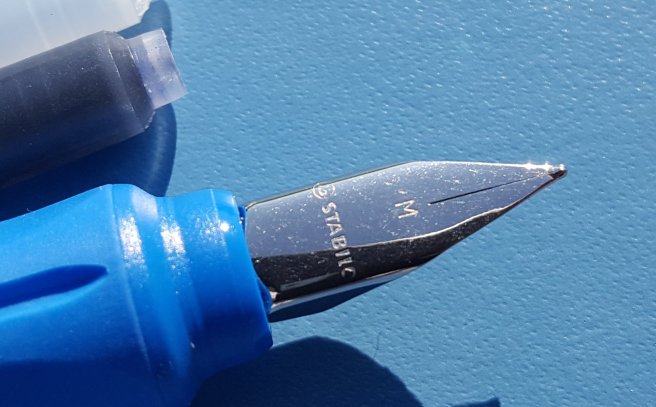
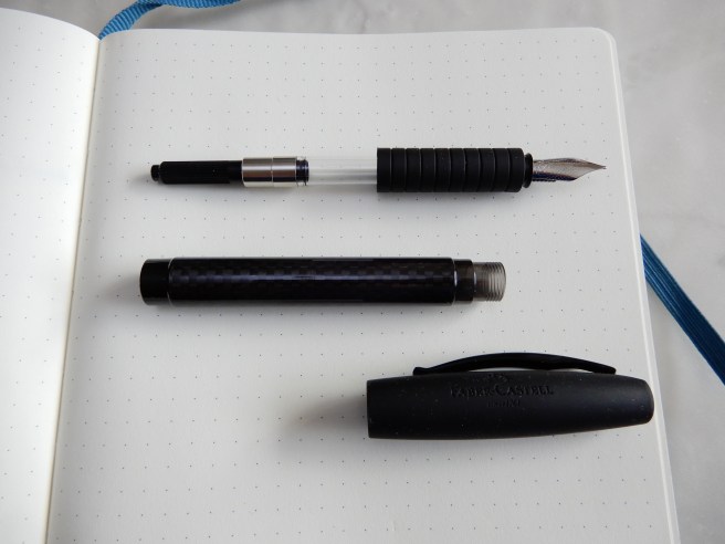
I bought a Faber-Castell Loom earlier this year and have been using it as my every day carry. It is my most successful of the Faber-Castells that I have tried. I found the Emotion too short for me and too heavy; the Ambition (black resin version) also too short and too slippery, or too back-heavy if posted. However, their steel nibs had all been excellent. Even on their £5.00 plastic school pens, the nibs were very enjoyable.

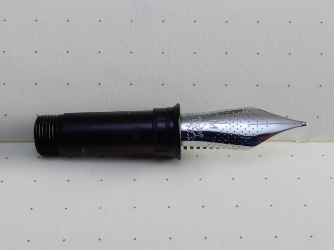
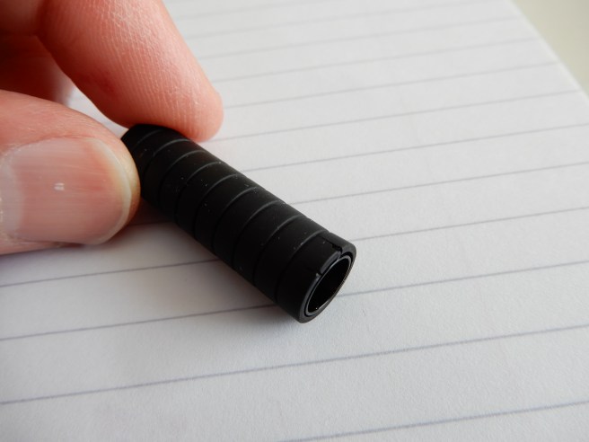
I spotted a pen which looked similar to my Loom, but with a slightly different shaped cap and which had a shiny, black carbon-fibre look to the barrel. Also, the long, cylindrical section was of grippy black rubber. There was even a smoky grey ink window. I now know this to be the Faber-Castell Basic, black carbon version.

DSCN3126
Faber-Castell Loom (above) and Faber-Castell Basic, (below).

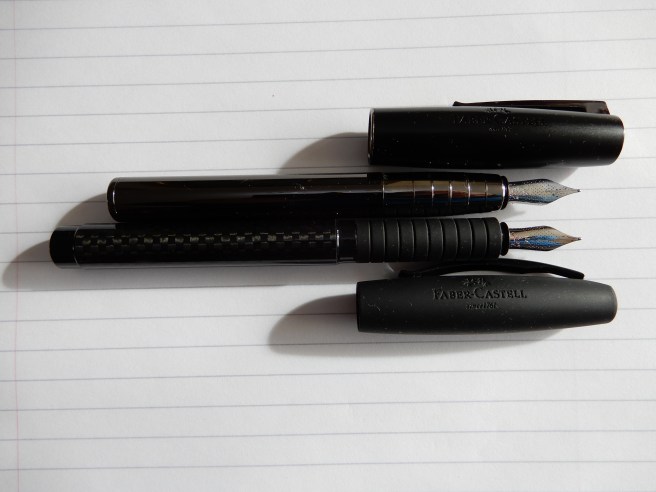
I asked to have a look at it and was immediately impressed by the length of the pen when uncapped, (about 134mm) which was considerably longer than my Loom, which I took out of my pocket, to compare. The familiar stainless steel nib looked in good shape and I decided to buy it. The sales assistant apologised that it did not have a cartridge with it but that did not bother me. A new Faber-Castell, like my Loom but longer! What could possibly go wrong?

Later inspecting my purchase, I unscrewed the barrel and found a spent blue cartridge inserted in the pen. Either someone had been testing the pen rather too extensively in the store, or it had had a previous owner and was a return. Never mind, the nib looked promising and I was not bothered about having to clean it first.

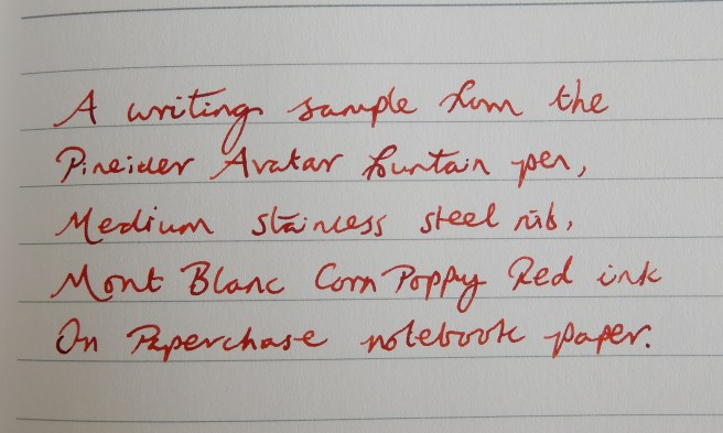
At home that evening, I flushed the pen. I planned to fill it with Graf von Faber-Castell Garnet Red. It is important to remove all traces of blue ink from the nib and feed first, otherwise you lose that lovely deep orangey-red colour in the Garnet, and instead it turns to a burgundy. (Ask me how I know this).

So after flushing the section several times I unscrewed the nib and feed unit from the section and patiently left it to soak in a jar of water overnight.

RSCN3112
The screw-fit nib unit for the Faber-Castell Basic

The next day, when screwing the nib unit back into the grip, (having carefully flushed it again, dried it and applied a little silicone grease on the threads) I realised that I had forgotten what it was supposed to look like. Or rather, I did not realise that I had forgotten and went on screwing it in, expecting to get the unit to fit flush into the grip, right up to the start of the nib, like the Loom. (DO NOT DO THIS!) Needless to say, it did not want to go in any further.

Next I got out a standard international converter. None was supplied with the pen, but I had a few different brands. The first I tried, did not grip onto the coupling at all. The next one, (actually a screw-fit converter, from a Conklin Duragraph) gripped nicely so I gleefully filled it with my Garnet Red ink.

DSCN3115
The wrong size converter. (This is NOT a Faber-Castell converter).

Next, on trying to replace the barrel, I found that it was a very tight fit over the converter, although it did just fit, so I screwed the barrel into place. (DO NOT DO THIS EITHER!) I then tried unscrewing the barrel again and was alarmed to find that, in unscrewing the barrel, the metal collar of the converter had unscrewed and was now firmly wedged inside the barrel.

The only way to retrieve this was to offer the converter back into the barrel (losing the ink first), screw it back into its collar, and pull. This operation, thankfully, was a success. I also learned how to disassemble, clean and re-grease a Conklin Duragraph converter in the process.

I found a different converter to use, this time checking not only that it would grip on the coupling, but also that the barrel would fit over it without touching the sides, before filling. I inserted a Kaweco converter (not the mini one but from a Dia 2) which worked fine.

So I filled the pen, replaced the barrel and thought that all would be well. However, the next discovery was that the cap had become an uncomfortably snug fit, when capping and uncapping the pen. Closer inspection revealed the apparent cause of this to be that the rubber grip had several stress cracks at the nib end and the rubber had actually flared out very slightly and was rubbing on the inside of the cap. This probably happened when I had been trying to screw the nib unit too deeply into the grip.

DSCN3133
Damaged rubber grip section, cracked and slightly flared.

Conclusion.

I think the Basic will be great pen, once I have obtained a replacement rubber grip. However it is not fool proof. I have since enjoyed watching old reviews of the pen by Stephen Brown and Brian Goulet who both spoke very highly of it. As a veteran of over 200 pen purchases, I had become sloppy and made a series of mistakes. Did you spot them all?

Notes to self:-

  • Do not rush a fountain pen purchase, if you have a train to catch;
  • Inspect the pen properly before purchase, including under the barrel;
  • Before removing a nib, perhaps take a photo as a record of how it looked before;
  • Do not use force when screwing a nib and feed back into a section;
  • Before filling a converter, (if it did not come with the pen) check that the barrel will fit over it.
  • If the barrel is going to be a tight fit over the converter, use a converter that fits properly.
  • You are only as good as your last pen purchase.

I hope that Faber-Castell will not mind sending me a replacement rubber grip and I can then start to use and enjoy the pen, with a fresh start.

The Visconti Rembrandt v The Pineider Avatar fountain pen.

One of my favourite pen purchases of 2018, has undoubtedly been the Pineider Avatar, in Lipstick Red from Harrods last May. At the time I bought it, I was vaguely aware of the rather similar Visconti Rembrandt but had never owned or handled one.

The pens share a number of similarities. They are both Italian, both from Florence, both I think designed by Dante del Vecchio (but while at different companies), both are resin bodied, steel nibbed, cartridge-converter fountain pens at what you might say, is the “entry level” for the luxury pen market. I recently heard someone describe the Ferrari California as entry level, so it is all relative. They both feature magnetic, pull off caps, and weighty, shiny, plated grip sections.

I looked at the Pineider Avatar in my post Pineider Avatar fountain pen review. At the time, newly besotted with the Avatar I commented that compared to the Rembrandt, I rather preferred the Avatar’s overall flair.

Four months on, I am still besotted with the Avatar. However I was curious to learn more about the Rembrandt and after watching a few reviews, I succumbed to the temptation to buy one. I felt that it would be sufficiently similar to the Avatar for me to enjoy it for all the same reasons whilst being sufficiently different to make it a worthwhile purchase. What finally tipped me over the edge was a range of new colours, including the Twilight (which I chose) with swirls of purple and glimpses of pink and white like you see when you examine the brush strokes of an oil painting up close. I also blame the magnifying viewer which you can move with your mouse over different areas of the pen, as you deliberate feebly on whether to “Add to basket.” I opted for the Medium nib.

DSCN3009
Visconti Rembrandt Twilight

When the Rembrandt arrived, my first impression was that the purple colours did not seem quite so spectacularly vivid in real life. But the pen felt very solid and well made.

It may be helpful to identify a few differences between the Avatar and the Rembrandt, for anyone considering whether to buy one, or both.

Packaging.

The Avatar came in an impressive and unusual gift box, shaped like a writing desk with a fold down top, in dark green faux leather with a padded creamy interior and a set of Pineider stationery inside. The Rembrandt came in a nice, perfectly acceptable but unexciting lidded cardboard box with padded cushion pen rest.

Construction and appearance.

The Rembrandt has the familiar Visconti pocket clip modelled on the Ponte Vecchio, the arched bridge over the River Arno in Florence. It is a hinged clip but needs to be pinched and lifted to slide over a pocket. It has VISCONTI, laser-etched on both sides, not the fancy enamel of loftier versions. The finial has the Visconti “my pen” system whereby you can replace the metal button held in place by a magnet, with a jeweled finial or a pair of initials.

DSCN3010
The Visconti clip and cap ring

The cap band is smooth and well finished and says VISCONTI on the front and MADE IN ITALY in smaller letters on the back.

The barrel of the Rembrandt is cylindrical, without any tapering until the torpedo-like rounding off at the end, with a shiny, plated metal nose cone, for decoration and to stand on in the pen cup, which is a nice touch.

The magnetic force holding the cap on, is stronger on the Rembrandt and more typical of the effort needed to remove most pull-off caps. It feels reassuringly firm. It is also fun that, with the cap resting on your desk, you can offer the pen slowly into it with one hand and watch the cap leap back on. (I rest my case: it’s worth it just for that).

The plated metal grip section has a slightly raised area just before the nib, to stop your finger sliding onto the nib or feed.

The barrel of the Rembrandt has metal threads inside, to screw onto the metal threads of the section. The Avatar lacks metal threads here.

dscn3020.jpg
Metal threads in the barrel of the Rembrandt only.

The Avatar’s finish is of a most gorgeous, deep red, (like cherry flavour cough sweets called “Tunes”) and has light and dark tones like velvet. The clip is a slender, sprung quill shape, easier to slide onto fabric than the Rembrandt (although I carry them in leather pen cases). The Avatar’s barrel also tapers towards to the foot and then rounds off, with no metal furniture added.

The nib.

This is where the real difference lies. The nib of the Rembrandt is much smaller than the Avatar’s, best shown in a photograph. On my pen, it was smooth but slightly dry. Fortunately, I was able to adjust it to open up the tines just ever so slightly and this made a great improvement to ink flow and lubrication which are now ideal for my preferences.

DSCN3016
Pineider Avater (left), Visconti Rembrandt (right)

The Rembrandt’s nib is very good but lacks those long sweeping curves of the Avatar which give it slightly more flex and line width variation and which make the Avatar such a joy to use.

Weights and measurements (approximate),

Pineider Avatar Visconti Rembrandt
Length closed 142mm 139mm
Length open 130mm 122mm
Length posted 161mm 157mm
Weight, total (capped or posted) 27.5g 33g
Weight uncapped 17.0g 20g
Weight, cap only 10.5g 13g

As can be seen, the Avatar is longer when uncapped. However, I still prefer to use them both with caps posted, holding them at the barrel rather than around the metal section. This avoids both the potential issues of slippery sections or of the pens becoming back heavy due to posting and I find them both perfectly comfortable posted. Neither of them has any cap threads, but there is a slight step on the Avatar. The Rembrandt is smoother to hold.

DSCN3018
Visconti Rembrandt (top) and Pineider Avatar.

Writing performance.

Both pens write wonderfully, with good ink flow, smooth and well lubricated for effortless writing. The Avatar feels the more expressive, simply because of the longer nib.

DSCN3025
Pineider Avatar writing sample after receiving CPR (Corn Poppy Red in this context).
DSCN3026
Visconti Rembrandt writing sample.

Cost and value.

Prices may vary depending where you look but I paid £148.00 for the Avatar and £125.00 for the Rembrandt. I felt that these prices were fair.

Conclusion.

So which is better? Which should you buy? I am delighted with them both. Most people, I think, would be happy to own either one of them. It is only when you have used them both that you notice little advantages in one over the other but they are like brothers from different mothers. If pushed I would say that the Rembrandt feels stronger, heavier, more substantial and robust, whilst the Avatar is prettier, longer, more delicate and has a more enjoyable nib. Perversely, I would conclude that the Rembrandt is the better pen but go and buy the Avatar. It’s beautiful. Here is my favourite nib pic again if you are still not convinced.

RSCN2029
The long steel, Rhodium plated nib of the Pineider Avatar. After my early worries about scratching the barrel, I soon decided that the pen felt better with cap posted.

Back to School with the Stabilo EASYbuddy fountain pen.

It has been hot and sunny in London this weekend but the cool morning air reminds me of my school days and the start of a new autumn term after those long summer holidays.

In Rymans’ Back to School special offers, I spotted this Stabilo fountain pen, called the EASYbuddy, reduced from £14.99 to £5.99. It comes in a blister pack. There were two other colour options available apart from this two-tone blue version, namely purple and pink, or black and hi-viz yellow.

20180902_214101726986751.jpg
Stabilo EASYbuddy fountain pen.

I was very pleased to see that it had such a long body. It measures about 135mm when uncapped which is longer than a Lamy Safari and appreciably longer than a similar looking Bic Easy-clic.

It is made of a very tough-looking plastic, with a snap on cap and an ergonomic rubberised section, which is rounded and tapering but with three facets to aid correct grip. (That is, assuming you wish to grip the pen symmetrically and not with the nib rotated either to the left or right in relation to the paper).

20180902_1618211241244664.jpg

The cap pulls off with a firm click, secured by a three small raised edges at the top of the section, (farthest from the nib) which are not obtrusive when the pen is in use. Unlike some pens that I have used, the cap does not need a huge effort to be removed but is firm enough to give reassurance that it will not slip off accidentally. The cap does not post.

20180902_214307409419178.jpg

The pocket clip is of moulded plastic, a continuation of the cap material and springy enough to clip onto a thick pocket or bag. The Stabilo swan logo is on the finial.

Removed, the cap does feel very strong and well made. It is a double thickness, having differing colours inside and out. It can be squeezed a little but feels as though it would need a lot of effort to break it accidentally while fiddling with it.

The nib is stainless steel medium, with an iridium tip but no breather hole. Mine was nicely aligned and wrote well from the start. It is fairly firm but with just a little give, to allow some line width variation.

20180902_1622241046705260.jpg

The barrel has two long transparent plastic viewing windows, one on each side, when the barrel is screwed on. It is pleasing that the threads are made such that the barrel comes to rest in this symmetrical position.

20180902_2144181916532924.jpg
Clear window on each side of he barrel to check on your ink levels. Room for a spare cartridge in the back too.

It takes a standard international cartridge with room for a spare which is a very useful feature. I immediately tried mine out with the one royal blue cartridge supplied. It began to write almost instantly. However I noticed the ink seemed to feather out on Leuchtturm notebook paper  (not usually susceptible to feathering) if I held the pen and allowed the nib to linger in one spot. But this was not a problem in ordinary writing. It is the fault of the runny ink and can easily be rectified by trying another ink next time.

Holding the pen, you do feel strongly urged to hold it with thumb and forefinger on the facets either side of the centre line and with the pen resting on your second finger. The rubberised grip means that once held in position, it is not very easy to make small adjustments to the angle of the pen to find a sweet spot, as the rubber prevents the pen from being slipped around in your hand.

At this time of year, there must be lot of competition with the likes of the Lamy, Faber Castell Grip and Pelikan vying for a slice of the school market for entry level pens. This one certainly feels very durable and well made. Mine writes well and with a change of ink will be even better. At full price it would be a tougher choice but while available at the sale price, it makes a great value, robust pen to carry around.

20180902_1730351890826024.jpg
Stabilo EASYbuddy on left, with a Bic Easy-clic for size comparison.