2021: Some of my fountain pen highlights.

It is time for a look back over my last 12 months as a fountain pen enthusiast (a euphemism for addict, perhaps). It has been rather solitary without the monthly social contact of the London pen club meets. However, with letter writing, a couple of pen shows and the constant online interaction of social media, it hasn’t felt lonely. Anyhow, using and tinkering with pens and stationery are good activities to pursue on your own.

The acquisitions.

First, the reckoning. I still keep a tally of pens acquired with their dates and cost, although I had not reviewed 2021’s figures until now. I see that I had a total of 25 pens incoming. My total spend on these amounted to £1,026, which does not seem too excessive, as hobbies or addictions go. However, a large chunk of this was on my Aurora Optima, at £396 from Iguanasell. If you deduct this, the remaining £630 was for 24 pens, an average of only £26 each. This is a bit misleading as I have not included the value of a few pens received as gifts, but it gives you a rough picture.

None of these was part of a plan. They were pens that I spotted online, or at pen shows or whilst browsing the shops during the summer sales.

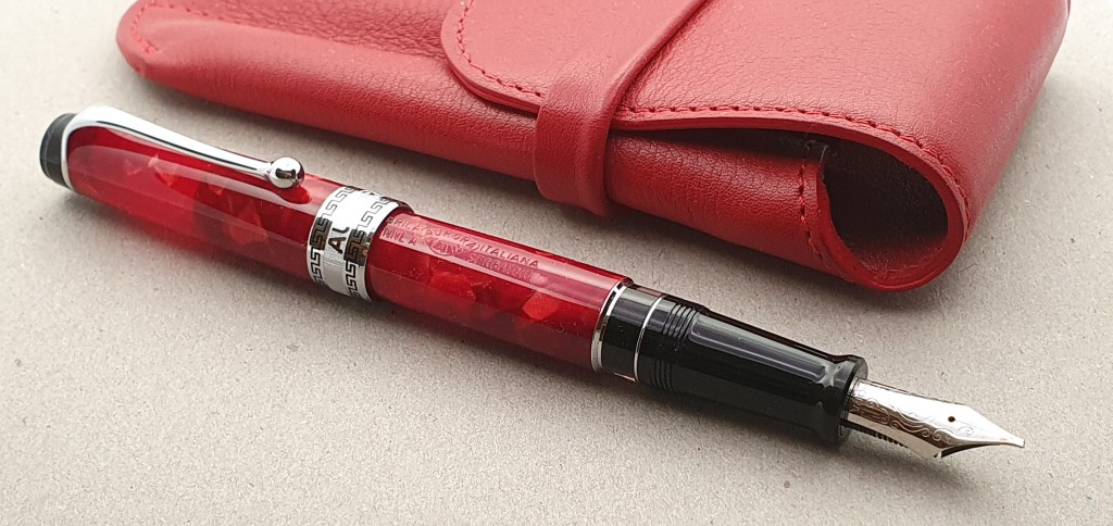
The Aurora Optima was my most significant purchase. The rationale was that I am delighted with my Aurora 88, also from Iguanasell. I was keen to try an Optima, with an oblique broad having found these to be well suited to my writing style from buying a Moonman S5 demonstrator. Also, the price looked favourable, although at the limits of my comfort zone. (I have never spent more than £450 on a pen). It was a bit of a risk, buying a pen with a specialist nib unseen, but it was excellent and I enjoy using it very much and have been encouraged by good feedback about my writing, from my correspondents.

Aurora Optima with oblique broad nib.

A few of the other arrivals this year have included three Diplomat Excellences, two more of the Moonman S5 (they are so good!), two more Cross Bailey Lights (I could not resist the green and the burgundy versions with gold coloured trim); two steel nibbed Sailors: a blue demo Procolor 500 and a sparkly dark red Shikiori, which seems to be its successor. Both of these have fine nibs which, in Sailor terms, means an extra fine.

A handsome Cross Bailey Light.

I bought two Narwhal Schuylkills – one being the 365, limited edition red swirl ebonite version released to celebrate the company’s first year of trading and the other being a blue marlin, both from Stonecott Fine Writing Supplies Ltd.

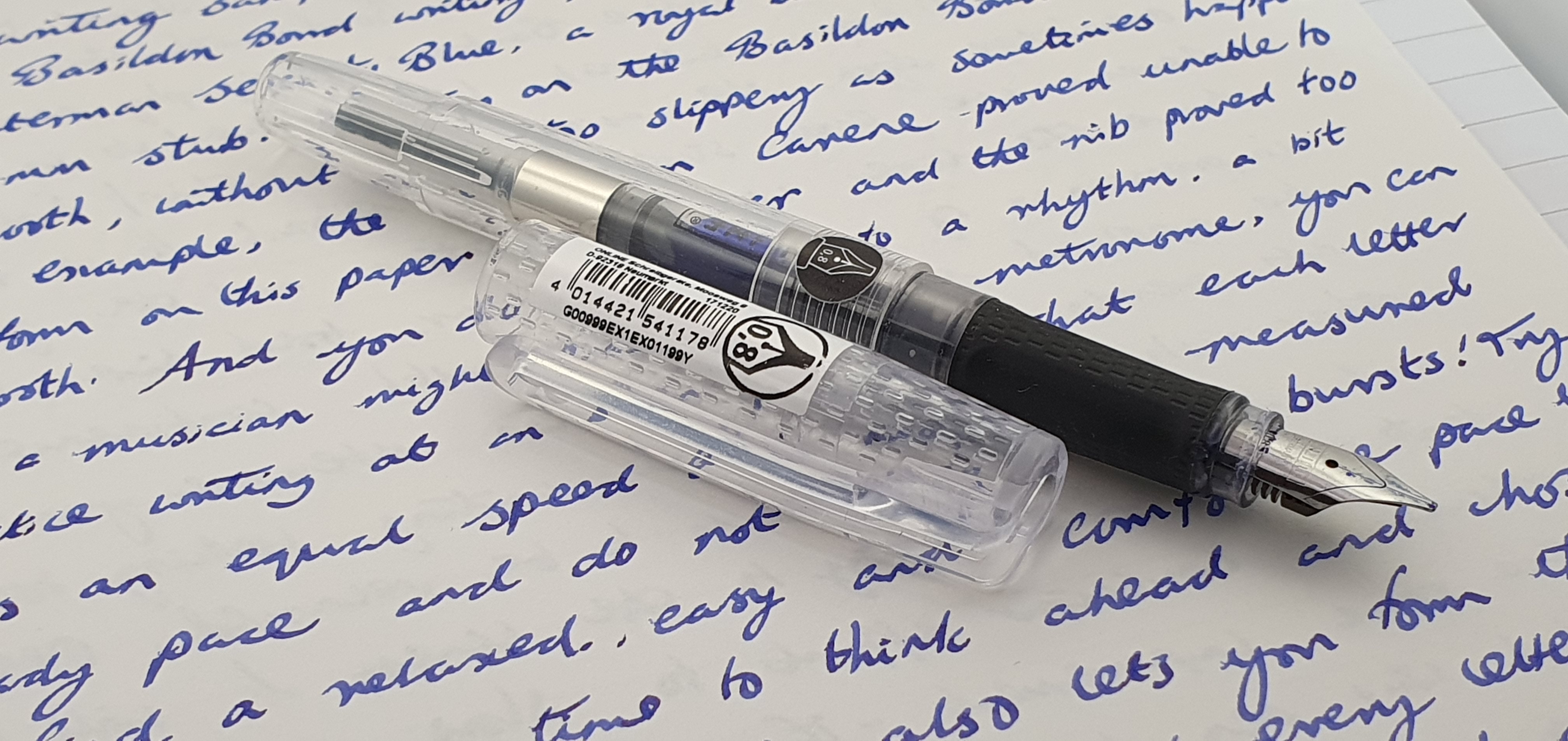
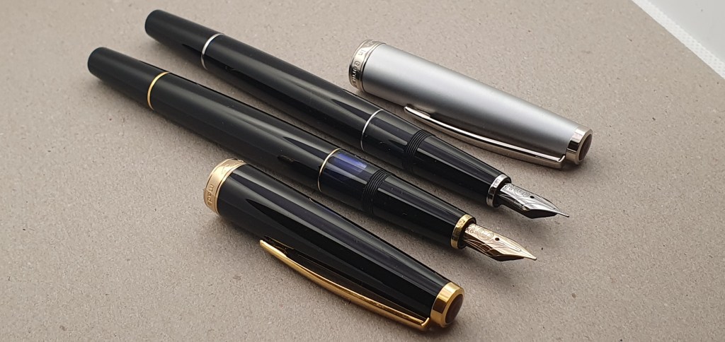
Finally, I ended the year with the purchase of a pair of Online Bachelors, a lightweight comfortable plastic demonstrator, cartridge converter pen but, unusually, fitted with a 0.8mm stub which I greatly enjoy and just reviewed in my previous post. I have had these only a few days but am happy with them both.

A few of the highlights.

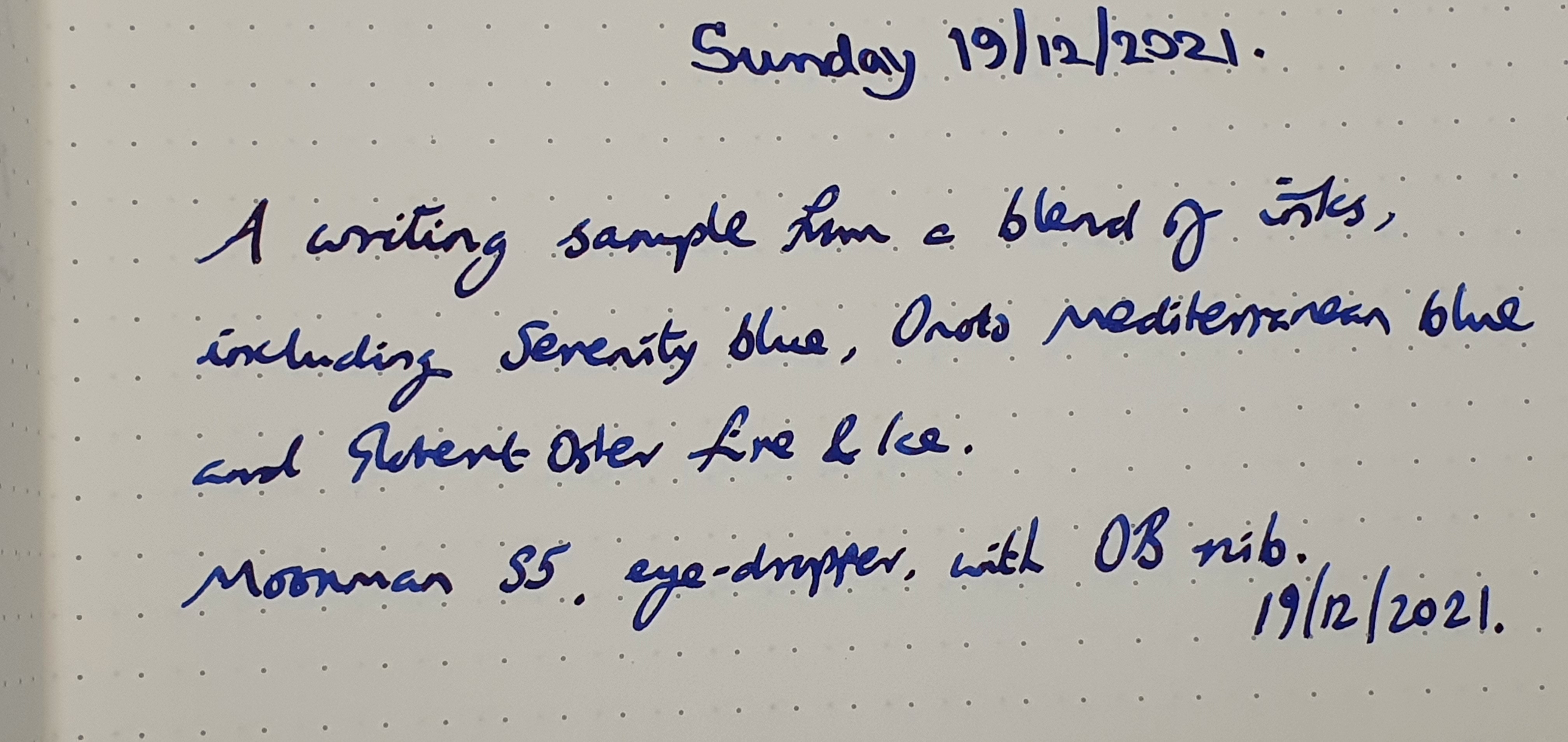
Aside from these fairly regular but low-dosage New Pen Days, I enjoyed completing the challenge of copying out the book Meditations, by Marcus Aurelius. This combined reading some philosophy with practising my handwriting. The idea was to write in a print-style, typewriter font and to use a different pen and ink combination for each two page spread. The whole idea was brazenly copied from Kimberly of @allthehobbies on Instagram whose own immaculate pages (as well as her “currently inked”posts) are most inspiring. I did this over a period of about seven months.

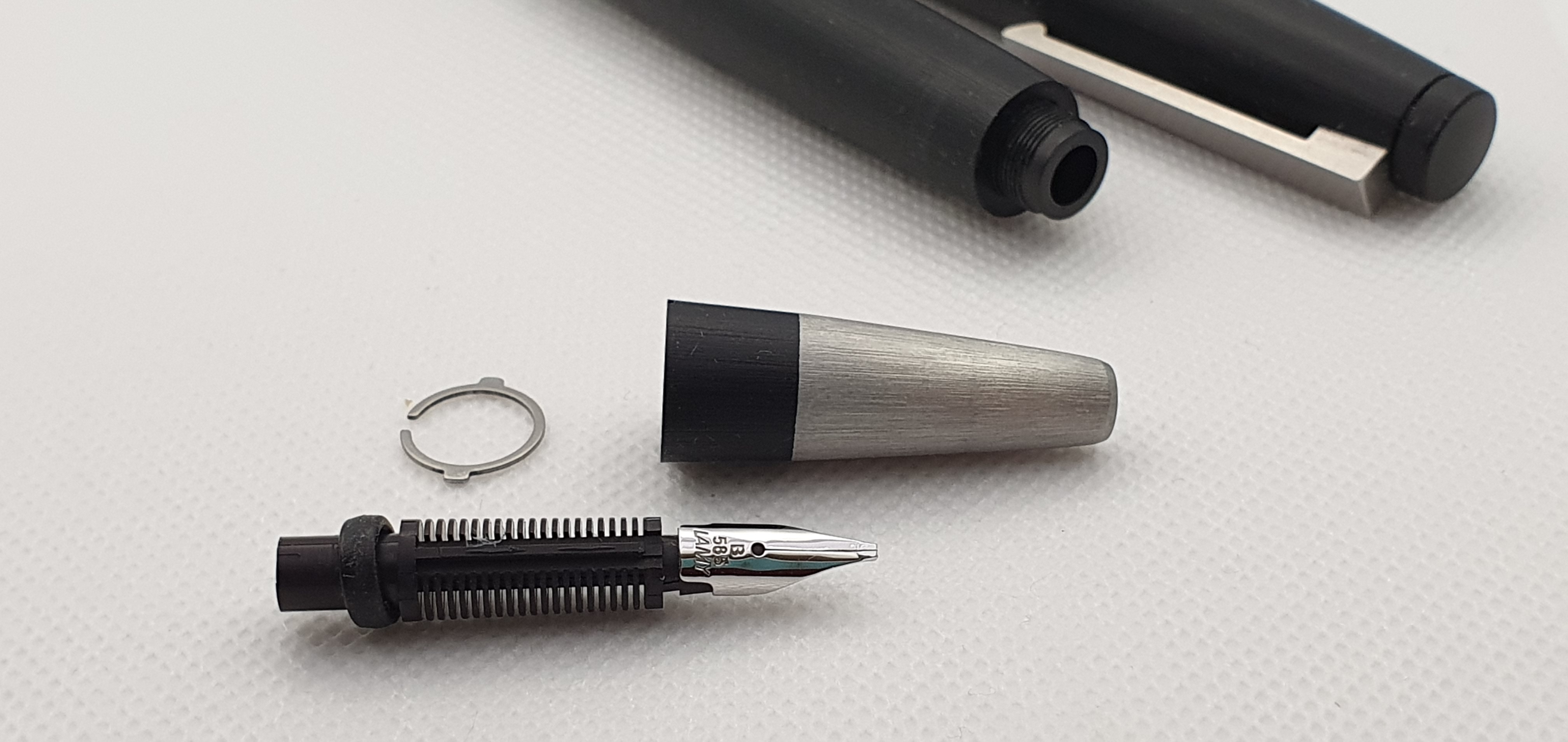
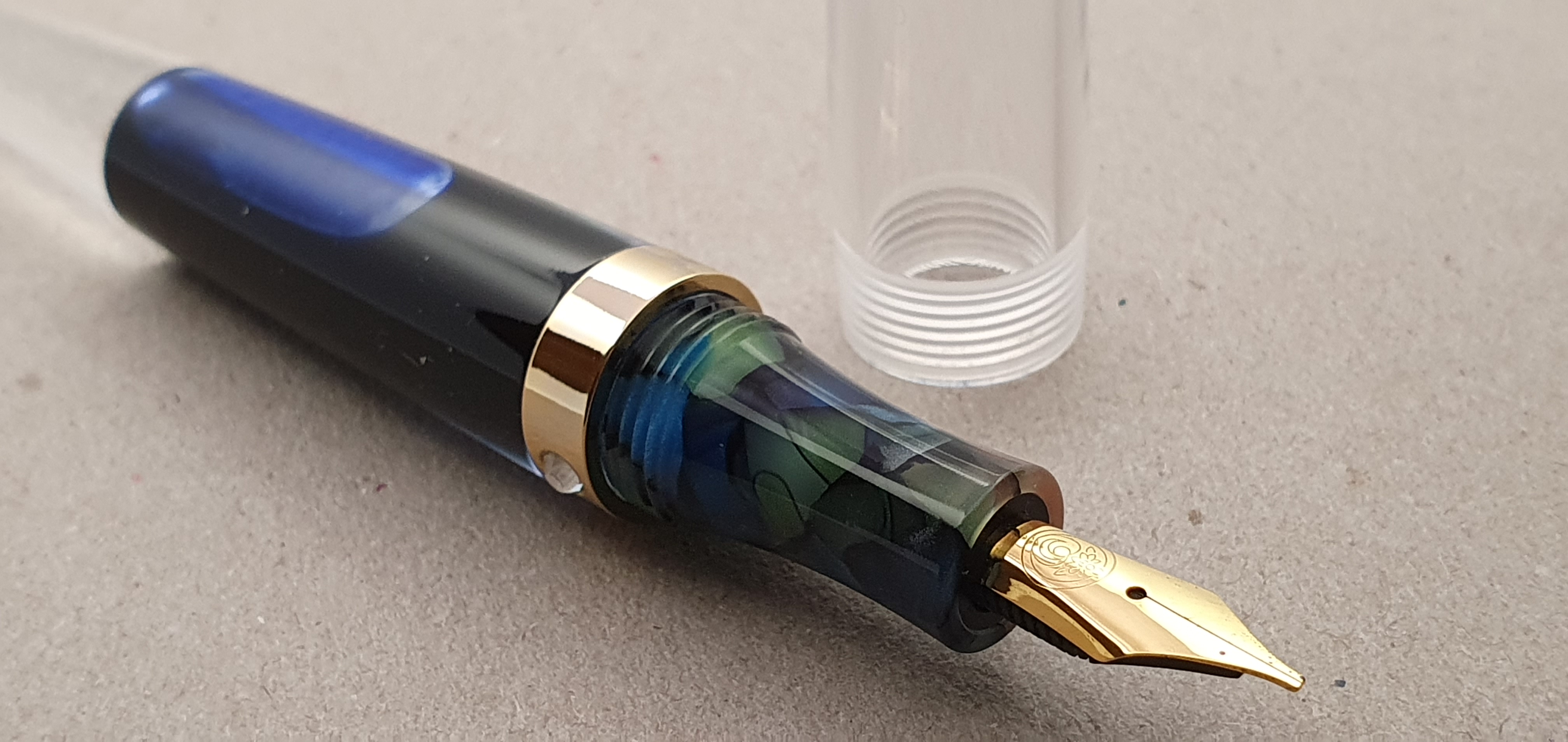
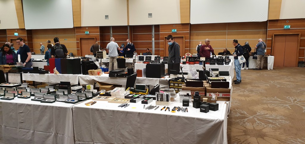
I attended the London Spring Pen Show (postponed until July) and Autumn Pen Show in October. Both took place at the Novotel in Hammersmith. The spacious, airy venue proved a big improvement on the previous events held at Holiday Inn, near Russell Square in recent years. It was good to see so many pen club friends again. Seven of my pen purchases came from these two events. Also, not included in the total, was a new titanium nib unit with an ebonite feed in Jowo fit housing, also purchased at the show. They were available in Jowo or Bock fittings and in a selection of widths. Mine went in an Opus 88 clear demonstrator and gives the pen a whole new character. The nib was just a tad longer than the original and I needed to make a little more space in the cap. This proved easy without major surgery, as the finial unscrews and I just added an O ring.

London Pen Show, Novotel, Hammersmith.

Aside from the pen show, I picked up a few bargains in the summer sales, at Rymans. These included a Sheaffer Prelude ball pen in Cobalt blue and rose gold, to match my fountain pen. This was a great find, reduced from £50 to £10. In John Lewis I snapped up another Sheaffer Prelude fountain pen, but in the brushed copper and black finish. And equally fortuitous was a Diplomat Traveller fountain pen, a rare find in our shops at the best of times, but reduced in Rymans to just £5.00. I sent one to a friend overseas who was so taken by it that he gave away several of his pens of much higher value, to another pen friend: a nice example of the “pay it forward” principle.

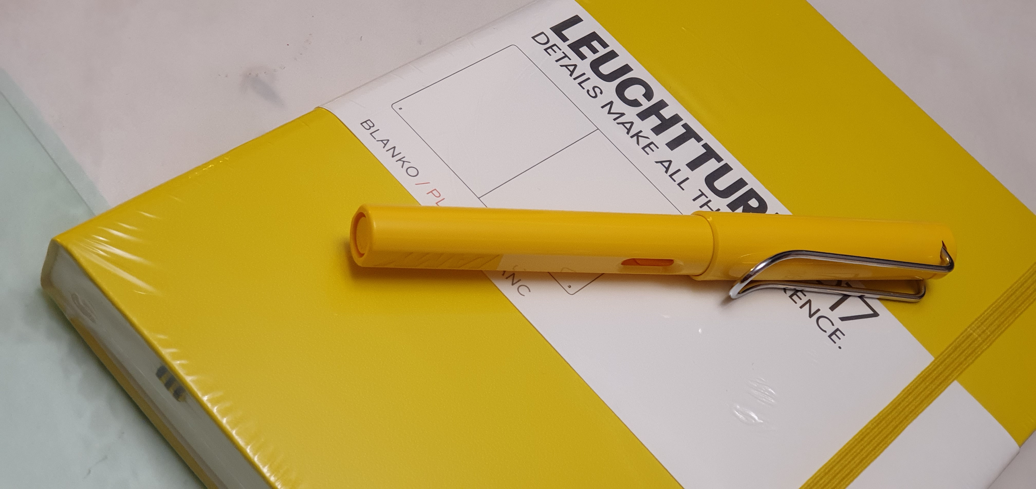
When out and about or exploring new places, it is nice to come home with a new notebook or pen, or both. Finding a new yellow Lamy Safari reduced in a sale was enough to see me pick one up with an accompanying Leuchtturm A5 journal.

Leuchtturm journals. Still my favourite.

The urge to buy a new notebook can be so irresistible sometimes that I buy one even when I know that most inks will bleed through the paper or that the line spacing is narrower than I would like. One such purchase was an Agenzio journal from Paperchase. I was attracted to the unusual size, being between A4 and A5. It was neatly bound, with 240 pages of lined paper with 33 rows per page. I enjoyed testing it out with various inks. I also found that one way to compensate for narrow line spaces (these were 6.9mm), is to rule the page into two columns. Somehow the rows look bigger then.

Trying out a new Agenzio notebook from Paperchase.

As for the blog, I have enjoyed putting out posts, although only 31 this year. The blog is now five years old and has received some 225,000 views. Occasionally my posts are picked up and linked by Fountain Pen Quest or the Pen Addict which greatly increases the number of views and lets me feel that “I have made it in America!” Thank you to Ray and to Brad for your support and to all who follow, like and comment on my posts.

This year I bought a new lightbox, a simple 9 inch box with two rings of bright LEDs in the top and powered by a USB cable. It is great to have a quick and convenient means of photographing pens in good light, at any time of the day or year.

With social gatherings and overseas travel largely on hold this year, I have spent a lot of time at home. I find it very relaxing to tinker with some fountain pens, filling or cleaning them, trying them with different inks on different papers and occasionally, attempting a little bit of nib adjustment. Most recently I tackled a pair of Cleo Skribent piston fillers, beautiful resin pens that I had not used very much in recent years on account of them both writing rather drier than I would like. Now, armed with a few simple tools, (a powerful loupe, a set of brass shims, some micromesh pads and a craft knife) I eased the tines apart just a fraction, which made a world of difference in improved ink flow and lubrication. These pens are both now back in circulation. This is a good argument for hanging on to your pens: you might improve them one day.

A pair of Cleo Skribent Classic fountain pens.

I have enjoyed keeping my journal for another year. My habit is to write this each morning after breakfast and before leaving for work. I hate to miss it. This year I decided to pick a different fountain pen for each month. I think I will do this again next year.

Favourite pens of 2021.

As mentioned my most significant purchase of the year by far, was the Aurora Optima, which has proved a success with its oblique broad nib. But, cost aside, I have somehow been just as pleased with my new Diplomat Excellence fountain pens from the London Pen Show, or even the Moonman S5 or Cross Bailey Light. I know that they are all in different leagues. But when you find great combinations of pen, ink and paper and the ink is flowing well, the fact that the pens might be of different classes seems to melt away.

Conclusions.

I have not made any new plans for the hobby for 2022. As for resolutions, I do not need any more pens although it would be unrealistic to expect that I will not be tempted enough to buy some. I would like to buy less and use more. My aim is to continue finding enjoyment and relaxation and a bit of escapism in the hobby. It has been another challenging year. Who knows what the next year will bring? Everyone needs some way to unwind from the day-to-day stresses of life and work. As long as I can still find this in my pen cups I shall continue to do so and wish the same to you. Thanks for reading and a Happy New Year to all.

Early thoughts on the Online Bachelor, clear demonstrator, 0.8mm calligraphy pen.

Ever since August 2019, when I was first given an Online College fountain pen, I have been on the look-out for another with the same 0.8mm stub nib. It is a great nib size for me. I am told that these German pens are readily available for around ten euros from the Müller chain of drugstores in Germany but hard to find in the UK.

The Online Bachelor, with 0.8mm stub nib.

I reviewed my Online College pen here. The Bachelor which I just found on Amazon for a modest £11.66 is a similar pen, and mine is the clear plastic demonstrator version. That price included a Schmidt converter, usually about £3.99 on its own.

I ordered two of them, just in case one of them had a poor nib. Alternatively, if both were satisfactory, I could use them with different inks or maybe given one away. I worried a little in case the nibs turned out to be too sharp sided, as inexpensive italic, calligraphy nibs can often be. These produce crisp edges to your letters if handled carefully but can be challenging for cursive writing, when the corners of the nib can dig into the paper.

I need not have worried: when they arrived by post from Germany four days later, both nibs looked in great shape, with even tines and with a narrow tine gap visible under the loupe, which promised a nice easy ink flow. They were also smooth and nicely rounded.

0.8mm stub nib.

I particularly like the 0.8mm stub nib, which is unusual and gives a finer line than a 1.1 or 1.4 stub, but still allows for a bolder and more characterful line than a round-tipped broad nib. It is good for scanning, if you plan to send your handwritten letters by email. You get some lovely line variation between the down strokes and the cross strokes.

The pens arrive with stickers on the cap and on the barrel, identifying the nib as the 0.8mm, with a bar code and address for Online Schreibgeräte at Moosweg 8, D-92318, Neumarkt. I have not yet removed these.

Aside from the nib, this is a plastic pen. The cap and pocket clip all seem to be molded as a single piece. The clip is quite flexy, and would probably work even on thicker fabric like a coat pocket. There is a gap down the middle of the clip and I have only now spotted that the name ONLINE is visible through the gap. With plastic innards and an apparently sealed barrel, it looks as though it could be eye-droppered, which is an exciting prospect although I have not tried it.

The cap sits flush with the barrel when closed. I had a brief scare when I thought that the patterned rows of dimples might actually be holes, so that the cap would not be airtight, but they are just decorative dimples, a pattern echoed in the black rubber grip section. The cap pulls off with some force required but is very secure when capped. The section is of a black, rubbery finish, pleasant to the touch and not sticky. There are two slight facets for a symmetrical grip, but they are not too pronounced or sharp ridged and so can be ignored if you wish to hold the pen differently.

Between the rubber grip area and the step up to the barrel, is an ink window. This is probably of more use in the opaque barrelled versions but since this pen is a demonstrator, you can see the entire cartridge or converter through the barrel.

Schmidt converter included. Otherwise takes standard international cartridges.

At the back end of barrel, there is a step down to a narrower area enabling the cap to be posted, securely and flush with the barrel. This makes the length about 162mm. Unposted, it is about 126mm.

I filled up the first of my two pens with Waterman Serenity blue. It wrote nicely, the nib having a little bit of give but best of all, having an effortless flow, lubricating the nib well without being overly wet. I tried the pen on a Rymans journal, then some file paper and finally on my smooth Basildon Bond letter writing paper which it liked best of all: so much so that I went on writing for two full pages just to practice my handwriting.

First efforts with the newly inked Online Bachelor.

The main key to this, in my case, is to make a conscious effort to slow down. Try to write at a steady and even pace, not in bursts. (Imagine practising with a metronome, like a musician). Try to keep the letters rounded, of even height and evenly spaced. Try to keep on the lines. Try to keep the ascenders and descenders parallel and the tail loops consistent (mine never are). I remember the advice when I was learning to touch-type, that you should type at a steady speed, rather than speeding up and slowing down. It is easier said than done but fun to practice and you soon start to see the benefits. When people say that a fountain pen will help improve your handwriting, it will – provided that you remember to do all the above!

Enjoying the flow. Serenity Blue on Basildon Bond paper.

I have since inked up the second Bachelor with Rohrer and Klingner Salix, the blue-black iron gall ink which is a useful ink to have in a pen, plus it needs using up.

That will probably be my last new pen purchase of the year. Having risen to the dizzy heights of an Aurora Optima in the summer, it is good to return to basics with some well chosen cheap pens and to see what we can accomplish together. A Merry Christmas to all.

Meet the twins, Salix and Serenity.

The thrifty ink-miser’s flush.

Sunday evenings are a good time for cleaning some fountain pens. Here, my pen cup occupancy had gradually risen to 18 currently inked. Cleaning a few is a quick and easy way of bringing the numbers down but usually at the cost of jettisoning some good ink.

Some of the current occupants of my pen cup: Aurora 88, Montblanc Meisterstuck 146 and a Cleo Skribent Classic gold.

“Deciding who goes and who stays” sounds like a line from Strictly Come Dancing when the judges are introduced. However in this case the decision is down to me. I selected four pens: a Lamy 2000 and an Italix Captain’s Commission, both inked with Onoto’s Mediterranean Blue which were ready for a change. Then there were the Diplomat Excellence and a Cleo Skribent, both of which I had two of on the go, and both with Waterman Serenity Blue.

The cleaning ritual.

I noticed that my Moonman S5 eyedropper pen was low on ink, last inked with Serenity Blue with a little Robert Oster Fire & Ice, which had produced a nice silky-smooth rich blue. This gave a pleasing effect on the page, from the smooth, oblique broad nib. Sometimes with luck an experimental mixing of inks produces an attractive blend, which is greater than the sum of the parts.

The Lamy 2000 gets an early bath. Careful not to lose the metal horse-shoe clip or the rubber O ring on the back of the feed.

It occurred to me that rather than dump the remaining ink from my four candidates for cleaning, I would instead empty it into the Moonman. This has the happy consequence of (a) topping up the Moonman for a good few months of use, (b) producing a new and unique colour blend, (c) allowing four pens to be cleaned and (d) making space in the pen cups and (e) not wasting ink.

For this exercise, I usually stand the Moonman in an old Aurora ink bottle. The pen has a flat end to the barrel and so will stand up on a flat surface on its own, but could easily be knocked over.

The Moonman S5. An ink bucket with a wonderful OB nib.

Of course there is always a risk that the mixed inks will not play together nicely and instead form a goo. I have not had this occur so far but if the worst comes to the worst, you just clean the pen and start again.

Newly filled Moonman S5

I love Waterman’s Serenity Blue: a well behaved, easy to clean, royal blue. If I had to be limited to only one ink, that would probably be my choice. I do sometimes have the urge to ink up a pen with a turquoise ink but for some reason, I soon tire of it and find myself not using the pen very much, until eventually I cave in and flush. Perhaps we all have this tendency with certain colours.

Tonight’s new blend. Tomoe River paper.

I had nothing against the Serenity Blue in my Diplomat Excellence, but fancied a change to a blue black. Same with the Cleo Skribent.

My other Cleo Skribent. This one remains inked and is my journaling pen for December.

Having told myself recently that I would not buy any more pens for a while, I recently found myself ordering an Online Bachelor calligraphy pen, when I saw that the supplied nib is the excellent 0.8mm stub. The pen is a clear demonstrator, cartridge-converter pen, rather like the Online College pens and comes with a converter. It is due to arrive in a few days and so I needed to make some space in the pen cup for the new arrival. Fingers crossed it will be a successful addition.