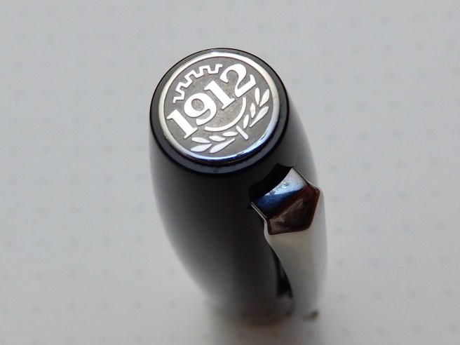
The Elmo & Montegrappa S.p.A. (public company) traces its origins to the Italian city of Bassano del Grappa in 1912, a date commemorated in the finial of this pen. Fortuna was the Roman name for the goddess of fortune (chance, luck and fate), so I gather.
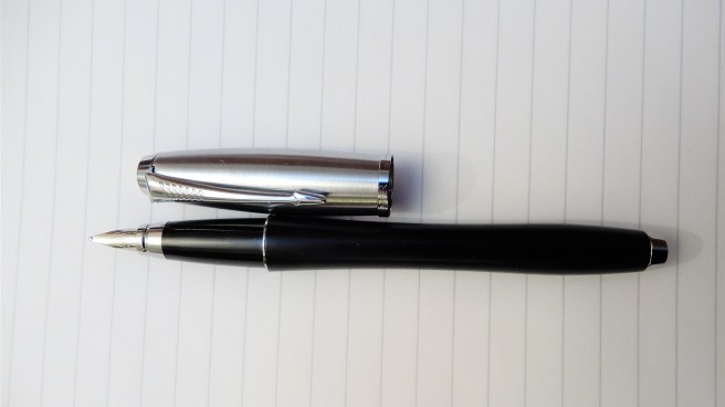
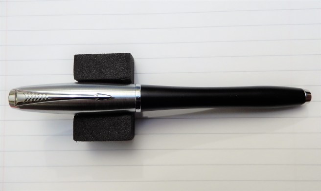
My experience of Montegrappa fountain pens has until now been minimal. I had noticed them a few times in recent years when browsing in Harrods or Selfridges in London but had never owned one. However, I had heard good reports and on my latest visit to Selfridges I decided to give them a closer look. I was drawn to the Fortuna, in black which looked to be a good sized, un-fussy model with a stainless steel nib. Initially I was interested to hold it to see whether the metal cap threads and step from the barrel to the section, would be uncomfortable. They do coincide with where I hold the pen but the threads are not sharp and I was satisfied that they would not cause discomfort.
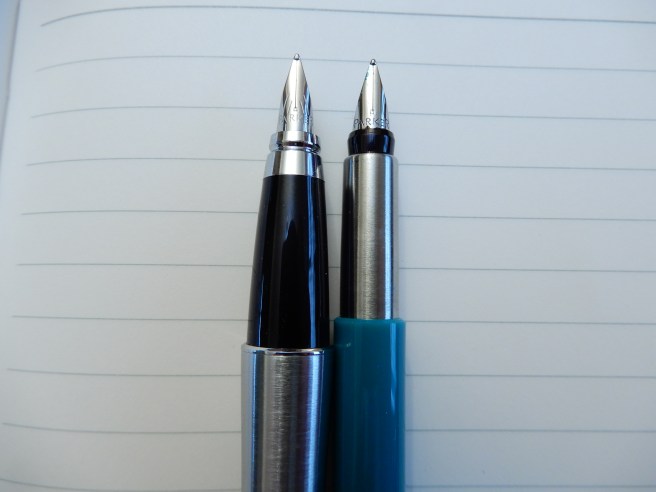
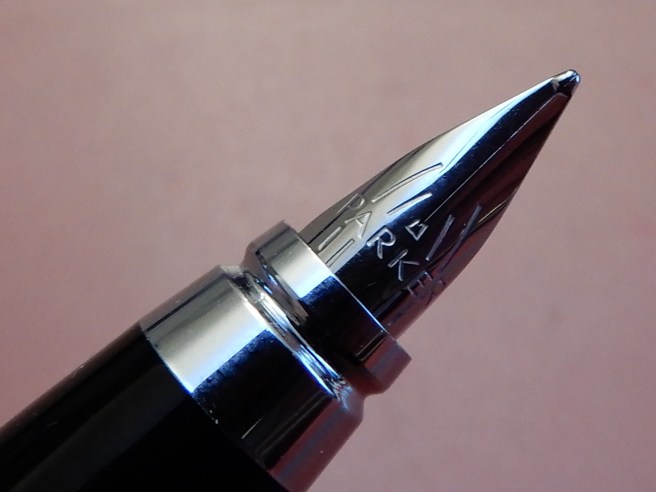
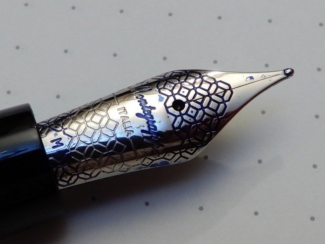
I then had a closer look at the nib. It looked to be very nicely set up but I was also impressed by the decorative work in a sort of geometrical honeycomb pattern. I then tried writing with it. Wow! It felt beautifully smooth. It was a steel medium although the sales assistant explained that these were on the finer side of medium. This sounded ideal for me as I am sometimes unsure which to chose, between a fine and a medium.
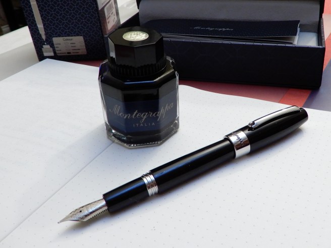
After comparing the alternative models in the range, I settled on the black one that I had tried and also picked up a bottle of Montegrappa ink, in blue black.
Description
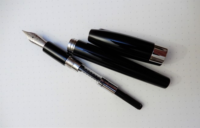
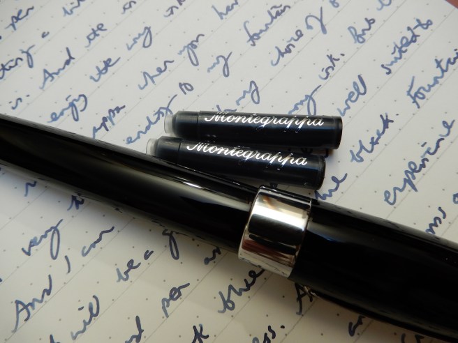
The Fortuna is constructed of resin in a gleaming, polished black finish and is a cartridge-converter pen taking standard international cartridges. The cap is rather torpedo shaped after which the cap and barrel taper down . The two ends of the pen are flattened. The pocket clip is extremely stiff but ends in a metal wheel which rolls as the clip slides over the side of a leather pen pouch, for example. The cap screws on, in about one and a quarter turns. The section is of the same, glossy back resin as the cap and barrel. All threads are steel, except for those inside the cap. Under the barrel, a Montegrappa converter is included although the package also included two black cartridges.
Size and weight (approximate)
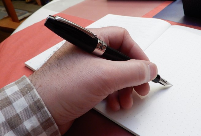
Capped, the pen measures 135mm. Uncapped, it is 127mm but the cap posts deeply and securely to give a length of 157mm. Being a resin pen, this does not make the pen too back heavy, in my opinion, and I tend to prefer using it posted for all but the shortest of notes. The exposed part of the nib measures 24mm.
Capped or posted, the total weight is around 30.5g, which I find to be neither too heavy nor too light. Uncapped it was 18.5g and the cap alone was around 12g.
The nib
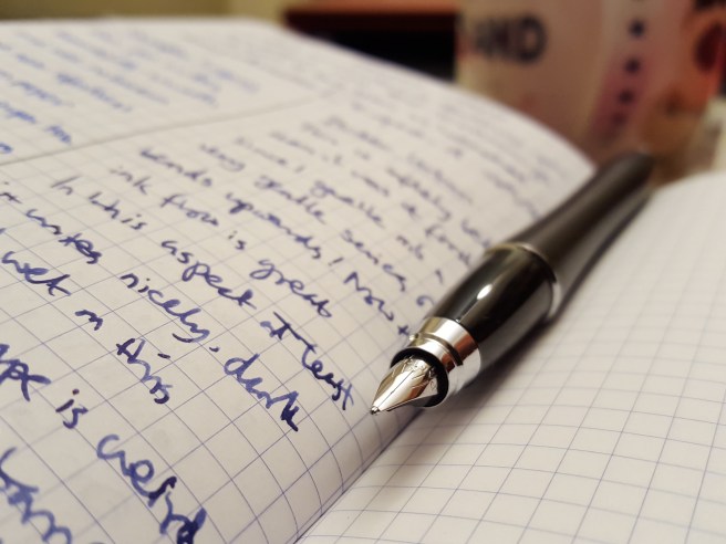
As mentioned this is a stainless steel nib, and will suit those who like their nibs firm, but smooth. It bears the inscription, Montegrappa, ITALIA, and an M for medium. I was thrilled to find the nib so well adjusted, giving what I consider an ideal flow, generously wet without being overly so and providing a lovely smooth writing experience.
Likes
Getting the pen home, I spent some time making pleasant surprise discoveries, apart from the obvious pleasure of the writing experience with the Montegrappa blue black ink. To list them all here may need a spoiler alert. Skip this paragraph if you prefer to be surprised by joy!
- Detailing in the finial, with the year 1912, a laurel wreath pattern and other decoration. It looks distinctive in the pen cup;
- Unusual rolling wheel design at the end of the pocket clip;
- Attractive pattern on the nib; after dipping the pen, the nib emerges with the lettering filled with ink;
- Nice quality, screw-in converter, with Montegrappa branding, and a metal coil ink agitator inside; this should avoid ink starvation, from ink staying at the top end of the converter;
- Montegrappa name in silver, on the two supplied cartridges;
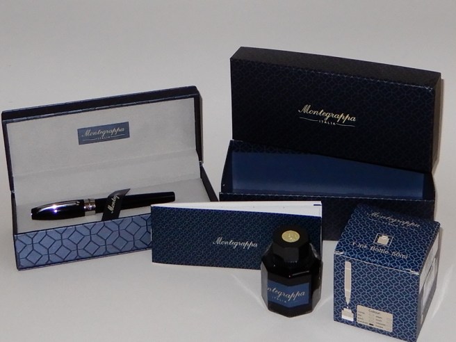
- Particularly nice, dark blue gift box, with silver coloured (metal?) Montegrappa name plate on the top and the name in blue on the inside. Removable pen tray, reveals warranty and information booklet below; but lower section of box is also lined, making this a nice storage box to keep for future use;
- The gift box is protected in a separate blue cardboard box and lid, with a hinged front flap for ease of access and a separate paper outer sleeve. Both boxes (and the ink box) bear the same geometric pattern as appears on the nib;
- Attractive, octagonal glass ink bottle with plastic lid and silver coloured centre badge with “1912”.
- Secure packaging of ink bottle, with cardboard insert in box; bottle and lid wrapped in protective layer and also sealed in clear plastic.
- 24 months’ guarantee against manufacturing defects;
- I will not review the ink here but suffice it to say, that Montegrappa Blue Black performs beautifully paired with this lovely smooth wet nib and I have found this combination to work better on the paper of some of my Paperchase journals than many other pen and ink combinations.
Dislikes
- Pocket clip is very stiff; whilst it is good that the pen is unlikely to fall out of a pocket, this does make it rather hard to use and I am more likely to carry the pen in a leather pen pouch than a jacket pocket;
- The rolling wheel in the pocket clip could fall out and get lost;
- The steel-into-plastic cap threads need care not to over-tighten but also feel a little too easy to undo. Another good reason for carrying the pen in a pouch rather than straight in a pocket;
- Whilst I have been fortunate (ha!) to get such a well adjusted nib, it is fair to mention that in a blue mosaic model reviewed by SBRE Brown, he found the nib to be very feedbacky and the step from barrel to section, to be sharp to the touch;
- He also commented that the price is perhaps high, for a stainless steel nibbed cartridge converter pen and compared the pen to a Conklin All American which was approximately one half of the price.
Conclusion
I have been very impressed so far with the nib performance, which seems to give as pleasurable a writing experience as any pen I have used, regardless of price range. I can imagine this quickly becoming a favourite, for home and work use.
Whether or not, at £170.00, it is the best use of the money, given the competition at this price level, is a matter of personal choice. Certainly there are gold nibbed pens to be had for less. You could go for a steel nibbed Edison Collier for a little less or a Sailor Pro Gear, with a gold nib (and from a company one year older!) for a little more, to name but two. But as pen enthusiasts will know, a higher price does not always go hand in hand with a better writing experience. Much will depend upon whether fortune is smiling upon you, as you make your purchase.