Since it arrived, only five days ago, I have been hugely pleased with this pen. It continues to behave well and to write beautifully. All indications are that we will be well suited to each other. Just a few items to report, by way of update:-
Having established that this eyedropper pen showed no signs of blobbing ink whilst only a third full, I topped it up to test whether that would invite any trouble. Still there has been no blobbing, despite the added pressure of a full tank of ink. The feed does a good job of holding back the tide.
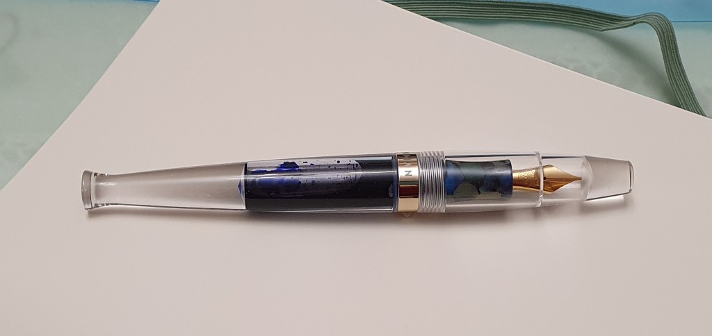
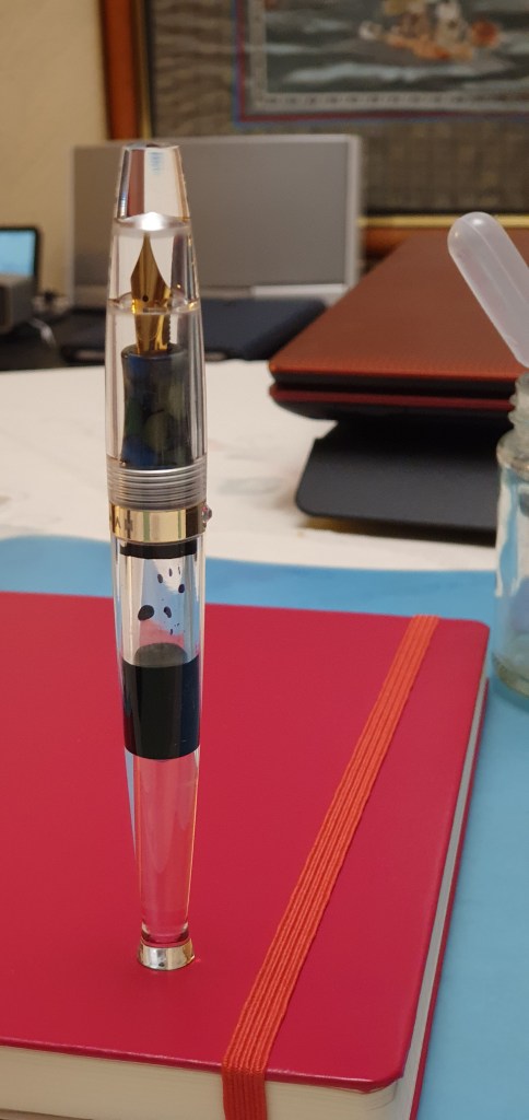
Moonman S5 with a good fill of ink on board.
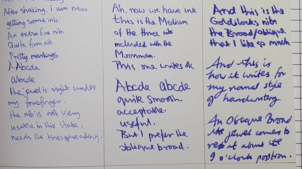
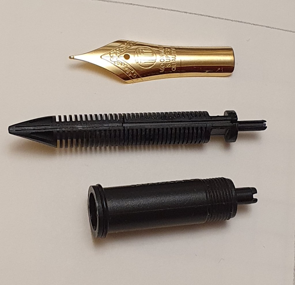
I took another look at the other two nibs, the extra fine and the medium included in the set. I had been reluctant to take out the lovely oblique broad nib in case of spoiling the magic, but it is simple enough to unscrew one nib unit and insert another. I tried the extra fine first. Once the ink had made its way down, it was still a very fine line and the nib was firm too. It may have its uses but in terms of enjoyment it fell far short of oblique broad. I have flossed it with brass shims to ease the gap between the tines a little.
The medium nib was somewhat better. I found that it wrote reasonably well in my occasional lefty-underwriter mode, but for overwriting it was not very pleasant. Having confirmed this, I was pleased to get back to using the oblique broad.
Comparing the extra fine, medium and oblique broad nibs.
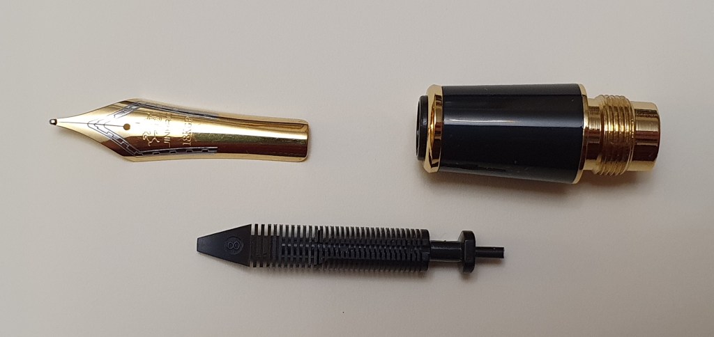
The nib units can be disassembled. The nib and feed are friction fit in the housing and can be pulled out if necessary. However they will only go back in one way, so my suggestion of rotating them in the housing to offset the nib in relation to the roll stop jewel on the barrel, is not possible.
The extra fine nib unit, disassembled.
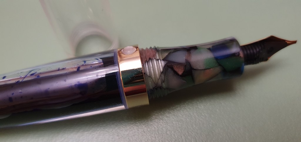
Luckily with the oblique broad fitted, the multi-faceted jewel roll stop was well out of the way of my grip. However, I still decided to file it down a little, so that my fingers would not keep finding it. The jewel is not particularly effective as a roll stop anyway and it is much safer to put the pen down on a pen rest so that it will not go anywhere.
The faceted jewel roll stop, now filed down a bit, but not completely flush.
I use the pen with the cap posted as this is the most comfortable. There is no metal on the cap at all – it is a piece of clear acrylic. The absence of a cap band to give it some strength does worry me slightly and I fear that it could crack if forced onto the barrel. I will be careful not to overdo it when posting but a little shove and a twist is enough to fix it on securely.
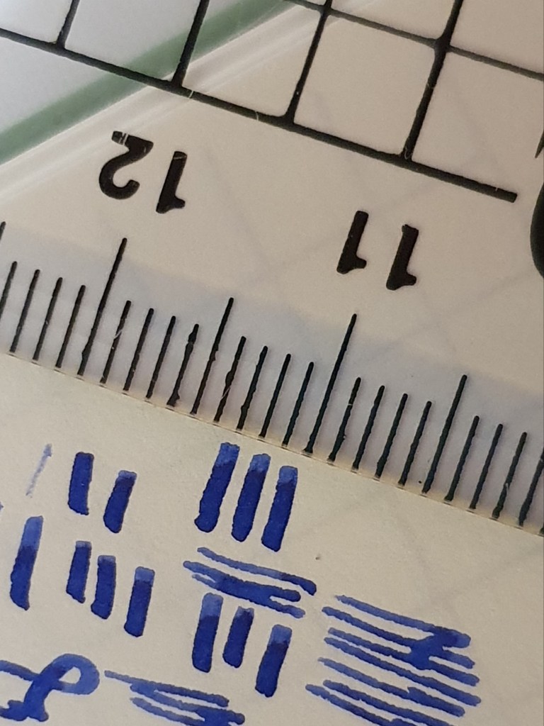
Having fun measuring the line width of the OB nib. About 0.7mm max, but if it is rotated a little, you do not see the full width in the verticals.
All in all I remain delighted with the pen and especially its oblique nib, even though the other two nibs are rather surplus to my requirements.
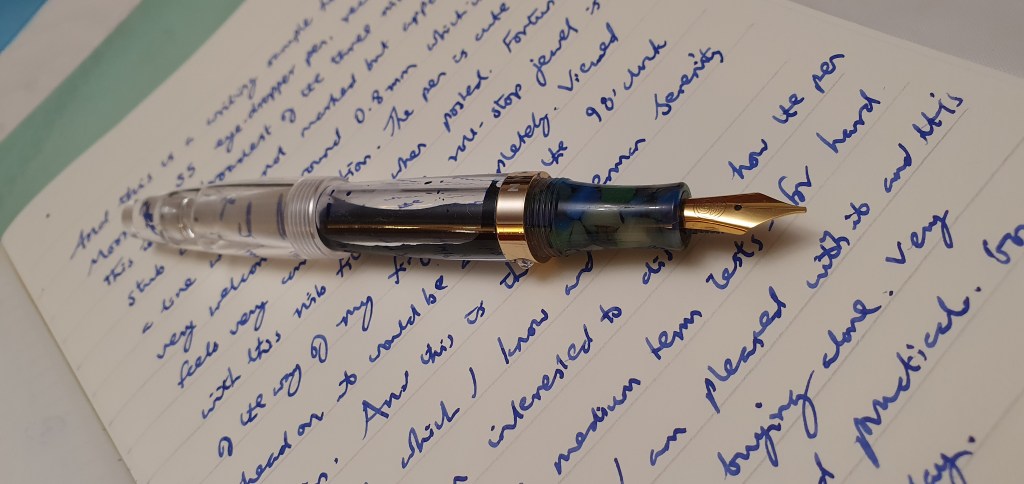
Occasionally a pen comes along that looks so enticing, full of potential and such good value that I am unable to resist buying it. Well, quite often, tbh. In this case, it was the Moonman S5, a clear acrylic demonstrator, eye-dropper pen which comes with an eye-dropper and three different nibs all for under £24.00.
What interested me particularly was the statement that it had an Extra Fine nib and two additional nibs in Medium and Broad. After watching one YouTube review, I gathered that the Broad nib was a stub of about 1mm width. But subsequently, from examining the nib and watching some more reviews, it transpires that the Broad nib is in fact an Oblique, which for me as a lefty overwriter, turns out to be brilliant news.
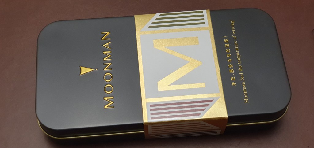
The Unboxing.
The pen comes in a nice black tin with gold lettering, held shut by a cardboard sleeve, with a nib motif and an M for Moonman.
The set comes in this black tin.
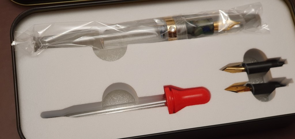
Inside the tin, in sturdy cushioned recesses, are the pen (in a polythene sleeve), the eye-dropper and the two additional nibs. There is a folding sheet of diagrams for filling various types of fountain pen, including eye-droppered pens.
What’s in the tin. (Also some instructions, not shown).
Description.
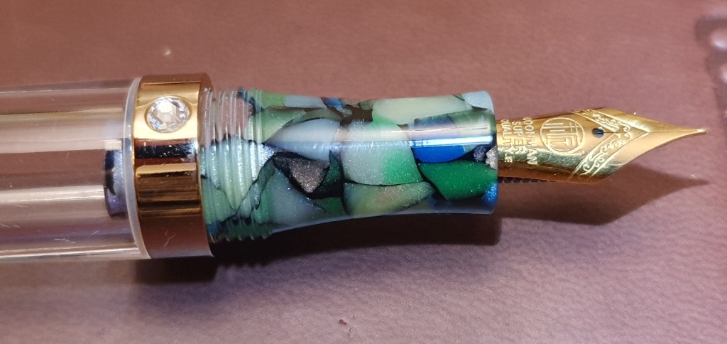
This is a clear, acrylic pen, with a screw on cap (taking three complete turns), no pocket clip but a jewel-like roll stop set in a metal band on the barrel. The band has the name MOONMAN laser-etched against the shiny background. The grip section is comfortably shaped with a very slight hour-glass contour and is in a patterned acrylic with a crazy-paving effect, in a mixture of colours – green, blue, purple, white and brown against a black background. I thought it looked a bit incongruous at first, as though it was for a different pen but I quite like it now. It comes alive and sparkles under the bright light of a loupe.
The Extra Fine nib. The roll-stop jewel is centred in this picture.
The barrel has a distinctive taper to it before flaring out at the end like a fishtail, into a flat base, on which the pen can be stood up. It looks a bit like a lava lamp when upright. The cap also has a flat top, which is useful if you wish to stand the pen upside down for a minute or two, to allow ink to make its way to the feed after filling.
The pen standing in lava-lamp mode.
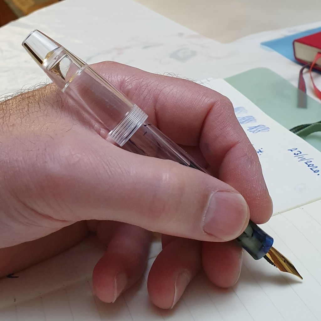
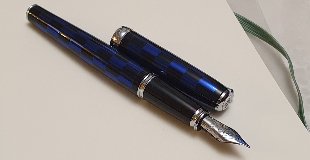
The barrel shape actually makes the pen very comfortable to hold unposted but for me, I prefer to post the cap whereupon the slight extra weight, length and girth at the back end, make it supremely comfortable. The cap posts very deeply and securely, if given a little twist.
The S5 with cap posted.
Size and weight.
I would call this a medium sized pen. It measures approximately 136mm closed, 123mm uncapped and 136mm posted. Weight (when about one third full of ink) is around 18g, as to 14g for the pen uncapped and 4g for the cap.
The three nibs.
I tried the Extra Fine nib first, dipped but not filled. This one has gold coloured plating, some scroll work and logo and the words MOONMAN SUPER QUALITY.E I am not sure what the E is for. On a brief dip test, the nib wrote smoothly but with an extremely fine line. I wrote about four lines with it but did not leave it on for very long and in hindsight, did not push it to try for any line variation, before unscrewing it and fitting the Medium nib.
The fitted Extra Fine nib is seriously fine, but YMMV, as one YouTube reviewer found little difference between the fine and medium.
The Medium nib had rather less markings on the nib – just a pattern within a circle but no text or width designation. It wrote well – significantly darker than the Extra Fine and with a typical medium-fine width. Again, in my excitement to try them all, I wrote only about four lines before switching to the widest of the three nibs.
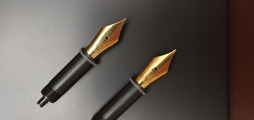
The two additional nib units, each with a housing and a grey rubber O ring. Be careful not to lose the ring.
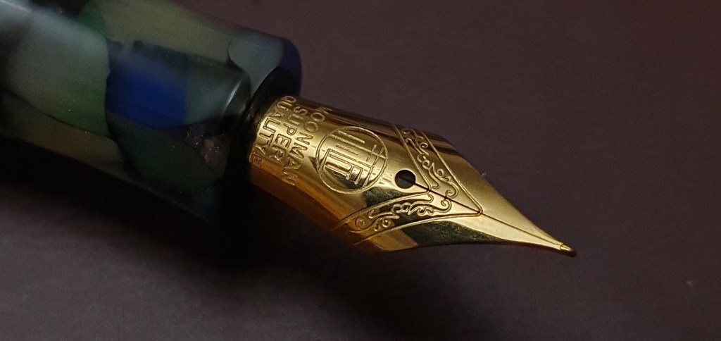
The Broad nib (again with only the floral pattern in a circle and no markings) is an Oblique. Looking at the face of the nib, tip upwards, the tip slants downwards to the left about 15 degrees and is what I believe is called a Left Foot Oblque, looking like a left foot. It produces a line of roughly 0.6 – 0.8mm maximum width, which is lovely.
This was for me, the best of the three nibs and I liked it so much that I have not taken if off since. It was like Goldilocks finding the bed that suited her best, or the glass slipper finding Cinderella.
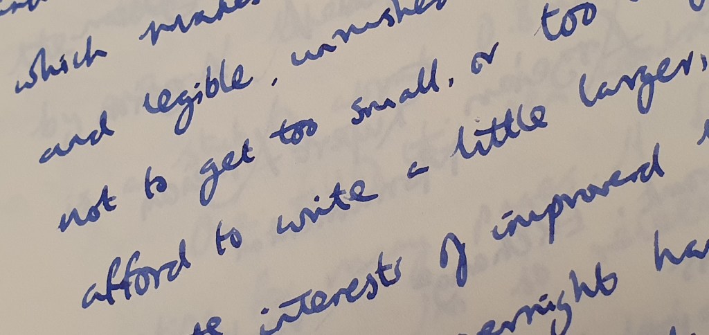
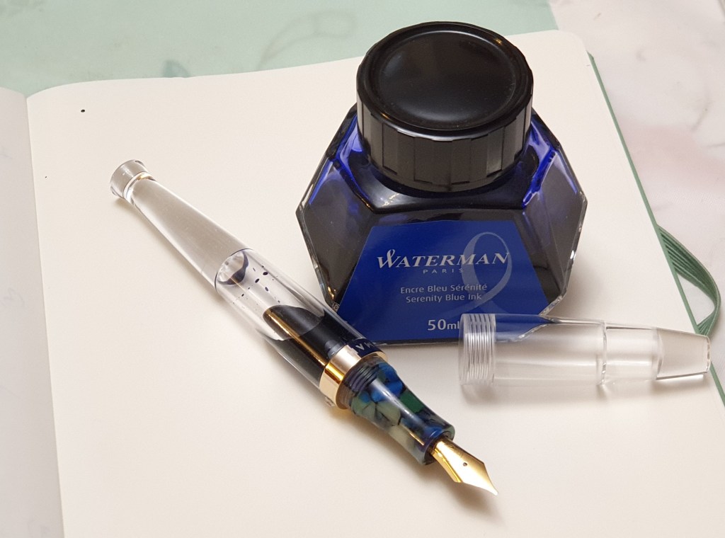
For me, the Oblique nib writes super-smoothly, with a nice flow. I inked the pen (as I ink most of my pens the first time), with Waterman Serenity Blue. It provides a broad line with some subtle line variation. It takes just a little practice to find its sweet spot and then to keep it at the same angle as you write.
Writing sample with the Oblique broad nib, Waterman Serenity Blue ink and a Leuchtturm A5 journal. Bliss.
Filling.
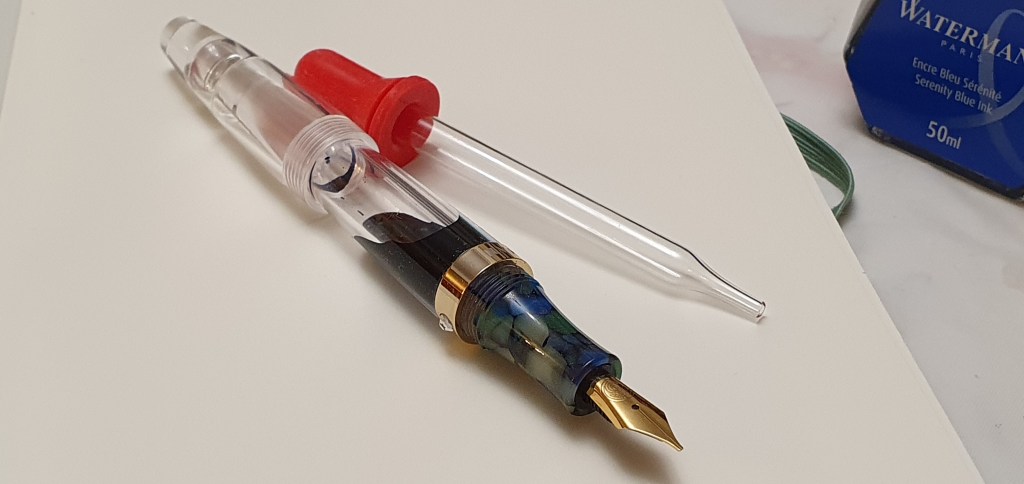
Filling is simplicity itself. You just unscrew the barrel and drop some ink into it with an eye-dropper or a syringe if you prefer. I use large soft plastic pipettes bought from an art shop. I put a little silicone grease on the threads before re-attaching the barrel although there is a O ring there and the grease might not be necessary. Then leave the pen to stand, nib down for a minute or so while the ink fills the feed. I have not yet measured the capacity.
A dream combo.
Likes and dislikes.
The only negative I found so far, is the jewel roll-stop. It is not that I have anything against the jewel itself, but I found that it gets in the way of my grip. When the pen arrived, it was aligned with the nib but once I started fitting different nibs into the section, and then screwing the section back on to the barrel, it was “jewel roulette” to see where the jewel would end up, in relation to the top of the nib: not that being in the 12 o’clock position would necessarily be the best position for me. But, by good fortune, I found that when the oblique nib is screwed in, the jewel finishes up at about the nine o’clock position (viewed facing the nib head-on) which for me is perfect and the jewel is completely out of the way.
If this does not work for you, I hope it may be possible to prise the jewel out of the cap band, or even to file it flat. Alernatively perhaps with the preferred nib unit screwed in, the nib and feed could be pulled out of the housing and replaced in different alignment to the jewel. I have not tried this yet.
Note the roll-stop jewel seen here at about the 9 o’clock position which is ideal for me.
Conclusion.
This is my first foray into the Moonman brand. I seem to have struck gold first time. I am thrilled with the pen and its Oblique nib. Writing with this, with Waterman Serenity Blue and my Leuchtturm A5 journal is a dream combination.
I have not filled the pen completely as I will try some more adventurous colours next. It is easy enough to swap out the nibs too and I need to give the others a proper go at some stage. Having found that the Oblique nib is capable of such smooth and pleasurable writing it just remains to test longer term for hard starts and for possible burping of ink, which eye-dropper pens sometimes suffer from. I hope I have not spoken too soon but so far all is looking good. At £23.99 I think this represents great value. If any bad behaviour occurs to take this grin off my face, I shall add an update.
Lovely smooth writer, with effortless line variation (see the capital A and V).
Well, that wasn’t too terrible. Being confronted with my own greed and folly was never going to be comfortable. But it was not as bad as I feared.
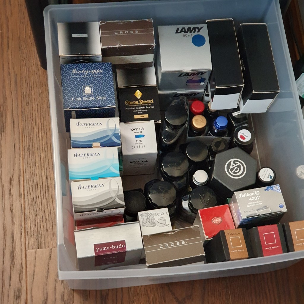
During the week I took part in Anthony’s online survey of the pen community, on UK Fountain pens. One of the multiple choice questions was how many bottles of ink you have. I honestly did not know and had not counted but suspected it might be nudging past the hundred mark. I resolved to find out.
I used to own only a few bottles of ink, Parker Quink generally. Getting through a whole bottle of ink takes time, particularly if you often use cartridges instead. Assuming, very roughly, that a 50ml bottle might give you fifty fills and that each fill would last you for, say 20 pages of A4 writing, that is 1,000 pages. Fortunately most bottled ink keeps well. The exception, ironically, is iron gall ink which needs to be used up within around 18 months of opening the bottle, or else it loses its colour and darkening properties.
I have a couple of old bottles of Monbtblanc ink, still in their boxes with a price sticker saying £4.95. Now they cost about £18.00 I think.
It was perhaps around 2014 that things escalated with my fountain pen hobby getting hooked on pen reviews on the internet. That was the first year in which I attended the London Pen Show, coming away with a TSWBI Vac 700 and a bottle of Omas blue ink. Should I have stopped there? In November 2016 this blog was launched to share the journey.
Since then I have been adding steadily to the fountain pen stash and accumulating a fair amount of ink along the way. I was curious to see quite how bad it had become.
A couple of years back I bought a plastic storage unit, with four nice deep drawers for my stationery stash. The top drawer has some accessories, like pen wraps and pouches, micromesh kit, some dip pens and a few boxed pens. The second drawer is my stock of unused journals, mostly A5 size but with a few smaller ones. And then the third and fourth drawer down are for ink. That is not to say that all of my ink is in these drawers: some frequently used bottles are on my desk (AKA the dining table) and others on the book shelves behind me.
The bottom drawer
It was not difficult to do a stock take. They are all in one room, (except for an emergency bottle of Cross black which lives in my desk drawer at work).
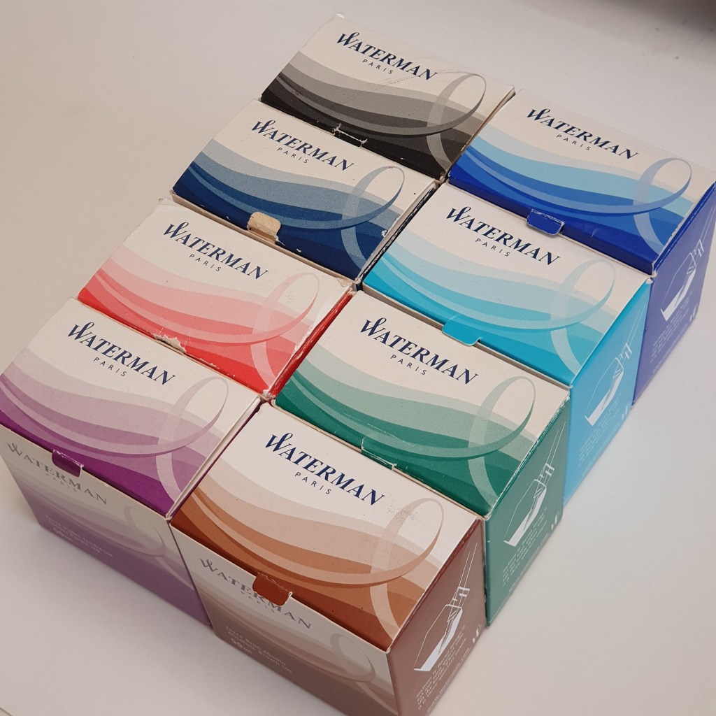
I created a spreadsheet, with columns for the Brand, the Colour or name, and finally, a simple name for the group which that colour falls into (for example Graf von Faber-Castell Cobalt Blue, Waterman Serenity Blue and KWZ Azure number 4 all come under “Blue”).
It was interesting (to me at least) to see them sorted by brands too and which were the most represented brands in my stash. It turns out to be Montblanc with nine bottles, closely followed by Waterman with eight and then Pelikan Edelstein with five (mostly gleaned from the annual Pelikan Hub events).
These should cover most eventualities for a normal person.
My final tally came to 65 bottles. As I was expecting it to be around one hundred I was pleasantly surprised. So I have enough ink for 65 years and not 100! Phew!
By colour group, it came as no surprise to me that I had 16 bottles of blue ink plus another 11 of blue black, almost enough to form a Democrat government. Next were 8 browns, 7 blacks and 7 greens, 6 reds, 3 pinks (What?!) 2 Burgundies, 2 green-blacks, and finally 1 each of Magenta, Purple and Orange.
What lessons can I learn from this?
I need no more ink for a while;
It is good to know what you have;
I have been buying ink faster than I have been using it.
I have not included a stash of ink cartridges in this count. Nor have I included a half dozen or so ink samples which are not in original bottles.
It is satisfying to finish a bottle ink. Last week I came to the end of a very enjoyable bottle of Pilot Iroshizuku Shin-kai blue black which I had been given by a friend. Once it got down to the last 5ml or so, I decanted it to my Pineider Travelling Inkwell, so that I could go on filling my Diplomat Excellence easily, without wasting a drop.
For anyone in a similar boat who has put off counting, I recommend it. It might not be as bad as you think.
If I have any superpower among the fountain pen community, it is probably the ability to get just as excited about a good cheap pen, as I do about an expensive one. Sometimes more. I will have to think of a name for that: something other than Mr Stingy.
I have not bought many new pens this year. I am constantly tempted, as I read posts from fellow bloggers or surf online. Recently I admired a vintage Montblanc 220, cartridge converter fountain pen on ebay but stopped short of pulling the trigger. I already have a Montblanc 12, piston filler, which is similar.
To combat the temptation, one tool is to have a wish list and to add pens to the list and let them sit there for a while before buying. You can compare their merits. Another, (which may be a clue that you have too many pens) is to list your pens under different categories, to see how each category is represented. I listed mine under Steel nibs: (1) Fine or extra fine; (2) Medium; (3) Broad and (4) Stub and italic, and then the same four categories for Gold nibs, so eight groups. Then, when a new pen looms on the horizon, I compare it with what I already have in that category. This sometimes works.
The Jinhao 159.
As I look at my pen cups, with twenty currently inked pens, they range from a few pounds upwards to include several Montblancs and my Aurora 88 at the other end of the spectrum. In between, the list includes a couple of Diplomats, a Pilot Capless and Platinum Curidas and my Sailor Pro-Gear Slim with its music nib.
One of my most recent purchases was a Jinhao 159 at £8.99. This is a very large pen, heavy but wonderfully rounded, smooth and tactile. Unfortunately, towards the end of its first inking with a cheap black cartridge, it exhibited irregular flow issues going from very wet, almost gusher, to very dry and even blobbing a couple of times.
Jinhao 159
I could have picked up a Montblanc or the Aurora at this point and carried on writing. However, I found that I could not settle whilst the Jinhao was struggling. A bit like the shepherd in the parable of the lost sheep I could not rest until the lost sheep was safely back in the pen (or pen cup). I extracted the nib and feed on the Jinhao which are friction fit and can be pulled out quite easily. I gave them both a good wash and then carefully pushed them in again, and re-inked the pen this time with a branded cartridge of Kaweco royal blue. All appeared well but I was looking forward to an opportunity to write for a few pages of A4 to check that the flow problems were fixed. Yesterday, when writing a letter, it was the Jinhao that I picked up first. I am happy to report that it now writes beautifully.
The friction fit nib and feed of the Jinhao 159.
Lamy Accent.
This weekend I remembered my Lamy Accent which does not see a lot of use as the nib was a bit on the dry side. I have the palladium finish version with a collar of Keralia wood, grey with a black grain. I remembered my brass shims and set about removing the Z50 nib with a piece of Sellotape, then flossing the nib with a couple of different grades of brass shim, before putting it back, checking the alignment of tines and picking a cartridge of Lamy Petrol, a luxurious dark teal from a special edition Safari a few years ago. And this too wrote beautifully – smooth and easy with ideal flow. I am glad that I had kept the pen. I also wrote a few pages with this too, in my letter writing session.
Lamy Accent, Keralia wood and palladium finish.
Wing Sung 699.
This is another pen that I thought to tweak with the brass shims. This is a fun pen, a very passable homage to the revered Pilot Custom 823 vac filler, with similar dimensions and filling system but a steel nib. The nib and feed are friction fit and with a bit of flossing and examining under the loupe, I think I managed to get it writing slightly wetter, whilst still retaining the smoothness of the nib. I filled it with Waterman Serenity blue, a favourite of mine and it is writing nicely.
Wing Sung 699, with nib and feed disassembled.
These antics and occasional triumphs do not quite make up for the heady thrill of hitting the “Add to basket” button and waiting for the delivery, but they avoid the risk of the Monday morning guilt and “buyer’s remorse” blues.
I realise as I write this, that my humble news may get lost in the noise surrounding more significant events – a certain election in the USA and the start of a second lockdown here in the UK. However, believe it or not, today marks the fourth anniversary of this blog.
Four years ago today I was a complete newbie at WordPress, but one grey November afternoon I took my first tentative steps to set up a blog. I was not familiar at all with the process. In the field for the title of the blog, I typed “Fountain pen blog” as a working title while I got up and running but then this became live. I have not thought of a better one.
This week, my WordPress statistics showed my total number of views as having just tripped past 100,000, which is similar to the excitement of watching the odometer reach a milestone number on your car. I know that there are many far more successful bloggers whose figures dwarf mine, but nevertheless it represents a level of publicity that I would not have dreamed of four years ago. What I also find staggering is how the viewings so far this year, come from over 130 countries.
This post will be my 150th, so I have been averaging a modest but fairly steady 37 or so posts a year, not quite one every week.
I must say, it has been a thoroughly enjoyable experience. I love the opportunity to write about things which I am interested in. To have the blog as a creative outlet is a wonderful thing as well as a privilege. Also, right from my first posts, I felt like a writer, a creator of content on the internet as well as a consumer of it.
Through the blog, I have met countless interesting people, some who have become friends here and abroad and many with whom I enjoy interacting with comments and likes. With the constraints of a full time job, it is hard to think of other realistic ways in which I could have increased my circle of friends to such an extent in this time. I have also expanded my knowledge of fountain pens and inks enormously. Someone should give out honorary degrees for this.
I am hugely grateful to those who encouraged me in my early days of the blog, those who commented and followed the blog from the start, such as Laura of Fountain Pen Follies whose own blog was one of my favourites and which set the standard for content, photography and good humour.
In my very first post, I included a gratuitous photo of the nib of my Diplomat Esteem. Funnily enough it is another Diplomat, the Excellence A Plus, that I am now using daily and which is “the one to beat” for me at the moment, as I survey my crowded pen cups. It is inked with Pilot Iroshizuku Shin-kai, a well behaved blue black. I was given a bottle of this and, just this week, used up the very last 1ml of ink, which you can do if you use a Pineider travelling ink well to fill your pen.
My current favourite, the Diplomat Excellence A Plus.
I have just renewed my subscription to WordPress for another year. With all the goings on in the world, it continues to be a source of relaxation and enjoyment for me and I am delighted that so many are still reading. Thanks and stay safe everyone!