Early thoughts on the Aurora Duo Cart fountain pen.

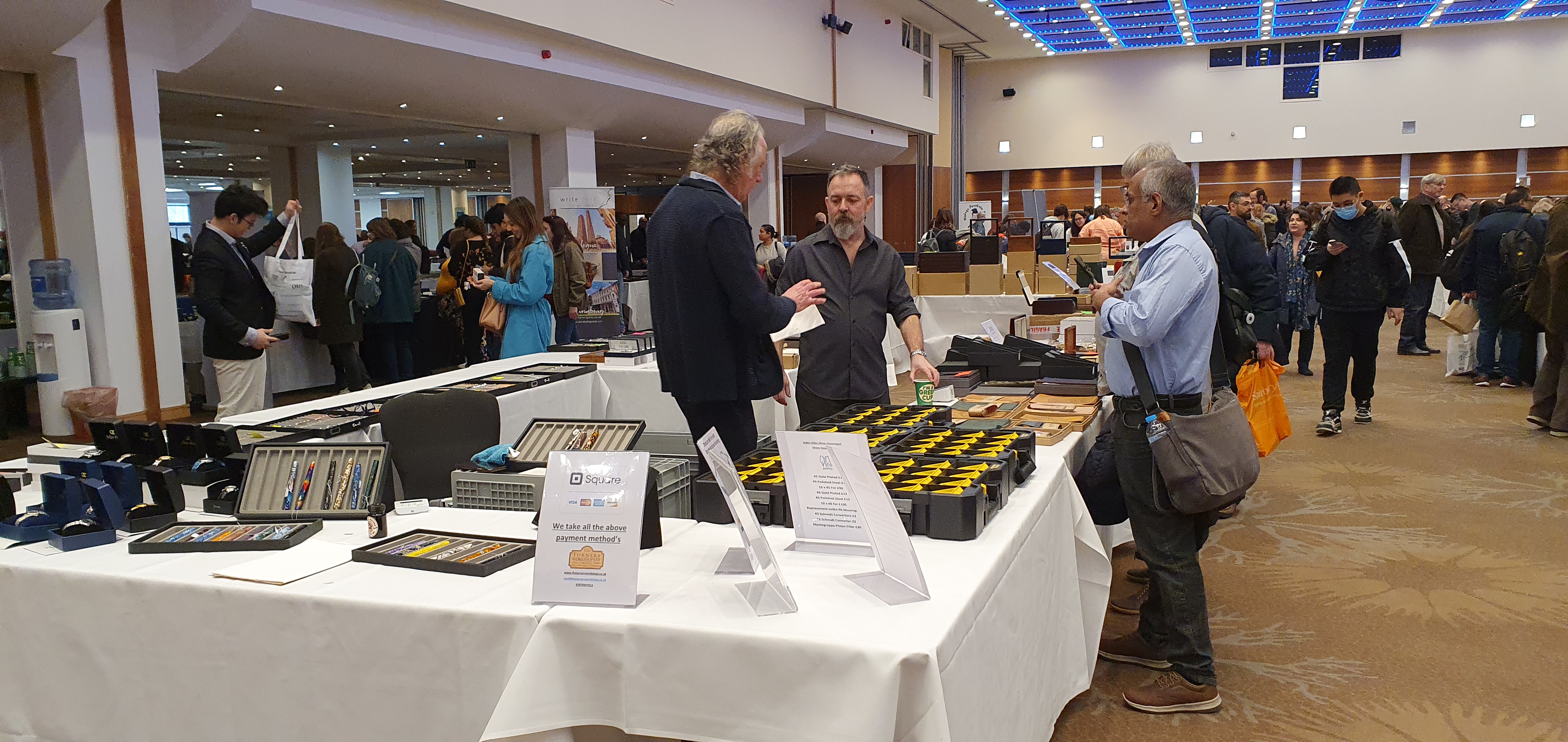
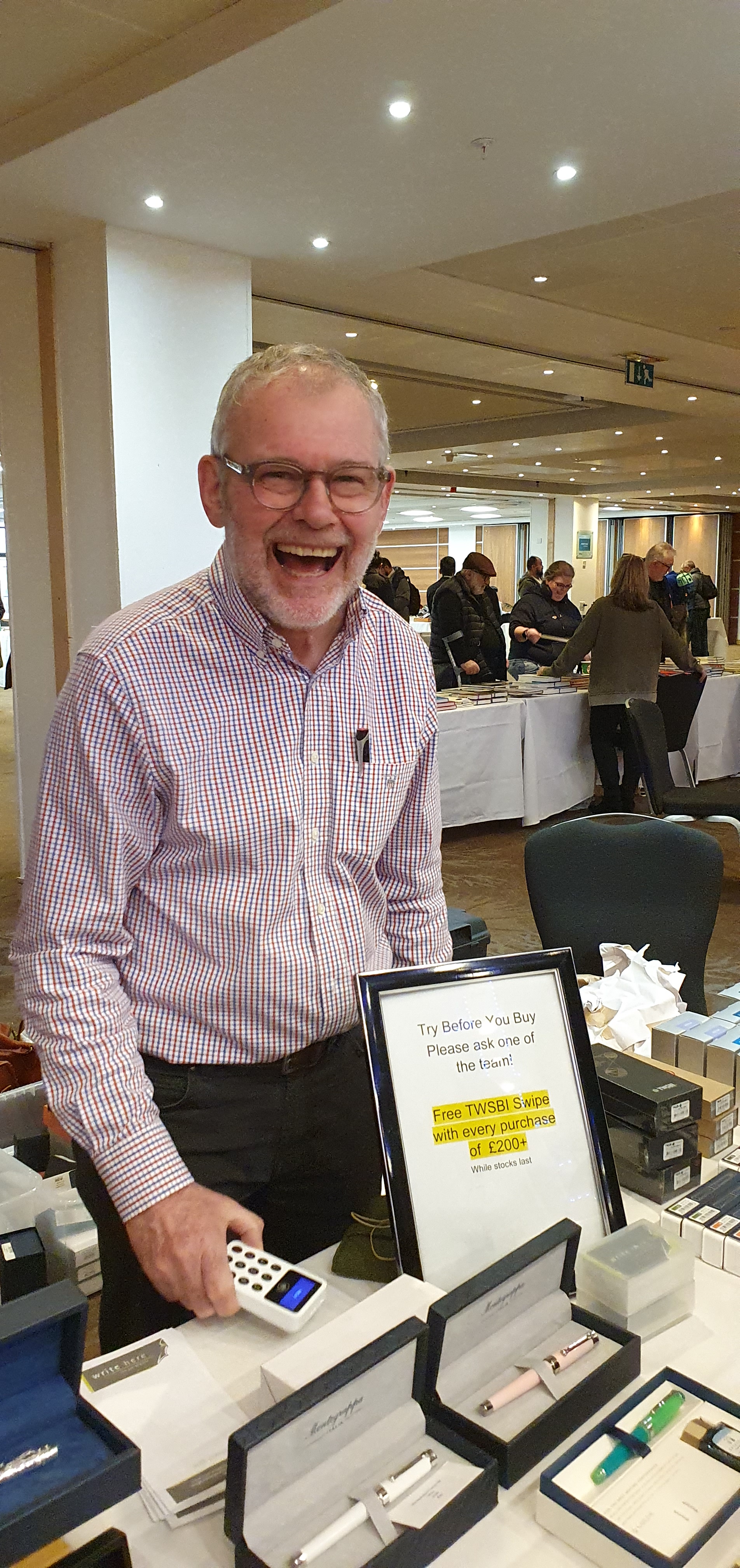
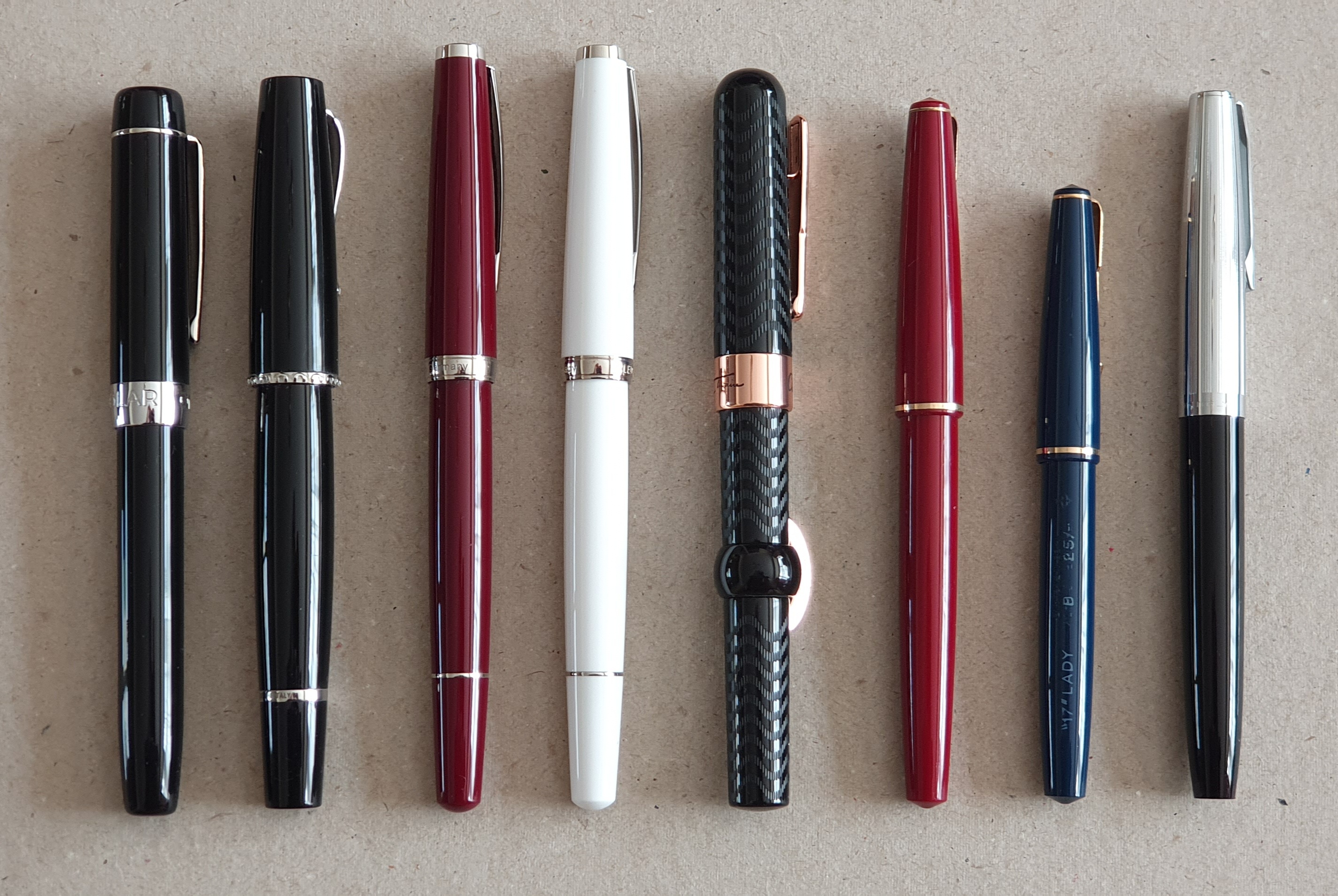
For the past three weeks, I have been getting acquainted with the pens I bought at the London Pen Show, some old and some new. Coming home with seven pens for myself (the eighth was to be a gift), I have enjoyed inking the new arrivals and trying them all out.

One of the these was the Aurora Duo Cart. I had been interested in this model for a few years since first learning of it, possibly through the favourable review by Anthony on UK FountainPens in 2019. More information can be found on another positive review also in 2019 by The Gentleman Stationer.

I am a late comer to this pen. I had pondered buying one online a few times, but it was spotting one for sale on Kirit Dal’s tables at the recent pen show, one of his test samples being sold off at half price, that finally made me buy.

Aurora Duo Cart fountain pen.

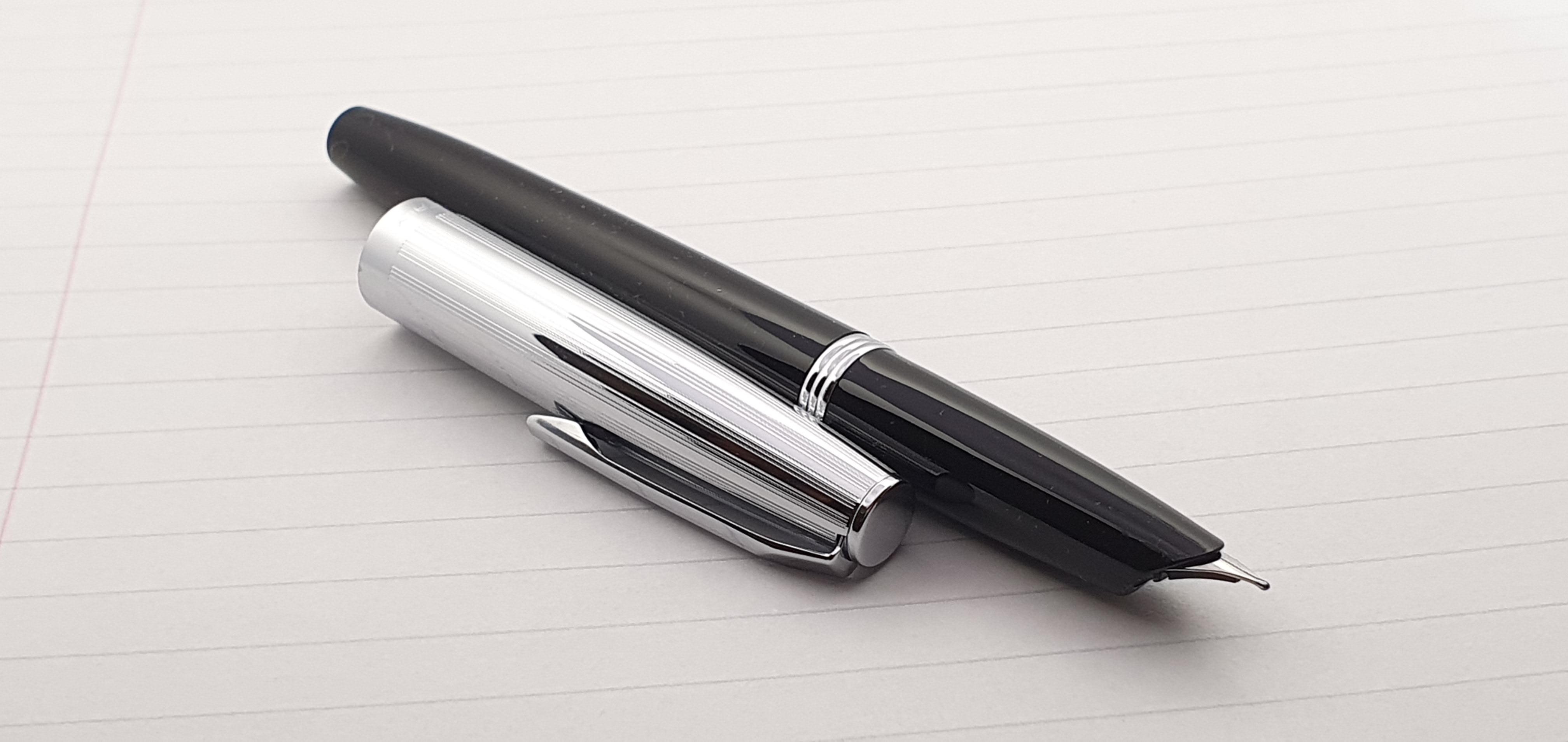
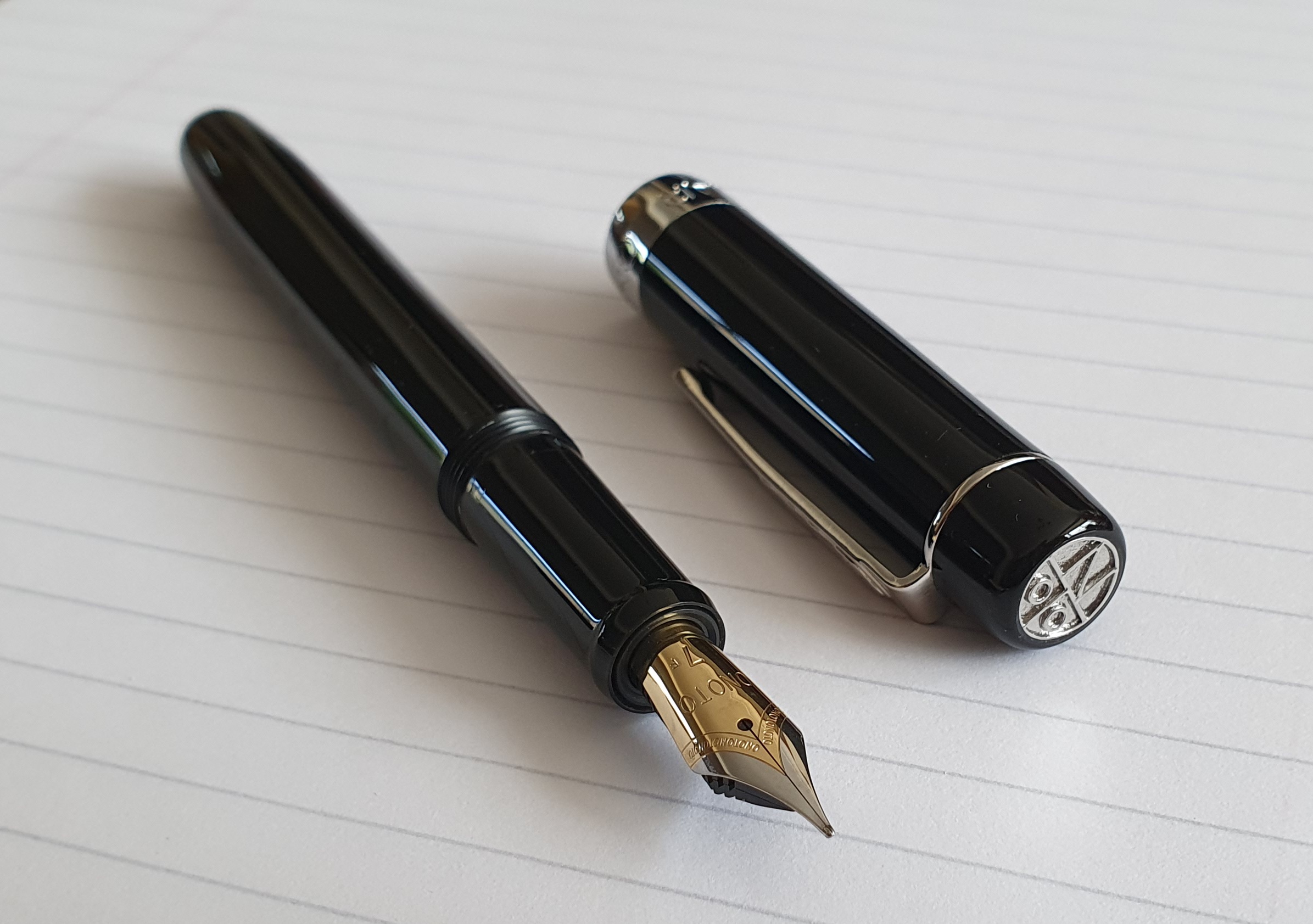
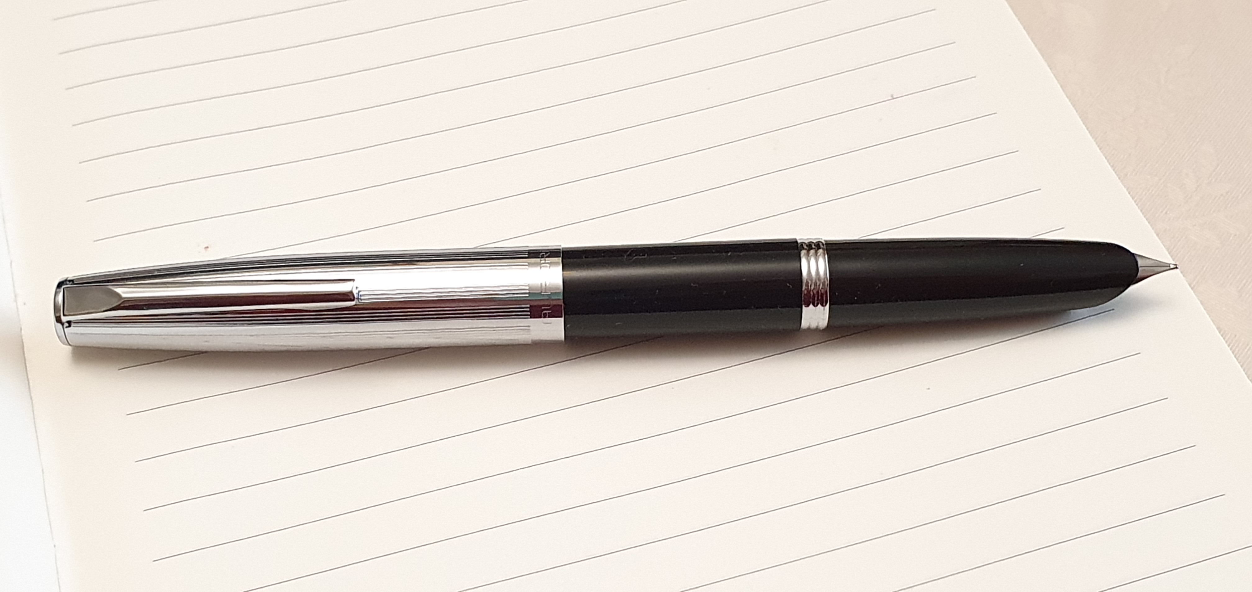
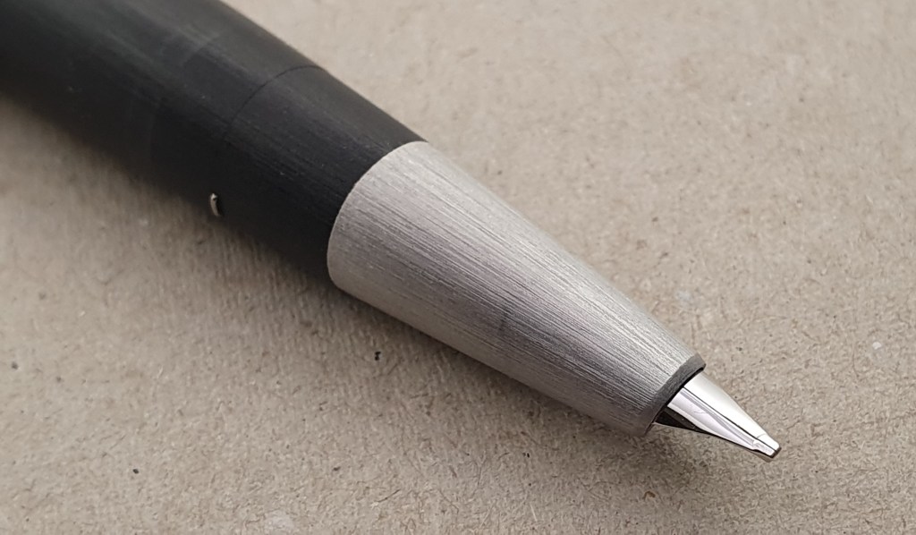
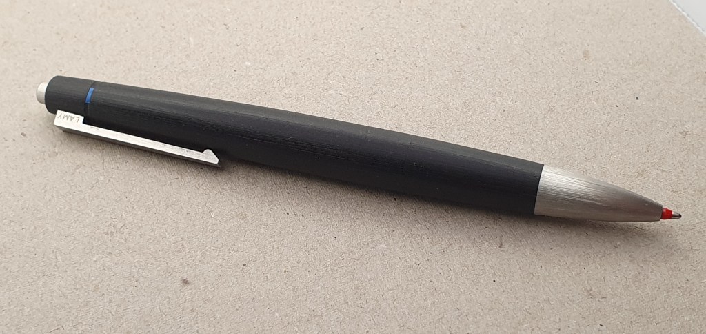
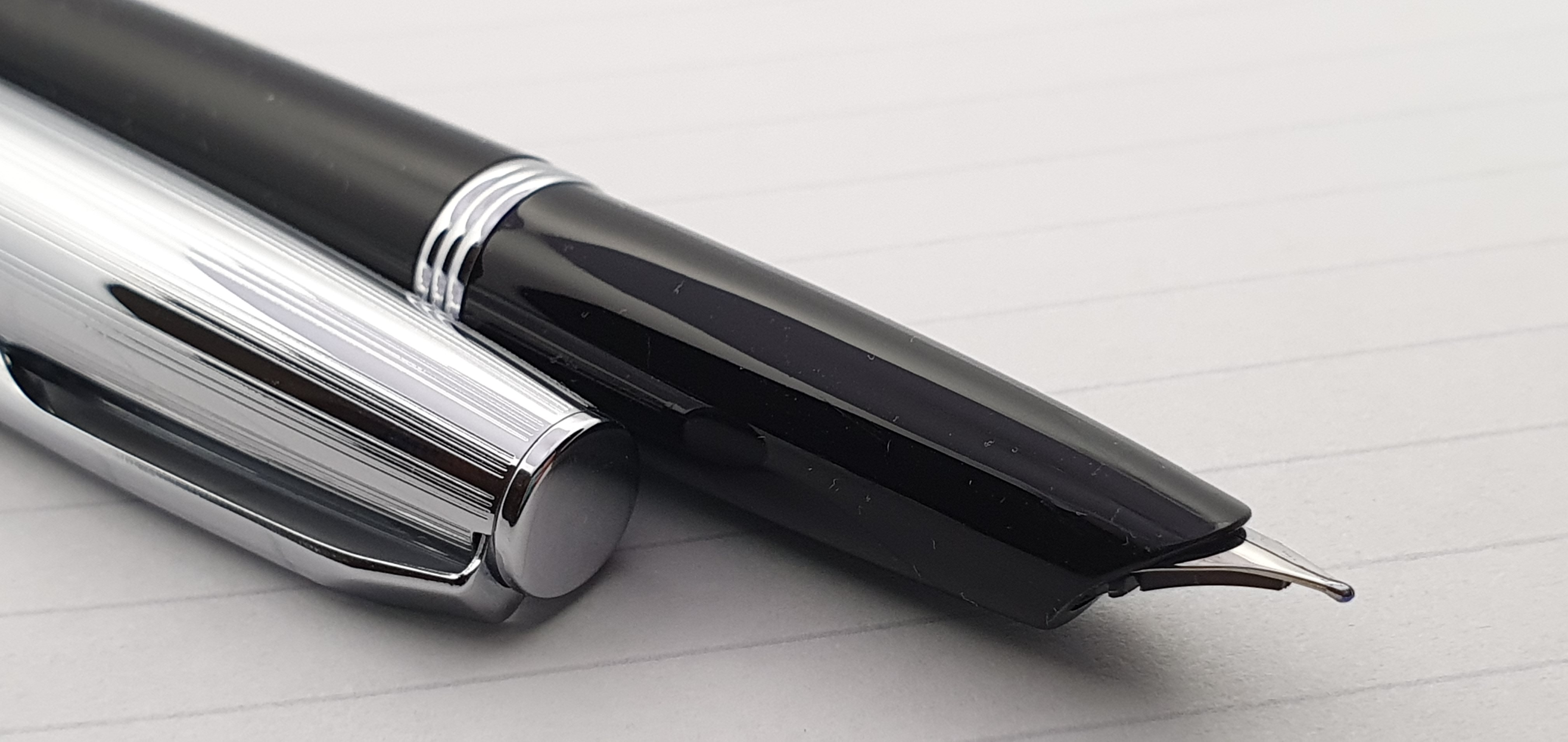
This is a cartridge-converter pen, in black resin with a shiny metal cap and a distinctive hooded steel nib. It was introduced a few years ago and is part of Aurora’s current range but has its origins in the Aurora 88 designed in 1947 by Marcello Nizzoli. I do not have such a pen to compare but have read that it was 145mm long when uncapped, had an 18k gold nib and was a plunger filler with some form of ink window. It was therefore longer than the modern Duo Cart but the subtle contours of the grip section and the hooded nib look very similar.

Hooded nib.

According to Aurora’s web site, the Duo Cart collection was inspired by the 1950’s and reinterprets the style of that period, with its tapered shape typical of those years. I understand that the name Duo Cart was taken from another vintage Aurora model, which carried two ink cartridges. The current Duo Cart is sold at 165 euros with the silver coloured nib and cap, or 190 euros for the version with a gold coloured nib and cap.

An eye-catching flat base with metal disc.

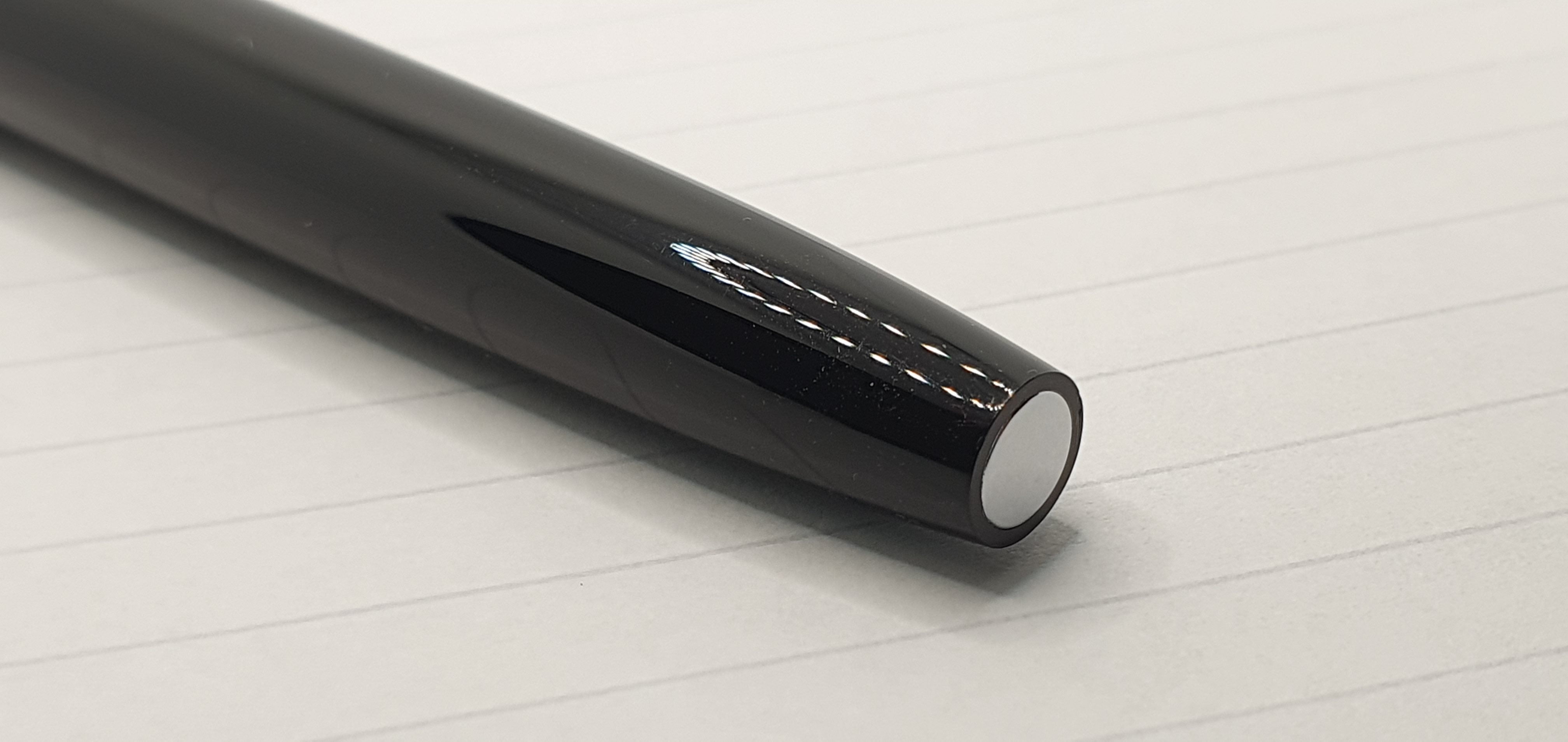
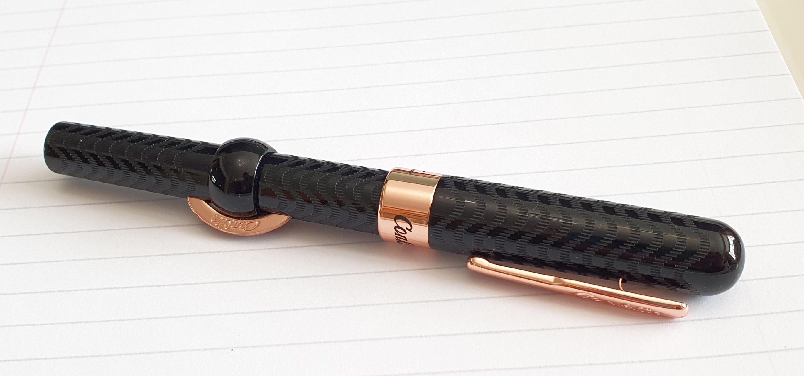
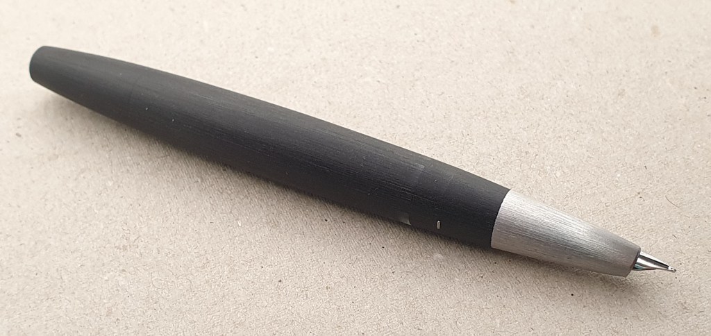
For me, the beauty of the Duo Cart lies in its profile, the gentle tapering of the section towards the hooded nib, the curvature of the hood itself with its striking parabola of resin, partly covering the nib and then, viewed from the side, the curved cutaway and the curved plastic feed. The tapering is matched at the opposite end in a truncated bullet-shape barrel with a shiny metal disc inset at the base. The pen looks and feels good in the hand and looks good on a table.

Attractive curves.

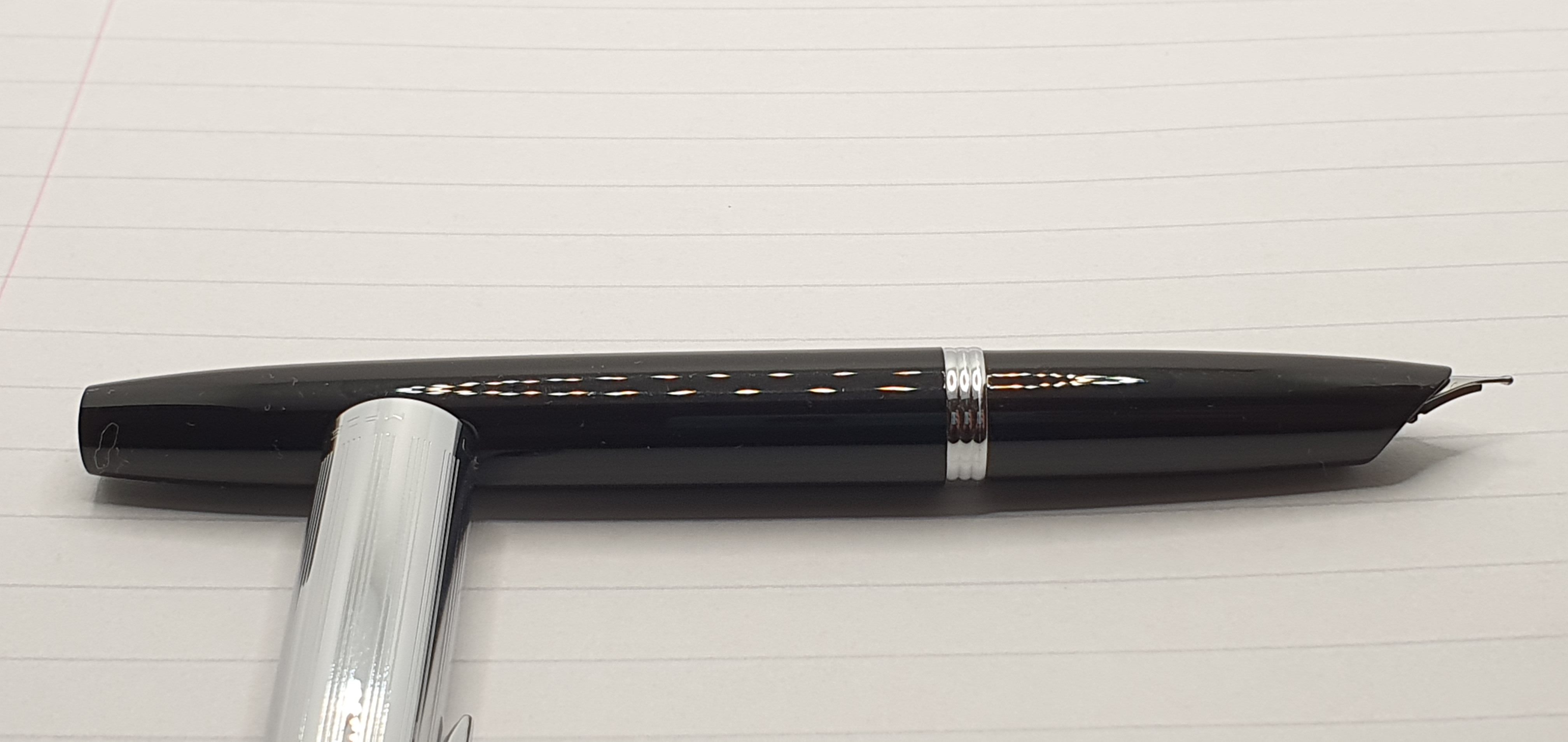
The metal cap has a flat top, a straight, guilloche design, and a springy pocket clip. The cap bears the name Aurora and the words “Made in Italy” in capital letters in a style also redolent of the 1950’s.

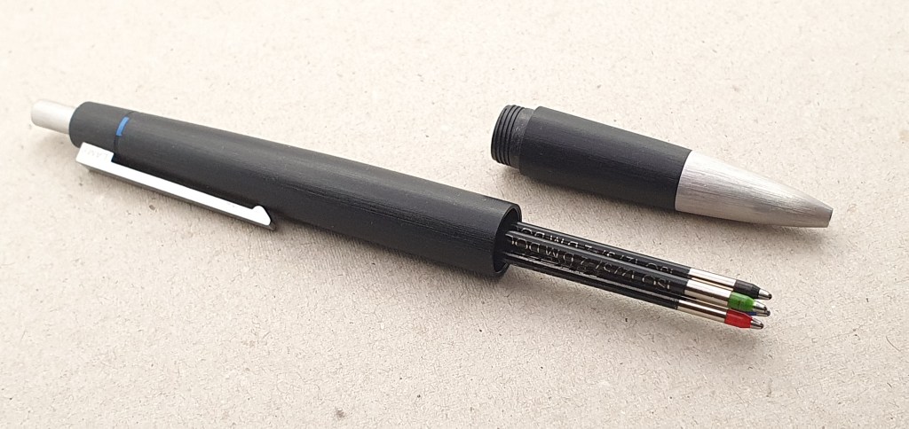
The cap is friction fit but fits very snuggly and securely, and makes a little pop as it is removed. As the cap material is so thin, the cap and barrel are almost flush when the the pen is capped.

The nib.

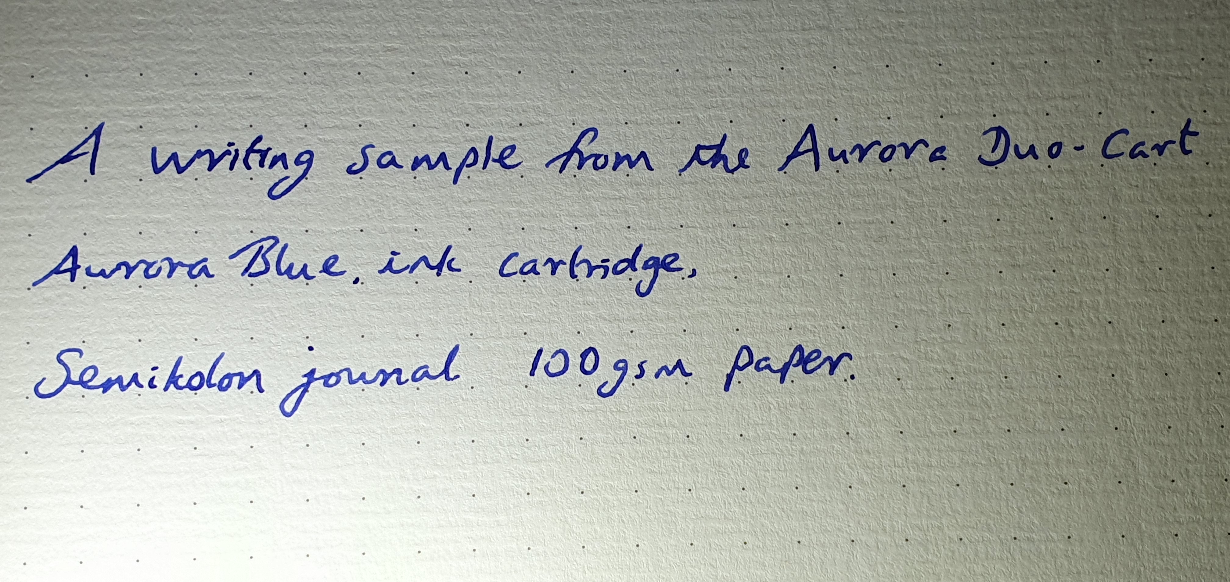
The steel nib has no visible markings but is a medium. The tipping, when viewed head on, is rounded making for a rather small sweet spot and a line that is on the fine side for a medium. It feels firm and this, together with the absence of a flattened (or stubby) surface for contact with the paper, means that there is little line variation between down strokes and cross strokes. Mine was set up well but I also flossed and smoothed the nib just a little, to try to improve ink flow and lubrication.

Filling.

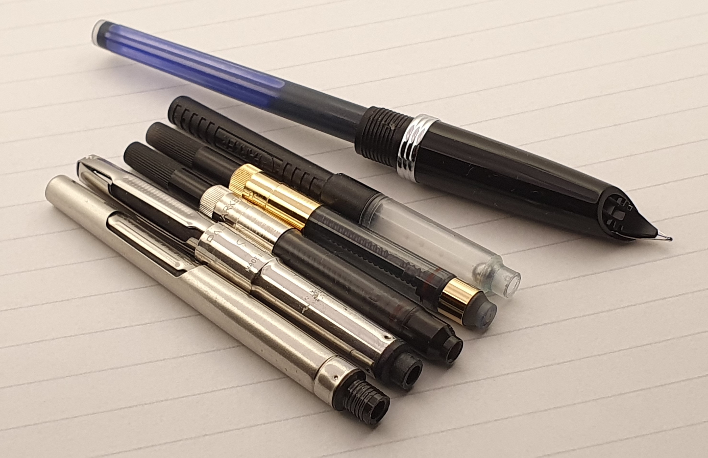
The barrel unscrews on plastic threads. The barrel is of resin but inside the barrel, a brass liner can be seen. The pen takes Aurora’s proprietary cartridges. These can be rather difficult to come by in the UK. My pen, having been a rep’s sample, came without box, papers or any cartridge or converter. I did have some Aurora cartridges at home, which had come with the purchase of an Aurora Talentum, so I inserted one of these. I could syringe-fill these until I find some new ones. However, the good news is that the Aurora cartridge fitting is compatible with Parker Quink cartridges. This means that Parker converters may also be used although this also depends on their girth. I have a selection of Parker converters gathered over the years. One of the squeeze bar models did not fit. Although the coupling was compatible, the barrel would not go over the wide girth of the converter.

A selection of Parker converters. The second on the left was too wide for the barrel.

Size and weight.

The Duo Cart is a smallish pen, at around 134mm long when capped. Uncapped it is just 119mm long. With cap posted the length is 140mm, but the cap does not feel very secure. I have been cautious of pushing the cap on to the barrel too hard. However I have quickly got into the habit of using the pen unposted. It weighs about 25g, or about 14g uncapped and 11g for the cap alone.

Concluding thoughts.

I am very taken by the vintage styling of the pen, with its modern materials. I enjoy holding and writing with it. It works best in my lefty-underwriter style. I am also glad to be able to use it with Parker cartridges or converters. I would like the pen even more if I had better handwriting and a more conventional writing style. As a person who is predominantly a lefty over-writer, I have found in recent years that oblique nibs are a benefit for me. It is not the most forgiving of pens to use as the nib has a narrow sweet-spot. I think this will improve with use.

That said, I am glad to have bought the Duo Cart. Rather like the classic Citroen DS, it is refreshingly different.

Some lefty overwriting with the Aurora Duo Cart.

Edit: 26 March 2023: For an in-depth account of the vintage Aurora 88 family, please see the post on Matspens Vintage Aurora 88 Family Ultra Review.

London Spring Pen Show, 2023: my haul.

Last Sunday found me at the Novotel, Hammersmith, for the twice-yearly London pen show. This time I went alone, my wife having changed her mind about attending, but sending me off with the cheery instruction “Don’t go mad.”

As always, I had a great day. The atmosphere was relaxed and enjoyable in the bright and spacious halls. The hotel’s bar/restaurant area is on hand for those wishing to take a break although I prefer to make the most of the time browsing the tables.

John Twiss and Vincent Coates’ (The Turners Workshop) table.

I soon found several friends and familiar faces such as Dave, and Gary from the pen club and Jon of Pensharing who attended this time as a visitor, without his Pensharing table.

My first task was to buy another Onoto Scholar so I made a bee-line for the Onoto table. These were again offered at an attractive show discount. Buying one requires decisions as to pen colour, whether gold or silver colour trim, nib grade and lastly the colour for the included leather single pen pouch. Without too much deliberation, I went with Black, Silver, Fine, Black. These were put in a smart Onoto box with an additional pen sleeve, custodian’s welcome card and a polishing cloth, making a wonderful, presentable package, which is what this will be.

The Onoto Scholar.

Next I visited John Hall’s “Write Here” table. His newsletter the previous day had teased of some attractive show offers, including on Montegrappa and Cleo Skribent and I was keen to see what these were. To my delight, John had a Montegrappa “Monte Grappa”. Longer term readers may recall that I have some history with this model having bought one in Harrods but promptly returned it in a bout of buyer’s remorse. I had never quite got over this “break-up” and had often looked longingly for online offers to own one once again, but without success. Imagine my delight then, when John showed me one in a smart glossy black, with 14k gold medium nib at an irresistible less-than-half-price discount. I bought it in a flash.

A Monte Grappa is back in my life!

I asked John whether he had any Cleo Skribent pens with him. He directed me to the other end of his tables. I do already have two models from this lesser known German brand, which I liked very much save for the fact that they were piston fillers and that the pistons had grown stiff and could not be re-greased. Over the years I had tried in vain to introduce some silicone grease into the reservoir, as you can with a Lamy 2000 using a tooth pick. However the barrel of the Cleo Skribent Classic, piston filler does not unscrew and the piston cannot be removed from the other end either, as far as I know. This is a pity as it is a comfortable and elegant pen and the nibs are very pleasant (and are friction fit, easily removable).

I had long been interested in getting another Classic, but cartridge-converter version. These look just the same as the piston fillers but without an ink window. My preference was for the Bordeaux red, to complement my two black models.

A Cleo Skribent Classic, Palladium trim, with 14k gold nib. Cartridge-converter fill.

Again, my luck was in! John had a selection of Cleo Skribent Classics, including one Bordeaux red cartridge-converter model, fitted with a 14k broad nib. Perfect! (I already have a steel fine and a gold medium). This was for sale with over one third off the full price. Yes please! John had a number of Classics in white and with stainless steel nibs also greatly discounted. I was unable to resist picking up one of these with a medium nib. I figured that I could later give it the gold nib from my old black piston filler model.

Always a pleasure to deal with John Hall.

One of my objectives for this pen show was to find another Parker 17 Lady. I had bought one at a previous show, in green but had gone a little too cheap and picked it from the “everything £10.00” box. Although its nib was soft and smooth, the body of the pen had a number of cracks to the cap, barrel and section making it unusable.

This time, browsing through the trays and tubs of vintage pens at various price points, I spotted another Parker 17 Lady, this time in blue, in a box at £20.00. Examining this, I could not believe my eyes as it appeared to be new, with the model and nib description still clearly visible stamped in white ink on the barrel. Seeing no cracks this time, I bought this little beauty.

Parker 17 Lady
It appears that this pen has been largely untouched in 50 plus years.

I also spotted a larger Parker in dark red with hooded nib, also a “Parker 17” but not a Lady this time. It appeared to have an oblique broad nib. Unfortunately I could see a crack to the shell immediately over the nib, which was stained with old ink. I could foresee this one leaking, which was a shame as I was very tempted by the nib. However, I was offered it for £30.00 instead of £40.00 and at this price I thought it well worth taking a chance.

Parker 17.

Another bargain of the day, was a Conklin Mark Twain Crescent filler, in black chase finish, with rose gold colour plating on the clip, cap ring and crescent filler. The nib was a stealthy black coated medium, rather at odds with the rose gold bling but handsome none the less. The black chasing was much like the original ebonite model produced in 1903 as used by Mark Twain. These are good fun and I have had a couple of them in the past. The nib housings are also interchangeable with the Jinhao X450.

A Conklin Mark Twain Crescent Filler, black and rose gold.

My final fountain purchase was made at Kirit Dal’s Aurora table. He had trays of his sample pens, now generously discounted to around half normal price. This was all the encouragement I needed to take another look at the Aurora Duo-Cart, a steel nib pen with an unusual semi-hooded nib and a metal cap. It is a modern pen but looks very similar in style to the Aurora 88 designed in 1947 by Marcello Nizzoli – an Italian architect, designer and artist who was the chief designer for Olivetti for many years, designing their portable typewriters in 1950. I had been rather intrigued by the Duo-Cart but had not tried one before and seeing one at half price was too good to miss.

Aurora Duo-Cart.

I had a very happy day, seeing many friends, browsing the tables and making some purchases. If not exactly a frenzy, I was certainly on a roll. Several times, I lost count of how many pens I had bought and had to stand still and peer into my tote bag and count the boxes, which I had packed upright so that I could more easily count the ends.

Aside from the pen-purchases, I also picked up another A5 Semikolon journal, a rather luxurious leather 3-pen case at Vince Coates’ table, and a large book entitled Fountain Pens History and Design, full of interesting information and photographs published in 1998.

My non-fountain pen purchases

Epilogue.

After all these new arrivals, it was fun to examine them all at home. Being too many to play with in one evening, I have been inspecting them all week! Oddly enough, it was the least expensive of these, the Parker 17 Lady, which I was the most eager to try out. A tiny pen, it is dainty and elegant when posted. The aerometric filler looked surprisingly clean for a pen which could be around 50 years old. I dipped the pen and tried to write: nothing! I dipped again: again nothing. I then filled the pen with Waterman Serenity blue and although I got a good fill with about five presses of the bar, still the nib refused to write. I wondered whether this was why the pen had remained in such remarkably new condition. I put it aside whilst I played with some of others.

A few days later, it occurred to me that the nib could be suffering from “baby’s bottom” and might benefit from a little smoothing on the Micromesh pads. This I tried but again, although filled with ink, the pen would not write a word.

Next I tried tackling the tines, sliding a fine brass shim between the tines at the tip and then sliding it up and down until the nib’s grip on the brass could be felt to be weakening slightly. This time, the pen then began to write, and very smoothly at that. It was still necessary to go at a measured pace and not to write too fast. The Lady will not be rushed.

As for the larger red Parker 17, I flushed the nib and tried to clean the cracked area of dried ink. Then, rather impatiently and before even trying to fill the pen, I dropped superglue on the shell to allow it to run down through the split in the shell and hopefully bind up the crack and prevent leaks. I left it a few hours to harden. The pen does now write, with a lovely line as you would expect from a vintage oblique broad but is a bit of a slow starter.

The Montegrappa, predictably, feels lovely in the hand. The medium nib writes well with just a little softness. I filled it with Diamine Tavy, blue black. Whilst I try multiple inks in some pens, with this pairing I feel like I have got it right first time. However, I did have a slight scare on Friday night when I tried to write something and found the nib to be dry. I had written only around 4 – 5 pages since filling it. I worried that perhaps the piston on this mystery filler was at fault. But, it transpired that on filling the pen, I had then wound the piston down again emptying the ink silently back into the bottle, thinking I was filling it. A newbie error! I now know that you must turn Clockwise to fill the pen. It is easy to forget, when the piston knob does not rise or fall but stays in the same place.

The Conklin is fun to fill and to use. The Aurora Duo-Cart needed a little tine-easing and might benefit from a little more.

The cast of my pen show, prepare to take a bow.

In conclusion, I did rather blow my annual pen budget in a day, but arguably it makes sense to do this early on and so have the rest of the year to enjoy the pens. There was a theme to my purchases in that many were “classic”, vintagey designs and/or pens that I own or have owned before. I don’t think I went mad, as every purchase was eminently well reasoned and justifiable. And that is the case for the Defence.

My growing Lamy 2000 family.

My journey with the Lamy 2000 began in May 2014, with the purchase of the fountain pen, at Websters on a day trip to Brighton. In fact, I had wanted one for some time before this, since being shown one by a helpful sales lady at her pen shop in Hampstead, whilst purchasing my first Lamy Al-star. That must have been around 2012. I still remember wrestling with my conscience over whether to buy one from a shop, or from a well-known online source whose price was significantly lower. I chose Websters.

My first Lamy 2000. The original medium nib was exchanged for this stubby broad.

The story of my first Lamy 2000 has been told here before and in an update here. Several years after buying the fountain pen, I picked up the matching four colour multipen, also in Makrolon and brushed stainless steel. It features an ingenious colour selection system, in fact based upon gravity but which seemingly enables you to select one of the four colours just by looking at that colour on the indicator, before pushing the nock. I love this. It is a great party trick.

Lamy 2000 four colour multi-pen.
The innards.

My Lamy 2000 fountain pen was then joined by another, this time a gift from a pen friend in Australia. He had sent one with an oblique broad nib, which sounds right up my street but which in practice I struggled with. However, the good people at Lamy in Heidelberg very kindly allowed me to send the pen to them for a nib swap and this time I opted for a Fine nib, which is lovely. That tale was told here. The pen is currently inked, with Montblanc Royal Blue, a good pairing.

Lamy 2000 back from Heidelberg with a fine nib (in place of the oblique broad)

I had no burning desire for any more Lamy 2000s. However, a few weeks ago whilst taking a walk in Hampstead, I spotted that Rymans had some display pens on sale. A Lamy 2000 ballpoint pen caught my eye, priced at £20.00. (Rymans do occasionally have some great discounts: in the past I have bought Diplomat Traveller fountain pens here for £5.00).

Trying hard to fight temptation, I passed up this opportunity to buy the Lamy 2000 ballpoint, even though it was about one third of the usual price. I walked back to my office, feeling self-righteous but also disappointed and Lamyless.

Over the following couple of weeks, I kept remembering the Lamy 2000 and tried to convince myself that I did not want it, certainly did not need it, and that I should let it go. This strategy was not very effective. Occasionally I would see something that would remind me of the pen, such as an Instagram post by Phil @theinkscribe on 22 February 2023, thanking the Brew Hull cafe, Kingston upon Hull, for finding and looking after his Lamy 2000 ballpoint, which had got cleared up with a board game that he and some friends had been playing at the weekend. A lovely story with a happy ending.

Not long before this, a solicitor had visited my office to sign a deed and produced his Lamy 2000 ballpoint with a green refill for this task, which was an unusual sight and lifted my spirits.

Unable to put the Rymans pen out of my mind, I decided to pay another visit to the shop, “just to see whether it was still there.” I had an, admittedly feeble idea that seeing it again would enable me to tell myself that I did not need it.

And so one Friday lunchtime, I strode up to Hampstead village again. First I popped in to Waterstones book shop, to see whether they had the new book “Tomorrow perhaps the future” written by my Goddaughter Sarah Watling. I very proudly attended her book launch evening earlier in February at Hatchards in Piccadilly.

“Tomorrow perhaps the future” by Sarah Watling, on display in Waterstones, Hampstead.

Not only did Waterstones have the book, but it was in the middle of the window. And then, on entering, I was greeted by an entire table displaying the book. I could not have been more thrilled.

Buoyed up by this exciting discovery, I floated into Rymans and made my way to the pen display. Miraculously, the Lamy 2000 ballpoint, marked “Clearance, £20.00” was still there! I could not believe that no-one had bought it in more than two weeks. What is wrong with people?

With the last of my resolve evaporating, I asked to see the pen and waited while the display cabinet was unlocked. In celebratory mood, I said that I would like to buy it. I asked whether the refill was black or blue. The sales lady made a little scribble and said “Black – and it’s very smooth!”

But then a little drama ensued. She went in search of the accompanying box for the pen, which was surprisingly and frustratingly necessary in order scan the bar code and sell the item. Several minutes passed. Eventually she returned with a handful of Lamy boxes. As there was no indication of which, if any was for the Lamy 2000 ballpoint, she took them to her computer to scan the boxes, hoping that for one of them, an image of the ballpoint pen would appear on her screen. One by one she scanned the boxes. At one point she announced “Lamy Assent?” this being another of the pens in the clearance sale. “Lamy Accent, I think you’ll find”, I replied. “I love that you know this!” she answered. She continued scanning boxes but none seemed to be the right one.

Eventually she found a way out of the impasse and I proffered a twenty pound note. She handed me back £5.00 change. “No, it was £20.00” I said. “Not any more it isn’t” she replied. And so, for a mere £15.00 I was the proud owner of a Lamy 2000 ballpoint, albeit without a box AND the proud Godfather of a published author.

Lamy 2000 ballpoint. Fitted with a black, medium refill

It is not that I am a mean person but it is lovely when a bargain like this comes your way. The ballpoint pen and I started off on a great footing. I found the familiar Makrolon to be very pleasant to the touch. I very much enjoy having the pen on my desk at work and relish every opportunity to pick it up and use it.

Perhaps the moral of the tale here is that, even if you do not think you need a certain pen, perhaps you do. As one of my colleagues in the office later said, “It had your name on it.” And big thanks to Rymans of Hampstead for enabling.

A family of four.