Paperchase Inky Swirls Open Spine Notebook review

20170730_213702
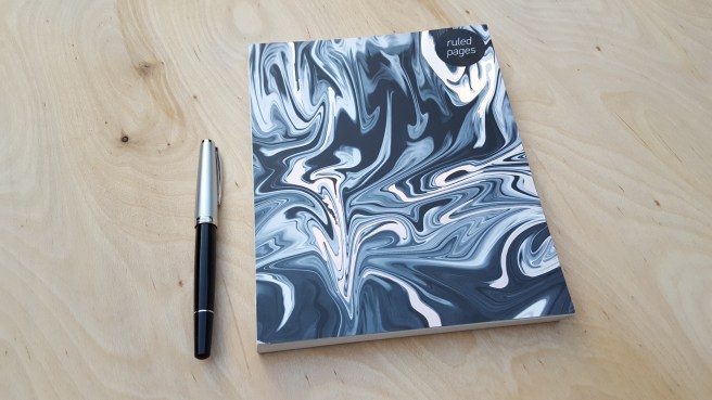
Paperchase, Inky Swirls Open Spine notebook, with Cleo Skribent Classic Metal, piston filler.

For the notebook enthusiast, Paperchase has a lot to offer. For those unfamiliar with the name, Paperchase is a chain of high street stationery shops here in the UK, selling pens, greeting cards, novelty gifts and stationery supplies as well as numerous styles of notebooks. The shops are bright and attractive although the displays of fountain pens in spot-lit glass-shelved cabinets, are very uniform from branch to branch. You will never see a fountain pen displayed at an angle of other than 90 or 180 degrees on the shelf and equidistant from its neighbour. Not that this a bad thing particularly. I enjoy browsing and shopping there. They also have a loyalty card offering various special offers and benefits.

On a recent visit, I noticed a new type of notebook. Available with a choice of cover design, (I chose the Inky Swirls), this measures 216mm x 172mm (8.5 inches x 6.8 inches). It contains 288 pages, of cream (not quite white) paper, with headings “SUBJECT” and “DATE” at the top of each page. Lines are ruled, in a reasonably wide format that I like, giving 22 rows per page (not including your header and footer area).

What sets this note book apart however, is that the pages are sewn AND the notebook does not have a covered spine! At first glance, it looks like a book from which the spine has come off. Instead, you look directly upon the neat row of batches of sewn pages.

20170730_213752
The unusual exposed binding of the open spine notebook

The colourful front and back cardboard covers are attached, with dark grey end papers. The notebook is nicely bound, but the absence of a spine looks a bit odd at first.

The great advantage though, is that the notebook will open and lay flat easily at any page. This is quite unusual.

20170730_214529
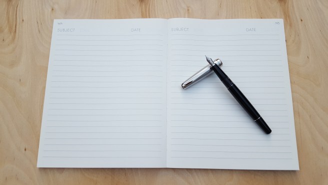
Notebook opens flat with ease.

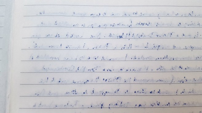
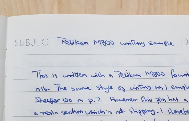
At home I paginated my notebook (surprisingly relaxing, thanks for asking) and then tried out a few different fountain pens on the last page to see how the paper behaved. I found it very smooth and pleasant to write on. However, the ink did bleed through the paper with most of the pen and ink combinations that I tried, to the extent that you might use only one side of each sheet, if you are fountain pen user. There were some combinations that fared better. My Cleo Skribent Classic with fine stainless steel nib (currently inked with Cross black) writes a very fine line and did not bleed through. Also My Pelikan M800, medium nib, with Graf von Faber-Castell Cobalt Blue did quite well at avoiding bleedthrough, (unless you let the nib linger too long in one spot). On the other hand, a very wet Sheaffer 100 with a Sheaffer Skrip blue cartridge, bled like a stuck pig.

20170730_214606
The back of a page, demonstrating bleedthrough from a Sheaffer 100 inked with Sheaffer Skrip blue cartridge.

In the UK we have a saying, that there is no such thing as bad weather, just bad clothes. This set me thinking that perhaps there may be no such thing as not fountain pen friendly; you just need to find the right friend.

For example, I have been reading a very cheap penguin paperback edition of William Wordsworth Selected Poems.  The yellowed, coarse paper is of the type that you would probably not even consider writing on with a fountain pen. Ironically, some of the most beautiful poetry in the English language, printed on some of the worst paper. However with a bit of trial and error I found that the ultra fine Cleo Skribent Classic with Cross black is also able to write on this without undue feathering, bleed or showthrough. It is satisfying to find combinations which cater to a paper’s strengths or weaknesses.

20170730_214544
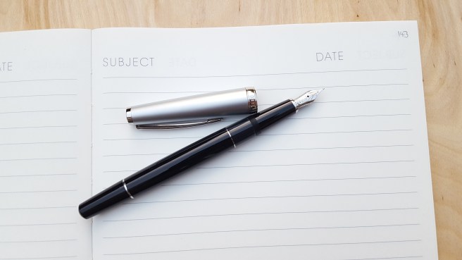
The Cleo Skribent Classic with stainless steel fine nib. There was no bleedthrough with Cross Black ink.  

I am fond of the cheap edition of Wordsworth’s poems. I don’t mind that the cover gets creased and dog-eared.  And I don’t need to feel too worried about scribbling in it. In a way, the Paperchase open spine notebook looks a little like a book that has been pre-loved and worn.  I rather like it.

20170730_214653
The Pelikan M800 likes this notebook. No bleedthrough, with Graf von Faber-Castell, Cobalt Blue.

Remembering Mr Chiu Fa Chan.


20170729_130617

Today marks the second anniversary since my father in law, Chiu Fa Chan passed away on 29 July 2015. He was in his 90th year.  He had been fit and active, but died after a short stay in hospital from complications following an operation.

As a young man, growing up in China, he went to sea, working on cargo ships and travelling the South China Seas. He rose to second officer. Later, in China he was to become a respected lecturer in navigation. He was still in touch with some of his former students from decades ago, now all elderly. He enjoyed a reunion with a group of them when he last visited China.

For the last twenty years of his life, he and his wife lived in London, not far from my wife and I.

He knew of my interest in fountain pens and I would sometimes show him my new acquisitions. He once told me the story, that with his very first month’s pay at sea, when going ashore at Singapore, he had bought himself a new Parker 51. Unfortunately the story had a sad ending as it went missing from his cabin not long afterwards. I don’t think he bought another one.

Last year at the London Pen Show, I bought a Parker 51 Aerometric in cedar blue which bears the markings Made in USA, 9, which I think dates from 1949 and so would be a similar age to dad’s pen if we still had it.

People often remember what they bought with their first earnings. In my case, after some temping work in my college holidays in the late 1970’s , I bought a portable typewriter and a book Teach Yourself Typewriting and laboriously set about learning to touch-type, (up to a point), little knowing that I would be spending such large chunks of my working and leisure hours at a keyboard in the years to come.

This morning my wife, her mum and I visited the peaceful gardens of the Golders Green Crematorium, North West London to see dad’s memorial stone and leave some colourful flowers, which my wife had brought from his own garden.


Kaweco Dia 2 fountain pen review.

I know well the pleasure of receiving a new fountain pen. There is an element of risk as sometimes the pen might not live up to expectations and the initial excitement can turn to disappointment.

The Kaweco Dia 2 had been on my wish list for over a year. Eventually I succumbed. This was in part triggered by my recent experience of the new Kaweco Perkeo. I fully appreciate that the Perkeo is an inexpensive, entry level pen. I do not like to be negative about it and would feel awful if anything I wrote caused anyone who had just received a Perkeo, to like it any the less.

I liked the nib of the Perkeo and it certainly has a place as a robust, reliable, decent quality writing tool. But I came to realise, as I looked again at favourable reviews of the Kaweco Dia 2, that the various aspects of the Perkeo that I liked less were all remedied in the Dia 2 and that perhaps this was the pen for me.

I did not have the opportunity of handling a Dia 2 before buying, as I do not know anyone nearby who owns one and they are not found in the shops here. Paperchase do sell Kawecos but these seem to be limited to the Sport models including some aluminium and brass versions, (and now the Perkeo too).

I ordered my Dia 2 from Cult Pens and enjoyed their excellent service as usual. I received the pen on a Friday evening, with the happy prospect of a weekend ahead to get acquainted with it.

To get to the point, the pen is simply gorgeous. I have seldom been so thrilled with a new pen (and I have bought a few).

Admittedly, a fountain pen, like a wristwatch, is a personal thing and what appeals to one person does not appeal to everyone. But as someone who appreciates nice quality design, features and materials in a fountain pen, I found lots of detail to enjoy in the Dia 2 and very little to dislike. It seems to embody an excellent compromise, of being not too heavy, not too light, not too large, not too small, not too cheap and (dare I say) not 2 dia.

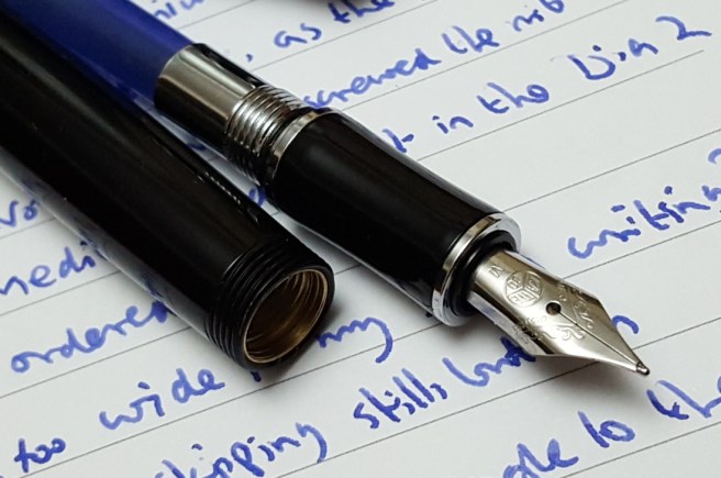
The pen is based on a classic design from the 1930’s. What immediately impresses, is the glossy black finish, with contrasting chrome coloured fittings, the classic subtle beauty of the shape, the gentle curves to the cap and barrel and the section where the pen rests comfortably on your finger as you write. Also the elegant knurled end caps and metal Kaweco badge at each end.

My pen arrived in a smallish black, hinged box with a push-button catch and a cushioned white satin interior, like a jewellery case. This was in a cardboard sleeve, with the Kaweco logo and slogan “License to write, Germany since 1883”. However I have heard the pen is sometimes packaged in the Kaweco tin instead (which I am familiar with, from purchasing a Kaweco Al-Sport).
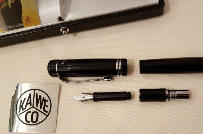
20170723_232118

The Dia 2 is a black, cartridge-converter fountain pen, taking standard international cartridges with a stainless steel nib. There is a 14k gold nib unit available. There is an option of the chrome coloured fittings, or gold coloured at a little extra cost. In the hand, the pen feels reassuringly solid, beautifully balanced and particularly tactile. It wants to be picked up.

The pen measures (approximately) 133mm capped, 124mm open (not counting the raised badge at the end of the barrel) and 158mm posted. I weighed it at 28g (including two cartridges on board) of which around 18g is the pen unposted and 10g is the cap.

For me, this puts the length as being adequate to use unposted, although it is a little shorter unposted than the generous 130mm of a Lamy Safari or AL-Star, or the 135mm of my Cleo Skribent Classic. However, I do prefer to use the Dia 2 posted. It still feels nicely balanced this way, is not too long or back heavy and has the advantage that you can put it down on a desk without it rolling off.

The stainless steel nib is part of a unit, which unscrews from the section when you want to clean it or swap nibs (rather like a Pelikan). Spare nib and feed units are very affordable, and available from Cult Pens in EF, F, M, B and BB widths. Currently these are priced at £8.40 each except for the Extra Fine or Double Broad which are £10.49. There is also a 14k gold option for £99.00, (all widths) if you want extra luxury.
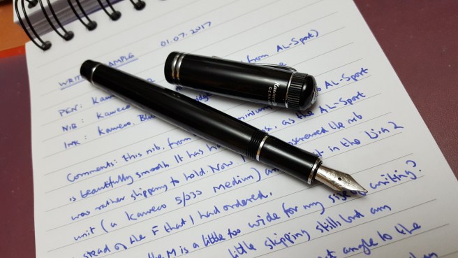
20170706_000336_001

I have been genuinely delighted with my Dia 2. I ordered mine with a Fine nib, in stainless steel. I tried this for a day or two but found mine a little skippy and not as effortless as it should be. Perhaps it just needed tweaking or running in but I was impatient. I then swapped this with the medium nib unit from my Kaweco Al-Sport, the shiny aluminium one, that looks stunning but which I find slippery to hold. With the medium nib installed, the Dia 2 came into its own and wrote superbly.

Nothing is perfect but, being reasonable and taking account of the moderate price tag, I cannot really think of many improvements that could be made. To summarise likes and dislikes:

Likes:

  • Aesthetically very pleasing; a classic, 30’s design;
  • Combination of metal and acrylic materials for beauty and strength;
  • Nice design flourishes, such as the knurled end caps, the metal Kaweco badge at both ends, the sweeping curve of the pocket clip and the very subtle tapering curves on cap, barrel and section;
  • The inscription in white lettering, “Kaweco Dia GERMANY” at the back of the black cap, rather than on any of the rings;
  • Good quality yet very affordable Bock stainless steel nib, in an easy-to-change, screw in unit;
  • Commendable performance for an inexpensive nib. Pleasant feedback. No skips or hard starts. (I am using Caran d’Ache blue cartridges in mine);
  • Comfort. The gentle curve at the middle of the section, makes for a comfortable and natural way to rest the pen on your finger as you write; the weighty section balances the pen nicely when the cap is posted;
  • Screw-on cap with minimal turns, with a good secure bite at the end; it is not going to uncap itself in your pocket or bag;
  • The cap threads are not sharp and there is no step down from barrel to section;
  • Removing the barrel, reveals nice metal threads on both the section and the interior of the barrel, for durability;
  • There is an O-ring at the base of the threads, on the section, which is a nice touch, preventing the barrel from coming unscrewed in a pocket;
  • The cartridge is inserted into a deep, chrome collar (about 15mm long, including the screw threads), unlike some pens where the cartridge can wobble from side to side;
  • The barrel can carry a spare cartridge – a benefit if you are out and about;
  • There is a spring inside the barrel, which compresses when you have two cartridges on board, so that the spare does not rattle;
  • I loved the box that mine came in, with its push-button clasp.

Dislikes:

  • The pocket clip is very tight. If you clip it in a pocket, it is not going to fall out, which is a good thing, but it takes a bit of practice to find a way to release it; I tend to put my thumb-nail under the end of the clip to pull it away from the cap, before trying to pull the pen out of a pocket;
  • I have read a criticism that the nib size looks a little bit too small for the pen; personally, I do not have any problem with this;
  • Also I have read comments that for the price, it should be a piston filler, like a Pelikan M200 for example. Well, that would make it a different pen altogether. Personally I like it just as it is. I have a hoard of standard international cartridges at home and am glad of having an enjoyable pen in which to use them.
  • Again, other reviewers have said that the cap does not post deeply enough for them. I think a lot of engineering design has gone into the cap and inner cap. If it had been made wider, to post deeper, then this might have thrown up other problems. As it is , it does cover about 27mm of the barrel when posted and is not perched precariously on the tip of the barrel. I have no problem with it. I enjoy using the pen posted, it does not make for an uncomfortable, back-heavy pen and the overall posted length is not too long, in my opinion. It does post securely;
  • I have read that some converters do not fit, (due to the spring inside the barrel) but a Kaweco converter (not included with the pen) costs only £2.99 from Cult Pens. Interestingly, if you do not tighten the nib and feed unit enough, and then refit the barrel, with cartridge and a spare on board, you will have the disconcerting experience of seeing the nib unscrew itself as the barrel goes on! Simply tighten the nib and feed a bit more, to resolve this.

Conclusion.

I have been using the Dia 2 at work now for several weeks, for taking notes on pads of file paper. It is a joy to look at and to hold. For a work pen, the ability to start immediately if left uncapped for a while, is appreciated.

If we were playing the “If you could only keep one pen” game, then currently this Kaweco Dia 2 would be a contender. It has very quickly become a daily companion for me. I cannot imagine getting bored of the classy design. For anyone looking for a well designed, well made cartridge converter pen that is smart and attractive enough to treasure but which does not cost a fortune, this is well worth considering.
20170706_000636

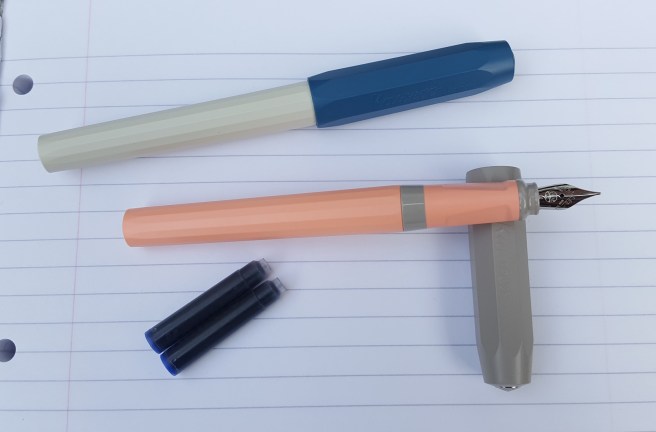
Kaweco Perkeo, a brief update.

Following my recent post A peek at the Perkeo; first impressions of the new Kaweco cartridge pen. I wished to add a few comments after my first week of ownership.

The good news and the main message to take away, is that the performance of the Bock, stainless steel medium nibs on both of the pens that I bought is quite superb, with a lovely smooth writing experience far beyond what you might expect at this price level. Yes, perhaps the size 5 nib is a little more firm than a larger, size 6 might have been but overall I am delighted with it.

My biggest gripe had been with the faceted grip section. After all it is probably targeted by its price tag as being a beginner’s pen or close to it. But having medium to large hands myself, I have very quickly found that I automatically grip the pen higher up the body than the facets (save for the third facet on the underside, where the pen conveniently rests on my second finger) and so the facets were not an issue for me in practice. Within a few days of use, I barely noticed them.

On the downside, I have received one comment from a work colleague, who saw my Old Chambray coloured Perkeo on my desk, and said that it looked like an insulin pen. Admittedly, the colour scheme, size, shape and material of this pen do give it a slightly clinical look.

20170624_164734

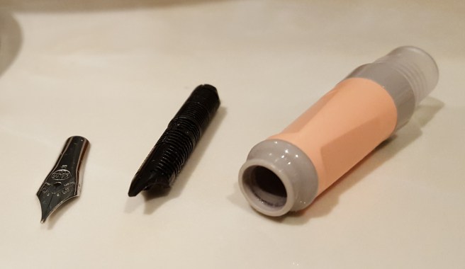
This week I did try removing the nib and feed. I had expected them to unscrew, as a unit (as on the Kaweco Al sport). However this is not the case. The nib and feed of the Perkeo are friction fit and push directly into the coloured section.

20170701_010554

As I tried in vain the unscrew them, I was simply rotating them in the section.

There is no flattened edge of the circular opening, to give any guide to locating the nib and feed. To replace them you just seat the nib on top of the feed, align them with a centre line between two facets and then push them home.

For the benefit of anyone new to the art of nib removal, (a noble and relaxing pass-time which I whole-heartedly recommend) then there are few rules which I have gleaned online and from experience:

  • take care to grip the nib and feed together firmly, between thumb and the first joint of your finger (with thumb over the nib) using some grippy material or else a tissue or cloth;
  • for nib and feeds which are friction-fit (as with the Perkeo), grip firmly and then pull in a straight line, taking care not to bend or distort the nib or damage the delicate fins on the feed;
  • if doing this over a basin, do have the plug in place, in case the small nib or feed drop down the plug hole;
  • once removed, it is very easy and satisfying to rinse the nib and feed and the section in water and dry them, before reassembling;
  • the nib can be examined under a magnifying glass or loupe to check that the tines are aligned and adjustments can be made (very gently and by hand) before reassembling;
  • for nib units which unscrew, (such as the Kaweco Al-sport, or Pelikan M series, for example) then grip the nib and feed as described above but rotate the barrel, not the nib, to unscrew;
  • It is good practice to clean a nib and feed from time to time, particularly before changing inks. A short cut, rather than removing the nib and feed, is to leave the entire nib section to soak in water overnight and then rinse under a tap or use a rubber squeezy blower to squirt water through it, until it runs clear.

Coming back to the Perkeo, since there is no set position to align the nib and feed in the section, this means that you are free to align them how you wish, in relation to the facets. You can offset the nib if you wish.  There is no need to feel that you are forced to have the nib centred between two facets. With trial and error, if the centred nib does not conform to your preferred grip, you can customise your pen – rather than feeling that you have to adjust your grip to suit the pen.

In conclusion, I think that the Perkeo is a pen that I shall use and enjoy, for its excellent stainless steel nib and writing performance, if not for its looks.