I realise that there is a risk here in marking myself out as a cheapskate. I make no secret of my fondness for inexpensive pens. This is not from any inverted snobbery: I like expensive pens too, but they sometimes lose points in my eyes from being too expensive. When a fountain pen costs more than, say, a decent bicycle, something seems wrong.
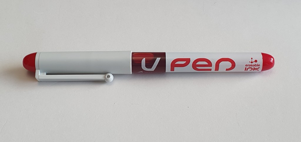
I happened to be out on my bicycle at the weekend and visited a stationery shop in St John’s Wood in North West London. I went to buy some supplies of file paper. I was tempted by a colourful display of Pilot pens – gel pens, fineliners and the Pilot V pen, a single use fountain pen. I stocked up on a selection of stuff, including a red ink V Pen, which I fancied as being a useful tool to use at work for amending drafts. I tried it out on a test pad and was impressed at the colour and how smoothly it wrote.
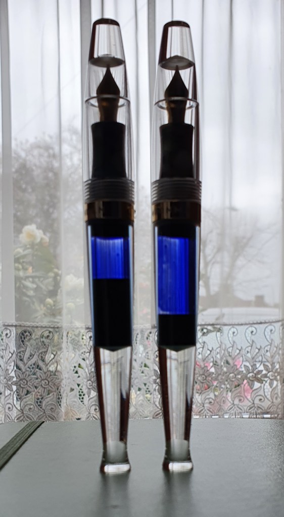
Pilot V Pen, a disposable or single-use fountain pen.
I have had a few of these V Pens in the past. Well, I say past, but I still have them in blue, black and purple. They seem to go on almost forever and do not mind being ignored for months or years on end. The ink seems to be specially formulated to resist drying out in the pen. The downside of this is that the ink seems prone to bleedthrough. On a recent test of thirty different inked pens on an A4 notebook, I found that the Pilot V pen was the only one to bleed through the paper.
Available in a wide range of colours.
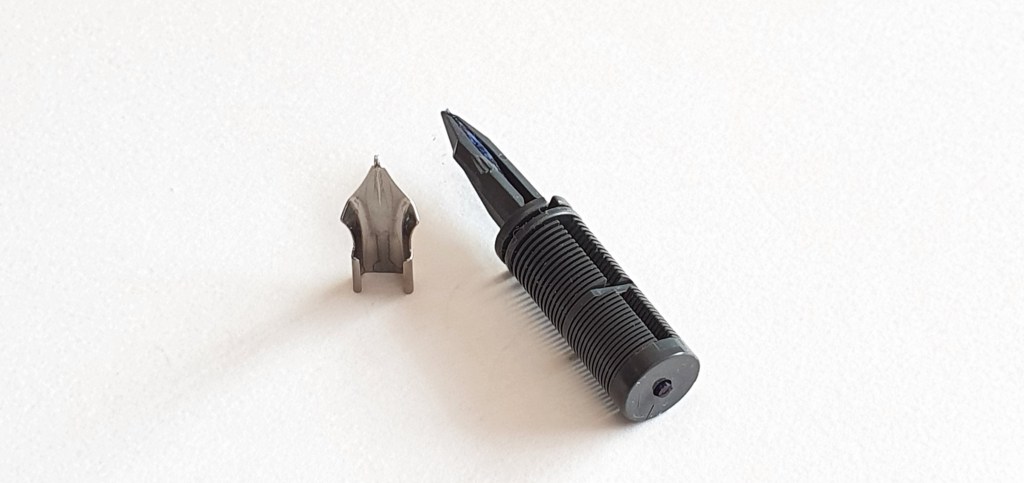
When I looked recently at my old V pens, which had languished in a pen cup for longer than I can remember, the black and the purple ones still wrote at once, but the blue one seemed to have finally run dry. I also noticed that the blue ink model was of an older design than the others, with a narrow slit for the ink window along the barrel on two sides and with a rather basic butterfly nib. This is a nib where there is no tipping material but the tines are crimped, and folded downwards at the end and polished to form a writing tip. I have encountered this design before on a Bic Easy-Click fountain pen.
I then remembered a friend mentioning that it was possible to refill and reuse these Pilot V pens. I did not know how and had never looked into this. I did a quick search on Google and found a very useful blog post How to Refill a Pilot Varsity Disposable Fountain Pen on Fountain Pen Love, by John Bosley in a post from September 20, 2017. I read this with interest. I was keen to have a go at refilling my blue V Pen and felt that I had little to lose.
The technique simply requires that you pull out the nib and feed, which are friction fit. You can then flush out the pen and refill the barrel with some ink of your choice and refit the nib and fit with a firm push, until it clicks into place.
I got some grippy material. I pulled and pulled at the nib and feed but they would not budge. Instead, the nib came away, leaving the feed in place.
Determined to get it out, I resorted to using hand tools, (a big no-no in fountain pen work) and used the pliers of my Leatherman. This was rather reckless as you have a good chance of crushing the feed and breaking it, or at least cracking it. Squeeze too hard on those pliers and it will break like a walnut.
I tried gripping it firmly with the pliers but not so hard as to crush the feed. I pulled. After the pliers had slipped off a few times, eventually I was successful and the feed came away with a pop, like a Champagne cork. That the feed came out and was not broken, was very pleasing.
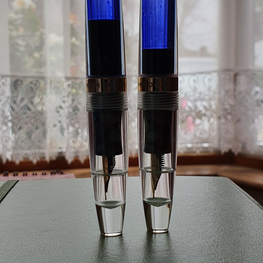
An older style Pilot V pen disassembled for refilling, with butterfly nib and narrow slit ink windows.
I washed the nib, feed and barrel then had a closer look at the nib and feed under the loupe. There were some marks from my pliers, but nothing terrible. I noticed that the feed has a wick running along the channel, to keep the nib moist.
Nib and feed disassembled
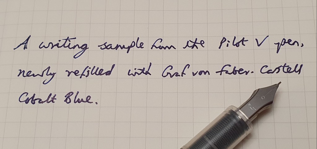
It just remained to choose some ink and refill the barrel, with a pipette. I decided on Graf von Faber-Castell Cobalt Blue. I was careful not to put too much in. You need to leave space for the feed, which can be seen through the clear plastic grip section.
The pen now writes again! The Cobalt blue looks good. It should not bleed through paper like the original ink, but then again the pen will probably not be so resilient as before in coping with long periods of neglect.
A sample of Cobalt Blue from my newly re-filled Pilot V Pen, on a Moleskin notebook.
The butterfly nib is not the best writing experience, but it is reasonably smooth. The newer version with the rounded tipping material is a big improvement.
In conclusion, I doubt that I would want to get out the pliers every time to refill this pen and risk shattering the feed. Perhaps it might come out a bit easier next time. But even refilling the pen just once means it has doubled its working life, roughly halving the pen’s “cost” and helps to reduce plastic waste. It is nice to know it can be done.
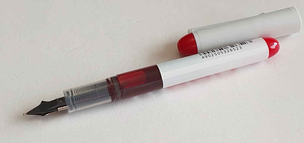
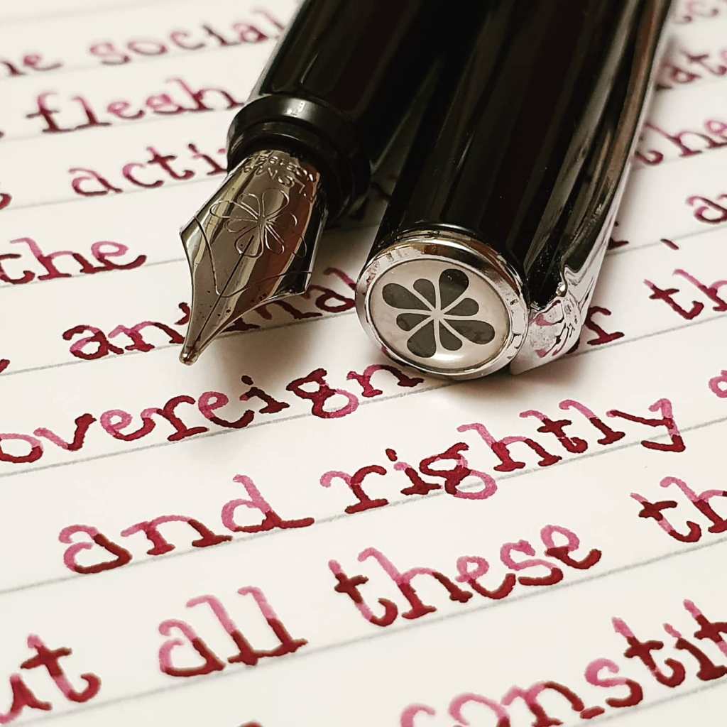
That red though!
Update 27 March 2021: I would just like to add, that in using the pliers I did also have the grippy material wrapped around the feed to protect it from the sharp metal jaws of the pliers.
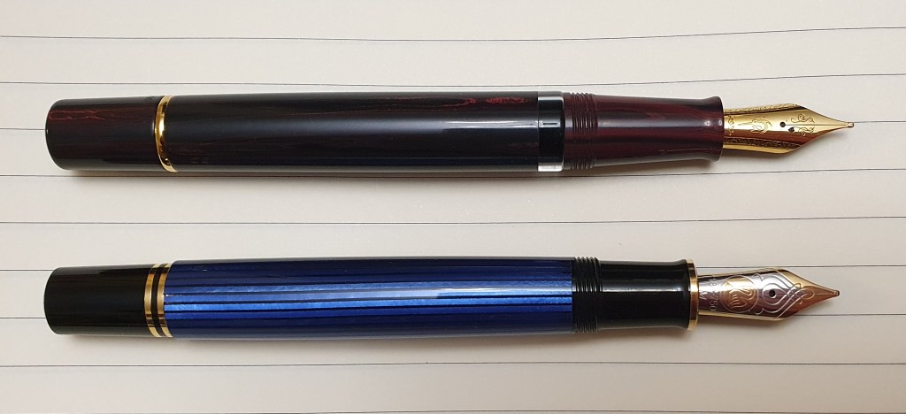
I have already raved about this pen in two posts, in November 2020. However, for an inexpensive pen it has been giving me a disproportionate amount of enjoyment. I really like it.
Readers may remember, that this is an eye-dropper pen, in a clear acrylic demonstrator body, except for the rather mis-matched grip section in a multicoloured but predominantly green, crazy-paving patterned plastic. It came with three nib units, of which the largest was an unmarked Oblique Broad. That nib proved to be such a smooth writer, with almost magical powers to bring out the best in my lefty overwriter handwriting, that I have used that nib exclusively. It is wonderful for writing letters. I posted the cap at first but have got used to it unposted now. Also, I have kept to Waterman Serenity Blue ink.
Often at work I need to sign forms which then get scanned and up-loaded. Seeing the scanned blue ink on my computer screen always lifts my spirits, in the course of a busy working day: I enjoy the effortless, automatic line width variation which comes from the stubby OB nib.
If the search for fountain pens is a journey, then it is not surprising that once in a while you may reach a destination where you want to stop and linger. For me at the moment, that’s the Moonman S5.
I would not say it is a perfect pen: I worry that the cap feels quite brittle like it could crack (although there is no hint of any weakness at all after 4 months’ use). Also, when picking up the pen for a quick signature, in the course of the busy working day as aforesaid, it does break your stride to uncap the pen which requires six separate twists. But I do still prefer screw caps to snap caps and also the Moonman does not ever suffer from hard starts or ink evaporation.
I was so taken with the pen that I decided to order a second one, so that I could keep one at my work and one at home. Again I was interested chiefly in that lovely OB nib.
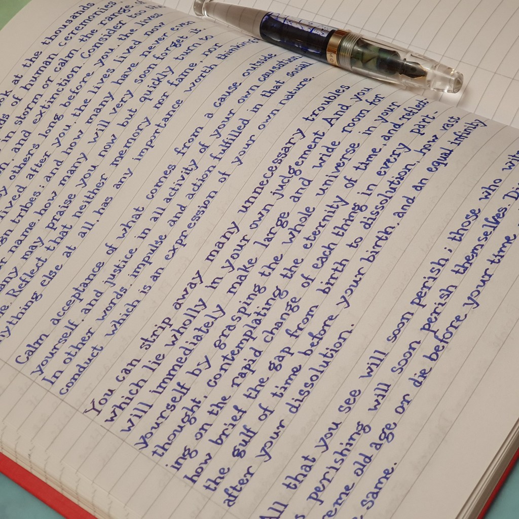
My two Moonman S5 fountain pens. Checking ink levels on a Saturday morning.
My second Moonman duly arrived. I eagerly examined the nib which was fitted (extra fine) and two extra nib units, expecting a medium and an OB again. However, it so happened that in the box this time, there were two medium nibs. No oblique broad.
I could have sent it back I suppose, but I tried the two medium nibs out – and I really liked them. I kept one of them in the pen and the other one in the tin, for a spare. Once again, I have filled the pen with Waterman Serenity Blue.
I have been using my second S5 all this month for my daily journal. (I am changing pen and ink combinations monthly and so far this year have had the Cross Peerless and then my Aurora 88). So, the second S5 (medium nib) now lives at home whilst the first one (oblique broad) lives in my pen cup at work, coming home for weekends. Both have Waterman Serenity Blue. The OB nib is best for overwriting and the medium nib best for underwriting, for me.
I am pondering whether to ink one of them with Rohrer and Klingner Salix, blue black iron gall ink. As it is, the S5 impresses me for its design, its comfort, its writing performance, its fun filling system and huge capacity, and its modest price. If I added Salix into the list, you could add to these benefits, a permanent ink, which darkens as it dries, is rarely subject to bleed-through and which can be written over with a highlighter pen without smudging. That would make an impressive feature list for one cheap pen!
I might try this when I next fill one of them. I have used Salix successfully with the Cross Bailey Light and have not had any blockages or corrosion but there does seem to be some blue staining to the silver coloured steel nib and to the inside of the converter. The S5 nibs are gold coloured and it may be that their plating might be better at coping with the Salix.
Who will be the first to get Salix on the next fill?
It will be a while before either of the pens needs filling again, such is the huge ink capacity. If I try one with Salix, I shall only fill it partially to start with while I monitor for side effects. If it turns to disaster, I do have some spare nib units – but I do not expect there to be any issues. It is recommended that pens with iron gall ink be flushed out every few weeks and so it would be best not to fill the S5 to its gills but just put in enough ink for a two to three week trial. Watch this space!
Marcus Aurelius was Roman Emperor, from 161 until his death in 180AD, aged 58. He kept a book of his personal reflections and ideas, intended for his own encouragement and guidance. It was not meant for publication, but was to become Meditations, one of the greatest of all works of philosophy. Written in Greek, it was comprised of 12 books, or chapters. I recently completed a writing project, to copy out the text from an English translation, in pen and ink. I thought I would share a few thoughts on this exercise.
I. The Inspiration
One of the good things to come out of 2020, for me, was finding a post on Instagram by Kimberly (@allthehobbies) who was copying out the entire text of Meditations using fountain pens, writing in a print style like a typewriter font. She changes pens and inks every two pages, recording the combination used at the end of each spread, at the foot of the right hand page and would occasionally post pictures of these spreads on Instagram. The page that I first noticed was on 15 June 2020, when she had used a purple Opus 88 Picnic, with Kobe 57 Himeajisai/Hydrangea ink. She was using a journal of Tomoe River, 52gsm paper.
I was impressed at how neat and uniform her lettering was, as though it had been printed. But as well as that, the text itself jumped out at me: I read a few lines and found the content so direct and engaging that I wanted to read more. The thought that she was to copy out an entire book, seemed too daunting to contemplate. And yet gradually, I resolved to copy her idea and do the very same thing. I liked the thought that I could read some philosophy whilst at the same time, improve my penmanship, create some colourful spreads of writing and get some added use from my accumulated fountain pens and inks in the process. I love to write with a fountain pen and thought that this sounded an enjoyable and worthwhile challenge.
II. The Preparation.
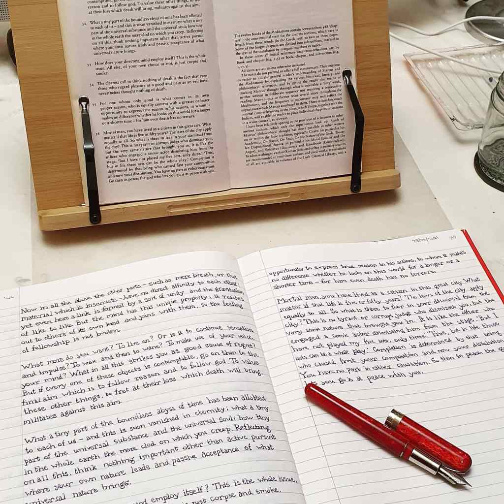
Naturally, I already had plenty of different pens and inks to use. I had to track down a copy of Meditations and found it in our local Waterstones, at the Brent Cross shopping centre. I bought the Penguin Classics paperback edition, translated with notes by Martin Hammond and first published in 2006. For a notebook to write it in, I wanted something which would not run out before I reached the end. I decided on an A4 format. I found a nice hard cover A4 Notebook, Ruled, with 192 pages, and what looked like a pleasant paper surface for fountain pens. It had stitched binding and so could be opened flat. It was from “5 Star Office” and I bought it in a delightful shop, the Eton Stationers, in High Street, Eton, Windsor. (This is also a great place for fountain pen ink, mechanical pencils and all manner of stationery goodies).
My notebook on the bookstand with my copy of Marcus Aurelius’ work, “Meditations”.
One issue for me with A4 notebooks, is that as a lefty overwriter, I would turn the book about 60 degrees anticlockwise to write in it (“uphill”) and almost always dog-ear the left hand side whilst writing on the right hand page. However, the plan for this project was to write in a print style, (like Kimberly’s) which would require me to use my left-handed underwriting style, with elbow tucked in and with the notebook straight like a normal person.
I paginated the notebook and tried out the paper with a number of different pens and inks from my pen cups. I was encouraged that the paper surface was smooth but not unpleasantly coated and that it resisted bleedthrough for all the pens that I tried, with one exception, a Pilot V pen, single use fountain pen whose black ink seems to be specially formulated not to dry out for years but makes it very runny so that it soaks through paper. It had 32 rows per page with a sensible 8mm row height which I like.
One other essential purchase was a book stand. I found a good selection online and ordered a wooden one, which could be adjusted easily for the viewing angle and which could also be folded flat for storage. It had a fold down wooden ledge for the book to rest on and two strong metal flexible arms to hold the pages open. I wrote out the alphabet at the back of my notebook in both upper and lower case, to practice the shapes. I was all set.
III. The Execution.
Having gathered together all the ingredients, I was eager to get started on page 1. Deciding that there would be plenty of time to improve, I waded straight in. It was a novelty to write in a print style rather than cursive and to use a type-writer style font, which I loosely called “Times New Roman” perhaps because of the word association with Marcus’s job. It soon became apparent that this is not as easy as it sounds. First, I had not really practised enough to decide upon a consistent relative height of my letters. There is something called the x height, which is the height of the letter x and other lower case letters which do not have bits sticking up or down. (See how I have learned the terminology?) I always struggled with the lower case h, for example and was not sure where I stood with the letter t. Then there are the serifs. I usually tried to include these, but would sometimes add them at the end of a word, or do them all together at the end of a line (when I could get my arm ready for a series of cross-strokes) or even do a few lines together. Occasionally with some of the pens I used, I skipped the serifs on the basis that if they were not horizontal, they just made the writing look messy. Sometimes I would put a serif on one leg of an m, or an h, but not the other.
Zooming in on the Diplomat Esteem with Diamine Tyrian Purple.
Another difficulty that I discovered is that lefty-underwriting is not natural for me and I have a difficulty even in making a perpendicular line, say for a letter L or K. Instead, it would lean a little bit backwards or forwards, turning my page into something more like a ransom note, than a work of philosophy.
I learned that pace is important: go too fast and the writing becomes scrappy. But go too slow and it can look too laboured and shaky. Rather like learning to touch-type, the best course is to find a steady rate at which you can keep going, accurately and carefully but not too fast or slow. Write at a speed at which you can think ahead, not in fast bursts.
It soon becomes apparent that copying out a text in this way, is very different from reading a book. I would look at the line of text and hold the next group of words in my head, or try to, in order to write the next three or four words. It is slow going, because there is often a little delay in finding your place again in the book when you look back up at it.
Perhaps the worst danger was of tackling this when I was too sleepy. I do like to relax after work by sitting down with a notebook and a few fountain pens, but there is a risk of nodding off to sleep and slipping out of consciousness whilst still writing. This is not good if Marcus is expounding on a theme with long sentences, or lots of Greek or Roman names which are unfamiliar to me and sometimes sentences which go on for line after line.
A page of my A4 notebook could take me about an hour. I did not write against the clock but would like to finish a page or a two page spread in one sitting, as I looked forward to finishing it off with the name of the ink and the pen. I did not map out in advance, which pens and ink I would use but just flicked back a few pages to see which I had not used lately and would then choose something out of my pen cup.
I put up a few photos of my efforts on Instagram . I was encouraged by Kimberly who commented “It doesn’t take too long to see improvements, just don’t beat yourself up over every letter that doesn’t look like what you want it to. Celebrate the ones that do.” She remains modest over her excellent calligraphy (which is far neater than mine) and cites @itsrainingpens as one of her inspirations.
Like Kimberly, I really loved having this project to pick up from time to time. I did not come to it every day and would sometimes leave it a week or more, or at other times I would have several long sessions on consecutive days. You can make your own rules.
An example page from the Moonman S5 with Waterman Serenity Blue.
At times, I was pleasantly surprised at how a paragraph of text looked on my page. At other times, when the letter sizes were too erratic and sloping back and forth, I wondered at the point of it all. But there is always the thought that each new page, even each new word, is a chance to do better, literally to turn over a new leaf.
Gradually, I found myself advancing through the book. I did some calculations occasionally, cross-multiplying, to estimate on what page of my notebook I would reach the end (e.g. if page 86 of the book is page 103 of my notebook, then the end (page 122) of the book will be 146. Sure enough I was to finish half way down my page 145.
IV. The completion.
It was nice and strangely momentous to get to the last page. I had started in August 2020 and finished in February 2021, after 7 months. It is pleasing to sit back and leaf back through my notebook to see all the different pens and inks that I employed. I added up a total of 44 different inks and 46 different pens used overall.
It is nice to finish something that you have started. The project saw me through the autumn and winter months. Was it the best use of my time? I think it was a worthwhile exercise, in time that I would otherwise have spent resting, watching television, listening to music or writing and tinkering with my pens and inks for the simple joy of writing.
This is not to pay a dis-service to Marcus for taking me on an incredible journey through his thoughts and reasoning in such a special and unique book. It is amazing to think that this was written almost 2,000 years ago. How often do we get to hear the innermost thoughts of a man grappling with the big universal questions that have taxed philosophers for centuries? How often can we sit and listen to a Roman Emperor? To say he was a thinker is an understatement. It is an inspiring book to read and makes me want to explore and write down my own thoughts. Now that really would be a challenge.
Reaching the end, with the Pineider Avatar and a cartridge of unknown purple ink. “Go then in peace: the god who lets you go is at peace with you.”
Narwhal Pens are a relatively new brand in the fountain pen world. Founded less than two years ago in California, the company was launched and made its debut at the DC Supershow on 1 August 2019. The original series was of large, swirly vibrant acrylic, piston fillers in Poseidon blue, Angelfish yellow, Merman green or Hippocampus purple.
From what I can gather, the website went live on 7 August 2019, at narwhalpens.com. An Instagram account was launched, which had attracted 300 followers by 16 October 2019, growing to 500 by 18 January 2020 and to 1,500 by 8 October 2020. Today it has close to 2,000 followers.
Other options were added: a classic black fountain pen and also a clear demonstrator version.
The Schuylkill model was launched at the Philly Pen Show of 17- 19 January 2020. The name Schuylkill comes from the name of a river in Pennsylvania. Google tells me that it is pronounced “skool-kl” and so I suppose it sounds a bit like snorkel. It was named by Dutch settlers and means “hidden river.” A Narwhal is a type of whale, with a distinctive single tusk (well worth googling for images) and forms the logo of the brand.
The Schuylkill model was later available in some exciting new colour options – Asfur Bronze, Chromis Teal, Rockfish Red and Marlin Blue from 22 September 2020.
Also, to mark the company’s first year anniversary, a special limited edition of the Schuylkill was announced, to be made in red swirl ebonite and limited to 365 pieces worldwide. It was available from 22 September 2020. And it is this pen that I am looking at today.
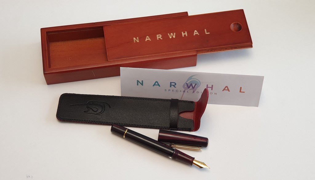
The Unboxing.
This limited edition pen is supplied in a wooden box, with the name NARWHAL etched in capital letters on the sliding lid. Inside the unlined box, was a soft black and burgundy pen-pouch (which I think is imitation leather), featuring the Narwhal logo, a one year warranty card with filling instructions, and the fountain pen itself in a polythene sleeve. I will not keep the pen in the box but it was a nice presentation and useful for storing bits and pieces.
Limited edition set includes a wooden box and a pen pouch.
Design and appearance.
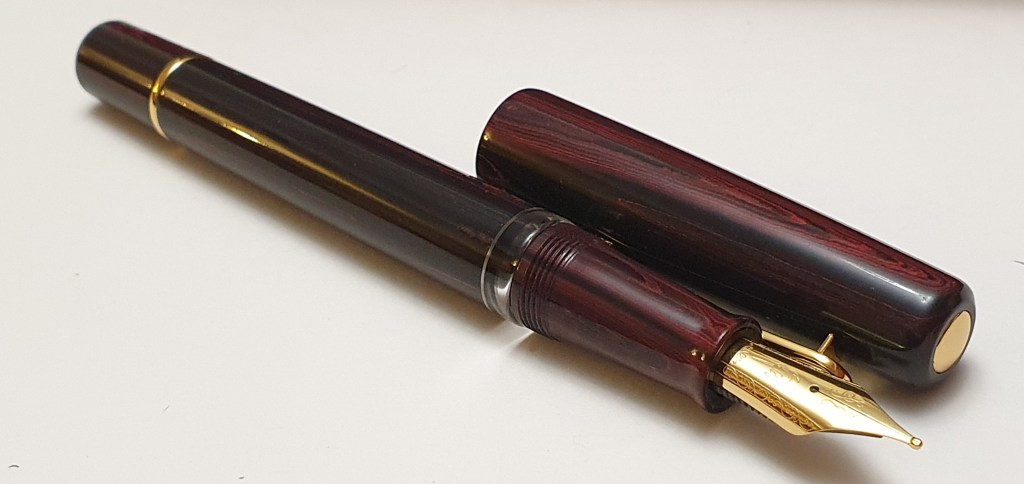
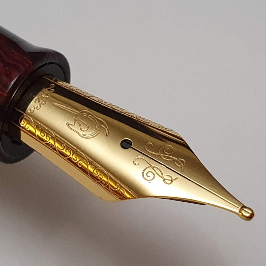
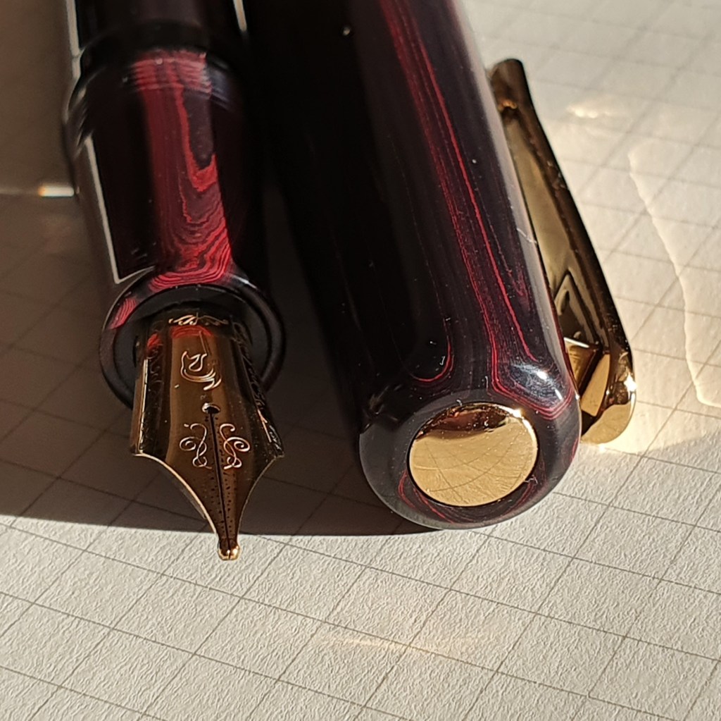
This is a large pen, generously proportioned. The colour of the ebonite is a lovely dark burgundy, smooth and polished, with a dark pinky-red wood-grain effect which is more evident under bright lighting. There is no brand name or any other text at all on the pen body, pocket clip, or nib. The only clue to its origins is the Narwhal logo on the nib.
Narwhal Schuylkill 365 limited edition fountain pen, in red swirl ebonite.
The cap has a gold coloured, slightly domed disk for a finial and a sturdy metal clip in the same finish. There is no cap band. The cap screws off in about one and three quarter turns. The section is of the same red swirl ebonite and tapers slightly towards the nib, with a raised lip at the end. There is no step from barrel to section, but there are cap threads, not at all uncomfortable. A clear ink window gives a good view of the ink remaining and makes it obvious when the pen needs refilling.
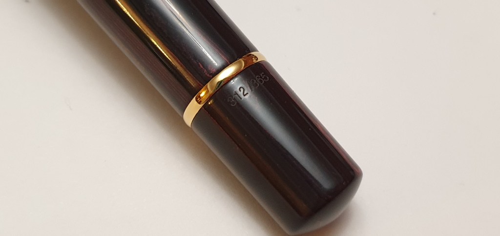
The barrel is long and wide, ending with a piston knob, where you will find the limited edition serial number. Mine is 312/365. A gold plated ring separates the piston knob from the rest of the barrel.
Limited edition number, on piston turning knob.
The nib and filling system.
The steel nib was available in fine or medium. I went for a medium. On visual inspection, this looked to be nicely set up, with a slender gap between the tines until meeting the very large and very rounded blob of tipping material. The tines were level and the tipping was extremely smooth.
Filling the pen (after a few flushes with water, to clear any residual oils and to measure ink capacity), I tried Waterman Serenity blue, but changed my mind a couple of times, switching to Diamine’s Conway Stewart Tavy and then to Graf von Faber-Castell Cobalt blue, which is in the pen now. I thought of going for an Oxblood or Burgundy ink to suit its colouring but was a little nervous that reddish inks were more likely to stain the inside of the ink window. Perhaps next time. Filling was very smooth and easy. The plunger stops short of the ink window and so you do not actually see it when you lower it for filling. I believe the filling system can be unscrewed for cleaning or adjustment but there was no wrench included with the set. I would be wary of getting involved in piston removal. I dabbled in this with a TWSBI Classic once and had a bit of struggle to get it back in right.
Steel nib, Medium, with Narwhal logo. Tines slightly opened by me.
Writing performance.
The key thing to say here, is that the nib was extremely, glassy smooth. I cannot recall ever having a pen that wrote quite this smoothly. Having said that, it was a little dry for my particular taste (since I am a lefty and mostly use an overwriter style, which needs a wetter flow to lubricate the nib) but I was able to floss the tines and widen the gap just minimally until I could just see daylight between the tines at the tipping material. This adjustment was made without knocking the tines out of alignment. The result was that the pen now writes not only super-smoothly but is also well-lubricated, needing no downward pressure to write. The overall effect is like ice-skating, which might not be to everyone’s taste if you like a bit of feedback.
The medium nib is also, in my view, closer to a typical broad, particularly after my tine-gap widening mentioned above. This is not a bad thing but if you prefer a finer line, for smaller handwriting, then the fine nib may be a better option.
Size and weight.
The pen measures about 145mm capped, and a very commendable 130mm uncapped (this being my personal favourite dimension for an uncapped pen). The cap can be posted, very securely but not deeply, making the pen about 177mm long and so I think most people will find it preferable to use unposted. Weightwise, it is around 28g in all, being about 15g for the pen uncapped and 13g for the cap. The pen does feel light for its size. Presumably the piston mechanism is plastic.
A size comparison of the Narwhal Schuylkill, with a Pelikan M800 below.
Likes and dislikes.
This pen has a lot to commend it, especially at its very reasonable price. In particular:-
large size body;
piston filler;
exceptionally smooth nib;
ebonite material with a classic, vintagey appeal;
rarity value, with only 365 available worldwide (that is one school-hall!);
competitive price, kept modest by use of steel nib rather than gold.
Dislikes: There is little to say against this pen, for its price. Some might find the nib overly smooth to their tastes, or the medium nib too broad. But this had advantages too. If using laid paper, the nib rides the bumps with ease. I have tried very smooth papers too and have yet to experience any skipping.
Perhaps from a design point of view, it might have looked neater if the cap covered the ink window, but conversely it is useful to see the ink level without having to uncap the pen. The designers have chosen function over style, which is a good thing. Some may wish the cap posted deeper, but then the pen is long enough for most people without posting. A wrench for the piston would have been nice, as one is included with some other Narwhal models.
Conclusion.
I am delighted with the pen and very glad to have been able to buy one while still available. I was curious as to how an ebonite pen would feel (smooth) and smell (no smell, to speak of). How to sum up this pen? Like a steel nibbed Pelikan M800? Or an ebonite TWSBI Diamond 580? There is nothing quite like it and most people reading the specification would be surprised that it sells in the UK for £75.00. Narwhal have just introduced another new model of the Schuylkill range, the Porpita Navy, limited to 800 pieces. That looks very tempting too. This young brand is on an upward trajectory. Narwhal pens are available in the UK from Stonecott Fine Writing or in the USA from Goldspot Pens. The pen in this review was purchased with my own funds.