Early thoughts on the Majohn P140 fountain pen.

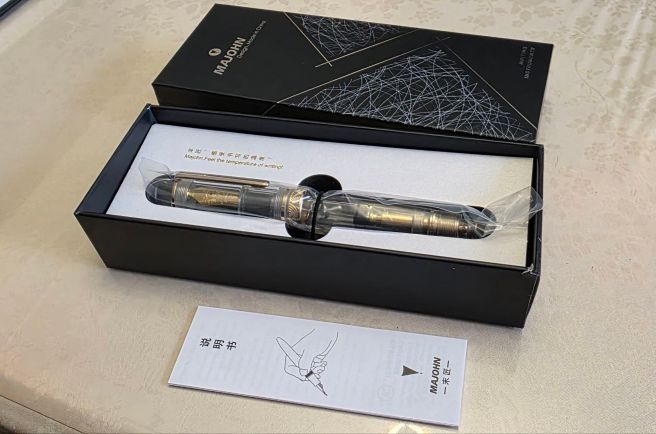
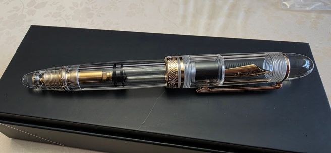
At our recent monthly pen club in London, my latest purchase drew quite a few admiring glances. This was the Majohn P140 in a clear demonstrator version.

My own experience of this pen is still in its infancy. I first received an email from a friend overseas, on 2 April 2026, who had been down the rabbit hole of Chinese pens. One that he thought might appeal to me, was the Majohn P140 as it had a number 8 nib and an ebonite feed. I found it on Amazon and was immediately taken with the clear acrylic demonstrator version. This gives the clearest possible view of the nib and feed, the ink reservoir and the piston mechanism, which appears to be brass. I ordered one on 8 April and it arrived on 9 April, 2026.

Unboxing.

The pen comes in a smart black cardboard box, with a protective padding surround and the pen itself in a clear sleeve. Inside the box is also a “manual”, a sheet of filling instructions to cover five different filling systems with diagrams annotated in Chinese on one side and English on the other. It does not cover disassembly.

Picking the pen up for the first time, it is weightier than I expected. Its size and rounded shape give it a wonderful tactile presence. It looks and feels to be of good quality and is a pleasure to handle, even before it has seen a drop of ink.

Majohn P140 unboxing.

Description.

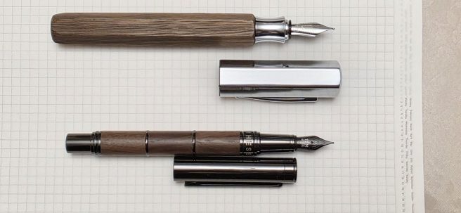
This is a large sized, piston-filler fountain pen. The ends are rounded and being also of the same clear acrylic as the rest of the pen, they are rather nice to gaze into.

The pocket clip has no brand name and is very stiff to raise. The cap has one narrow, plain cap band one decorated broader band, but again, no brand name or model number, nor any mention of its country of origin, presumably China.

Clear demonstrator version.

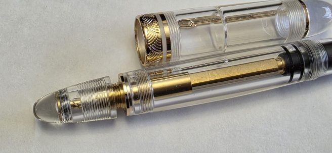
The cap unscrews in two complete rotations. It does tighten very securely. There is no inner cap but when capping the pen, it comes to rest with a visible ledge inside the cap up against the front of the grip section, which should produce a good airtight seal.

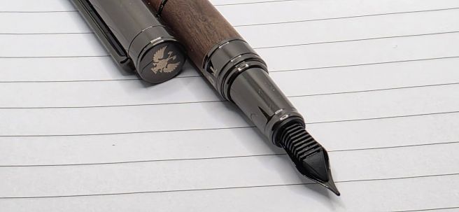
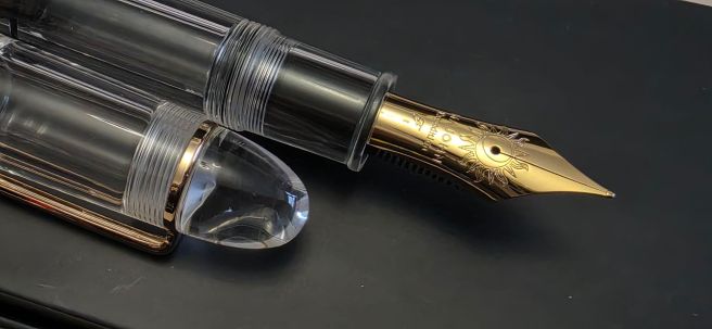
The nib, a #8 size, is impressive in itself. It is a steel nib but coated, I imagine, with a PVD plating of gold or some gold-coloured metal, matching the pocket clip and other furniture. There is a sun emblem around the breather hole. Some text on the nib reads “MAJOHN, Expedition, F” (for fine).

No. 8 steel nib.

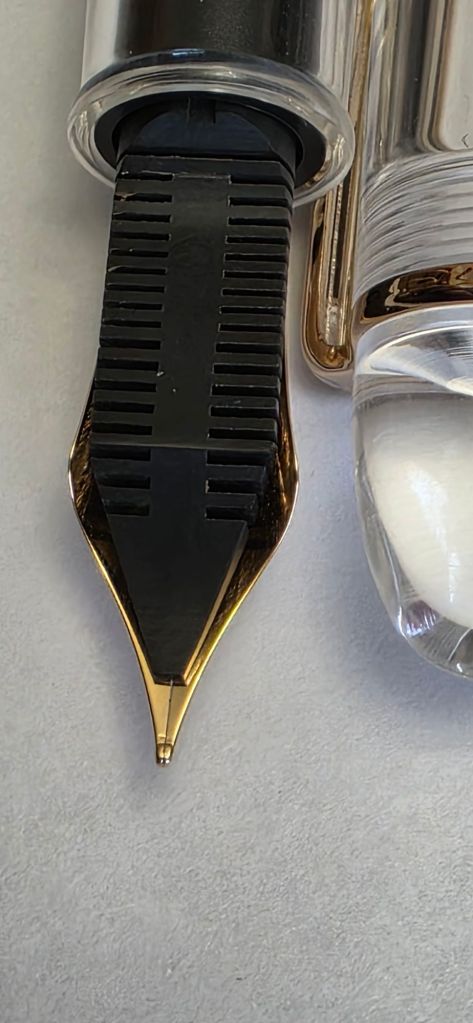
The grip section is very girthy, tapering slightly from around 13mm to 11mm. At the end of the section, there is a raised flange, to prevent your fingers from sliding onto the nib. This rim is a little sharp . However I am glad that a metal ring has not been added, since these can sometimes (a) trap ink after filling, which then gets on your fingers, (b) cause distracting reflections, if writing in sunlight (eg Pelikan M800) and (c) corrode.

The broad acrylic barrel shows the piston mechanism, the black rubber plunger and an ink chamber of about 29mm in length by 13mm diameter, considerably wider than a typical ink cartridge. The piston knob operates smoothly, drawing up a large volume of ink very swiftly.

Piston knob. Brass mechanism.

Size and weight.

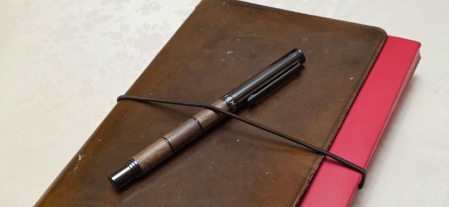
The pen measures around 155mm closed, 133mm open and 170mm if posted. Mine weighs around 38.5g filled, comprised as to 27.5g for the pen and 11g for the cap alone. The cap does post well, but the pen then becomes rather too long and heavy for my taste. However, as with most pens of 130mm or more uncapped length, there is no need to post the cap.

Nib and writing performance.

After flushing the pen with warm water, I filled it with Diamine’s Conway Stewart Tavy, a pleasing blue-black ink (of which I have accumulated several bottles). It writes smoothly and I was delighted with the writing experience. The ink flow seemed ideal. Looking at the nib with a loupe, it appeared to be set up perfectly, with no suggestion of defects. It is a joy to have such a wonderful writing experience, straight out of the box. Although marked as a Fine nib, the line is perhaps closer to a Medium. The feed appears to be ebonite which is a rare luxury these days. As the feed absorbs some ink, an ebonite feed is thought to assist ink flow and to keep the nib moist, avoiding hard starts. It can also be adjusted to the nib quite easily by standing it in hot water for a little while, then squeezing it against the nib to fit its contours.

Ebonite feed. Fine nib, writes smoothly straight out of the box.

Disassembly.

The nib unit can be removed by unscrewing it. Be careful not to lose the silicone washer on the back of the nib housing. The nib unit is interchangeable with the nibs of the Asvine V800 vac filler (another pen which I much enjoy using), although you would need to transfer the P140’s silicone nib washer from the back of the nib housing, if inserting a nib from the V800.

Disassembled.

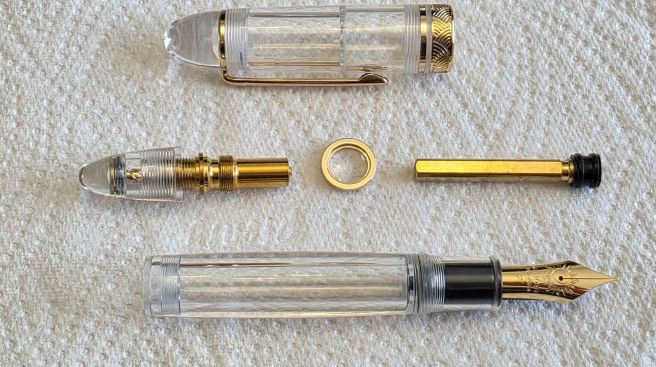
The piston mechanism is removable. It can be unscrewed, using an Asvine wrench (supplied with the V800) with prongs which fit into the two notches on the rim of the piston housing. Having just removed my piston and then reassembled it, (after some difficulty) I can set out a few tips here:

Removing the piston:

  1. Turn the piston knob (“the cone”), lowering the plunger downwards and to open a gap between the cone and the barrel.
  2. Insert the prongs of the wrench into the two notches of the piston housing, as deeply as possible so that the handle of the wrench is at right-angles to the pen body.
  3. Screw down the cone, to trap the wrench in place.
  4. Rotate the wrench. (To unscrew = clockwise).
  5. Then withdraw the piston mechanism from the barrel. It is advisable to leave the piston mechanism intact, with the wrench still gripped by the cone. This makes it easy to reassemble. Some grease can be applied to the black silicone plunger.
  6. A metal ring, which sits in a recess at the back of the barrel, may fall out once the piston is removed. Take care not to lose it.

I had not disassembled a piston prior to writing this post, but having a demonstrator pen lends itself to such an experiment, as you can watch the piston working. The mechanism separates into three parts, which I will call (a) the cone (with the helical shaft attached); (b) the bush, or housing: and (c) the piston shaft, with the rubber plunger at the end.

The slightly tricky part is putting these back together again, in such a way that the piston operates normally, and the cone tightens down onto the barrel without leaving any gap, when the piston is drawn up. On my first few attempts, I had a gap: the piston shaft had been fully raised, before the cone had screwed down to the barrel.

To resolve this, the cone needs to be screwed down on the bush part of the way, before the piston shaft is inserted at the opposite end of the bush. It may need a bit of trial and error to get this right. I found that the following method works:-

Replacing and adjusting the piston:

  1. With the three components of the piston separated, first screw the cone onto the bush: whilst it will take approximately 11 turns to screw down all the way, try just 4 turns.
  2. Then introduce the piston shaft into the other end of the bush and turn the cone some more, so that the threads connect.
  3. Check that the cone can then be screwed the rest of the way down onto the bush, with no gap and the piston drawn up to its raised position.
  4. Once correct, loosen the cone again and insert the wrench and tighten down to grip the wrench.
  5. Insert the metal ring into the top of the barrel and then insert the piston unit (three parts all attached) into the barrel and tighten. (Note: to tighten = anti-clockwise). This needs to be fairly tight, so that the piston is secure in the barrel and does not unscrew when the cone is operated later but not too tight otherwise the acrylic will crack).
  6. Remove wrench. Having greased the plunger, operate the piston up and down a few times to distribute the grease and to check for proper operation.

Conclusions.

I am thrilled with the pen. At the pen club, a few friends who had discovered this model before me, (some having more than one!) also spoke well of their experiences with the pen. One friend got out her Montblanc 149 to compare along side my P140. The similarities in shape and size were uncanny!

I deliberately chose an ink for this pen that is one of my favourites and not one that I am likely to want to flush before using the fill. I imagine that one fill may last a few months. Also, being a demonstrator, it is obviously advisable to avoid any inks which are known to stain.

This pen is one of a growing number of my pens that makes me think (at least for a while) that I do not need to buy any more pens. With the pen having so much to commend it and at a price which is so affordable, it makes you wonder how the rest of the pen manufacturers can compete and retain a place in the market. The Majohn P140 might not be to everyone’s taste but for those who enjoy a large pen, with a piston fill mechanism, an oversize nib and an ebonite feed, this one does currently seem hard to beat.

Early thoughts on the Tom Hessin Revolution fountain pen.

While visiting Hampstead recently, I sauntered into Rymans to look at their fountain pen display shelf and see if there was anything new or on offer.

I requested a closer look at a fountain pen from Tom Hessin. I did not yet know the pen model’s name. It featured a barrel in a dark brown wood and a gunmetal cap, sitting flush with the barrel and clearly designed to post on the gunmetal peg at the end of the barrel. The nib and grip section were also in this same gunmetal finish.

Tom Hessin Revolution.

With some pens, I can tell from experience just by looking at them, that they will not be comfortable to hold, for one reason or another. Despite having some reservations, I was interested enough to take a look. The pen design is quite striking and unusual although there are some superficial similarities to the much-more-expensive gold nibbed Graf von Faber-Castell Classic. But it is not very common to see a new fountain pen with a wood finish to the barrel, especially at this modest price (£54.99), being not much above an entry level pen.

The barrel has two shiny gunmetal rings, dividing the barrel into three separate wood collars, or sleeves (if I may call them that) over a metal barrel lining. The juxtaposition of the natural wood grain and the gunmetal certainly looked attractive to me and I decided to buy one.

All metal fittings are PVD coated in gunmetal colour.

Unboxing.

The pen comes in a nice dark blue cardboard box, with Tom Hessin 1870, in gold lettering on the lid, with a logo of what appears to be a two-headed bird with wings spread, and five diamond shapes. A white carboard outer sleeve has the same in black, plus an evocative Victorian black and white photograph of a pen factory named T. Hessin & Co. Ltd, on the front. Inside the box, the pen is presented on a white felt tray, and below this, a card provides some historical background and warranty details. The pen comes with one standard international cartridge and a converter. From the packaging I learned that my pen model is called the Revolution (a reference to the industrial revolution) and that this specific edition, in walnut, is called the Rustic. Another version with an Ebony barrel is called the Charcoal.

Packaging. Pen with cap posted.

The five generations.

The logo from the box is also on the cap finial. The five diamond motif is also found on the pocket clip and is said to represent the five generations of the family business, since its beginnings in Birmingham in 1870. Some of the detail of that 150 year, five generation history can be found online. The company’s history is long and involved, but in a nutshell, I have so far gathered the following events:-

1st gen.: Andrew Charles founded the business T. Hessin & Co Ltd, in honour of his grandmother’s maiden name, manufacturing steel nibs (which were then called pens) in Birmingham, England.

2nd gen.: In 1871, Andrew’s son Thomas Hessin Charles‘ (“Tom”) name is used for the business. Later, T. Hessin was to acquire the pen works of S.B Whitfield in 1890, M. Turner & Co in 1899 and G.Smith & Co in 1911. T. Hessin & Co became a private company in 1930.

The 19th Century factory photo is a nice nod to the family heritage.

3rd gen.: Tom’s son, Arthur Charles works in the pen trade. After finishing his war service in 1946, he worked for pen manufacturer John Mitchell, which was soon taken over by Esterbrook. A.A.S. Charles leaves in 1947 and establishes Highley Pen Company (in Highley, Shropshire) which later merges with D. Leonardt & Co, whose origins date back even earlier, to 1856. The new merged company was called D.Leonardt & Co (Highley Pens) Limited.

4th gen.: Arthur’s daughter Malissa (nee Charles) and her husband Nicolas Stockbridge, set up Manuscript in 1989. They developed the business, through the 1970’s and 1980’s.

5th gen.: Their son Charlie Stockbridge joined Manuscript in 2009; in 2019 they buy a distribution business, taking on a number of other well-known fine-writing brands. In around 2025 Charlie launches a new brand “Tom Hessin” and is CEO (his parents having retired). The new brand introduces new fountain pen models, including the top-of-the range “Charles” fountain pen (with colour options names taken from pens in the company’s archives) and mid-range models the Rebel, the Edinburgh and the Revolution.

The significance of Birmingham, England in those early days of pen manufacturing is staggering. At one time there were over a hundred pen manufacturers producing around 70% of pens of the global market. Much detailed information can be found in the comprehensive book “People, Pens & Production in Birmingham’s Steel Pen Trade” edited by Brian Jones, published in 2013 by Brewin Books.

First impressions, likes and dislikes.

I first wished to fill the pen with the included converter. This proved extremely hard to push onto the nipple in the grip section. In the end I used another converter which I had at home, which was an easier fit.

Apparently the nib is a Jowo. Mine came with a medium nib, but other options are available if you order online. It was set up perfectly, right out of the box. The quality and finish all seemed faultless. The snap-cap closes with a satisfying click, to be perfectly flush with the barrel. There is no cap ring but when capped, it looks as if there is one since the name Tom Hessin appears on a ring around the barrel.

The Jowo nib was well set-up, right out of the box.

As is apparent from the shape of the barrel, the cap can be posted where it is again flush. The cap has a plastic liner inside and grips the gunmetal peg at the end of the barrel very well. However, it can only be pushed on slowly and with uncomfortable force, if it is to go on all the way. Even then it feels a little bit back-heavy although others report that it is balanced well, posted or unposted. Consequently, although the pen is shorter than my preferred minimum, I am getting accustomed to using the pen unposted.

Although the nib was set up well, with a narrow tine gap, I felt that the writing experience was slightly draggy, with insufficient lubrication on my Stalogy paper. The nib was smooth and had no obvious defect, other than perhaps that the black PVD coating had covered the tipping as well, in which case it would resolve itself in a few days with normal use, which it did. Changing inks may also have helped.

I am thrilled with the walnut wood barrel. The two rings on the barrel add some tactile interest. I have seen some reviewers complain that the wood grain on the three separate sections does not align, but – isn’t that the point? Having three separate sleeves creates more visual interest.

I have not encountered any problem from the shiny metal grip section. This is because I grip the pen at the barrel, with the section only resting on my second finger. Initially I was aware of the step, pressing on my finger but this soon passed.

With this pen, I enjoy practising my lefty-underwriter style of handwriting. I try to hold the pen loosely.

Being quite a small pen, it can feel a bit dense. I still prefer that it be a little short, than if it were posted and a little too long and off balance.

Size and weight.

The pen is on the small side, although had it appeared in the 1870s, (when it would really have been revolutionary!) or the first half of the 20th century, it would then have been quite an average size, I suspect. It measures 13.7cm closed, 11.8cm open, and 15.8cm posted. The weight closed (or posted) is around 32.5g, comprised as to 21g for the uncapped pen and another 11.5g for the cap alone.

Tom Hessin Revolution, with a Faber-Castell Ondoro, smoked oak, for size comparison.

Conclusions.

In the 10 days or so since I bought the pen, I have used it a lot. It is a convenient size to carry in a shirt pocket. I enjoy using it at any opportunity. I have already flushed and refilled it three times, trying a different ink each time. I am currently on Diamine Oxford blue, having tried Campo Marzio Tabacco, Diamine Pelham Blue, and Diamine Ancient Copper. I may try a green ink next or else a burgundy, or return to the Pelham Blue which I liked. The gunmetal and walnut colour scheme of the pen suit any ink.

My ‘impulse buy’ purchases do sometimes lead me to suffer buyer’s remorse: this feeling hovered over me for a day or so. However, with use, during which time I tried different inks and also enjoyed feeling the nib becoming smoother, those thoughts have gone and I am delighted with the pen. True, it is not my ideal length but the attractive design, materials, quality, price and the Hessin heritage more than make up for that. It is great to see new, attractive pen models on the market, from a British manufacturer, reasonably priced and continuing this family business.

Tom Hessin Revolution, with my Stalogy notebook.