Goodbye to Paperchase.

In recent weeks we have witnessed the disappearance of another well-loved chain of shops from our high streets and shopping malls. Now the UK’s Paperchase stationery stores have closed.

This means the loss of 106 stores, 28 concession stands (in shops such as Next and Selfridges) and the loss of some 820 jobs. As well as being a familiar presence in the shopping centres, there were Paperchase shops at some railway stations too.

At the eleventh hour, the supermarket giant Tesco stepped in and acquired the Paperchase brand. It remains to be seen what they will do with it. The Paperchase shops are gone. If you click on Paperchase’s web site, you are now diverted to Tesco and greeted with a message that Paperchase online and UK Paperchase stores are now closed and that “we look forward to bringing this well loved brand to Tesco.”

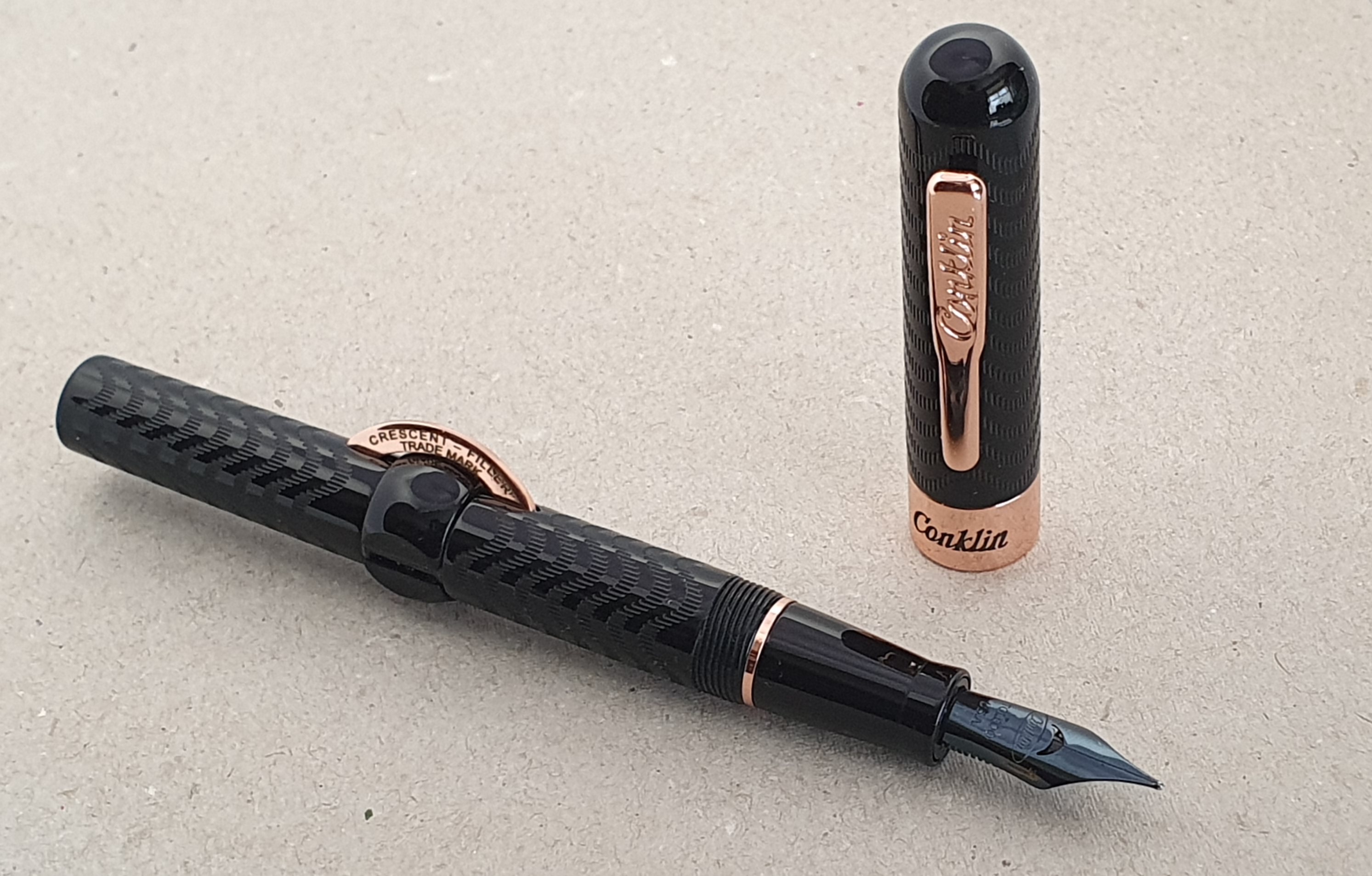
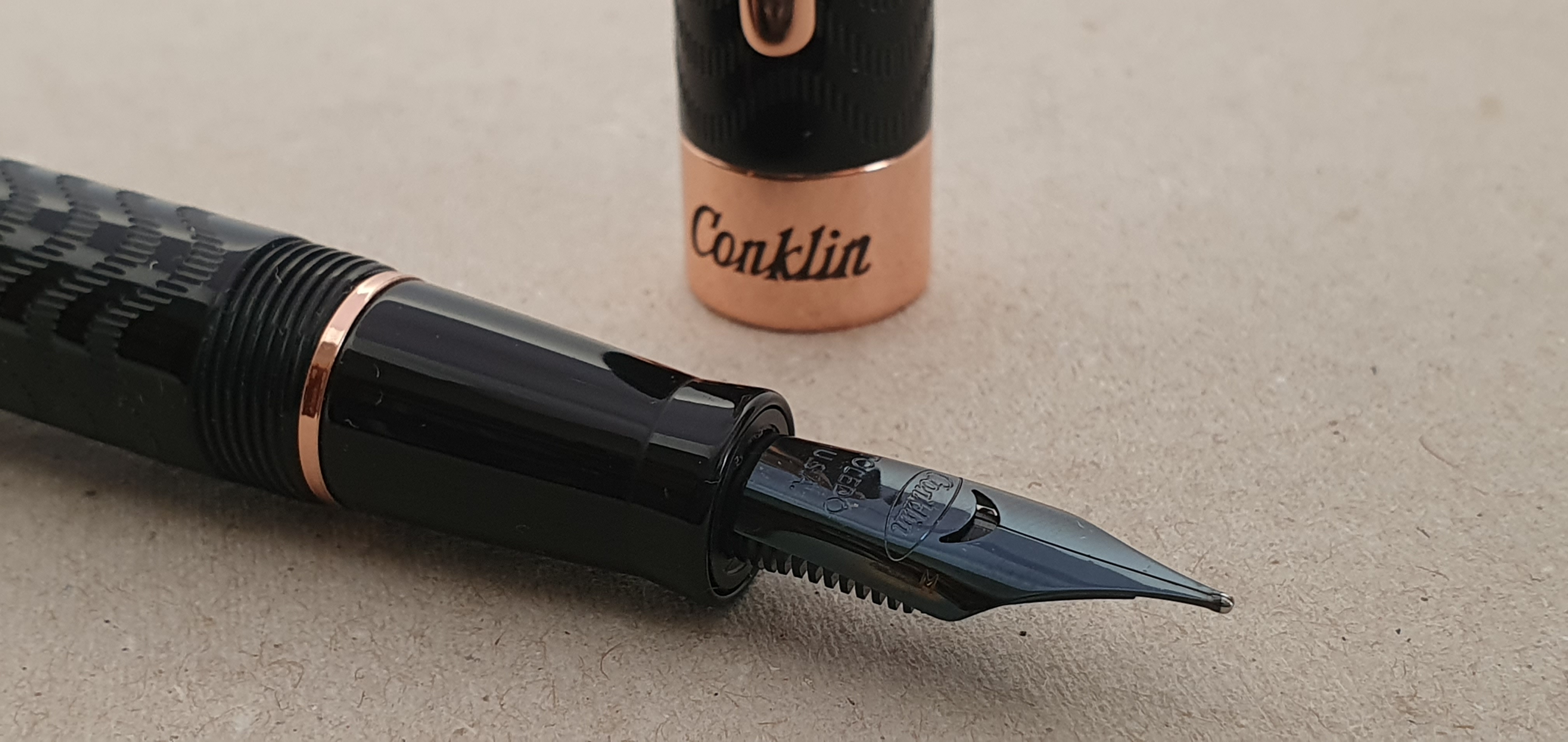
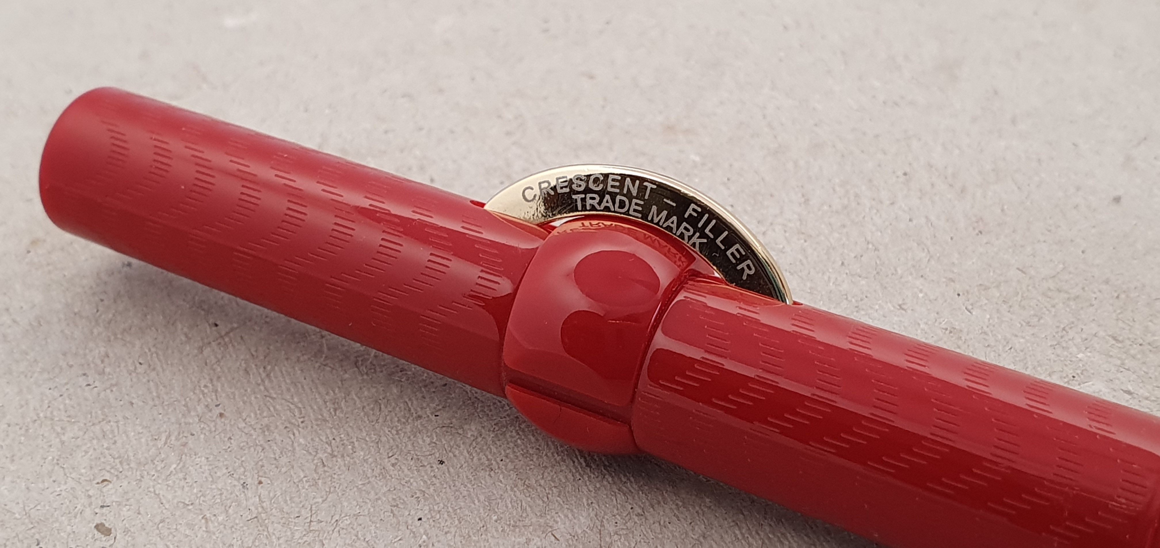
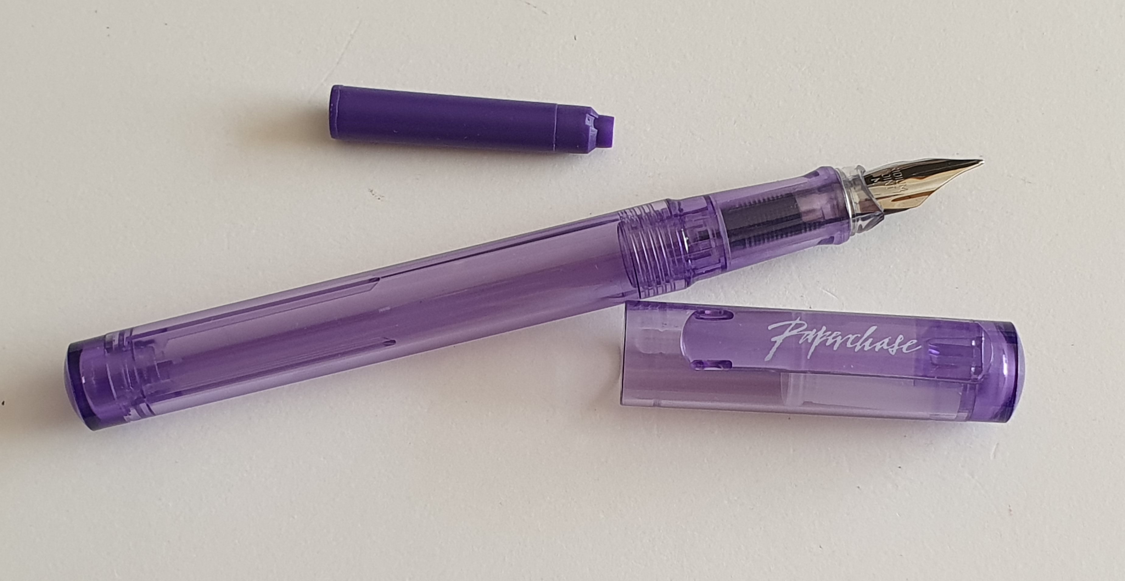
Paperchase was founded in 1968 and grew to be a familiar sight, along with stationers Rymans and WHSmiths. The branches were not all identical but were bright and inviting to browse in, featuring a large selection of greeting cards, shelves offering numerous styles of notebooks in all shapes and sizes, tables of toys and novelty products appealing to children, loads of stationery accessories, pots of colourful pens and, in some stores, displays of fountain pens in glass cabinets. These might included Parker, Cross and Kaweco and a few others although generally none too expensive for an impulse buy.

The Paperchase logo on the back of a journal.

Over the years, I visited Paperchase a lot. If my wife and I came across a Paperchase we would pop in for a look round and often buy something.

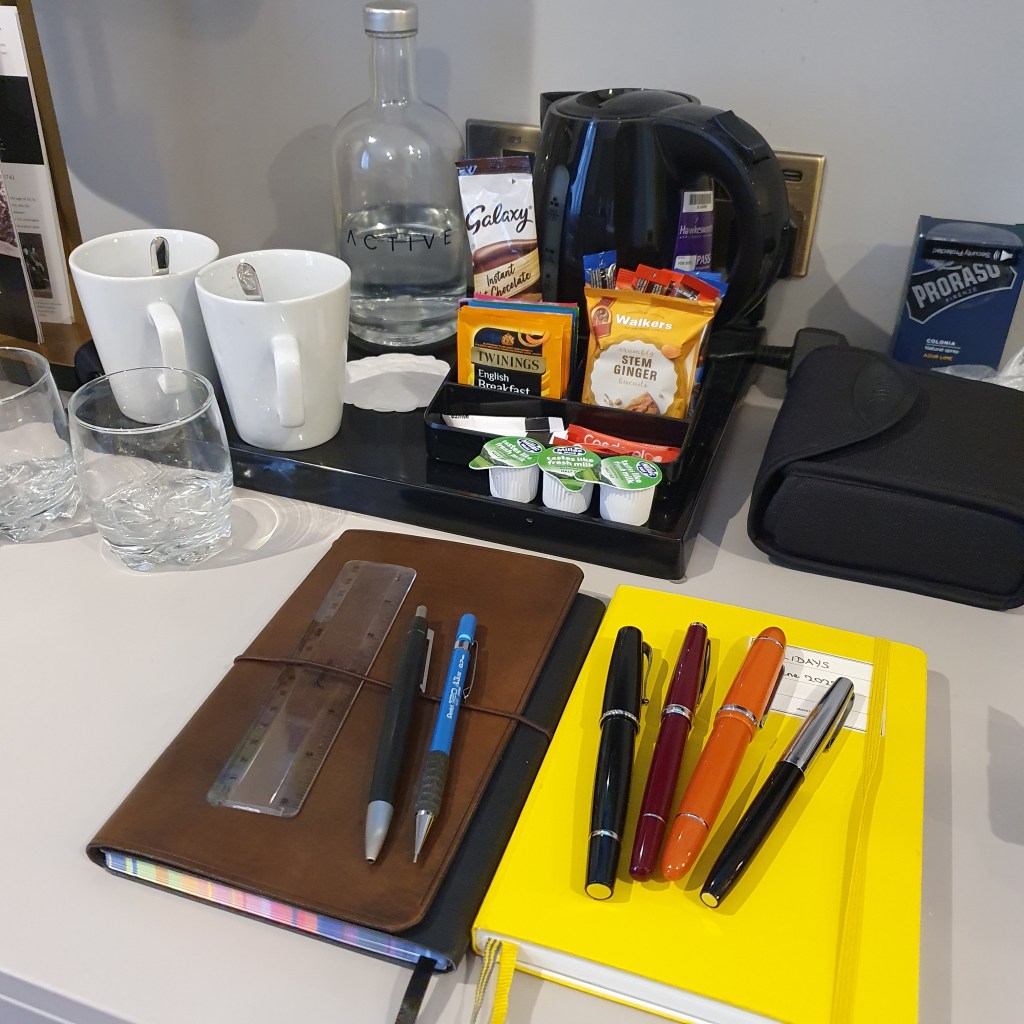
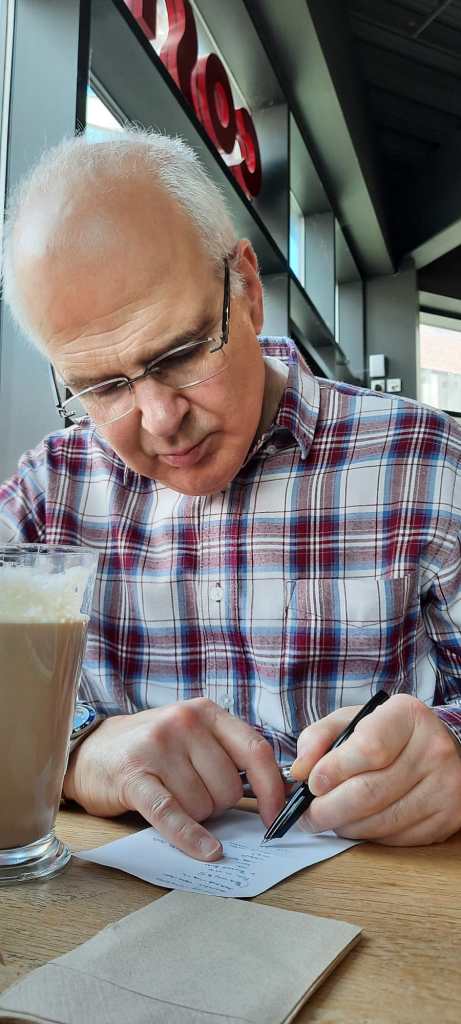
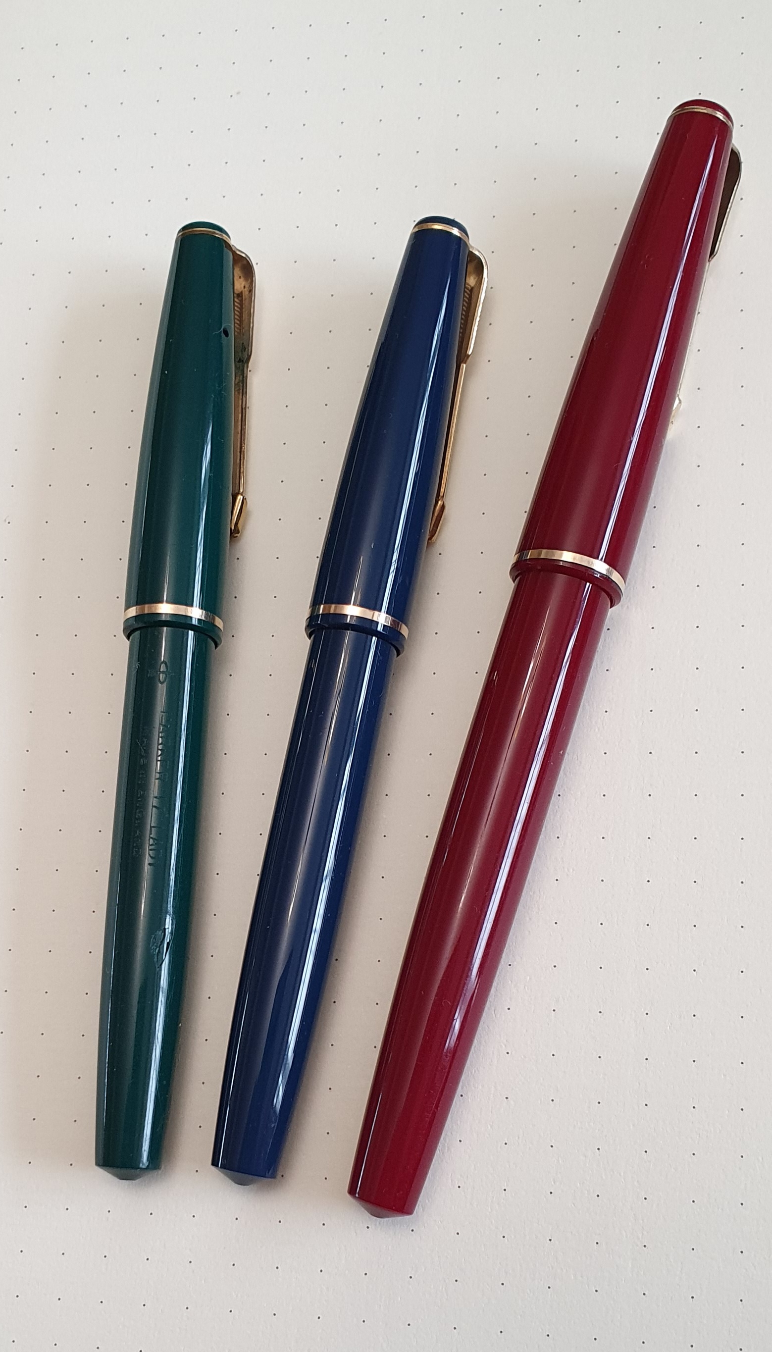
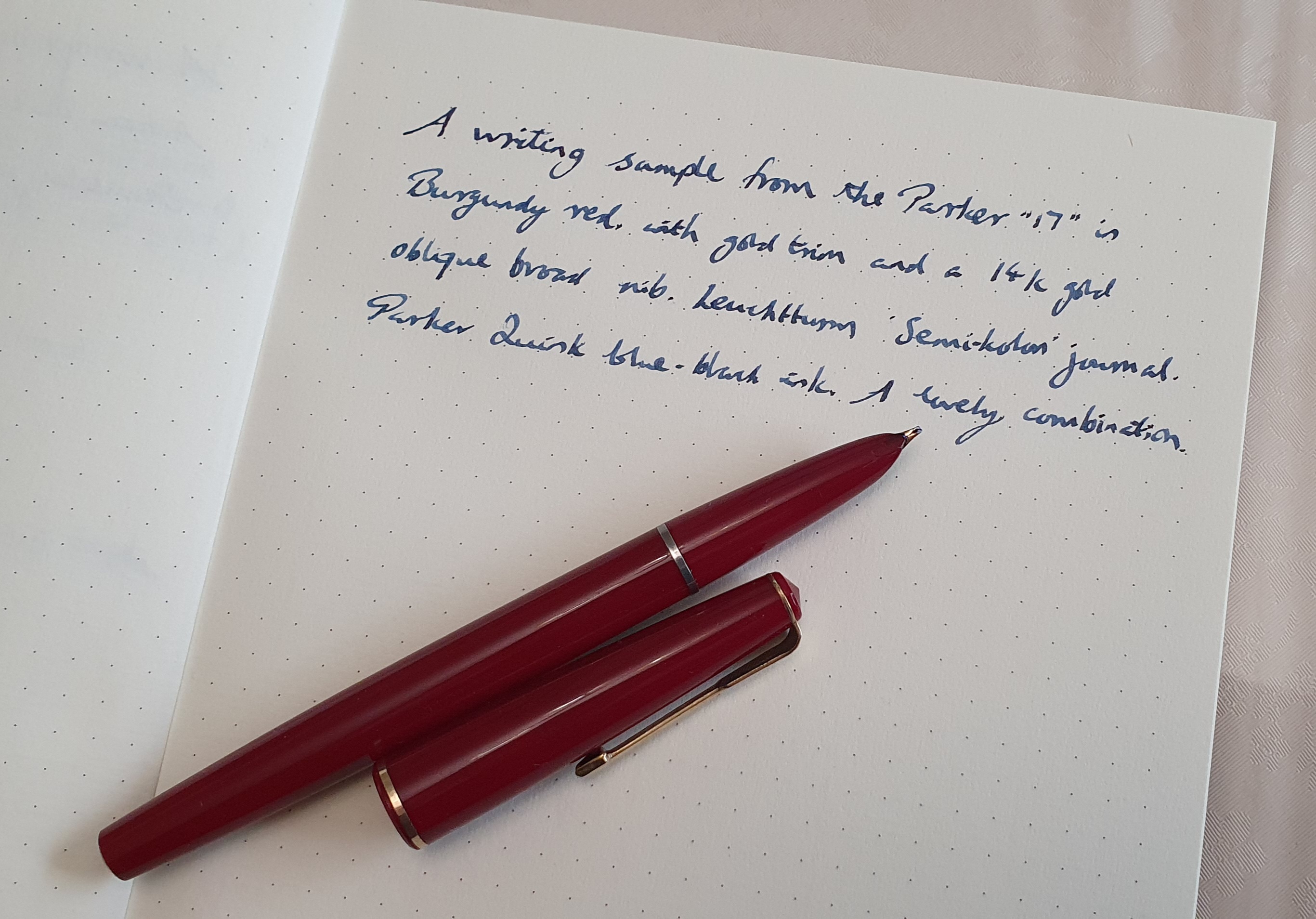
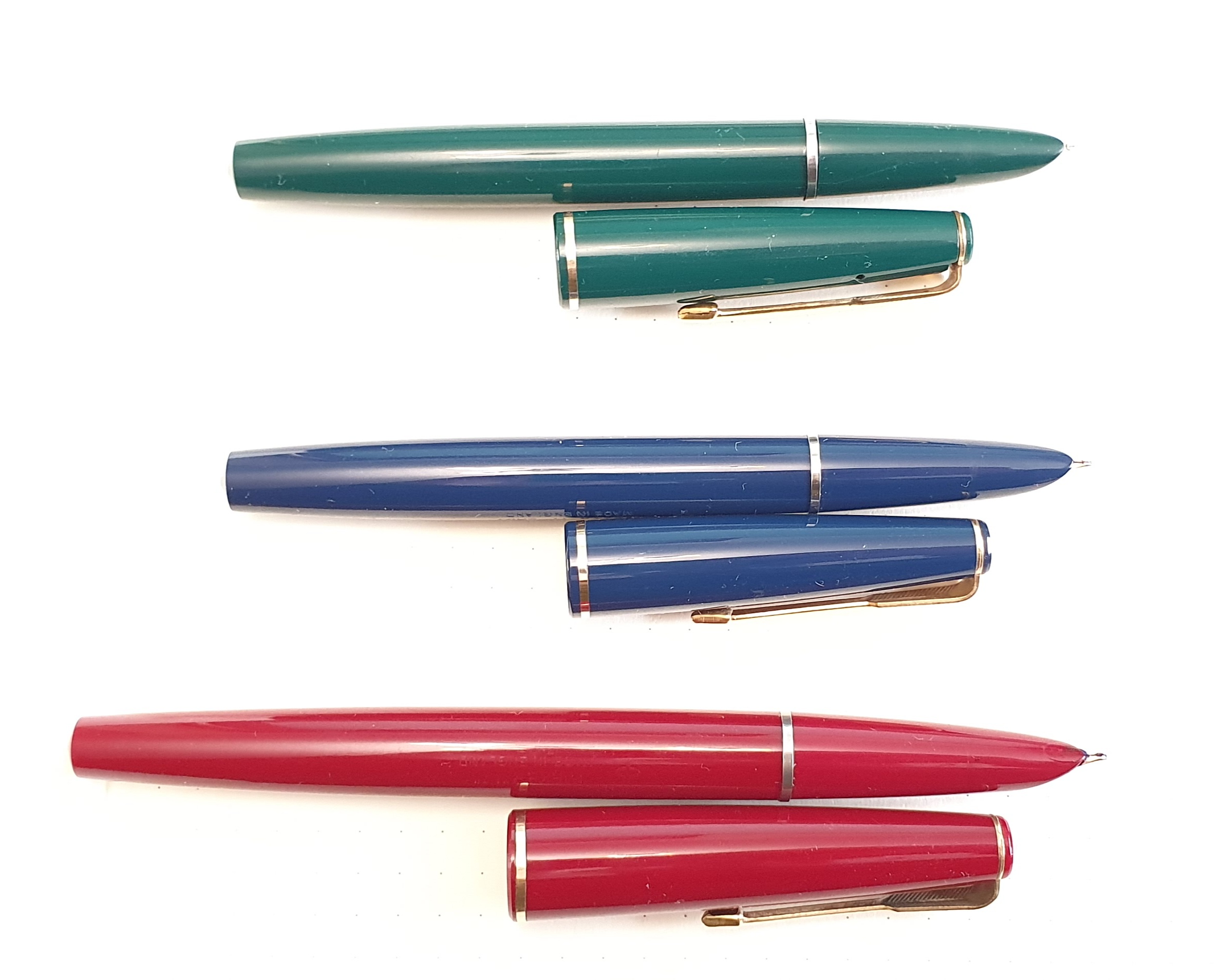
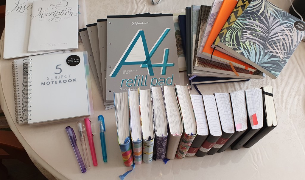
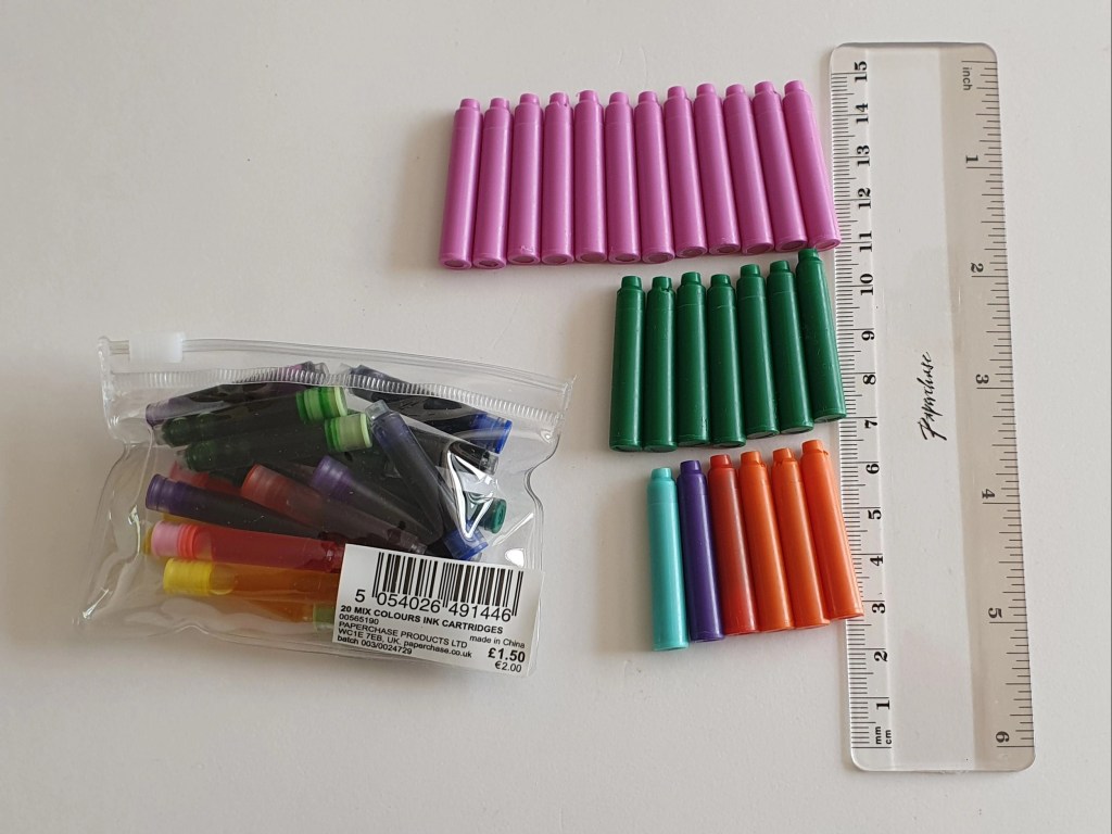
Today, looking around my writing space (aka the dining room) I rounded up just some of the products that had come from Paperchase, for a team photo. These ranged from packets of standard international cartridges in a variety pack (I seem to remember that they had once cost £2.50 for a bag of 50), through literally dozens of notebooks, pads of writing paper and file paper, to a few memorable pen purchases.

A quick round up of just some of my Paperchase purchases over the years.

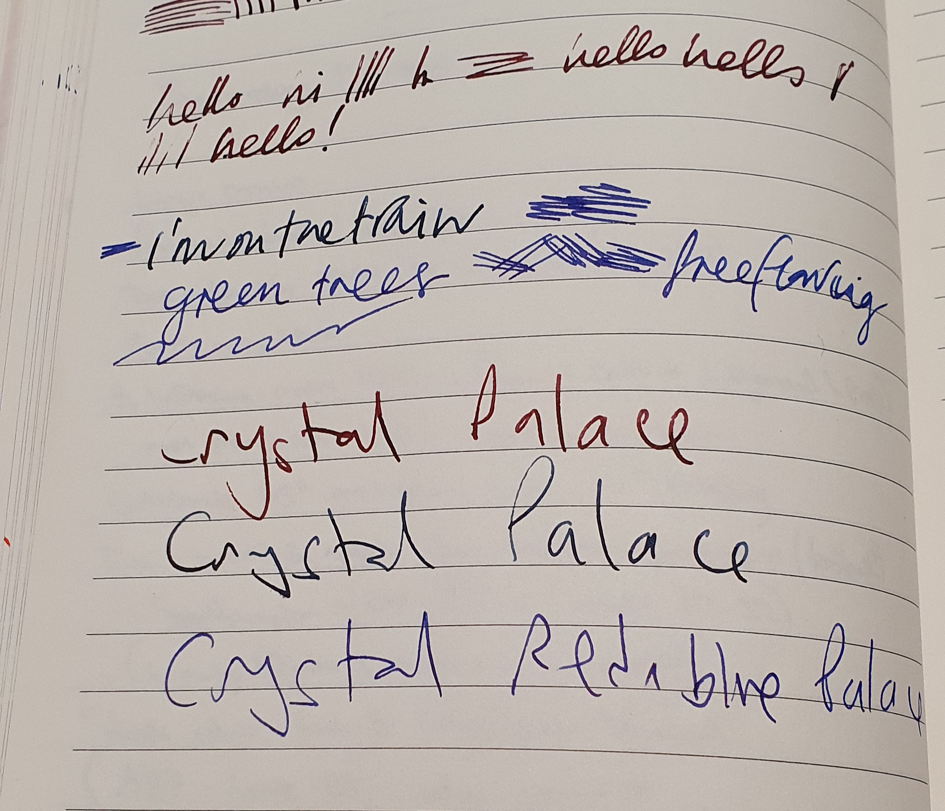
If you chose a fountain pen from the display cabinet, the staff often struggled to locate the box. My favourite Paperchase story (told here before) is of once buying a handsome Cross Century II fountain pen in black with a chrome cap, at the price marked on the display. Several months later, I was in the same shop and saw the matching Cross ball pen and asked to buy it. This time, they were unable to find the box and its code in order to sell it. Eventually, it transpired that it could be sold only as part of a set with the fountain pen. After proving that I had bought the fountain pen already, they agreed that the ball pen was mine too!

Loose cartridges from my first variety pack. I have a lot of pinks left.

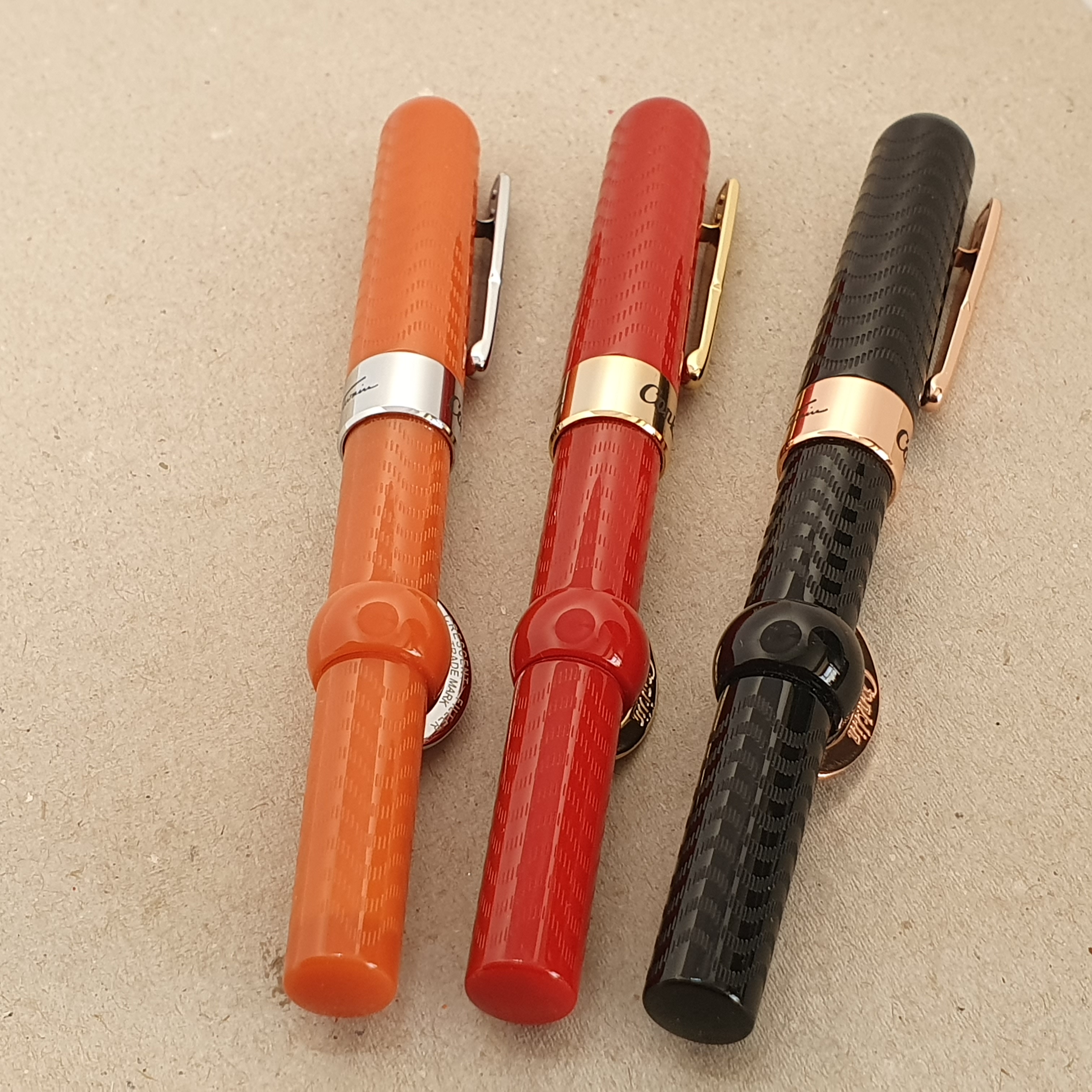
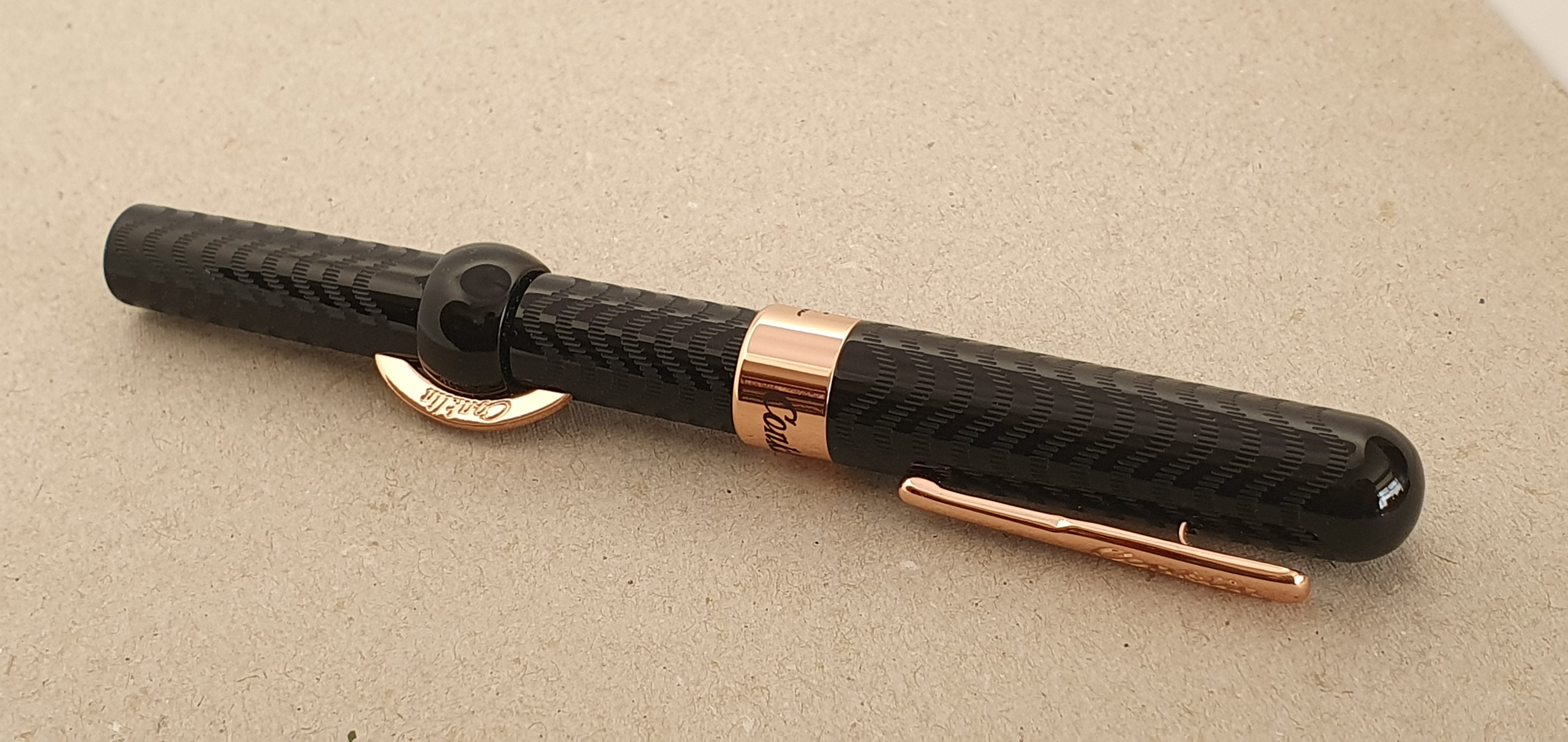
I remember where I was when I bought my first Kaweco Perkeo: it was the Paperchase shop in St Peter Port, Guernsey. The pen was a success and I later stocked up on about five more, in various colours. This pre-dated my same behaviour with the Cross Bailey Light, although those were not from Paperchase.

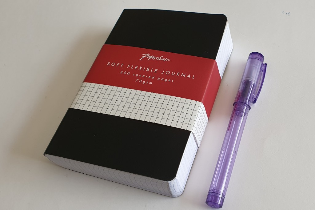
However, my greatest dependence on Paperchase, was for notebooks and journals. I remember discovering the little chunky black A6 journals with a staggering 600 pages of squared, fountain pen friendly paper. I bought a couple of those and was sorry when on a later visit, they seemed to have ceased selling them. But then I later found them back in stock again a year or two later, I binged on another three! They were great, such as for jotting down trivia when watching tv or listening to music online. They would last for ages.

One of my favourite Paperchase products. Actually 600 pages.

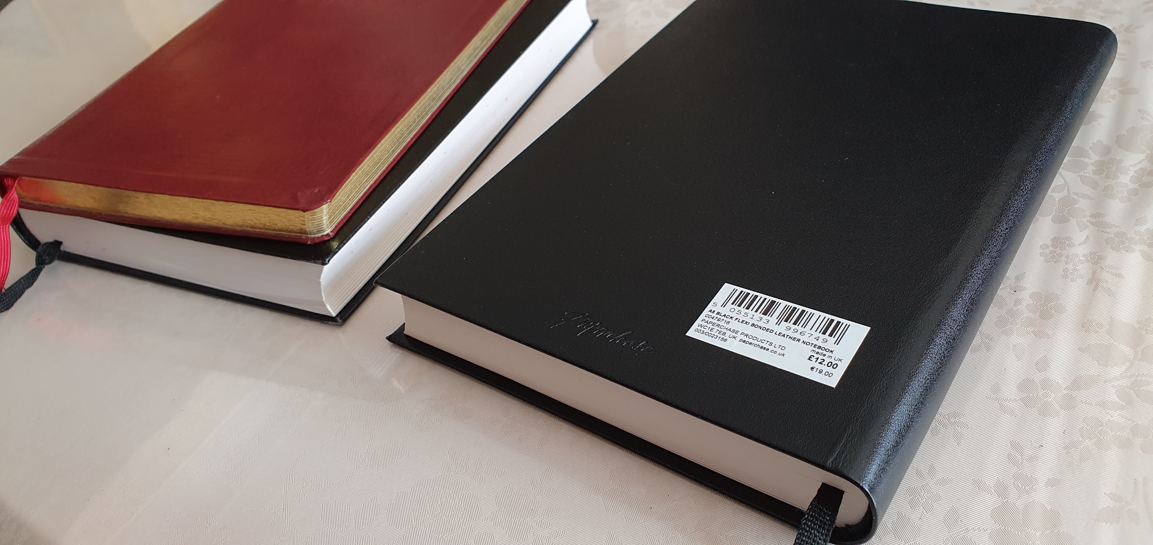
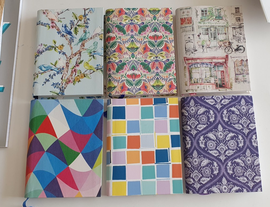
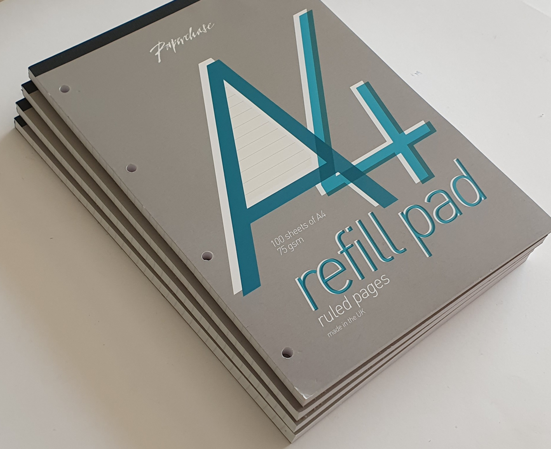
Paperchase had a wide choice of journals. Some had paper that was not fountain pen friendly. I liked the A6 flexi-covered books, nicely stitched, with 320 pages of either lined paper (8mm line spacing) or plain paper, both of which were great for fountain pens. They were usually £8.00 each and occasionally reduced in a sale. I tended to buy more than I needed (an understatement).

Paperchase A6 journals, of various designs.

For larger, A5 journals, Paperchase once sold journals with bonded black leather covers, with 384 pages of smooth, lined paper, with a generous 10mm row height. I used these for more lasting projects, such as memories of my school days and would enjoy writing in these with various fountain pens and inks.

A few of the more luxurious, bonded leather covered journals.

Paperchase also had an online service, although I did not use it as I was well served with branches in London. But I did make use of their loyalty card. If presented when making a purchase, you would be given an offer with your receipt, for a discount on your next purchase, subject to various conditions. I once bought some pads of file paper, only to be told that there was nothing to pay as it was all covered by accrued benefits. I was very fond of their pads of file paper, which I use at home and at work. Not only was the paper of good quality but also, the pages could be torn off the pad easily without ripping the paper, unlike some I have used.

Paperchase pads of white A4 file paper. They also had yellow paper.

The final months of Paperchase’s departure have been sad to see. I visited the branch in Windsor and bought a few more pads of file paper. The staff had just heard the news of the closures and did not know what the future held for them.

I was at the O2 Centre in Swiss Cottage when I saw the massive black-on-yellow posters in the shop window, announcing the closing down sale. I went in to look round, but most of the stock had gone. What was left was all discounted and it was unclear what the final price would be. I picked up a few small items, such as Lamy ball pen M16 refill, marked at £3.75 but which came to only fifty pence when rung on the till. Similarly, a clear plastic ruler was only a few pence.

One of Paperchase’s occasional, own-brand cartridge pens.

On visiting Bracknell recently, and also Southampton, the Paperchase stores were dark with their shutters down. I almost took a photo of the sad looking shop fronts, but it seemed like gloating.

I have been sorry to see Paperchase go. I will miss them. I read that the company had suffered years of plummeting sales and soaring costs and was a victim of the Covid lockdowns and the growing shift to online shopping.

But we had many good years. I will wait to see what becomes of Tesco’s involvement. If some of the better notebooks and journals can be offered through Tesco’s many stores, this will be some consolation.

Travelling with ink: April snippets.

An Easter at Easthampstead Park.

I recently enjoyed a nice Easter break at the Easthampstead Park hotel, near Wokingham. It was little more than an hour’s drive from home, but still felt like a holiday. The hotel is a stunning 1860’s mock Jacobean mansion, and for many years belonged to successive generations of the Marquess of Downshire, whose estates also included Hillsborough Castle in Ireland. Eventually, it was sold to the local council and then a few years ago to the Active hotel group.

Easthampstead Park Hotel, Wokingham.

As with any holiday, part of the enjoyment is deciding which pens to bring. I am always torn between going minimal and just bringing one pen, or else going the other way and bringing too many. Even though it was just a one night stay, I ended up bringing three of the new pens bought at the London Pen Show in March, plus a Jinhao X159. Three of these went into my new Orom pen case in Elk leather, and the fourth in my shirt pocket.

Believe it or not, this was the stationery that I felt necessary for a one night hotel break.

Whilst I could not resist the desire to bring all these, I did in fact use only one pen for holiday journaling, namely the Aurora Duo-Cart. This was bought from Kirit Dal at the recent London Pen Show, who, after seeing my pen show haul blog post, kindly got in touch and offered to send me a proprietary converter for the pen. A few days later, I was thrilled to receive the converter in the post – a lovely metal squeeze bar type, which seems appropriate for the vintage inspired Duo-Cart model. He also enclosed a box of Aurora cartridges which was very kind.

Before driving home, my wife and I visited Bracknell, a Berkshire town not far from the hotel. Although only an hour from home, it was the first time we had been and we had a saunter around the pedestrian shopping centre, a nice mix of shops, some inside the mall and some outdoors. Although well-prepared with my pen stash, I found myself wondering what options there would be to a traveller who found himself in Bracknell, and (for some reason) in urgent need of purchasing a fountain pen! From our brief visit, it seemed that there were various options although somewhat limited. Someone desiring a fountain pen from the Italian or Japanese brands might be out of luck. However there was a selection of Montblanc pens in Fenwicks’ department store. For Cross, Lamy and Parker you have a Rymans. There were also Parker and Lamy in WHSmiths. Sadly the Paperchase store, as with all their branches, has recently closed.

Just before leaving I did come across a fountain pen, in the shop window of F Hinds, jewellers, which I had not seen before. It was a Sheaffer, in polished chrome and from its size and shape I wondered whether it might be one of the recent Sheaffer Legacy models. I went inside to investigate. They also had a few Cross and Parker fountain pens. The Sheaffer model that had caught my eye, labelled at £85.00, turned out to have a very tiny steel semi hooded nib, not the inlaid nib that I had rather hoped for. The nib looked more like the one on the Sheaffer Taranis. It looked rather odd but strangely appealing, and certainly felt comfortable to hold, with its generous girth and decent weight. But with the help of my wife at my side, I was able to resist buying it. I later found online that this model is called the Sheaffer Icon, in lustrous chrome and found a favourable review of it on The Pen Addict blog.

Sheaffer Icon, Lustrous Chrome. (Photo from F.Hinds’ website).
In Costa coffee shop. This is my writing face apparently. Aurora Duo-Cart.

The Quiet coach.

I am not very good at confrontations. Nor am I very good at conversation, which may be a result of spending most of my working life in rooms on my own.

Travelling back by train from Southampton to London, I was looking forward to reading my God-daughter’s book “Tomorrow Perhaps the future”. I had travelled down to see off my wife and mother-in-law for their cruise ship holiday and was travelling back alone.

Seeing that I’d boarded a “Quiet coach” on the train, (where passengers can escape from overhearing other people’s loud mobile phone conversations etc) I settled into a corner seat with a table. However the remaining three seats were promptly taken by three men in buoyant mood from watching a football match, whose manner seemed unnecessarily rowdy and boisterous for conversation across a table. Fearing that I might be subjected to this for the next hour, I politely mentioned that this was a quiet coach. The man turned to me as if I was mad and told me that I was “very silly,” travelling on a train from Southampton on a match day and expecting the train to be quiet.

To be fair I had not thought this through. Perhaps I expected these three football supporters to just say “oh, sorry” and talk in hushed tones for the trip as if in a library, whilst I read my book in peace. Instead they bellowed “Does that mean we can’t talk?” and asked “what are you going to do, confiscate our phones? “No, that won’t be necessary” I answered, sounding even more ridiculous, before adding apologetically “clearly I am out-numbered, my mistake.”

What could have been an awkward and uncomfortable journey then turned out to be delightful and memorable one. Introductions were made. Whilst one of them went to find the facilities, another, Tim next to me explained that they were keen supporters of Crystal Palace, a London team although he had travelled from Manchester to see the match against Southampton. The third man told me that he had been to every game, and had collected every match programme, for decades. Clearly they were lifelong football fanatics and took great enjoyment in travelling to follow their team.

Tim then asked what turned me on. I hesitated, saying that they would find this ridiculous, before saying that I was a fountain pen collector. Tim immediately recalled his school days with inkwells in the desks, for dip pens. That would be back in the 1960’s. He asked whether I had any fountain pens with me. Funnily enough I had with me a pen case with a Montegrappa, a Cleo Skribent and a Waterman (representing Italy, Germany and France, in football parlance). I got these out, bracing myself for further ridicule, but none came. He took interest in each pen. I talked about the issues for fountain pen users, of being left handed. I got out a notebook to demonstrate the pens and explain the style that I had adopted of writing away from me, turning the paper 90 degrees left, rather than hooking my wrist, to avoid smudging.

One of the men opposite returned to his seat. He asked what I did, to which I replied that I was a lawyer working in residential property. This prompted a bitter tale of his own experience of using a solicitor for a property sale, in which he had complaints about perceived delays being the fault of the lawyers. But soon after this the train reached his stop.

Tim remained while the two friends opposite got off. A young woman boarded and took the window seat opposite me.

To my embarrassment, Tim then asked the newcomer “Are you into fountain pens?” She took out her ear buds and he repeated the question. “No, not really, I mostly use biros” she replied. Tim (who was clearly good at starting conversations) then filled her in, with our conversation thus far. We established that her name was Hannah and that she was an illustrator and author of children’s books. She had written a series of children’s detective books. She was also left handed.

Tim and Hannah each try my pens: Cleo Skribent (Diamine Deep Dark Red); Monte Grappa (Diamine Tavy blue black) and Waterman Embleme, (Serenity Blue). They both liked the Waterman best.

I mentioned that my God daughter Sarah Watling had recently had a second book published and showed it to her. The book concerns a number of women writers and outsiders, who were drawn to the Spanish Civil War. Tim was familiar with George Orwell’s Homage to Catalonia and was well versed in this part of Spain’s history.

We also got on to talking about the Titanic and coincidentally I had just visited an exhibition about the ship whilst in Southampton and had noticed that the anniversary of the sinking was just a day ago 14 April 1912. Tim was clearly well read about the Titanic too. Many of the crew who perished in the disaster had come from Southampton.

The journey to London flew by in pleasant conversation between us three random strangers on the train. As London approached, Hannah put on her woolly hat, coat and back pack. Tim shook my hand and we parted as friends. On the platform Hannah disappeared into the crowd and we each went to our separate lives.

After such encounters I am often left feeling that I have not been a very good ambassador for the fountain pen hobby and community. Although one cannot rehearse such conversations it was enriching to meet both Tim and Hannah.

Early thoughts on the Conklin Mark Twain crescent filler fountain pen.

This pen was part of my haul from the London Pen Show in March 2023. I do already have a pair of these, also bought at a pen show several years ago, one in red and one in a dark orange, (which might be called coral) but was newly tempted by this handsome black chase edition with rose gold colour trim and a stealthy black-coated nib.

Conklin Mark Twain crescent filler, black chase and rose gold colour trim.

The pen is based upon the original, designed by Roy Conklin between around 1897-1901 and featuring a quick and easy filling system. Advertisements at the time claimed that the pen “fills itself in four seconds.” Whereas the original was made of ebonite, the modern one is of some sort of plastic or resin, but has a pleasing, glossy finish and an attractive wave pattern on the barrel and cap for decoration and texture, like the original.

The cap features a sprung metal clip: you press the top end inwards to raise the clip, making it easy to slip the pen into a pocket one-handed. There is a broad metal cap band, with Conklin on the front and a facsimile of Mark Twain’s signature on the back.

The cap unscrews, in about one and half turns. The nib is a size 6 steel one, with a distinctive crescent shaped breather hole and an imprint of the Conklin logo and Toledo, USA. Mine has an M for medium.

Stealthy black nib. Not-so-stealthy rose gold trim.

The nib and feed housing can be unscrewed from the section, for ease of cleaning. I found the nib on one of my older pens to be rather rough but it was interchangeable with one from a Jinhao X450. Separate replacement nib units from Conklin are also available (for example from Cult Pens at £28.00).

On this new black pen, the nib has a glossy black coating. Mine is a gusher. Whereas I do generally like a wetter nib for lefty overwriting, this one was leaving such a volume of ink on the paper that I needed to try to narrow the tine gap slightly by gently bending the tip downwards. This has helped and I may yet try using a drier ink, such as Pelikan 4001 Konigsblau at my next fill.

There is a single rose-gold coloured ring separating the section from the barrel. However the barrel does not unscrew, or at least I do not think it is meant to, and I have not tried to force it. It is not necessary to remove the barrel to fill the pen.

Beneath the barrel, there is a large ink sac, or reservoir. To fill the pen, you simply twist the locking ring to align a gap in the ring with the crescent-shaped filler button. Dip the nib in your ink bottle. You can then press this button causing a long flat metal bar inside the barrel to deflate the reservoir, creating a vacuum which then draws up ink as the sac regains its shape. After a few presses, when you cease to hear bubbles, you have a good fill. Twist the locking ring back again, to prevent unintended ink ejection and you are all set. The pen holds a mass of ink.

Mark Twain (1835 – 1910) was an early fan of the Conklin’s crescent filler pen, for its ease of filling and also for the added benefit of it not rolling off a table.

This won’t roll anywhere.

Size and weight.

When capped, the pen measures about 140mm. Uncapped it is around 129mm. The cap can be posted, but it then becomes very long at around 166mm and the pen is plenty long enough without posting. It weighs about 30g, comprised as to 19g for the pen and 11g for the cap. I find the size and weight to be very comfortable. The only issue in terms of comfort is to ensure that the crescent filler button is roughly in line with the nib and not facing too far one way or the other so as to be in your way as you hold the pen.

Some do’s and don’ts.

On my coral-coloured pen, I found that the barrel was not securely glued to the section and I was able to remove it. The rubber sac stays attached to the section. There are metal threads inside the barrel. If you do remove it, you can then remove the crescent filler. However you should apply some talcum powder to the sac before reassembling. I later re-visited this pen to find that the barrel was stuck and would not unscrew. When I forced it, I found that the sac had become stuck to the inside of the barrel and that by unscrewing the barrel, I had torn it from the section. I have still got the bits.

My Conklin crescent filler family.

Another thing to avoid is immersing the pen in water. If flushing the pen, be careful to keep the crescent filler clear of the water as you do not want water getting in the barrel through the openings.

One handy tip when capping the pen, given that the cap threads have four entry points, is to work out how best to align the cap clip with the crescent filler button. To do this, insert the pen loosely into the cap, with the nib in line with the pocket clip. Then turn the pen left (anti-clockwise), and listen for the clicks. You can then find by trial and error whether you need 1, 2, 3 or 4 clicks to the left, before turning the pen the other way to screw the cap on. Once learned you have perfect alignment every time.

Conclusions.

I was fortunate to find this pen greatly discounted at a pen show. A more usual price would be closer to £200.00 and I do think that at full price a well-tuned nib is in order. If not in gold, then at least a really delightful steel nib (such as one finds on a Diplomat, Onoto or Otto Hutt, for example) would be appreciated. As it is, all three nibs on my crescent filler pens needed some attention.

However, I love the filling system which is very convenient and satisfying. Also I find the girth, length and weight of the pen to be ideal. Having owned this pen for a month now, I can report that it has not suffered from hard starts and has performed well. And so with that one caveat that a nib might need a little fine-tuning, I think the pen is good to have, as a modern reminder of an important piece of history in fountain pen development.

Cap and crescent filler alignment achieved.

My Parker “17” fountain pen family.

I shall always have an affection for Parker fountain pens. The brand was my first introduction to a higher quality, grown-up’s pen when I went to my new school in 1970. Previously I had used Platignum or Osmiroid pens at junior school.

I used Parker pens throughout my seven years at secondary school. Since then I have tried many different Parker models, most recently the new version Vector XL, which I quite like but which lacks the character of the vintage models.

Happily, vintage Parker pens are in plentiful supply at pen shows. One sees numerous trays of Parker 51 pens in their various finishes, which can be found at prices from about £50 upwards depending upon the model and condition. But in the crowded setting of a pen show, it may be difficult to pick out which one to buy, if you are faced with several trays of almost identical models. To check their condition, to have a quick look at the nib, the state of the barrel and the “Lustraloy” cap and the aerometric filler, one by one, whilst being careful not to mix up their caps, and then to remember which one you liked best, is a challenge.

Parker “17” Lady, green with gold trim. Broad nib.

Somehow there seems less pressure, to go down a rung or two, and look at the lower priced pens, sometimes grouped together by price. And so it was, at the London Pen Show in October 2022 that I picked up a Parker “17” Lady, for a very modest sum of £10.00.

On closer inspection at home, this particular example was damaged in several places, with a chip near the cap finial and cracks to the grip section, which I had not really noticed properly until I had filled the pen and found ink on my fingers. It was a pity, as the broad nib was silky smooth. Still, it was only £10.00. I could not bring myself to throw it away but thought perhaps the nib and reservoir (attached together) might be reusable as a spare in another body.

Parker “17” Lady, blue with gold trim. Broad nib.

At the London Pen Show in March 2023, I hoped to pick up another Parker “17” Lady. Sure enough I spotted a blue one in a box, at £20.00. The condition this time looked like new and the barrel even had the original white markings, in chalk or white crayon, which read “17” LADY B 25/ -. These rub off very easily, suggesting that this pen had been handled very little in the past 50 years. I bought it eagerly.

It appears that this pen has been largely untouched in 50 plus years.

Parker “17”, Burgundy with gold trim. Oblique broad nib.

A little while later, on another pass of the tables, another Parker caught my eye, this time a Burgundy red model which was also a Parker “17” but not a Lady, and with a tag indicating that it had an italic nib. This one was £40.00. Using my loupe, I saw that the nib appeared to be a left foot oblique, and looked in good shape but there was a crack to the section just above the nib. I suppose this is a weak point and prone to cracking if too much pressure is applied to the nib. I hoped that the section might be reparable or replaceable. I was still keen to give the pen a chance and a deal was agreed at £30.00.

Thus I have in the last six months bought three Parker “17”s, at £10.00, £20.00 and £30.00. See how this hobby escalates?

My three Parker “17” fountain pens. The two on the left are the Ladies.

Reading up on the Parker history, I learned that the Parker “17” range of pens were made from 1962 to 1972. They have the aerometric, squeeze bar filling system and so were true fountain pens, before the introduction of the Parker 45 which was a cartridge-converter pen. For more information on the Parker 17 range and the rest of the Parker family, visit Parkerpens.net.

After the pen show, when I was able to try out my purchases, I found that the blue Lady did not want to write, neither when first dipped nor when filled from a bottle. The aerometric filler was working fine and so I could not understand why no ink would come out of the nib when the pen touched paper. After a couple of days, I tried flossing the nib with brass shims. This seemed to do the trick: the problems was simply that the tines were too tightly together. I tried to ease the tines apart very slightly and then smoothed them on Micromeshe pads. The pen now writes smoothly, with a good broad line.

As for the Burgundy model, after cleaning the pen a bit, I could see that the crack to the hood over the nib was likely to be a problem and I could foresee leaks occurring. I found some Loctite glue and dripped some of the clear liquid onto the hood, to allow it to run down into the crack and waited a few hours for it to set hard. This worked. I filled the pen and there have been no leaks, after several weeks of occasional use. In hindsight, I wish I had had the patience to try out the pen before applying the glue, and also wished that I had been a bit more thorough in cleaning the crack before gluing it, but you live and learn.

Notwithstanding my rather amateur repair efforts, the real success story is how well the pen writes for me as a lefty overwriter and the pleasing effect that it has upon my usual writing style. The nib does tend to dry out and is a hard-starter. Also it needs to be held at a certain angle to the paper and quite upright, like a ball-point. But once it gets going and you find the sweet spot, it is worth the wait. For these reasons it may be better suited to longer, continuous letter writing or journaling sessions, rather than for intermittent notes.

The Parker “17” in Burgundy red with an oblique broad nib.

At the last pen show, spending several hundred pounds, I got some great bargains and some wonderful pens and have no regrets. However, if I am honest with myself, it is the 50 year-old Burgundy red Parker with its oblique nib that is the best suited to my writing style and the most complimentary to my handwriting. It is a salutary reminder that in buying a fountain pen, perhaps the most important question is whether the nib will suit your writing style. If not, you will need to adapt your style to suit the pen.

Arguably for the £60.00 spent on my three Parker 17’s, I could have bought a Parker 51. Three 17’s do make 51. But, I have already enjoyed more than £60.00 value in my new Parker 17 family. If I do venture towards a Parker 51, I shall know that an oblique broad is the nib for me.

They were available in black too.