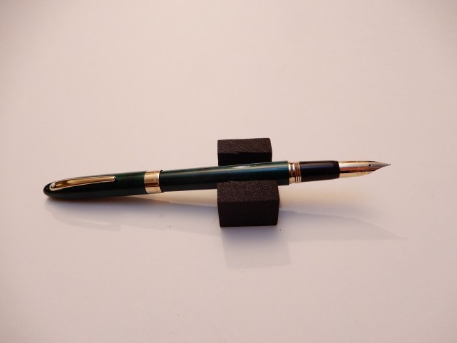
One of my lucky finds at the recent Cambridge pen show was this lovely Parker Junior Duofold, in dark green with gold fittings.
Parker Junior Duofold
The pen is lovely in its own right, but had a particular attraction for me, being a close match to the pen that my mother bought for me in 1970 on the occasion of going to a new school. Sadly and inevitably, I managed to lose it within a few weeks and for the next seven school years, used a succession of less valuable Parker fountain pens.
Description
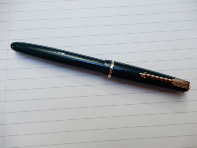
The pen has a classic, timeless look, in British Racing Green resin (think of a 1920’s Bentley at Le Mans), with a 14k gold nib, which looks like a Broad but has no width description showing, and a simple, fixed aerometric type squeeze bar filler. It has a screw cap, a shortish gold coloured arrow clip and a single gold coloured cap band with some engraved pattern but no text. The cap has two small drilled air holes in the sides which I presume are to avoid air pressure building in the cap. It is not a particularly big pen, by today’s standards but forms a generous length when posted and is smooth, light and comfortable to hold. The nib reads “PARKER, 14K, ENGLAND, 10”.
Still lots of mileage in this nib.
The pen measures 135mm long capped, 120mm open, or 160mm posted. It weighs just 15.5g closed or posted. Uncapped it is 10.5g and the cap alone weighs 5.0g.
Buying a vintage fountain pen can be a bit daunting. At a pen show, tables filled with row upon row of vintage pens can seem rather overwhelming unless you are looking specifically for something. There is the worry (assuming that you are buying a pen to use) of whether the nib writes well, whether the filling mechanism is still working and (unless you have researched any given model before hand) whether the price is right.
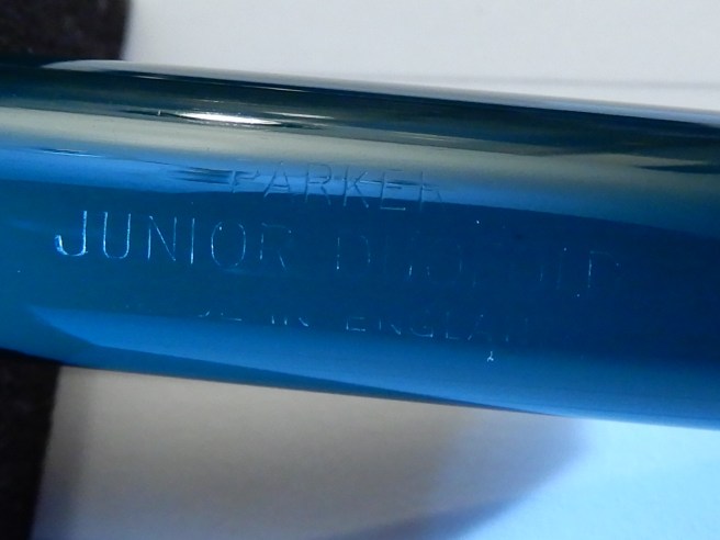
Being at least slightly prepared, I had a magnifying glass with me and was able to have a look at the nib and the tipping material, which looked to be in great shape. I also looked at the barrel and there found the very faint imprint, barely visible to the naked eye, “PARKER, JUNIOR DUOFOLD, MADE IN ENGLAND”. That clinched it.
I had to hold a torch in one hand while holding the camera in the other.
I have heard it said that the Parker aerometric sacs rarely have anything wrong with them. You can test them by removing the cap and barrel, putting the nib to your ear and giving the squeeze bar a press, to feel a small puff of air, assuming that it is not inked, of course.
At home, I flushed the pen in clean water a few times. I was pleased to see that the sac filled easily with a few presses.
The writing experience
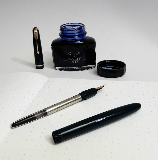
I filled the pen with Parker Quink, Blue-black, a rather obvious choice, I know. The glass bottles with their chunky plastic caps and 57ml of inky goodness, seem not to have changed much (if at all) since I was a child, except that they are now sold in ugly blister packs instead of carboard boxes.
Parker Quink Blue Black suits it well.
To my great pleasure and delight, this little pen wrote like a dream. It has a lot of what fountain pen enthusiasts crave, namely a buttery smooth nib, ideal ink flow, a little softness to the nib giving beautiful shading, comfortable handling, reliability and a bit of historical interest too.
A bit of Keats. Beautiful shading with Parker Quink Blue Black on Tomoe River paper. [should read “but still will keep”, not “with”, demonstrating that errors are only visible after publication].
In fact, looking across at my (ahem) 18 other currently inked pens, I could almost convince myself to put all the others away and just enjoy the Parker with its bottle of Quink. That is all I need, really.
I did not know very much about this range before buying one. Reading up afterwards on FPN, in a post by Malcy, I learned that Parker Duofolds of the 1950’s came in a range of models, with a corresponding number on the nib as follows:-
Lady (4)
Slimfold (5)
Junior (10)
Demi (15)
Standard (25)
Senior (35)
Maxima (50)
Conclusion
Armed with this information I am interested now to handle some of the others in the range. It is nice to have something specific in mind to hunt for next time a pen show comes to town. Parker Duofold pens have been made for a long time and I feel that I have a lot more to learn.
Last Saturday I had another browse in the sumptuous fountain pen department at Selfridges in Oxford Street. (No, I managed to resist buying anything this time). I did linger in front of the current Parker Duofold, International, Big Red in a glass display case, but at £500.00 it is a lot of money. Happily, my vintage Junior Duofold cost me only £50.00 which seems a small price to pay for the pleasure it gives and for entry to the Duofold owners’ club.
For the past two weeks I have enjoyed getting acquainted with this pen, bought new at the Cambridge pen show.
If you are new to the Pilot Falcon, as I was, there are a few things that might cause some initial confusion, as follows:-
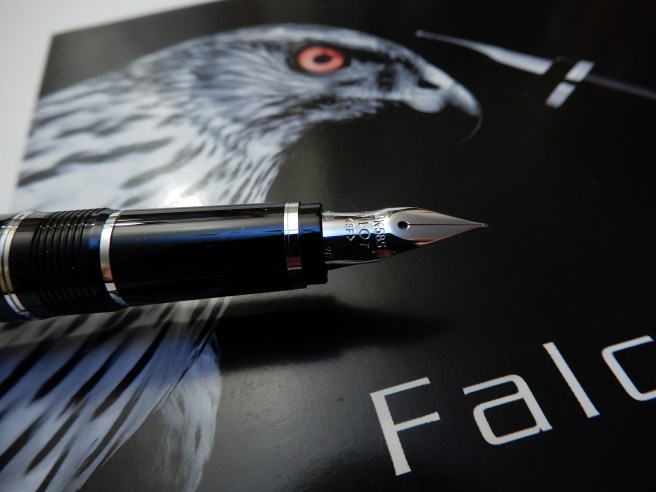
This the Pilot Falcon. In the past, they were branded as the Namiki Falcon (Namiki being Pilot’s brand for its high-end pens).
The Falcon can be found in either resin or a metal body with lacquer finish.
The nib on the Falcon is a semi-flex nib, with the markings SEF, SF, SM or SB (for soft extra fine, soft fine, soft medium of soft broad), also denoted by a removable silver sticker on the barrel. However, when people refer to the “Falcon nib” they may instead mean an entirely different shaped nib, with distinctive cut-aways on the sides to help it flex, with the markings FA and which is not found on the Falcon pen at all but on a different Pilot pen.
The nib called the Falcon (FA) nib, is more soft (flexy) than the soft nibs made for the Pilot Falcon.
See what I mean? Anyhow, the model that I have is the Pilot metal Falcon, in black with a Soft Fine (SF) nib, which is 14k gold, rhodium plated. The pens branded as Pilot are clearly identified by the name Pilot stamped on the nib and on the cap, just above the shiny plain cap band.
Pilot metal Falcon, in black lacquer over steel.
There have been other modifcations too, such as the change from a resin to a metal finial and barrel end cap and the addition of another metal ring, so that there are now two rhodium plated rings on the grip section and a third on the barrel, just after the cap threads. These do give this smart but ordinary looking Pilot’s uniform a bit of panache, rather like the rings on the sleeves of an airline pilot’s jacket.
The nib
When I chose my Falcon, there was a Soft Fine or Soft Medium nib available. Both looked nicely finished, under a loupe but I chose the Soft Fine as I have come to appreciate Fine nibs more, in the past year or so and because I have relatively few of them, compared to the number of pens with medium nibs.
Soft Fine nib, in 14k gold, rhodium plated. Writes like a western extra fine. Wet and effortless.
I had read that Pilot nibs had a good reputation for being well made and for great performance straight out of the box, which is always a delight. This one lived up to expectations.
The unique nib of the Pilot Falcon, is the main draw for this pen. Shaped more like a nib that you might find for a dip pen, it is long and slender with a bulge half way down, as if the nib had been pushed into a wall and had buckled. It is rare nowadays to find a new pen sold with a flexy nib. This is not a “full flex” nib but has more softness to it than most. In the right hands, this can be used to apply a little downward pressure to the nib on the down stroke, to open up the tines a little and create some thicker lines, for attractive line variation.
I say “in the right hands” as (a) it does take some skill and practice to achieve this and (b) it is more difficult for left handers, particularly lefty overwriters, (such as myself) as the nib does not like to have pressure applied when being pushed forward, but only when being pulled backward. Indeed, you have to be careful on the upstroke to keep a light touch and avoid the nib jabbing into the paper.
In this regard, possibly a medium or broad nib might have been a more sensible and forgiving option for me if buying a flexy nib. However the fine nib certainly does have its advantages. It is not necessary to flex the nib and the pen can be used to write quite normally, without any downward pressure. The remarkable thing is that the pen requires no pressure at all and the tines are so responsive, that the pen will write as soon as the pen touches the paper – and with no skipping. Smooth paper is preferred.
Because the nib is so soft, it takes only the slightest touch to paper, to open the tines and lay down ink. I have found that it is important to keep the nib flat to the paper (rather than rotated left or right), so that both tines remain level on the paper. If the pen is tilted, one tine will lift higher than the other, causing the inner edge of the other to catch on the paper and make the nib feel scratchy.
I have also read that the nib needs to “break in” and become softer and more flexy in time. Meanwhile I have been careful not to push it too far for fear of springing the nib, bending it past the point of no return.
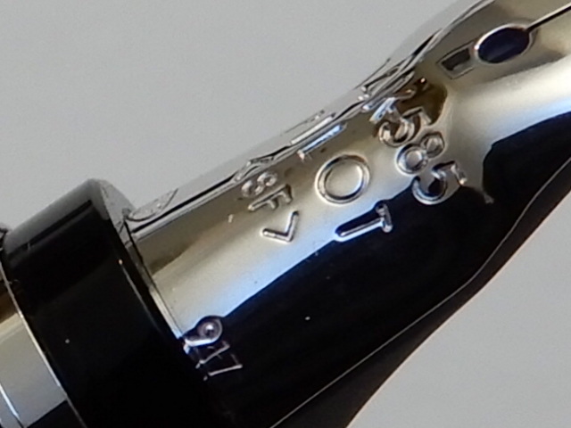
One of my favourite discoveries with the nib, was to find that the numbers in the lower right corner, and barely readable with the naked eye, denote the date of production of the nib. Mine is 917, that is September 2017. I have since looked at pictures of numerous others online to compare when they were made. I do enjoy it when pens can be dated.
Date marking on nib, for September 2017.
Filling mechanism. The pros and cons of the CON 70
The Falcon (be it the Pilot or Namiki) is a cartridge – converter pen but has evolved through several filling systems. I understand that originally, the pen had the CON 20 press-bar converter, unpopular for its small ink capacity which soon ran out especially if one was doing much flexing of nib for broader strokes. The next generation had the CON 50 piston converter. Both are now discontinued according to Cult Pens. The current metal Falcon has the CON 70 push button converter, which is relatively large capacity, efficient and fun to operate.
I have not yet fully grasped how this works. The converter has a button at one end. Inside, you can see a thin metal rod, with a rubber plug at the end, but which does not reach the open end of the converter and which can slide up and down the metal rod.
The CON 70 push button converter.
To fill your pen, with converter attached to the section, you simply place the nib in the ink, give the button a quick press and release, and ink is drawn into the reservoir. Repeat a few times and each time, the ink reaches a higher level. Within about four quick presses, you have a full reservoir.
From watching a Brian Goulet video on this converter, I gathered that pressing the button pushes the rubber plug downwards; air is expelled and the plug seals off the opening so that a vacuum is created. With the nib immersed in ink, the vacuum then draws ink up into the pen. It is all over very quickly.
The CON 70, refuelled with Pilot Iroshizuku Yama-budo.
On close inspection, it can be seen that the metal shaft inside the reservoir is a hollow tube. I have not yet deduced whether it is this tube through which air is expelled or ink is drawn in. But it works.
There are some issues to be aware of , with this design of converter. (a) It is rather a faff to clean if you are changing ink colours. You can try pushing the button repeatedly to fill and empty the pen with clean water. Or it is quicker to remove the converter and squirt water into the opening with a syringe or pipette. I have read that ink can lodge inside the metal tubular rod and that this can contaminate inks of a different colour, if you fill the pen before cleaning the converter thoroughly. (b) Also the action seems to make the ink go bubbly so that you are left with lots of tiny bubbles sticking to the inside of the converter, stopping you from seeing the new ink sloshing around from end to end with a single air bubble like a spirit level. The bubbles or tiny air pockets disperse a day or two after filling.
Straight after filling. Perhaps it just needs a flush with some detergent.
In use
The pen is very comfortable to hold, being a good medium sized pen with a nice weight to it. It weighs around 33g (20g uncapped, and 13g for the cap).I prefer to use it with the cap posted, although at 126mm unposted, many people would find it long enough without posting. One criticism that was made of the resin version, was that it felt too light. This is no longer an issue in the metal Falcon. Also, there was criticism of the small ink capacity converter but the CON 70 resolves this.
A few days after buying the pen, I had the opportunity to use it to take notes at a full day of training lectures. At the time it was filled with Pilot Iroshizuku Yama-budo which I was sure it would like. The fine nib proved very good for annotating typed hand-outs and marginal notes. It can be used for fast writing so long as you remember to avoid pressure on the nib. Sitting with the pen uncapped, it did stop writing on me a couple of times during the day, but this could just have been due to the ink drying in the nib while uncapped, rather than any issues with the feed. I have read that when used a lot for flex writing, the nib can railroad and also stop writing if the nib is flexed upwards away from the feed for too long, which is hardly surprising. I have not found any such difficulties in normal use.
In conclusion, the Pilot Falcon might not suit everyone, due to its softer nib but is a great quality, well finished precision writing tool, for those who enjoy pens with an extremely light touch for effortless writing , having the option of some flex writing if desired.
A week ago, it looked unlikely that I would make it to the Eastern Pen Show (Cambridge) on Sunday, 4th March, as snow and freezing temperatures had caused disruption to transport. Fortunately, this cleared just in time and a good rail service to Cambridge was running.
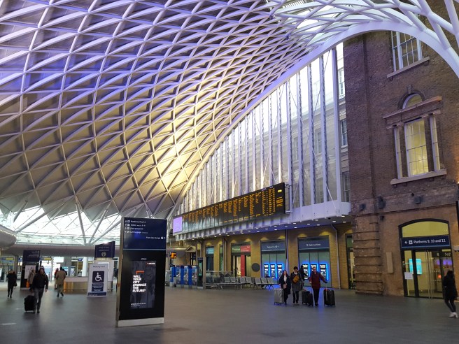
London Kings Cross station, at 7.30 on a Sunday morning.
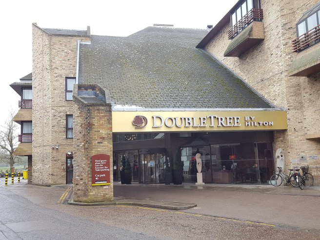
This was my first visit to the Cambridge pen show and I was much looking forward to it. Arriving early, I had time to walk from the station to the venue, the Doubletree Hilton Hotel, on the River Cam. This proved to be a good decision as those travelling by car were delayed by road closures and diversions for the Cambridge Half Marathon.
The venue, situated next to the River Cam.
The enjoyment of the day was as much down to the people, as the pens. First, I was pleased to find Marisa (@illustriouscactus on Instagram) and Faisal, two members from our monthly London UK Fountain Pen Club gatherings, as we waited in the lounge for the show to open. Also I had arranged to meet Jon (@jonr1971 on Instagram) and he introduced me to two of his Instagram friends, @fountainpensandink and @theclumsypenman. Jon later guided me as to the features of some Montegrappa pens which we saw at the show.
Bright and roomy venue.
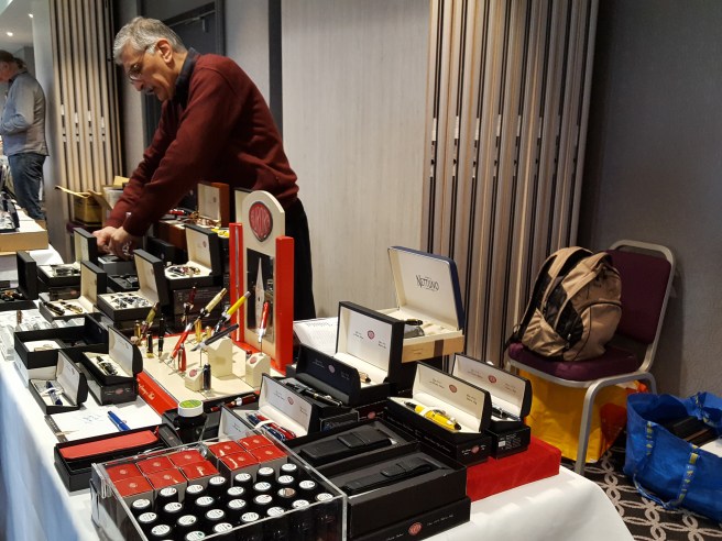
The venue was excellent, a bright, spacious ground floor room with rows of tables on three sides, and more down the middle, which lent itself to doing “laps”.
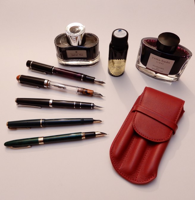
In prime position was Sarj Minhas, with several tables of enticing vintage and modern pens. Immediately, a green Sheaffer (a Crest, I believe) on his table caught my eye, as I already have the matching ball-point which I use daily. The fountain pen has a distinctive conical bi-colour nib in 18k gold. This proved irresistible and I thought it best to pick it up at my first pass, rather than risk losing out. Sarj also showed me some beautiful Sheaffer Balances, which will be added to the “wish list” as the price seemed a bit too high just for an impulse buy. While at Sarj’s tables it was good to examine some Urushi lacquer pens and an Arco pen which hitherto I had seen only on the internet.
A Sheaffer Crest with conical 18k bi-colour nib, for which I have the matching ball-point pen.
I had not planned to hunt for anything in particular although I was hoping that the vendor of my London Pen Show “mystery pen”, would be there so that I could buy another! He was. I learned that he is John Twiss of Twiss Pens (twisspens.co.uk) and that the blue and clear demonstrator eyedropper pen that I had bought at the London Show, (see blog post: Wanted: an identity for this pen. ) from his supplier is deliberatly left unbranded. John also sells his own handmade pens and produces these at his Nottinghamshire studio. I bought another of the eye-dropper pens as I liked the last one so much and also picked up a gorgeous purple and black cartridge/converter pen with a size 6 nib for my wife (purple being her colour).
Having now attended the London pen show several years running, I now recognise many of the vendors and I enjoyed talking again to Graham Jasper (of Penestates) who had helped me to select one of his Parker 51 Aerometrics a few shows ago, and Kirit Dal who is a dealer for Aurora. I handled a beautiful Aurora 88 Mineralis demonstrator, but reluctantly put it down again and decided to content myself with a bottle of Robert Oster Aqua ink, at a show price of £10.00.
The Aurora table.
John Hall of “Write Here” showed me a Scribo fountain pen and told me about the brand. Trying the smooth, wet nib was a revelation. Again, this would have to wait for another occasion but I did not leave his table before buying a bottle of Pilot Iroshizuku Yama-budo, a beautiful magenta ink.
Next at the table of The Hamilton Pen Company, (Nigel Simpson-Stern) I was shown a Pilot Falcon, which I had seen online but was yet to handle. I have harboured an urge to pick up a Pilot (so to speak) and have tried the Custom 823 and the Custom 74 at our pen club gatherings and been impressed by the feel of the gold nibs. The Falcon is different and has a rather uniquely shaped flexible nib. The models for sale were of lacquer over a steel body and therefore heavier than the resin versions and also featured the interesting, large capacity, CON 70 push-button vacuum converter. With my resistance weakening, I chose the metal Falcon in black with a Soft Fine nib and was excited to try it out. I later spotted Marisa again and she kindly allowed me to dip my new Falcon in a blob of wet ink which she made, in her notebook. The smooth, fine, wet flexible nib was wonderful.
Pilot metal Falcon with 14k Rhodium plated SF (soft fine) flexible nib. The most quill-like nib I have experienced.
At the same table I bought another ink, the Graf von Faber-Castell Garnet Red, which I have wanted for a long time, having enjoyed their Cobalt Blue and Moss Green very much. Oh, and I could not resist a leather three-pen case and chose the red one.
My final pen purchase of the show was a little green vintage Parker Junior Duofold with a broad, 14k gold nib and aero filler. Why? Because this is a close equivalent to the pen that my mother bought me in 1970, to take to my new boarding school and which I lost within the first few weeks. It was my first quality fountain pen and I remember to this day, the sales lady telling me that gold nibs give more expression to your handwriting. I was fascinated, although rather puzzled, knowing that the tipping material was not gold and so why did gold nibs matter? It was to be many more years before I began to appreciate the delights of line variation and inks that shade.
Outside the show I met Jon and his two friends again, for coffee in the hotel lounge where we had a very enjoyable time trying each other’s pens, and sharing our pen stories and experiences.
Left to right: Sheaffer Crest, Parker Junior Duofold, Pilot Falcon, eye-dropper pen from John Twiss, another un-named pen from John Twiss and a Lanbitou give-away from @fountainpensandink.
All in all, I had a great show. It was somewhat smaller and quieter than the London pen show in October but considerably less crowded. The relaxed atmosphere was perhaps more conducive to some memorable conversations and purchases.