Finding joy in small things: the Burnham 54 fountain pen.

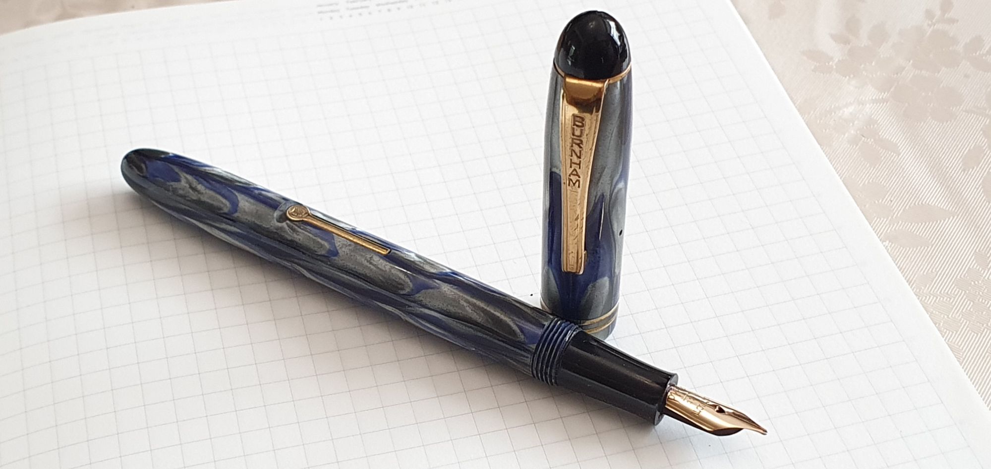
Recently, I was thrilled to win an eBay auction for an attractive, marbled blue and grey vintage fountain pen. It was a lever filler with a 14k gold nib. The sac had been replaced and it looked to be in good condition. I had looked at the seller’s photographs again and again in the week before the auction.

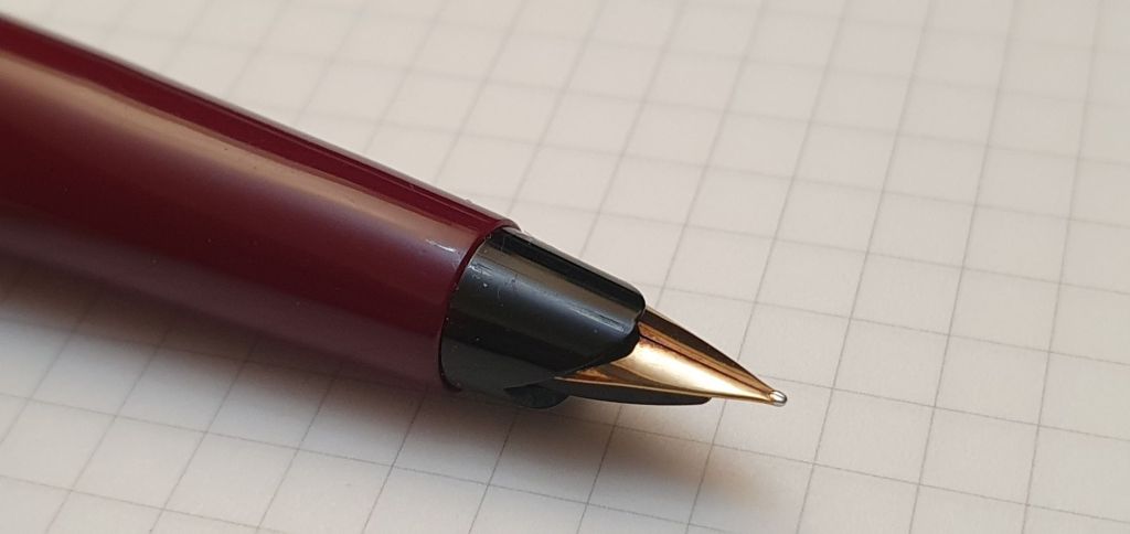
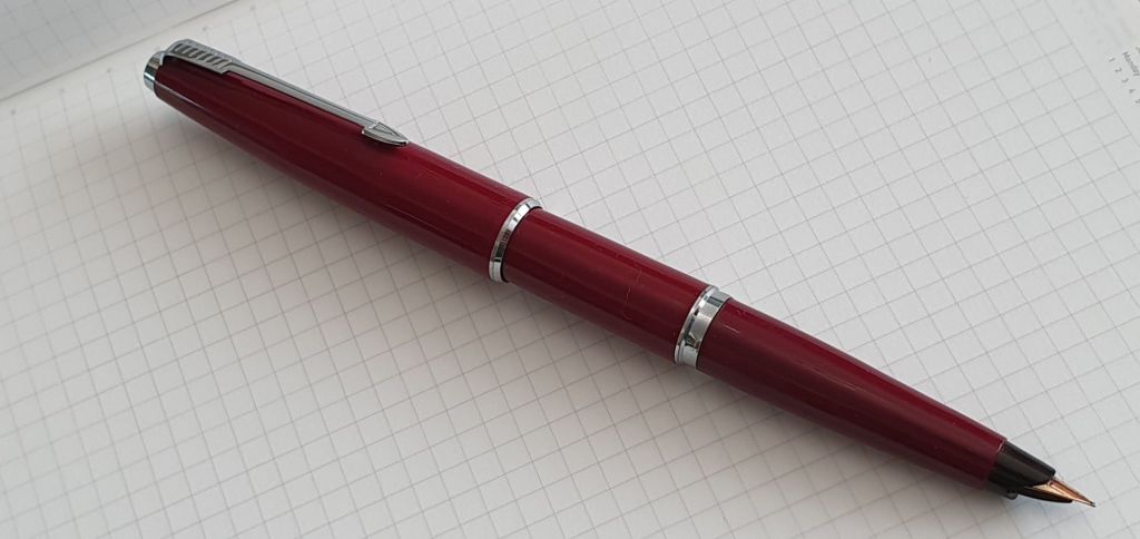
When it arrived, it looked even prettier in person than in the photographs, although much smaller than I had expected. I believe it to be a Burnham 54, although there is no imprint on the barrel and I know little about this brand. There were many variants of the model 54 and numerous other clues to look for in the finial, pocket clip, branding on the clip, the number of cap rings, the inscription on the nib and the shape and markings of the lever filler.

Burnham 54 fountain pen.

In his book “Fountain Pens” by Peter Twydle, (2009), he includes a few paragraphs about Burnham in his chapter on manufacturers. He writes “The pen trade has recognized Burnham, perhaps unfairly, as the poor man’s Conway Stewart.” The company was started by Harry Burnham in London in the 1920’s and continued until the 1960’s. Their pens were mostly lever fillers and used similar materials to Conway Stewart, but being less prestigious and lower priced, became thought of as school pens.

Rounded finial, branded clip and two cap rings on my version.

For a detailed account of Burnham pens, there is a comprehensive study on the WES website, (the Writing Equipment Society), wesonline.co.uk from 2011 by Alan Charlton, on Burnhamography. Meanwhile, my post here is more of a “show and tell” since I know little about this pen.

Uncapped. The classic proportions mask its diminutive size.

Had I known how small the pen was by current standards, even though beautifully-proportioned, I would probably not have bid. This would have been a great shame as I have found the pen very comfortable and enjoyable to use. As I have tended to avoid pens which I thought of as too short or too slim, this was an exciting revelation with a potential to extend the already vast rabbit warren.

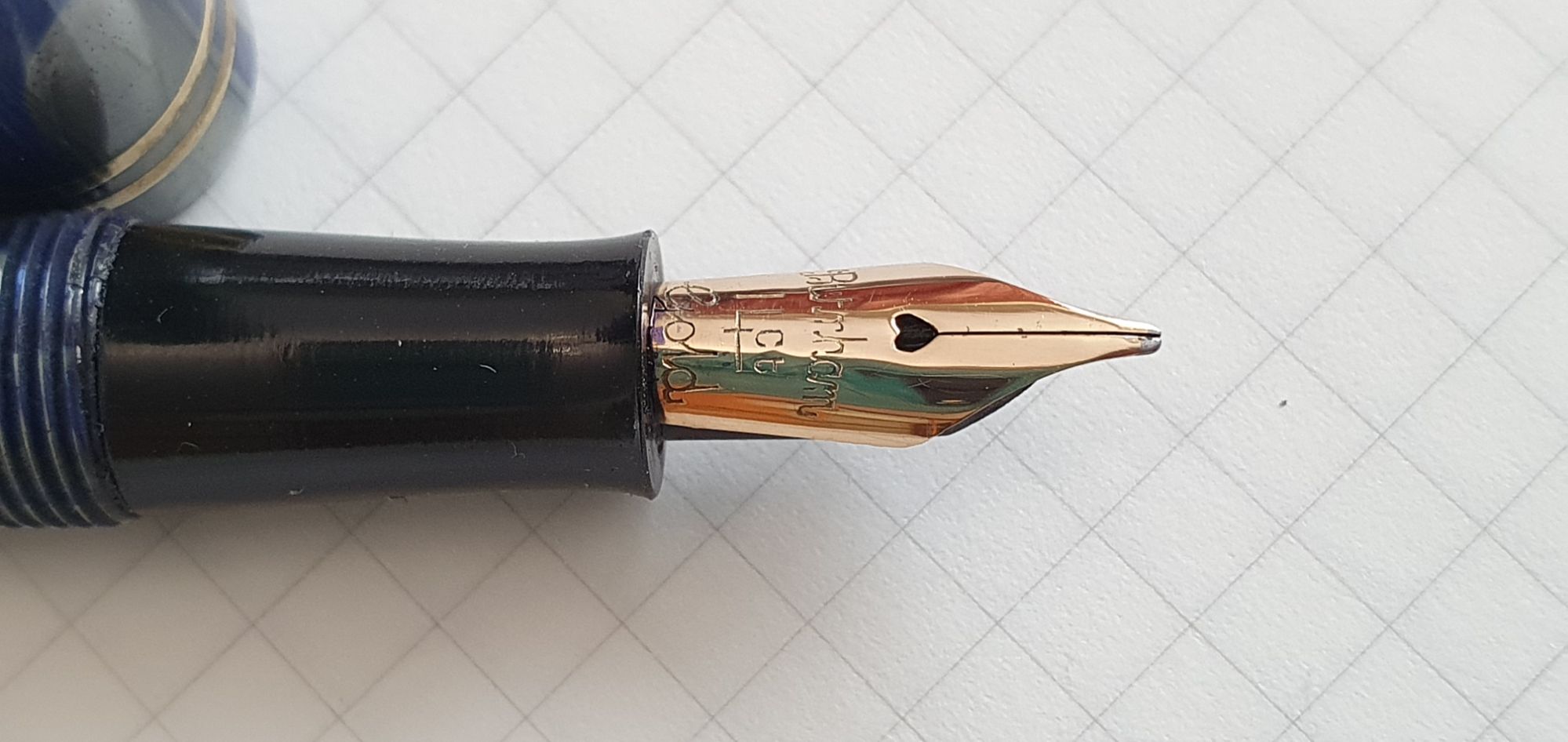
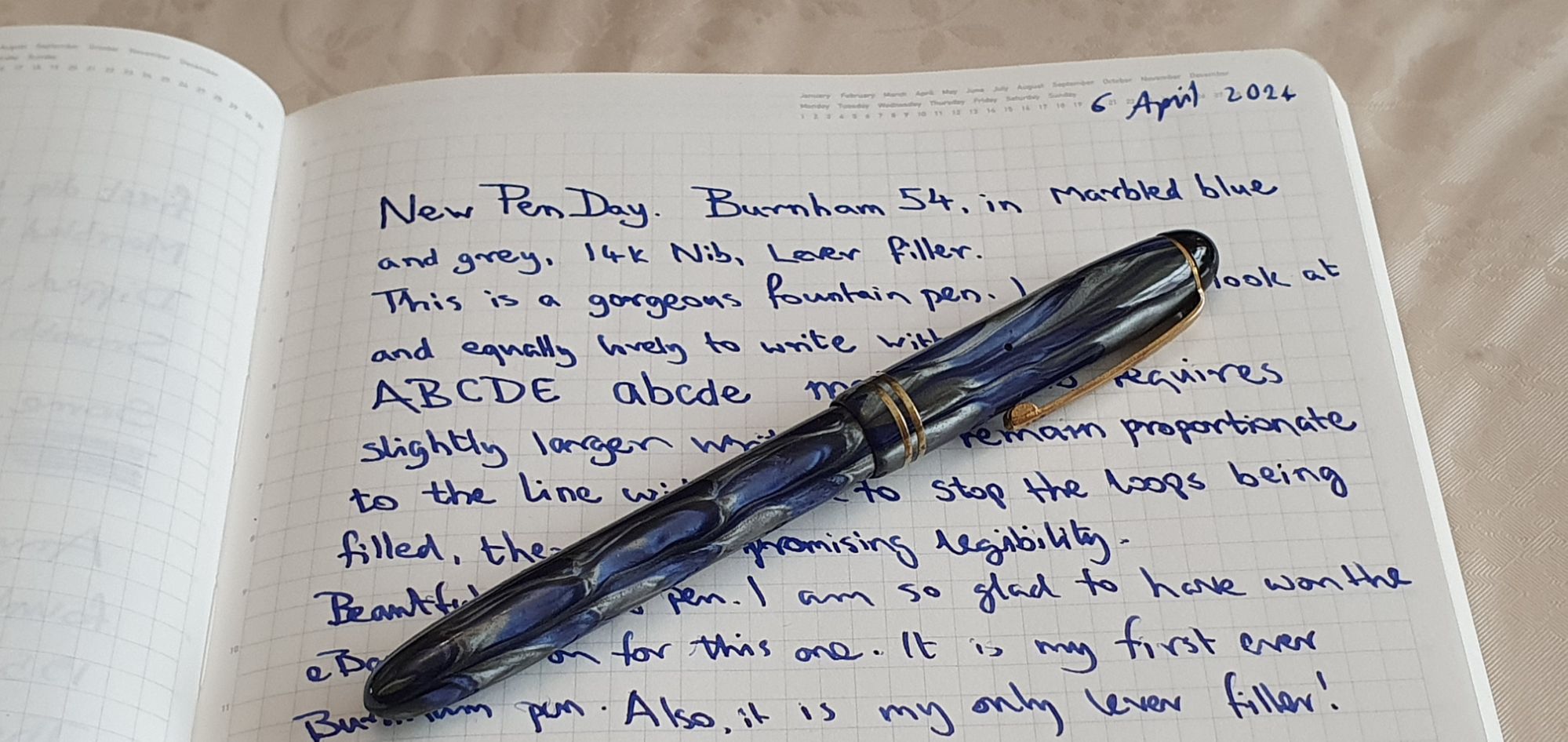
After flushing the pen, I filled it with Waterman Serenity Blue. It filled well. The writing experience from the 14k gold nib was a joy: silky smooth, broad, with an optimal flow and just a little bounce, that you might call semi-flex. This more than compensated for any shortness or skinniness of the pen. I cannot tell you whether the barrel and cap material is celluloid or plastic, or whether the feed is ebonite or plastic. I have avoided posting the cap and instead have grown accustomed to holding this little pen unposted.

Very clean nib, marked “Burnham 14 ct Gold.”
Smooth feed. Ebonite, I think.

The screw cap comes off in just over two full rotations. The cap threads are multi-start and I found that by inserting the pen (nib up) into the cap, pocket clip up, and turning the pen one click the wrong way before tightening, the lever almost aligns with the clip.

On a recent short break in the beautiful Shropshire countryside, I took the Burnham and used it every day for some holiday journaling in a Leuchtturm A5 notebook. The nicely-tuned vintage nib, with its heart-shaped breather hole, performed as well as any other nib I have ever experienced, at any price. One fill managed more than 12 pages, before it was time to enjoy the lever-filling experience again.

Size and weight:

Capped, the pen measures about 121mm and uncapped, only 109mm. The weight is about 11.5 grams capped, comprised as to 7 grams for the pen and 4.5 grams for the cap. These figures are pretty minimal and might sound off-putting but my experience has been that what the pen lacks in size and weight is more than made up for, by its cuteness and the sensation of writing with the smooth and bouncy nib.

Trying out my new old pen. Waterman Serenity Blue; Stalogy 018 Editor’s Series 365 days notebook.

The moral of this tale is that you might surprise yourself, using a pen that goes against your usual criteria. This is good news, unless like me, you are trying (weakly) to resist more pens incoming.

Edit: Here is a photo to show the comparative size of the Burnham 54, against a Parker 51 Demi, a Parker 51 standard and a Parker 45.

Size comparison.

Rediscovering the Parker 45 fountain pen.

I think I may have mentioned that I am fond of vintage Parker pens. My admiration dates back to the late 1960’s when I collected Parker advertisements from newspapers and magazines. A Parker was also my first “grown-up” fountain pen when I went to my secondary school. It follows that this blog post might come across as slightly biased.

The Parker 45 model was part of the current range when I was at school. Buying a new one in town was a rare treat. I remember using them in lessons to write in exercise books. If you left one uncapped for too long the nib was likely to dry out, although this is true of most fountain pens.

A Parker 45 Arrow.

In those days, I would have used the cheaper, steel nib versions, mostly Medium. They were also available with gold nibs. I do not recall being aware that there was such a wide choice of gold nibs to choose from for the Parker 45. The nib grade is shown by a letter on the underside of the little black nib housing. I never ventured beyond M (medium) and F (Fine). Only recently, have I discovered the X (Extra Fine) and the R (Medium Oblique). For a list of the nib codes, see the following thread on Fountain Pen Network.

I still have a couple of my Parker 45’s from the seventies – one in grey and another in brushed stainless steel. As ever I recommend Tony Fischier’s site, Parkerpens.net for an authoritative and comprehensive history of the Parker 45 range. They were produced from 1960 until 2007 and heralded the beginning of the Parker Quink cartridge system. The all-plastic version was called the Parker 45 Arrow. The version with a metal cap was the Parker 45 Classic and the brushed stainless steel version (very desirable to my 11 year-old self) was the Parker 45 Flighter.

Fast-forwarding to the present, my fountain pen journey took me down the vintage Parker rabbit hole. Last year was my year of the Parker-buying. I swooped on the inexpensive but surprisingly good Parker 17 models at pen shows and on eBay, before moving on to the Parker 61 and 51.

In the midst of this run, I happened to spot a Parker 45 Classic with a somewhat rare Medium Oblique (code “R”) nib, which proved to be delightful. Oblique nibs seem to be the most flattering for my handwriting when using a lefty-overwriter style, whereas non-oblique nibs work better for me in an underwriter style.

My last Parker pen purchase of 2023 was bought on eBay and intended as a Christmas present for someone else. It was a black model with a 14k gold Medium nib. But here’s the strange thing: after testing it the writing experience was so utterly delicious, exquisite and wonderful, that I honestly could not bring myself to part with it and had to keep this one for myself. Selfish, shameful and shocking I know, but true.

Easy to disassemble. No heat gun or shellac required.

But then, like a drug (I imagine), or at least chocolate, I craved another one. Happily at the London Spring Pen Show in March, I spotted and pounced on a lovely midnight blue model with a Fine nib. And then finally, back more recently on eBay I bought a burgundy red model with the less-common Extra Fine nib.

You can just make out the “X” for Extra Fine on the nib housing.

And so in the last seven months, my little Parker 45 family grew from two to six pens. My four recent buys all having 14 gold nibs, have all been superb and yet each cost between around £20 to £25 only.

The four on the right have 14k gold nibs in Oblique medium, Medium, Fine and Extra fine, respectively.

“What is so good about them?” you might ask. Here are a few answers:

  • Comfortable to hold (not too short, long, heavy or light; not having any step or cap threads);
  • Well balanced whether used unposted or posted. The lightweight cap posts very deeply and does not throw the balance off;
  • Convenience of accepting cartridges or a converter;
  • Great-looking pen (subjective and in the eye of the beholder, I know);
  • Best of all, having a screw-in nib housing. The nib, feed and housing can be removed easily for cleaning or nib adjustment; this is where the 45 scores over the 17, 51 or 61.
  • Can be found at pen shows or on eBay for a very modest outlay – similar to the cost of a Lamy Safari or Cross Bailey Light, both of which would have steel nibs.
The rather rare “X” (Extra Fine”) nib in 14k gold.

In summary, it comes down to good design. I read on Tony Fischier’s site (linked earlier) that the Parker 45 was designed by Don Doman who also designed the Parker 61 and Parker 75 amongst others.

17 grams and 145mm with cap posted.

Are there are any negatives? Yes, the type of plastic material used for the Parker 45 is softer and inferior to the material of the Parker 51. It would show bite-marks, rather like a chewed cap of a Bic Crystal biro.

Size and Weight: The length capped is around 136mm or uncapped, 127mm. The length posted is 145mm. The all-plastic version weighs around 17 grams, or 12 grams uncapped, whilst the Flighter is only slightly heavier at around 20 grams.

For anyone who has any liking for fountain pens, let alone an obsession, vintage Parkers can save you money, so long as you do not buy too many of them. Which is why (as politicians annoyingly say), I have garnered a reputation in my pen club as the vintage Parker influencer.

Parker 45 with the Filofax A5 Lockwood zip in Garnet.