Early thoughts (and some vandalism) on the Waterman Allure fountain pen.

A couple of weeks ago, whilst away for a long weekend in North Norfolk and in a happy, holiday mood, I popped into WH Smiths in King’s Lynn, to have a look at their wares. Just a couple of hours earlier, walking around the quays, I had learned that the town was the birth place of Captain George Vancouver (born in 1757), a British officer in the Royal Navy famous for the expedition which explored and charted North America’s northwestern Pacific coast regions.

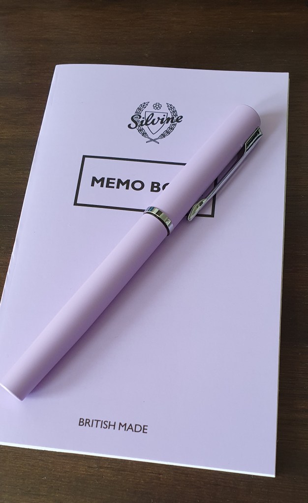
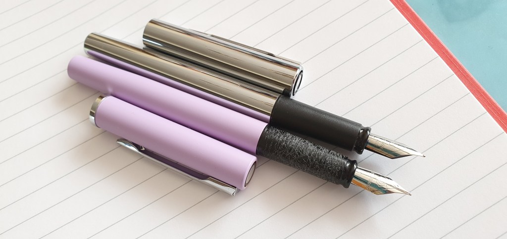
Finding myself in front of the fountain pen rack, I spotted the Waterman Allure, in a few different pastel colours and at £19.99. I peered through the plastic packaging and admired the nib. I had seen these a few weeks before, in our local branch but had managed to resist them. I almost succeeded again, but when about to leave the shop, spotted a sign which said “Please only handle items that you wish to buy.” A small wave of guilt overtook me and I went back to buy it.

The Waterman Allure

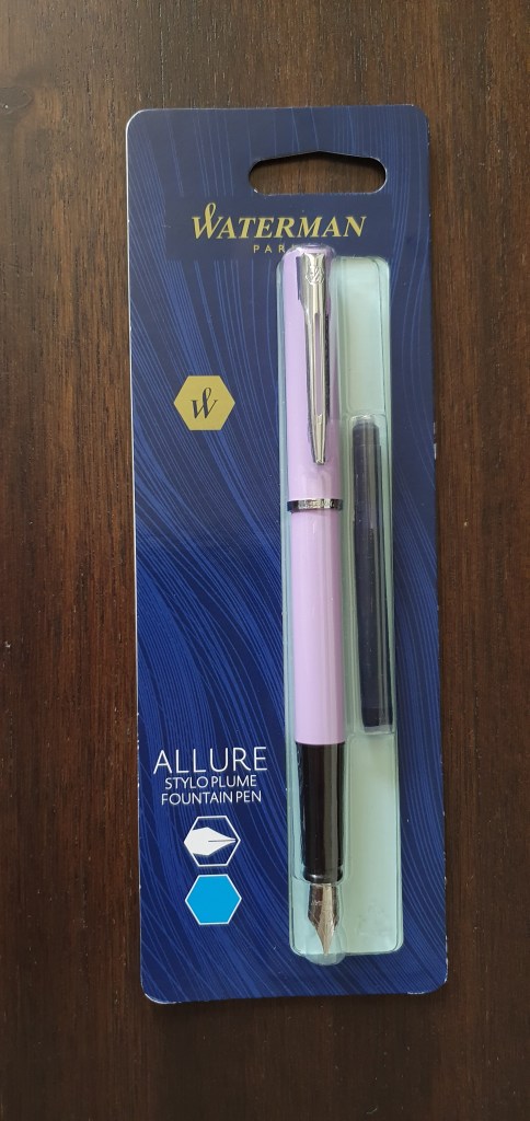
Later, opening the packaging, the first impressions were mixed. The simple design and the matt finish to the pretty lilac barrel and cap were appealing. It is a little on the slim side. There is a shiny metal finial and a sturdy metal pocket clip with the Waterman logo at the top. A narrow chrome cap band simply bears the name Waterman.

Removing the pull-off cap, there is a black plastic section and a very acceptable, steel nib in a Fine. The pen was supplied with one Waterman blue cartridge which I inserted.

Size and weight (approx).

The pen is 133mm long when closed. Uncapped it is 124mm, which is okay to use unposted, although the cap does post well and brings the length up to 157mm.

I measured the weight to be around 23g including a half spent cartridge, comprised as to 14g for the pen uncapped, plus about 9g for the cap.

The writing experience.

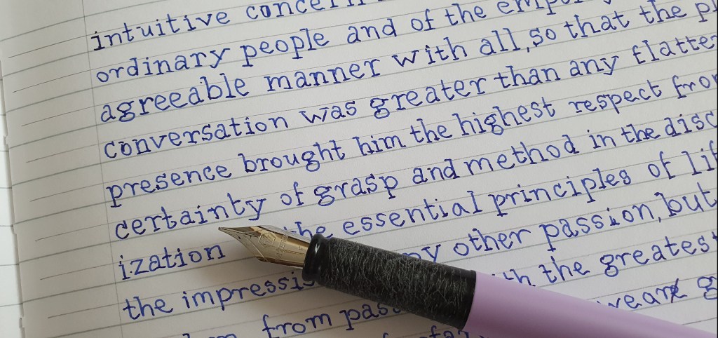
The pen wrote without too much initial coaxing. I enjoyed the smooth nib, which is fairly firm and produced a good flow, being neither too wet nor too dry in my opinion. The fine line was pleasing.

Waterman Allure and Waterman Graduate.

Likes and dislikes.

The pen writes very nicely and I enjoy carrying it and using it. It is lightweight and well suited to being clipped into a shirt pocket or a shoulder bag. It seems good value for a metal bodied pen. The finish is attractive. The nib and feed are friction fit and can be removed for cleaning and maintenance quite easily. I might switch to an ink like Pilot Yama-budo or Pelikan Star Ruby for the next fill.

The only real downside, for me, is the material from which the grip section is made. It is a black plastic of some sort but whilst it looks innocent enough, it manages to be very slippery to the touch. The consequence is that the pen felt insecure in my hand.

The modification.

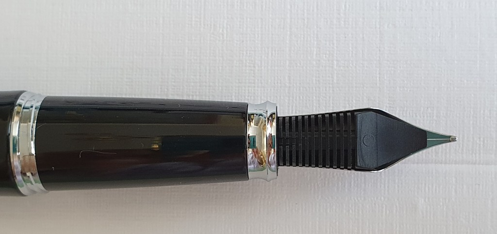
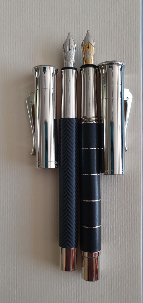
Having pondered this over for a few days I decided that the pen’s section needed some texture or some means to make it more grippy and less slippy. In an ideal world I would like to have machined some attractive regular grooves, perhaps in a diamond cross-hatch pattern like on the Parker Reflex. My late father used to do that with wooden pistol grips in the 1970’s when he bought a new hand-gun and produced beautiful results which looked very professional.

He would not have been impressed at my efforts. I used the saw blade on my Leatherman (which is very sharp) to scratch some random texture all over the section. This resulted in gouging out little bits of plastic which I then had to brush away.

Here is a photo of the result. (Please look away now if you are of a nervous disposition).

The section after scratching some texture into it with a Leatherman saw blade.

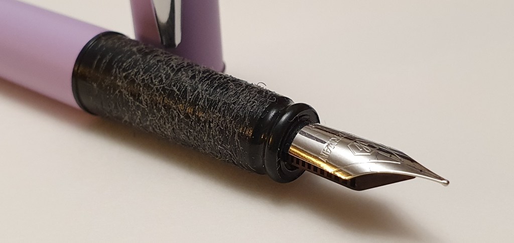
This is not a look that I am proud of. Let me be the first to admit that it looks terrible. It does not equal the aesthetically pleasing modification that I made to my Platinum Curidas and which I would rather be remembered for. However, it does serve the purpose and is no longer at all slippy.

Conclusion.

I am happier with the pen now that it does not slip around in my fingers whilst writing. I have been using it every day. However I expect the majority of customers will be happy with the pen just as it is without any butchery.

Inspired by Kimberly of @allthehobbies on Instagram, I have been having a go at transcribing Meditations by Marcus Aurelius.

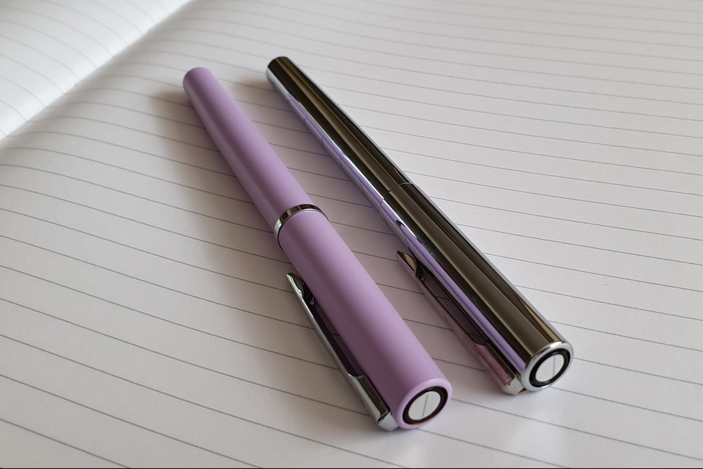
I had been under the impression that the Allure was a new addition to the Waterman line up. I have since noticed that it is a new finish on the Waterman Graduate which has been around for a long time. I have one to compare.

Waterman Allure, alongside a Waterman Graduate which used an identical nib and section.

Waterman’s website proclaims the Allure to be a first step into the world of Waterman. Clearly they intend this as an entry-level pen but also to be “a symbol of flair and sophistication.”

I think it is great value and a robust and practical pen. A Waterman for under £20.00! As a newcomer to my pen cups, I have been using it a lot and have had no hard starts or other misbehaviour. If I had any say in the matter, I think it could be so much better by using a nicer quality material for the section and then it really would be something. I expect Captain Vancouver would have been very glad of one.

Getting matchy matchy with a Silvine notebook.

Currently inked, 16 August 2020.

This morning I made a list of the currently inked pens that I have at home, knowing that the result would be embarrassingly uniform. I arranged them in order of colour, making it even more apparent that of the 20 pens shown, 15 are inked with either blue or blue black.

The currently inked as at 16 August 2020

For some months now, I have been juggling 20 inked pens on the go. This does not include a further two (both Cross Bailey Lights) which I keep at my office, since returning to work after lockdown, in July.

Twenty pens is a lot to use at any one time. I have tried to keep the number from growing any higher and have imposed a “one out one in” rule. But even so, assuming that the average cartridge or converter might manage around 20 pages of writing, (more if a piston filler), that is 400 pages of writing, sitting on the table. Pens are not running dry fast enough to keep the cups from becoming stale.

On one hand, I do enjoy having a lot of pens available simultaneously and I enjoy the variety that they offer. But on the other hand, part of me craves a simpler existence of running just one fountain pen (flashback to me aged 12…) and just filling it up, with the same ink usually, whenever it needed ink. It is possible to re-create this simplicity, temporarily, by getting away from the desk and going to write in a coffee shop taking just a single pen and notebook. Of course you cannot then enjoy the option of selecting any one or more of 20 pens from the pen cups as the fancy takes you, but you cannot have your cake and eat it.

But the bigger problem I see from my list is that 75% of the pens are inked with blue or blue black. No greens. No bright reds. No turquoise, or orange. This highlights the fact that the pens and their inks have each been selected individually without regard to the bigger picture of the pallette that is being created. Who of us, given an empty paint box, would set out to equip himself with 75% of the space given to blue and blue black?

When a pen runs dry, unless it is one of those to keep in circulation, I enjoy picking another pen to replace it. I generally pick the pen first and then decide which ink to use. Very rarely do I start with the ink and then decide which pen to put it in, except perhaps with iron gall ink.

There is always the option, to remove a bunch of pens and give them an early bath, to keep the pen cups fresh and varied but at the expense of jettisoning some good ink.

It is, after all just a hobby. The pen cups do not stand up to a lot of scrutiny. Why for example am I using a Waterman Allure when I have two empty Carenes at my disposal? Why not use only my best pens, all the time?

Perhaps by mixing in some entry level pens we appreciate the difference more when picking up the Montblanc.

There are no right and wrong answers. I am sure each one of us has his own principles and systems for managing the currently inked. But one simple lesson to take away, (for me at least) is not to loose sight of the bigger picture when filling the pen cups, to ensure you have more than just blue and blue black at hand.

A look at the Diplomat Excellence A Plus fountain pen.

Today I want to share a few thoughts on a pen that I have been particularly enjoying lately and which has rapidly become one of my favourites. This is the Diplomat Excellence A Plus.

Diplomat Excellence A Plus (blue and black harlequin pattern).

The background to this particular specimen is that my wife bought it, when we attended the London Pen Show together in March 2019. It is fair to say that she is not a fountain pen person but having persuaded her to come to the Show, I rather twisted her arm to buy this pen for herself, convincing her that Diplomat was a very under-rated brand, that their pens were well regarded and not easy to come by and that this one was on offer at a great price (from John Twiss). She negotiated a deal with John which included a couple of attractive pseudo-vintage metal lattice ball point pens, which I am sure she intended as gifts rather than for herself. Meanwhile, I happily bought myself a Diplomat Excellence A2 Marrakesh, which had a gold nib and which I reviewed here.

In the weeks and months that followed, I am not sure that she even looked at her Diplomat Excellence again, let alone inked it and tried it out. Eventually over a year later I came across it in a drawer and expressed enthusiasm about it and asked permission to try it out for her (ahem). The upshot of this was that she said that I could have it and that it could be my birthday present, as I had a birthday approaching in a few weeks time. What with the lockdown, we had not done any shopping for gifts in months and so this all worked out very conveniently!

Well it turns out that this pen is absolutely fantastic! I am not just saying that because it was a gift, although that helps and gives it added sentimental value. Much of what I said last time about the Marrakesh also applies here and so I will focus on the differences.

The first and most obvious difference is the pattern. This is a beautiful dark blue and black harlequin design. I have not seen another one like it, before or since. It is subtle too, as you do not immediately notice the pattern until you look closer: it just looks like a dark blue pen.

Secondly, and one of the best features about it, is that the cap on the A Plus unscrews, rather than being a push-on cap like the A2. But these are not just any screw threads. The cap needs only one third of a rotation. It might be more correct to call it a bayonet mount, a bit like on a camera lens. It is very quick and easy and feels smooth and secure.

The shortest cap threads ever!

Thirdly, there is the nib. This one has a steel fine which wrote perfectly for me, out of the box. I filled it first with a Waterman Serenity Blue, which was a good pairing but after that first fill I have been on Pilot Iroshizuko Shin-kai. I find the nib really enjoyable. It is smooth, with effortless flow, firm but with a touch of bounce and just the right amount of feedback. My Marrakesh came with a 14k gold fine nib which was good too, but I actually find myself preferring the steel nib. Certainly (and from my very limited samples) I do not think there is much to be gained by opting for a gold nib here.

The inside and outside of the Diplomat Excellence A Plus.

It is great when you find a pen that you love. This seems to have everything I could wish for: the attractive body; a distinctive finial; a robust metal pocket clip (hinged and sprung); the short cap threads, the generous girth, the long smooth, comfortable section, the very minimal step from barrel to section (the threads are not sharp), nice balance, the 129mm open length – being comfortable to use unposted and the pleasing weight (about 28g uncapped; the cap adds another 15g). And of course that great nib and wonderful writing experience.

At almost 130mm, the pen is comfortable for me to use unposted.

In summary, the recurring theme here is comfort. I could talk for a long time about all the things that make up a successful fountain pen. A shorter list is to look for a list of dislikes. Here there are virtually none.

Really there is not much I would criticise here. One point though, is that I was worried about pushing the cap on the back too firmly in case of damaging the plastic inner cap. I am not sure whether it is one of those designs where the cap clicks on securely to the metal disk at the foot of the barrel: it looks as though it does but I did not want to chance it. But the cap can be posted gently and grips on to the barrel. It does make for quite a heavy unit, at 43g and I have got used to writing with it unposted.

My only other complaint is about the confusing name. The Excellence is the largest of the trio, of Traveller, Esteem and Excellence. I can imagine a company board meeting at which the discussion goes “Well, we have got the Excellence… now this version with the clever cap threads is even better. Any ideas for a name anyone?” Personally, I am not keen on either of the names “Excellence A2” and “Excellence A Plus” to distinguish the two models. Could do better. Please see me after class.

That said, I think this is a wonderful pen. My pen cups have hovered at around 20 inked pens for the past few months but the Excellence A Plus has been used daily and always impresses me with its looks, comfort and performance.

The perfectly tuned nib right out of the box.

Early thoughts on the Graf von Faber-Castell, Classic Anello fountain pen.

Recently I had a rare treat. A pen friend in Australia asked if I would do him a favour and take delivery of a pen for him, that he was to order from Izods. He gave me free rein to open it, to test it out and use it as much as I wished and even to review it. To add to the fun, he did not tell me what pen it was.

The pen duly arrived, lavishly wrapped by Roy of Izods and was in fact a Graf von Faber-Castell Classic Anello (the version with inlaid metal rings along the barrel) in Ebony.

The pen arrives in a chamois-coloured linen bag, in a solid wood gift box.

Description.

This is a luxury pen, priced towards the bracket at which stationery becomes jewellery, but with a great deal of attention to detail and no compromises in the exquisite 18k gold nib, for a wonderful writing performance.

Graf von Faber-Castell (“Graf”) is the luxury arm of Faber-Castell. This is a slender but weighty pen, with the distinctive highly polished cap with a flared top, which reminds me of the funnel of Stephenson’s Rocket, of 1829, contrasting with the warm texture of the black Ebony segments in the barrel, with four platinum rings.

The distinctive flared cap.

The cap has a sturdy hinged and sprung pocket clip, above which is the brand’s coat of arms. The name Graf von Faber-Castell appears on the rim and “Germany” on the other side.

Hinged clip and coat of arms.

The cap unscrews, in three-quarter’s of a turn. The cap feels very secure with no wobble and no fear of coming undone by itself.

The section is long and slender, tapering gently towards the nib but then flaring out again, creating a natural curve on which to rest the pen on your second finger as you write.

At the other end, there is a shiny plated metal knob, shaped to allow the cap to be posted. However, posting is not advisable as the pen becomes very back heavy and about 175mm long.

The nib.

This is a stunning piece of work, in bi-colour 18k gold, the front part and the coat of arms picked out in silver coloured plating against the gold background. This one is a Medium nib. Although I take it that this is a pre-owned pen, the nib looked perfectly set up and with a generous amount of tipping and no signs of wear.

The 18k gold Medium nib is superb.

According to Graf’s official web-site this is a handmade nib, run in by hand and with a manufacturing process that involves over one hundred steps. This is a polite way of saying “Please don’t drop it, you ham-fisted oaf.”

I was thrilled to dip-test the pen. I reached for my customary Waterman Serenity blue, and spent a very happy few minutes enjoying this smooth and springy nib, on a variety of different papers. The wetness from this initial test and the degree of feedback seemed spot on to me. I later filled the pen with Graf’s Cobalt Blue, probably my favourite dark blue and the pair seemed made for each other.

Graf von Faber-Castell pen, Cobalt blue ink, and headed paper. Other brands are available.

Filling.

This is a cartridge-converter pen, taking either standard international cartridges (look no further than Graf’s Cobalt Blue!) or a converter. The pen arrived with a Faber-Castell branded converter, which worked well and drew up a decent amount of ink.

The section unscrews from the barrel on very long screw threads, which are metal to metal. These will be hard-wearing but I noticed the occasional tendency to come loose, whereupon the section just needs tightening again.

On the rim of the cartridge-converter holder, I found the markings “031011 PT” which I presume to be the date of production in 2011. For comparison, my Graf Guilloche has the markings “010717” here. Even Graf’s ink cartridges have a date mark which I think is a very nice feature.

Production date code, just above the threads.

Size and weight (approx.)

The Classic measures 138mm closed, 130mm open and 175mm if you try posting. The whole pen weighs about 41g comprised as to 27g for the pen uncapped and 14 for the cap.

Likes and dislikes.

This pen is hard to beat for sheer elegance and sophistication. The flared cap with its smooth, secure, precision fitting threads works perfectly. I have not noticed any hard starts, after intervals of over 24 hours. The pocket clip has a good amount of movement and is reasonably tight although personally I would carry the pen in a pen case rather than a jacket pocket. The contrast of materials and textures from the almost black Ebony wood and polished furniture is very pleasing. But although this is clearly a luxury item, it is no less a fountain pen and the nib should delight any pen fan.

On the negative side, the grip section is slim, tapering and slippery. Personally I like to hold pens quite high up and for this pen, I have found a grip where the section rests on my second finger, my first finger is at the threads and my thumb anchors the pen at the wooden barrel, which is not slippery. Fortunately the 130mm length uncapped still allows the pen to sit just about comfortably in the web of my hand although I sometimes find myself holding the pen slightly more upright like a ball point pen.

Comparison with the Graf Guilloche.

I have a black Guilloche, with a Broad nib. Although they share a similar style, the Classic is superior in having extra weight, length, and girth, a threaded cap and a bicolour nib.

Guilloche (left) and Classic Anello.

However, it appears to me that the nibs are the same size and that the only noticeable difference is that the Classic’s nib is bi-colour. Fun fact: the nib and sections of the Guilloche and the Classic are interchangeable and so if you have a different nib in your Guilloche, you can simply screw the Guilloche’s entire nib, section and converter, into your Classic Anello body.

The nibs of the Guilloche (left) and Classic.

Conclusion.

The Classic is a lovely pen. I am sure that my friend will be happy with his purchase (when eventually he can collect it). I know that as a long term user of pens with plated metal sections this is not an issue for him.

For me, whilst I appreciate the pen’s artistry and quality, the grip would take a bit of getting used to and whilst I am able to use the pen, I do not yet find it the most comfortable. But I anticipate that with time I would get more used to that, particularly whilst swept away by the superb nib which sings along the page. But to do that would mean to bond with the pen, of which in this instance, I am its temporary custodian.

Another comparison shot of the Guilloche and Classic.

For further reading, see Graf’s official web site. It seems from this that currently there are four versions of the Classic Anello fountain pen, namely the Rose Gold, Grenadilla, Ivory and Black. There is currently no mention of Ebony or Pernambucco. See also the excellent reviews of versions in other woods by UK fountain pens and The Gentleman Stationer.