First impressions of the new Platinum Procyon fountain pen.

I am pushing out this  “first impressions” review with unseemly haste, as the pen has been with me for only half a day. However I saw that there had been some speculation and eager anticipation on Fountain Pen Network about this new model, although the thread Platinum Procyon New Model digresses into discussions of Platinum nibs generally and people’s differing experiences with the gold nib of the Platinum 3776.

I first learned of the Procyon while browsing on Cult Pens’ web site a few nights ago and was intrigued by the promotional video, showing the pen sucking up the last drops from an ink bottle, by means of the newly designed feed. And how nice to have a promotional video at all! The pen also benefits from Platinum’s slip and seal inner cap, which supposedly prevents ink drying out for up to 2 years. Also it boasts a steel nib offering flexible writing like a gold nib. With Cult Pens currently offering 10% off, and a free Platinum Preppy thrown in, it seemed worth a go.
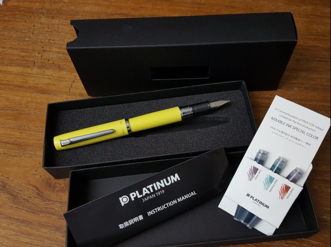
20181129_17481556434775.jpg
The post it note is the only thing I can find which is like this colour.

Unboxing.

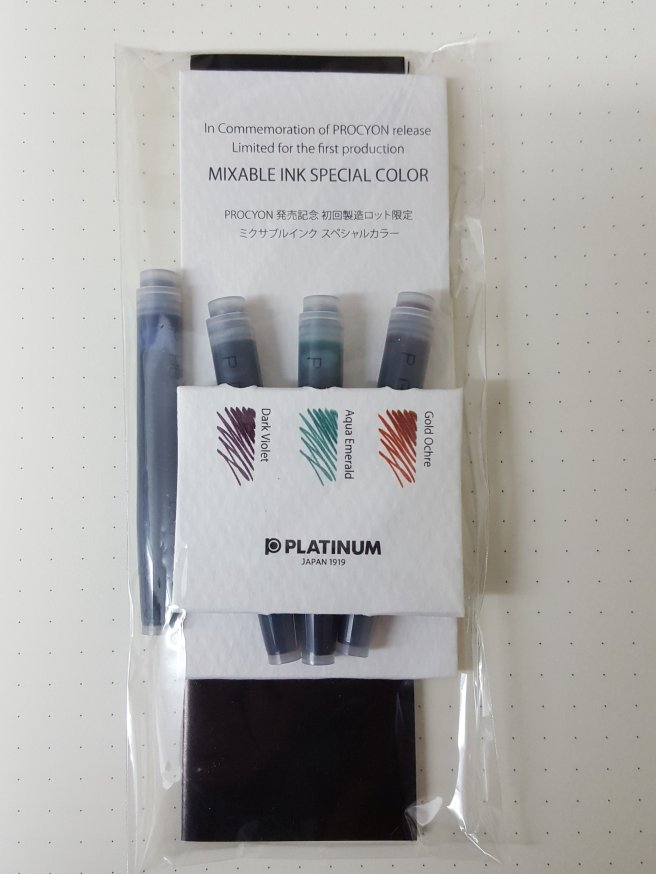
The pen arrived in a plain black cardboard box and separate lid,  with a foam insert, and protected by a cardboard outer sleeve. The pen was in a polythene sheath. Also in the box were a sample set of three Platinum coloured ink cartridges, in Gold Ochre, Aqua Emerald and Dark Violet, plus one blue one and a fold out Instruction Manual. The box seems perfectly sensible and proportionate at this price point.

20181129_131500928624371.jpg
What’s in the box.

Construction and appearance.

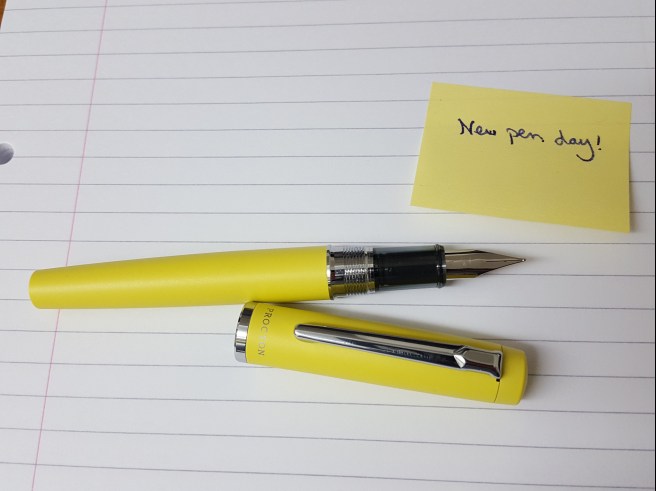
The Procyon, or PNS 5000 as it is also called, is an aluminium pen, feeling solid but not overly heavy. The finish is matte, not glossy and feels pleasantly smooth and yet is not slippery. It has a screw cap (which is to be applauded) and despite the rather large area of screw threads on the section, the cap is removed in less than one full turn.

It is available in a choice of five colours. I chose Citron Yellow but the others are Deep Sea, Porcelain White, Turquoise Blue and Persimmon Orange.

The metal pocket clip is springy and moderately firm, and quite easy to use albeit not giving great security. There is a shiny cap ring, which is not sharp to the touch and the cap has the name PROCYON on the front, below the clip and PLATINUM, MADE IN JAPAN on the reverse.

The cap closes to be almost flush with the barrel, but is just slightly wider. This is achieved by having a small step down from barrel to section and to the shiny plated cap threads. The step and the threads are a bit sharp and uncomfortable and so you will probably want to find a grip which is either above or below the threads. Personally, I like to post the pen and hold it higher up so that my thumb is on the barrel. It is therefore important for me that the barrel material is not slippery (which this is not) in order to be able to anchor the pen with my thumb and keep the pen at the same angle.

The section is of a smokey grey translucent plastic, with a small lip at the nib end.

Unscrewing the barrel, with durable metal threads on both barrel and section, there is a generously long housing for the cartridge or else for a Platinum converter (not included but £4.99 from Cult Pens).

The cap can be posted, deeply and securely and being aluminium does not upset the balance.

Nib and Feed.

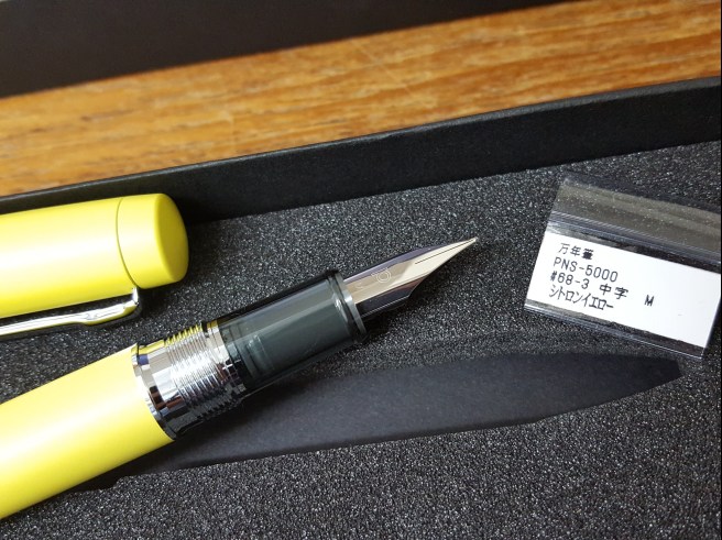
At first glance, the nib looks rather like those on the Lamy Safari and AL-Star. I chose a Medium. It does offer a little bit of flex but this is not very pronounced and it is not what I would describe as a flex nib. It does however have a pleasing softness or bounce, whereas Lamy steel nibs tend to be on the firm side.  There is no breather hole on the nib, which features just the P for Platinum and M for medium.

The black plastic feed does not have any fins but does have a noticeable inlet, about half way up the nib. This is the breather hole which is also used to fill the pen from a bottle and so the nib needs only to be dipped in the ink sufficiently to cover the hole. This means less mess when filling and also that you can still fill the pen when the bottle has only a puddle of ink left, by tilting the bottle and positioning the feed in the ink, as in the promotional video.

20181129_1246481798352986.jpg
The nib, section and threads of the Procyon.

I first tried the nib dipped in Pelikan Edelstein Smoky Quartz and was immediately impressed with its smoothness, good flow and some pleasant shading. For those who worried that the nib might be scratchy or dry I can say that my nib wrote smoothly and well, straight out of the box, with no skipping and was adequately wet. Of course I have only this one pen to go on and YMMV.

After trying the pen for a while on one dip of ink, I inserted one of the three coloured cartridges and went for the Gold Ochre, which is a nice autumnal dark orange.

Filling system.

This is a cartridge-converter pen, taking either Platinum’s proprietary cartridges or else the Platinum converter. It is slightly disappointing that a converter is not included at this price, particular as the ability to draw up the last dregs from a bottle is a feature of this pen. I do already have a converter from my Platinum Century 3776, which I might put to use once I have used up the cartridges. Another option is to recycle the old cartridges and syringe-fill them with ink of your choice.

20181129_1307121569044056.jpg
Some cartridges included, but no converter.

Sizes and weights.

Closed, the pen is reasonably large and at 140mm is about the same length as a Lamy Studio and a bit wider. However, uncapped it is a bit on the short side at 118mm but posts well, to give a length of 155mm. It weighs 24g, which is quite a nice happy medium, neither too heavy nor too light.

Likes and dislikes.

It is exciting to try a completely new design, from a respected and long-established Japanese pen maker. With the proviso that my pen is only hours old, I venture the following:

Dislikes:

  • The uncomfortable step and threads, which mean that you may want to adjust your grip to work around these;
  • I am still coming to terms with the colour I chose, which is a sort of pastel lemon, giving the impression of an old and rather faded hi-viz jacket, but it is unusual and distinctive.

Likes:

  • Smooth and effortless writing;
  • Comfortable weight and balance;
  • Screw cap;
  • That feed! I am looking forward to experimenting with near empty ink bottles.

Conclusion.

It is early days but overall I am pleased with the pen, particularly how nicely it writes. Having a screw cap and a slightly softer nib plus the innovative feed feature lift it above the Lamy AL-Star, although it costs about twice as much as an AL-Star in the UK.  It represents a step up from the entry level pens and a welcome change from the usual offerings of the big brands here. As to value, it is priced a little higher than a Cross Bailey or Parker Urban, which are metal and lacquer steel nib pens. For the writing experience that I have seen so far, (and my nib was perfect, out of the box) I think it is a good new option.


A look at the Montblanc Meisterstuck No. 12 fountain pen.

I have been very fortunate this year, to have been given some superb fountain pens by generous friends in the fountain pen community. The most recent of these was a 1960’s Montblanc Meisterstuck No.12, given by a pen pal who was leaving London to work in Melbourne. I have been using it for a few weeks now and the pen is truly delightful. 

Showing the distinctive semi-hooded nib and the bishop’s mitre cap band.

I knew very little about vintage Montblancs. I had seen one or two at our monthly pen club gatherings in London. Coincidentally, back in the summer, I was shown one whilst visiting my late godfather’s wife, Mary.  She said “You might be interested in Brian’s old pen” and went to find it from a writing desk drawer.

First, a few words about my “Uncle Brian.” He had been my father’s best friend and cycling companion at school and later his Best Man. Brian was a tall man, hale and hearty with a bellowing loud voice. He was a surveyor and was probably one of Vespa scooter’s most loyal customers and had ridden over a million kilometres on them over the years. 

I was therefore a little surprised initially, to see that his chosen fountain pen was a rather small and unassuming black pen. However it was a Montblanc. I established that it was a cartridge-converter pen, with a semi-hooded nib. I told Mary that she ought to keep it in the family and took a few photos of it before handing it back. 

Uncle Brian’s 1960’s Montblanc

I think it was a 22x series although I am not sure which. It had a shiny black body, a single cap ring and a was a cartridge-converter filler:

A cartridge converter version.

After seeing this, I thought of looking for one at a pen show in memory of Uncle Brian but had not yet done so. Imagine my delight then, when last month over a coffee, my friend offered me his Meisterstuck No. 12 adding that I had remarked upon what a nice line it produced when he had used it to write to me. 

Appearance and Design

I gather that the No.12 formed part of a range, introduced in around 1959, with model numbers identifying where they sat in the hierarchy, their size and their filling type. For an authoritative account, visit FPN and “A thorough report on Montblanc 12/14/22/24/32/34 Series.”

Model numbers beginning with a figure 3 were the economy range. Model numbers beginning with a 2 were the medium range. Those beginning with a 1 were the superior range, the Meisterstuck, or masterpiece, the flagship range.

This is a piston filler, with a black resin body and the trademark white star at both ends. There is a gold coloured pocket clip (which can be removed by unscrewing the finial) and a distinctive cap band known as the bishop’s mitre. This has a chamfered edge around which are the words  “MONTBLANC MEISTERSTUCK No.12.”

Montblanc Meistestuck No.12

The cap pulls off, is reassuringly firm and secures with a click. There is an amber coloured ink window, with some decorative striations and a metal ring either side, a long tapering section and a semi-hooded 18k gold nib. 

At the other end, the the barrel tapers gently, to a flat base with a decorative gold coloured ring and a white star, so that you can enjoy the Montblanc emblem whilst writing with the pen, whether the cap is posted or not. 

The Montblanc white star, or snow peak.

Hardly noticeable in the barrel, is the join where the piston turning knob blends in to the barrel. It is all very subtle and understated. 

Weights and measurements

Capped, the pen is 129mm long. Uncapped it is 117mm and so quite usable unposted for those who hold their pens low down near the nib. However I prefer to add a little length and weight and to hold it higher up, with my thumb on the ink window. The cap posts deeply and securely to give a length of 144mm.

The whole pens weighs only around 15g, of which 6g is the cap, so the pen weighs just 9g if you are using it unposted.

Disassembly

My friend had mentioned that the section could be unscrewed and also that the piston was a bit stiff. At home, I watched a YouTube video by Peter Unbehauen on cleaning the section of a Monblanc No.12. I was happy to learn that it is quite easy. You simply unscrew the section, being careful with the delicate plastic amber ring that forms the ink window and the two metal rings, one each side of the window. Then, the nib unit (comprising the gold nib, the feed and a surrounding plastic housing) can simply be pushed out through the back of the section, rather like removing the nib of a Lamy 2000. 

Disassembled and after a clean.

Once the nib unit is removed, you can see that the grip section, or shell, is very thin and translucent. It is rather fragile when separated. 

From the video, I saw that you can disassemble the nib unit quite easily, by sliding the clear plastic housing back off nib and then separate the nib and feed. When you put it all back together you just need to align everything correctly and then screw the section back in place and not over-tighten it. It is great to know that the pen can be stripped for cleaning so easily, unlike the modern Meisterstuck 146 where such DIY exploits are discouraged. 

I did not completely disassemble the nib unit but left it to soak in water overnight. But while the section was off, with access to the ink reservoir, I took the opportunity, after flushing with water a few times, to introduce a little silicone grease on the end of a plastic stick, to the inner walls of the ink chamber and then operated the piston up and down a few times. Within moments the piston was gliding up and down, silky smooth again. The pen is like new! I got this tip from an old Brian Goulet video. 

Nib and writing performance 

As I mentioned, the nib is 18k gold. I think it is a medium but it has a wonderful stub-like quality to it and a very pleasant softness. I filled the pen with Montblanc Royal Blue, an excellent combination which I will stick with.

A perfect combination, unsurprisingly. You cannot go wrong with this, for business or pleasure.

The ink flow is sufficiently generous to make for a very pleasing smooth writing experience. It is not too wet but does have ample lubrication for the nib to cope with my lefty-overwriter handwriting style, (which requires a wetter nib than if writing in the more conventional “underwriter” style). I have tried a few longer writing sessions with it and am extremely pleased with its performance. It is comfortable and light in the hand. It certainly makes for more characterful writing than a standard round medium nib as you get a subtle variation of line width between your down strokes and cross strokes. 

Conclusion 

I am thrilled to own this pen and love using it. It shows no signs of being nearly 60 years old. It is a superb writer, with a large ink capacity and a really enjoyable soft gold nib. It is interesting to observe that there are elements in the design which were to appear in the Lamy 2000.

I would recommend trying one, if you get a chance to pick one up at a pen show. For those who find it too slender, there was the Meisterstuck No.14 offering slightly more girth. But my No.12 is the same size as my Uncle Brian’s and if it was big enough for him, it is big enough for me.