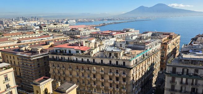
Following on immediately from our time in Albania, we flew to Naples to take a two hour ferry ride to Amalfi.
From Amalfi’s harbour, the owner of our accommodation had kindly arranged for us to be picked up with our luggage and taken to the apartment, which was actually in Pogerola, a pretty town up in the hills above Amalfi and about a 20 minutes drive. I was to discover from the bus drivers that it is pronounced “Po-jero-la” (and not as I had been saying it, like Motorola).
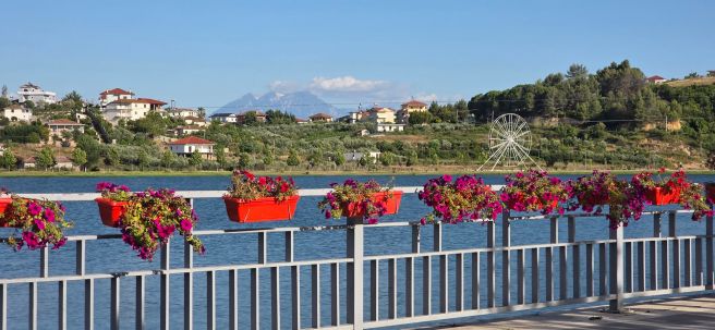
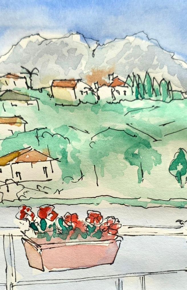
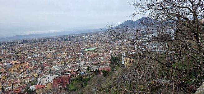
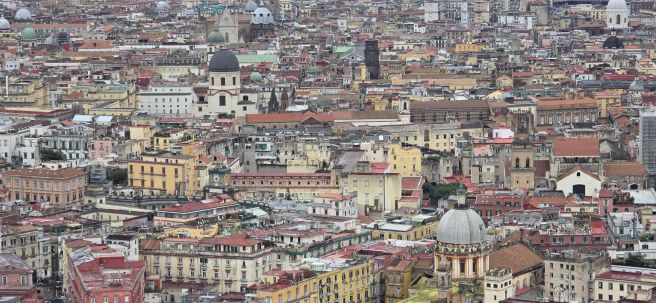
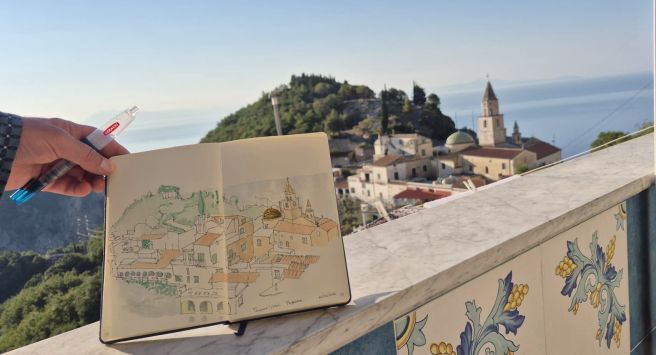
The views from our apartment were breath-taking. A terrace looked down over the tower of the local church, with views of the sea beyond and also across the valley with terraces of lemon groves, to the neighbouring town of Pontone, of white buildings nestling on the steep hillside and a ridge of mountain tops beyond. It was a scene that I sketched a few times.
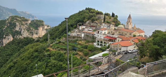
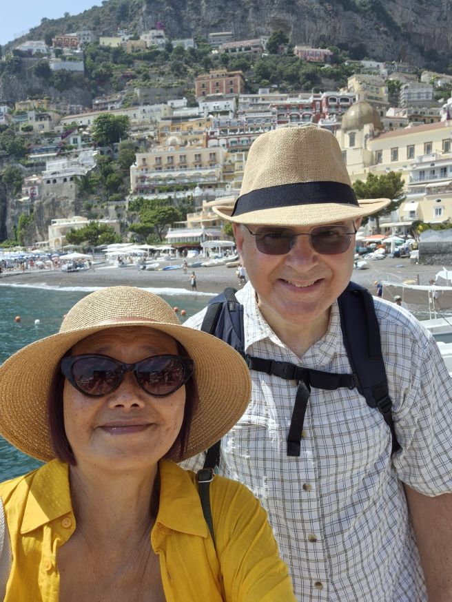
Amalfi turned out to be a convenient base from which to visit other towns along the Amalfi Coast, in each direction, since there are excellent links by ferry and bus. We had seven nights there and began each day with a very scenic local bus ride down to Amalfi. As well as exploring Amalfi itself, we made trips to Capri, and Positano to the west, and Pontone, Atrani, Ravello, Minori and Maiori to the east.
It was wonderful to see all these places although in June, Capri and Positano were already very crowded with tourists like ourselves. It was much more peaceful at Minori, just a short bus ride from Amalfi and we went there a few times to escape the crowds.

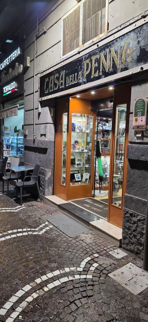
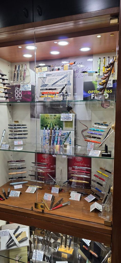
As regards fountain pen shops, I found very few on my travels, even though several of the place names – Furore, Positano and Maiori. were familiar from the models, brands or colours of Italian fountain pens long before I visited the towns. There were countless shops for tourists, but (unlike in Rome), fountain pen shops were elusive.
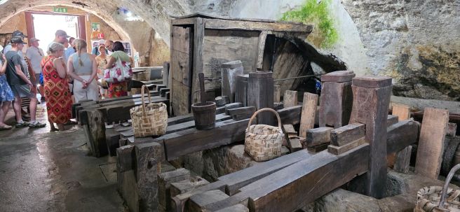
Amalfi has a very long history of being famous for its high quality hand-made paper. At the top end of the shopping street, we found the Amalfi Paper Museum (Museo della Carta) which is well worth a visit. Once there I would recommend joining the short guided tour to see the ancient machinery in operation and learn the processes used in paper making. This was carried out there and at similar mills, from the 13th century, right up until the 1960’s. Particularly impressive are the rows of huge wooden hammers like wooden crosses laid on their sides, which were operated by a cam shaft, driven by a water wheel. These were used to beat the cotton rags into pulp. Seeing just one hammer in operation, the noise was loud but a row of such hammers all beating for hours, must have been deafening.
Samples of paper types were available to buy in the gift shop, whether for writing or for water colours. There were dip pen and ink sets and just a few nondescript fountain pens but paper was the story here, not pens.
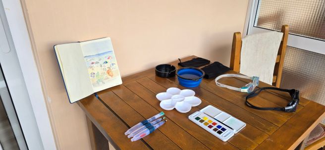
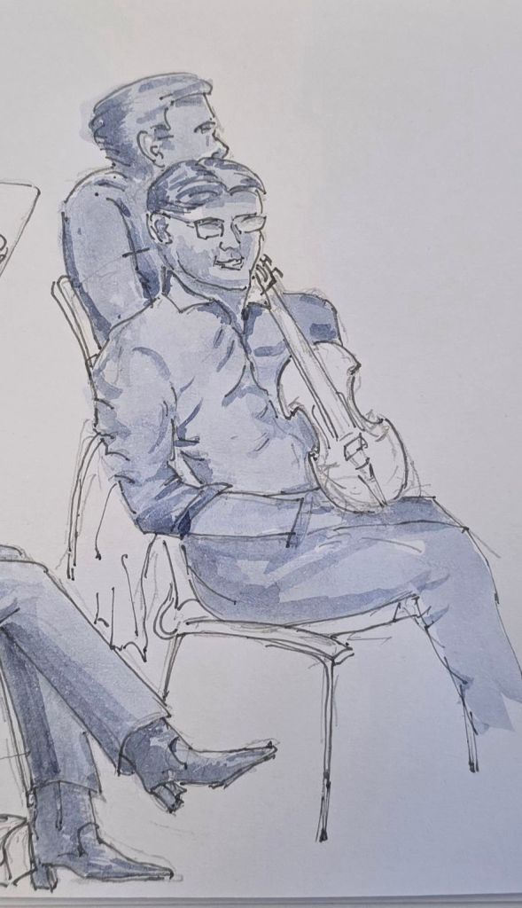
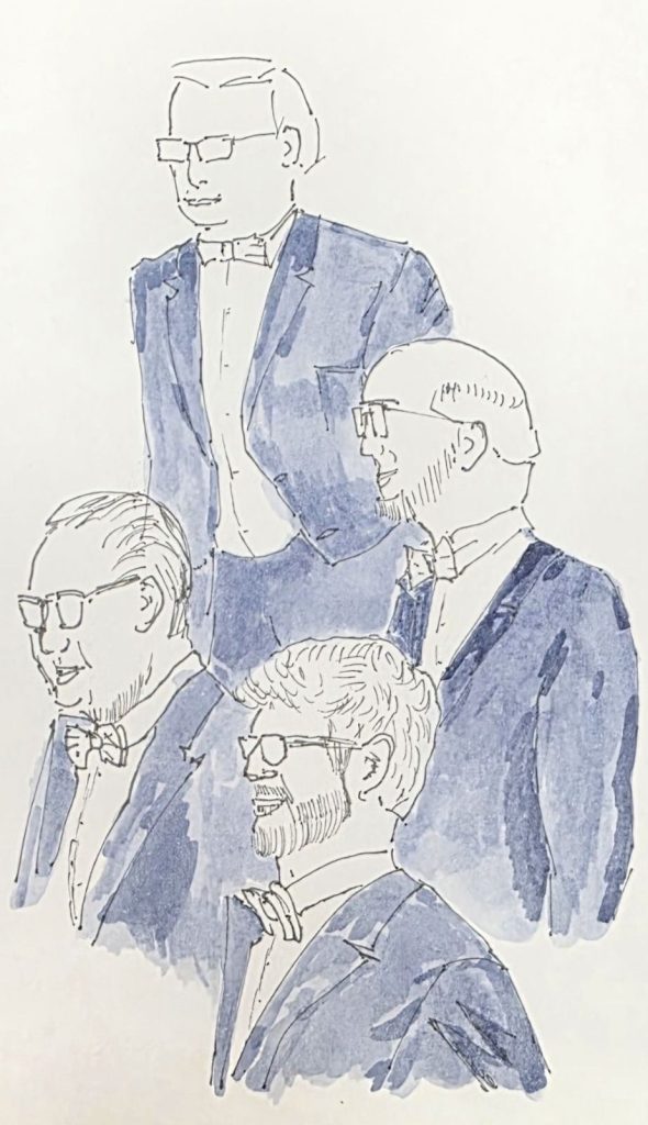
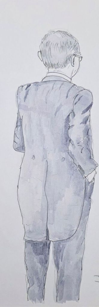
As well as using my fountain pens every day for holiday journaling, I also pursued my newfound hobby of travel sketching. Sitting with a sketch book certainly added to the enjoyment of this trip, introducing breaks from constant walking, some extended observation and creativity and a pleasing sense of achievement (mostly)!

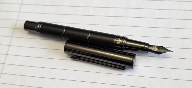
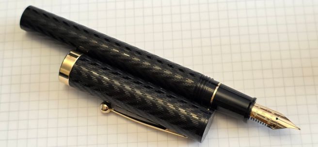
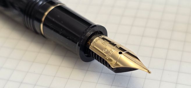
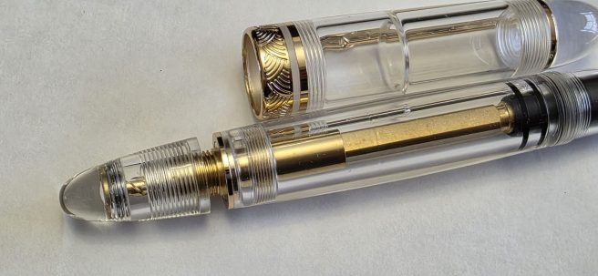
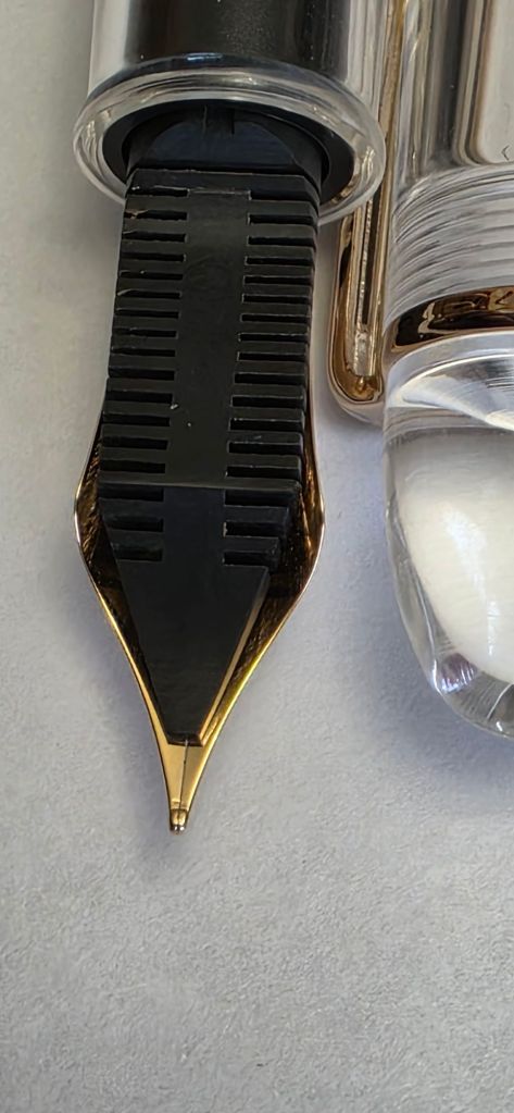
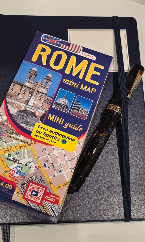
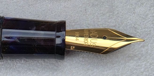
I was to have one bit of extraordinary good luck in my seemingly fruitless fountain pen quests. At the hill-top town of Ravello, (where we visited the gardens of the Villa Cimbrone and Villa Rufolo) I was wandering the attractive lanes of shops and found a Tabacchi. I always check the shelves for stationery in the hope that there might be some uncommon fountain pens for school supplies. But on this occasion I saw in a glass cabinet, a pair of open Waterman boxes. In one was a marbled green fountain pen, with gold coloured fittings. A sticker in the lid read “pennino oro massiccio 18kt.” The sales lady got out the pen for me. The pen was priced at 30 euros. I was not familiar with the model but given the price I assumed that the 18kt must refer to gold plating. It was fitted with a converter, included a pen pouch and one cartridge of ink, which was about four fifths evaporated. She did not sell Waterman cartridges but when I came to pay for the pen, she had reduced the price to 25 euros as the cartridge was nearly empty.
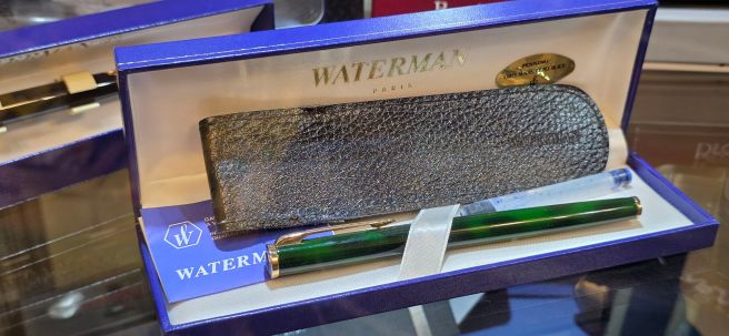
Some internet searches soon revealed that the pen is a Waterman Preface, a model from around 1995 – 1998 and that the nib is indeed solid gold! This was a New Old Stock (NOS) pen. I felt incredibly fortunate. I inserted the included cartridge and managed to get nine and a half pages from it in my Leuchtturm notebook before it ran out. The other Waterman pen in her cabinet was a NOS Phileas, in black but was a rollerball or ball pen, also at just 30 euros but which I let pass, not wishing to test my wife’s tolerance further. It might still be there now.

This, together with our Albania holiday in the first leg of this trip (described in my previous post here) was a wonderful time of seeing new places, travelling around by ferry and buses, enjoying meals out and in our self-catering accommodation and usually a swim in the sea to cool off each day. I enjoyed my sketching, and on a couple of occasions, attracted attention from passers by who even stopped to talk and asked to photograph my picture! Going home with a NOS Waterman was the icing on the cake.