Some early thoughts on the Aurora 88 fountain pen.

The origins of this, my latest pen purchase, probably go back a few years to when I first started to hear about Aurora pens, particularly the Optima, in other people’s blogs. It was not a brand that I had come across before. I also met an Aurora rep at the London pen show and picked up a couple of glossy catalogues of their then current collection of writing instruments. I learned that their gold nibs were all made in-house by their own craftsmen and women which is rare and admirable.

14k gold nib, Medium.

And then whilst visiting Italy on holiday in June, I found a pen shop selling Auroras, in the centre of Brescia. There I handled an Aurora Talentum in black resin, which was a good sized pen and felt very comfortable. However, my wife helped me to resist the urge to buy it on the spot.

Back story: the buying journey.

Back home I found myself browsing the internet for Aurora pens and I looked at several different Talentum models and watched a few reviews. I was pondering over which colour to go for and which nib.

And then came a summer sale on Iguanasell. It so happened that the Talentum models were not reduced but I found the Aurora 88, a well regarded and much longer-established model than the Talentum, dating back to the late 1940’s, with a generous discount of 35%. I particularly liked the black resin version with gold plated cap.

I shared this information with my wife, hoping that it would be a mere formality to obtain her approval that such a large saving represented good stewardship of our joint financial resources. However, she was not so enthusiastic as I and made a compelling argument that I had “so many pens” and did not have time to use them all. True. But it is an Aurora 88, with a gold plated cap! It is a piston filler, with a 14k gold nib, an Ebonite feed, an ink window and everything. And a hidden ink reserve! On paper, its size and weight called to me that this was an ideal pen that might have been designed with my preferences in mind.

However, by the next day, her position had softened to “Oh well, it’s up to you” which I took as a yes. I then leapt on the Iguanasell website again. The discount offer was available only whilst the pen remained in stock. It was still there. Free shipping from Spain and despatched within 24 hours. I deliberated briefly over which nib to chose and went for a Medium. Click. Proceed to Checkout!

The following day I received an email from Iguanasell that my order had been shipped and providing a tracking reference. There followed an anxious wait. First, I worried whether the Aurora nib, known for its feedback which is not to everyone’s taste, would suit me. I had not had an opportunity to test it out. What if it does not write as well as my Faber-Castell Grip? Secondly, over the coming three days I was a bit perturbed that the tracking reference (34 digits long!) gave the status “not yet received” by the couriers. This went on for three working days. Some doubts began to creep in about the veracity of Iquanasell’s fast delivery claims.

But then on the fourth day, the doorbell rang at 7.30am. I hurtled down to get the door, scattering furniture in my haste. It was the next door neighbour who had taken in the parcel for me, the previous day.
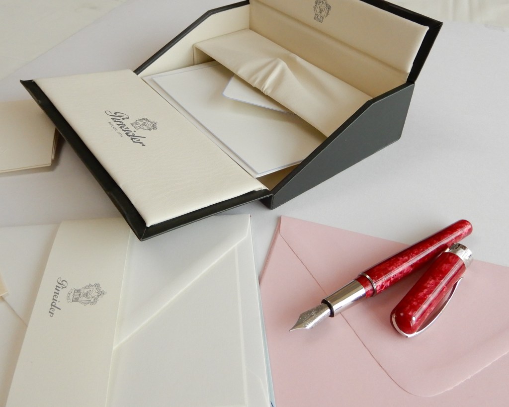
The unboxing.

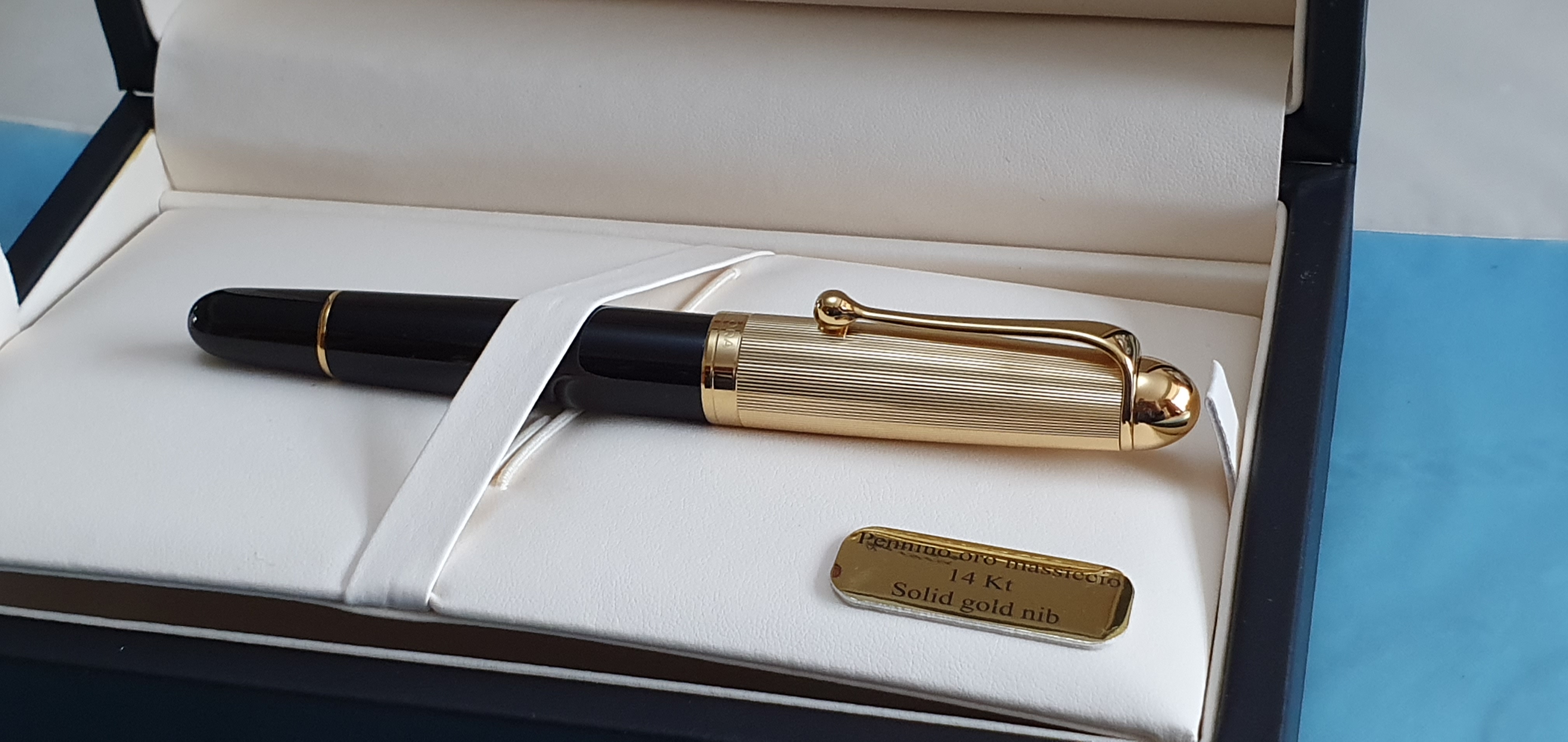
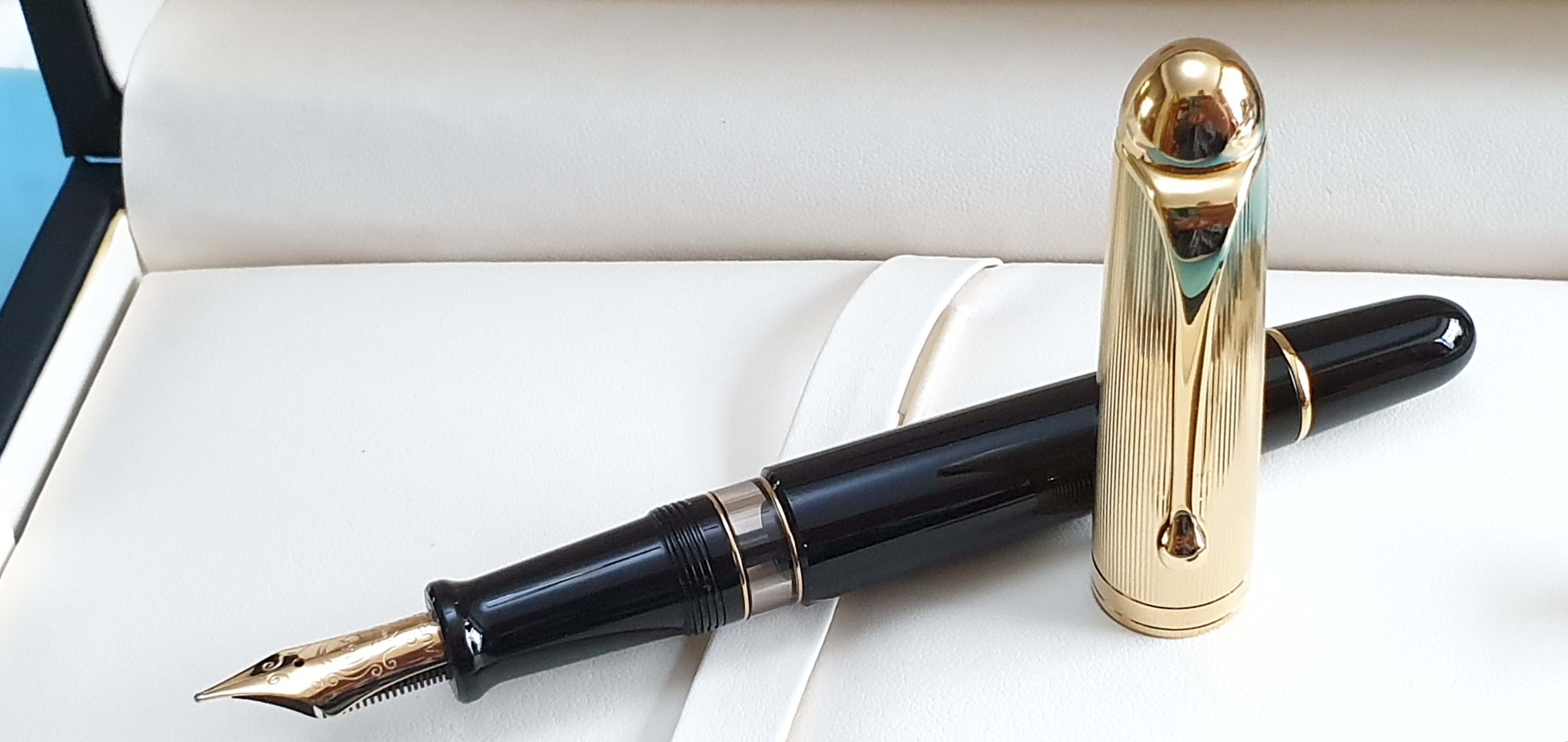
I enjoyed peeling back the layers to get to my new toy. Inside the white polythene outer packaging, was a large brown cardboard box. Inside this, padded with bubble wrap, was the large glossy black cardboard Aurora box with the Aurora logo and my pen model details on the end, “88 BIG” (yes please!), “Gold plated cap and resin barrel.”

Inside this, was the actual gift box, a handsome black leatherette type with creamy coloured padded interior. And there was my pen, gleaming black resin and a luxurious gold plated cap with subtle guilloche design. Though I say so myself it looked absolutely gorgeous.

Aurora 88 (large) in black resin with gold plated cap.

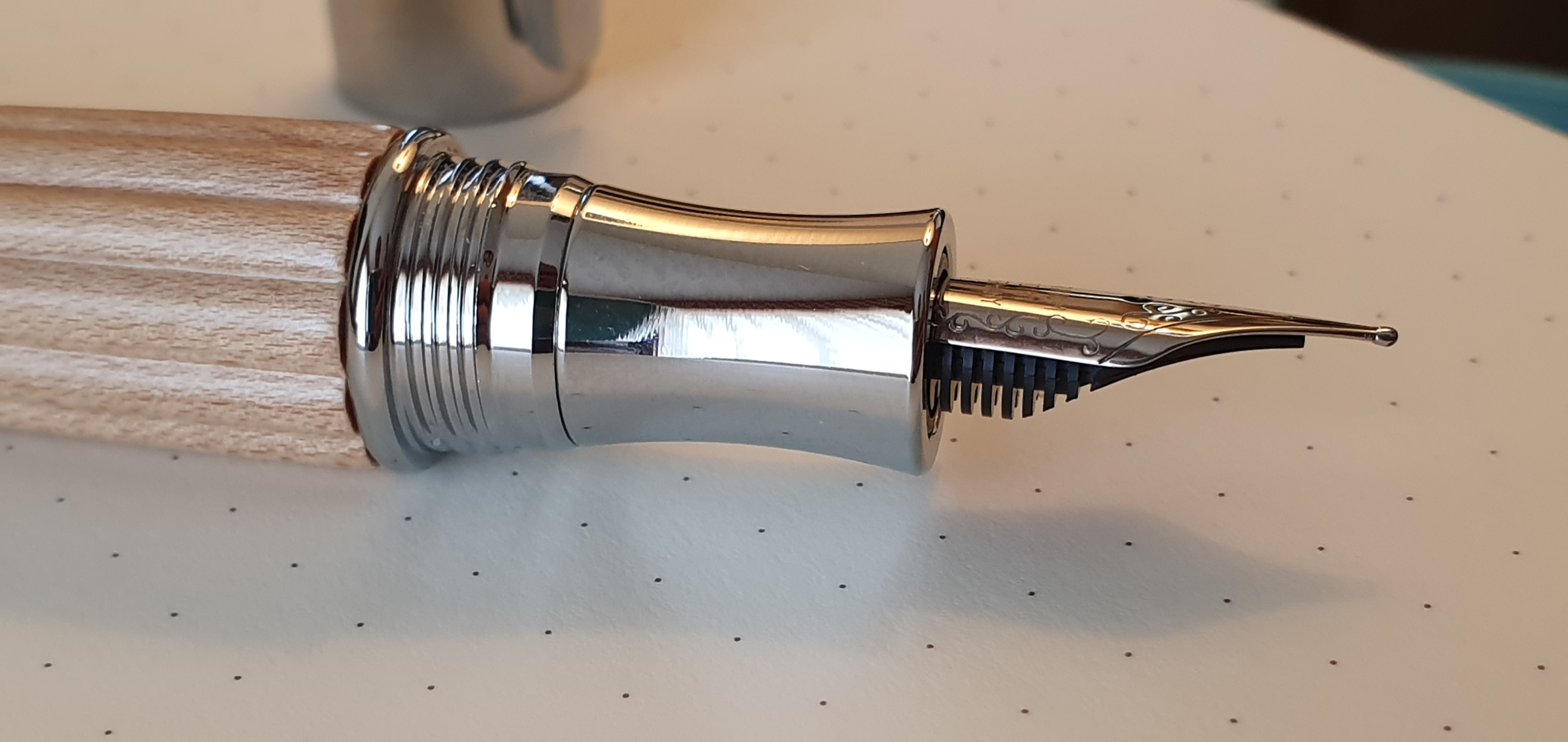
Picking it up, it was lighter than expected. (It weighs 27g; around 15.5g uncapped plus 11.5g for the cap). I unscrewed the cap, (about one and a quarter turns) to reveal the 14kt gold nib. This looked to be superbly finished. There was a glimpse of daylight between the tines until the tipping material, which was generous, symmetrical and even. Looking head on, the tines were perfectly level. However I did note that the tipping was narrow where it met the paper. Turning it over, I got my first sight of the Ebonite feed.

Ebonite feed. This pen ticks all my boxes.

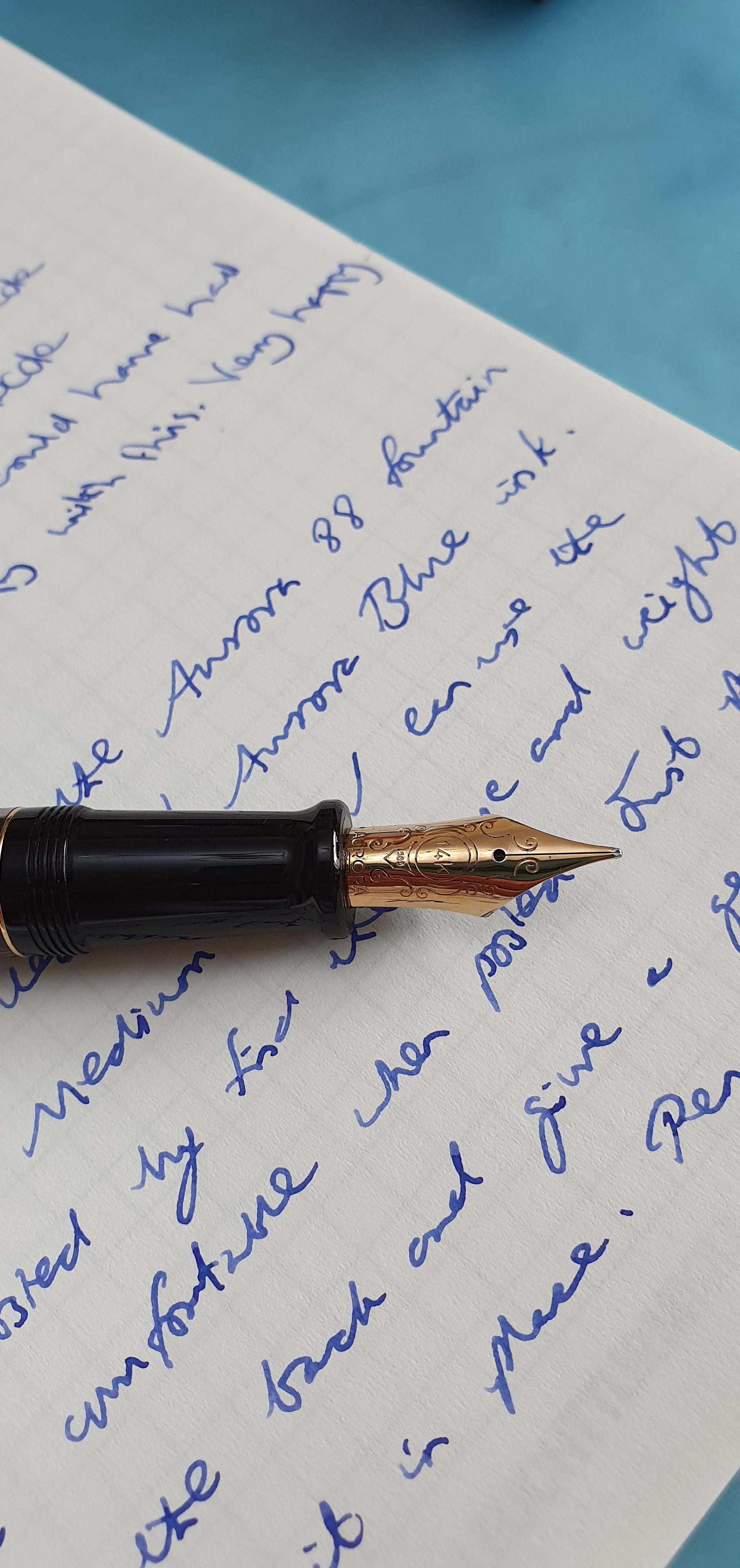
I got out a bottle of Aurora Blue and a Leuchtturm note book. The pent up anticipation in that first dip was immense. It wrote, smoothly and effortlessly. No skips. The pleasure and relief was all the more intense for having been anxious for a few days. No toothiness or drag as I had feared. However the line was more fine than I had expected, although I was perfectly happy with it. I enjoy having pens with all sorts of nibs. Perhaps, had I known that the medium would be this fine, I might have chosen a broad but I like it as it is. It does mean that with my usual style and size of writing, there is less filling in of my loops and this helps with neatness and legibility. The nib is sufficiently wet for my lefty-overwriting as well as underwriting styles.

I then tried the piston, which was smooth and easy. It took about 10 twists to lower the piston fully. I then filled the pen, following the recommendation in the supplied instruction booklet, to release about 4 drops at the end before turning the pen nib upwards and tightening the piston knob.

My new bundle of joy.

As you can imagine I greatly enjoyed trying the new pen and writing a few pages in my notebook. It is about 130mm long when uncapped but I still preferred to post it. The cap is light and does not upset balance when posted. The cap threads are plastic and so should not mark the barrel, but this would not bother me anyway. The grip, when the pen is posted feels very natural and comfortable with my thumb over the ink window. It is so comfortable that you want to go on and on writing. And it looks so classy and elegant. It is a good generous size, without being huge and without being too heavy either.

There is also a smaller version of Aurora 88 which has similar styling but no ink window and is a cartridge-converter pen. I have since seen from YouTube reviews, that the Aurora 88 range was first introduced in about 1947. I have a lot to learn about Aurora and its history. It celebrates its centenary this year and so this seems like another good excuse to join the club of happy Aurora users.

So how does it write? What about the Aurora feedback? Well, mine writes very nicely indeed. Straight out of the box. On Leuchtturm paper, it feels smooth and well lubricated but not a gusher. I would say that the flow is spot on. I have now covered about fifteen pages and so any saturation in the feed from filling will have settled down. The sensation of nib on paper is very pleasant and pencil-like, neither too glassy smooth nor toothy and draggy. Together with the comfort and ergonomics of the pen, it makes you want to write more.

First inking with Aurora Blue.

It is also a design classic. Parker had its 51, Montblanc its 146 and Lamy its 2000. I learned from a video by Grandmia pens that the Aurora 88 was introduced as a competitor to the Parker 51.

I looked for the Aurora 88 in my old Aurora catalogue. At first I could not find it in the index, in the list of the Collezioni Prestigio, the prestige collections. And then I spotted the name Ottantotto, which I now know is Italian for Eighty Eight.

My wife likes the pen too. And I gave my whole-hearted support and encouragement to her purchase of some summer dresses in the sales and would never dream of saying “You have so many dresses.” What sort of a husband would say that?

My Italian fountain pen line-up.

If you were to ask me about my experience of Italian fountain pens, I could tell you a bit about the ones that I own. In real life however, as fountain pen enthusiasts know, such a question never comes up around the office water cooler. Perhaps just as well. So I will resort to giving my response here.

A quick scroll through my pen accumulation database today, identified 12 fountain pens of Italian origin. This surprised me. I had not realised that I had so many.

I remember once watching a reviewer on YouTube, make a sweeping generalisation that Italian pens were a bit like Italian cars, by which he meant that they were flashy looking and fantastic when they worked but perhaps not the most reliable. This is probably unfair to both pen and car.

For my part, within the last four years or so, I have amassed this small sample. It is fair to say that these are all in the lower echelons of the price range. Of my twelve only one has a gold nib. This is the Aurora Ipsilon blue lacquer, with a 14k gold nib, rhodium plated. And that has not been my favourite of the bunch.

From left to right: 1. Aurora Ipsilon blue lacquer; 2. Campo Marzio Ambassador; 3. Campo Marzio Acropolis; 4. Delta Fantasia Vintage; 5. La Kaligrafica; 6. Leonardo Furore; 7. Leonardo Momento Zero; 8. Montegrappa Fortuna; 9. Pineider Avatar, lipstick red; 10. Visconti Rembrandt twilight; 11. Visconti Van Gogh Starry Night and 12. Vittorio Martini Col Disore.

Here again, capped:-

If I were to see this tray of pens at a pen show, the one to jump out at me the most would be the orange one: the Leonardo Officina Italiana, Furore “Arancio”. It is the brightest, the longest, the most flamboyant and also one of the most enjoyable to use. Oh, and the serial number of mine is number 001.

So here is a brief run down of my thoughts on these:

Aurora Ipsilon, blue lacquer.

This is the lacquered metal and gold nibbed version. It is on the small side but posts deeply and with a secure click. I enjoyed buying it whilst visiting Verona but for some reason did not take to it and it has not had much use. The black and blue marbled finish is nice. The fine nib, I recall, was not the most enjoyable.

Campo Marzio Ambassador.

Campo Marzio hails from Rome. They have a small but delightful shop in Piccadilly and sell their own range of fountain pens from around £20 up to £80. They are colourful, good value, standard international cartridge or converter pens with steel nibs. The Ambassador was, when I bought it, at the higher end of their price range. I enjoyed being able to swap out the number 6 nibs easily. It was a big comfortable pen, posted well but could have done with being just slightly longer to be as comfortable un-posted. I think it was the first Italian pen that I had owned. I have a suspicion that it may share a common heritage with the Conklin All American as they seem to have very similar dimensions.

Campo Marzio Ambassador.

Campo Marzio Acropolis.

I later added this blue marbled resin Acropolis, which was similar to the Ambassador but a bit slimmer and with a black section and with metal cap threads on the barrel. My only gripe was that the cap did not post as well as I would have liked. I was afraid of pushing it on too hard and cracking it.

Delta Fantasia Vintage.

This was bought at the London Pen Show and is my only celluloid pen. The steel nib keeps the cost down. It has a lovely swirly dark green finish and I have since learned how to cap the pen such that the patterns of the cap and barrel align. Hold it with nib facing you; place the cap on; turn cap two clicks “the wrong way” and then screw it down. Hey presto. The benefits of attending a pen club. It is a beautiful pen and the steel medium nib works well.

La Kaligrafica.

This is included for completeness but is not one to dwell on. It has a vibrant red acrylic body, some metal lattice work on the cap and a medium Iridium point, Germany, nib. It was a spontaneous and inexpensive purchase on holiday last year. Cap does not post securely. Too short without posting.

Leonardo Officina Italiana, Momento Zero.

This is an excellent pen and excellent value. New on the scene a year or two ago, I found mine for sale by Izods at the London Pen Show. Mine had some slight teething trouble, a tiny crack in the section, which Leonardos, via Roy of Izods promptly replaced for me, sending me a complete front section with nib and feed. The replacement section had no such problem although this time, the nib tines tended to click together a little. Another issue which I and others have noted, is that the converter rattles against the barrel unless you put some tape around it. But the size of the pen and the colours are great.

Leonardo Officina Italiana, Furore.

This is a very similar pen to the Momento Zero, but with bullet shaped ends. I love mine. I took to using it with Waterman Tender Purple ink. The pen really stands out in the pen cup, for its size and orangeness.

Montegrappa Fortuna.

This is standard black resin version. It is big, girthy, comfortable and posts nicely. I felt at first that the shiny plated threads were a bit of a distraction when you hold the pen, but I think with use you forget this or position your fingers to avoid the threads. The nib is smooth although very firm but that makes for a good pen for fast note-taking. It is a little pricey for a steel nib pen, but similar in price I suppose, to the Visconti Van Gogh.

Montegrappa Fortuna, meets Waterman Audacious Red.

Pineider Avatar, Lipstick Red.

Aah. Seldom have I enjoyed buying a new pen so much. I bought mine in Harrods, although they were no longer selling Pineider pens the last time I was there. I loved the vibrant red, mottled velvet-like pattern in the glossy red cap and barrel, the magnetic cap closure, the elegant clip, the Florence sky line on the cap ring and above all, the smooth soft nib. Everyone who tried it said it felt like a gold nib. I enjoyed basking in its reflected glory at our pen club meet ups.

The Pineider Avator, in lipstick red. And one of the nicest pen boxes I have ever received, with some welcome free Pineider stationery.

Visconti Rembrandt, Twilight.

This was my first Visconti, (if I do not count a Homo Sapiens Elegance Oversize, which I bought and promptly returned as the nib was unacceptably dry and too expensive to adjust myself). The Visconti Rembrandt also wrote on the dry side but I was able to adjust the nib by using a simple technique learned from SBRE Brown’s videos, whereby you put your thumb on the middle of the nib and then push the nib down against a hard surface, (such as your other thumbnail) and so bend the tines upwards very slightly, opening up the tine spacing. This made a great improvement and now it writes beautifully.

Visconti Van Gogh, Starry Night.

I had fancied getting a Van Gogh to go with my Rembrandt, (you get the picture?). This one was was being sold by my friend Penultimate Dave at our June pen club meet. When I had seen the full range in a shop in Cardiff once, the Starry Night was my favourite. I may have had to do the same trick with this Fine nib but now it writes superbly, smooth and wet.

Visconti Van Gogh, Starry Night.
The faceted cap and body, in the palette of Van Gogh’s Starry Night.

Vittorio Martini (established 1866), the Col Disore.

This was spotted in the window of a stationery shop in Sirmione, on Lake Garda, for 56 euros. I was attracted by the unusual fluted Maple wood barrel, which I felt looked a bit like the Diplomat Aero. It was a holiday purchase and a nice souvenir. I used it throughout my stay in Italy, with a black cartridge and the cap posted. However, with more comfortable and better-performing pens at my disposal, I have not used it so much since then but it is well made and it is nice to have a shiny, chrome, screw-on cap at this modest price.

Maple wood and chrome.
Vittorio Martini Col Disore fountain pen, next to Daniel’s Diplomat Aero at our July pen meet.

So that has been my experience of owning Italian pens, so far. I still have the urge one day to acquire a superior Montegrappa something, in blue celluloid and sterling silver. And the Aurora Talentum is still on my wish list, notwithstanding the lacklustre experience with the Ipsilon. The Italian allure lives on.

Finally, this has been my 100th post and it seems a fitting milestone at which to say a big Thank you for reading, liking, commenting and following this blog.