Moderno B5 Charcoal notebook review.

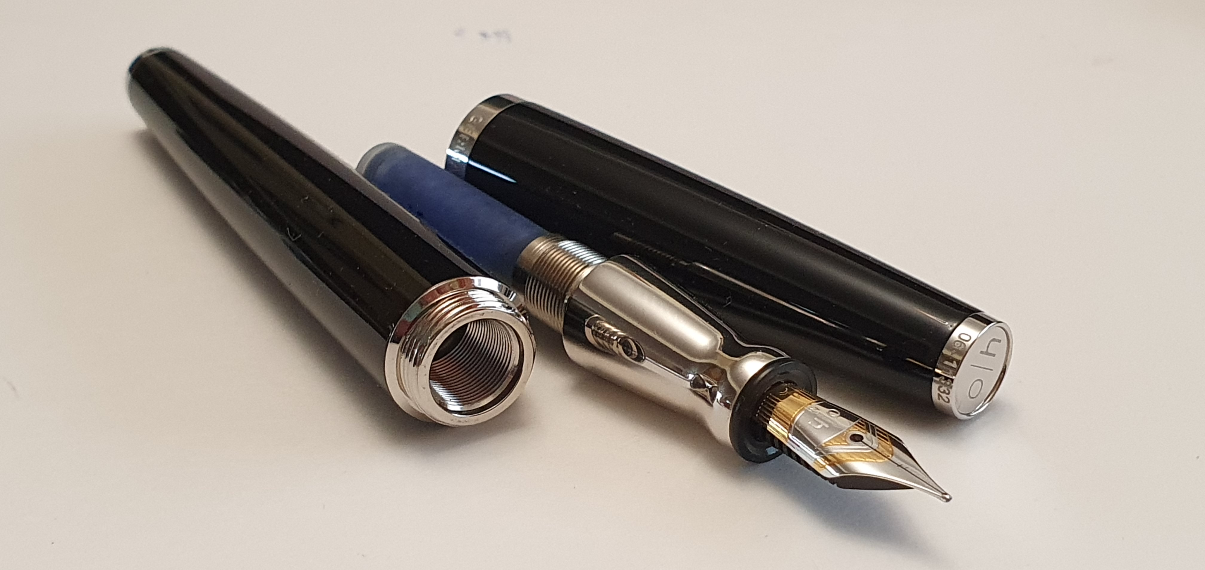
Our local WH Smith stationery shop in Brent Cross shopping centre has had another revamp recently and is looking a bit more inviting and spacious as you enter. Whilst browsing, and after circling the racks of roller-balls and fine-liners to check out the fountain pens (mostly Lamy, Parker and Sheaffer), I ventured on to the shelves of journals.

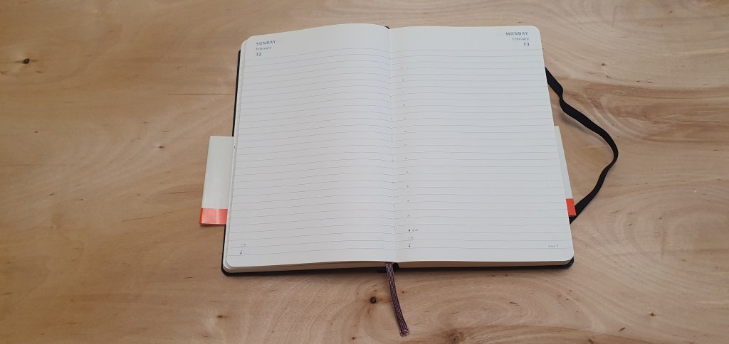
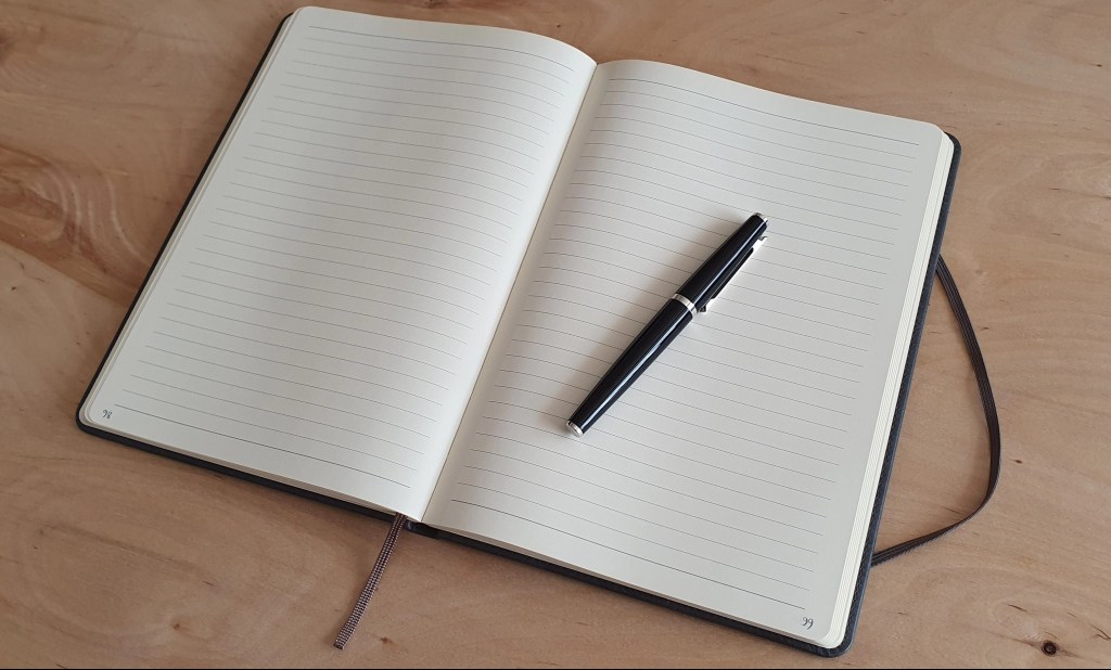
My eyes were drawn to their Moderno B5 notebook, with 96 ruled ivory sheets (192 pages) of 80gsm paper. It has the ubiquitous inside back pocket and an elastic closure.

Moderno B5 journal, next to an A5 Leuchtturm for size comparison.

I did not have any immediate need of a notebook (an understatement, tbh) but was nevertheless tempted by this one, mainly I think due to the interesting B5 size which sits as a nice compromise between A4 and A5. I had no idea whether the paper would be fountain pen friendly or not (which is partly why I am writing this brief review: spoiler alert – yes it is) but found myself making my way to the self-service checkouts to part with £11.99. The lure of a new journal is a strong one.

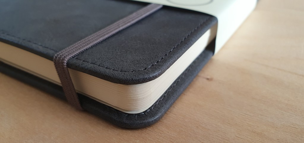
The notebook has a pleasing grey plastic leather-look cover. I do not yet know whether this plastic will crack and flake in the long term. The book is stitched. The lyrics of Paul Simon pop into my head – every page is neatly bound, “for a poet and a one-man band”, or something.

Nice strong open-flat binding.

Getting it home, I could examine the features more closely:

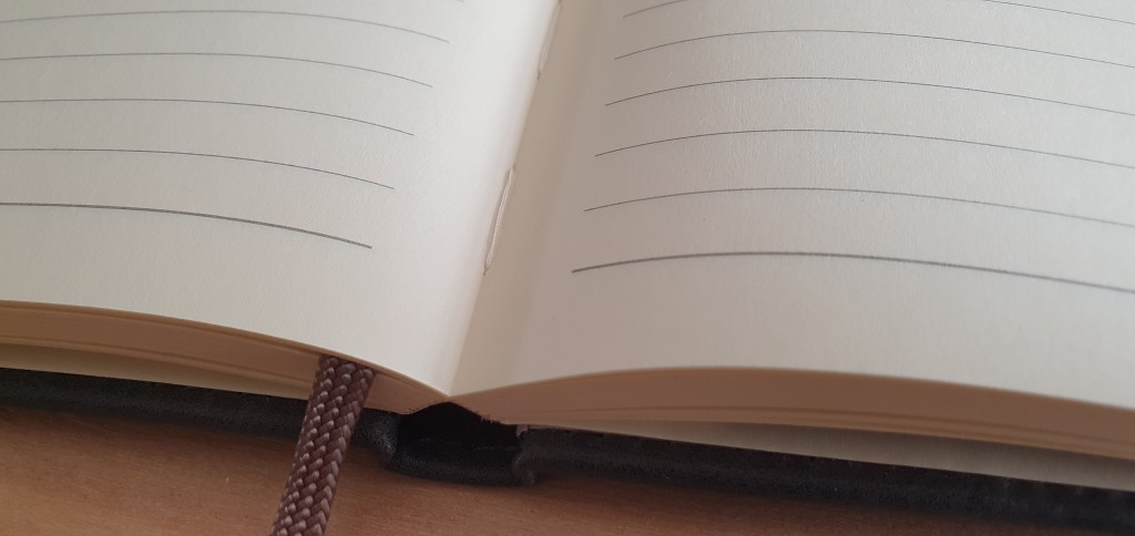
  • 96 ruled ivory sheets; (not paginated but I do that myself);
  • 80gsm paper;
  • rounded corners;
  • inside back pocket;
  • elastic closure: (a bit slack but usable);
  • 8mm row height; (Yay! my favourite)
  • 29 rows to the page; (close, but not quite a month’s worth of days);
  • one ribbon bookmark;
  • produced in China.

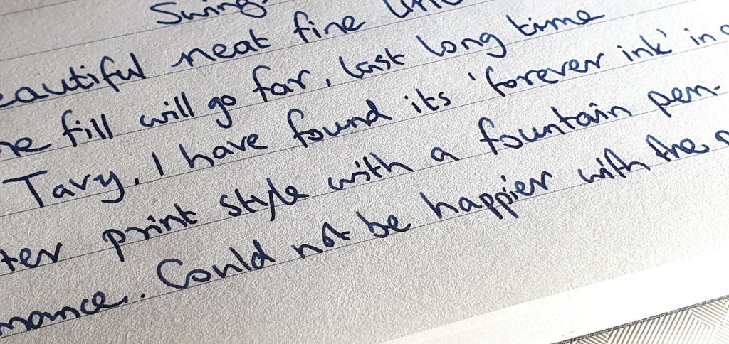
One of the first things to be done of course when trying a new notebook, is to test the paper for fountain pen ink. I usually select a handful of pens from my “currently inked” pots and write a line or two with each, to see how the pen feels on the paper, whether it feathers, and crucially whether it bleeds through the paper or shows through too much. I am happy to report that with all the inks I tried, these tests were a success. There was no bleed-through with any of them and very little show-through either.

Plastic leather-look cover in smart charcoal colour and neatly rounded page corners.

In terms of usefulness, a B5 journal is rather nice to have. It could be used as a bullet-journal or “bu-jo”. The only caveat is that with 29 rows to the page, you are a couple of days short of a month (or a few sandwiches short of a picnic) but you could add an extra row at the top and another at the bottom of the page, if this is your chosen use. I have done this before on another book, in which I created a three year bu-jo with a double page spread for each month.

I am not one for stickers and washi-tape but do find a bu-jo very useful. For example, unlike a one year diary, you can insert dates for a future year, or even two or three years ahead, such as car insurance renewal dates, MOT expiry dates, or maturity dates for ISAs or fixed term saving accounts.

A double page spread with 29 rows per page.

Then there are the rest of the pages, not allocated to monthly views, which you can use for all sorts of other things. For example I like to make lists of albums from particular artists, and then tick them off after I have listened to them, – which I find so much more satisfying than track-hopping on Spotify.

Above all, I am pleased that I can use fountain pens with the book. The 8mm row height hits the spot for me. I do not think I will use this one for a bu-jo as I am already set up for that, but I shall enjoy having it in stock until a suitable function presents itself. I realise that one should have a NEED of a notebook before buying one, not the other way round, but such is the life of a stationery addict.

My notebooks fall into two broad categories: those which I would want to keep once they are full, and those which I would not (which are typically full of pen and ink samplings and notes of no lasting interest). Having a book which has a durable cover would tend to indicate that it should be used as a “keeper”. In the past I used a Ryman A4 journal as a bu-jo but after several years’ service, the cover material is now flaking off and leaving bits everywhere on my table. If planning to use a notebook for a multi-year bu-jo, then it is wise to consider how the cover might wear.

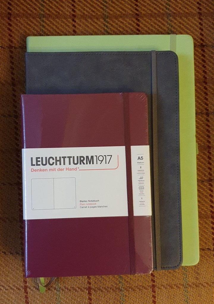
The B5 size has the advantage of giving you more space on the page than an A5 journal, (of which I use a lot of Leuchtturms) whilst not needing as much space in a bag as an A4 if you wished to take it out and about, to do some writing in a coffee shop, as I like to imagine myself doing, but have not done much of late.

When I next need a B5 journal, which is suitable for fountain pens, I will be ready.

This picture might be more useful, to show the B5 size, in between an A5 and an A4 notebook.

Early thoughts on the Jinhao X159 fountain pen.

Occasionally, something new comes along in the pen world which sets social media buzzing amongst the fountain pen community. Recently, we have had a new offering from Jinhao, named the X159.

The imposing Jinhao X159.

This is not entirely new: there has long been a Jinhao 159 (without the “X” factor), which we might call an homage to the Montblanc Meisterstuck 149, but with a steel nib, cartridge-converter filling and a fraction of the cost. However, it was a heavy beast, being made of metal. I owned one myself. In the event it did not see a lot of use, on the ground that the ink flow in my model proved to be a bit erratic despite my efforts.

However, the new version, the X159 is different in many respects and offers significant improvements. Whilst similar in size and appearance to its forerunner, the main changes are as follows:

  • It is now made of acrylic and is much lighter;
  • It has a larger, number 8 nib;
  • There is new, more subtle pocket clip;
  • The grip section is much less tapered and does not end with a metal ring (colloquially termed a “rust ring”);
  • The threads on the barrel, for the cap are now acrylic instead of metal.
Uncapped. Big girthy pen with number 8 nib.

These cannot be found in our shops but are available online. The prices on Amazon currently range from £7.49 to around £20.00 depending upon which colour, trim finish and nib size you chose. Nib sizes are Fine or Extra Fine. There is an option for gold or silver colour trim, the former having a bicolour nib.

I resisted the temptation to order one for several weeks, happy with my current line-up and convincing myself that the Jinhao could not possibly perform any better than steel nibbed pens that I already owned, such as my Onoto Scholar or the Otto Hutt Design 06 to name but two. Whilst the price was obviously not an issue, I did not want the added clutter.

However the temptation did not go away and I learned that a few friends had ordered one. Still curious to try one for myself, I eventually weakened and pulled the trigger. I opted for a black version, with silver coloured trim and a Fine nib, for a princely sum of £9.99.

The unboxing.

With Amazon Prime, the pen arrived the following day. Inside the cardboard envelope, the pen was packed in a simple polythene sleeve inside a padded envelope. This was just enough to get the pen to me without damage and did not leave me with any unnecessary box.

That’s all the packaging.

In the flesh, first impressions were very favourable. The black acrylic body was smooth and glossy. Fit and finish all seemed good. The number 8 nib, being the first pen I have bought with one, was a good bit larger than the usual number 6 size and looked impressive and perhaps a bit more in keeping with the large girth of the pen.

The nib and feed.

I examined the nib under a loupe. The tines looked to be even, with good symmetrical tipping. There was a nib slit which narrowed down from the breather hole to the tipping at which point the tines were quite tightly together. Viewed from the back, the nib was not quite symmetrical to the feed, but this is easily adjusted.

Disassembled.

I flushed the nib and feed in warm water to remove any residue of grease from manufacturing. The nib is easy to disassemble – a feature that I appreciate very much. You can unscrew the nib housing from the section. Once out, the nib and feed are friction-fit and can be pulled out from the housing, by gripping them together, perhaps with a soft cloth or tissue and pulling in a straight line, being careful not to damage the delicate plastic feed. Once out, you can lift the nib off the feed, and it is more easy to clean and adjust if necessary. I noticed that the ink channel at the top of the feed was cut quite wide and more like a trough than a slit. Good!

I had expected the nib to be a bit dry, having seen a video review by Stephen Brown. As a lefty-overwriter, my preference is for pens which lay down ink with little or no pressure needed. This can usually be achieved by opening up the gap between the tines at the tipping, just a very little until you can see a space, or daylight, between them.

After separating the tines slightly and realigning the nib on the feed.

This is a very useful adjustment. It is often easier with a gold nib than a steel one. There are various tricks to doing this, using brass shims to floss the nib, bending the tines up, or trying to wriggle a blade between the tines – all of which should be attempted with great care and with frequent pauses to inspect the nib under a loupe and to try writing with it again. Eventually, I had the best success by lifting first one tine, with my thumbnail, bouncing it up and down a few times – and then doing the same with the other. I then replaced the nib onto the feed, and pushed them back into the housing, carefully ensuring that the feed’s point was centred with the nib and that the tines were both level and smooth.

Filling:

After flushing and drying the pen, I filled it with Montblanc Royal Blue. The large nib does need quite a full bottle to be able to immerse the nib for filling. My Montblanc bottle has the useful feature that you can tip it to make the filling area deeper. Before doing this, the converter did not draw up any ink leading me to wonder whether it was not pulling a vacuum. Note that the converter is like the Lamy ones, with a flat edge to hold rather than being round. Personally I do not like this feature as it makes the converter harder to twist.

Converter included.

Writing and performance:

Having adjusted my nib I then flushed, cleaned, dried and filled it, all of which took less than an hour. I was thrilled that it wrote superbly, as well as I could wish for. The nib was smooth, with good ink flow and lubrication. It is a firm nib. My fine nib writes a slightly wider line than intended by reason of my tine-widening exercise, but the end result, a medium-fine, is very pleasing. All in all, I was absolutely delighted.

It then just remained to do two further tests. One is to write for about a page of A4, to see how the feed keeps up, once the excess ink from filling the pen and saturating the feed, is used up. This is to check for “ink starvation” if ink is not being replenished from the converter. This (like opening the tine gap) is another tip I picked up from Stephen Brown’s videos. All looked good on this front. The final test was to check for hard starts. Leaving the pen untouched for 8 hours, revealed no issues. Later, when I could bear to leave it alone, I managed some longer intervals and again, there were no hard start issues.

Size and weight.

Jinhao 159Jinhao X159
Weight, total46g28g
Weight without cap27g18g
Weight of cap 19g10g
Length capped148mm148mm
Length open125mm130mm
Length posted165mm162mm
Size and weight (approximate) comparison.
Comparing the X159 with the 159 (right).


Epilogue.

I have been really thrilled with the Jinhao X159. I think it is phenomenally great value. There is nothing else quite like it on the market. It could compete well with some pens in the £100.00 to £200.00 bracket. I hope that it continues to perform as well as it does now, and see no reason why it should not, with usual care and maintenance.

Indeed, so impressed and blown away was I, that I ordered a second one, this time trying a different colour, and with gold coloured fittings with a bi-colour nib and in Extra Fine. I opted for a blue and gold one. This cost just £7.99, firmly within “no-brainer” territory. There is also a Dark Blue version but this was priced around £20 and would come from the US, taking longer.

The blue-teal colour is quite hard to capture in a photo.

Once again, my pen arrived the following day. At first, it looked like I had got Dark Blue as it looked like navy, in artificial light. However, daylight revealed the colour to be a very pleasing blue-teal, which I am very happy with. I was excited to see under the loupe that the EF nib looked to be tuned to my liking, with the slightest of gaps between the tines, promising a good writing experience. After flushing the pen, I filled it with Diamine’s Conway Stewart Tavy, my go-to blue black. Bliss. This feels like its “forever ink.” The extra fine nib performs beautifully. In my notebook I wrote “I am genuinely over the moon at how good this pen looks, feels and writes and all for a £7.99 price tag.”

Writing sample of EF nib.
A big pen with a tiny EF tip.

Early thoughts on the Otto Hutt Design 06 fountain pen.

My relationship with the Otto Hutt Design 06 fountain pen had the best possible start. I bought the pen whilst on a short break in the beautiful city of Porto, in one of the most delightful pen shops I have ever seen, namely Araujo & Sobrinho founded in 1829. So, being abroad, in holiday mood AND being in a pen shop, I was very open to the possibility of finding a new fountain pen to take home.

The Otto Hutt Design 06 fountain pen, glossy black lacquer version.

The brand Otto Hutt, of Germany, was unfamiliar to me. I had heard the name and seen a few reviews of their pens online, notably from Anthony of UK Fountain pens, but had not seen any of their pens in the flesh. I had not come across them in any shops in London although I have since learned that they are available from the online seller Cult Pens. Another excellent review can be found on The Gentleman Stationer.

At the time of my visit, the shop had two glass display cabinets featuring Otto Hutt pens. First, an eye-catching display in the counter as you enter the shop, contained the Otto Hutt Design 08, a stylish metal pen with a grooved barrel and a distinctive black grip section with with rather sharp-looking backward pointing ridges. These looked grippy, if rather uncomfortable, rather like a sharper take on the Lamy Imporium. Next to this was an Otto Hutt Design 07, which I learned is made from sterling silver and a little more conventional in shape than the Design 08.

Next I spotted a range of Otto Hutt pens in various colours, and which I now know to the be the Design 06. I must admit that at first sight, I was not tempted by these by reason of the polished metal grip section and secondly, the step down from barrel to section. I have found that metal sections can be slippery making it difficult to control the pen without it rotating left or right in your hand. Also a step can be sharp and uncomfortable under your fingers. I had a good browse around the shop and its attractive displays but left without buying anything.

The cap ring of the Otto Hutt Design 06.

However, I returned a few days later, being the last day of our mini-break in Porto. This time I met Miguel Araujo the proprietor who kindly allowed me to take a few photos in the shop, which I included in my recent post Travelling with ink: Porto, Portugal. I then asked to take a closer look at the Otto Hutt Design 06, perhaps hoping to convince myself of its unsuitability.

A series of revelations ensued. First, whilst the polished metal section is undoubtedly slippy if you were to grip it there, I found that I naturally held the pen with the section resting on my second finger, my first finger over the cap threads (which are not sharp) and, crucially, with my thumb on the lacquered metal barrel, which was not slippery and which allowed me to anchor the pen and prevent it from turning inwards or outwards. Held in this way, unposted, and with its centre of gravity being located towards the front end, it actually felt strangely comfortable. I say “strangely” as it felt different from my other pens and with it cradled in my hand it almost felt like an extension of my body (if my hand had been designed as a writing tool).

Uncapped. A step down from the barrel to the shiny metal section.

The step down from barrel to cap threads and section, which looks quite pronounced and sharp, was not a problem for me in practice. As I said, my thumb rested on the barrel and my first and second figures were on the section and so my grip was formed either side of the step.

The next revelation occurred when I asked to try the pen. Miguel produced a bottle of ink and some paper. I tentatively dipped the nib, and put pen to paper. There was literally a “Wow” moment as soon as I wrote and noticed the soft springiness of the nib, such as is sometimes found in gold nibs. Yet the Otto Hutt Design 06’s nib is stainless steel. Aside from the softness of the nib, it was also beautifully tuned to write smoothly and with an optimal flow. The bi-colour nib with its imprint also happens to be very pretty.

Cartridge or converter fill.

As you can imagine, I was thrilled with the pen and was keen to buy that very one. Miguel cleaned the nib for me, found the box and the converter, and gave me an Otto Hutt catalogue plus a post card with an old black and white photograph of the shop and a tote bag in which to take it all back to my hotel.

The unboxing. The polishing cloth is a nice bonus.

Having used the pen for almost two months I am pleased to say that I remain just as pleased with it as I was on that first day, if not more so. I have used it so far only with Graf von Faber-Castell cartridges in Cobalt Blue.

Size and Weight

The Design 06 is a medium-sized pen. It measures 139mm capped, 122mm uncapped and 156mm posted. It weighs around 47g in total, comprised as to 32g uncapped and 15g for the cap alone. Personally, I prefer to use it unposted and in this mode it feels nicely front-weighted. However the cap does post, quite deeply and securely if desired, making the pen quite long and shifting the centre of gravity back a bit.

Likes

There is a great deal that I like about the pen. As I write this at home, I have ten fountain pens in my ink cups, plus a further three Delike New Moon pens at hand with inks to match their colours. Of my currently inked pens, the Otto Hutt is the only lacquered metal pen and so its heft does make it stand out from the rest. Here is what I like about it:

  • The nib is the main attraction, being soft, smooth, with a pretty imprint and bi-metal, shiny plated finish. It is a medium but writes a line which is on the fine side of medium.
  • The smooth, flush body, from barrel to cap (achieved at the expense of having the step down from barrel to section mentioned earlier);
  • The stylish, disc finial bearing the initals o|h;
  • Having a serial number, laser etched around the finial, mine being 06-11332;
  • The long, straight, pocket clip, which pivots when the top is pressed;
  • The stylish cap ring, with “ottohutt” on the front and “GERMANY” on the back.
  • The shiny metal barrel ferrule.
  • The surprisingly quick cap threads, needing literally only a half a rotation to remove or replace the cap;
  • The ability to use standard international cartridges, with room for a spare in the barrel.
  • It is, in my humble opinion, great value for a top-quality, steel nibbed fountain with a nib that is amongst the best that I have used. I paid 145 Euros for mine.
  • The clean and smart look of the polished metal section, next to the glossy black of the barrel; the hardwear components, according to the catalogue, are plated with platinum in the black version, whilst some other colours feature rose gold plating. Whilst I tend to avoid metal sections, who doesn’t like platinum?
  • The pen comes in a white cardboard box, (a bit like a mobile phone) with a black outer sleeve. Inside you find, in cardboard inserts, the cartridge converter, a cleaning cloth (a rare luxury) and the user guide and card to note your serial number and date of purchase. The packaging is ideal and makes a good impression but could be easily recycled or used for other things.
  • Overall, the pen is tactile, stylish and attractive, whilst also subtle.
VERY long threads for the barrel. Serial number on the finial!

Dislikes

In two months of ownership, I have genuinely not found anything to dislike about the Design 06. One could perhaps wish that it was slightly longer and/or that the grip section was not of shiny metal plating or tapered the way that it is. But if you take away those features, you would be left with a pen like the Diplomat Excellence, clearly a great pen and one of my favourites but which can look slightly plain next to the Design 06.

Size comparison with the Diplomat Excellence (right)

I would like to visit Pforzheim one day, the city in south west Germany from which the Otto Hutt business had its origins in 1920. Some history can be read in the Otto Hutt website and Pforzheim was famed as the Golden City and jewellery capital of Germany. The city was the target of a notorious and controversial bombing raid by RAF Bomber Command during World War II on 23 February 1945 in which much of the city was destroyed with huge loss of life. When the city was rebuilt, the rubble from the destruction was formed into a hill, or Wallberg, to create a scenic memorial and viewpoint. Today, Otto Hutt is located at the nearby municipality of Konigsbach-Stein.

When asked to name a German fountain pen maker, I suspect that most people here would first think of Montblanc or Lamy or Faber-Castell. Otto Hutt is a much less well-known name here but its distinctive Bauhaus-inspired designs and quality workmanship are deserving of greater attention. Certainly if you are fortunate enough to find yourself in a pen shop which sells Otto Hutt fountain pens, it is well worth taking a close look at one. You may be pleasantly surprised and smitten, as I was.

An attractive sweeping taper to each end and the cap fits perfectly flush with the barrel.

The new year diary, 2023.

I have been in the habit of keeping a diary since I was about 18. For about the last 10 years, I have used A5, page a day diaries and usually write my entry after breakfast the next day.

In recent years, I have bought these from Rymans stationers, which had 23 rows per page, with a row height of 7.9mm. These are still available for £13.99. My new year diary 2022 was reviewed here.

However, for 2023 I have tried something different. I am now using a Moleskine 2022-23 Daily Diary / Planner. Again this has a day per page and is ruled. A big difference is that it covers 18 months, from July 2022 to December 2023.

My Rymans page a day diary for 2022 and the Moleskine 18 months’ diary 2022-23.

This was an impulse buy, on visiting the Moleskine store in London’s Covent Garden, in early November. Admittedly, I was lured by the fact that it was reduced in a sale, from £24.99 to £17.50. I presume that this was due to the fact that it was November and over four of the 18 months covered by the diary had already passed. This did not worry me as I was quite happy to start the diary in January and to have the previous six months’ pages free to use like a notebook, as I wished.

I did have some reservations, first as to the paper quality. My experience of Moleskine A5 notebooks had been that the paper was generally not fountain-pen friendly, as most inks bled through the paper making the other side unusable. However, I thought that I might overcome this by finding an ink which would not bleed. My other concern was as to the line spacing. This Moleskine diary pages have 29 rows, with a row height of 6mm which is much narrower than my preferred spacing of around 8mm. On the other hand, you get more rows per page. Also, I often use balloon diagrams in my diary entries for work days, and so the row height is a bit less important.

Narrower pages and narrow line spacing (6mm) than I would like.

Ultimately, the reduced price, extra notebook pages, as well as the rather pleasing chunky proportions of the diary, sealed in its shrink wrap, made me overcome my reservations and I bought it.

When I got it home and had the opportunity to test the paper, I was pleasantly surprised and relieved to find that the paper is not the same as I had seen in Moleskine A5 notebooks. The paper in the diary IS fountain pen friendly and very pleasant to write on! I tried writing a paragraph with five different inks (Waterman Serenity blue, Diamine Tavy, Waterman Harmonious green, Montblanc Velvet Red and Diamine Pelham blue. All performed beautifully on the silky smooth paper with no bleed through and very minimal show through.

Testing the paper for fountain pen friendliness. Success!

As for the line spacing, whilst I still prefer to have a bit more breathing space, I think I can manage with it. I noticed that the Moleskine diary page is quite a bit narrower than the Rymans diaries, (130mm instead of 145mm) but the shorter length actually helps make up for the narrower row height. (I sometimes rule a page into two columns, in notebooks with narrow line spacing).

Three sheets of stickers included.

Other features of the Moleskine diary include neatly sewn binding and so the book lays open flat, without risk of pages falling out. There is a ribbon bookmark, an expanding pocket in the back cover, an elastic closer, and three sheets of sticker symbols which can be used in the diary, or elsewhere. There are plenty of information pages at the beginning, with yearly calendars and monthly planning pages, world time zones, national holidays and dialing codes.

Nice stitched binding.

So, off we go again for another year. Already 2023 looks set to be marked by the awful continuing war in Ukraine, industrial action for pay disputes and the current fall-out of Prince Harry’s tell-all biography, plus challenging times for household finances. We all live in hope for better days ahead.

Crucially, the paper in the Moleskine 18 months’ diary is very fountain pen friendly.