After my last post about the Sailor 1911, it seems timely to follow up with a look at the Pro Gear Slim. Also, a reader asked in the comments, how the music nib compared to a conventional stub and so I will cover that here.
It is getting on for a year now since I received my Pro Gear Slim. It came to me in very happy circumstances, won in a giveaway competition hosted by John Hall, of Write Here, stationery shop in Shrewsbury. The brief had been to write a short piece extolling the virtues of the pen and to include a music suggestion. I spent an enjoyable hour brainstorming some music-themed puns on the names of composers and assembling them into a letter to John. At the risk of blowing my own trumpet, I will include my successful entry as published in John’s newsletter of 22 November 2019, at the end of this post.
This was my first introduction to the Pro Gear Slim, apart from seeing a few at our monthly pen club meetings, which I miss now that such gatherings are currently not possible.
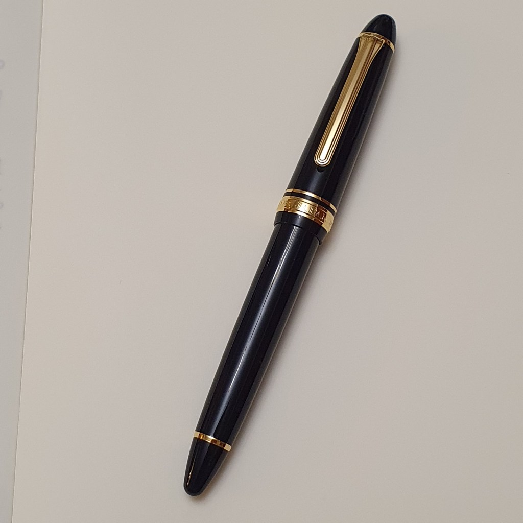
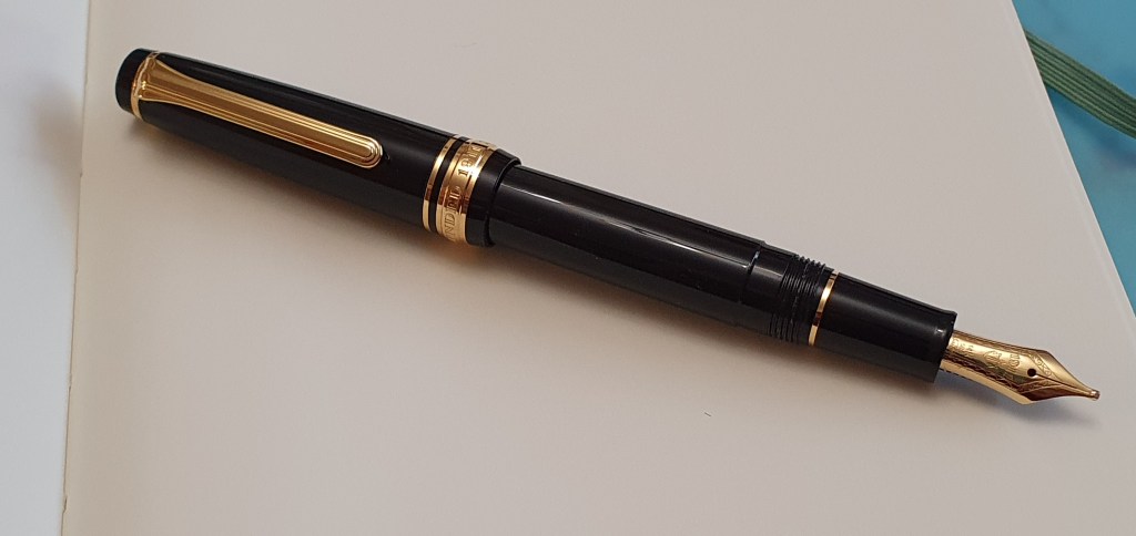
The Pro Gear Slim is a small pen. However, I think that the name “Slim” is rather a misnomer and could put some people off, before even picking one up. Certainly it is a short pen, and slimmer than the Pro Gear Classic. But I find the girth very comfortable. It feels solid and of good quality, not plasticky. There are many pens which are slimmer which are not called slim. The grip is not slippery. I think most people would use the pen posted and for me, holding the pen around the base of the barrel, with the short section resting on my second finger, feels comfortable and natural so that I soon forget that I am holding it. I am not very proficient with the measuring calipers but think it is about 11mm wide at the threads where I hold the pen. It is certainly short though: at just 110mm uncapped or 143mm posted.
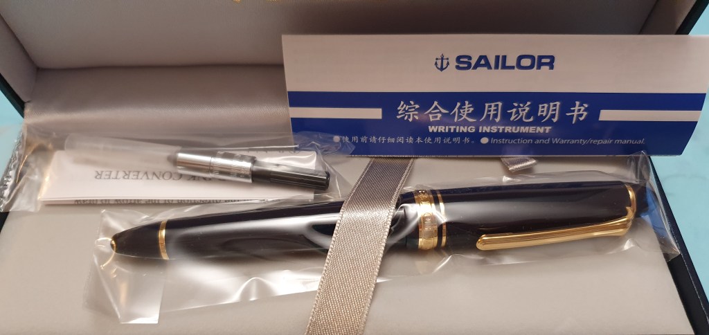
Like the Sailor 1911, it is a cartridge-converter pen, and was supplied with a Sailor-fit converter or else needs Sailor’s proprietary cartridges.
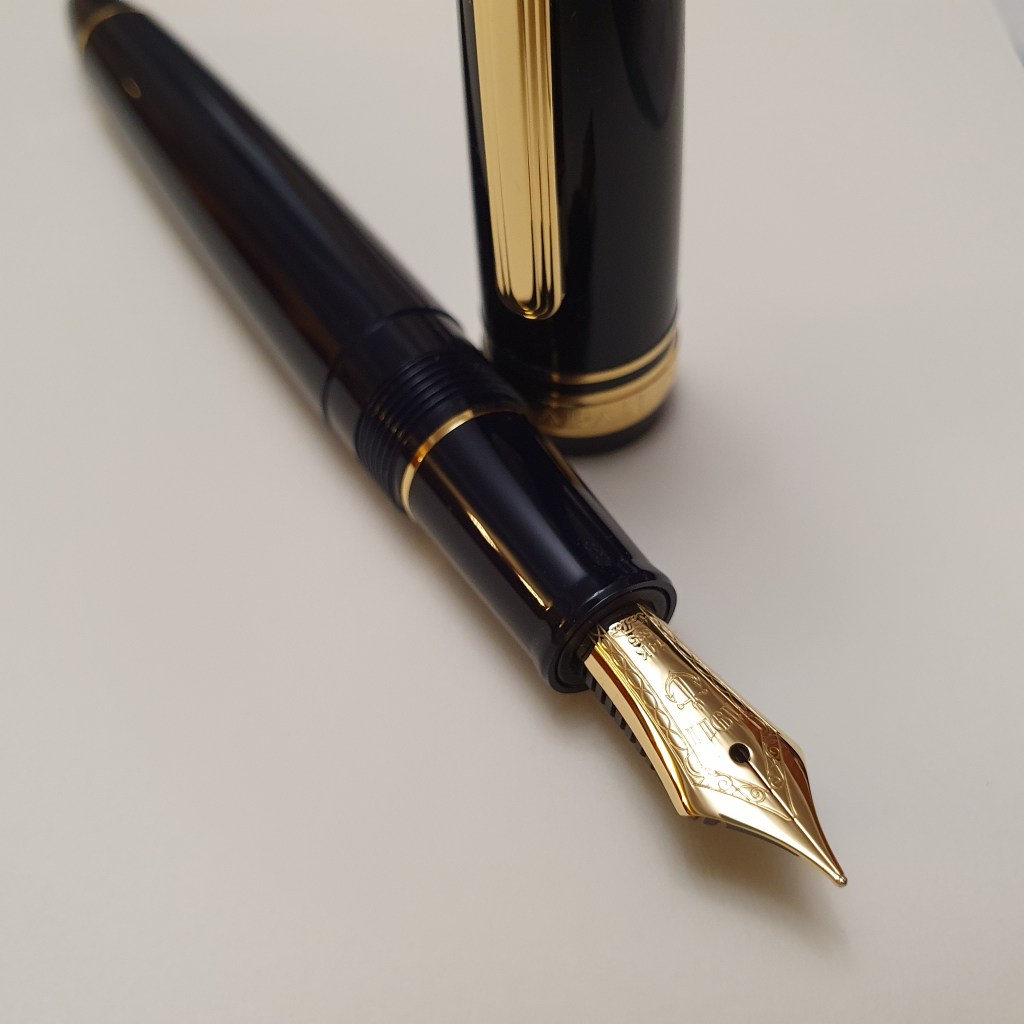
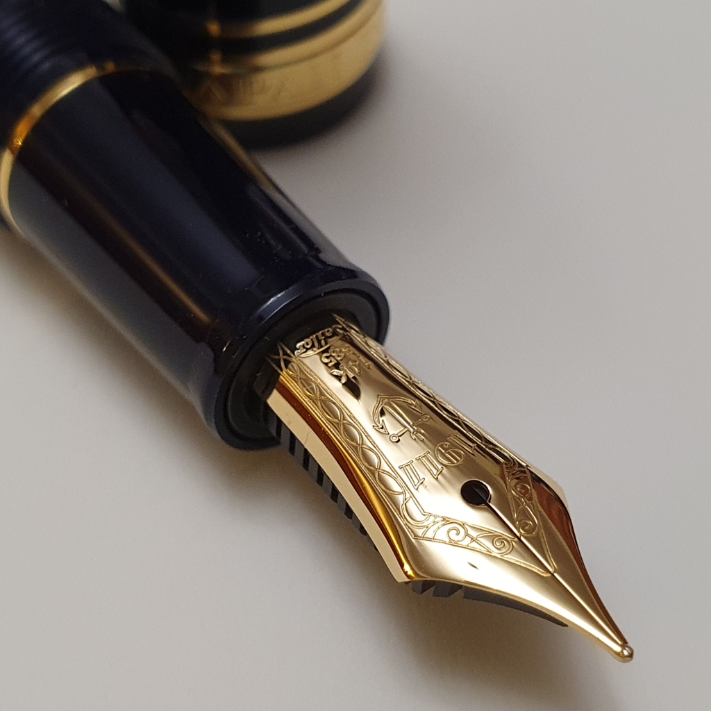
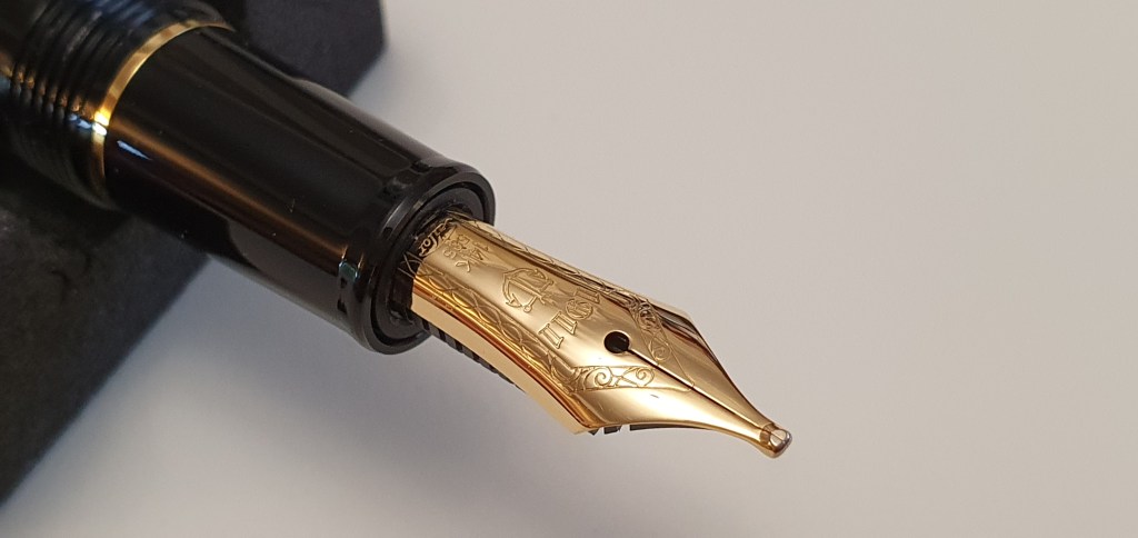
The real interest however, lies in the nib. Available with a range of nibs, mine has the Music nib. This is 14k gold (although there is a 21k nib option for a slightly higher price). It is a stub nib, in that the tip is wide to give broad down strokes and narrow cross strokes. I believe the name comes from being suited to writing musical notation, squiggling a quick circle to make your crotchets, quavers and minims and so on, without having to go back and ink them in, as the loop will already be filled in by the wide writing surface. This ironically is just what you want to avoid when forming letters with loops in. You need to write a bit larger than normal if writing with a music or stub nib, to avoid this.
But unlike a conventional stub nib where the tipping is cut off and ground, there is a blob of tipping material on the nib. This is flattened on the face and reverse sides of the nib, but rounded at the tip which is the writing surface. Also it still provides that special Sailor feedback.
Some music nibs, such as on the Platinum 3776, have three tines and two slits, to provide better ink coverage for the writing surface. The Sailor music nib has just the usual two tines yet works very well.
It is perhaps easier to show in a photograph than it is to describe.
Here is a quick sample of how it writes, bearing in mind I am a left handed overwriter by nature, (writing from above the line rather than from below). Thus the nib is pointing towards me as I write, rather than away from me as an under-writer would hold it. Experience shows that when holding the pen this way, whilst it feels more natural for me, the nib needs a better ink flow. This is because it is pulling less downstrokes to spread the tines and re-charge the nib. There is more pushing of upstrokes where you do not apply pressure to the nib, do not open the tines and do not increase ink supply.
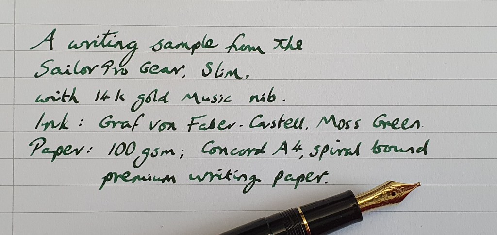
Fortunately, the Sailor music nib (or at least my example) is a nice wet writer and copes with my writing style very well. And the benefit of using such a pen, for a lefty overwriter, is that it gives you that lovely attractive line width variation between down strokes and cross strokes that otherwise would require a flexible nib and skillful handling to apply variation in writing pressure to open and close the tines.
Since receiving this pen, I went on to order my first Pro Gear Classic, from Write Here, which is a bit more girthy and with a larger nib too. I chose a broad nib which from Sailor, equates to a typical western medium. It is a good pen undoubtedly and feels in size rather like holding a Montblanc 146. Yet, I find that I do not use it as much as my Pro Gear Slim. It is subjective, admittedly but the classic is just not as cute (dinky, petite and adorable) as the slim.
My winning entry:
“A Sailor fountain pen with a music nib has long been on my Chopin Liszt even though I have not had a chance to Handel one.A black resin body would be perfect for me although the maki-e editions have the Mozart on them. Also the new Faure special editions look wonderful. It is an exquisite pen, not for just any Dvorak-the-lad. I would buy one myself but am a bit Bruch at the moment and don’t want to put my hand in my Purcell. If I could Gershwin one competition, this would be the one! If not, it is Bach to the drawing board. I have not entered a giveaway before. This is my Debussy? So, if you could Delius a Sailor PG Slim, with a music nib, that would be Verdi kind of you. I trust you can find one, Haydn in a cupboard somewhere. I so look forward to receiving your Purcell in the post. My music suggestion: Had this been a different music nib, I would have suggested Lionel Richie’s Once, Twice, Three tines a lady. However, instead in anticipation of my success I will go with Abba’s Thank you for the Music.”
I thank you.