
Recently after hearing of the imminent price rises of Sailor pens, I decided to pull the trigger on a 1911 standard, to go with my Pro Gear Slim which I love.
I have had my eye on a 1911 for some time. I have been tempted by the yellow version, with black ends and had almost bought one, a couple of times. But when the time came to chose, I was swayed by a gorgeous dark blue model with gold coloured fittings. The dark blue is one of those which has matching ends and grip section, rather than the black ends and grip which some of the other colours have. In the photographs, the dark blue looked very appealing.
The nib is 14 carat gold and I opted for a medium, thinking that this would be a good all-rounder for general use.
Pleased with myself for getting in ahead of the price hike, I looked forward to the pen’s arrival. At the unboxing, the first impression was that the dark blue is seriously dark. In artificial light it looks for all intents and purposes, like a black pen. But shining a bright light on the pen, it certainly is a lovely rich dark navy blue.
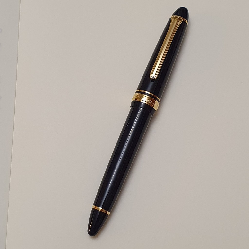
I was delighted. It is an exquisite pen. Not large, but not too small either. Personally I find this size to be very comfortable. The grip looks to be the same diameter as the Pro Gear Slim.
The Sailor size designations are a bit confusing: with the Pro Gear range you have the classic (in the middle) and then the Slim which is smaller and the King of Pen which is larger. But with the 1911 you have the standard and the large – yet the 1911 standard is the same girth as the Pro Gear Slim. The main difference is that in the Pro Gear both ends are flattened whereas on the 1911 they are rounded and bullet shaped.
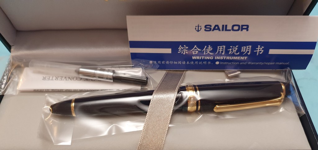
For a modest price, (at least, before the price rise) you get a gold nibbed pen with a very smart, nice quality body. The cap unscrews in about two complete turns. When capping the pen again, it tightens nicely towards the last stage and so you have confidence that this is not a pen that will unscrew itself in your pocket or bag.
Similarly, when unscrewing the barrel, you see the tiny O-ring at the base of the metal threads which helps to stop the barrel from loosening. The pen came with a Sailor fit converter.
For some reason, this was to be one of those pens in which I struggle to settle on an ink. In less than two weeks I have already tried four: Diamine Pelham Blue, Graf von Faber-Castell Cobalt Blue, Rohrer and Klingner Salix and currently, Montblanc Toffee Brown. This happened with my Montblanc 145 Classique too and I must have gone through about eight inks before discovering Montblanc William Shakespeare Velvet Red and I have not looked back since. I am still happily working through my inks with the Sailor.
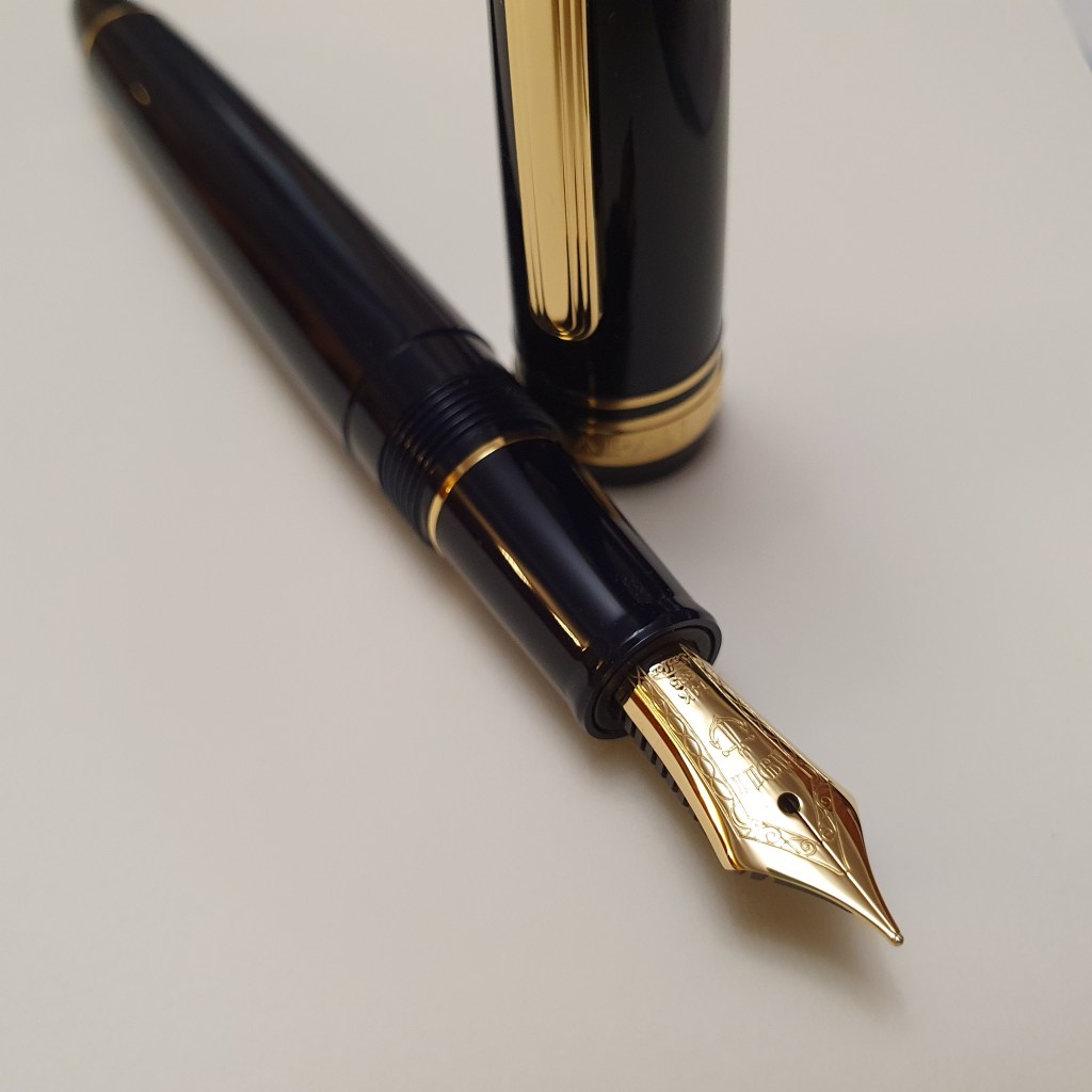
The real story with the pen though, is the nib. It pays to know what to expect with a Sailor nib. They have a reputation for being well tuned, right out of the box. However there are two issues to be aware of. First, the width will be about one grade finer than a typical western nib, so that a Sailor medium equates to a western fine, and so on. Secondly, there is that legendary Sailor “feedback”, which at first might feel like a defect. However, it is not a case of misaligned tines but rather a deliberate toothy feel which Sailor somehow gives to its nibs.
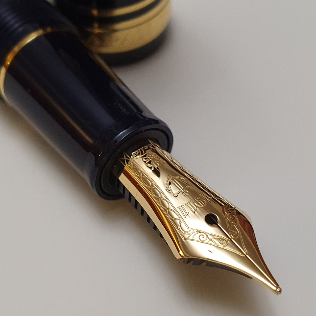
Looked at under a loupe it is possible to see that this medium nib appears to have a rounded blob of tipping material on the end but with the two sides towards the front end, flattened and angled inwards like the prow of a ship. The result seems to be that when the pen is held with both tines on the paper evenly, the pen is at its smoothest but if the nib is rotated, or rolled to one side or the other, the sharpened edge of the tipping scrapes the paper giving a slightly gritty feeling and sound, commonly likened to writing with a pencil. It is very different from the feel of your typical steel medium nib on say, a Lamy Safari. It is, you might say, not very forgiving.
For me, as a lefty overwriter much of the time, these Sailor nibs seem better suited to my underwriter style. Funnily enough the opposite is true of my music nib, (fitted in my Sailor Pro Gear Slim) which writes like a dream for me in overwriter mode, but is very awkward in underwriting style.
So it is important to know what to expect with a Sailor pen. Provided you like the feel of the nib, you get an excellent Japanese pen, impeccably well mannered and which writes whenever required, does not hard start, blob or burp or come undone in your jacket. It is a smart looking pen too, not ostentatious but unassuming with a quiet quality and confidence of its own. And that is probably why a Sailor is a staple of every pen enthusiast’s collection.


I almost sent my blue Sailor back because I thought they had send me a black pen by accident.
LikeLiked by 1 person
I can well believe that. When they say dark blue, they mean it!
LikeLike
You mention your experience of the Sailor 14k music nib. How does it compare to a more conventional stub? I’m a lefty underwriter, so maybe it’s not the best option for me. Aside from one broad, all my Sailor nibs are either medium or medium-fines.
LikeLike
Unlike a typical stub nib, the Sailor Pro Gear Slim’s music nib has a big blob of tipping material. This is flattened on the front and back of the nib but curved or rounded at the tip for the writing surface. It gives broad, fairly crisp down strokes and very fine side strokes. It is quite wet (at least mine is) and for me, as a lefty overwriter needing a wetter flow, this is ideal. I can write in my normal way, with a smooth wet flow, and see the attractive line width variation appearing, without any downward pressure. It is therefore very enjoyable to use and flattering to my handwriting. It is just necessary to write slightly larger to avoid filling in the loops. Also it still has that Sailor feedback.
If you haven’t got one I would certainly recommend picking one up. For a gold nibbed pen, I think the Pro Gear Slim is great value. I love mine – although the fact that I won it in a giveaway from John Hall at Write Here, adds to its happy associations for me!
If you are a lefty underwriter, then you should find the nib pleasant to use. It is overwriters who need wetter flow as the nib does not make so many down strokes and the absence of pressure does not get the juices flowing to lubricate the nib so much.
LikeLiked by 1 person
Thanks, that’s really helpful. I’m tempted to try one and the Pro Gear Slim seems a good route in. Sailor feedback and good ink flow are a good combination. 😀
LikeLiked by 1 person
Good review. Thank you for taking the time to put it together.
I have been collecting for over 30 years and must say sincerely that the Sailor nibs are in the top three of my favorites.
Thanks again!
LikeLiked by 1 person
Thank you for your kind comments. I do enjoy my Sailor 1911 and Pro Gear Slim. My latest pen acquisition was a Cross Peerless which also has a nib made by Sailor and is a delightful pen too.
LikeLike
I was tempted to bring up the Peerless. I also purchased the Cross just after watching a YouTube review on them and I must say that I was truly taken aback by the way the pen performed. One of the very best nibs I have had the pleasure of using in the last decade. And the Peerless design is also very good!
I will be watching your blog for more reviews.
Thanks!
Richard
LikeLiked by 1 person