Some thoughts on the Lamy Nexx fountain pen.

About a year ago, a pen friend overseas asked if I could help him to find a replacement Lamy Nexx, with a yellow cap. I knew very little about the Nexx but read that the yellow (“Citron”) was an edition from 2015.

Our local WH Smiths at London’s Brent Cross shopping centre sells the Lamy Nexx but I have seen only the lime green cap version there, in contrast to their wide selection of Safari and Al-Stars. However, as luck would have it, finding a yellow one online was a piece of cake as they were available from the Hamilton Pen Company. I took the opportunity of ordering two, to try one for myself.
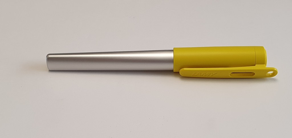
Lamy Nexx, Citron (2015 edition).

I had seen the Nexx for sale many times, hanging on blister packs beside the Lamy Safari and Al-Star range, but had never bought one, dismissing them as a bit childish. Also, although I have bought plenty of Safaris and Al-Stars over the years, I did so despite the faceted grip, not because of it. As a lefty over-writer, who rotates his fountain pen nibs inwards a few degrees, the facets do not align with my fingers and consequently I am left with thumb and forefinger resting on uncomfortable ridges rather than the intended facets. I can hold them if using my under-writer style but this is not so natural for me and therefore limits my use of the pens.

There is a big difference with the Nexx: the grip area is of a black rubber and the edges of the facets are not so pronounced and the edges are not at all sharp.

Design and construction.

The Nexx is a robust, workhorse of a pen, if ever there was one. The barrel is made of a aluminium with a silvery, satin finish and blends from being round, next to the grip, to being triangular (but rounded off) at the back end. The grip section is of black rubber and of generous girth. The cap is of a tough plastic with an integral plastic pocket clip (on my version) with a hole should you wish to attach a lanyard to carry it around your neck.
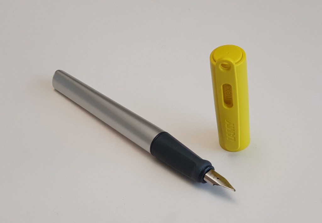
The Nexx uncapped with a girthy rubber grip. Facet edges softer than on the Safari or Al-Star.

The nib is the same as found on the Lamy Safari and Al-star and various other Lamys, available in a range of widths and easy to swap out.

Filling system.

The Nexx takes the Lamy proprietary cartridges or else a Lamy converter.
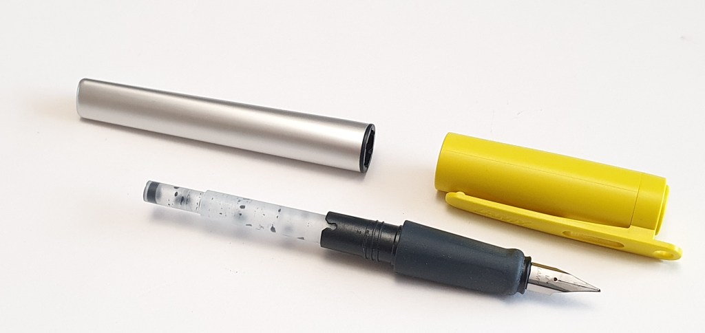
The Nexx with an almost spent cartridge.

Writing performance.

The familiar nib is reliable, firm but very smooth as I have come to expect from having used many such Lamy nibs. Ink flow on my particular model is not overly wet but about right. For those needing a wetter flow, it is possible, with care, to open up the tine gap very slightly.

Writing sample, Lamy Nexx, medium nib with Lamy Petrol cartridge. Paper is a “5staroffice” 192 page A4 ruled notebook.

Size and weight.

The Nexx at 133mm is very slightly shorter than a Safari when capped. It measures about 128mm when uncapped, long enough to use unposted, but the cap can be posted quite well, even though the round cap sits on a triangular barrel. Posting brings the length up to about 153mm and is very comfortable. Any worries that you might have about having a flattened edge of the barrel resting in the web of your hand and upsetting your preferred rotation of the nib, are resolved by posting. You can also align the pocket clip with the nib for a visual aid to keeping the nib at your desired angle to the paper.

The pen weighs about 16.5g in all, capped or posted, 10.5g uncapped and 6g for the cap alone.

Likes and dislikes.

Perhaps the most distinctive design elements of the Nexx are its big clunky coloured cap, its rubber grip section and the contrasting aluminium tapering barrel. It seems inappropriate to cite any of those as dislikes. Some might prefer the pen without any facets on the grip and a barrel that did not taper and merge from cylindrical to triangular but these features are the heart of the pen. However, as it is, the pen is very usable even for my left handed writing style.

Conclusion.

A big plus point for the Lamy Nexx, like the Safari, is that it is modestly priced and one of the least expensive “proper” pens available. The price means that you could collect a few different colours if you wish without spending a fortune. It feels strong and almost indestructible and is well suited to being carried around. Above all, it is surprisingly comfortable for long writing sessions. Once you have the pen in your hand, it will not slip. On the contrary, in order to adjust your grip, you have to first separate it from you fingers and then re-position it. It is not a pen that can be rolled around in the fingers.
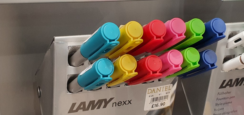
A display of Lamy Nexx fountain pens in Daniels, department store, Windsor.

Whether you find a pen comfortable may depend upon what you have just been using. If that happens to be a pen which has a grip which is too narrow or too slippery, or both, then the Lamy Nexx will feel like a breath of fresh air. It is robust, light weight, and good for long writing sessions. It was a mistake to think of it as childish. Anyone who has avoided the pen for that reason would be well advised to give it a try.

Inky pursuits: some non-fountain pen tinkerings.

Feeling a little tired from the week’s work, I began this Saturday morning sampling a few different fountain pens on a pad of A4 paper, to see which would give the best writing experience for a forthcoming letter writing session. After writing a paragraph with each of six different pens, I thought to try to a few rollerball and fibre-tip pens, to see how they compared.

The Mitsubishi uni-ball AIR.

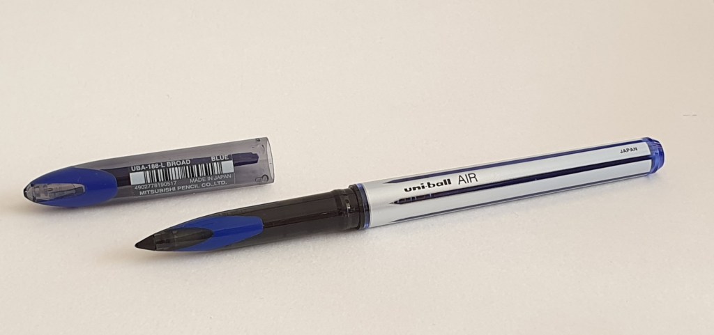
Mitsubishi uni-ball AIR, Broad.

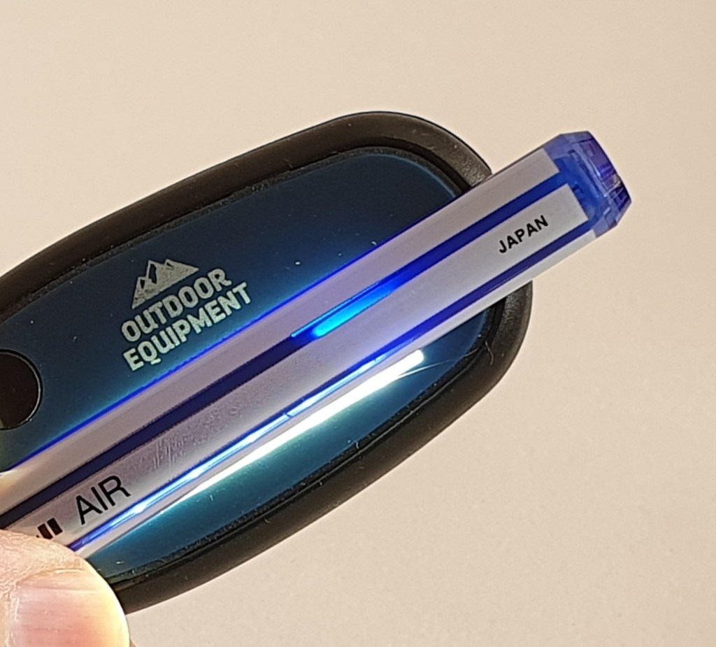
The Mitsubishi uni-ball AIR, with a Broad tip, claims on the packaging to write like a fountain pen. It does allow effortless writing with no pressure and provides a thicker line when a little pressure is applied to the tip, so you benefit from some line variation. It also writes smoothly even when held at a lower angle to the paper, in contrast to some other rollerballs that I have tried. Also, at about 131mm uncapped, it is a good length to use unposted. The clear plastic cap can be posted deeply and securely and provides a roll-stop. The grip section looks opaque to the casual glance, but in fact is translucent giving a view of the feed system if lit from behind. Also, in the Broad tip version (the one with the white barrel) the dark stripes are ink windows although again, need to be held against a light.

Checking your ink level, lit from behind.

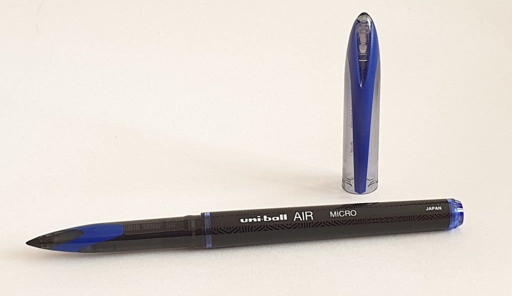
The fine tip version is called the Micro and has a black barrel, with nice geometric patterns but no ink viewing window. But whilst appearing rather plain, the uni-ball AIR pens are brimming with technology and worthy of respect.

Mitsubishi uni-ball AIR, Micro.

Pilot V Sign pen.

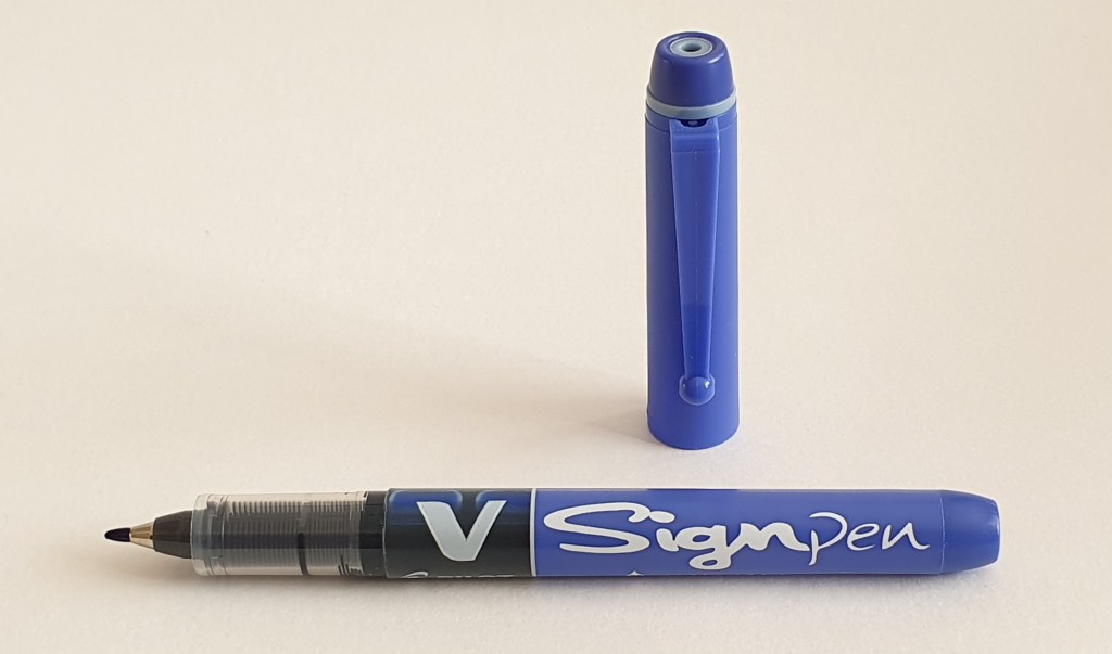
A few months ago, in a newsagent’s/ stationer’s in St John’s Wood, I found a display of Pilot pens and picked up a couple of their “V Sign” pens. These look similar to their single use fountain pen, the V Pen, but instead have a fibre tip. This is quite broad, like a Sharpie marker pen, good for labelling but could be used for normal writing if you like the extra bold look. The black part of the barrel is actually translucent and gives a good view of the ink level, when held up to the light. I had not seen these pens before and bought one in blue and one in red.

The Pilot V Sign pen. A liquid ink, fibre tip pen.

Parker Ingenuity.

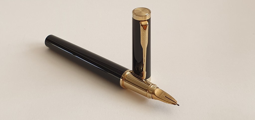
After using a few different lightweight disposable pens, holding the Parker Ingenuity fibre-tip pen felt luxurious, with its wide girth and hefty metal body and PVD gold plated grip section. I am now on my second refill, since buying the pen just over a year ago. My preference is for the blue refills, in medium. I had been rather dismissive of the Ingenuity for several years until the chance presented itself to pick one up for about half price at my local John Lewis and I am very glad that I did. Once the fibre tip starts to wear in, it forms a nice chisel edge at your writing angle which always stays constant as the refill will fit in only one way. The benefit of this is super-smooth writing at your normal angle and the option of extra fine lines if you turn the pen over.

The Parker Ingenuity. A fine liner in a heavy, durable body.

With certain types of paper, particular those which feel coated and too smooth for fountain pens, the Ingenuity can sometimes be the best tool for the job. And being housed in the handsome black and gold body, it is still an attractive pen to grow old with.

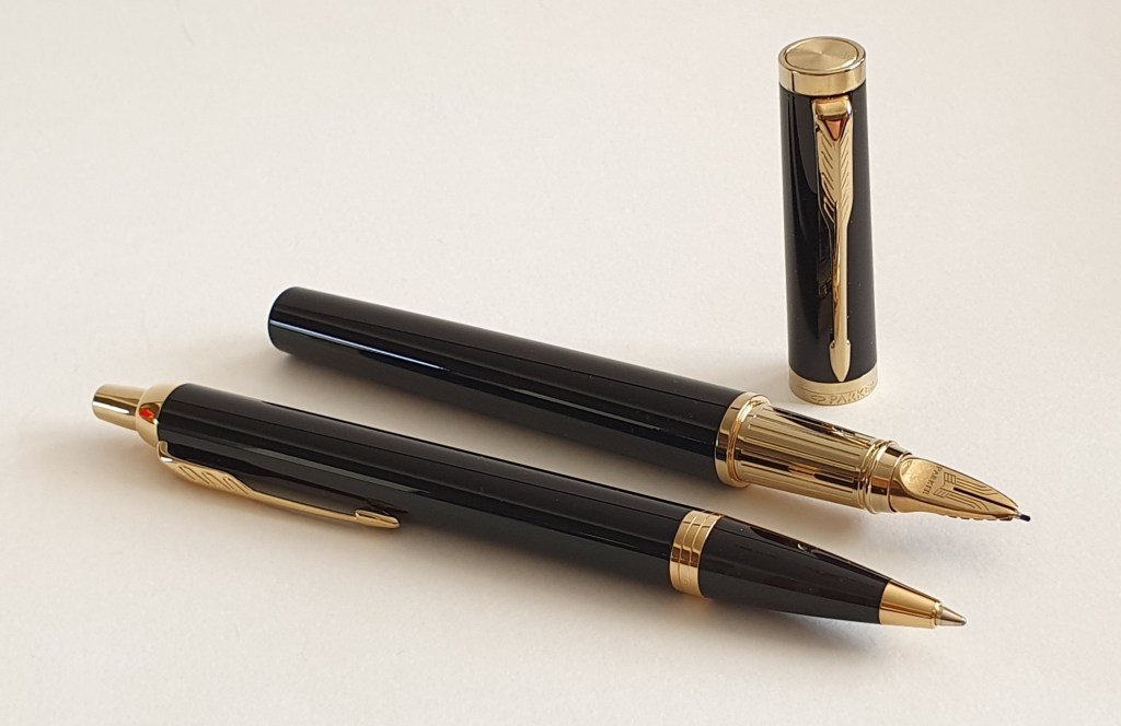
Looking at my Parker Ingenuity, it occurred to me that it would make a nice set with the Parker IM ball pen which is also black and gold. They are not quite from the same family, but are both roughly the same age with Y (2016) production date codes. They make a good travelling pair.

These are not a couple but could be. The Parker Ingenuity with the Parker IM ball pen.

The Parker IM in this black and gold version, makes a very comfortable vehicle for the Parker ball pen refill, having a noticeably wider girth than the Parker Jotter. And the refills seem to last forever.

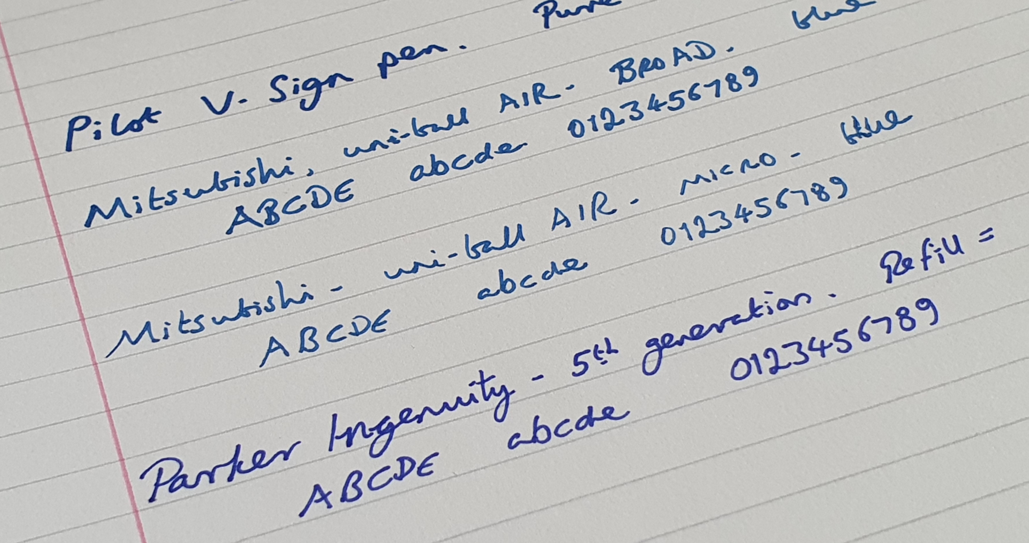
Writing samples. On WH Smith A4 file paper

Inky Pursuits: some notebook tales.

I have always enjoyed getting a new notebook. I start on the back page with a range of pens to test the paper, primarily for bleed through. I also like to paginate my notebooks, if they are not paginated already.

Lately I have also taken to paginating new pads of A4 paper. I use this all day for work notes and sometimes find when gathering up a pile of loose sheets, it helps me assemble them back in order. It is also handy for seeing how many pages you have used and therefore, how many remain – a bit like an ink window on a pen.

My notebooks fall into two broad categories: those that are expendable, filled up with pen and ink sampling, handwriting practice and writing for its own sake, and those that I want to keep, filled with more purposeful writing such as collected memories or other writing projects.

Finding your palette.

The logical consequence of testing a new notebook for which inks it likes, is to arrive at a list of those which can be used without bleed through or excessive show through or feathering and those which cannot. This is useful, particularly if you buy the same type of notebook regularly or if you have bought a few spares to keep “in stock”.

Taking this a step further, I thought it may be useful to arrive, for a given notebook, at a core palette of say four colours – a blue, red, green and brown, which not only behave well individually on the paper but also look good together, and compliment each other, as if part of the same range. For example, for a Radley A5 notebook that I bought last February, I made at the back, a list of inks that could be used and a list of those which could not. For my core four, I have almost got this down to (1) Rohrer & Klingner Salix; (2) Montblanc William Shakespeare Velvet Red; (3) Graf von Faber-Castell Moss Green: and (4) Pelikan Edelstein Smoky Quartz.

This is not quite as simple as it sounds. I found that I had entered Smoky Quartz in both the “can use” and “cannot use” columns. This might suggest that the paper is not consistent throughout the notebook but more likely, is because the paper’s ability to resist bleed through with a given ink, depends also upon how wet the pen writes.

I had hoped to be able to use Conway Stewart Tavy, my go-to blue black in the Radley notebooks but this ink bleeds through on some papers – Radley included. Honing my palette is a work in progress and constantly evolving. But since I picked up three spares of the Radley red notebook whilst they were in a sale, it is worth pursuing – before I fill them all!

The notebook stash.

Buying more notebooks than you immediately need, might sound a bit crazy. I seem to have accumulated a whole drawer full of mainly A5 size journals. When you find one you like, it is best not to buy too many spares in case you later find one you prefer.

However, with the UK now in lockdown again, with non-essential shops closed, I am now unable to roam through Rymans or Paperchase for supplies. Suddenly my drawers of journals and inks are not so crazy after all. Although I still have far too many to sit out any conceivable period of lockdown, to be fair.

The telephone table diary.

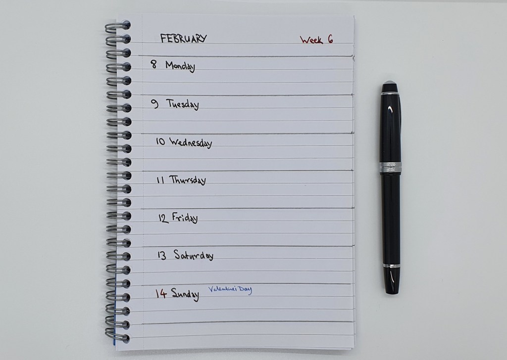
One thing that I had not bought before lockdown, was a 2021 diary to keep next to the home telephone. For the past few years, I have used a Letts Royal tablet diary from Rymans, with a week to a page, spiral bound A5 size and with the spiral at the top. Instead, for this year, I made my own from one of the spiral side-bound notebooks in my stash. I ruled pencil lines at three row intervals and then spent a merry few hours writing Monday to Sunday on each page and inserting the dates. I broke this up over two evenings as the process was a bit monotonous to be honest but it was satisfying to reach Week 52 eventually and put away my Cross Bailey Light, with its black ink cartridge. The Letts diary cost £8.49. My notebook was £2.00. A saving of £6.49 if you do not factor in my time.

Voilà! The new home-made diary. Somewhat crude but it works.

The daily diary.

Writing my page-a-day diary is a routine which I honestly could not be without, such is the satisfaction of recalling the previous day and condensing it into note form. For working days, I now find that balloon diagrams work best. It is very easy to stress oneself with “to do” lists for work but healthy to pause sometimes and reflect on what daily progress was achieved… a sort of “done” list.

There was a time when I would settle upon a fountain pen and use it for my diary for the entire year. My current plan is to change over at the start of each new month. For January I used my lovely new Cross Peerless 125, with Tavy ink. For February I am using my Aurora 88, with Aurora blue. I am very fortunate to have gathered a collection of fountain pens, of which so many are wonderfully enjoyable.