My Aurora 88, one year on.

It has been a year to the day, since my Aurora 88 arrived in the mail, as told in my post Some early thoughts on the Aurora 88 fountain pen. That same pen has been the focus of my attention over the last few days and it seems timely to give an update.

The pen is magnificent and has “the wow factor” whenever it is produced. People exclaim “What a gorgeous pen!”

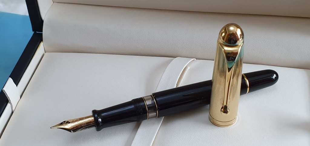
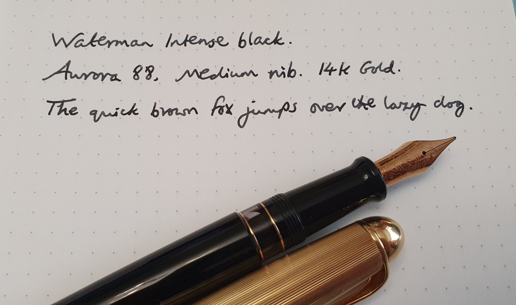
It has remained inked since I bought it, as befits a pen which is almost my most costly to date. Looking at my records, I see that I have filled it with seven different inks over this time, starting with the obvious Aurora Blue, then Aurora Blue Black, Graf von Faber-Castell Cobalt Blue, Montblanc Irish Green, Diamine Tavy, Cult Pens Deep Dark Red, Aurora Blue Black (again) and then Waterman Intense Black.

Board room ready.

The pen is a joy to look at and to hold. The only problem was that the written line was not as bold and juicy as I had expected. Although described as a Medium nib, the resulting line was a Fine by most people’s standards. That in itself was not an issue for me as I enjoy a good fine nib too. However it was so fine and so thin and pale that on some papers, it would look like the work of a needlepoint. Generally speaking I am a fan of blue black inks as preferable to black, but in this case I had resorted to trying Waterman Intense Black, in an effort to make a more contrasty line. The result was anything but intense. More like a pale grey.

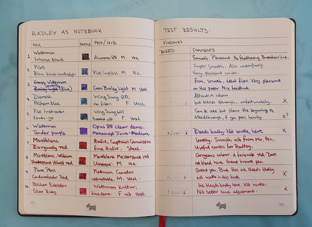
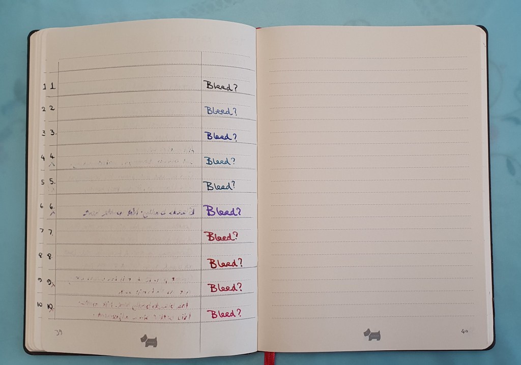
I have an abundance of notebooks with different paper types. Some of these make a pen write finer whilst others make it write broader. I found that I could compensate for my Aurora’s fineness by using it on a Radley A5 notebook, which tends to make the line slightly broader, yet without any apparent feathering or bleedthrough.

For a long time, I had avoided trying to adjust precious gold nibs, (apart from simple tine alignment) for fear of damaging them. I am happy to have a go with a steel nib, giving it a tweak here and there to improve flow or to smooth the tipping but most gold nibs I left alone.

I think the turning point came when I realised earlier this summer that I had not made much use of my Lamy 2000 in six years, as the broad nib was dry and hard going. I had reached a point when (a) I had accumulated some knowledge and experience of what was wrong and what was needed; (b) I was sufficiently confident to have a go and (c) the pen was six years old and I had little to lose and was “past caring”: a certain blend of know how and recklessness. As luck would have it, I was able in a few minutes, to open up the tines of the Lamy and improve wetness and flow considerably. I was thrilled with the transformation. More confidence to me.

A few weeks ago I ordered a set of brass shims online. These enabled me to floss nibs and clean out accumulated paper fibres. I had imagined that it might not be that hard to floss nibs with shims of increasing thickness and so make slight adjustment to tine spacing. It is not quite that simple. I watched a Brian Goulet tutorial video about using brass shims although his emphasis was on cleaning between the tines, rather than adjusting the gap.

When the brass shims came, I tried them out first on a Sheaffer Crest, with its distinctive conical nib in bicolour 18k gold but which was dry and hard to use. I wanted to achieve a very slight widening of the tine gap. After a few goes with my brass shims, I very carefully inserted the point of a craft knife, just below the breather hole, and brought the blade down into the gap as low as it would go. I was then able to wriggle it very gently from side to side to get a little more space between the tines. Gold does bend quite easily but you need to push it just past the point at which it will spring back again, so that it stays.

As with all nib work the advice is go to very carefully and check the results frequently with a loupe and with a writing test to check the outcome. When I discovered the Sheaffer now writing effortlessly I was very happy and relieved.

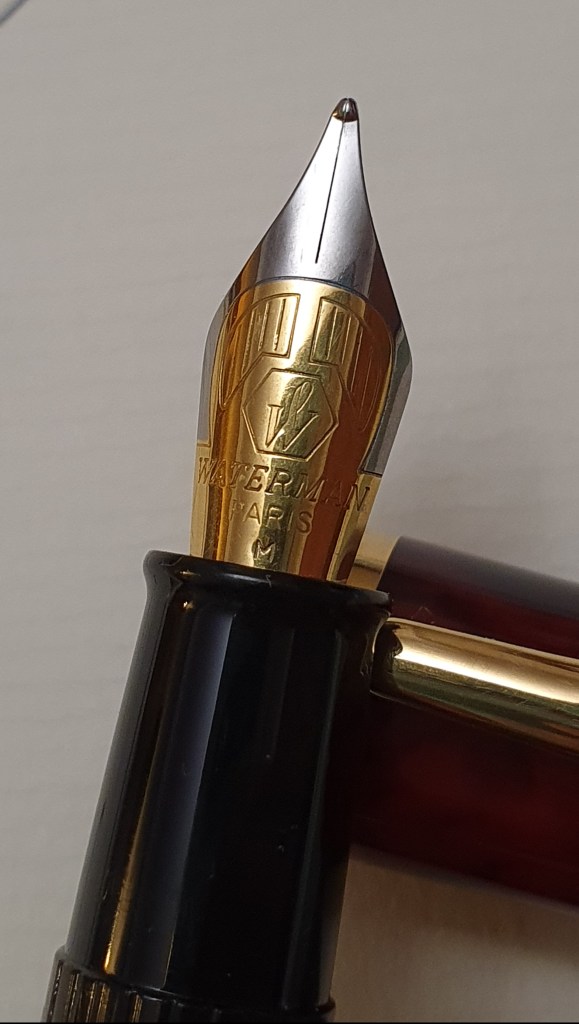
Encouraged by my success with the Sheaffer, I formed the idea of tackling the Aurora 88 nib in the same way. I rehearsed the operation in my head on my two mile walk home from work, as if it were a rocket launch.

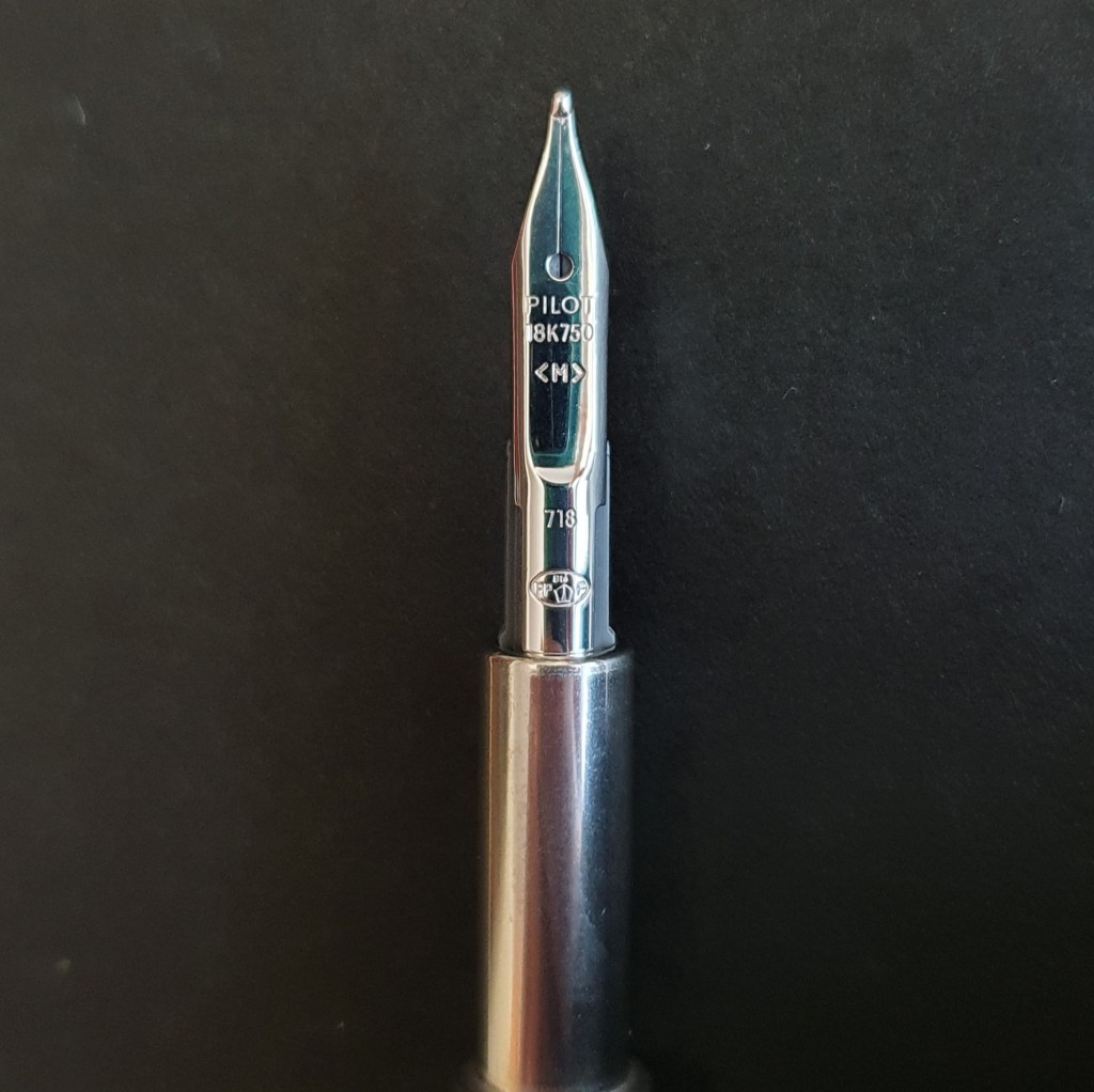
Nib work on the Aurora.

The process involved three stages:-

  1. Flossing the nib first with the finest grade of brass shim.
  2. Inserting the scalpel and doing some extremely gentle twisting right and left to spread the tines. It is best to lower as much of the blade into the gap as you can, to avoid “chewing up” the gold surface along the top of the tines.
  3. Once happy with the outcome, checking for tine alignment and doing some final smoothing (the minimum needed) on micromesh pads.

The pen remained inked through this process although at the end, I unscrewed the nib unit and rinsed it, to inspect the results of my handiwork.

Conclusion.

It probably goes without saying that working on a nib, especially with metal tools, is risky and can result in damage. You do so at your own risk. But having said that, it is possible with a little courage and practice to improve a nib and so save yourself the frustration of disappointing nibs.

To the eye, the Aurora nib now looks no different from before. However the ink flow is now more generous. This increases line width and lubrication and makes for a more pleasurable and effortless writing experience. It is better to spread the tines in the way described here, rather than use the short cut of bending the tines upwards which can spoil the look of a nib.

I now plan to re-try my ink choices. Once the Intense Black is finished, I will try Aurora Blue once again in the eager anticipation of seeing the ink flow from this pen in its true vibrant colours.

Writing sample on Tomoe River paper. The medium nib is now a medium!

Early thoughts on the Pilot Capless, matt black.

A month ago, in A new pen deliberation, I mentioned that I was wrestling with a desire to buy a Pilot Capless.

Not for the first time, temptation got the better of me and I placed an order with The Writing Desk, in time for my birthday. A birthday present to myself. Or should I say, from the UK government, as I was on furlough at the time? (Actually, I resented those news announcements that said “The government is now paying the wages of 9.5 million employees”, because I am and have been for decades, a UK tax payer and it was my own money).

Anyhow, this was a slightly odd purchase for me because I had long ago formed the view that this was not a pen that I would like. This is because I am left handed and generally write in an “overwriter” style, with the nib rotated inwards slightly. This means that I do not grip my pens in a perfectly symmetrical alignment around the centre (as required of Lamy Safari users) but a little off centre. As you might imagine, this means that the pocket clip of a Pilot Capless would get in my way.

Pilot Capless, matt black.

Earlier in the year, I bought a Platinum Curidas, which proved to be a very successful purchase. However, I very quickly removed its detachable pocket clip and then filed down the fin which, for me made my pen a whole lot more comfortable.

This is not an option on the Pilot Capless. Nevertheless, I had convinced myself that it was a worthwhile purchase, even if I might be restricted to using it in underwriter mode.

I had always thought that, if I did ever buy a Capless, it would be the lovely yellow one with rhodium plated fittings. However, this preference changed once I saw the matt black version, with black fittings. A stealth pen, except for the nib which is still rhodium plated, over 18k gold. I thought that this looked very nice indeed, and had the advantage of making the upside down clip less obvious when the pen is in writing mode.

The matt black finish is very pleasant to hold, as well as to look at.

First impressions of the pen were very favourable. All looked perfect. In particular the medium nib that I had chosen, was superb – soft and smooth and juicy. What’s more, it was quite forgiving in even allowing me to write in my customary overwriter style without needing to roll the nib inwards to find a sweet spot. The generous round tipping and the soft gold tines enabled the pen to write well at a wide range of angles.

My nib was born in July 2018.

The offer at The Writing Desk included a box of 12 Pilot cartridges. There was no option to select the ink colour (or if there was, I missed it), but the pen arrived with blue black ink – which is exactly what I would have chosen. There was also a converter. I christened the pen with a blue black cartridge and enjoyed every drop. When that finished, I tried a blue cartridge but decided that I prefer the blue black and will stick to those in future.

Not my car. I do not have the car to match my stealth pen, but if I did…. That is my bike though!

Well, I can report that I have been thrilled to bits with my Capless! Happier even than I had hoped to be. I still enjoy the Platinum Curidas immensely and the experience is different, as the Pilot Capless is a metal pen and with a gold nib. I must be one of the last fountain pen enthusiasts on the planet to buy one, but better late than never.

Simply gorgeous.

My new approach to notebooks.

I have always enjoyed buying a new notebook. Like many fountain pen enthusiasts, I have a several notebooks on the go as well as a stash of new ones of various types waiting to be used.

My used notebooks could be divided into two broad categories: those which I have used for a specific purpose and would want to keep, or those which I have just filled for the joy of writing, consisting mostly of pen and ink samples or note taking.

When I buy a new notebook, I often paginate it first, except of course for those when this task has been done for you, such as the Leuchtturm A5 or Taroko Design Breeze. Next I try out my currently inked pens on the last page. This has two purposes. First, it is a useful exercise to see which inks are suited to the paper and write without bleedthrough, feathering or excessive amounts of show through. I can also see how different nibs feel on the paper. It is about establishing the right tools for the job.

Secondly, it breaks the ice of starting a new book, without having to dive straight into the blank first page and risk spoiling it.

However, I have found that on some occasions I have started a notebook at the back and continued happily, with random pen and ink samples all the way to the front of the book!

It occurred to me that my stash of old notebooks from the last few years, even if they contain little writing of any significance, are at least an accumulation of pen and ink tests which I have not followed through in any methodical, let alone scientific manner.

Many hundreds of hours have been whiled away, in picking up a pen from my pen cups and writing a few lines or paragraphs, purely for relaxation and the momentary enjoyment of feeling the nib glide along the paper.

Paper types in notebooks are very variable. If you use only the best, such as Tomoe River, there may be no need to test for bleedthrough as this will not be an issue, nor will there be a feeling of draggy resistance from an overly coated surface. For other types of untried notebooks, it is useful to find out which inks can be used and which are best avoided – unless you are happy to write on one side only.

Although I do try out pens and inks and try to keep a mental note of the outcomes, I have not recorded the findings in a consistent way. Perhaps there are just too many variables of pens, nibs and inks and papers that I have accumulated.

However today I decided to try a slightly new format for recording my little experiments. Starting with a Radley A5 notebook, I set up a double page spread, with one side with columns for the ink and the pen: the facing page to show the degree of showthrough and bleedthrough (if any) – written from the other side of that page – and a column for comments, such as my subjective impressions of the sensation of the nib on the paper, the feedback and so on and whether the combination is successful. There is one constant in the test, namely the paper of that particular notebook.

A selection of my currently inked, now paired with findings on the facing page. The column for bleedthrough is written from the other side.

I do not want to turn a relaxing enjoyable hobby into an onerous project of recording a vast combination of variables and test results. But on the other hand it seems useful to me to record the simplest of conclusions, to avoid having to repeat the same tests and reinvent the wheel. Once we settle on a favourite type of notebook and stick to it, we can also pick a palette of coloured inks to use in it.

The third page of the pen and ink test – the column to demonstrate bleedthrough.

In conclusion, some preliminary lessons for the Radley notebook are to avoid Waterman Tender Purple, Pure Pens Cadwaladr Red and Pelikan Edelstein Star Ruby due to bleedthrough. Good choices are Waterman Serenity Blue, Pilot Blue Black and Montblanc Velvet Red. In the case of the Radley, I have three more bought in a sale and so it is well worth knowing which inks it prefers.

A look at the discontinued Waterman Phileas fountain pen.

Buying a new fountain pen is tempting and exciting. However, during the past few months of lockdown, I have also enjoyed looking back over my accumulation and, in a few cases, making some simple nib adjustments. So having an old fountain pen is nice too. Some benefits are (1) saving your money; (2) reducing waste; (3) avoiding additional clutter in the home from stored pen boxes; (4) using and appreciating what you have and (5) connecting with some memories and associations from the past.

Today I am looking at my old Waterman Phileas. I remember buying it, a long time ago in a department store in Shantou, China, chosing it from the selection in the glass display counter. I cannot now recall what year it was. It could have been late 1990’s or early 2000’s. It was not very expensive by UK standards, possibly around the same price as a Lamy Safari at home but, as my wife pointed out, quite expensive for the locals.

Waterman Phileas

Description.

This is a plastic pen, taking Waterman cartridges or a converter. It has a vintage look from its red marbled patterns on the cap and barrel and gold coloured furniture. The cap has a rounded black top, with a sprung metal clip bearing the Waterman logo. There are two gold coloured rings on the cap which add to the elegance. It is a snap cap. The black band next to the gold ring, is stamped with the name Waterman and (on the back), France.

The section is black plastic, tapering slightly towards the nib but with a combination of a smooth area near the nib and a ribbed grip area higher up, which has a comfortable girth of approximately 12mm. I noticed that although the Phileas is discontinued, this section appears to have resurfaced for the new Waterman Embleme fountain pens.

Showing black plastic section with ribbed grip area.

The barrel has two more gold coloured rings but the most elaborate part is an inlaid gold coloured badge with some decorative engraving. This seems to echo the golden area of the bi-colour nib.

Decorative badge on the barrel.

Unscrewing the barrel, on plastic threads, it can be seen that there is a metal liner inside the barrel, for about the rear two thirds of its length, presumably for added weight, strength and to help with balance. There is still room for a converter inside the barrel.

Disassembled.

The cap can be posted, both deeply and securely which I appreciate.

The nib.

The bicolour nib is stainless steel but with a large area of gold coloured plating. It bears the logo and name Waterman, Paris, M, for medium. The nib and the plastic feed are friction fit.

Bi-colour nib.

Size and weight (approximate).

This is a medium sized pen and relatively light weight which should be comfortable for most people. Closed, the pen measures about 136mm; open 126mm and posted 146mm. Weights are about 21g in all (not including a cartridge or converter) comprised as to 14g for the pen and 7g for the cap.

Conclusions.

My vague recollections of the pen when I bought it, are that it was a little disappointing, a bit plasticky and not the best of writers as the nib was smooth but on the dry side. Whatever the reason, I did not make much use of it.

I am glad that I kept it. Recently I got out an old Waterman Kultur, blue demonstrator, which is very similar to the Phileas but with a simpler, less ornamented cap and barrel and an all-silver coloured nib. I was able to tweak the nib of the Kultur to open up the tines and improve ink flow. The result was to rediscover a very enjoyable pen.

And so with the Phileas I performed the same trick, (once again with thanks for SBRE Brown for the old instruction video “How to make a nib wetter in seconds”) bending up the nib just a little to widen the tines and to introduce a glimpse of daylight between them at the tip, for an easier flow of ink without pressure for my lefty overwriting preferences.

Just a little tine-gap widening work.

Perhaps, around 20 years ago, I had looked down on this pen for trying to appear vintage and of better materials than it was made of. But with older eyes and a little more experience to perform some easy nib work, I now appreciate the pen for what it is. Waterman succeeded in producing a pen which had timeless, classic looks (even recalling the decoration of old Waterman Ideal pens) and some elements of feel-good luxury in the gold coloured fittings, but at a modest cost. The metal liner inside the barrel is a particularly nice touch and marks this pen out as a quality tool in its own right. And so whilst I still enjoy buying a new pen, it sometimes pays to keep the old ones too.

The adjusted nib in profile. The upward bend is barely noticeable.