2018: Some of my fountain pen highlights.

It is that time of year again, when we reflect on the year that has passed; the highs and lows, the lessons learned and the resolutions for the future. This is now my third such annual round-up on this blog.

My enthusiasm for fountain pens, inks and journals has continued unabated. Depending upon your point of view, this could be seen as an unhealthy obsession or on the other hand, a harmless source of joy and relaxation. The discussion of whether a fountain pen addiction is a blessing or a curse is one for another day.

The reckoning.

I continued to keep a simple database of my pen acquisitions – whether they were purchases or gifts. A brief review of this today tells me that I have acquired 61 fountain pens over the year with a total spend of around £3,300. Some of you may be comparing this now with your own tally and finding my figure either shockingly high or low depending upon your own budgets and sense of proportion. Happily, in my experience the fountain pen community is not judgmental and we take people as we find them.

As in previous years, the number of pens incoming, is inflated by quite a large number of inexpensive pens, which you might class as school pens. For example, I was so pleased when some clear plastic demonstrator cartridge-converter pens re-appeared in our local Tesco supermarket after a two year absence, that I bought one of each of the four colours, in blue, black, red and green. They are only £2.00 each but write very well with a smooth, fine line. They are undeniably cheap and plasticky and yet I am capable of getting almost as much pleasure from these as one of my high end pens. “I know it’s crazy, but it’s true.” (Arthur’s Theme).

Also, some of my pen purchases were gifts for others. So impressed was I with the Italix Captain’s Commission, that my wife and I bought two more during the year, as gifts for friends. My pen tally includes five pens bought as gifts.

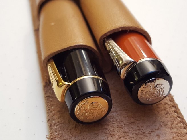
The list included eight pens given to me by friends or family and which are therefore of special importance to me. These included a new Pelikan M120 in green and black, kindly sent by a fellow blogger in Sweden and some pre-owned Pilots and a Montblanc from another generous reader of my blog.

Browsing in pen shops is a regular habit of mine, in particular our local John Lewis department store or Rymans, Paperchase and WH Smith for more workaday pens. Occasionally when in central London I take a look at the fountain pen departments of Selfridges or Harrods. If visiting other towns and cities here and abroad, it is great to seek out the pen shop if there is one. In the summer we took a holiday in Italy. The pen shop in Verona (called Manella) where I bought an Aurora Ipsilon, was a delight.

In Cardiff recently, I was pleased to find not only a John Lewis but also a branch of The Pen Shop and an independent stationer called Pen & Paper which was a treasure trove of fountain pens not commonly found in bricks and mortar shops. They had a good selection of Visconti pens including the range of Visconti Van Goghs.

Pen Shows.

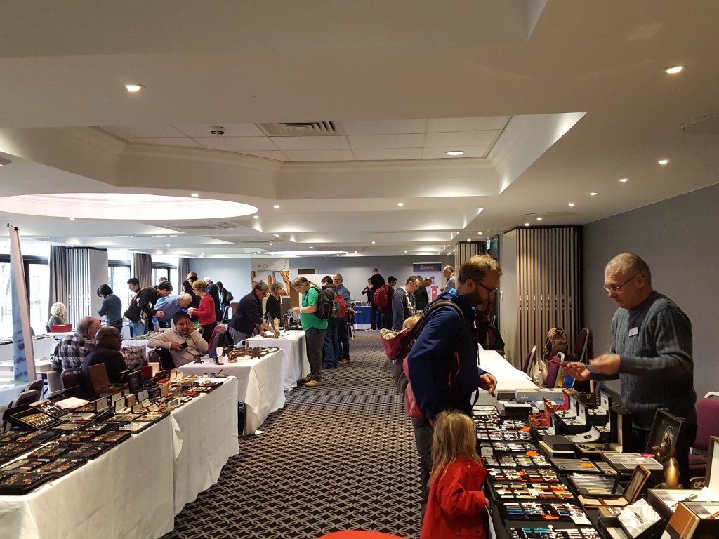
As in previous years, the London Pen Show in early October is a highlight of the year. I bought five pens and met lots of friends there. It can be a bit of a frenzy with so much to see and it is good to take some breaks from going around the tables, to catch up with friends and compare notes on our respective purchases. At the end of a pen show, it can be shocking to add up what you have spent in total. A pen which looked way over budget at the beginning of a pen show, could have been purchased after all, if you had not bought all the others which added up to a similar amount! Much the same thinking can be applied to the year-end count-up.

This year, as well as the London show, I also attended the Cambridge Pen Show in March, for the first time. I had a very memorable and enjoyable day, travelling out to Cambridge on the train from London, making some purchases and making some new friends from the online pen community. Sadly it may also be the last time as I have heard that it is being disbanded next year and that instead there will be an extra show in London.

Cambridge Pen Show, March 2018.

The London UK Pen Club.

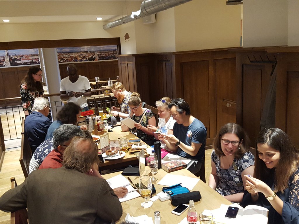
I was first invited to come along to the London UK Fountain Pen Club, by
Marisa whom I met at the London Pelikan Hub in September 2017. I have since been to almost all of their monthly meet ups. We meet at Bierschenke, a German restaurant and beer hall near Liverpool Street Station to talk pens and enjoy food and drink and each other’s company. Typically we will have around a dozen people who all bring along some pens for others to try. These might be currently available pens, or obscure limited editions or vintage pens and with a host of different nibs, filling systems and characteristics. There are pens for all tastes, whether your preference is for colourful pens in exotic materials or minimalist, understated functional designs. We try them out in our own journals and note any particular inks or pens that we like. It can be very useful to try pens and hear other people’s opinions on them, before committing to a purchase. There is a vast amount of knowledge and experience in the room.

The London UK Fountain Pen Club.

The online community.

There is a vast friendly community of fountain pen users and enthusiasts out there, from the thousands who use FPN, to bloggers and instagrammers. I have enjoyed keeping up this blog and following a number of others, as well as interacting daily with enthusiasts on Instagram, here and abroad.

The successes and failures.

Looking at my list of pens acquired this year, there have been a few which turned out to be less successful. A vintage Sheaffer with a tubular nib wrote dry despite my efforts at flossing and adjusting the nib. It could benefit from some expert help. The Pilot Falcon with soft fine nib was interesting but ultimately not suited to my lefty overwriter style of writing and I passed it on to my neice who writes beautifully with it. I bought a Lamy Dialog 3, which is also unsuited to my writing style, since the pocket clip only caters for people who hold the pen symmetrically and not for those who rotate it one way or the other. It is a pity as I like the look, the weight and the retractable nib. The Lamy gold nib is also very pleasant. I can still write with it if I hold it underwriter style, but it has sat unused since I cleaned it and put it away, in favour of many other easier pens.

My Aurora Ipsilon suffered from a leaky converter, but I was pleased to find that Parker cartridges fit. I have not warmed to the pen as I usually do. Perhaps it is the fine feedbacky nib. Perhaps it just needs more getting used to, but it has been cast aside in favour of other pens which require less effort to like. Finally, the Lamy CP1 is a design classic and impressive for containing a Safari sized nib and cartridge or converter inside such a slim body, but in use it us just too skinny for me to hold comfortably.

The favourite pens of 2018.

On the other hand there have been far more pens that I have really enjoyed. I list just a few of my year’s favourites below:-

Faber Castell Loom, shiny gun-metal version: This has been my EDC pen for the whole year with a superb steel nib, comfortable handling (when posted) and used with a box of Cobalt blue cartridges.

Lamy Studio, brushed metal version with black grip: Another inexpensive pen but a comfortable and reliable work horse which has served me well as a work pen. Unfortunately it did roll off the table once but I was able to replace the nib from a spare Safari.

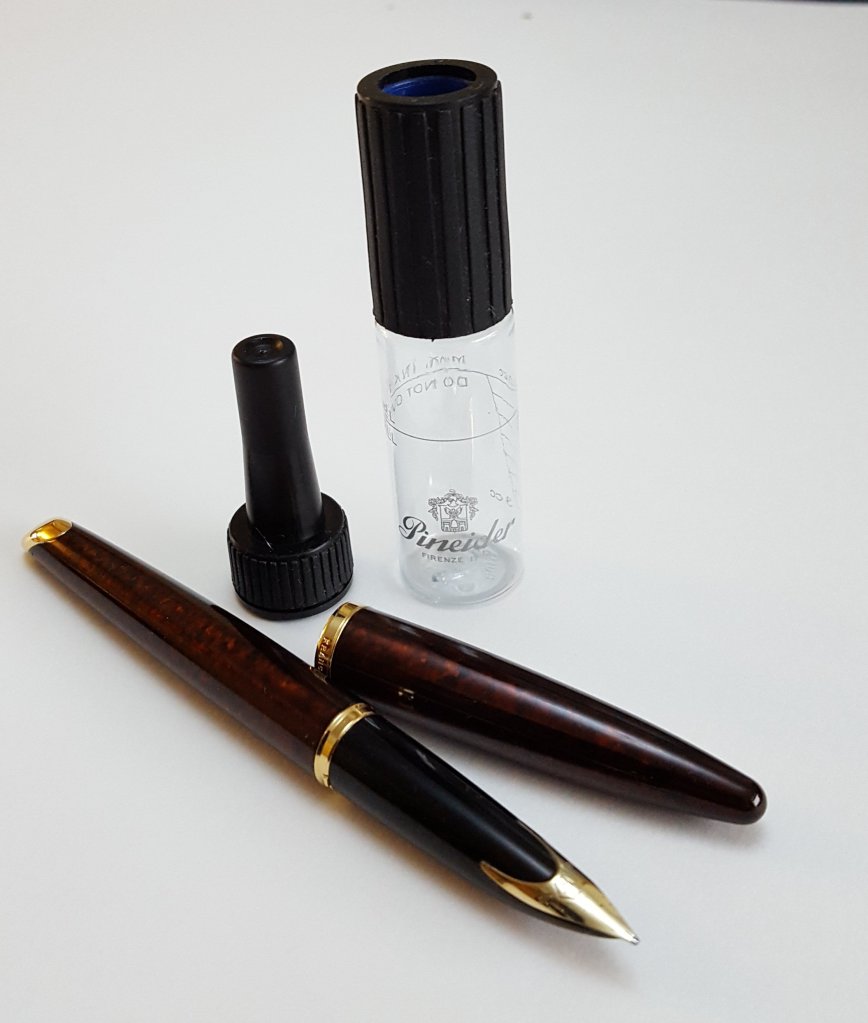
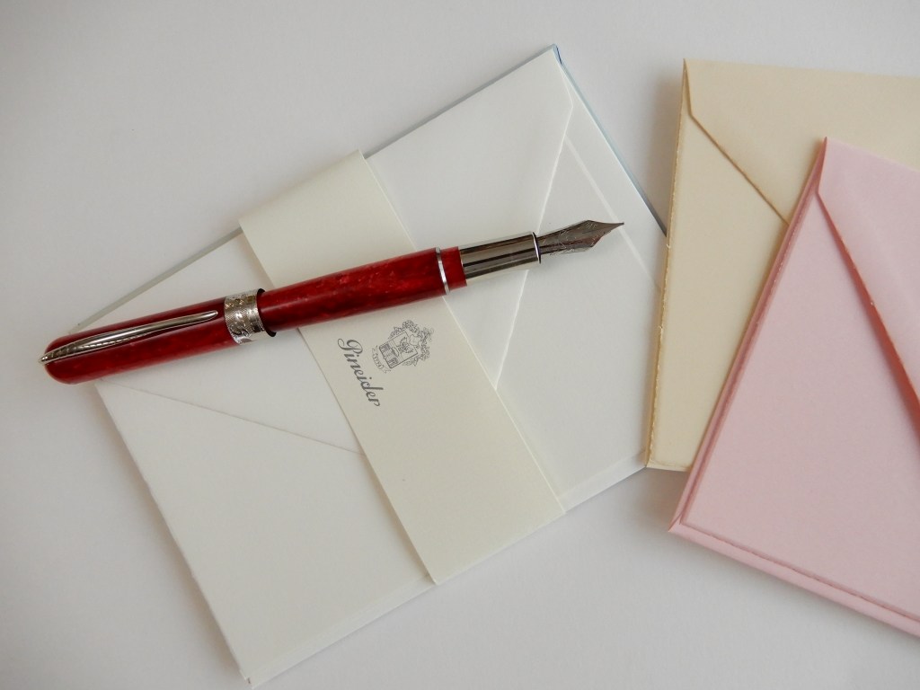
Pineider Avatar: This brand was new to me this year and I loved the look and the writing experience of theLipstick Red version, with its long elegant steel nib.

Pineider Avatar, Lipstick Red.

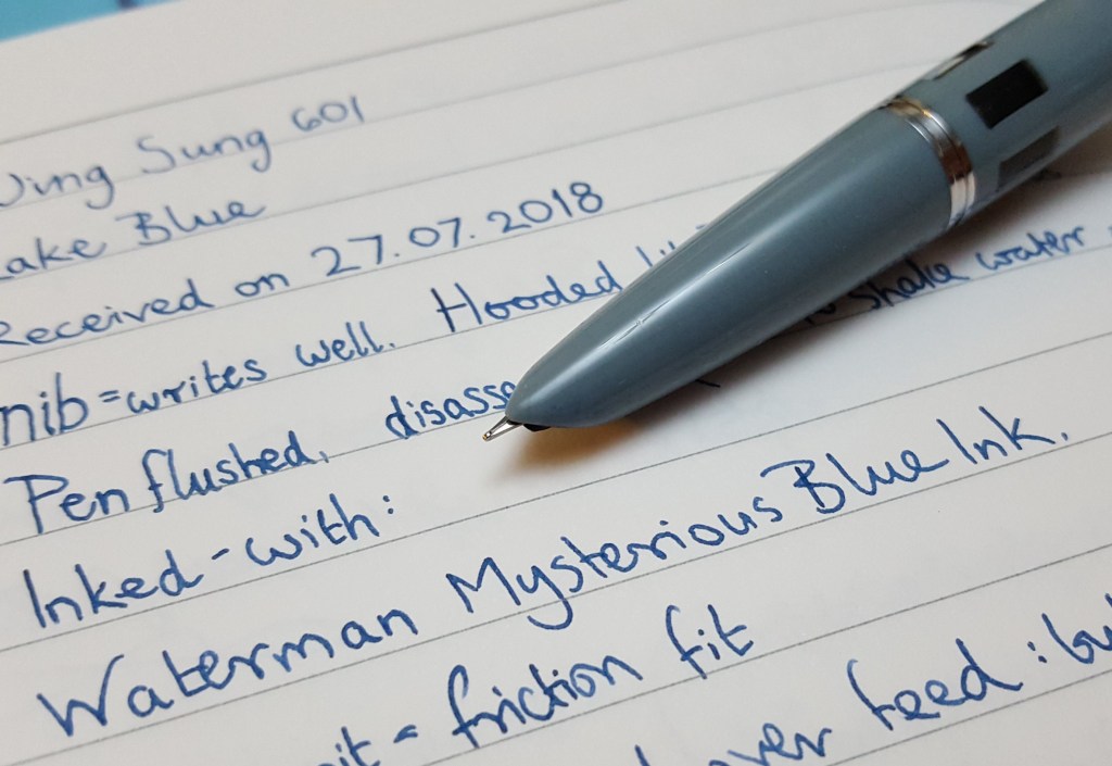
Wing Sung 601: These are inexpensive steel nib versions modelled on the Parker 51 and offer great looks, comfortable handling and a large ink capacity from the push-button filler. I have one which is still on its first fill from six months ago. I have since bought a couple of the 601A versions, which are the same but with a tubular nib like a vintage Sheaffer Triumph.

Wing Sung 601 in Lake Blue.

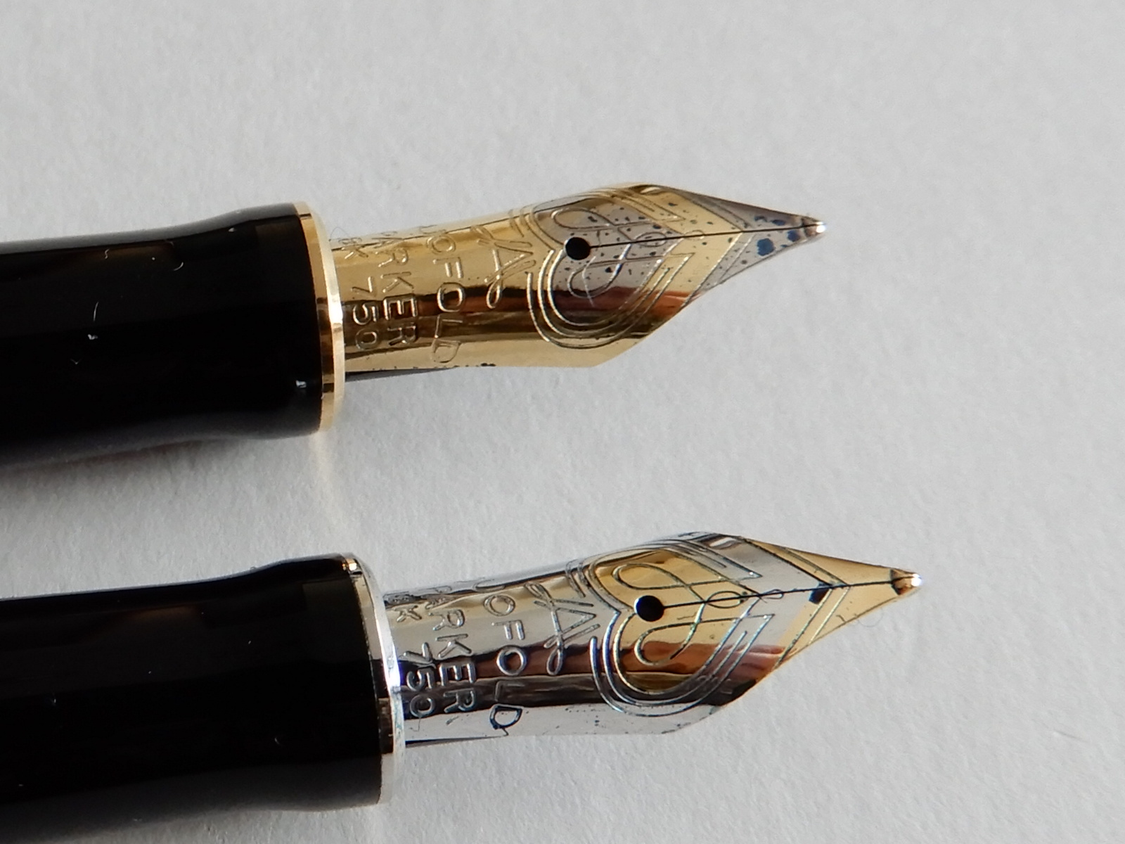
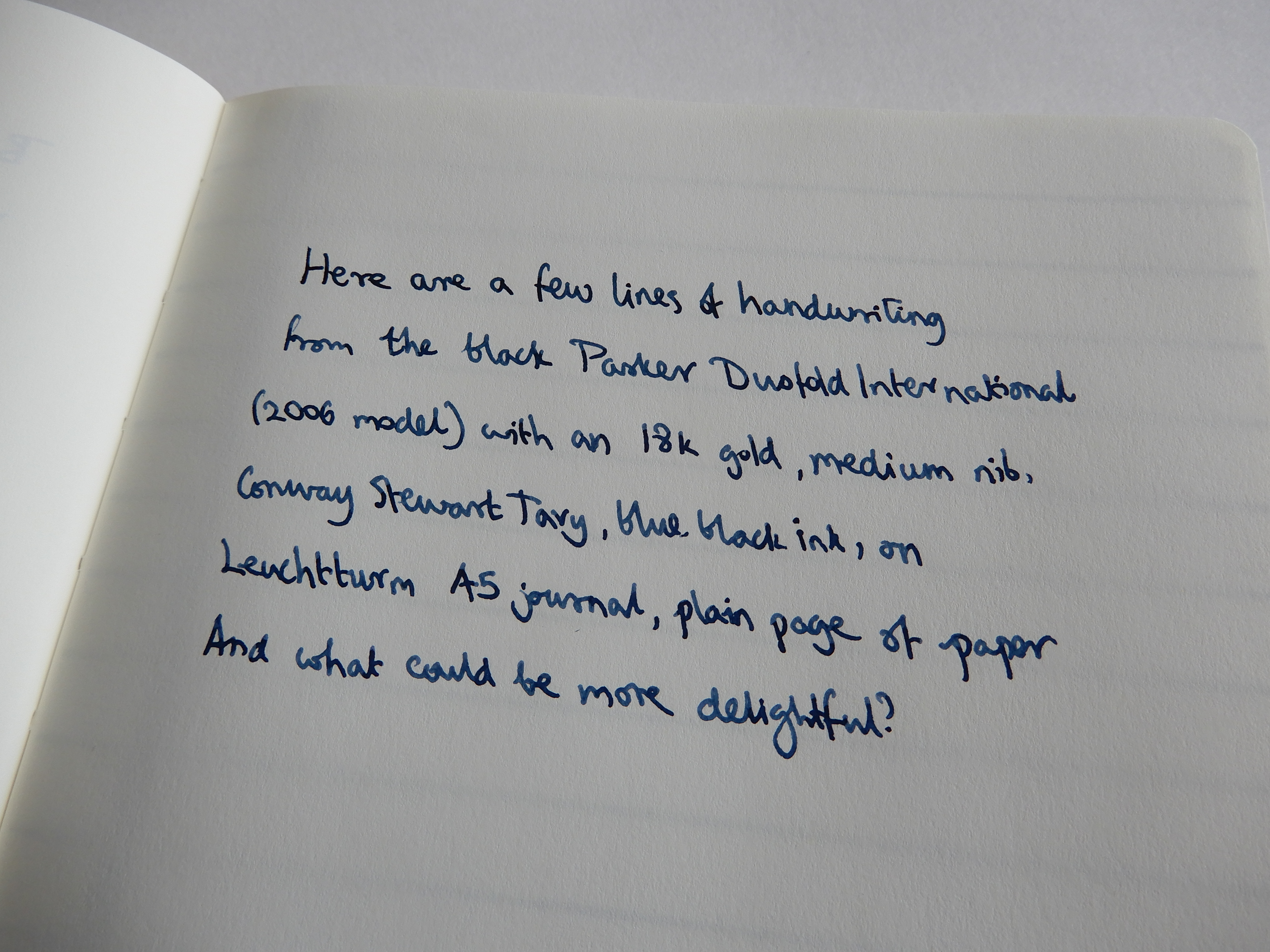
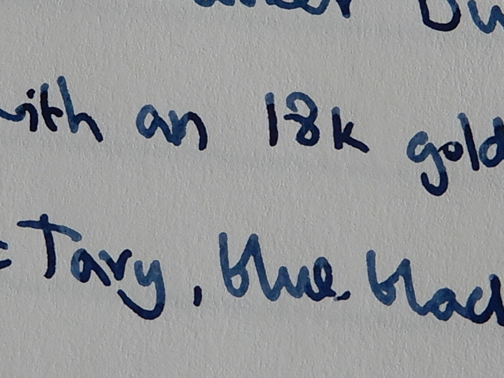
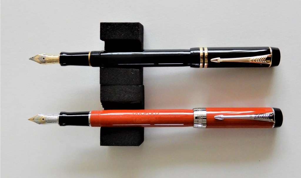
Parker Duofold International, Big Red. Medium nib, 18k gold: This pen needs little introduction. I got mine at a great price in a John Lewis sale and after a little wearing in, the pen writes superbly for me and looks and feels great in the hand. Previously I had a Kaweco Dia 2, which was similarly styled. I realise now that one of the reasons why I liked the Kaweco so much was that it looked a bit like the Duofold, when the cap was posted. I have since bought a previously owned Duofold in black from a friend who found the nib too firm for his liking.

My Duofold duo.

Opus 88, clear demonstrator, eye-dropper pen: This was one of my purchases at the London pen show and has one of the smoothest broad steel nibs that I have ever used. It holds a massive 3ml of ink and is large and chunky but very comfortable.

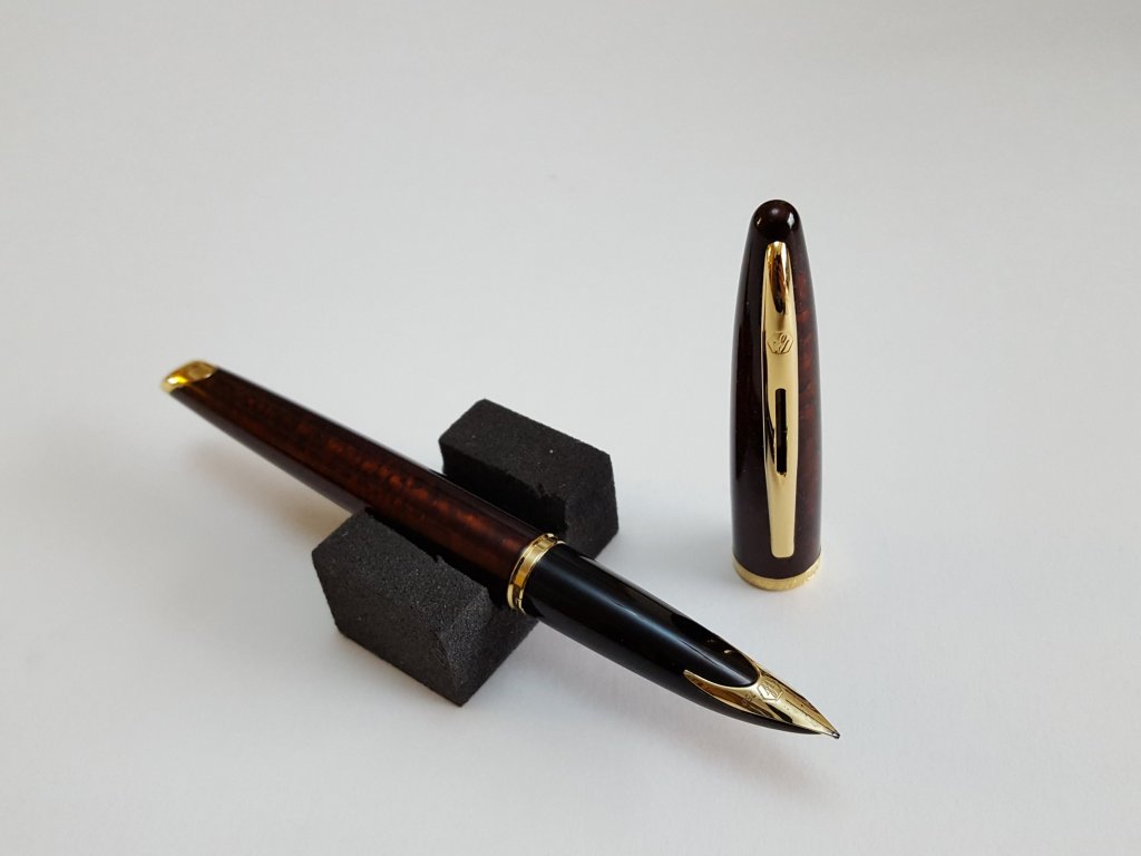
Delta Fantasia Vintage, limited edition in dark green celluloid, Medium steel nib: This was another buy at the London pen show and also my most costly single pen of the year at £230.00. The celluloid body is wonderful to hold and to look at. As I write this I am itching to re-ink it with Graf von Faber-Castell Moss Green ink.

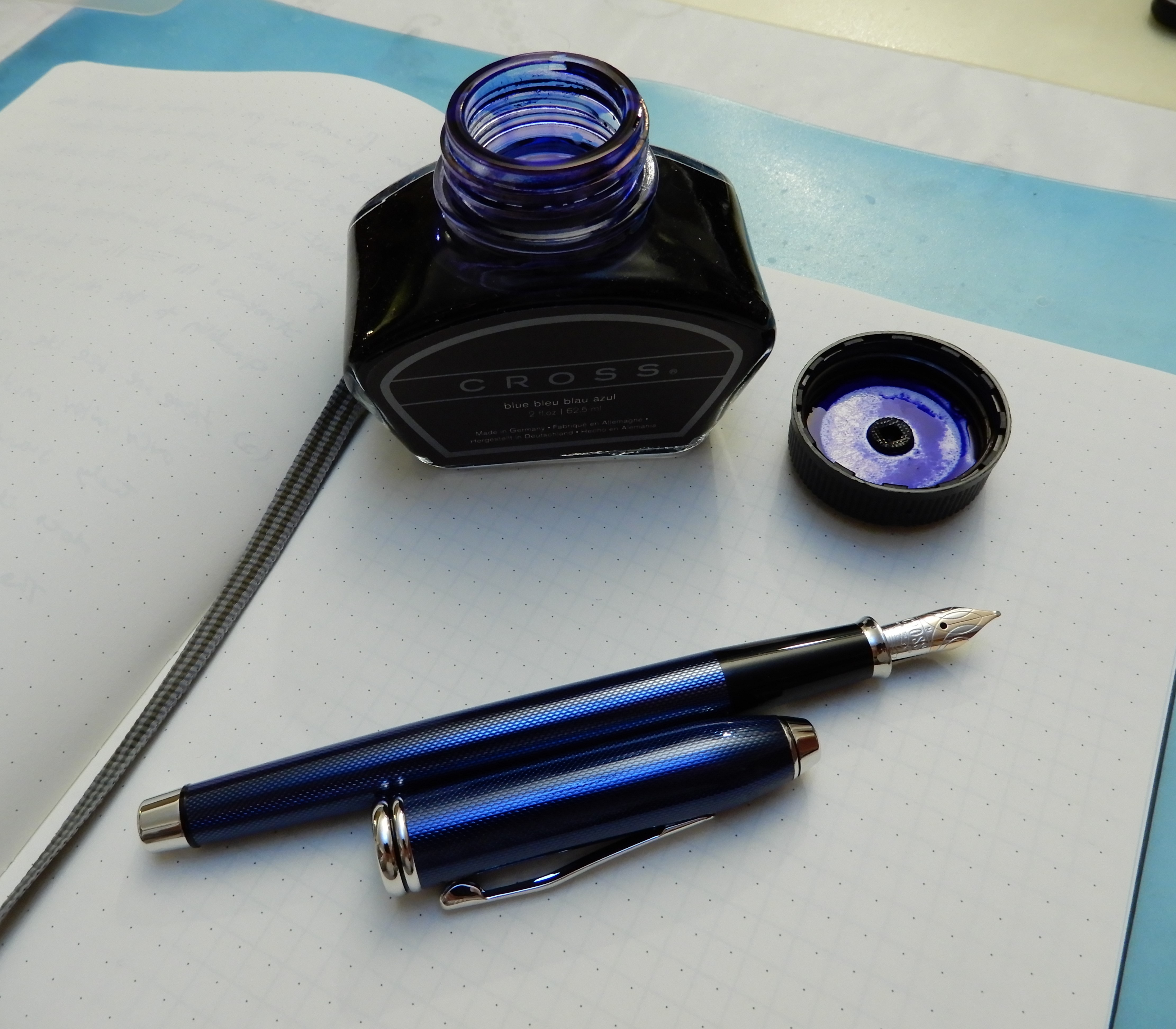
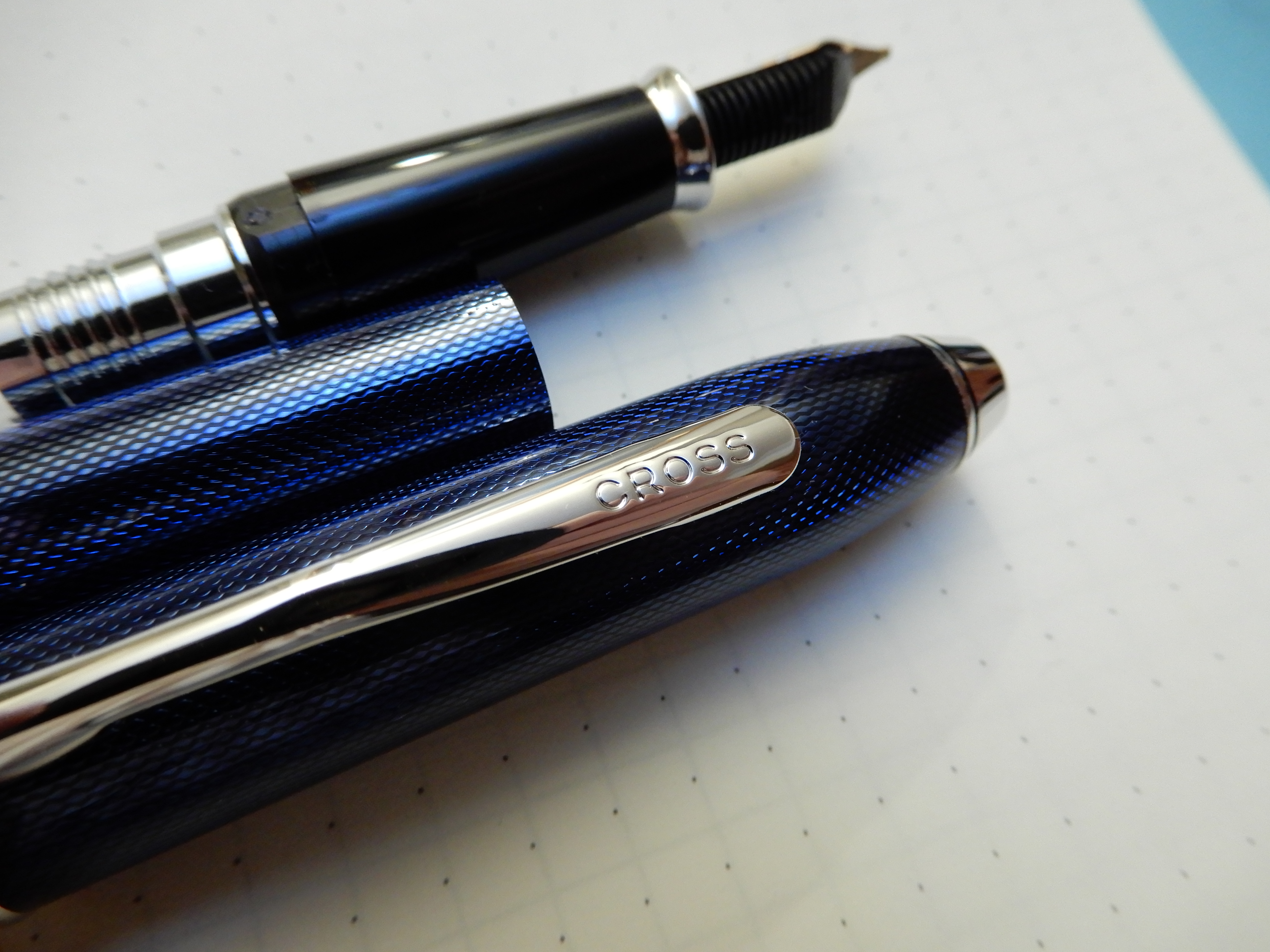
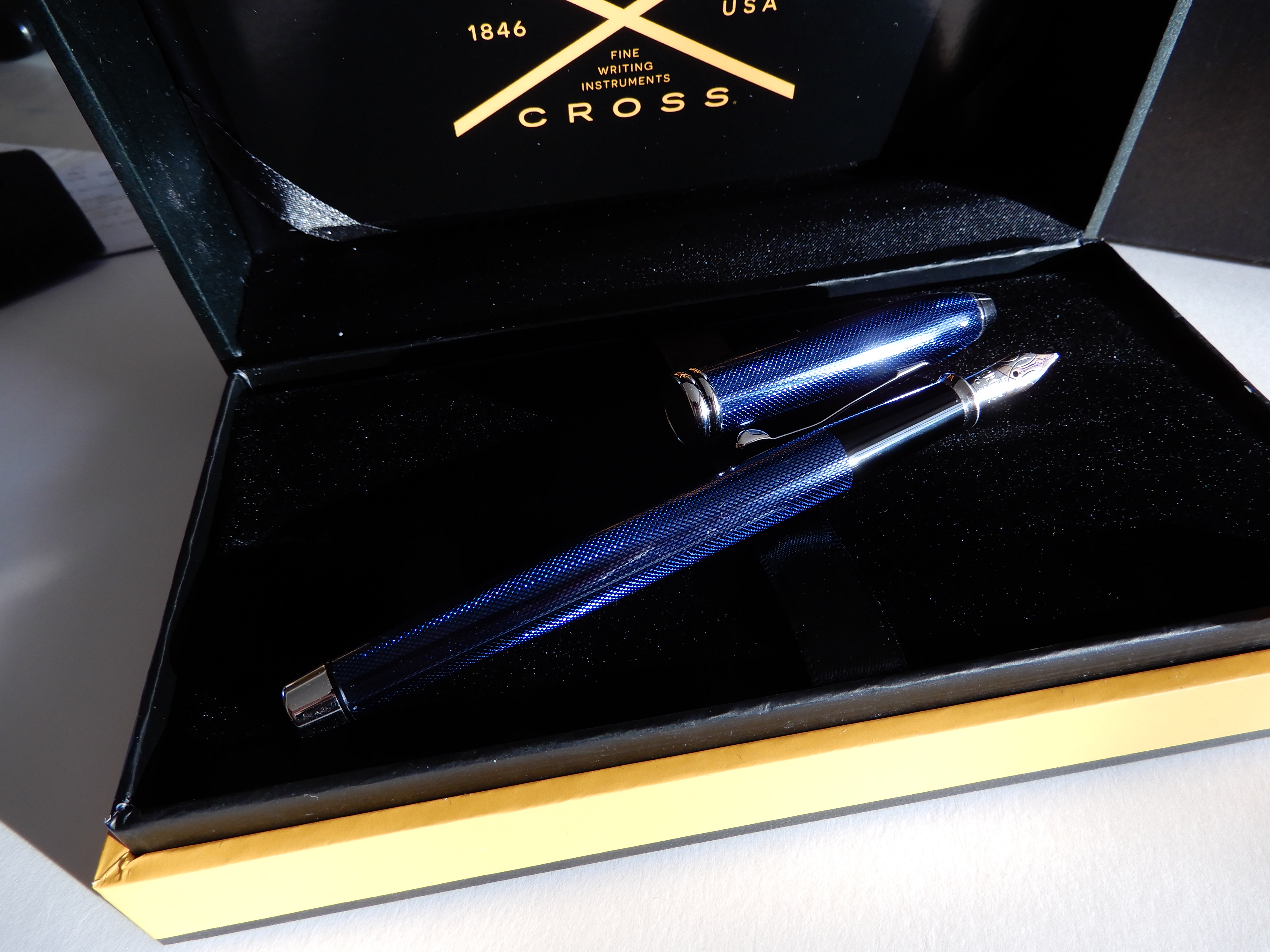
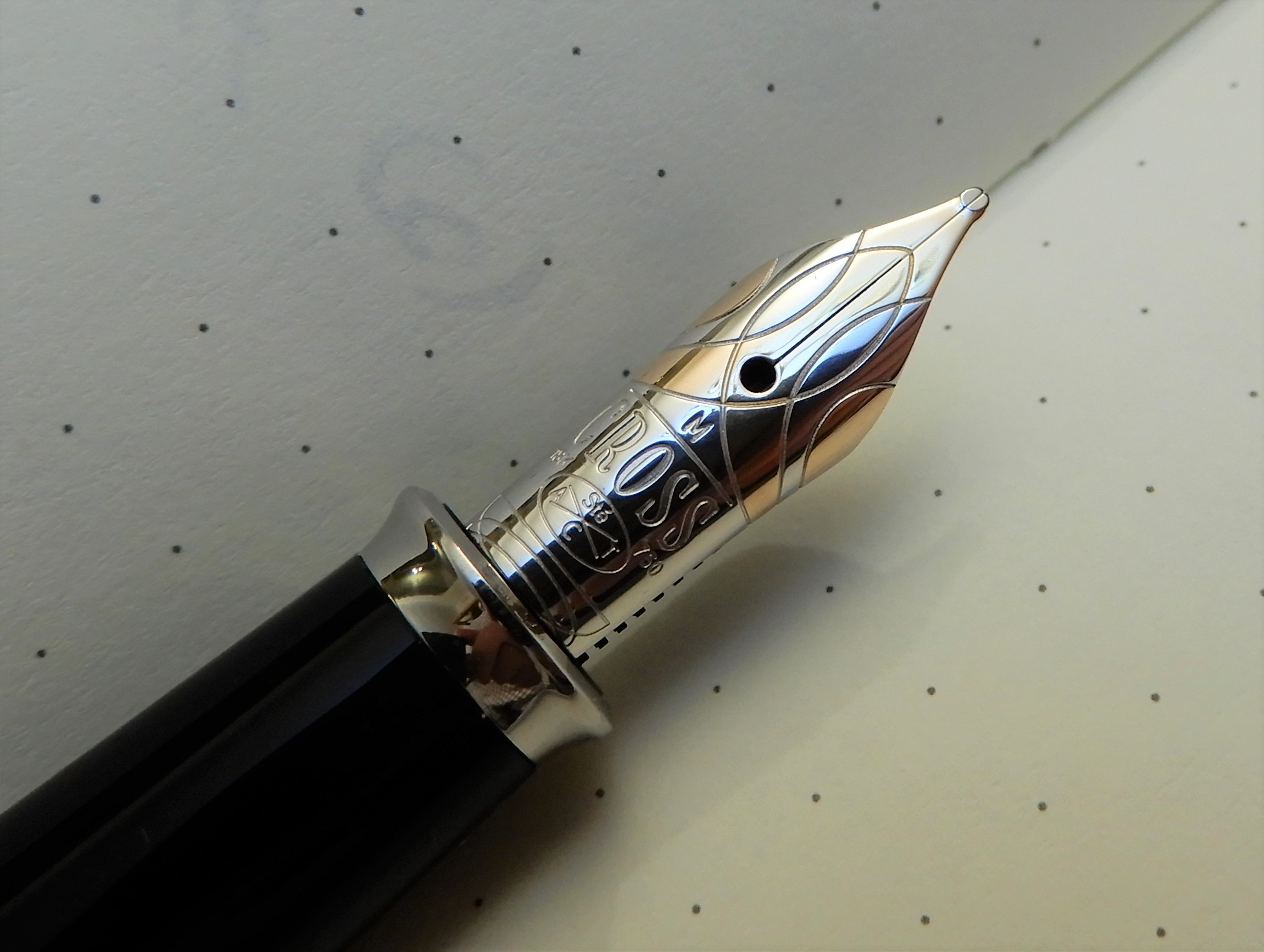
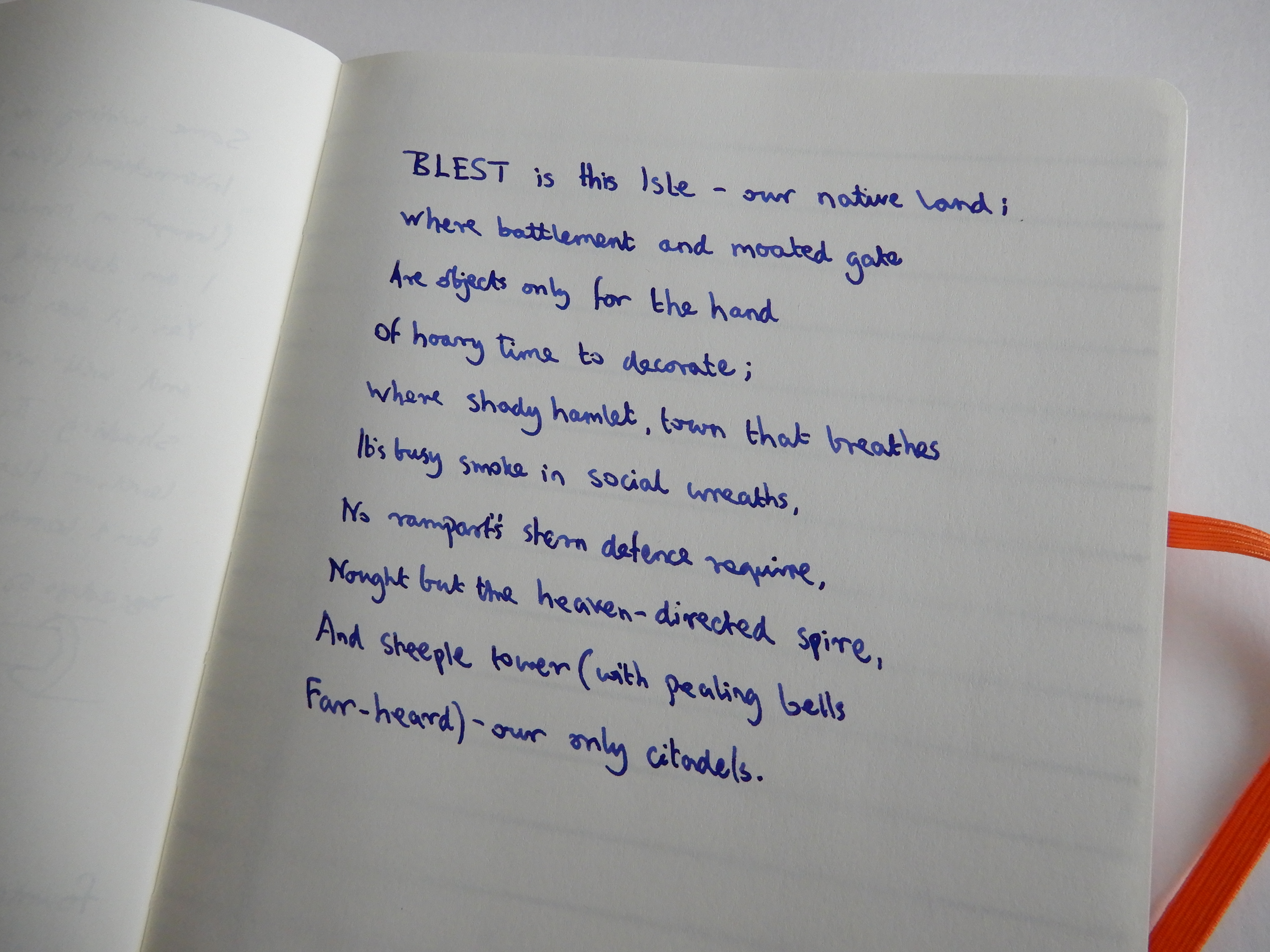
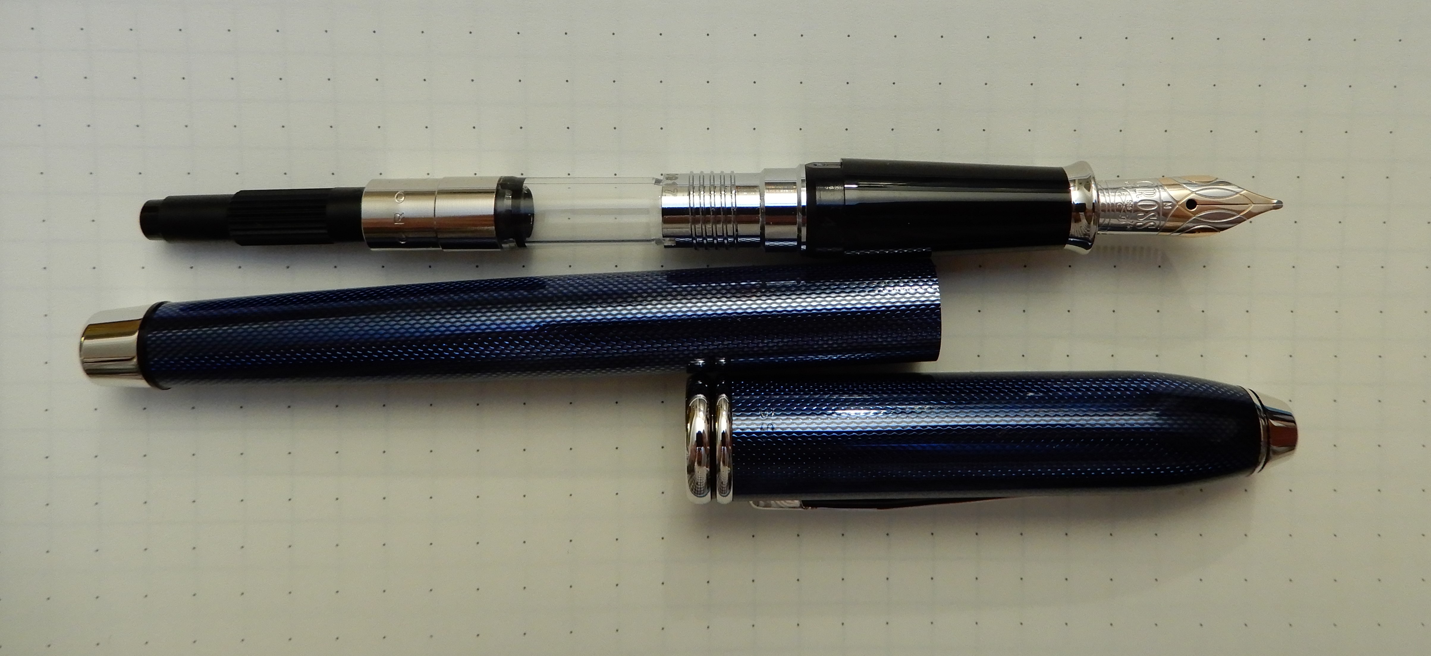
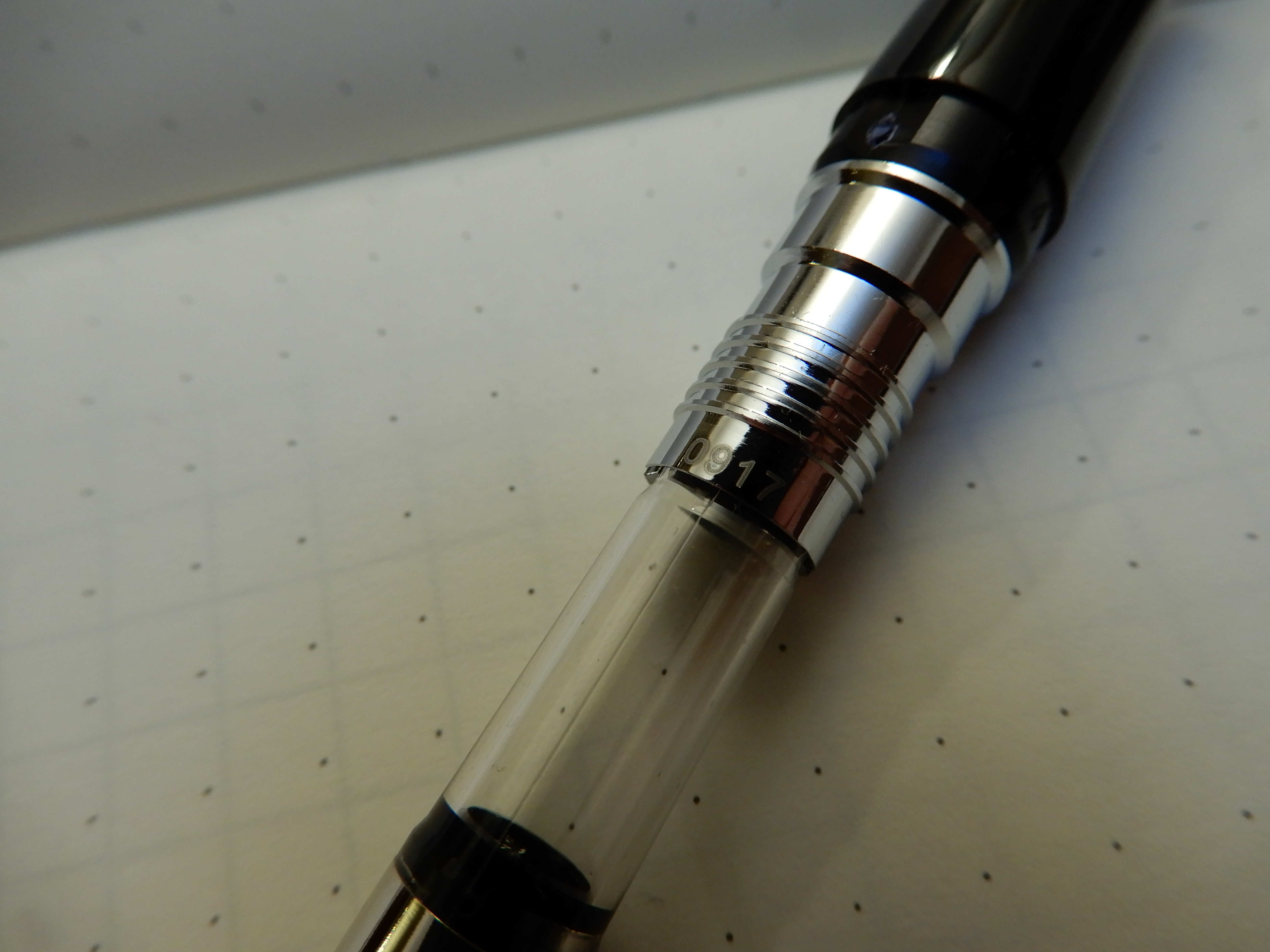
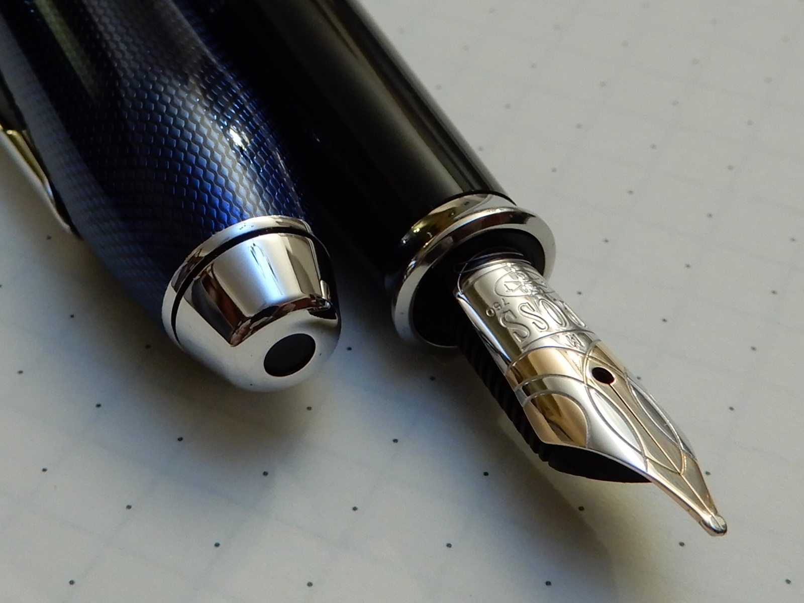
Cross Townsend, quartz blue: Another well known pen. I reviewed it not long ago here and am enjoying the writing experience, with Montblanc Royal blue. I have tried a number of Cross pens over the years, including the Apogee, Aventura, Bailey, Calais and Century II but find this Townsend to be the best of these.

Waterman Carene, Marine Amber, 18k gold inlaid nib (Medium): This was my final pen purchase of the year and probably the best. It is supremely comfortable. It looks stunning and it writes like a dream. I now have to think very carefully if buying another pen, “Will it be better than my Carene?” If only I had found it in January!

The Waterman Carene, in marine amber. Seen here in dry dock.

Concluding thoughts.

Apart from the buying, the researching of pens online and in shops, the pen shows and club meets and the social media rabbit hole, what this hobby is all about is the enjoyment of owning, using and caring for fountain pens. Not necessarily expensive ones but pens which write nicely. Every pen is different. And they behave differently depending upon the inks and paper used. Currently, I have 26 fountain pens inked, which I feel is a bit too many even for me. Part of me craves the simplicity of having just one pen. But I also enjoy the variety of having several to chose from. As in previous years I will aim (again!) to cut back on the buying.

At the end of the day, I am thankful to have a hobby that has given and continues to give me so much pleasure, enjoyment and relaxation and friends to enjoy it with. Thanks for reading and best wishes for the New Year.

Some early thoughts on the Pineider Pen Filler travelling inkwell.

This handy gadget is a travelling inkwell, introduced in 2018 by Italian company Pineider. A friend arranged a group buy for our London UK Fountain Pen Club although they are now available from Cult Pens at £20.00.

Pineider Pen Filler. Stopper removed to show blue rubber inner sleeve.

What’s in the box.

The pen filler comes in a simple cardboard box, about the size of a cigarette packet. One side of the box has two holes, one of 9.5mm, one of 13.5.mm diameter, being the minimum and maximum size grip sections that can be used. The idea is to use these holes to check that your pen is neither smaller than the small hole, nor larger than the large hole.

Cardboard box. Holes to check that your pens will fit.

Inside the box, was the pen filler together with a small pipette or eye-dropper (although I am not sure these are always included) plus a sheet of instructions. If no pipette is included, use your own or a syringe to fill the pen filler.

The pen filler is comprised of four parts: the clear plastic ink holder with a measuring scale in 1ml units, up to 10ml (or 10 cubic centilitres), a black plastic knurled collar and a black plastic stopper. Hidden by the collar is a blue rubbery sleeve, part of which fits into the ink holder.

The four parts of the Pineider Pen Filler.

How to use.

Preparation: It is recommended that you first check that your pen is not too big or small for the pen filler, using the holes in the box if in doubt. Next practice with water first. Fill the ink holder with water, up to the 10cc mark. If you have a number of pens that you might wish to use with the pen filler, then it might be convenient to flush them all and try each of them in turn with the filler and make a note of which pens you have tried. According to the instructions, “you can use the pen filler to fill lever pens, piston pens, plunger pens, converter pens and even the old eyedropper pens.”

Filling the pen: It is recommended that the pen be emptied first. If it had last been filled with the same ink, you could discharge it into the pen filler if you are not too fussy about only using fresh ink. If using a converter or piston fill pen, then wind the plunger down first, before locking the pen into the pen filler. This is to avoid over-pressurising the ink holder and causing leaks.

Pen gripped securely in the filler, ready to turn upside down and fill.

So, you are ready to fill your pen.

  • remove barrel of pen (if using a converter) and wind down the plunger;
  • pull out the stopper from the pen filler; unscrew the knurled black collar (which gradually increases the opening) until you can insert your pen;
  • tighten the collar; (as you screw the collar down, the blue rubber sleeve tightens around the grip section of the pen); continue until the pen is held firmly. This stage is a little awkward as you are holding the pen in one hand with the barrel removed and so take care not to dislodge the converter from the pen);
  • Now the fun/risky part. Turn the bottle upside down, allowing the ink to cover the nib. Wind the converter or operate the piston to fill the pen, by a combination of suction and gravity;
  • Once filled; turn the pen and bottle the right way up again; unscrew the collar a little until the pen comes free; remove pen; screw the collar back down fully and insert stopper.
  • Replace the barrel on your pen, wipe off any ink from the section and nib. And you are ready to go.

Limitations.

There are some limitations to the use of the pen filler, for those pens which are too wide or too narrow for it. For oversized pens you may have to fill these direct from a bottle. For pens too narrow to use the pen filler system, you may still be able to fill from the travelling ink well, just by removing the stopper and dipping the pen into the ink (if the ink level is deep enough).

Advantages.

  • The pen filler is a very convenient size for travelling, being small and light weight, when you do not want to travel with a typical 50ml glass bottle.
  • A 10ml supply of ink is enough to fill a typical converter around 12 – 15 times I found, although I confess that I lost count while attempting this exercise, filling a pen repeatedly with water until empty.
  • If used correctly and carefully, it is possible to get a good fill with minimum inky mess.
  • You can still fill a pen even from your last 1ml of ink! This would be difficult for most pens, if filling from a conventional bottle.
  • You do not need to be too anxious about the pen not being perfectly clean from a previous ink, as you will not contaminate a whole bottle, but only a few millilitres.
  • You can experiment by mixing compatible inks, just a millilitre or two at a time, in your pen filler. (I made a blend of Robert Oster Aqua and Pilot Iroshizuku Shin-kai, about 50/50, although this carries some risk that certain inks will not be compatible and will combine to make a sticky goo). It is prudent to test out any such blends in a separate receptacle and leave to stand for a day or so, before filling your pen.
  • If going away for a few days, it can be very handy to have a little supply of ink with you just in case you buy a pen (!), or as happened to me recently while visiting an elderly aunt over the holidays, I was asked to see if I could get her old Parker Slimfold working again and she could not find any ink in the house. In this situation it is little consolation to know that you have an entire drawer-full of fountain pen inks back at base camp.

Conclusions.

I am impressed with the simplicity of the design. If used correctly and with care, it works well. It is not entirely fool proof and it is a good idea to practice first with any given pen, using water until confident. When I first got mine, I picked a fairly large sized cartridge converter pen and was interested to see how many times it could be filled, from 10ml of water and using even the last drop. I have been using it successfully for a few weeks now. However, in trying it last night newly filled with Conway Stewart Tavy to photograph for this post, I must have done something wrong and ink leaked over my hands. This could be due to me forgetting to wind down the plunger prior to locking the pen into the holder, or not tightening the screw-down collar sufficiently before inverting the bottle, or perhaps dislodging the converter slightly. Like I said, it is not fool proof.

As for durability, it remains to be seen whether the plastic ink holder may crack eventually from the repeated stress of tightening and loosening the collar but I would expect it to last for a few years at least and would be happy with this. As for value, when looking at the four individual components of the pen filler, each of which looks mass-produced costing only a few pence each, it is questionable whether the sum of the parts amounts to £20.00. I sometimes feel like this when looking at the disassembled parts of a fountain pen. Obviously the company needs to make a profit and the initial costs of designing the parts and manufacturing them all need to be taken into account.

Overall, for the usefulness of the pen filler I would be happy to spend £20.00. And for the question of what to give a fountain pen enthusiast, who has everything except a Pineider Pen Filler, this is a good answer.

Pineider Pen Filler, shown with a Waterman Carene for size comparison.

My Duofold Duo.

Regular readers may recall that I was fortunate enough to find a new Parker Duofold International, Big Red on sale at half price, in John Lewis, Oxford Street branch in October. I wrote a post about it here. 

I have been very much enjoying the pen, these past two months. What had aroused my interest in the pen, just before I bought mine, was a post by Anthony on UK fountain pens blog entitled A Day with a Duofold.

Fast forwarding two months, Anthony advertised his Duofold for sale, as he was not getting along with the very firm nib. I pondered buying it myself and, after sleeping on it, was sure that this was the right thing to do. (“There is a Duofold out there and it needs my help!”).  At 07:42am the next day, I sent Anthony a DM offering to buy it, if it had not already gone. Within moments, he had replied that the pen was mine. He kindly sent it out to me that day and it arrived the next day. 

I felt like I knew the pen already. It is not often that you get a chance to own a pen not just of a type that you have read about online, but that very one. 

This differed from mine sufficiently to make it a very worthwhile addition. First, it is black, and a gleaming glossy black at that. Secondly it is a 2006 model and had a few subtle differences from my 2016 model. And also the metal furniture on it is gold coloured as opposed to silver on mine. 

They both have 18k gold, bi-colour medium nibs, but the silver and gold colours are reversed in the two versions:-

Parker Duofold Internationals. The black one is a 2006 model and the ‘Big Red’ is 2016.

Plating reversed. Excuse the ink residue, but these are both currently inked. 

I knew already that I would like the size, shape and weight of the pen. I use it with the cap posted, holding near the cap threads (which are not sharp) and find it very comfortable like this. 

The nibs ought to feel similar. My Big Red had been a bit skippy at first but, like my Pelikan M800 nib, I had written it in, a few pages a day and within a week or so, the skipping subsided until it was all but gone completely. It is now a joy to write with and has a distinctively pencil-like feedback. I use it with Conway Stewart Tavy, a blue black ink now made by Diamine. 

Anthony had commented in his post about how the nib drooped or dips downwards, which it does. The nib of my Big Red has a more level profile. Perhaps this is what contributes to the nib on Anthony’s being quite so stiff. I recall hearing Stephen Brown say in an old YouTube review that the Duofold nibs were reputedly stiff in order to make carbon copies, through two layers of paper (back in the day) and hence the name “Duofold”. Also the tipping material, at least on the old vintage model Duofolds, was advertised by Parker as being harder than others. Perhaps the gold is thicker too than on other pen nibs and this is no bad thing. 

I do not mind the stiff nib. I have spent some time each day writing with Anthony’s Duofold (I must stop calling it that now) and am thrilled to have it. The tines are aligned. The tipping material is huge and so there is a lot of mileage in this nib yet. The nib is smooth, provided that you hold it level; if I rotate it clockwise a little, it starts to scrape the paper, which suggests that the outer edge of the tipping needs smoothing. I do not think this is such a problem as an inner edge being prominent (which causes not only scratchiness but a build up of paper fibres in the nib slit). I have a sense that the tipping material is shaped slightly like a garden roller with flat sides, rather than rounded like a ball. I am exaggerating but you get the idea. I am wary of doing any harm to the nib by my ham-fisted grinding and so for now I will continue to use it with nib angled the way it likes. 

Notwithstanding the stiffness of the nib, there is some very pleasant shading apparent, just from writing quite normally with no pressure. Looked at this under the loupe,  the shading from this blue black ink has a lovely vintagey iron-gall look which is in keeping with the whole 1920’s vibe of the pen. Thank you Anthony for passing this one on. I am delighted with it. 

From the black Parker Duofold. Tavy ink, Leuchtturm paper. 
And look at that shading 🙂
The same. But different.

Some early thoughts on the Cross Townsend, quartz blue fountain pen.

Does anyone remember the Cross pen billboard advertisement, late 1990’s, which featured a Cross fountain pen, with cap posted, against a plain white background? The slogan went something like “Twelve jobs; five homes; three marriages; one pen.”  I cannot recall the wording exactly but the message was that, for this owner, through life’s changes, a Cross fountain pen had been the one constant. 

I guess that message appealed to me, the thought of having the ideal pen and not needing any others. 

I notice that we do not see very many Cross fountain pen reviews online, at least not many in proportion to the availability of Cross pens almost everywhere. I have visited department stores with hardly any fountain pens at all except for a display of Cross. And for those stores that do stock a range of brands, the Cross displays seem to dominate. Perhaps we just see too many of them.  

My local shopping centre, with its large John Lewis department store, is a typical example, with glass counters displaying Cross, Sheaffer, Waterman and Parker plus a couple of other brands such as Hugo Boss and Ted Baker.  Lamy Safaris and AL-Stars hang in their blister packs on a shelf behind with the inks and refills, with a few calligraphy pens from Manuscript and Sheaffer. I practically know them by heart. 

To buy a fountain pen with a gold nib from here, your only options are a Cross Townsend or a Waterman Carene, both priced around £235.00 usually. For a year or more I had been glancing at these whenever I passed by,  but had not been sufficiently tempted by either at this price.

However, a recent promotion around the time of the Black Friday sales, offering 30% off almost all fountain pens on display, was enough to melt my resolve and I took a closer look at the Cross Townsend. There was a choice of black or quartz blue, both with rhodium plated fittings. Both were appealing but I chose blue as a more interesting and unusual finish and with less presidential associations. 

Cross Townsend, quartz blue. 

Appearance and construction.

This is a sturdy, brass lacquered pen, long and sleek, with a slip on cap and an interesting patterned blue finish. If you look down the length of the pen it appears almost black. But in good light, the finish is a lovely glossy gleaming blue. If under bright lights, you see thousands of tiny pinpricks of light. Also the combination of the blue lacquer with the rhodium trim is very pleasing. 

The elegant shape of the cap, cylindrical with a torpedo shaped top and a shiny metal finial is classic Cross, smart and elegant.  Aside from the unmistakable iconic cap, the name CROSS appears on the clip and, less obviously, on the back of the cap (if you look closely) just above the two cap rings. The clip is usefully strong and springy and works well if pinched between finger and thumb, to lift it as you slide the pen into a pocket, although I usually carry mine in a pen case. 

Unusual blue lacquer finish.

The cap closure is very firm and secure, (thankfully not so tight as a Cross Bailey medalist that I have, which is almost impossible to uncap without violence and expletives). The inner cap fastens with the metal lip at the nib end of the section, but as you push the cap on you feel the gradual increase of resistance , until it clicks over this lip. 

The cap can also be posted deeply and securely, where a black plastic ring located between the blue barrel and rhodium end piece, serves the same function of fastening the cap on. 

Packaging.

The pen comes in quite a nice large box somewhere between the usual size pen box and the extra large one for the top-of-the-range Cross Peerless. It is a hinged box, with a black velvety bed for the pen, which can flap up to reveal a compartment below, where you find a cardboard envelope containing two black proprietary cartridges. The box also contains the guarantee brochure and the whole box is protected in a cardboard sleeve.  All in all a very presentable package. 

Unboxing the Townsend. 

The nib, filling and writing performance.

The nib is 18k gold, bi-colour with rhodium plating. Mine is a medium. I examined it as best I could in the shop and all looked well, which indeed it was. The nib is long and rather narrow, in keeping with the rest of the pen, making for an aesthetically pleasing look. It bears the Cross name and logo, 18k – 750, and the letters ACT, a reference to Alfonzo Townsend Cross, from whom the pen takes its name, being the son of founder Richard Cross. The nib also has the name Sté which I have not yet deciphered – perhaps a form of gold hallmark.  

18k gold nib, bi-colour. Soft and juicy. 

The lovely gold nib is smooth, with a very pleasant softness and a good wet flow. This was a relief as I have sometimes found Cross steel nibs to be dry and difficult to correct. 

Writing sample. Some words from William Wordsworth, (opened at random but strangely topical).

The pen takes Cross cartridges or a Cross converter. None was included in the box but the sales assistant kindly gave one to me. The Townsend, along with the Aventura,  takes the push-in converters whereas the Apogee, Bailey, and Century take the screw-in converters. 

The Townsend takes the Cross push in converter. 

Size and weight.

The pen is long, at 150mm capped. Uncapped it measures 131mm, which I am very happy with, although I still prefer the feel of it posted, at 157mm. As I hold the pen quite high up (with my thumb at the barrel, just before the section) I do not find it back heavy.

It weighs around 39.5g (freshly inked) or 22g uncapped. The cap alone is around 17.5g.

Likes and dislikes.

I have been using this pen for three weeks now, with Montblanc Royal blue bottled ink. Personally I have not found any serious dislikes. But trying to be objective, I list a few points that might bother some people.

Dislikes:-

  • Some may find the pen slightly slender, if accustomed to modern oversized pens; but it is a good bit wider than a Cross Century II;
  • Some may find the pen a little unbalanced if posting the cap and gripping the pen low on the section. However I think anyone who wishes to grip the pen low, would probably find it long enough without posting; 
  • If you stroke the finial with your thumb, the join with the blue lacquered cap feels slightly rough, but this is not a big point and I mention it only for those expecting Rolls Royce perfection. Likewise, at the other end, you feel the slight prominence of the black plastic ring which secures the cap when posted;
  • The worry of whether the slip on cap will wear loose in time. Happily all Cross pens carry a lifetime guarantee so no worries there. 

Likes:- 

There are far more factors to like than to dislike, thankfully. 

  • The smooth, soft, wet nib with a hint of feedback. The generous flow means that I, as left hander, also have the option of writing in my slanting “lefty overwriter” style which demands better flow and nib lubrication than some pens allow;
  • Comfort! Total absence of step or cap threads where I grip the pen;
  • The attractive blue lacquer finish next to rhodium accents;
  • Generous long barrel; pen can be used unposted for shorter notes;
  • Tall pen, stands out in the pen cup yet the pocket clip starts a little way down the cap so that the pen is not too long to clip in a pocket;
  • A date code. Mine was 0917;
  • Reassuringly secure cap mechanism. 
Date code, September 2017.

Conclusion.

This is a sturdy, durable and attractive pen that is comfortable and reliable and which writes extremely well. And so it could become the only pen you will ever need, if you are the sort of person envisaged by that billboard ad. Personally, I love mine but I am not yet ready to forsake all others.

Resistance is futile.