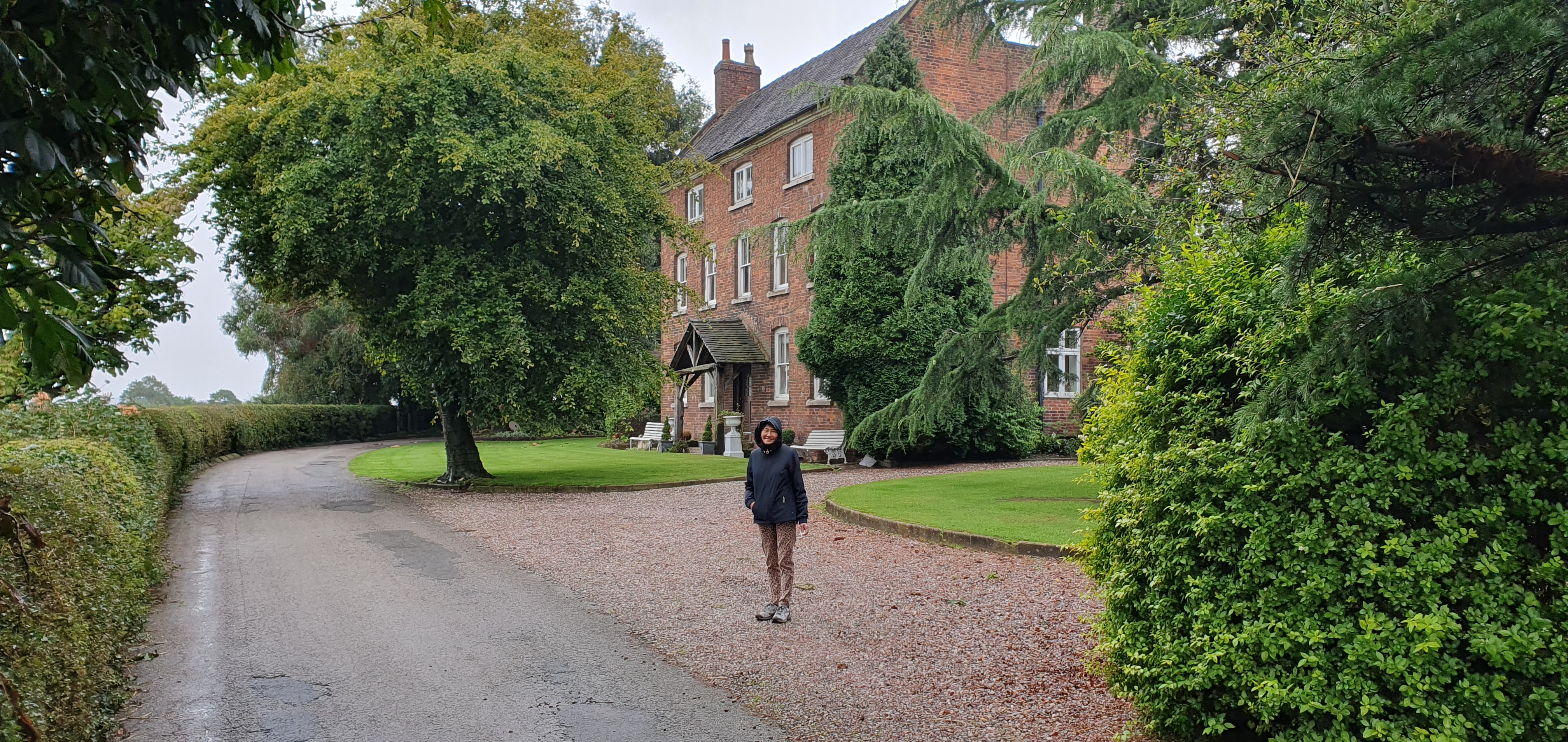
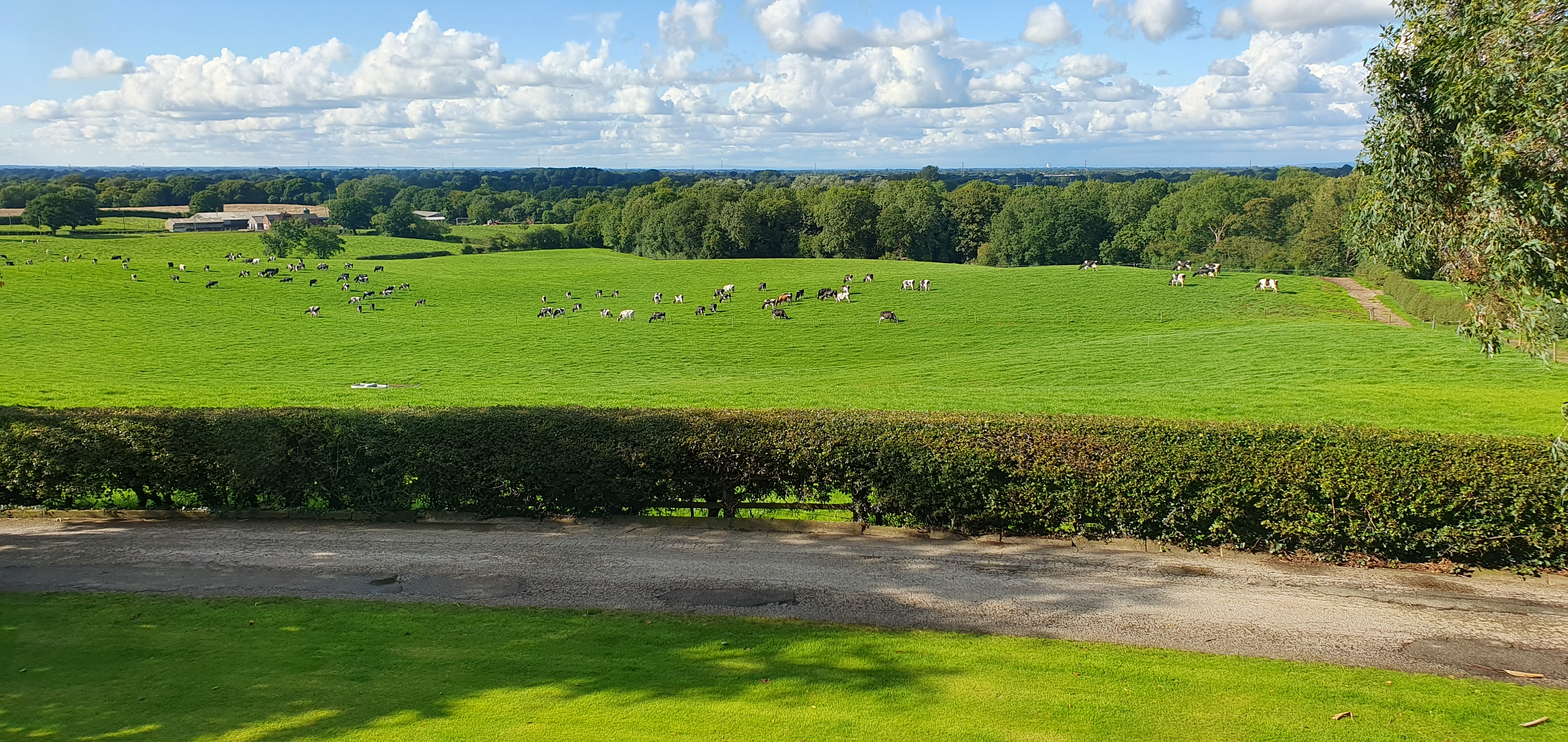
We recently enjoyed a relaxing long weekend break, on a farm. Our accommodation was annexed to the impressive Georgian farmhouse, facing a delightful courtyard. This is a working dairy farm, with 240 acres of land and 400 cows.
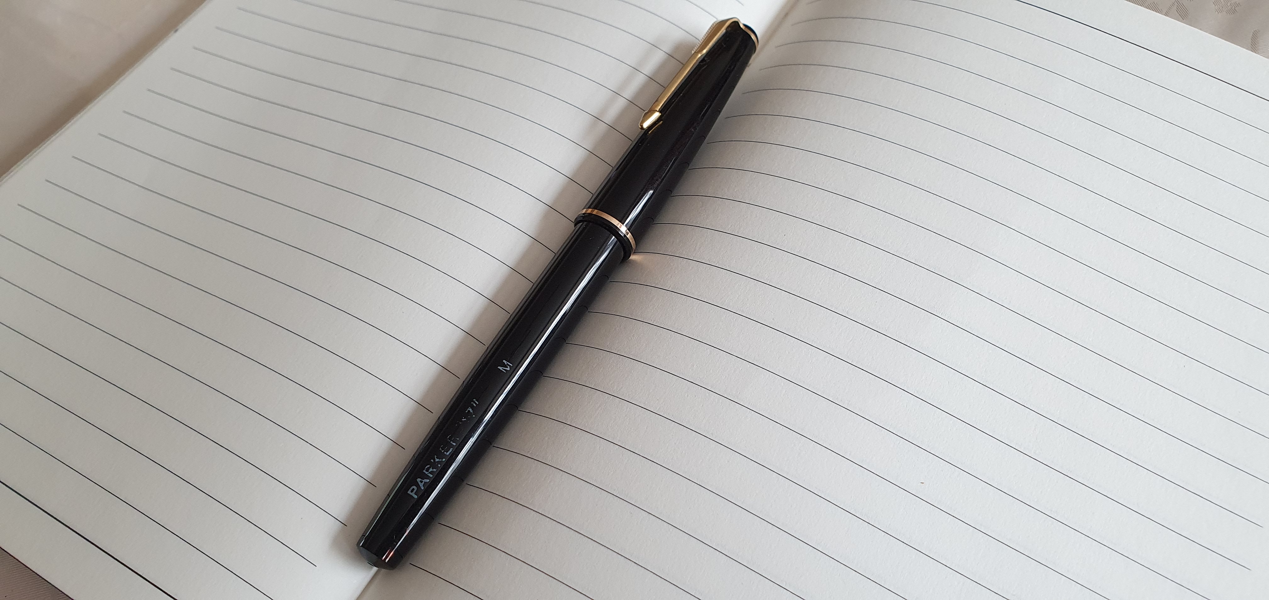
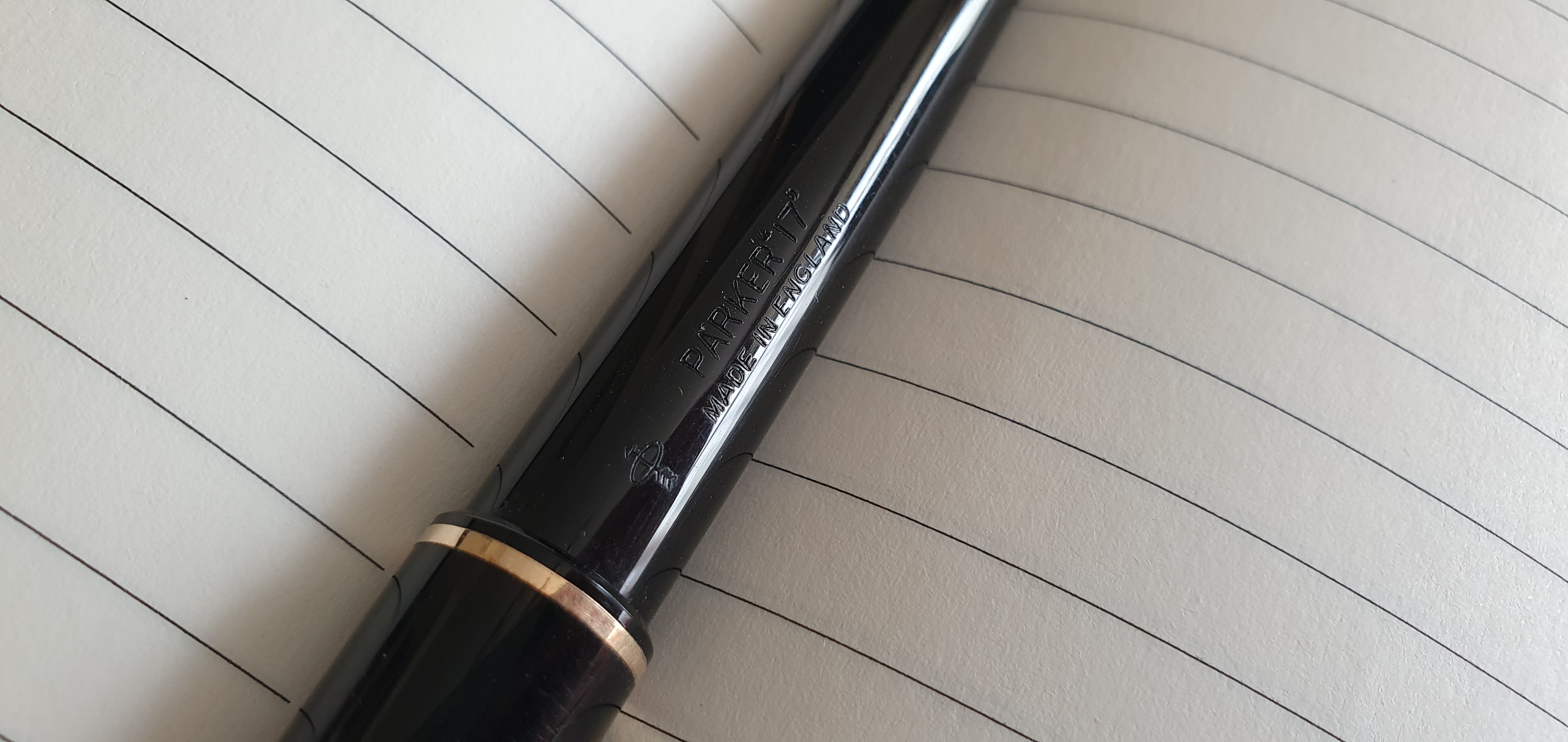
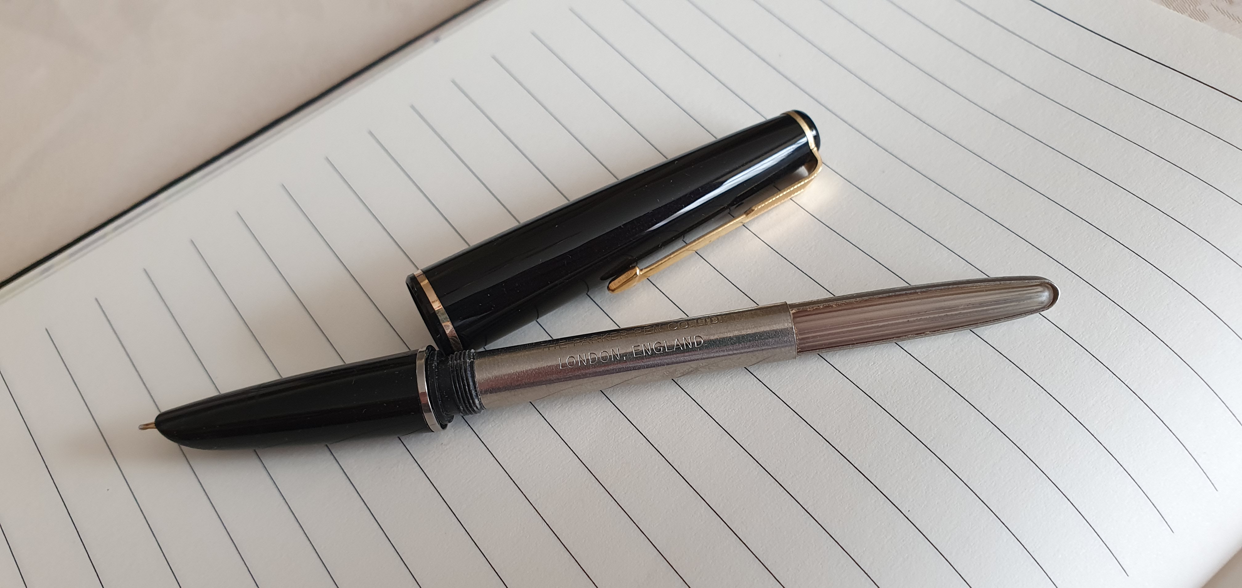
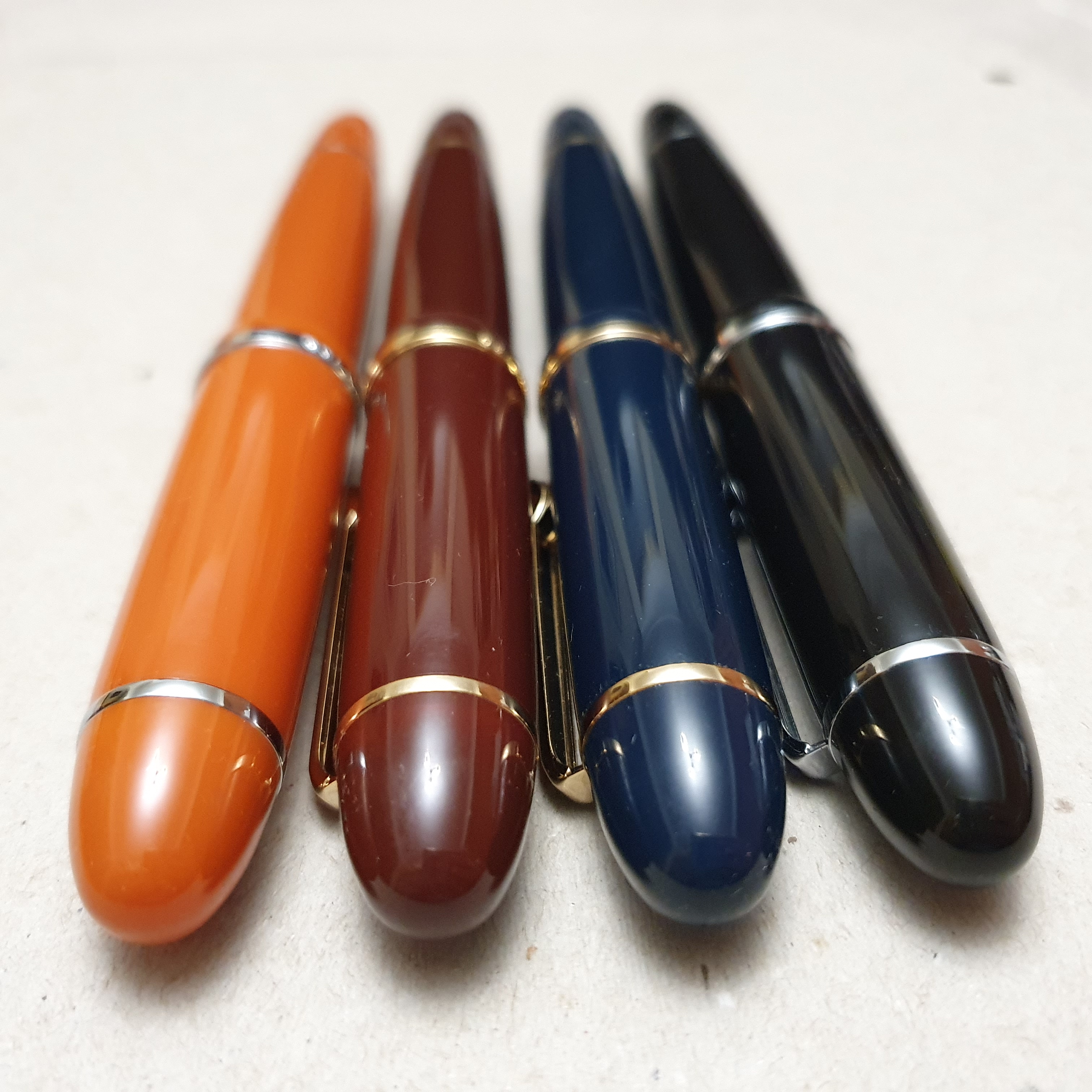
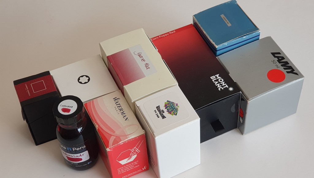
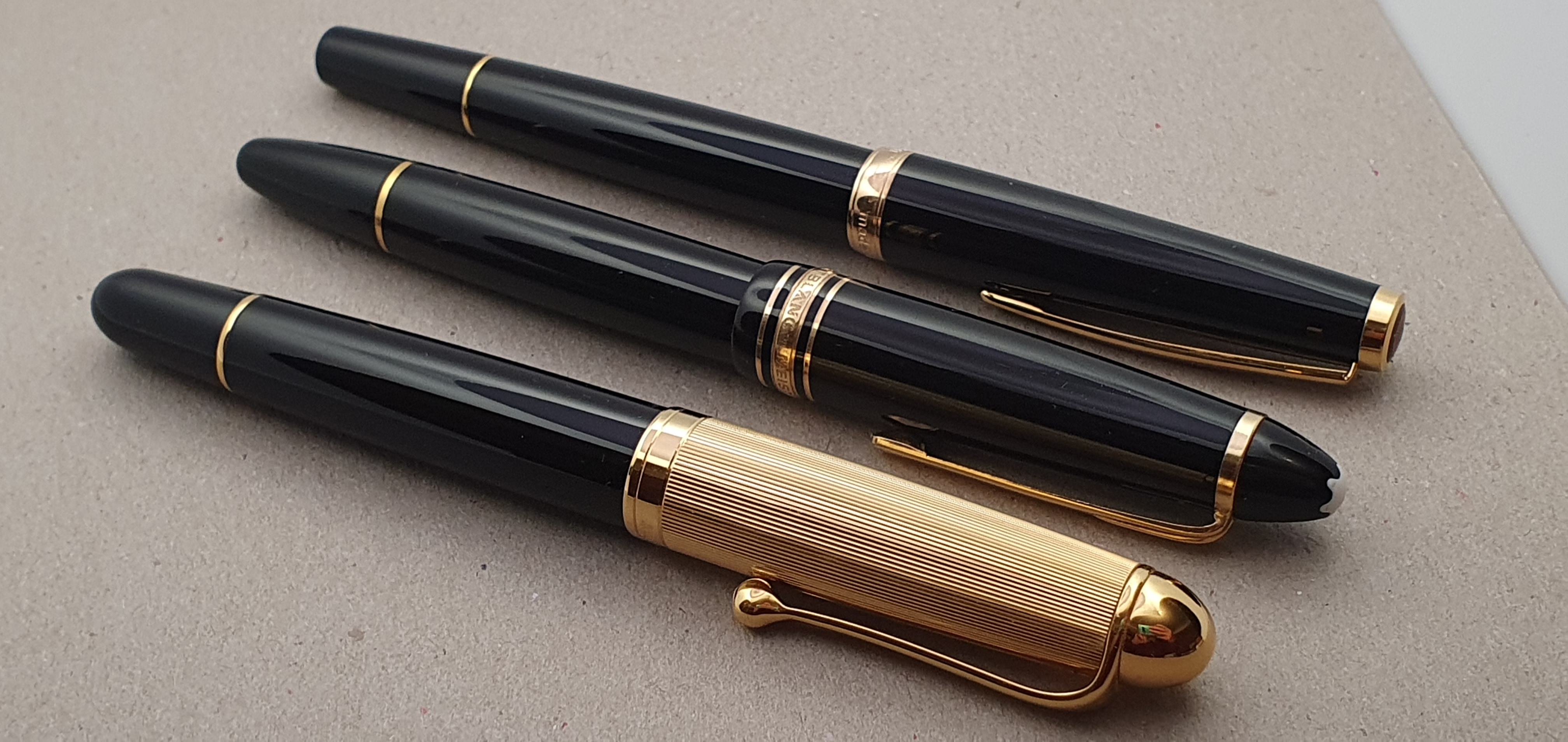
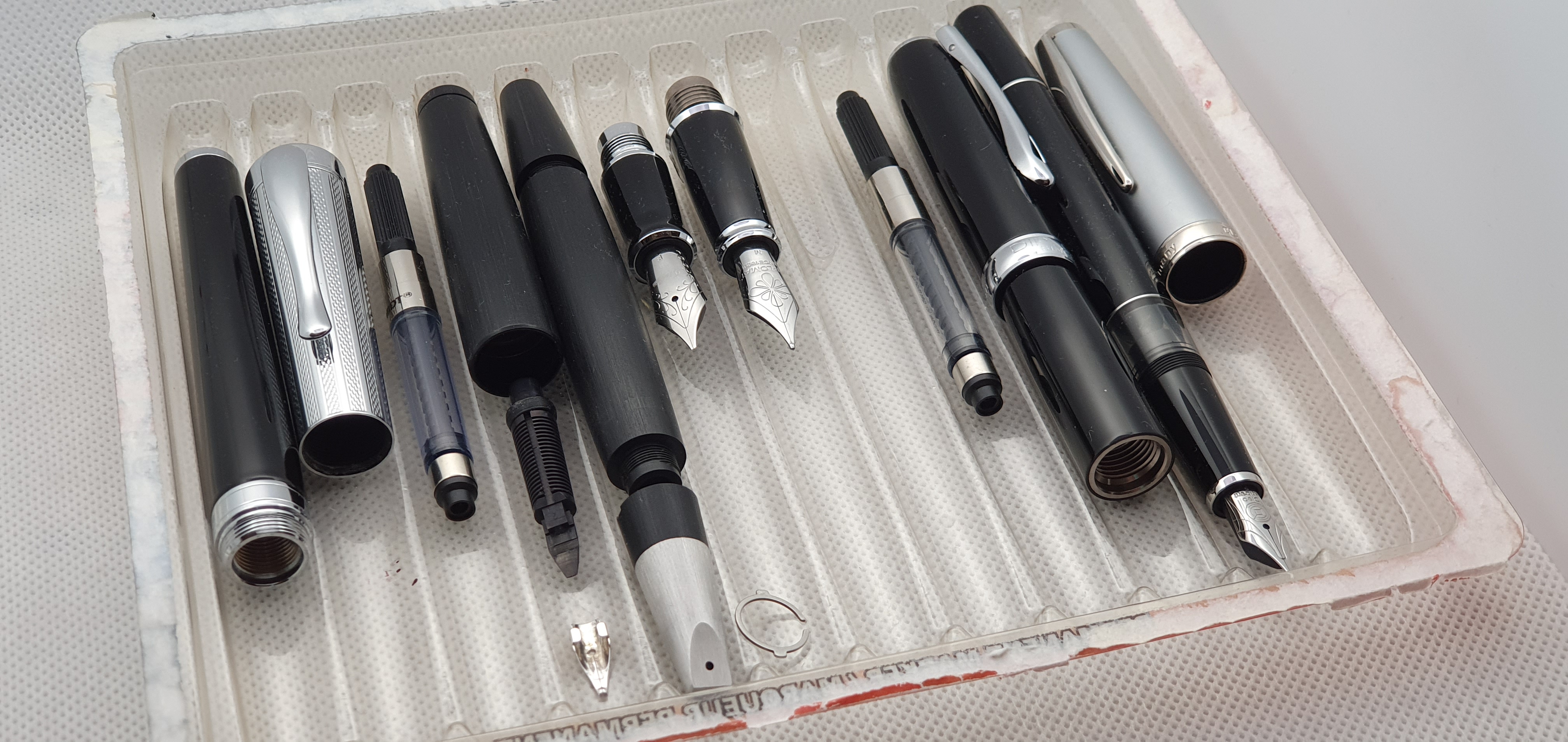
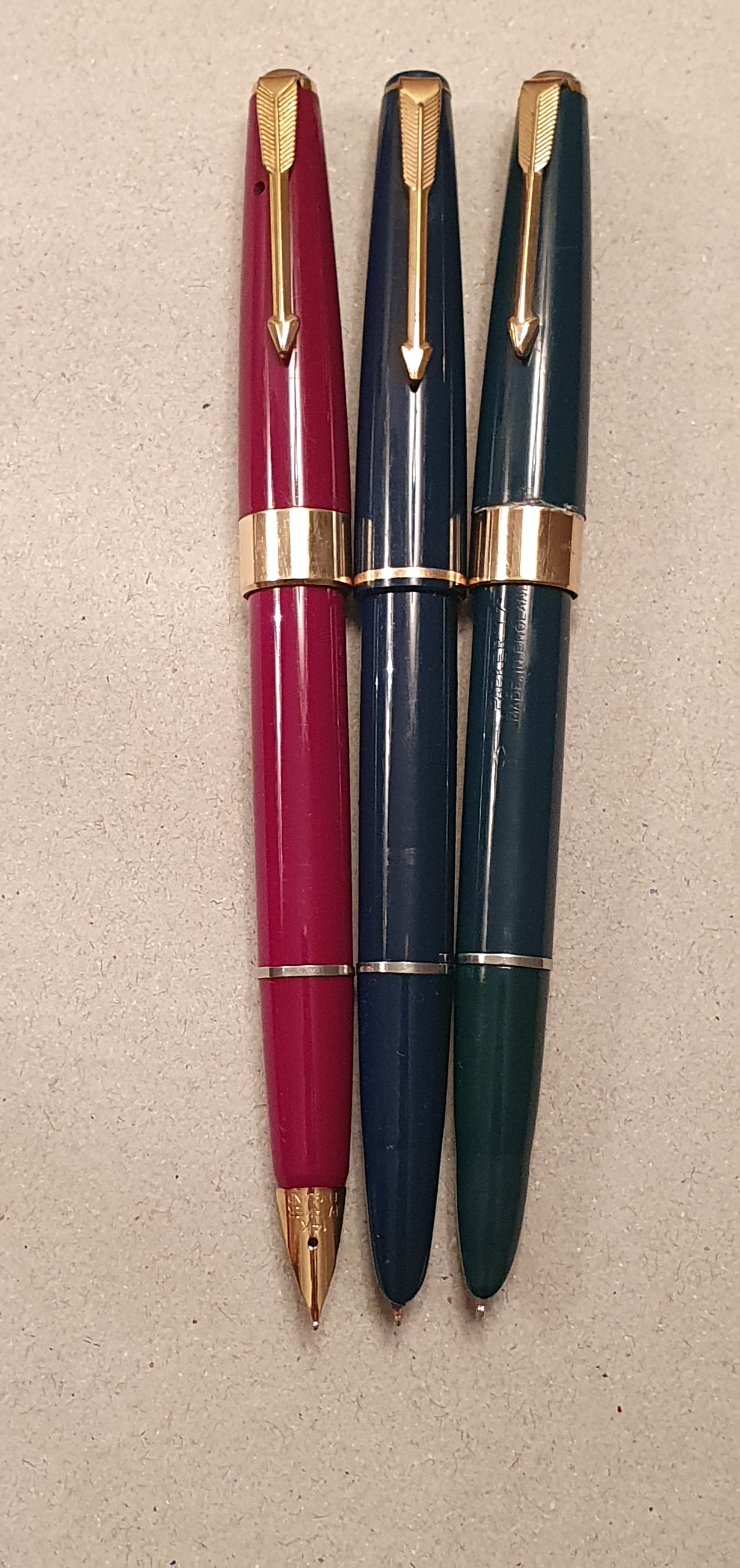
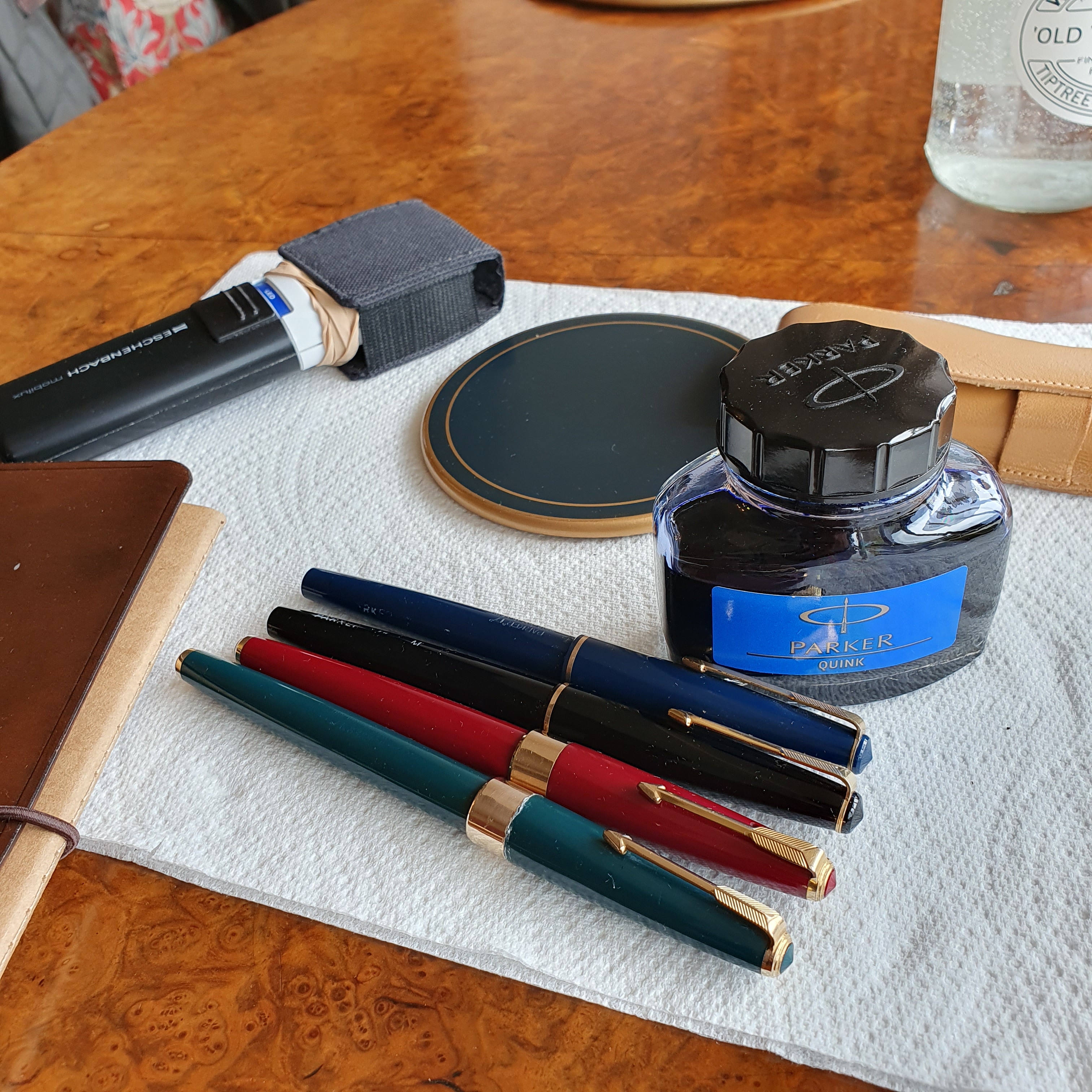
During July, I had an outbreak of Parker Pen Purchasing on eBay. The first of these was a Parker 17, in black with a medium nib, which I wrote about earlier. This was followed by a Parker 51 also black, but with an oblique nib which I was very keen to buy. Next, there were two more Parker 17 fountain pens, each for sale by auction. There were no competing bids and I got both 17’s at their opening prices of £16.99 each, plus p&p.
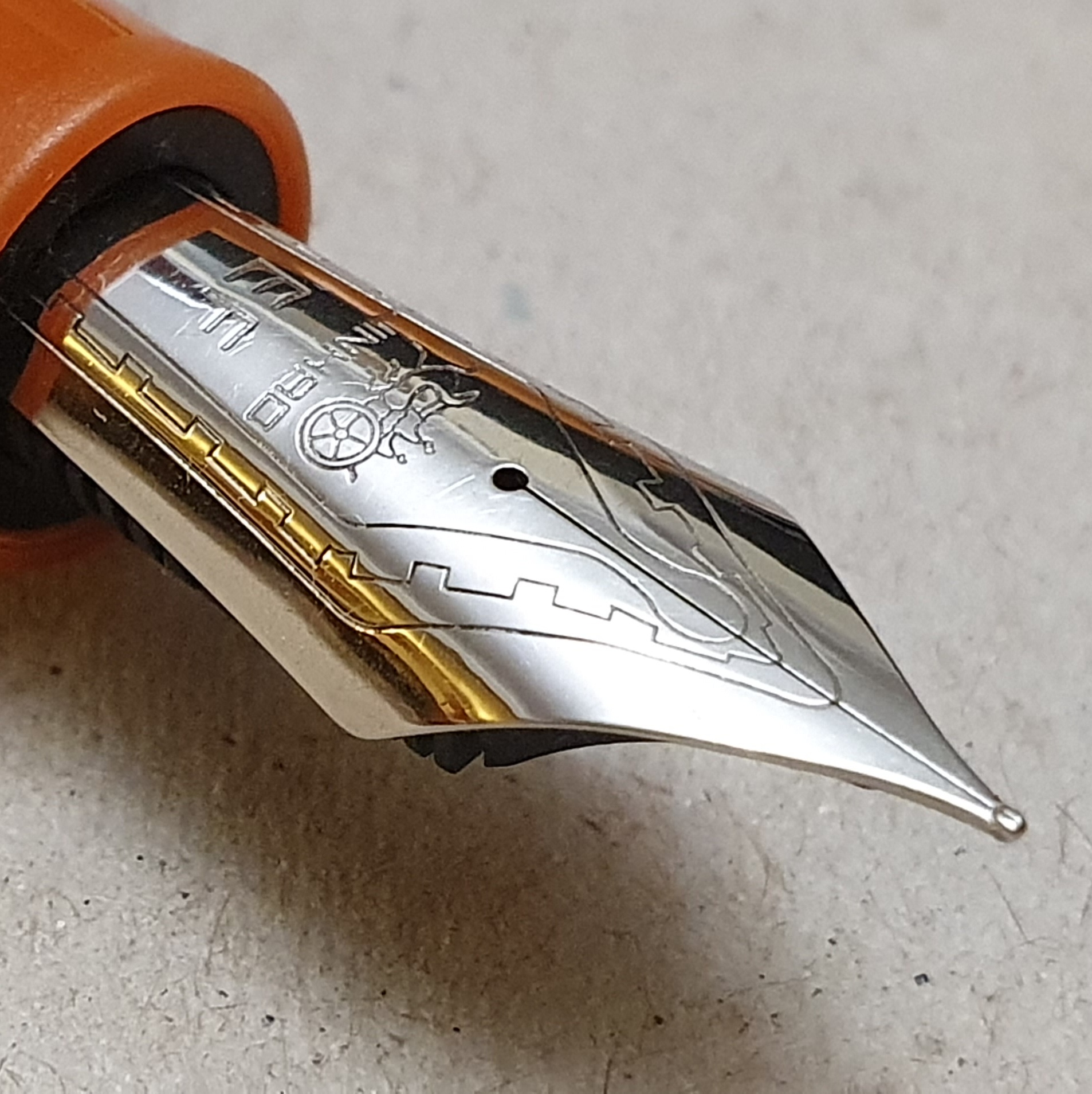
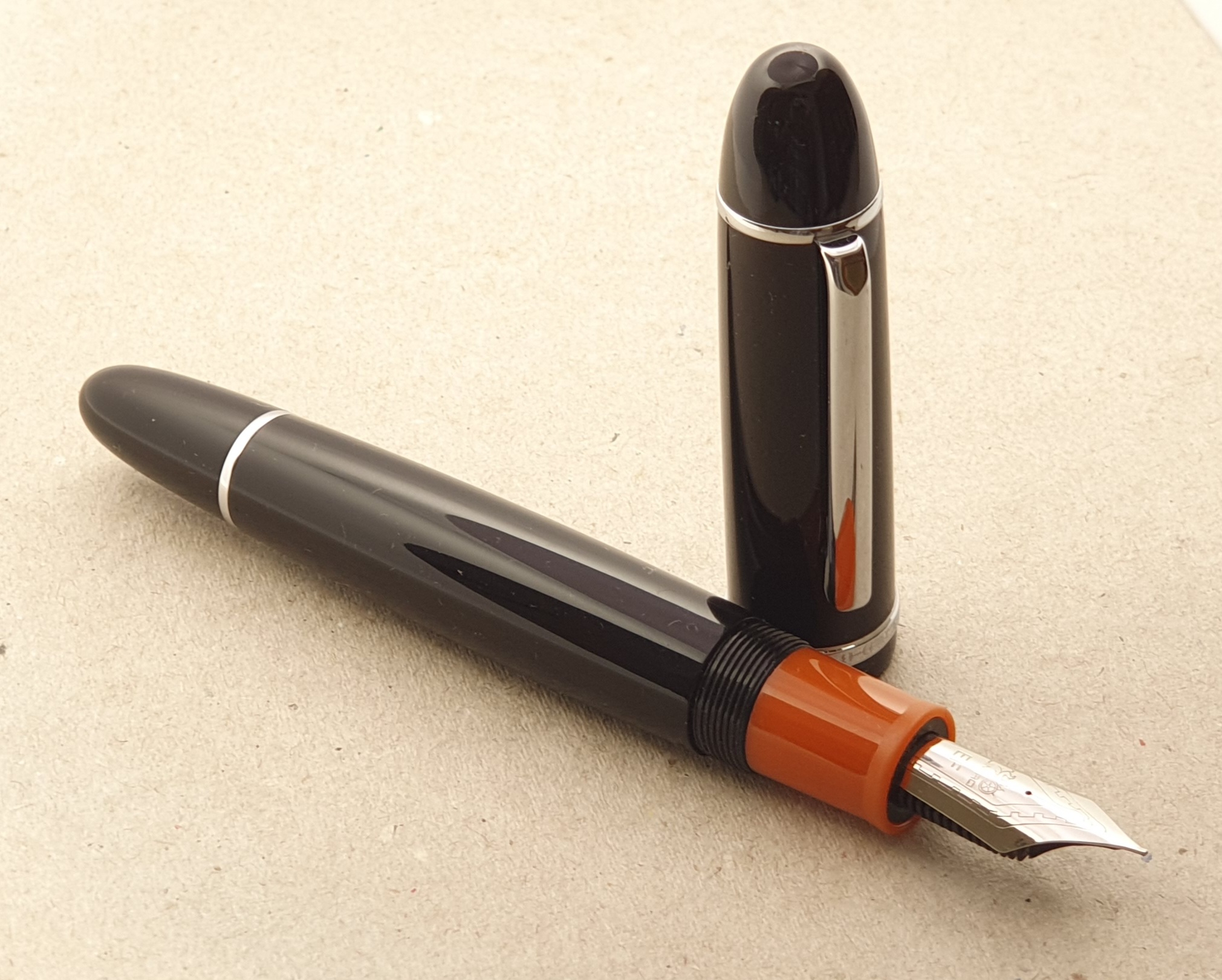
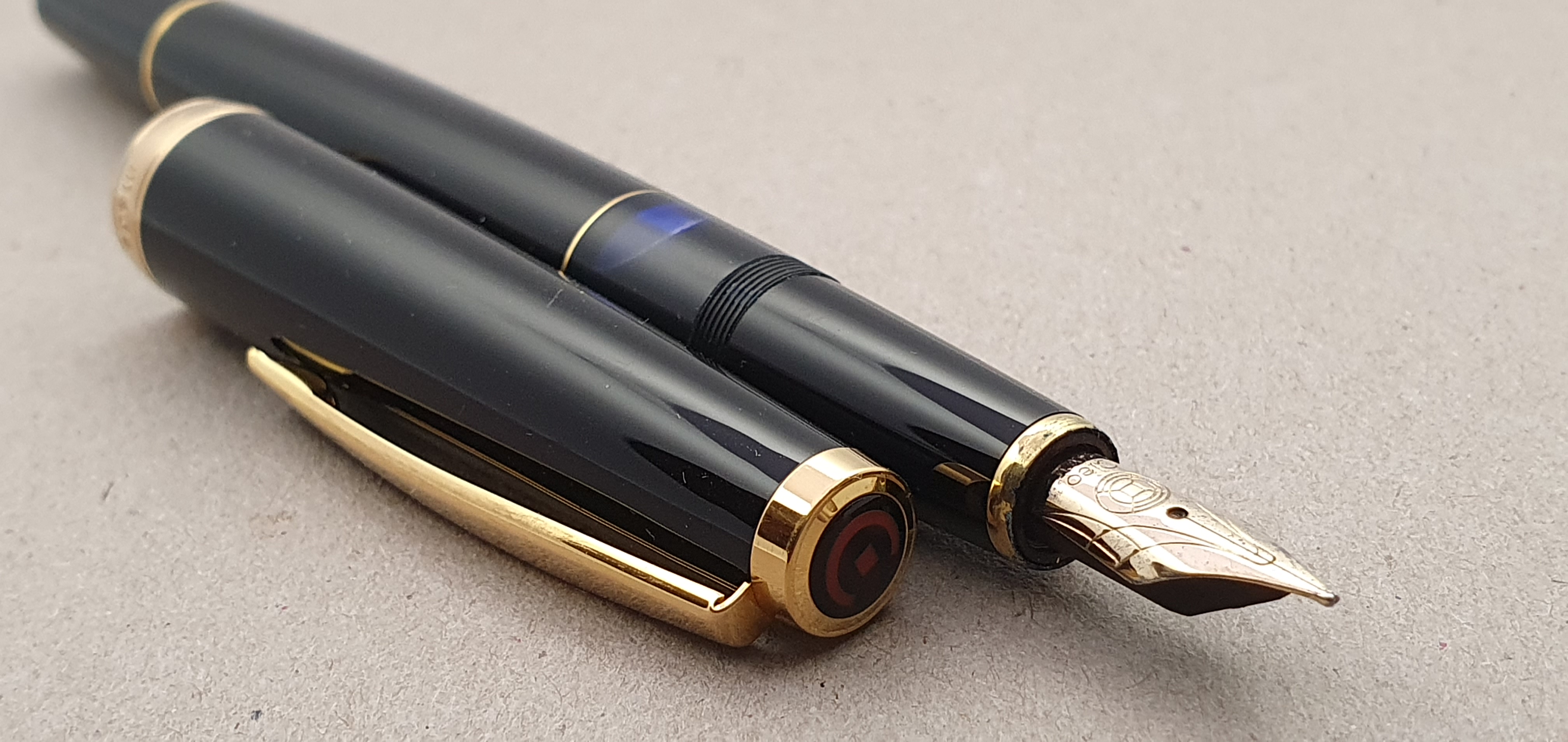
The final purchase was rather more dramatic. I had seen a Parker 17, burgundy red fountain pen, with the open, “beak” nib, made only from 1962 to 1964 and harder to come by. I read that these command a higher price than the later, hooded nib models but had heard good reports of the nibs.
The auction was still several days away. For most of this time, mine was the highest bid but I made a maximum bid, of £59.90. In the tense final few seconds, I watched my screen helplessly as a flurry of increased bids were placed. I was successful! Afterwards, I found that another bidder had offered £58.00 with just four seconds remaining: eBay then bid one pound higher for me automatically, so it was a close shave.
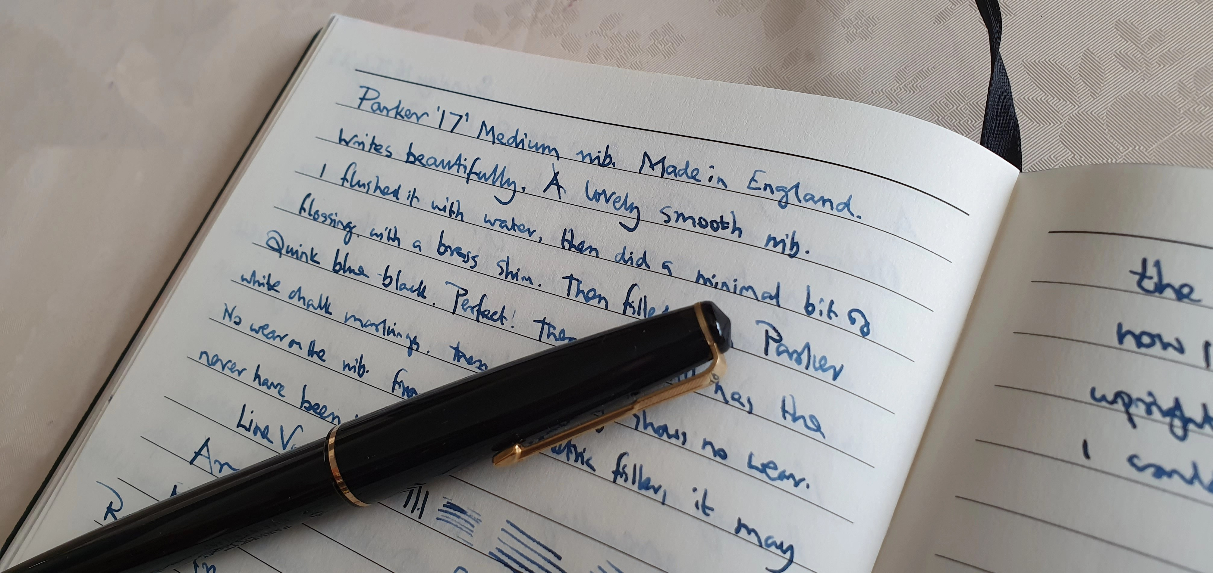
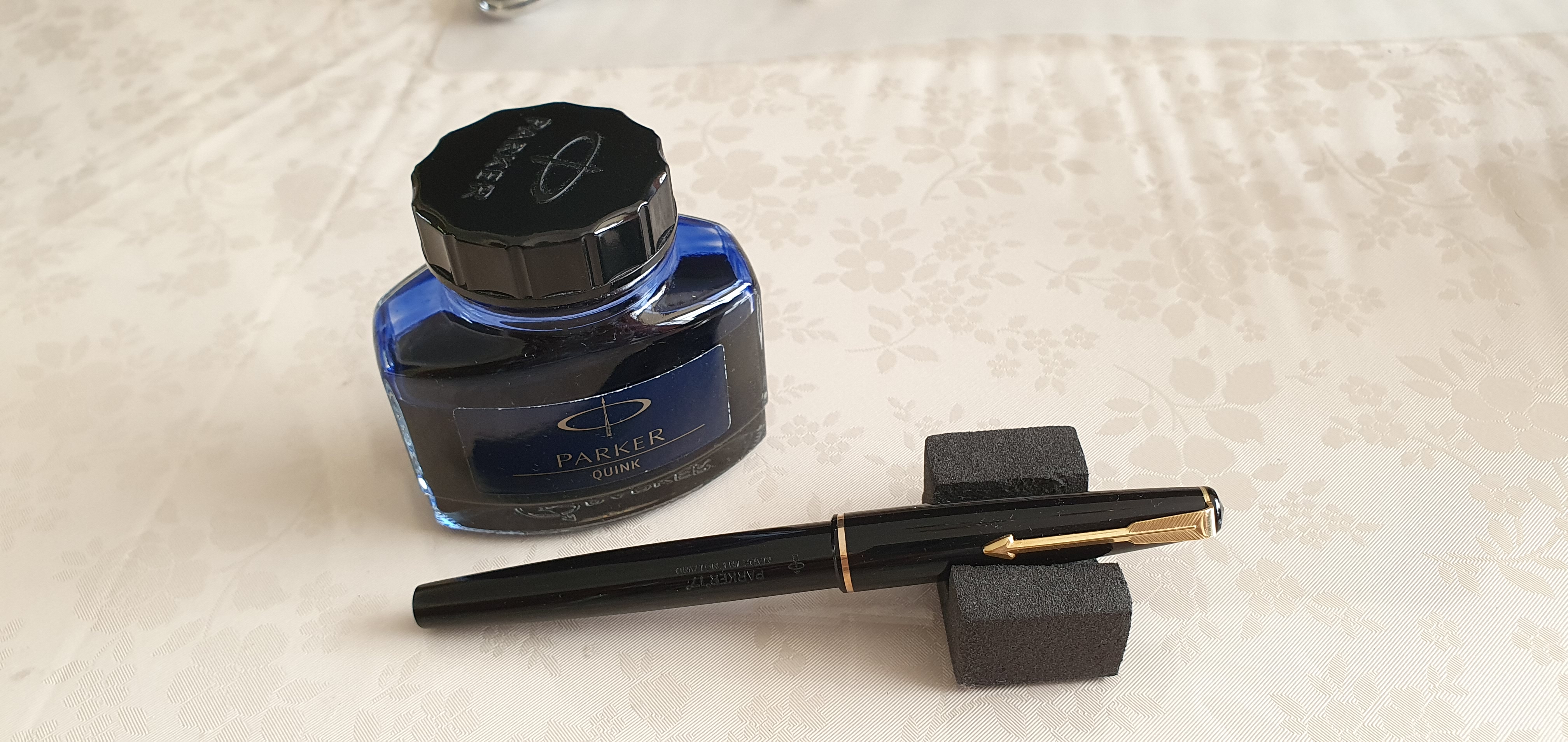
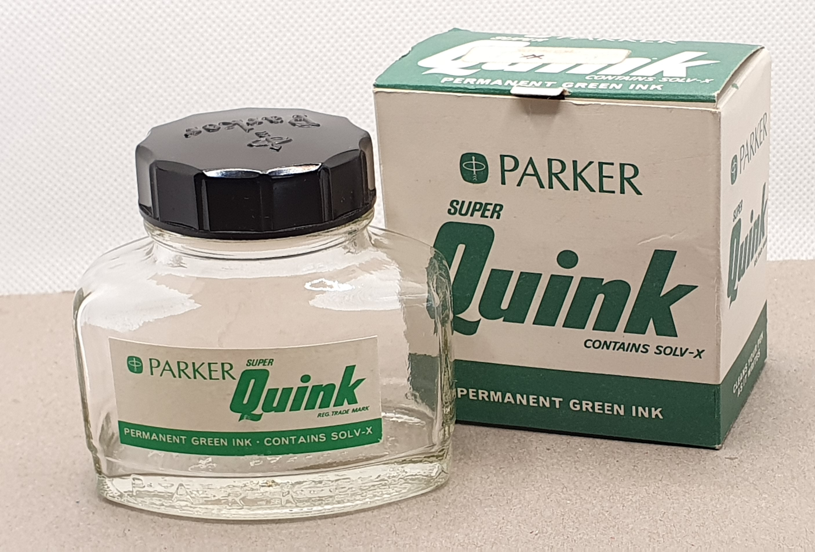
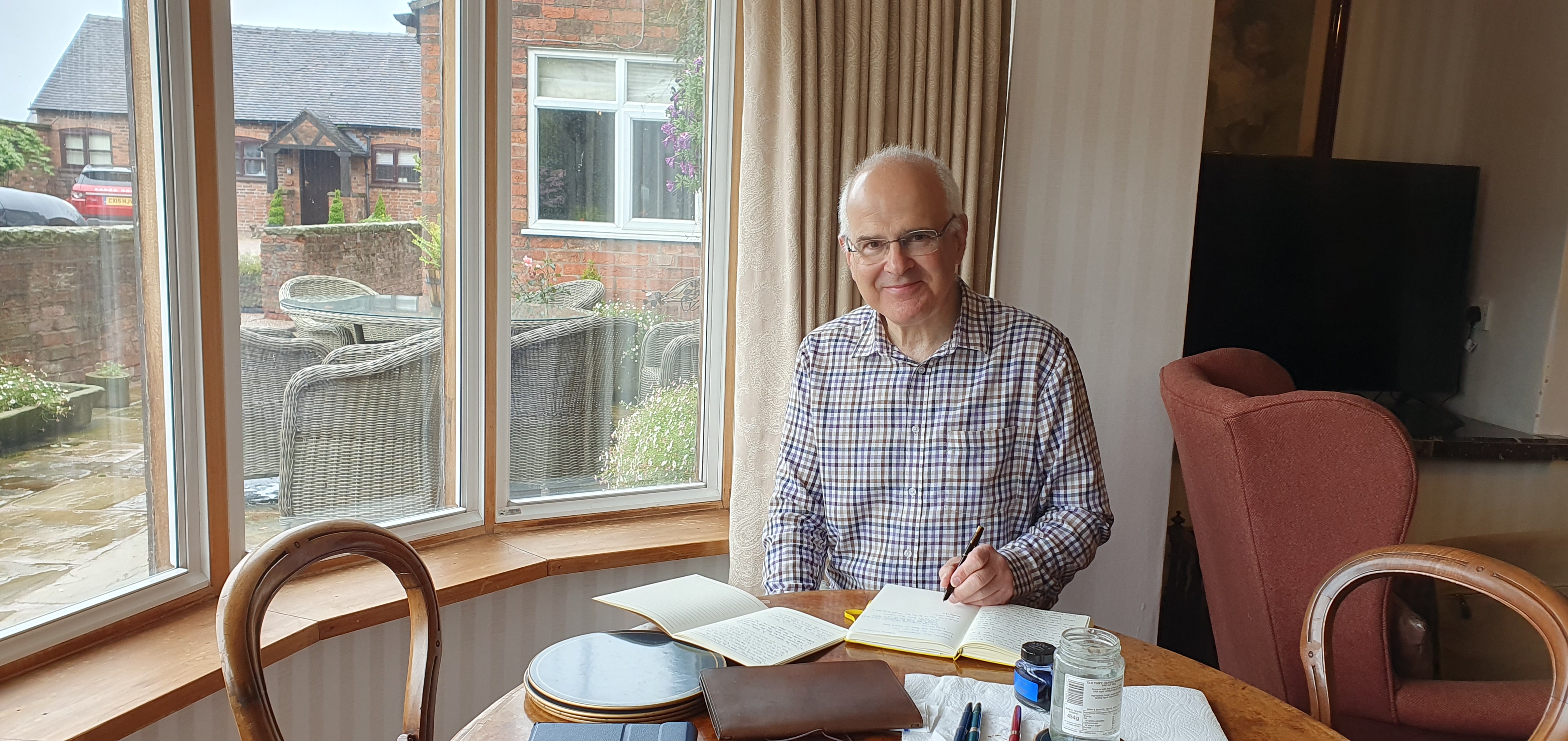
These last three Parker 17s arrived just as we were setting off for our break, so I was able to bring them with me to clean and try out, with a bottle of Parker Quink Royal Blue.
It was wonderful to get away and have a change of scene. We were in a rural area with views of fields and trees. Our comfortable cottage had vintage furniture, a large kitchen with an electric AGA and a lounge/dining room which included a grand piano, which I enjoyed playing.

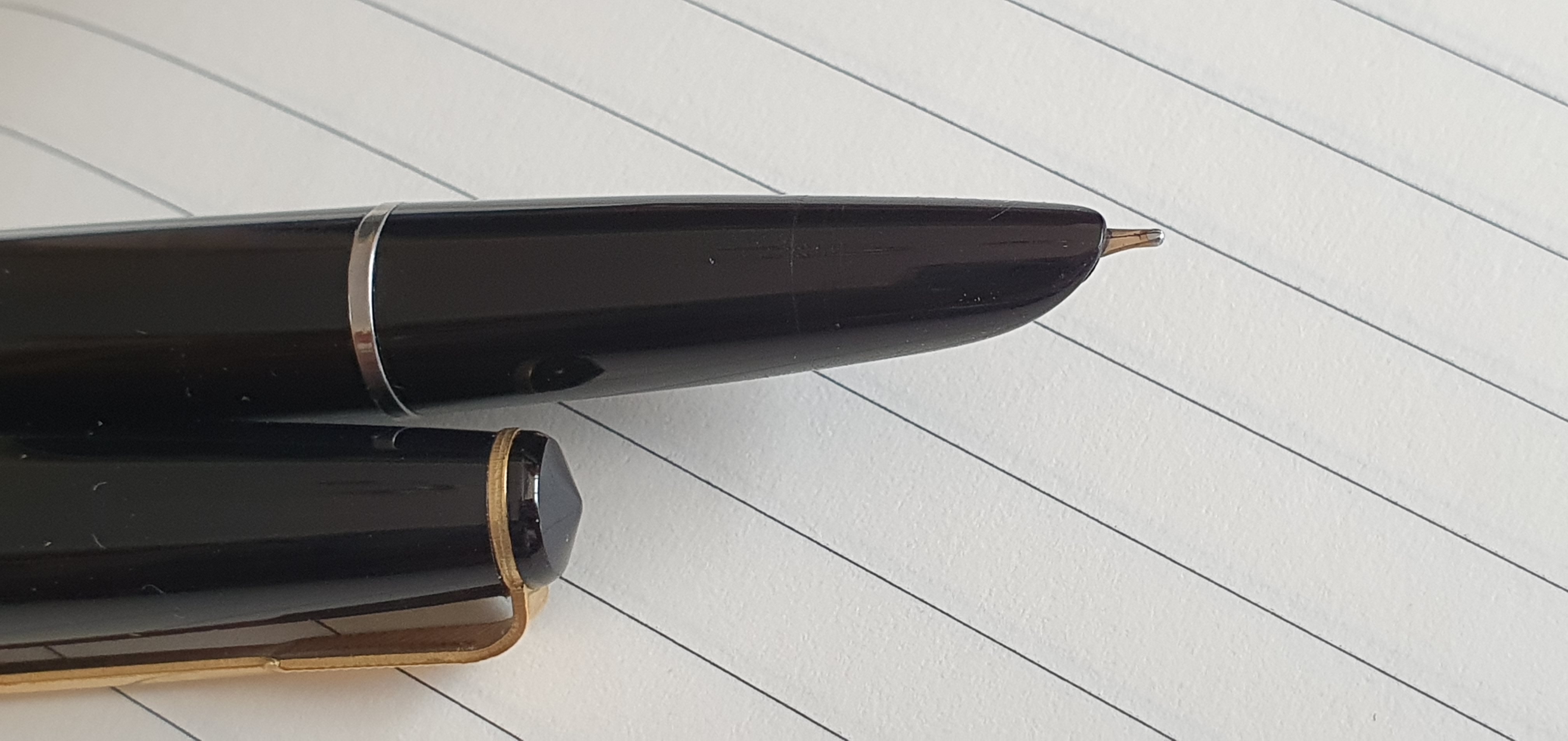
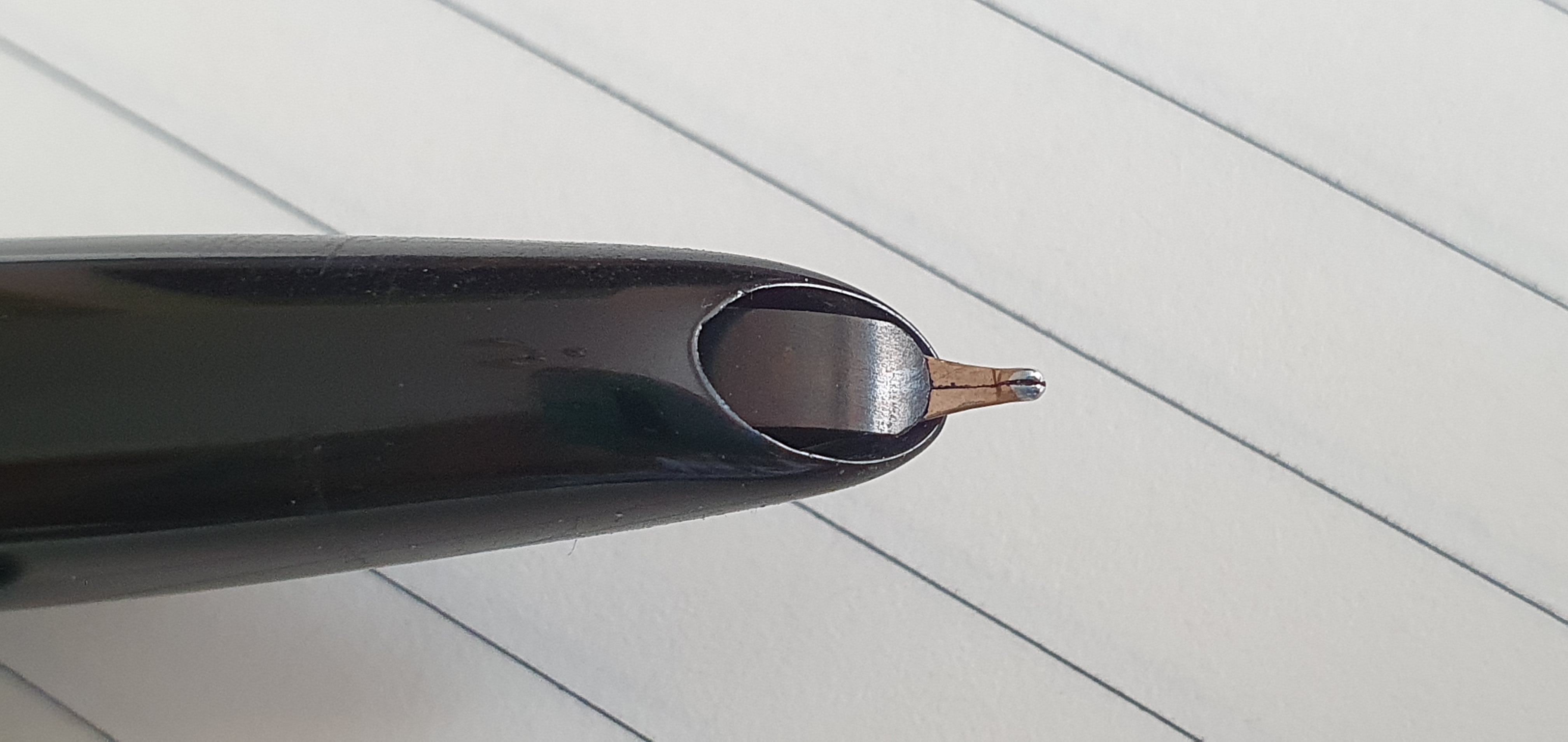
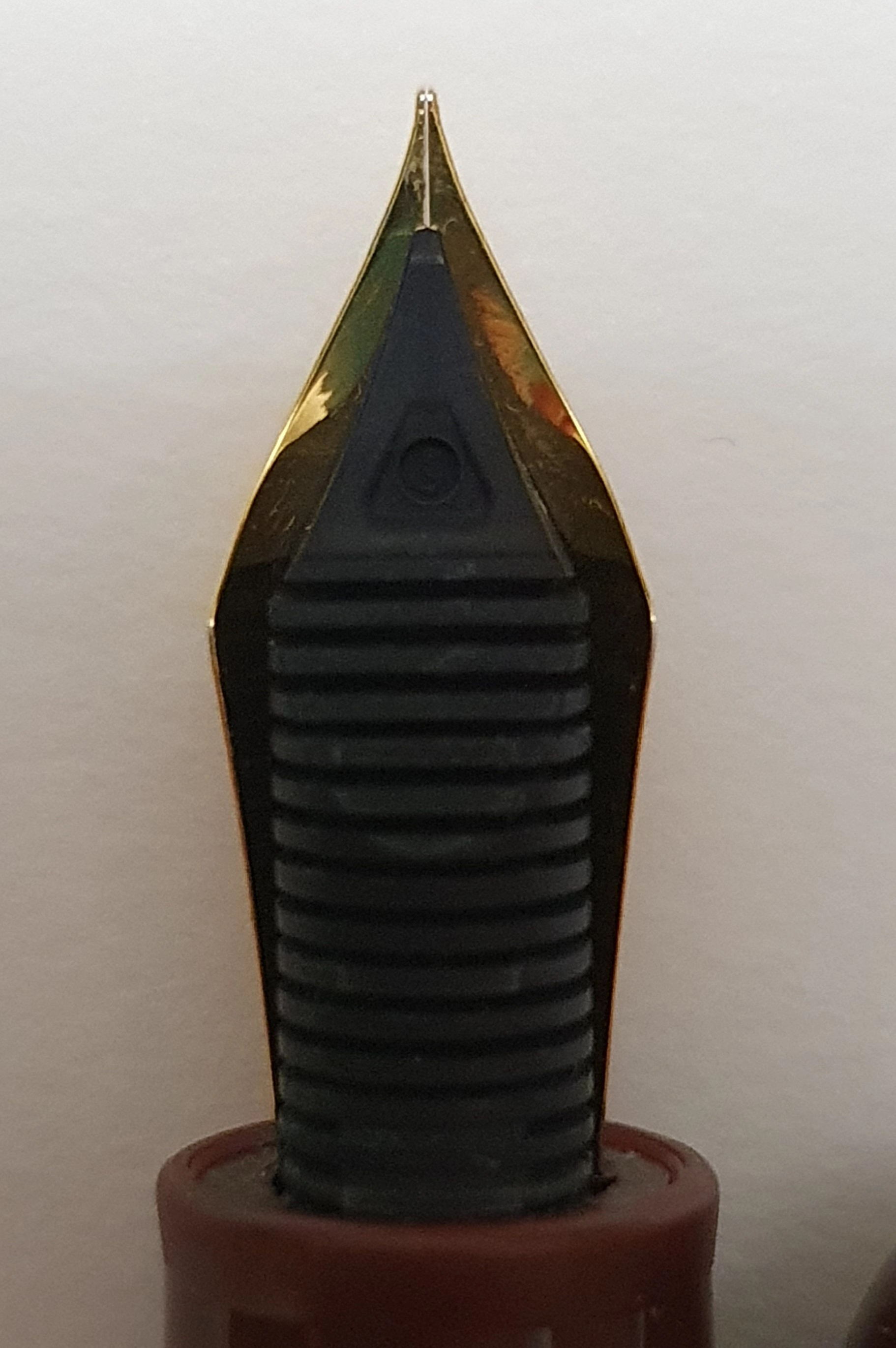
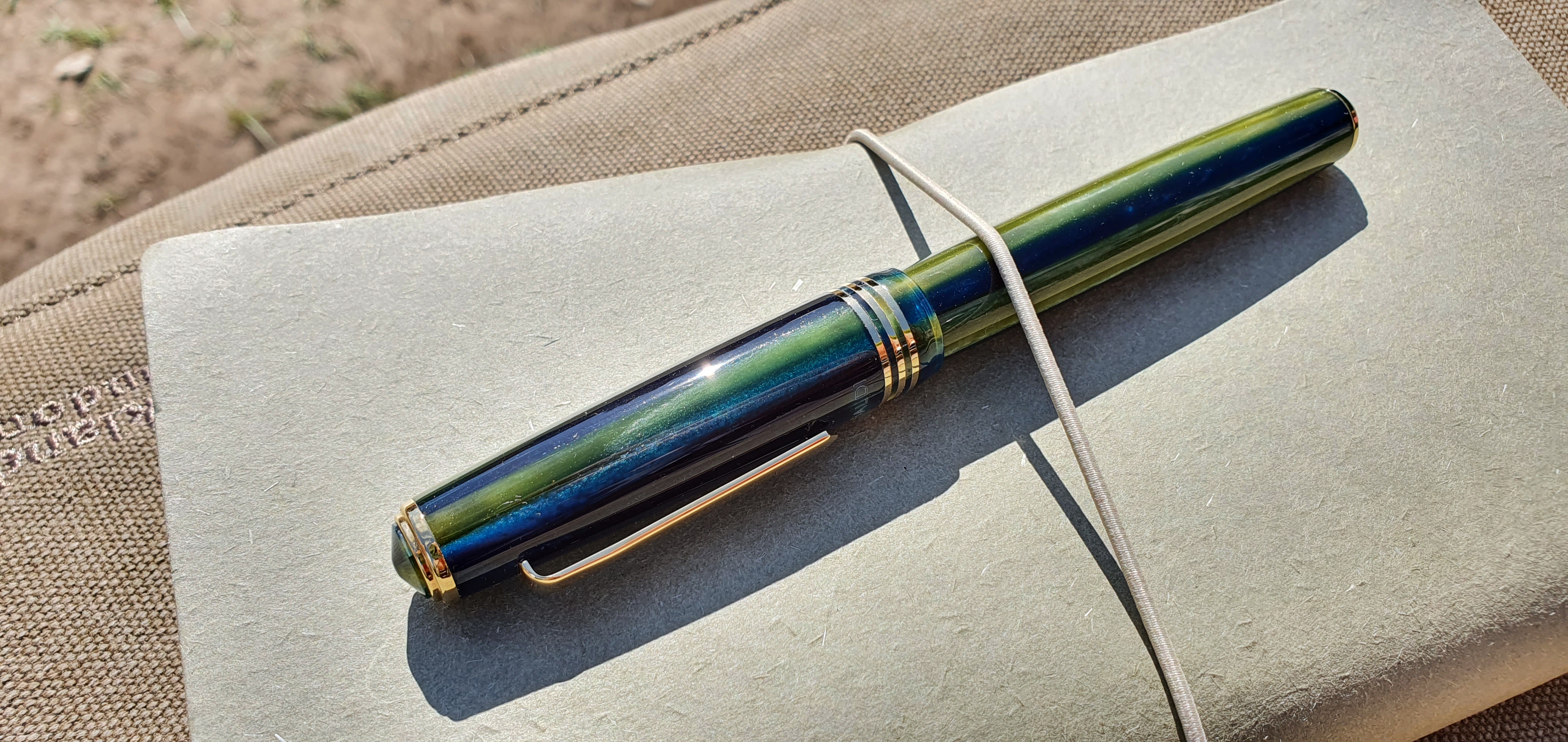
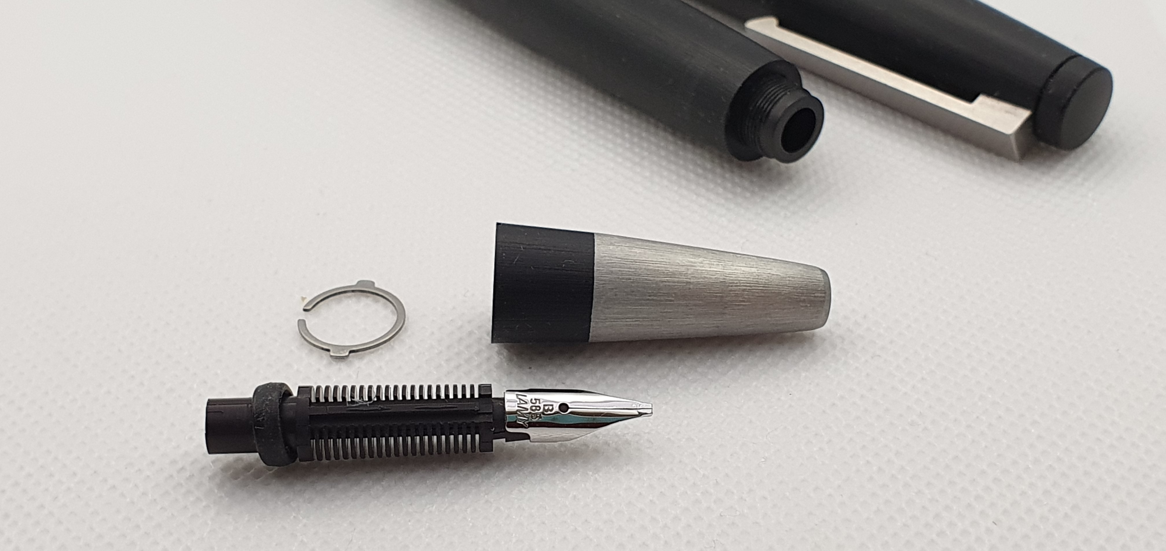
There was time to inspect my three new Parker 17’s. The blue one was a basic, standard model with a medium nib and wrote very nicely, with a pleasing bit of feedback. The green one was the Parker 17 Super Duofold, which featured a wider gold coloured cap-band and a ring on the end of the barrel. However this one had a few issues. The cap-band appeared to have been glued but with glue residue around the edge, on the cap. Also the cap was unusually tight. The grip section was misshapen, as if it had been forced into a cap that was too small. The pen filled normally and the nib was glassy smooth and felt like a broad.
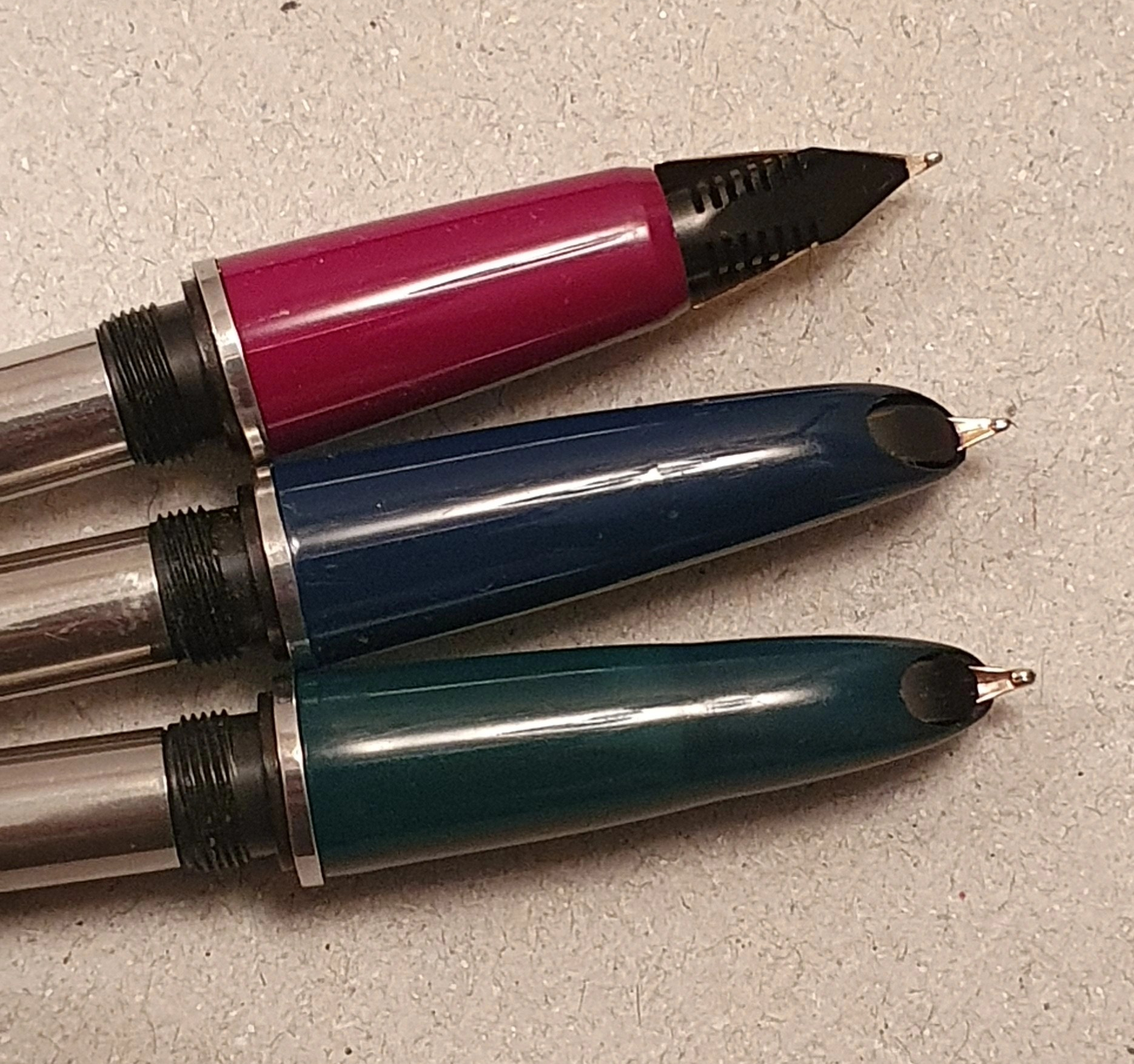
However, the pen would write only for a paragraph or so before drying up and suffering “ink starvation.” A check inside showed that the ink had not got stuck at the back of the sac and so it was not obvious why ink flow had stopped. I suspect that it may be an issue with the air replacement to the sac, rather like trying to pour from a carton of milk with only one opening.
Talking of milk, we were invited to watch the cows being milked in the afternoon. This was a highly informative and memorable experience. The owner had farmed here for 53 years, taking over from his father who came in 1930. These days, the milking process is highly computerised with the milk piped to a large holding tank. The milkman comes to collect, every day including Christmas Day. The milk from this farm, goes to make cheese. Whilst being milked, the cows eat from a hopper of grain, which is automatically piped into the milking sheds from a big silo outside. Each cow is identified on the computer system, which monitors how much milk they yield and how much grain to give them. We were shown the harvester, which cuts grass for silage, the cows’ winter feed. It was quite an education for us city dwellers.
We explored the nearby city of Stoke-on-Trent. We browsed the shops and bought some clothes and shoes and enjoyed a meal. There was little in the way of fountain pen action, aside from a WHSmiths with Lamy and Parker pens for the “back to school” season. Looking at these, I felt that my vintage Parker 17s with their 14k gold nibs were a better buy.
Returning home, I found that my Quink bottle had leaked. It was only around the cap and had not done any harm except that I got it all over my fingers. Fortunately it was Washable blue, but I might not chose Quink bottles for travel next time.