
Like many others in this hobby with a passion for fountain pens, I have suffered from Gear Acquisition Syndrome and now find myself with an embarrassing number of pens, unused notebooks and bottles of ink. From time to time I need to remind myself of what I have “in stock.”
When my late Godfather (“Uncle Brian”) died, his wife Mary offered me his almost full bottle of ink. It was Cross Blue. I gladly took it to finish and have been getting through it in the pen that I use at work, a Cross Bailey Light. It is now on its tenth fill, since last December.
Unlike Uncle Brian, I have two drawers full of bottled inks in various colours and will never get through it unless I decide to paint the walls with it. Of course it is nice to have a good selection of different inks to play with and most inks keep well for years. (One exception is registrar’s blue black iron gall ink, which once opened, is best used within 18 months or so, before it starts to lose its darkening ability).
I may at last be reaching the age where my desire not to fill my house with extra possessions, can sometimes outweigh the attraction of the thing itself. As I try to to use and enjoy what I have, it can help to break this down into smaller goals. Green inks are a category of inks that I have relatively few of. I can count my bottles on the fingers of, well, two hands.

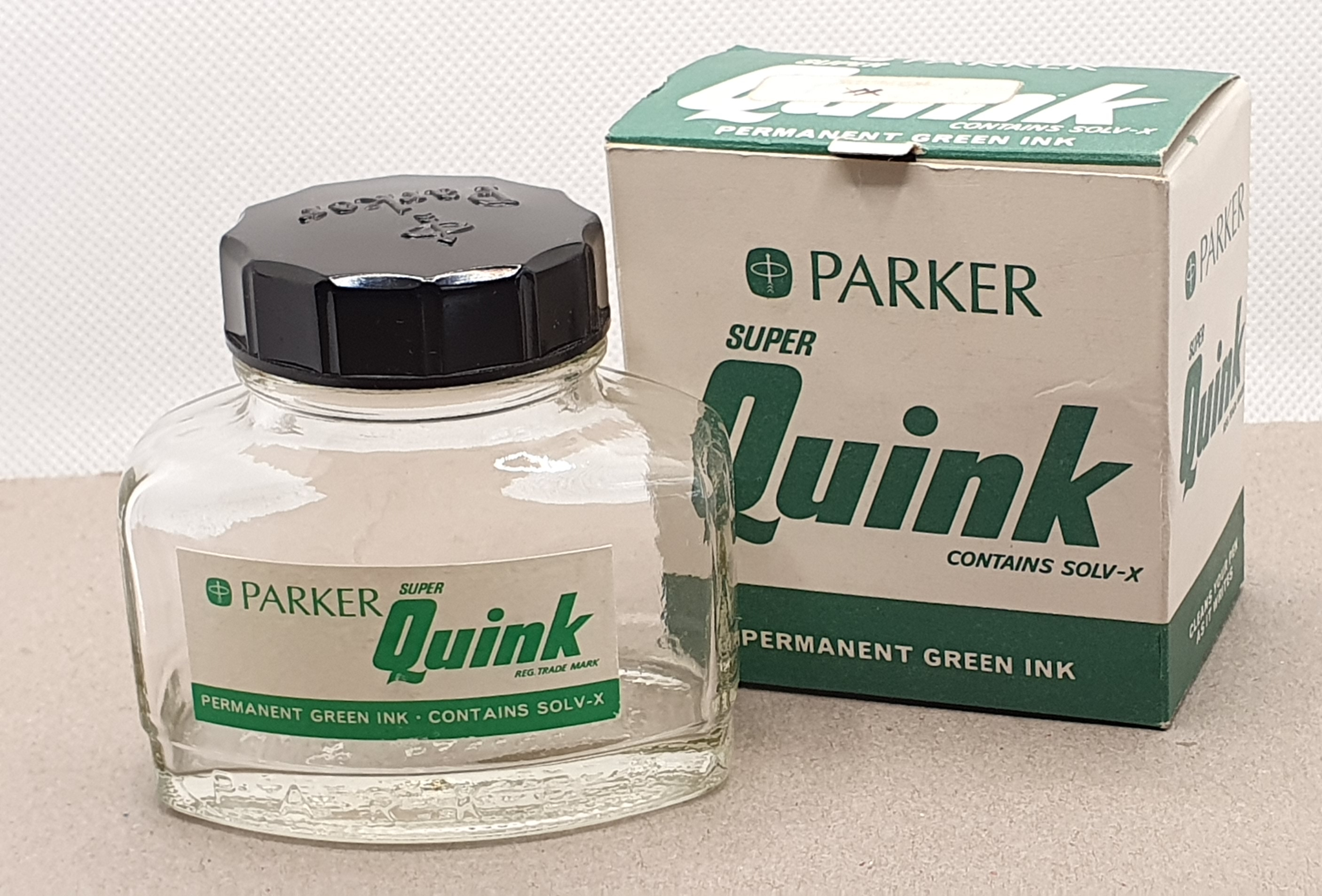
The only one of these that I have finished, and which was for many years my only green ink, was a bottle of Parker Quink. I still have the classic bottle and its cardboard box. Sadly these bottled inks are sold in plastic blister packs now. My bottle has a faded price label and I can still see that it came from WHSmiths.
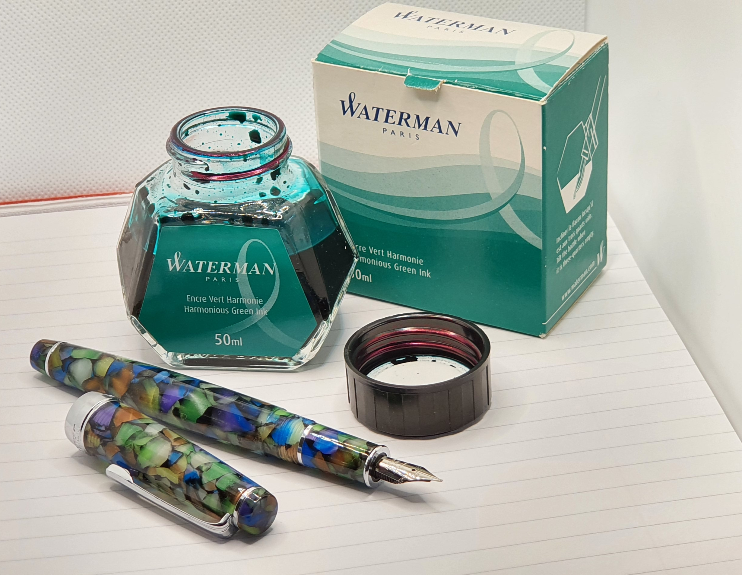
A modern equivalent, for a good day-to-day green ink might be Waterman’s Harmonious Green. Nowadays, I like to write the date of purchase inside the box lid. Mine bears the date 26 September 2015 and I bought it in the Burlington Arcade, off Piccadilly in London. It is still a good two thirds full. However I am now using it regularly in my Delike New Moon, fude nib pen. It is a good combination for the marbled green acrylic pen. It is an inexpensive ink for an inexpensive pen.
I have some more up-market green inks: Montblanc Irish Green and, probably my favourite, Graf von Faber-Castell Moss Green in its attractive heavy bottle.
I have a 30ml plastic bottle of Diamine’s Deep Dark Green, which I bought at the same time as their Deep Dark Blue and Deep Dark Red. I used the Deed Dark Blue by far the most and finished the bottle, often using it in a TWSBI Vac 700 or Diamond 580.
Some less common greens are my Noodler’s Sequoia: a brim-full glass bottle containing 3oz of this green-black ink. Unfortunately, although I was very taken with the colour, I found it all but unusable for a lefty-overwriter as it is so slow-drying and smudges long after I would expect it to be dry.
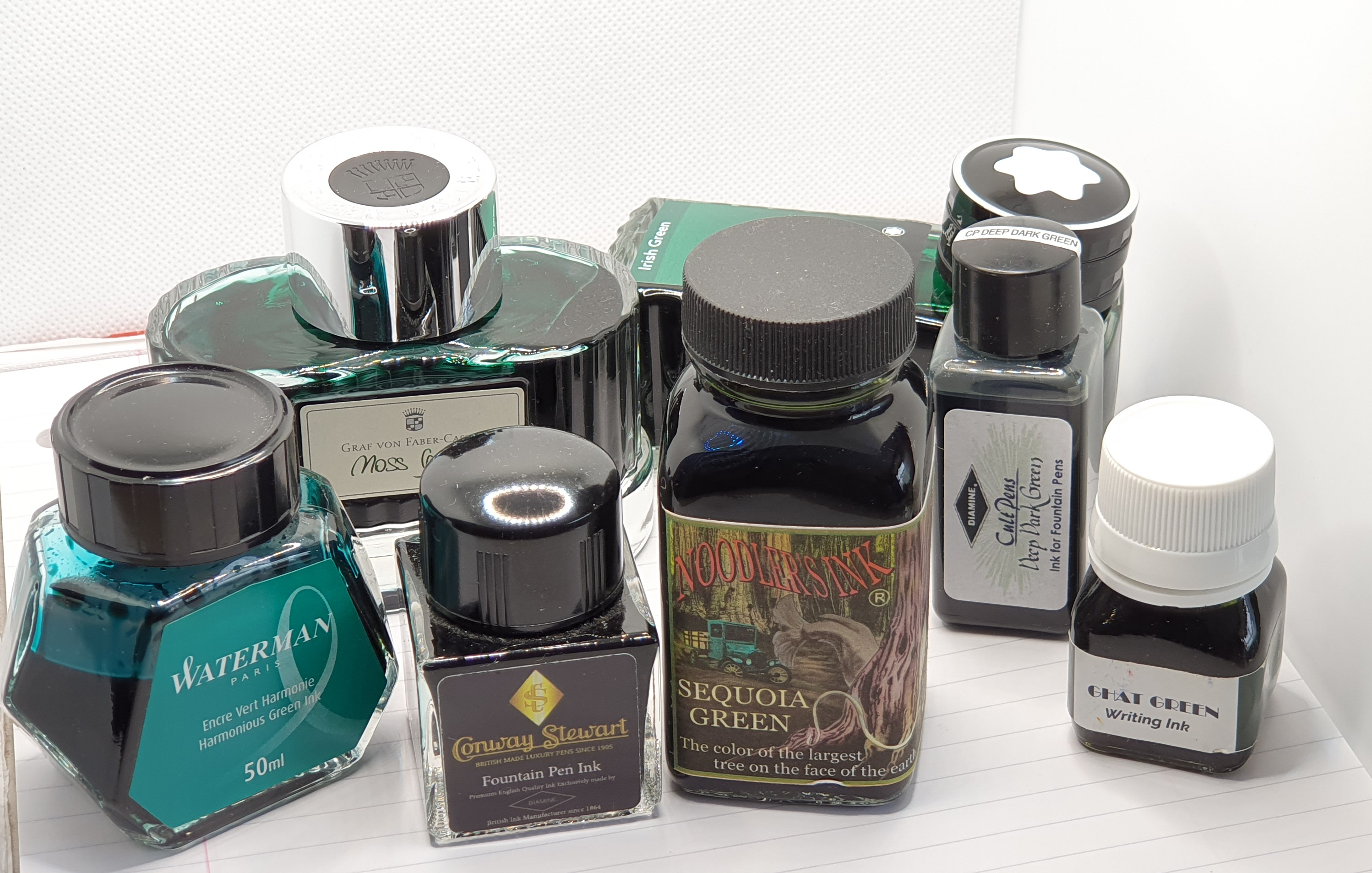
At the London Pen Show one year, I picked up a cute little bottle of Conway Stewart green ink, made by Diamine. I do not know the name of the colour but think it was of the same series as Conway Stewart Tavy, which is a nice blue black. However I bought it more for the bottle, nice for travelling, than the ink.
Finally, I have a bottle of Krishna Inks Ghat Green, which is an attractive khaki green-gold. I did not use it much at first as I suspected it of causing unsightly and disturbing nib crud on my Montegrappa Fortuna’s steel nib. But I later gave it another chance, in my Sailor Pro-Gear with a 21k gold nib and have had no problems with it at all.
If you want to get through ink faster, using a pen with broad, stub or music nib will help. Or you could use it for drawing. For some years I could not settle to using a green ink as I would soon have the urge to flush it out and refill with a blue. But I now appreciate a green ink from time to time and it is well worth having at least one green-inked pen! I heard it said that there is, or was, a convention in the Royal Navy, of different colour inks being used by different ranks of officer. I have not been able to verify that. I do remember that green was the colour of correspondence from Rolex, if you got a typed letter from them in the 1960’s. It also makes a good colour for amending and editing typed drafts, rather than red.
A green ink can look attractive, particularly on cream coloured paper and paired with the right pen and can make a refreshing change from the usual blues. I don’t know when I will next finish a bottle or whether I will ever own just one bottle but I am at least trying not to buy more.

I’m with you on Graf von Faber-Castell’s Moss Green – well worth the slightly up-market price tag. I have found myself falling out of love with green ink over the past nine months or so and I am not sure why. I’m waiting to see if the passion returns.
LikeLiked by 2 people
Thanks Pamela. It is probably natural that certain colours go in and out of our repertoire. I do not use browns very much but do like Smoky Quartz a lot. Sometimes it is just a matter of finding its “forever pen”.
LikeLiked by 1 person
Green is my favourite colour so I have more green ink than any other. Think it stems from finding out that ‘M’ wrote exclusively with green ink.
LikeLiked by 3 people
I was not aware that ‘M’ used green ink but that sounds fitting.
Yes, I recall you are a fan of Montblanc Irish Green and get through a lot of the stuff.
LikeLike
Perhaps I need to buy myself a bottle of Herbin’s Lierre Sauvage which was historically my favourite green.
LikeLiked by 1 person
I am not very familiar with J Herbin’s colour palette and had to look this up. I hear nothing but good things about their inks. Also it is so nice writing their names. Lierre Sauvage looks a good choice, although from the picture I have seen, the shade does not appear sufficiently different from some greens that I already have.
LikeLike
Several months ago I thought green would be a good work appropriate ink. It didn’t occur to me to try samples in order to find that one perfect shade. Not sure I’ll ever use up so many bottles of green ink.
LikeLiked by 2 people
Yes there are a great many green inks available now. Diamine have 20, according to the colour chart on Cult Pens’ website. Typically the best shade is the one you have not yet bought.
LikeLike
I know it doesn’t work for everyone, but I will often buy a box of cartridges if I want to test out a colour ahead of splashing out on a bottle.
LikeLiked by 1 person
I prefer earthy colors and green has always been a fave. I have the Diamine’s Deep Dark Green but it didn’t impress me.
LikeLiked by 1 person
Thank you for your blog, it is always interesting. This link (https://www.navy.gov.au/customs-and-traditions/chiefs-navy-use-green-ink) gives some background to the use of different colour inks in the Navy. In the past I worked in a civil service audit department. When we were auditing, we could use red ink, the national audit office could use green. Our head of department could, I think, use purple. Otherwise it was blue or black. Perhaps if you were adventurous, blue-black. More tellingly, perhaps, we all stuck to it.
LikeLiked by 1 person
Thanks very much for your comments Bert and for the link. It is good to see what appears to be a humble Bic multi-pen in the last photo.
These traditions of different ink or font colours indicating the rank of the author, are interesting and are a useful tool to quickly gage the seniority of the sender.
LikeLike
A great post on a under-appreciated ink colour!
I managed to obtain some green Quink a while ago, via a friend who picked up a large bottle from a successful eBay bid. I do like the bright colour and agree that it would be good for editing printed copy. My current green of choice is Conway Stewart (Diamine in a slightly different bottle) Sherwood Green although I don’t use it as my primary(!) ink colour for fear of being labelled as an eccentric at best… https://www.worldwidewords.org/qa/qa-gre5.htm.
LikeLiked by 1 person
Thank you for your comments and for the entertaining article about “green ink letters”. There are some lessons there in how not to write a letter of complaint!
LikeLike