
This weekend has seen some more inky goings-on which, taken on their own, might not be blog-worthy but together seem worth sharing in a round-up.
I am still delighted with the Cleo Skribent, piston filler fountain pen, four weeks in. I can genuinely say that I feel happy every time I remember it. The first fill, with Aurora Blue was still not quite finished when I ordered a bottle of Monteverde Napa Burgundy and decided to flush the remains of the blue, to have an ink change.
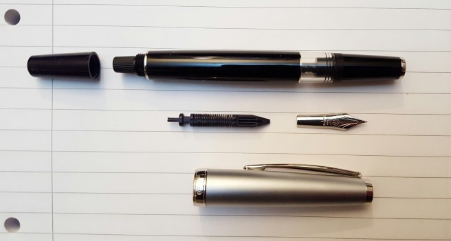
While flushing the pen, I decided to try removing the nib and feed. I had not yet found any guidance on doing this and was anxious not to cause any damage. I found that they are friction fit and came out very easily, when gripped together in tissue paper and pulled out straight. It is great to be able to rinse a nib and feed or remove the nib for any minor adjustments. To replace them, you just need to line up the nib and feed correctly, holding the nib on top of the feed centrally and with the right length of tines protruding beyond the end of the feed and then gently rotate them in the grip section until you locate the right way to push them back in.
Whilst the pen was empty, I dipped it in three different inks to see how they would each look from the fine (more like extra fine) nib of the Cleo Skribent. I tried Pelikan Edelstein Tanzanite, Waterman Harmonious Green and then Diamine Conway Stewart Tavy, which is one of my favourite blue-black inks. I tried these on three different papers in turn. The Tavy gave a slightly bluer shade than the Tanzanite.
I then had the idea of seeing whether any of my pens had nibs which were interchangeable with the Cleo Skribent. The nib looked to be about the same size as the nib on a Kaweco Sport, a Cross Apogee or a Monteverde Artista Crystal. All of these are friction fit and are removed just by a careful pull of the nib and feed together, taking care not to damage the delicate feed. The nib on the Cross Apogee is 18k gold with a silver-coloured plating. However, once removed from the pens, the nibs of the Cross Apogee and the Kaweco Sport were both shorter than that of the Cleo Skribent.
The nib on the Monteverde Artista Crystal appears to be same length as the Cleo Skribent and so I think it would be possible to use that in the Cleo, if I wanted a Medium nib option. However, for now, I kept to the Cleo’s own nib.

On Friday, I received an exciting package from Cult Pens, including the Monteverde Napa Burgundy ink that I had ordered. It came in a 90ml bottle and boasts a special formula, which they call ITF (Ink Treatment Formula). This, it is claimed, “drastically improves ink-flow quality, extends cap-off time, lubricates and protects the ink-feeding systems from corrosion and clogging and improves ink-drying time on papers.”
Whilst this all sounds very commendable, I soon found that the colour when paired with the very fine nib of the Cleo Skribent, looked a rather pale pinky-brown rather than the rich dark burgundy red that I had hoped for. I will try it in a pen with a broader and wetter nib but meanwhile decided to flush it from the Cleo.
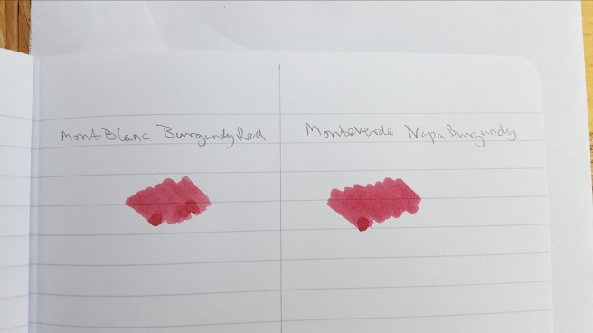
Furthermore, I did a very quick swab test comparison of the Monteverde Napa Burgundy with a Mont Blanc Burgundy and found that they appear pretty much the same colour. Others may conduct a proper and thorough comparison but to my eyes there is little to distinguish them in terms of colour on the page and if I was shown a sample of only one of them, I would be hard put to say which one it was. Of course, the other qualities listed above should also be evaluated and not only the colour. Anyway, happiness was soon restored once I refilled the Cleo, with the Tavy ink that I had sampled earlier.
On Saturday, I spent the day at a church in Flackwell Heath, Buckinghamshire, hearing first hand about all the excellent work of a UK registered charity, Jubilee Society of Mongolia. The talk was hosted by the church which has supported the organisation since it was founded. Two Mongolian ladies from the organisation had come over to give a presentation, celebrating its 15th anniversary.
After hearing about all the very important and valuable work that the charity is doing in Mongolia, it seems rather shallow to tell you only that I took notes all day, using a Sheaffer Sagaris in the morning and then the Cleo Skribent in the afternoon. Both pens were excellent for note-taking and did not dry out if uncapped for a while.
Also in that package from Cult Pens, as well as the burgundy ink, was my new Lamy AL-star in the Pacific Blue, special edition for 2017. I had not seen these in the shops yet. The colour and finish are very appealing. Cult Pens offers a choice of nibs, in Extra Fine, Fine, Medium, Broad and Left Handed. I was rather intrigued by this last option and telephoned to ask what it meant, before ordering. Was it an oblique nib? Or one which was adjusted to write wetter for lefties? And what nib width was it? I was told that it is simply a bit more rounded and forgiving for people to hold the pen at different angles. Being a leftie, I decided to try one. I also ordered a pack of the matching Pacific Blue cartridges.
I tried the new pen and ink as soon as they arrived. I love the colour of the pen and the ink. I thought the ink to be quite similar to Pilot Iroshizuku ama-iro. However on comparing them side by side, the Pacific Blue is clearly lighter than the Ama-iro.

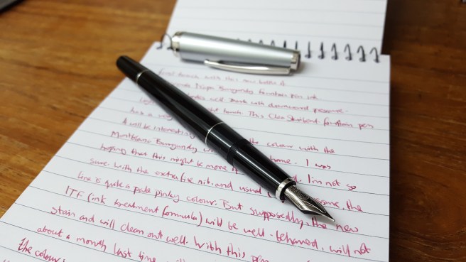
As for the nib, I had close look at it under the loupe. It has the letters LH on. There is generous amount of tipping material and the nib was usable straight out of the box, but a little skippy. I suspect it just needed to wear in. However, being impatient to enjoy the new pen and ink, I swapped over the LH nib for a medium nib from one of my Safaris and this is now writing very nicely and is the nib used for the writing sample pictured.
With this new Pacific Blue AL-star to brighten my pen cups, I now have seventeen fountain pens currently inked and need to bring this down.
This week I have one day out on a continuing professional development course. I am looking forward to taking notes with the Cleo Skribent again and possibly the Lamy AL-star Pacific Blue for annotating the handouts.


Oh you are absolutely correct about the burgundy inks. The new Monteverde Napa Burgundy is just the old Monteverde Burgundy, renamed, and I tested the old Monteverde Burgundy against Montblanc Burgundy Red in 2015, and found them identical on the dye level.
I hate to say it, but there’s a different burgundy is Graf von Faber-Castell Garnet Red, which is darker, and I think more attractive, while still remaining serious and suitable for work. There should be an Ink Snippet or Ink Review at my blog. I liked it so much, I ended up splurging on a bottle. You know how beautiful those bottles are. 🙂 And so many Diamine burgundies are attractive; you have Red Dragon, I think? 🙂
I love seeing that beautiful Pacific Blue! I am waiting to see the Petrol Safari in person before deciding whether to buy just the Al-Star or both.
LikeLiked by 2 people
Thank you! I should have done more homework before acquiring two identical burgundies:) I will look into the Diamine offerings, which are less of a splurge…although those GvFC bottles are very attractive:)
The Pacific Blue AL-star is very eye-catching and unusual. Once I get through the cartridges, I can wean it onto bottle-feeding and the ama-iro will make a pleasing combo.
LikeLiked by 1 person
love the pen and the ink color on the last photo ❤
LikeLiked by 1 person
The Pacific ink is Lamy Turquoise–they just changed the name to match the pen. This may or may not irritate some people. For me, Lamy Turquoise has been a long time much undersung hero: neat bottle, crazy shading and rock steady performance for a fraction of the price of Iroshizuku. I don’t really care what they call it (a rose by any other name and all that) as long as they don’t feel the new name deserves a price hike 🙂
LikeLike
Yes, I just learned this from another blogger yesterday. I agree, it is a nice ink and good value.
LikeLike