
Well, this is a bit sudden. This attractive pen has just arrived today, but as it was ordered and received all within 21 hours, it seems fitting to continue the momentum with some initial impressions.
I have had my eye on a Peerless 125 since they were first introduced a few years ago. I saw them first in Fortnum & Mason, where the gold plated guilloche version was on display under the bright lights. I looked at a black resin version in Harrods once. A few years passed. I acquired my Cross Townsend in quartz blue and wished that a Peerless would be made in that finish.
Seeing on a friend’s Instagram post this weekend that there is now a quartz blue option, my interest was reawakened. I wrestled with the usual conflicts. Did I need it? No. Would it be better than, say my Aurora 88? Probably not. But it had enough differences from my Townsend to make it a worthwhile purchase, namely a wider more comfortable girth, a screw on cap, a Sailor nib, the top-of-the-range kudos and a sparkly blue Swarovski jewel in the finial! Also, on offer at £235 it seemed good value at half the price of a Montblanc Classique, always a dangerous line of argument.
The unboxing.
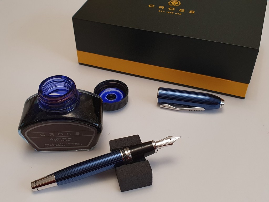
The pen arrives in a large, clamshell type cardboard box with a cardboard outer sleeve. First impressions seen in real life and natural light, are favourable with the beautiful rich blue glossy finish looking very handsome against the polished silver coloured fittings. Unscrewing the cap I was eager to examine the medium nib. It looked nicely tuned with a narrow tine gap visible under the loupe and the customary Sailor tipping which was flattened to form facets on the face of the nib and at the sides where the tipping is pointed like a spear head.
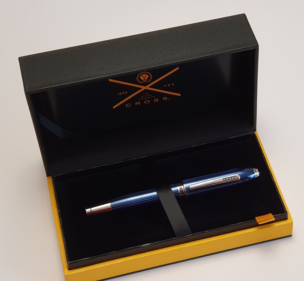
Beneath the pen tray, was a little foam compartment with a Cross, screw-fit converter, two black cartridges and a little velvet draw-string pouch for the pen. The pen no longer comes with an acrylic block display stand.
Description.
Although the cap and barrel feel smoothly lacquered at first, there is actually a texture from the striations beneath the lacquer which run down the length of the blue barrel, all the way round. On the cap, they do not quite go all the way round; there is a gap, of about one sixth of the diameter on one side of the cap where the lines are absent, not that you would notice unless you looked hard. If you put your finger nail against the barrel or cap and rotate the pen, you can feel the little grooves, which make for an interesting finish.
The cap finial has a little crater, like a volcano with a blue Swarovski faceted crystal set inside, which is quite lovely. I also found a serial number laser etched around the finial. Mine was ATX46987. I take it that the ATX stands for A. T. Cross Company LLC. Alonzo Townsend Cross was the son of Richard Cross who had founded the business in 1846. The truncated, bullet shaped cap top is unmistakably Cross. The pocket clip has CROSS in a black enamel background and is very firm. This makes it very secure for a shirt pocket although rather hard to use easily if you wish to show off that crystal. I am more likely to use a pen case.

The cap unscrews in just over two full turns, a much nicer experience than uncapping the Townsend, although taking a moment longer.
The section is smooth and quite broad, where the pen rests on your middle finger. I find it very comfortable to hold although I have yet to try a long writing session. You may find yourself gripping near the cap threads but these are not sharp or uncomfortable. The barrel has a band saying “CROSS PEERLESS 125” on a black enamel background which is still visible even when the pen is capped although mostly hidden when held for writing. At the other end of the barrel, there is an impressive shiny ferrule, with a black groove near the end which I think secures the cap when posted.
The cap, despite its large size, is thin and feels lighter than expected and posts well, to a depth of about 35mm, more than half of the cap’s length. Early tests show that I can write comfortably with the cap posted or unposted. I rather like the added length and girth at the back end, particularly with barrels that taper like this. When posted, the pen lays back nicely in the web of the hand.
To my delight, there is a date code around the metal collar for the cartridge or converter. Mine reads 1219.
The nib and writing performance.
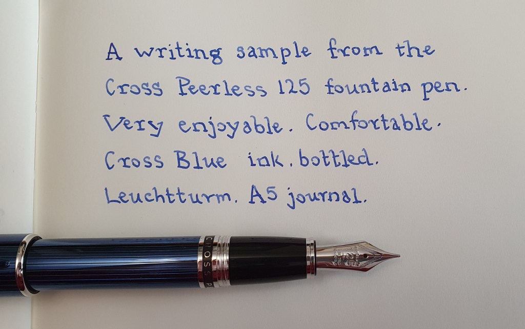
I flushed the nib and feed with water a few times, before filling with Cross blue bottled ink and then tried the pen on Leuchtturm paper. This is an 18k nib, marked as a medium but writes rather more like a medium – fine by usual western standards. It is a firm nib. The Sailor feedback is there. I found that as a lefty-overwriter, the pen is smoother in underwriter style since the nib soon moves from the sweet spot when in my overwriter mode and you feel the edges of the faceted tipping. Ink flow was good, neither too wet nor too dry. I tried the Cross blue ink for the first fill, although paler than say a Montblanc royal blue.

Likes and dislikes.
I do appreciate the extra girth of this pen and the screw cap. It is very attractive and tactile and the weight is substantial without being burdensome. I was intrigued to get one and try it for myself after reading good reports online. The nib made by Sailor feels very different from the Townsend’s nib made by Pelikan which was smoother and more forgiving, but the Sailor feedback is distinctive and special and, paired with the Peerless’s more girthy barrel, makes a comfortable and luxurious writing instrument.

For dislikes, I would only suggest that the pocket clip could be improved if sprung and a little easier to operate, but having said that, I never took to the Cross Apogee style of sprung clip, which slipped around from side to side. The Peerless clip will at least grip your clothing like its life depended on it.
Conclusions.
I had little hope of resisting the charms of this beautiful stately pen and will look forward to trying some longer writing sessions and different inks, in the months to come, God willing.

Simply lovely; gorgeous finish and interesting information about the nibs. I think I’ll just pop a Cross Blue ink cartridge into my Century II because it’s an age since I used their blue ink.
LikeLiked by 2 people
Thanks for reading. Yes the finish is gorgeous. Not sure that Cross blue is the best diet for it yet…although it was the obvious choice. I shall work through a few options until I find its forever ink’
LikeLike
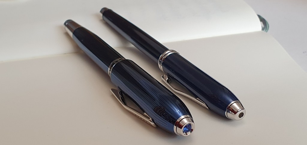
Felicitations on your new acquisition. Looking forward to Christmas, I thought of writing “toy,” but the Peerless 125 is an ambitious production. What piques my own interest is the photograph that pairs your Townsend and the new pen. I own three Townsends and my general opinion is that those are as good as I need a pen to be.
That said, I find that I tend to write with something else. Whatever its writing qualities, the Townsend doesn’t feel cozy in the hand, as many other pens do. Including my own post-Nizzoli Aurora 88.
It does occur to me that a shorter and perhaps fatter pen than the Townsend just might feel more comfortable and less as if it’s a major object seizing too much of my attention. (I am not an enthusiast for either the Pelikan M800 or the M1000.)
So I look forward to your longer-term experience of what the pen feels like in your hand.
LikeLiked by 1 person
Thank you very much for your comments which raise some interesting points. I am still getting accustomed to the Peerless and am still at the stage of being very conscious of it as I write, as it is no new. I am looking forward to having time to try it for some longer writing sessions. Getting comfortable with it is also complicated by my own left-handed overwriting style, but I have been experimenting with the options of underwriting (posted / unposted) and overwriting (posted / unposted), to see what works best.
I tried writing a letter on A4 file paper and found that my writing looked rather shaky. However this proved to be due to the paper texture which caused the pen to stick and then unstick itself slightly as I wrote. Ironically my recently acquired Moonman S5 wrote on the same paper like a dream as the slightly wider, oblique nib was able to straddle the lumps and bumps of the paper surface. It is very much “horses for courses” and I find the Peerless needs smooth paper if in overwriter mode.
I shall give the matter further consideration and see how I get on.
LikeLiked by 2 people
Hi, as you mentioned in other posts as well as I had experienced with Cross Century II, now I am always suspicious about whether peerless has the same ink starvation problem. Did Peerless had this problem during you use it? I am considering to purchase it but I am afraid. Waiting for your reply! Thanks for your review of peerless!
LikeLiked by 1 person
I have not experienced any ink starvation issues with the Cross Peerless. I find it a very comfortable and reliable pen.
I did have ink starvation issues with a Cross Apogee and never identified the problem, with that particular pen.
I have used Cross pens a lot, particularly the Bailey Light. The Peerless is the top of the range and has a special 18k gold nib, made by Sailor. Depending upon how you hold your pen, you may or may not enjoy this nib which has quite a bit of toothy feedback. I find it good in underwriter style, but not so good for overwriter style, but that is just due to my awkward left handedness. The medium nib is on the fine side. Good luck.
I hope that you will enjoy the pen.
LikeLike
Great review and nice close-up of that Swarovski! Other reviewers of this model say they’d prefer not to post it. Like you, I’m one for posting. I tend to press down too hard while writing and the slight backweight helps to train me out of this bad habit. Do you think that posting might cause issues with the lacquer finish over time? Is there a plastic lining all the way through the cap’s interior to guard against this? Thank you.
LikeLiked by 1 person
Thankyou. Yes, the version that I have in blue, does have a black plastic lining inside the metal cap which includes the plastic threads for capping the pen. Also, deeper within the cap, there is a plastic inner cap to help seal the nib against ink evaporation.
So there seems to be no risk of marking the barrel if you post the cap.
Having said that, I now prefer to use this pen unposted: it’s shape and heft are very comfortable and as others have said, it sits very well in the hand.
LikeLike
Thank you for the detailed reply Rupert. Much appreciated!
LikeLike