2016: some of my fountain pen highlights

Now that 2016 has ended, it seems a fitting time to look back at where this hobby has taken me, over the past 12 months.

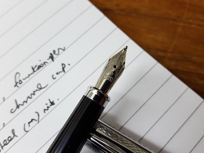
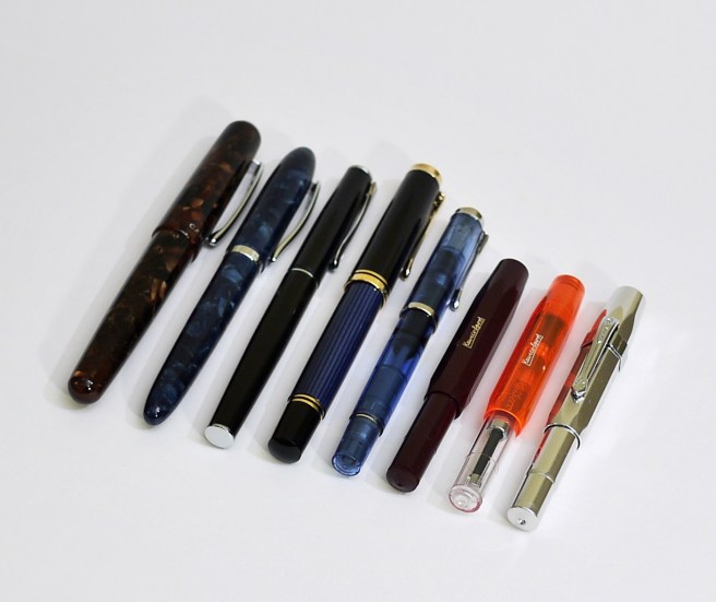
First, to get the figures out of the way, I bought a total of 40 fountain pens for myself. Many of these were inexpensive and bought in twos or threes or in different colours. If we can deduct all the pens costing £6.00 or less, of which there were fourteen, then the total comes down to a slightly less greedy 26.  A very few of the purchases turned out to be regrettable and lessons were learned. On the other hand, some of the inexpensive pens turned out to be surprisingly good, which was marvellous.

However, the pen-buying was only part of a larger picture and I now see that there have been many highlights over the course of the year. Let me list a few here, in no particular order.

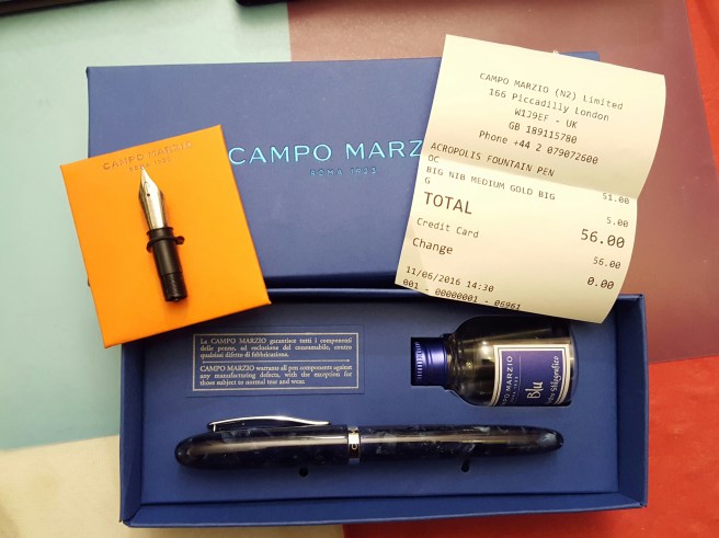
1. Trying brands that were new to me. I bought pens from several brands that I had not tried before, including Campo Marzio, Diplomat, Kaweco, Noodlers and Pelikan which all proved very worthy buys.

new-in-2016

2. Visiting the beautiful city of Bruges, Belgium in March. Whilst there, I did a Google search for fountain pen shops which led me to Iris De Corte, a third generation pen shop, in a cobbled street just off the main square at Sint Amandsstraat. When I visited, the shop was closed with the shutters half down. I peered through the metal grille at the attractive window displays which included Kaweco, Cross, Visconti, Parker, Faber Castell and Hugo Boss. I then noticed some people working inside. A charming woman then came out. I asked her if the shop was open. “No, but I can be open.” It transpired that this was Iris and she was busy taking photographs of products for a web site. She kindly let me look around, having my own private shopping experience. I bought two leather pen cases for my Kaweco pens.

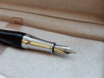
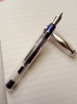
3. Buying my first Parker “51”. This was at the London pen show in October, a cedar blue Aerometric dating from 1949 which is now the elder statesman of my pen cup. I am grateful to Graham Jasper, the vintage pen collector who sold it to me. Now that I own one, I have enjoyed reading up on the Parker “51” with added interest. Using this pen feels very special and unlike any other that I own.

4. Making use of the internet. Throughout the year I have been both entertained and informed by the many You Tube reviews, WordPress blogs, Instagram posts and FPN threads by fountain pen enthusiasts all over the world. These eventually led me to start my own blog through which I have become acquainted with some inspiring like-minded people, whose work I much admire.

5. Getting more organised: Having allowed a growing number of fountain pens and their entourage of boxes, inks and accessories to spread unchecked throughout the house, it became necessary to find a better way of storing inks, tools, empty pen boxes, new notebooks and pen cases. I found a plastic storage tower, consisting of four nice deep drawers which has been an improvement on the previous state of affairs.

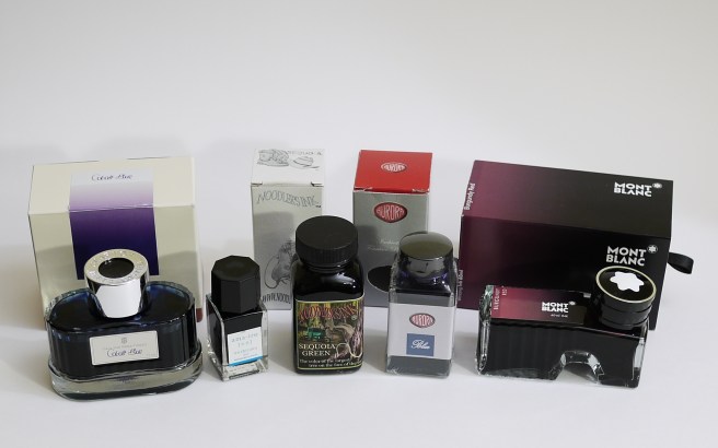
6. Being more adventurous with inks. Having gone for many years using a limited palette of mainly blue and black inks, I am now exploring some of the huge range of other coloured inks available and enjoying the pursuit of inks to match particular pens. This has now got to the stage where I might see a car in the street and remark that I know just the ink that would go with that.

inks-bought-in-2016

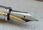
7. Experiencing a fountain pen auction. Whilst visiting an antiques emporium in Hampstead and enquiring whether they had any fountain pens, I was told of a forthcoming silver, jewellery and general antiques auction which would include pens.  I took a catalogue. Flicking through, I found several lots consisting of a selection of fountain and ball pens. One item that caught my eye was listed as a “Parker, a burgundy marbled resin fountain pen, with medium 18 carat gold nib, cartridge converter mechanism, no box or paperwork” with an estimate of £20 to £30. I went to the viewing and handled the pen, which was a very pretty Duofold Centennial. I registered to bid by telephone in the auction which was a few days away. In the ensuing days, I thought about how high I might go, allowing for the commission and vat payable on top of the hammer price. In my head the pen was mine.

When the day of the auction came, (which was by telephone and internet or previously lodged bids only) I was able to log on to a saleroom web site and hear the auction progressing through the various lots. It was not until about four hours in, that the burgundy  Duofold came up. The much anticipated telephone call from the auction room came, a couple of lots before hand. I was told that there had been a lot of interest on the internet, on this item. And then the bidding started and within seconds had gone over £100, to £120 and I chickened out. It sold at £140.00 plus commission. This was an interesting new experience but lessons were learned as to (a) not assuming that a pen is yours until you have bought it and (b) not expecting an item to be sold to you for the estimated price.

8. Trying new pens. Getting a new pen home, it is exciting to examine it and try it out, with various inks and on various paper surfaces and determine its role. Finding the right ink can sometimes happen first time but can be an ongoing process of experimentation, trial and error.

9. Washing out pens. Having bought rather too many pens in the past year and wanting to make use of them all, I am suffering from having too many inked at a time (currently over 20). A few of these will suffer from hard starts if not used regularly and so there is a continuous process of lifting a few out of the pen cup to be flushed and rested for a while. A few of them seem immune to hard starts, such as the Pelikans and the Platinum 3776 Century with its slip and seal inner cap. Whilst not really a highlight,  I do find enjoyment and relaxation from washing the pens from time to time and rotating the selection although I struggle to keep the numbers down and do not like to flush them if it means wasting a lot of ink.

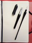
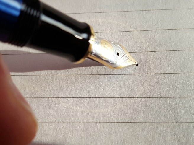
10. Writing with the pens. Not to forget the obvious, it is putting the pens to good use that should be the goal. I have varied my office pen from time to time but currently use a TWSBI Vac 700 clear demonstrator with Graf von Faber-Castell Cobalt Blue, for signing letters and documents. My Every Day Carry pen is currently a Sheaffer Sagaris, which I also used for most of the year as my 2016 daily diary pen. In 2015 it was the Italix Parson’s Essential, that I used almost every day for the year with Waterman Serenity Blue ink.

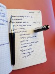
Aside from work use, I have enjoyed setting aside an hour or more a week, to write up such things as memories of parents or school days, for my own satisfaction before memories fade.

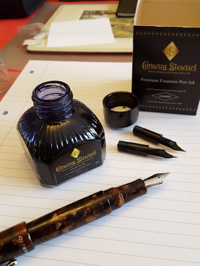
In the final hours of 2016 I took another pen to flush, picking up the Campo Marzio Ambassador in brown marbled resin. I have been using it with one of my favourite inks, Conway Stewart Tavy, by Diamine which is a classic looking blue-black. Having washed the converter and rinsed the nib and feed with running water and then with water squirted through a bulb blower, I then left the section to sit in a basin of water. As the water became still, I watched a ribbon of deep blue ink, slowly issuing out of the feed and fading into the water. It seemed rather symbolic of the final hours of the year, ebbing away.

I have been very fortunate to have a hobby that gives so much pleasure. It is useful to look back over the year to see what lessons can be learned. My main one is that, without a strategy, my occasional and often spontaneous pen purchases resulted in rather a shocking number and I expect to buy a lot less in 2017 and to make more use of the many delightful pens that I now own.

A Happy New Year to all.

20160904_171635


Parker IM, black lacquer and gold trim. New version. First impressions

I was quite excited when news reached me recently, that Parker had launched a new version of the IM fountain pen. I have the basic, earlier model in gun metal finish as well as the twin metal chiselled (chrome cap) version which is in the premium range. Both are quite worthy, work-horse type pens although I was not overly keen on the design of the grip section. Also the nib is basically the same as you get on the Parker Vector. I have had mixed fortunes with these nibs. Sometimes they perform beautifully from day one, but otherwise you need to tinker and persevere with them to get better flow.

wp-1481567495392.jpg

This is a metal bodied pen with stainless steel nib. The new version however, has a much nicer, wider diameter grip section in matching metal with black lacquer finish and what appears to be a totally new nib, in stainless steel and available in medium or fine. I have seen online that there is a range of colours although so far in London I have found only the black with gold trim, black with silver trim or the brushed stainless steel version.

They sell for £39.99 in London. However a current promotion in Rymans means that with every new Parker pen, you get a gift box with a hard-backed note book bearing the Parker name.

I had read reviews of the old version IM black and gold version on Amazon, where people reported the gold plating coming off. Nevertheless, being a sucker for black and gold pens and in the interests of science, I decided upon this finish for my new IM and a medium nib. I shall watch for wear in the gold coloured fittings with interest.

I had read on FPN that the IM stands for Instant Modern, although I have found no verification of this as yet on Parker’s packaging. You would think it would say this on the box if you buy one, without having to find out from FPN.

The pen came in a small cardboard pack with a transparent plastic front, with a plastic tag to enable it to hang up on a display. However it was too difficult to open the box and see the pen in the shop without tearing the cardboard and so I took a chance on the nib being ok, hoping optimistically that with the new design, there might have been greater attention to quality control.

At home, magnifying glass to hand, the pen looked very attractive with a beautiful high gloss black lacquer finish and the gold decorative clip and rings contrasting nicely with the stainless steel nib. The nib had three chevrons vaguely reminiscent of the Parker arrow emblem on the Duofolds of old.

wp-1481567559758.jpg

I was very pleased to find that the production date code on the cap ring was IY, the Y denoting 2016 (hurray!) from the QUALITYPEN year codes (starting from Q for 2010) and the “I” meaning (I think) the third quarter of the year. As I understand it, the code III means first quarter (on the basis that there are three quarters of the year left to go); II is the second quarter, I is the third quarter and no mark means the fourth quarter (no quarters left to go). When I bought my previous IM in July 2015, the date code showed it to have been made in 2011 and so it had been waiting around for a while before I gave it a home.

As for the nib, there was a visible slit, albeit very small, running from the breather hole all the way to the tip such that you could see light between the tines even at the tip. This can make for a very wet writer. Also the pellet of tipping material seemed, under high magnification, to be very round, not flattened on top and so looked a bit like a clown’s nose, although you do not notice this with the naked eye.

I was slightly apprehensive on dipping the pen that the nib was going to produce an overly wet line. I chose a half full, trusty bottle of Parker Quink, black ink which seemed the obvious choice. The cap is a slip on one, as with the old version and posts securely to give a very comfortable length and weight. To my relief and delight, it wrote very nicely indeed and one prolonged dip kept me going for a good couple of pages of an A5 notebook. I have not yet filled the pen properly but do not expect any problems now. The pen comes with one blue cartridge but no converter and so this would need to be bought separately.

I had read of people encountering hard starts with the IM and suggestions that this might be due to a rectangular hole in the cap which is hidden beneath the top end of the pocket clip. I think this might be an anti-choking measure so that the hole stays open even if you find yourself having swallowed your cap. One reviewer said that he managed to stop the hard starts by taping over this. If the pen is in regular use there should not be a problem but I shall watch out for this.

As for the gift box, this has inserts for your new Parker pen and for the complimentary notebook. This is an attractive and sturdy cardboard box to keep for pen-related bits and pieces if you remove the plastic insert. The hardback pocket notebook, with cloth cover and elastic closing loop,  is almost too nice to use and I have not seen one before with the Parker name embossed on the cover. Beneath the notebook, is a small booklet with a nice rubberised cover, with some diagrams and filling instructions and nice affirming messages from Parker about your new purchase.

The price seems compatible with other metal bodied steel nibbed pens such as the Cross Bailey. It is more than double the price of the old basic version IM but for the improvements in nib and section alone, I think this is a fair price to pay.

wp-1481567535301.jpg


Pelikan M800, some initial impressions

wp-1481221062466.jpg

You don’t need to spend long surfing in Fountain Pen Network to learn that the Pelikan M series are many people’s favourite fountain pens. It took me a while to catch on and to understand their attributes, while people wrote lovingly of their M200, or M1000 or whatever. The mystery was not helped by the fact that most regular stationery shops do not sell these and you will need to go to a specialist shop or a high end department store to see them in the flesh.

I first found a display of Pelikans in Selfridges a few years ago and was able to handle them. I watched as an M800 was dipped for me in Graf von Faber-Castell Cobalt Blue and the sales assistant produced a smooth and effortlessly elegant line of handwriting. I was smitten.

Having read much about the range in the mean time, I had an urge to own one, which refused to go away. In April, I bought a blue demonstrator M205 and chose the broad nib option. It proved to be an absolute joy to use. I filled it first with Waterman Serenity Blue and have been doing so ever since. The ink seems to match the sky blue pen perfectly and there was no need to experiment with anything else. The broad nib was silky smooth and springy and delivered a pleasant feedback. I took it on a two week holiday in the following month and I recall that it managed over 50 pages of an A5 journal on one fill. Also there were no problems at all with leakage on the flights.

I love the piston filling design and the ability to unscrew the nib and feed unit easily (even when the pen is inked if you want) to wash it or swap nibs.

I continue to enjoy my M205 but my only minor gripes were that it is a very light pen,  that the piston mechanism is plastic not brass and that the nib was a stainless steel one. And of course here, you have the options to look at the M400, M600, M800 and M1000.

As most readers will know, the M400 is the same size as the M200 and will also accept the same size nibs although it comes with a 14k gold nib. The M600 is a little larger, also with 14k nib. Then the M800 and M1000 bodies and nibs are each progressively larger still, with 18k nibs and brass piston mechanisms, making for a heavier pen.

Spurred on by predictions of imminent price increases in our post-Brexit era, I decided upon purchasing the M800. The choice of model involves a certain amount of guesswork as I purchased online with Cult Pens, (whose service I have found to be unfailingly excellent by the way) and so you do not have the chance to sample all the different sizes back to back, or to try out various nib widths.

The choice of an M800 model was the easy part. As to colour, I settled on blue over the more traditional and retro-looking green although would have been happy with either. But the nib choice is a tricky one. My handwriting tends to be on the medium to small side and I invariably find that the loops of my a’s and o’s are all filled in, and may have suited a fine or an extra fine more than my mostly medium nibs. Then on the other hand, I have the broad already in my M205 and love it. As someone who appreciates his inks, I like to see a good line of colour and some shading. And so after a little pondering, when it came to ordering, I settled upon a medium as being, hopefully, a good all rounder, a bit of a compromise but the best of all worlds.

The other choice to make is whether to opt for the standard gold coloured (plated) clip and rings and two tone nib, or to have the M805 version on which which all are silver coloured finish, which looks very smart. However I decided upon the gold plated version. With the blue, black, silver and gold combination this put me fondly in mind of my old school colours.

And so it was that just over two weeks ago now, my M800 arrived, literally as I was checking the tracking reference number online to see where it was. I became a two Pelikan man. It arrived in a large cardboard box, surrounded by copious amounts of protective polystyrene packaging and bubble wrap. And then the white cardboard outer box and another box inside that. Lifting the lid, revealed an attractive woodgrain-effect box with a white, leather effect bed, on which lay a white “penvelope” with brown elastic and a plastic seal. Finally inside that, in a clear plastic sheath, was the pen.

wp-1481221022788.jpg

I must say, it looks absolutely stunning. I had not been prepared for how pretty, smooth and polished the blue striped barrel is, since each stripe of blue seems to reflect light in a different way. Between the blue strips, as you hold the pen up to a light and rotate it slightly, you can see through it and this allows you to see the ink level. (The ink level is not immediately obvious as it would be in a demonstrator model. I found that you need to hold the pen tilted slightly, for about 10 seconds to allow ink to clear from the walls of the barrel and then rotate it to see the height of the ink in the barrel. It holds 1.35ml which is a goodly amount).

I had a bottle of Cobalt Blue on my desk, and gingerly dipped it in. Panic. At first it seemed not to write at all. Heart in mouth moment. No, it didn’t seem to like this and so I gave it a proper fill, too excited and impatient to bother with flushing first.

I wondered whether my Cobalt Blue might have got a little bit contaminated by silicone grease from being used to fill my TWSBI Vac 700. Close inspection of the ink in the bottle with an illuminated magnifying glass did reveal a slightly oily-looking surface. I wondered whether this was what was stopping the M800 from writing.

However, once filled (the piston was super-smooth) the pen did indeed write and I tried several types of office copier paper that were to hand.

However, when trying it out at home with three different types of letter writing pad, Basildon Bond, John Lewis Script and Paperchase Inscription, I found that it skipped dreadfully. Ironically, it seemed to be happier on photocopier paper rather than heavier, smooth writing paper.

I looked online and soon found lots of advice about running in a new Pelikan nib. One article recommended writing two pages with it, every day for two weeks. I started doing this, as well as using it generally whenever I could. Happily, well before the two weeks was up, the initial skipping problem subsided and then disappeared and it seems therefore to have been simply a case of highly polished rounded nib clashing with highly smooth paper. Now that the nib has adapted a little to the angle at which I hold it to the paper, it writes just beautifully.

As for the weight, it is considerably heavier than my M205 and a good bit wider and longer too. Here they are side by side.

wp-1481221076129.jpg

To me the pen just oozes quality, class and luxury from end to end. The Pelikan Souveran online catalogue makes good reading and has some lovely photography. Needless to say, a great deal has been written about the Pelikan 800 and there is no need for me to attempt a review of its specifications here.

Just one niggle recently. In a rare opportunity to enjoy writing on a Sunday morning with some wintry sunshine, slanting in low to my dining room table as I wrote, I became aware of a halo around my nib on the page.   I was writing in a sort of golden ellipse like a comet across the night sky. It soon dawned on me that this was the sunlight reflecting on the gold plated ring at the lower end of the grip section and casting a golden reflection on the paper. I tried to photograph this with one hand as I held the pen and so, apologies for the blurry image, but you will see what I mean.

This was short lived as the winter sun does not last long. However, it struck me that if a golden halo from your new M800 is your biggest irritation in life, you are a very fortunate man.

wp-1481221194830.jpg


Cross Century II, black lacquer and chrome

wp-1480514661650.jpgI have not always been very lucky with Cross pens. I find that the nibs can be a bit hit and miss. Some years ago I bought the Apogee, in black, thinking that it would be “the one”, the lifetime companion. Perhaps this was unrealistic, but I became a bit irritated by the amount of sideways play in the sprung clip. Then when unscrewing the barrel, instead of the barrel coming off, the collar of the section rotated loosely instead. Finally, it suffered from “ink starvation” and would not make it to the end of a page. I gave up. I know that they have a lifetime guarantee but I didn’t bother and just wrote with something else.

I have the Aventura (black again) which came with a wonderful steel medium nib – the sort that just works beautifully without any aggravation within seconds of having a cartridge inserted. But for me, I was not a fan of the chrome finish grip section nor the oddly and pointlessly truncated design of the barrel end, which put me in mind of a passport that has expired and had a corner cut off.

I have since had a nice Bailey, also in black, which I prefer although I had to work on the nib a bit at first, to get a wetter, more lubricated flow. The thick steel nibs are difficult to bend. If anything, it is a little too wet now, but good for more challenging surfaces such as thick sketch book paper.

I had seen the Cross Century II on special offer a few times, in a set with a ball-point pen, in matching black lacquer and chrome outfits. I had handled the fountain pen but initially been put off by the thin section.

However, when I saw a fountain pen for sale on its own recently, in gleaming black lacquer with chrome cap, I gave in and bought one. Certainly the metal cap, with fine guilloche scrollwork is very appealing, especially under the spot lamps in a shop display case. Then the medium nib, in stainless steel but long and slender, again with fancy scrollwork is also very attractive.

wp-1480514649967.jpg

Yes, the section is narrow, although it has ridges to help with grip and it is of a resin or plastic material and not slippery chrome. The Century II has a wider section than the Century classic.

Examining the section more closely, I was very surprised to find that it is actually translucent, with a dark blue tint, when seen with an illuminated x7 loupe (as you do).

One great thing, for me at least, with Cross pens is that the date of production is stamped on the metal ring, where the cartridge goes. Mine, although purchased in November 2016, bore the date 0415. I love it when pens are dated.

The cap is a pull-off type, and with a good firm grip, but without being too hard to remove, (as I found with a Bailey Medallist rendering it almost unusable). Having a secure cap is great for an EDC pen, so it won’t come loose in your jacket pocket. The cap also seals the nib well and I have had no problems with hard starts.

The pen measures 123mm open, which even for my medium to large hands, is ok to use without posting, but I do prefer to post for the extra length, weight and sheer beauty of the combination of black lacquer and chrome. The cap posts nice and deep and grips the barrel well and gives an overall length of 155mm.

Another plus, is the fact that it takes the screw-fit type of Cross Converter, which fits very snugly and securely into the section. At present mine is filled with Parker Quink, black ink, which although has been hanging around the house for several years, still performs beautifully in the Century II with a nice dark line, wet flow, good lubrication but not too slow a drying time and a little bit of shading.

But perhaps best of all, as I am noticing as I become more discerning in my fountain pen journey, is the lovely feedback from the nib. This is hard to put into words. It is smooth, but it delivers a lovely sensation of nib-on-paper as you write, a faint sound, not a scratchy sound but a gentle play of well-designed metal on the page. This is what fountain pen use is all about and is what sets the fountain pen apart from a ball point pen – this effortless gliding of pen on paper and the glossy trail of freshly laid ink in its wake.

The pen is a joy both to use and to look at. It is smart enough for business use without being showy but dainty and elegant for social use too. Perhaps the narrow section might not be well suited to lengthy writing sessions for people with larger hands and I have yet to put this to the test. But there is something about the narrow section and slender barrel which creates a feeling of using a precision instrument.

Rumour has it that HM The Queen uses a Cross Century.

Perhaps this could be “the one”.

20161130_140255.jpg


Campo Marzio Acropolis fountain pen

If you find yourself in the vicinity of London’s Piccadilly and feel like a pen prowl, then there are several establishments along the way that can all be visited within an hour or so.

Beginning at Piccadilly Circus and heading westwards along Piccadilly, you soon come to Paperchase, a bright and inviting store full of stationery. There are greeting cards, novelty gifts and a huge selection of notebooks to cater for all ages and tastes. As for fountain pens, there are racks of Lamy Safaris and a few others but head to the back and you find a large glass display counter, with fountain pens including Cross, Kaweco, Faber Castell, Lamy, Tombow and Waterman.

Continue along Piccadilly a little further and you will reach Fortnum & Mason, an elegant and prestigious department store where the staff still wear morning suits. The Stationery department is up the stairs on the first floor. On a recent visit I found that the display counters had been re-arranged from one side, out to form an island in the middle so that you can walk all round them. It is a good place to see luxury pens from Yard-O-Led, such as the Viceroy Grand in Sterling Silver. Also you will find some Visconti Rembrandts and Homo Sapiens and Cross pens as well as calligraphy pen sets and leather covered note books. I once bought a Faber Castell E-motion in dark pearwood here and was delighted to be given two of their test pads of Faber Castell paper and then went to find the mens’ room where I could fill it up from a newly purchased bottle of Waterman Harmonious Green.

After Fortnum & Mason, head into the Burlington Arcade on the north side, to the far end where you find the delightful shop Penfriend.

wp-1479765437760.jpg

The shop is one of the few places I know where you can find the Japanese Sailor pens in London and also many vintage pens and a good choice of inks.

Finally, back on Piccadilly, do not miss Campo Marzio, a small Italian shop selling their own brand of competitively-priced modern pens starting from just over £20 and up to around £80. The display is quite unique and eye-catching, with the fountain pens and ball pens and roller-balls each nestling horizontally in a felt-lined rack of little ledges, mounted on a wall, each section containing  models of the pen in each of the available colours.

On my last visit I chose a Campo Marzio Acropolis, a lovely cigar-shaped pen in dark blue marbled effect “Celluloide mix” (according to their web site) with black section and a large, (size 6) German-made stainless steel nib. The pen is a cartridge/converter filler, taking standard international cartridges. I had already purchased the Ambassador in marbled brown, which is similar but larger but using the same large nibs.

One advantage of these pens is that the entire nib unit can be unscrewed from the section for disassembly and cleaning, making it easy to flush the nib and feed if changing inks. You unscrew the unit from the section and are then left with a collar, housing the nib and feed. The nib is friction fit and so you then pull out the nib and feed together, using some grippy material. The shop sells these nib units separately (consisting of a nib, feed and collar) for only £5.00 and so it is well worth buying one or two spares in different widths as you can chose what you need, from a selection of silver and gold coloured nibs.

wp-1479765692410.jpg

The packaging is a simple but attractive carboard tray in a sleeve, with a cut-out for a “bottle” of ink which in fact contains six cartridges. However the shop also sells converters and its own range of bottled ink in attractive retro-looking bottles with enticing names such as “Tobacco brown”.

Departing the shop, there are plenty of coffee shops nearby where you can ink your pen and try it out. Mine proved to be very pleasing, smooth and on the wet side but not overly so and I have put it into immediate use.

I like the look, size, and feel of the pen which is beautifully tactile. I prefer to write with the cap posted. My only slight niggle is that the screw-on cap does not post very deeply and perches on the barrel a little crookedly if you are not careful. I worry then about accidently forcing it onto the back of the barrel with too much force and cracking the cap but there are no signs of this happening so far and I will take care not to over-tighten it on the metal threads when capping the pen.

I mostly use bottled ink and the pen will take a converter but it is nice sometimes to have pens to use up one’s bags of standard cartridges and enjoy the convenience of easy refills if travelling.

wp-1479680504496.jpg


Autograph Artist fountain pen review

Back in July, my family and I spent a very pleasant summer’s day visiting the Woburn Deer Park, in Bedfordshire.  The Woburn Estate includes Woburn Abbey and gardens, set within the 3,000 acre Deer Park, home to nine free-roaming species of deer. Woburn Abbey is the seat of the Duke of Bedford.

Before driving home to London, we stopped to take a look around Woburn village. There we found the Woburn China Shop and had a browse inside. Upstairs I was pleased to find a display of pens, each shown in its accompanying gift box. Closer inspection revealed that almost all were ballpoint pens but I found one unusual-shaped fountain pen, with the name “Autograph”. It was marked at £22.00 but with an unexpected 10% off, was mine for £19.79.

The pen is of metal construction, with a glossy black lacquer finish to cap and barrel and a shiny chrome section. The section has a distinctive pattern of engraved wavy lines giving the impression of diamond-shaped cross hatching, making this a very pretty pen.

The other unusual features are the bulge where the section meets the barrel and the gentle concave shape of the cap. The shape was reminiscent of a glass dip pen (shown above for comparison).

On the gift box, a sticker identified this as the AUTOGRAPH Artist Fountain Pen. On the pen itself, the name Autograph appears on the centre band and also on the converter. However the nib had the name DUKE and some attractive pattern with a crown logo. The twist converter has a small piece of coiled metal inside to act as an agitator.

Looking up Autograph pens online, I found that this is the brand name of Suchak & Suchak, a family firm with interesting beginnings as migrant entrepeneurs from Tanzania, started in 1986 and now specialising in the design, manufacture and distribution of quality writing instruments for the gift and stationery trade.

Their website announces with great regret that a fire in Perivale, on 4 July 2015, that engulfed some 20 properties, burnt theirs down to the ground and that they are in the process of relocating.

Looking online into the Duke name, I found that the pen is also known as a Duke 600 Lady, Duke being manufactured, on the Huangpu River, Shanghai, by Shanghai G Crown Fountain Pen Co Ltd and registered in Europe as Duke Pen Lux Germany GmbH. I read on FPN that Duke is one of the best quality Chinese pen brands.

Thus I am interested to discover that I have a Duke 600 Lady fountain pen, re-branded by Suchak & Suchak as an Autograph Artist.

I am happy to say, that the pen performs beautifully. The nib is a stainless steel medium, with very smooth and pleasant touch and an ideal not-too-wet-not-too-dry ink flow. It is always a joy when first filling a new pen, to discover that it writes perfectly straight out of the box.  The cap posts securely and the curve of the cap makes the pen very comfortable to hold. I filled mine with Conway Stewart Tavy, by Diamine, a lovely blue-black that I have been using a lot this year. Paired with a pad of Basildon Bond letter writing paper, you have the dream combination.

The pen measures 137mm closed, 120mm open and 144mm posted. The weight including converter is around 22g uncapped, or 34g when posted.

It is also a pleasing coincidence that the pen is secretly a Duke, as a reminder of a happy day in beautiful Woburn.


Noodler’s Ahab

What a fun pen this is. I had often read about the Noodler’s Ahab and its eyedropper filling capability but did not get my hands on one until visiting the London pen show in October. There was a good display of Noodler’s pens and inks, including the Ahab in various brightly coloured demonstrator options. Also there was a helpful display of writing samples of the inks in the range.
I was able to try an Ahab and was shown how to convert to eyedropper by removing the pump filler and rolling down the O ring so that it sealed the join between the barrel and the section instead of between the pump filler and section.
I was impressed by the unusual pump filler mechanism with its large capacity in which even the hollow tubular pump handle holds ink.
I decided upon a clear demonstrator Ahab and a bottle of Noodler’s Sequoia ink, an unusual olive green-black.
The pen came in a small, simple cardboard box with a helpful A4 sheet of information and pictures.
At home I was excited to fill the pen for the first time with the Sequoia. The writing experience was very pleasurable from the smooth, fine, flex nib, giving nice light and heavy shading. The only issue was that it tended to blob occasionally but I later learnt that this was easily avoided by releasing three to five drops after filling.
I am now on my sixth different ink within a month. After the Sequoia, I tried Mont Blanc Burgundy red, Diamine Pumpkin, Waterman Harmonious Green, Parker Quink Black and finally Omas Blue which I like the best, for the moment anyway. I do not remember ever before trying so many different inks in a pen, in such a short time.

The pen is such a joy to use that I pick it frequently and write just for the pleasure of it.

We do not see Noodler’s pens in the shops in the UK which is a pity as they would make a good alternative to the Lamy Safari or entry-level Parker pens and may even encourage more people to experience the joy of fountain pen writing.