Travelling with ink: pen shopping in Lake Garda.

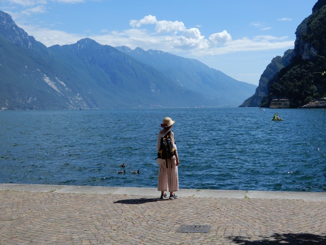
Once again it has been holiday time and an opportunity to visit a beautiful part of the world, that is northern Italy. My wife and I and mother-in-law were to spend a week at Garda Town, on the eastern side of Lake Garda (or Lago di Garda).

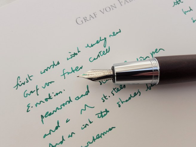
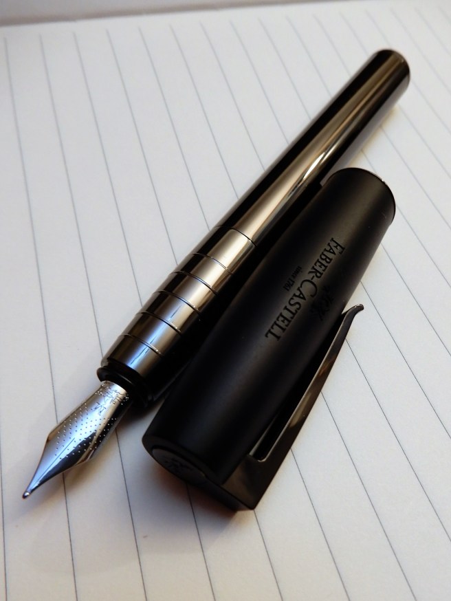
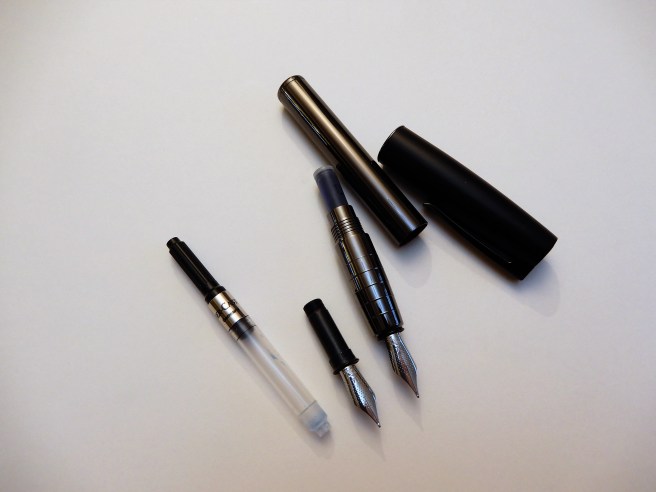
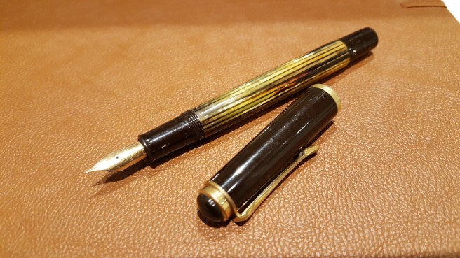
My forward planning had consisted of chosing what pens to bring for journaling and deciding upon a Wing Sung 601 (clear demonstrator, vacumatic filler), plus a Kaweco Dia 2 and a Perkeo. Rather than bring bottled ink this time I brought some cartridges for the Kawecos. I also packed a WH Smith exercise book. However, at the last minute, at Stanstead airport, I spotted a soft cover Leuchtturm plain paper journal with elastic loop closure. I stuffed it in my bag and took to the skies feeling like an Ernest Hemingway.

20180619_1608061212024349.jpg
Wing Sung 601, vac filler.

I had also googled “pen shop Verona” and jotted down the name of a shop on the via Mazzini called Manella, to check out when we got there.

Lake Garda, set among the spectacular backdrop of the Dolomites, has a perimeter of 158km (98 miles). Early in our holiday, we joined a coach tour to go all the way round, visiting four of the lakeside towns, Sirmione, Limone, Riva and Malcesine.

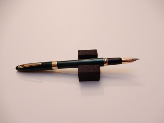
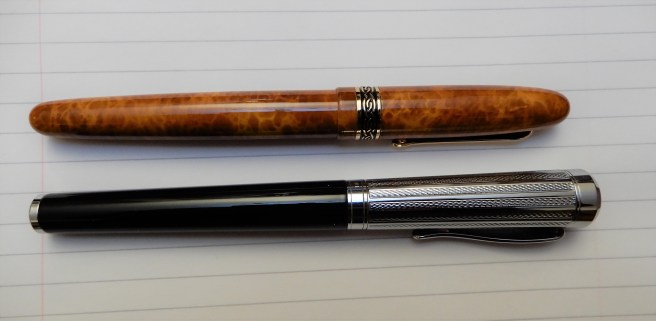
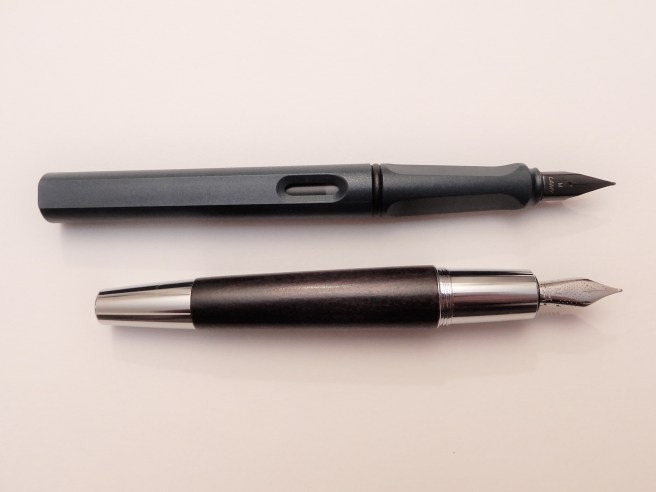
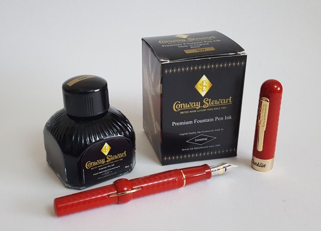
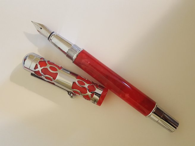
Sirmione is located at the tip of a narrow peninsula, on the southern banks of the lake, and famed for its thermal baths, a medieval castle and the remains of a Roman villa. We arrived via a motor launch for the short journey to the tip of the peninsula and cruised into the castle, which was very cool. Busy with tourists on this hot June day, I did stumble across a stationery shop with some attractive fountain pens in the window and went to investigate. I did not recognise any of the brands on display but was drawn to a red resin pen with shiny chrome lattice work around the cap, sold with a converter and a bottle of black ink and one standard cartridge. The brand was La Kaligrafica and at under 30 euros and with a nice steel nib it seemed like a good buy.

Later, inking the pen up with the supplied cartridge, I was quite content with the nib (the ubiquitous “Iridium point, Germany”) but found that the pen was a little short to use unposted. It was clearly designed to have the cap posted, where it sits flush with the barrel. But the problems were (a) the metal furniture on the cap makes the pen a bit top heavy and (b) the cap does not grip securely on the barrel and very easily works loose as you write, which is very irritating. There is a risk of it falling onto a hard floor and breaking or disappearing over a balcony. I tried wedging a scrap of paper under the cap but this did not seem to help. I think this pen is destined for someone with smaller hands who will not need to post the cap.

20180629_192955428378125.jpg
La Kaligrafica, Italian cartridge-converter fountain pen.

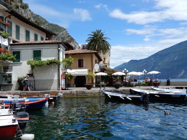
We travelled up the west side of the lake by coach, passing through many tunnels, built in the 1930s by Mussolini. Lunch was at another pretty town, Limone, before taking a ferry up to Riva on the northern bank, from where there were marvellous views down the lake. Having some free time to explore Riva, I found another stationery shop, selling leather bound journals, ornate glass handled dip pens (with steel nibs) for calligraphy or for display and a few inexpensive Italian fountain pens geared for the tourist trade at between 20 to 30 euros. I was able to resist these.

The final visit on the lake tour was Malcesine on the eastern side, with another castle and also boasting a cable car to the top of Mount Baldo. The cable car gondola is round and actually revolves very slowly as it ascends. (We returned to do the cable car trip another day).

The lake tour was a very good start to our holiday, giving a good introduction and a taster, to plan trips by ferry during the rest of the week.

DSCN2291
Typical scene on Lake Garda

Later in the week we took a bus to Verona which is only an hour away. The bus terminates in the centre of the city right next to the impressive arena, a Roman amphitheatre, still used as a venue for opera. The scenery for a performance of Aida was laid out in the square.

We walked down the via Mazzini, the pedestrian shopping street which takes you from the arena to the piazza delle Erbe, a beautiful square with a bustling market.

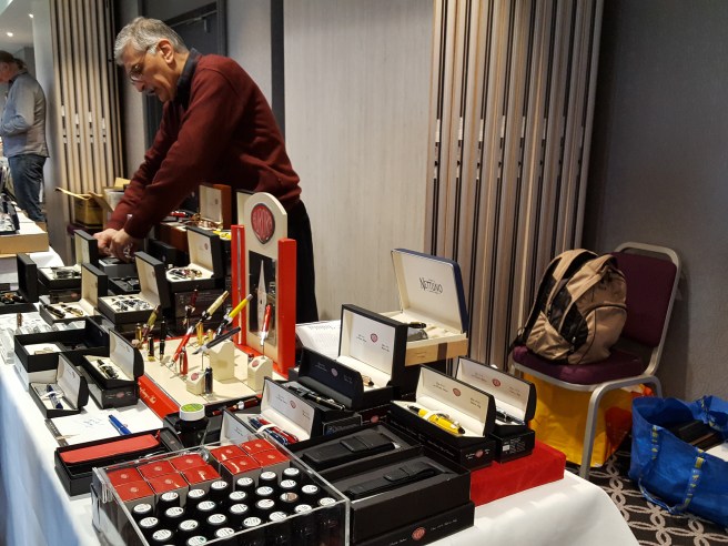
I found the Manella pen shop, under a Pelikan sign! Unfortunately it was closed so I was resigned to missing it this time. I had to content myself with pressing my nose up to the windows and taking a few photos (marred by reflections from the busy street) of the displays of Pelikans, Auroras, Delta, Montegrappa and other delights.

DSCN2594
Manella, fountain pen shop, Via Mazzini 5, Verona.

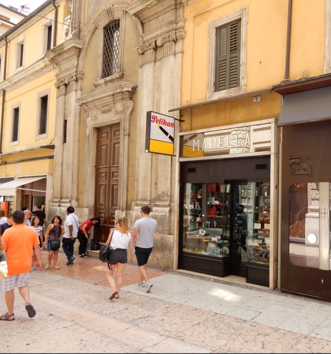
However, after spending some time exploring Verona, including a visit to the casa di Giuletta (the “house” of Shakespeare’s Juliet) and the impressive Cathedral, we passed the pen shop again and this time it was open! The very cordial proprietor told me that this shop had been here since 1940 and run by his father before him. On telling him that I was keen on fountain pens he kept getting things out to show me,such as a Montegrappa Fortuna although I had to tell him that I had one already.

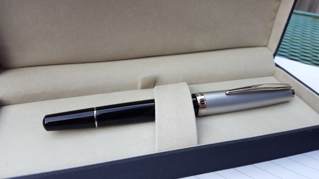
I was interested to try an Aurora, not having owned one and he showed me the Aurora Ipsilon Deluxe, in red resin with a gold nib. However, he had some more colours and models in his other, larger shop, literally just around the corner and together we walked around to look at some more pens.

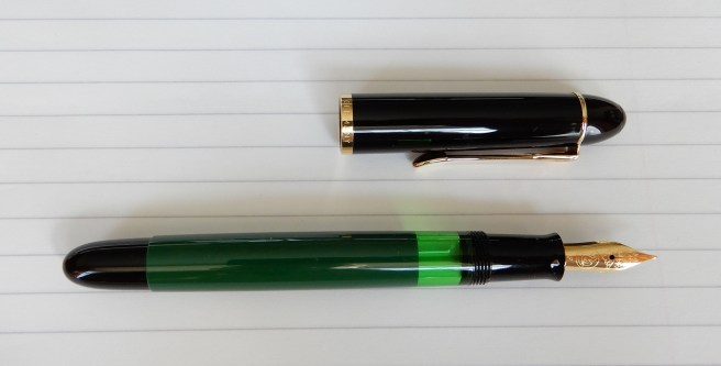
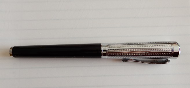
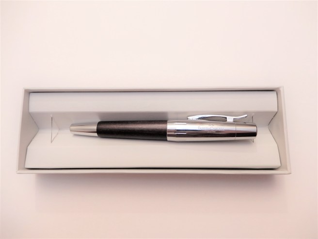
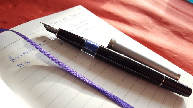
There he also had an Aurora Ipsilon Lacca, the metal lacquer version, in a new dark blue and black finish and also with a gold nib, which looked to be rhodium plated with matching furniture. This I chose as my souvenir from Verona. Oh, and I spotted a display of “Pelikano Up” pens and one of those went home with me as well.

20180702_212524135179422.jpg
Aurora Ipsilon Lacca.

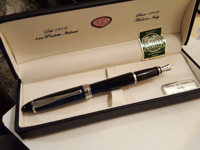
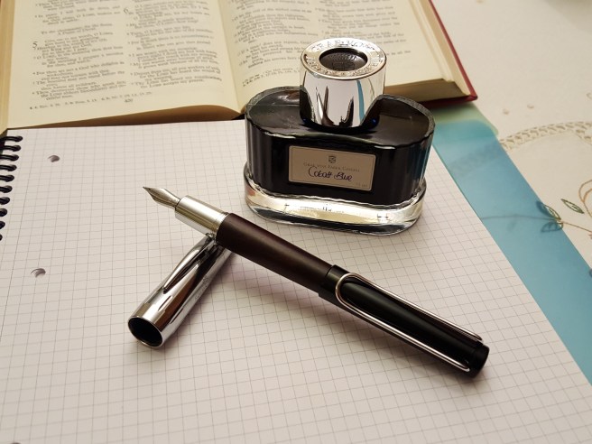
Back in London, I filled the Aurora, rather unimaginatively with Aurora blue. It is a smallish pen but weighs a solid 31.5g. It is short when uncapped, at around 118mm, but the cap posts well with a secure click.

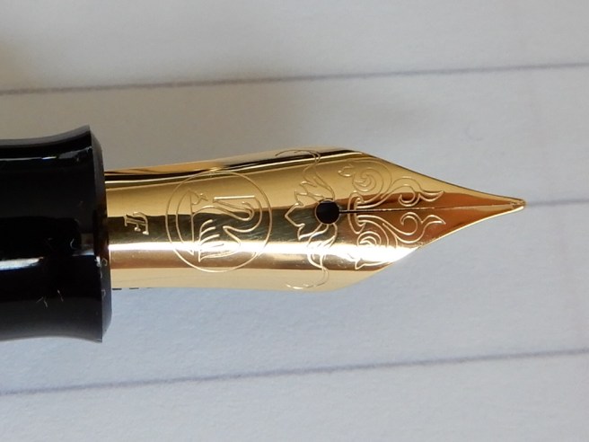
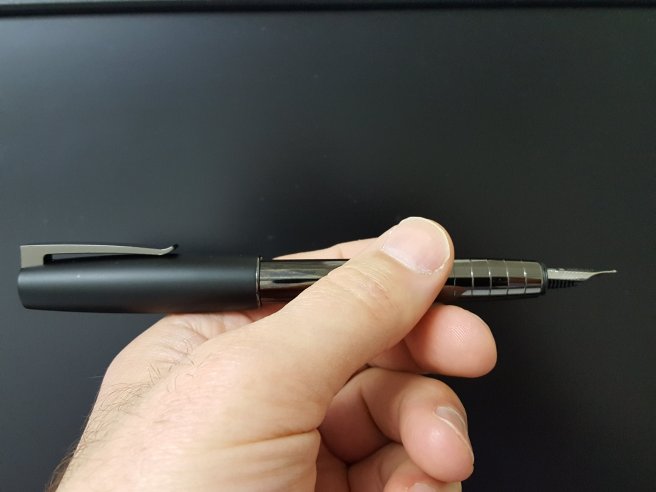
My Fine nib version wrote well. But the nib is small and firm without much give. I was also a bit troubled by what looked like rows of tiny mysterious scratches right across the mid part of the nib, from edge to edge, although only visible with a loupe. Also the nib was not precisely centred over the feed and I have not yet figured out how to remove the nib and line it up more symmetrically. However neither of these issues affects writing performance.

20180702_2126541149707318.jpg
Detail of the Fine, 14k gold nib, Aurora Ipsilon Lacca.

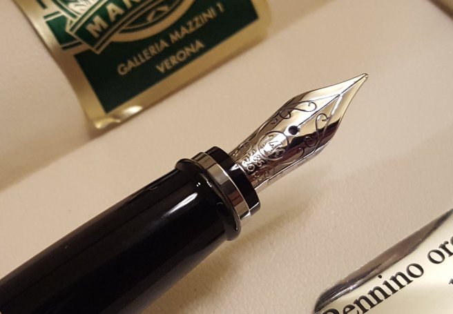
I must confess, that I did find the pen a bit bland, particularly matched with royal blue ink. I then flushed it and refilled it with Monteverde Napa Burgundy, which has injected some more life into it. I think it is a decent pen but on reflection, I enjoyed the buying experience more than the pen itself. Perhaps it is just that I am “penned out” at the moment and spoilt from a surfeit of other very satisfying aquisitions in recent weeks. I had been happier with the Montegrappa Fortuna and Pineider Avatar pens bought earlier this year, two Italian pens which both have steel nibs.

Finally, the modest Wing Sung 601 served me well on the trip, as did the Leuchtturm journal. After about 35 pages the Wing Sung (with its fine nib) still had half a fill of ink remaining and I had no need of my two Kawecos or spare cartridges which came to Italy for the ride.

DSCN2341
View of Lake Garda, from Riva on the north bank.

Some early thoughts on the Pelikan M120 special edition, green and black fountain pen.

Within the last few weeks, I have been on the receiving end of three wonderful, unexpected, unconnected and very generous gifts.

First, a Methodist minister retiring from her post at a city church in London, and moving from the manse to smaller accommodation, offered me an old camera that she no longer used. This turned out to be a Nikon F, the very first of Nikon’s line of single lens reflex cameras introduced in 1959. Well travelled but well looked after, the camera was in good working order and I have enjoyed taking it out and about, remembering the way that we used to take photographs: winding on, setting speed, aperture and focus and then hearing the shutter release and the mirror returning. Before the fountain pen hobby grew and took over, I had built up an accumulation of classic cameras (particularly Voigtlander and Zeiss) but had never owned a Nikon 35mm film camera. I am now thrilled to have this classic model.

Then, a reader of my blog, whom I met up with for the first time in London recently, kindly passed on to me a bunch of his fabulous pens as mentioned in my post Inky Pursuits: a recent round-up. I am greatly enjoying the Pilot Custom 74 and Custom Heritage 92, the nibs and comfort of which give a writing experience amongst the best I have ever known.

And then on returning from holiday recently, I had a parcel waiting for collection. This was the size of a small pillow, and contained a very well wrapped, new and unused Pelikan M120, in classic green and black, complete with presentation gift box, a bottle of Pelikan 4001 royal blue ink, and the guarantee and guide to the Pelikan range.

This generous gift was from another reader of my blog and a fellow blogger, but from another country and whom I have never met. I am most grateful but also humbled that people can be so generous even to a total stranger. Events like this make the world seem a friendlier place and help to redress the balance when so much world news is so troubling. Indeed, in the last few years, I have found the online fountain pen community, to be a wonderful bunch, from all over the world and from all walks of life, united by a common passion for fountain pens, inks and stationery.

Returning to work after a week away, (into a tumultuous week including World Cup football, Wimbledon tennis, and President Trump’s visit to the UK) it has taken me a little while to adjust and get back into my routine. However, I have now had a closer look at this pen and have been using it with the lovely Pelikan Edelstein Smoky Quartz (which I did not pay for either, as it came from last year’s Pelikan Hub).

I understand that this model, in green and black, is a 2016 re-issue of a classic Pelikan from 1955 but with a few improvements.

Appearance and design

This is a vintagey-looking cigar shaped pen, with a green body and black grip section and piston knob and rounded ends. There is a good sized ink window with a green tint. The black cap screws on securely, needing only half a rotation. The gold plated pocket clip features the Pelikan bill. A gold plated cap band reads “PELIKAN GERMANY”. But one feature that is not so obvious is the logo of pelikan and chick on the finial, very subtle in black with no colouring so that you would hardly notice it.

dscn2772.jpg
Pelikan M120, special edition (2016) in green and black.

Construction and quality

Being a resin pen it is lightweight but looks and feels to be of good quality, not plasticky. I cannot find any fault in the construction.

Weight and dimensions

With ink, the pen weighs only 16g capped or posted, or 10g for the body only, and 6g for the cap. Capped, it measures 130mm (not too long for a shirt pocket), whilst open it is 120mm (a bit short; I prefer 130mm plus, to use un-posted); with cap posted it is a very comfortable 155mm and this is how I like to use it. The cap grips quite deeply and securely on the back of the pen without upsetting balance. Also the clip will then stop the pen from rolling if put down on a sloping surface.

Nib and performance

Ah! Thanks for asking! This is a steel nib, (mine is a Fine) with gold plating to match the cap furniture (or vice versa). A special feature of the pen is that the scroll work on the nib is based upon a Pelikan price-list from 1889 and looks very attractive under a loupe (although, like the logo on the finial, it is not noticeable in ordinary use but it is nice just to know it is there). The nib wrote beautifully out of the box and has a pleasant bit of springiness or softness to it (although not a flex nib). It has a very pleasant touch on the paper, a little feedback but no scratchiness. I would say that the line is more towards the Medium side, than a true Fine and is perfect for me. Also, the nib and feed unit can be easily unscrewed for rinsing or swapping with any nib from the M200 or M400 pens, should you wish to do so.

RSCN2776
Curlicues borrowed from an 1889 Pelikan price list.

Filling system and maintenance

This is a piston filler and is very smooth and effective and holds a good supply of ink although I have not measured it. For cleaning I would just fill and empty the pen a few times in clean water until all traces of ink are gone from the water. It is good to be able to unscrew the nib and feed units to wash them or soak overnight if need be, if changing ink colours. I am not sure whether or how you can remove the piston mechanism but it should be good for many years yet.

Cost and value

This pen, in green and black, was a special edition to be made for a limited period. I remember seeing them for sale on Cult Pens at the time. Currently there is a similar model but in blue with blue cap and blue ink window for sale at £128.00 and I think the green and black model used to be a similar price.

This puts it somewhat higher than the regular M200 models which are currently offered in the £70.00’s and £80.00’s on Cult Pens, which is lower than they used to be.

Is it worth it? This is a tough question. Several reviewers concluded that it was a great pen but let down only by being rather over-priced for what it is, when based on a school pen from the 1950’s. Personally, I would recommend the pen if you like the nostalgic style combined with modern Pelikan materials and reliability.

Certainly it is a pretty pen, with vintage looks from a bygone era, very well made and if like my other modern Pelikans, perfectly reliable and always ready. And it makes a good companion for my Nikon F.

20180714_1348301005891004.jpg
Nikon F with Pelikan M120.

A fresh look at the Lamy Studio 65 fountain pen.

This is not so much a review, as an admission that our first impressions are not always correct and we can change our minds about pens.

The Lamy Studio is a pen that, for a long time, I did not think I needed. Certainly, I liked the idea of the pen, namely a nib of a Lamy Safari or AL-Star, but housed in a more business-like and slightly more up market body. I do possess numerous colourful Safaris and several AL-Stars, as they are good value, decent sized without posting and perform well, despite my not being a fan of the faceted section.

DSCN1977
Lamy Studio 65 fountain pen, with Lamy Safari above

So when I first learned of the Studio, having all the benefits of the stainless steel nib that I like but without the faceted section, I was quite keen. But then I handled the pen and was put off by the shiny chrome tapering section, which I could imagine being slippery to hold. Apart from that, when handling the pen in a shop, I noticed that the rim of the cap seemed rather sharp (almost as though you could use it to cut holes in leather) giving the impression that it was unfinished.

So I was able to put the Studio out of my mind quite easily, without hankering to own one.

However, fast-forwarding several years, I realise now that not all Studios are equal. Whilst the dark Imperial Blue or the Black versions (named the 67) have the shiny chrome section, there is also a steel version with a black section (called the 65).  And whilst I had assumed these to be priced the same, it transpires that the steel version without a chrome section, actually costs a little less.

RSCN1975
Lamy Studio 65, with soft-touch grip.

When in our local WH Smiths recently, I saw the steel Studio offered for sale at just £39 and decided to take a closer look. And there I discovered that the black grip section on this model is not finished in metal but in a rubbery material which is not at all slippery. And so for this modest outlay, I gave it a go.

DSCN1969
Unboxing. A cartridge and a converter are included.

First, about the grip: I cannot tell you exactly what it is made of. It could be a plastic with a soft-touch finish. But I rather suspect that the rubbery feel might be formed from a thin transparent skin of silicone or similar synthetic rubber. I have another fountain pen with a similar feel to the grip, an old Parker Frontier in brushed stainless steel finish, which served me well for several years, but the grip material eventually wore away in places, leaving a very smooth (and slippery) plastic underneath.

So the Studio 65 might have a similar material. If so then a more normal moulded plastic, perhaps textured like some of the Safaris, (but without the facets) would I think have been preferable.

But the purpose of this post is to say that I have been using the Studio now for several weeks, and am finding it to be great as a day to day work pen and an EDC. It is comfortable to hold. It is pleasant to use either posted or not posted. Yes, the rim of the cap is a bit thin and sharp but I appreciate that this is a consequence of the pen having a cap which is perfectly flush with the barrel when capped, and with just a minimal step down from barrel to section when the cap is removed.

RSCN1984
Cap forms flush fit with barrel. Also, thin cap material means a minimal step between barrel and section.

Any post about the Lamy Studio would not be complete without some mention of the pocket clip. It is attractive and unusual and sometimes described as being like a blade of a propeller (although this is not strictly correct). It is appealing to look at and does well at stopping the pen from rolling on a flat surface. But as a pocket clip, (to actually clip the pen into a pocket) it is awkward to lift over material. It does not bother me as I carry it in a pen case. Some may like it but I fear that it was a triumph of looks over function.

RSCN1979
The famous Lamy Studio clip.

Having said all of that, I do enjoy using the pen. I found recently that I had accumulated a dozen or so pens over the years with an all steel finish, including the Parker Frontier mentioned above, but I think that this Studio 65 may prove to be my favourite of these, in terms of size, writing performance, reliability and comfort.

DSCN1972

An Easter weekend of Gold, Frankenpens and Mirth. Rediscovering the Parker Urban fountain pen.

DSCN1889
Parker Urban mash-up.

This holiday weekend, I spent Saturday in Colchester visiting family. There was also time to explore the town centre for pen shops. The best option seems to be the Fenwick department store, (formerly Williams & Griffins) in the High Street, with gleaming glass counters including Cross, Waterman, Parker and Mont Blanc and a revolving rack of Lamys. I witnessed the sale of a Waterman Hemisphere as I bobbed around the nearby glass cabinets but did not make any purchases.

In the evening after a meal with my sister’s family, (always accompanied by much laughter) I sat with my neice who tried out my Pilot Falcon and who, being right-handed and having a natural flair for calligraphy, was able immediately to produce beautiful script from its soft flexy gold nib, far better than any of my efforts. Some of her pieces are on Instagram at simple_inkings (although she might change that name, in case people think it is for tattoos).

Back in London for Easter Day, which coincided with April Fools’ Day, I found a picture of Brian Goulet on Instagram with the caption “In the strangest move yet…Brian switches to Ballpoints!” I was not fooled by that.

Checking out our local Rymans, to see whether anything new had appeared on the pen shelves, I found  reductions on low-end Parkers, with 50% off the Parker Vector. (Annoyingly I had paid full price there for the new teal version just two weeks ago, although it is a great match for my Robert Oster Signature “Aqua” ink!)

Scanning the shelves, I noticed the Parker Urban, reduced from £32.99 to £14.99 and now to £7.49. This is not a pen that I am keen on, but figuring that this amounted to more than 75% off, I decided that a brushed stainless steel model might be useful. I do think the ergonomic, contoured barrel is ugly and find that the Vector-type steel nibs can be hit or miss, so that buying one is a bit of a gamble. The blister packs do not enable you to examine the nib before purchase. I had bought an Urban a few years ago in matte black and had to work at the nib to get an adequate ink flow.

DSCN1887
Parker Urban (left) and Parker Vector (right).

Deciding that for the price, it was a no brainer and worth the risk, I made my purchase and went off to  give it a try in a nearby coffee shop.  I found the production date code on the cap band, IIA, (second quarter of 2012), so this pen had been languishing somewhere for up to six years before finding me. (Conversely, my teal Vector was IIIE: first quarter of 2018 and still warm from the factory!)

Initial impressions from the brushed stainless steel Urban were mixed. The nib looked to be decent on close inspection. The pen was a reasonable length when opened (125mm) but the cap posts securely for extra length, which I prefer. I do not find it a very comfortable pen to hold. It does have a much less skinny section than the Vector, but there is still a rather sharp step down from the barrel to the section, just where my fingers want to go.

RSCN1881
The Parker Urban medium nib. The groove in the housing is an ink trap if bottle-filling.

I shoved in the supplied blue Quink cartridge. (Yes, flushing the section first might have been more sensible). I love it when you put a cartridge in a new pen and it writes immediately. This did not happen and it took an age before it would write anything, with much shaking and squeezing of the cartridge (and fear of splitting it) before it finally started to flow. Fortunately, it did then write pretty well, with the rounded medium nib being quite smooth in all directions. Given time to wear in, I think it will prove to be a good basic writer. Also, the cap passed my “blow test” for air-tightness, and so I hope that the nib will not suffer from dry-out when left capped and unused for a day or two. If you have one with a good nib and can tolerate the design, then it is quite a durable workhorse and, having a metal construction, will not suffer from cracking of the barrel or cap as can happen with a Vector or Reflex.

At home I got out the matte black Parker Urban that I had bought a few years earlier. I had never really taken to it and it had seen little use. It then occurred to me to borrow the matte black barrel to put on my new brushed stainless steel pen to make a Frankenpen mash-up, of black barrel with brushed stainless steel cap. This was an improvement, IMHO, both when capped and when posted, (in a Parker 51 sort of way) and so this is how I propose to use it, for the time being. Also, I will try some nice bottled ink once the Quink blue cartridge is finished.

DSCN1888
Parker Urban in brushed stainless steel with barrel from a matte black version.

One email this weekend, which was not an April Fool joke I hope, advised of a discount code on Bureau Direct’s online orders to receive a 15% discount, on anything, so long as you order before Tuesday! It so happened that I had been deliberating whether to treat myself to the Lamy Dialog 3, which I had seen on their web site. In fact I had been watching YouTube reviews just the previous day! Having been tempted now by several favourable reviews and with the timely added incentive of the discount, and being in holiday mood, I pulled the trigger on the Dialog 3, in glossy piano black with a Medium 14k gold nib. My experience of Lamy Safari and AL-star medium nibs is that they have been very pleasant, (smooth, if rather firm) and I hope for even more smoothness from the Dialog but with a little softness too. I am now looking forward to its arrival and pondering which ink to try first.

Happy Easter everyone.

20160104_220742

Some early thoughts on the Pilot metal Falcon (SF) fountain pen.

For the past two weeks I have enjoyed getting acquainted with this pen, bought new at the Cambridge pen show.

If you are new to the Pilot Falcon, as I was, there are a few things that might cause some initial confusion, as follows:-

  1. This the Pilot Falcon. In the past, they were branded as the Namiki Falcon (Namiki being Pilot’s brand for its high-end pens).
  2. The Falcon can be found in either resin or a metal body with lacquer finish.
  3. The nib on the Falcon is a semi-flex nib, with the markings SEF, SF, SM or SB (for soft extra fine, soft fine, soft medium of soft broad), also denoted by a removable silver sticker on the barrel. However, when people refer to the “Falcon nib” they may instead mean an entirely different shaped nib, with distinctive cut-aways on the sides to help it flex, with the markings FA and which is not found on the Falcon pen at all but on a different Pilot pen.
  4. The nib called the Falcon (FA) nib, is more soft (flexy) than the soft nibs made for the Pilot Falcon.

See what I mean? Anyhow, the model that I have is the Pilot metal Falcon, in black with a Soft Fine (SF) nib, which is 14k gold, rhodium plated. The pens branded as Pilot are clearly identified by the name Pilot stamped on the nib and on the cap, just above the shiny plain cap band.

DSCN1773
Pilot metal Falcon, in black lacquer over steel.

There have been other modifcations too, such as the change from a resin to a metal finial and barrel end cap and the addition of another metal ring, so that there are now two rhodium plated rings on the grip section and a third on the barrel, just after the cap threads. These do give this smart but ordinary looking Pilot’s uniform a bit of panache, rather like the rings on the sleeves of an airline pilot’s jacket.

The nib

When I chose my Falcon, there was a Soft Fine or Soft Medium nib available. Both looked nicely finished, under a loupe but I chose the Soft Fine as I have come to appreciate Fine nibs more, in the past year or so and because I have relatively few of them, compared to the number of pens with medium nibs.

RSCN1779
Soft Fine nib, in 14k gold, rhodium plated. Writes like a western extra fine. Wet and effortless. 

I had read that Pilot nibs had a good reputation for being well made and for great performance straight out of the box, which is always a delight. This one lived up to expectations.

The unique nib of the Pilot Falcon, is the main draw for this pen. Shaped more like a nib that you might find for a dip pen, it is long and slender with a bulge half way down, as if the nib had been pushed into a wall and had buckled. It is rare nowadays to find a new pen sold with a flexy nib. This is not a “full flex” nib but has more softness to it than most. In the right hands, this can be used to apply a little downward pressure to the nib on the down stroke, to open up the tines a little and create some thicker lines, for attractive line variation.

I say “in the right hands” as (a) it does take some skill and practice to achieve this and (b) it is more difficult for left handers, particularly lefty overwriters, (such as myself) as the nib does not like to have pressure applied when being pushed forward, but only when being pulled backward. Indeed, you have to be careful on the upstroke to keep a light touch and avoid the nib jabbing into the paper.

In this regard, possibly a medium or broad nib might have been a more sensible and forgiving option for me if buying a flexy nib. However the fine nib certainly does have its advantages. It is not necessary to flex the nib and the pen can be used to write quite normally, without any downward pressure. The remarkable thing is that the pen requires no pressure at all and the tines are so responsive, that the pen will write as soon as the pen touches the paper – and with no skipping. Smooth paper is preferred.

Because the nib is so soft, it takes only the slightest touch to paper, to open the tines and lay down ink. I have found that it is important to keep the nib flat to the paper (rather than rotated left or right), so that both tines remain level on the paper. If the pen is tilted, one tine will lift higher than the other, causing the inner edge of the other to catch on the paper and make the nib feel scratchy.

I have also read that the nib needs to “break in” and become softer and more flexy in time. Meanwhile I have been careful not to push it too far for fear of springing the nib, bending it past the point of no return.

One of my favourite discoveries with the nib, was to find that the numbers in the lower right corner, and barely readable with the naked eye, denote the date of production of the nib. Mine is 917, that is September 2017. I have since looked at pictures of numerous others online to compare when they were made. I do enjoy it when pens can be dated.

RSCN1833
Date marking on nib, for September 2017.

Filling mechanism. The pros and cons of the CON 70

The Falcon (be it the Pilot or Namiki) is a cartridge – converter pen but has evolved through several filling systems. I understand that originally, the pen had the CON 20 press-bar converter, unpopular for its small ink capacity which soon ran out especially if one was doing much flexing of nib for broader strokes. The next generation had the CON 50 piston converter. Both are now discontinued according to Cult Pens. The current metal Falcon has the CON 70 push button converter, which is relatively large capacity, efficient and fun to operate.

I have not yet fully grasped how this works. The converter has a button at one end. Inside, you can see a thin metal rod, with a rubber plug at the end, but which does not reach the open end of the converter and which can slide up and down the metal rod.

DSCN1781
The CON 70 push button converter.

To fill your pen, with converter attached to the section, you simply place the nib in the ink, give the button a quick press and release, and ink is drawn into the reservoir. Repeat a few times and each time, the ink reaches a higher level. Within about four quick presses, you have a full reservoir.

From watching a Brian Goulet video on this converter, I gathered that pressing the button pushes the rubber plug downwards; air is expelled and the plug seals off the opening so that a vacuum is created. With the nib immersed in ink, the vacuum then draws ink up into the pen. It is all over very quickly.

20180306_122050_001
The CON 70, refuelled with Pilot Iroshizuku Yama-budo.

On close inspection, it can be seen that the metal shaft inside the reservoir is a hollow tube. I have not yet deduced whether it is this tube through which air is expelled or ink is drawn in. But it works.

There are some issues to be aware of , with this design of converter. (a) It is rather a faff to clean if you are changing ink colours. You can try pushing the button repeatedly to fill and empty the pen with clean water. Or it is quicker to remove the converter and squirt water into the opening with a syringe or pipette. I have read that ink can lodge inside the metal tubular rod and that this can contaminate inks of a different colour, if you fill the pen before cleaning the converter thoroughly. (b) Also the action seems to make the ink go bubbly so that you are left with lots of tiny bubbles sticking to the inside of the converter, stopping you from seeing the new ink sloshing around from end to end with a single air bubble like a spirit level. The bubbles or tiny air pockets disperse a day or two after filling.

RSCN1823
Straight after filling. Perhaps it just needs a flush with some detergent. 

In use

The pen is very comfortable to hold, being a good medium sized pen with a nice weight to it. It weighs around 33g (20g uncapped, and 13g for the cap).I prefer to use it with the cap posted, although at 126mm unposted, many people would find it long enough without posting. One criticism that was made of the resin version, was that it felt too light. This is no longer an issue in the metal Falcon. Also, there was criticism of the small ink capacity converter but the CON 70 resolves this.

A few days after buying the pen, I had the opportunity to use it to take notes at a full day of training lectures. At the time it was filled with Pilot Iroshizuku Yama-budo which I was sure it would like. The fine nib proved very good for annotating typed hand-outs and marginal notes. It can be used for fast writing so long as you remember to avoid pressure on the nib. Sitting with the pen uncapped, it did stop writing on me a couple of times during the day, but this could just have been due to the ink drying in the nib while uncapped, rather than any issues with the feed. I have read that when used a lot for flex writing, the nib can railroad and also stop writing if the nib is flexed upwards away from the feed for too long, which is hardly surprising. I have not found any such difficulties in normal use.

In conclusion, the Pilot Falcon might not suit everyone, due to its softer nib but is a great quality, well finished precision writing tool, for those who enjoy pens with an extremely light touch for effortless writing , having the option of some flex writing if desired.

DSCN1838
Soft Fine nib, Yama-budo on Tomoe River paper.


So what happens now? Another pen show, another haul.

A week ago, it looked unlikely that I would make it to the Eastern Pen Show (Cambridge) on Sunday, 4th March, as snow and freezing temperatures had caused disruption to transport. Fortunately, this cleared just in time and a good rail service to Cambridge was running.

20180304_073951
London Kings Cross station, at 7.30 on a Sunday morning.

This was my first visit to the Cambridge pen show and I was much looking forward to it. Arriving early, I had time to walk from the station to the venue, the Doubletree Hilton Hotel, on the River Cam. This proved to be a good decision as those travelling by car were delayed by road closures and diversions for the Cambridge Half Marathon.

20180304_093219_001
The venue, situated next to the River Cam.

The enjoyment of the day was as much down to the people, as the pens. First, I was pleased to find Marisa (@illustriouscactus on Instagram) and Faisal, two members from our monthly London UK Fountain Pen Club gatherings, as we waited in the lounge for the show to open. Also I had arranged to meet Jon (@jonr1971 on Instagram) and he introduced me to two of his Instagram friends, @fountainpensandink and @theclumsypenman. Jon later guided me as to the features of some Montegrappa pens which we saw at the show.

20180304_111906
Bright and roomy venue.

The venue was excellent, a bright, spacious ground floor room with rows of tables on three sides, and more down the middle, which lent itself to doing “laps”.

In prime position was Sarj Minhas, with several tables of enticing vintage and modern pens. Immediately, a green Sheaffer (a Crest, I believe) on his table caught my eye, as I already have the matching ball-point which I use daily. The fountain pen has a distinctive conical bi-colour nib in 18k gold. This proved irresistible and I thought it best to pick it up at my first pass, rather than risk losing out. Sarj also showed me some beautiful Sheaffer Balances, which will be added to the “wish list” as the price seemed a bit too high just for an impulse buy.  While at Sarj’s tables it was good to examine some Urushi lacquer pens and an Arco pen which hitherto I had seen only on the internet.

DSCN1782
A Sheaffer Crest with conical 18k bi-colour nib, for which I have the matching ball-point pen.

I had not planned to hunt for anything in particular although I was hoping that the vendor of my London Pen Show “mystery pen”, would be there so that I could buy another! He was. I learned that he is John Twiss of Twiss Pens (twisspens.co.uk) and that the blue and clear demonstrator eyedropper pen that I had bought at the London Show, (see blog post: Wanted: an identity for this pen. ) from his supplier is deliberatly left unbranded. John also sells his own handmade pens and produces these at his Nottinghamshire studio. I bought another of the eye-dropper pens as I liked the last one so much and also picked up a gorgeous purple and black cartridge/converter pen with a size 6 nib for my wife (purple being her colour).

Having now attended the London pen show several years running, I now recognise many of the vendors and I enjoyed talking again to Graham Jasper (of Penestates) who had helped me to select one of his Parker 51 Aerometrics a few shows ago, and Kirit Dal who is a dealer for Aurora. I handled a beautiful Aurora 88 Mineralis demonstrator, but reluctantly put it down again and decided to content myself with a bottle of Robert Oster Aqua ink, at a show price of £10.00.

20180304_121024
The Aurora table.

John Hall of “Write Here” showed me a Scribo fountain pen and told me about the brand. Trying the smooth, wet nib was a revelation. Again, this would have to wait for another occasion but I did not leave his table before buying a bottle of Pilot Iroshizuku Yama-budo,  a beautiful magenta ink.

Next at the table of The Hamilton Pen Company, (Nigel Simpson-Stern) I was shown a Pilot Falcon, which I had seen online but was yet to handle. I have harboured an urge to pick up a Pilot (so to speak) and have tried the Custom 823 and the Custom 74 at our pen club gatherings and been impressed by the feel of the gold nibs. The Falcon is different and has a rather uniquely shaped flexible nib. The models for sale were of lacquer over a steel body and therefore heavier than the resin versions and also featured the interesting, large capacity, CON 70 push-button vacuum converter. With my resistance weakening, I chose the metal Falcon in black with a Soft Fine nib and was excited to try it out. I later spotted Marisa again and she kindly allowed me to dip my new Falcon in a blob of wet ink which she made, in her notebook. The smooth, fine, wet flexible nib was wonderful.

DSCN1776
Pilot metal Falcon with 14k Rhodium plated SF (soft fine) flexible nib. The most quill-like nib I have experienced.

At the same table  I bought another ink, the Graf von Faber-Castell Garnet Red, which I have wanted for a long time, having enjoyed their Cobalt Blue and Moss Green very much.  Oh, and I could not resist a leather three-pen case and chose the red one.

My final pen purchase of the show was a little green vintage Parker Junior Duofold with a broad, 14k gold nib and aero filler. Why? Because this is a close equivalent to the pen that my mother bought me in 1970, to take to my new boarding school and which I lost within the first few weeks. It was my first quality fountain pen and I remember to this day, the sales lady telling me that gold nibs give more expression to your handwriting. I was fascinated, although rather puzzled, knowing that the tipping material was not gold and so why did gold nibs matter? It was to be many more years before I began to appreciate the delights of line variation and inks that shade.

Outside the show I met Jon and his two friends again, for coffee in the hotel lounge where we had a very enjoyable time trying each other’s pens, and sharing our pen stories and experiences.

DSCN1799
Left to right: Sheaffer Crest, Parker Junior Duofold, Pilot Falcon, eye-dropper pen from John Twiss, another un-named pen from John Twiss and a Lanbitou give-away from @fountainpensandink.

All in all, I had a great show. It was somewhat smaller and quieter than the London pen show in October but considerably less crowded. The relaxed atmosphere was perhaps more conducive to some memorable conversations and purchases.

DSCN1791
My haul.

An admiring look at the Italix Captain’s Commission fountain pen.

I have a soft spot for pens with shiny chrome caps. This one is particularly handsome and comes from Mr Pen, an online pen maker and seller, based in Ruislip, on the outskirts of North West London (web site: mrpen.co.uk).

DSCN1707
The Italix Captain’s Commission

Mr Pen is the trading name of P J Ford & Associates Ltd. As well as selling pens of many  well-known brands, the firm also has its own brand, “Italix”,  manufactured in England, Germany and the Far East. As the guarantee states, all Italix pens are hand finished in the UK. The nibs are ground in their own workshops in Ruislip.

As I grew up in Ickenham, less than two miles from Ruislip, it feels nice to deal with a local company, which provides a high quality personal service, even though Italix pens are now known the world over. The Italix Parson’s Essential is very well-regarded and was one of the first pens that I bought online, when my interest in fountain pens began to expand into the world of the internet.

Appearance and design.

The Captain’s Commission, from the same stable as the Parson’s Essential, is a larger pen and quite heavy, with a brass barrel and cap. The barrel is finished in glossy black lacquer, whilst the cap has shiny chrome plating with a very attractive guilloche pattern and a black domed finial. A burgundy version is also available.

DSCN1758
The Italix Captain’s Commission, with the smaller Parson’s Essential above.

An unusual feature is that the pen when capped, tapers gently down from the top to the bottom, with the cap fitting perfectly flush with the barrel, to create a very smooth and elegant piece, rather suggestive of a silver topped walking cane. The pocket clip is firm and springy and should secure the pen in a jacket pocket, against the hazards of being pulled out accidently with other items (as I did recently with another pen, sending it scuttling across the floor of a busy airport terminal).

RSCN1713
Lovely detail in the cap.

Uncapping the pen was a surprise.  First, what looks like a cap band with the Italix name, is actually fixed to the barrel and so the cap separates above it. Secondly, there was an uncommonly smooth, cushioned feel to the uncapping. I think that this may be in part due to what appear to be, two rubber O rings on the inside of the cap. In any event, the cap unscrews very smoothly, although the cap needs about three and half full revolutions (or about five twists) before coming away from the threads. Some might have issues with this but I do not mind it at all. It adds to the feeling of handling a well made, good quality writing instrument. The cap does tighten with reassuring bite. However you do need to take care at first, not to put the cap on cross-threaded.

There seems to be no risk of inadvertently unscrewing the barrel  when you think you are unscrewing the cap, as can happen with some pens. The threads to unscrew the section, are on the underside of the threads which unscrew the cap; so you would have to remove the cap first, otherwise you could not anchor the nib and section while unscrewing the barrel.

Beneath the cap, is an impressive, large (size six) nib with attractive scroll work and the Italix brand name.

DSCN1702
Size 6 F nib, ground to Italic Fine by Mr Pen.

A Schmidt converter was included although the pen also takes standard international cartridges.

DSCN1700
Schmidt converter included. The nib and feed are friction fit.

Nib and performance.

Mr Pen offers a huge choice of nib options, (I think, 27), mostly steel but with one gold option. I chose the steel Italic Fine, having a width of approximately 0.85mm. I hoped that this might suit me better than a 1.1mm stub, given that my handwriting is not large and I have to be careful to avoid filling in all the loops when I use a broader nib. I was a little apprehensive that an italic nib would have sharp edges and dig into paper unless handled very carefully, whereas cursive, or stub options have more rounded edges. An hour or so after putting in my order online, I telephoned Mr Pen and spoke to proprietor Peter Ford who gave me further advice about the nib choices. By this time, my order had already been packed and franked ready for dispatch! However, he offers a nib exchange within 30 days and so there is no need to worry if you do change your mind.

My pen arrived in the post the following day.  I need not have worried about my nib choice. This was my first ever custom grind nib. The only previous experience that I had with italic nibs was on cheap calligraphy sets, where the nibs do have sharp edges that can dig into the paper unless held at a very  precise and consistent angle.

DSCN1764
With gift box.

There were no such problems with the Captain’s Commission. I flushed it first with water before filling with my usual Conway Stewart Tavy, blue-black ink. Putting pen to paper for the first time, was a delight and has been ever since. It was smooth from the word go, firm but with a decent flow which allowed me to write in my left-handed, overhand, slanting handwriting and still have a smooth writing experience, with suitable paper.

DSCN1753
From the hymn book. The words seemed appropriate.

I mention this as being left handed and writing the way I do, sometimes means a drier writing experience, as the pen is doing more pushing upwards and sideways, than down strokes where more ink is released. To cater for this, I have also developed an “elbows in”, upright style of writing too, but find it harder to write neatly in this way.

DSCN1729
From West Side Story.

Size and Weight (approximate).

The pen is 145mm long capped, 131mm when opened or 160mm when posted. It weighs around 53 grams in all (including converter and ink) or 28g uncapped. The cap weighs around 24.5 grams, by my scales.

The cap can be posted securely. (The rubber O rings inside the cap keep the cap from slipping off when posted and also protect the lacquer, I presume). However, in practice I would envisage the cap only being posted for ceremonial purposes or photo shoots. It adds a lot of weight to the back end and causes imbalance, unless you hold the pen quite high up. So in general, you have an uncapped pen of 131mm and 28 grams, which is very nice indeed.

Conclusions and value.

I have been using the pen for just a week now and have been thrilled with it. It looks stunning, feels weighty and substantial and writes among the best of steel nibs that I have experienced. I have had no hard starts. The writing experience will differ depending upon inks and papers chosen, as with any pen, but I have already found some winning combinations.

The cost (including the ground italic fine nib) with post and packaging and vat came to £57.22. My delight at the pen has been far in excess of what this price might warrant. For comparisons, there are many steel nibbed pens such as the Cross Bailey or Sheaffer 300  but none that I can readily think of, certainly at this price, which has the elegance and vast choice of ground nibs as the Captain’s Commission.

DSCN1706
Now, who shall I write to?


A look at the Faber-Castell E-motion fountain pen.

On a day of beautiful autumn sunshine in September 2015, I went into central London to look in a few pen shops. I bought a bottle of Waterman Harmonious Green ink at Pen Friend in the Burlington Arcade, before going into Fortnum & Mason to visit their fountain pen department.

As I hovered over the displays, the sales assistant Robert asked “What’s caught your eye?” I had found the Faber-Castells and was rather taken with the  striking looks of the E-motion, with its combination of natural wood and shiny metal.  A delivery had just come in and he went to find one in the dark Pearwood finish. I preferred this to the lighter brown version or the all black “stealth” model. After trying the pen on a pad of Graf von Faber-Castell paper, I bought one. It was rather an impulsive buy and at £87.99 was one of the more expensive pens that I had bought.

DSCN1613
Faber-Castell E-motion fountain pen.

I was delighted with my choice. Before leaving the shop, with my pen and a much appreciated complimentary Graf von Faber-Castell note pad, in a distinctive Fortnum and Mason carrier bag, I went to ink the pen with my new Harmonious Green, then went to the Royal Academy across the road, to try it out.

20150926_134711
First inking. Waterman Harmonious Green.

In the years that followed, it has been a pen for which I have mixed emotions. I have bought four more Faber-Castell fountain pens (an Ambition, two school pens and a Loom) and have always found their stainless steel nibs, even on the entry-level school pens, to be very pleasing. The Ambition, E-motion and Loom share the same nib unit. Today I will look back at the E-motion, my first foray into Faber-Castell fountain pens.

Construction and Appearance

This is a metal pen, rather short and tapering at each end, with a large, heavy, shiny polished metal cap. There is a smooth, curved pocket clip, which is sprung and can be operated one-handed.  The cap is tastefully embellished with the Faber-Castell name and logo and the words “since 1761”.

RSCN1607
Cap detail.

Removing the screw cap, in two short twists, you have the nib and section in shiny steel. There is also a tapered finial (perhaps nugget or lump of metal would be a better description) in shiny polished steel at the end of the barrel. The main part of the barrel is very attractively finished with a layer of dark brown Pearwood, with its beautiful, natural dark wood grain and patina. There is no discernible join around the wood and so I suppose it to be a carefully drilled tube of wood, slid over the metal barrel, before the end finial is put in place. Correct me if I am wrong.

The barrel unscrews to reveal metal threads on both the section and inside of the barrel. Everything fits together very well and gives an impression of sturdiness and good quality. A converter was included with my pen but it also takes standard international cartridges.

DSCN1642
With Faber-Castell converter.

The Nib

This is stainless steel, in an attractive shape and finish. There is no breather hole, but the nib features a pattern of dimples, which are subtle yet catch the light sometimes in a most pleasing way. My nib is a medium, but writes on the fine side of medium, which suits me. I later discovered that the nib and feed unit can be easily unscrewed from the section and that the nibs are interchangeable with those of the Ambition or Loom.

RSCN1617
That nib though. 🙂

Dimensions and weights

Length closed: 138mm

Length opened: 117mm

Length posted: 148mm

Weight capped or posted: 53g

Weight uncapped: 31g

Weight of cap: 22g.

DSCN1622 (2)
Faber-Castell E-motion, below a Lamy Safari, (the standard unit of pen measurement).

Handling and performance

The pen writes very well. The tines were level, the tipping material was symmetrical, and the ink flow on all the papers I tried, was just right, neither too dry nor too wet. The nib gives a smooth writing experience, but not overly so; there is enough tooth for the pen to cope with smoother paper and to give a pleasant degree of feedback. Of all the stainless steel nibs that I have used, I would say that these have been consistently among the best. It also provides good “cap-off” time, remaining ready to write even if the pen is left uncapped for a few minutes.

On the downside, for my hands, the pen is just too short to use comfortably unposted. If I were to use it unposted, I would try to grip it low down around the section, but this does not work for me because the shiny metal section is slippery to hold and cannot be gripped steadily.

The cap can be posted (although it needs a hard push and a twist – with a worry of cracking the inner cap or marking the lovely wood covered barrel) and whilst this solves the length problem, this makes for a very heavy pen. You are carrying the full 53 grams as you write.

Conclusion

I do like to be flexible and accommodating to my pens, to allow for their idiosyncrasies and to celebrate their diversity. In the case of the E-motion, I found that the best way to use it was to post a light weight cap from another pen. This means the pen is probably confined to home use, but I have used this method to good effect on at least three pens now  (the E-motion, the Faber-Castell Ambition and the Bic Easy-Click). You might have to rummage around to find the best match of size, weight (and even colour if you are lucky) and try several tops before you find the best fit.

DSCN1623 (2)
Not you Scary. I said try several tops.

It is a good idea to keep some pen tops when roller balls or marker pens such as the Sharpie run out, for this very reason. For the E-motion or the Bic Easy-Click, the Lamy Safari caps work well.  For the Faber-Castell Ambition, I use a Sharpie cap. Obviously it looks unfashionable and eccentric, but it is better than leaving the pen unfilled and unfulfilled.

I find that when I post a Safari cap on the E-motion, I naturally grip the pen higher up and around the warm wooden barrel with only my second finger used as a rest for the metal section. Consequently there is no issue of the section being slippery to hold. And the pen is not too heavy or too short, although still on the heavy side. Length with a Safari cap posted is a comfortable 152mm and the Safari cap weighs just 8.5g as opposed to the E-motion’s hefty 22g.

20150927_232235
E-motion with a cap from a Safari posted. It posts well to add length without adding much weight.

So this, for me, was the way to deal with my E-motions. YMMV. It is an attractive and good quality pen and it is worth persevering to make use of the excellent nib.


A look at the Faber-Castell Loom fountain pen.

If you are trying to resist the temptation to buy more fountain pens for a while, then drifting into Selfridges on London’s Oxford Street and heading for their new pen department, is probably not going to help.

The pen department has moved, from the ground floor to the lower ground floor, near Dolly’s cafe (for afternoon teas). There is a Mont Blanc area and then, next to it, another section with a generous area of brightly lit and enticing glass counters and wall displays, for all the other fountain pen brands that they stock.

As I was not looking for anything in particular, I made the customary lap of the cabinets, admiring but resisting the expensive offerings, but then hesitated at the display of Faber-Castells. These looked particularly good value, after a circuit of all the other brands. I asked to see the Loom fountain pen which I had not handled before. On a previous visit a year or two ago, I had looked at a Loom but at that time, they had only the roller ball version.

Now, there were numerous Loom fountain pens to chose from. Typically, these have a grey coloured metal barrel and section, with a coloured plastic cap in a range of colours. The section is reasonably wide but tapers towards the nib and has five raised rings, to aid grip.

In addition to several models like this, I saw one with a shiny silver chrome barrel and glossy black cap and another, with shiny gunmetal grey barrel and section, and matte black cap. It was this latter model that I was to go for.

20180108_115828862486705.jpg
Faber-Castell Loom, shiny gunmetal version.

I was particularly interested to try holding the pen and to see whether the metal section was slippy or whether the raised rings solved that.

What I found was that the standard, silver coloured metal sections are still a bit on the slippery side for me. However, the shiny gunmetal version was not slippery at all. It seems to have some sort of thin plastic coating over the barrel and section. If you press on it hard with your thumb and then try to slide your thumb on the section, it judders along and squeaks, as it overcomes the surface resistance.

The shiny gunmetal version cost a little more than the others, (£45.00 as opposed to £37.50, I think) but seemed the better option to me, both in aesthetics and handling. I have learned since, that there is also a matte gunmetal version which I have seen online only. I also bought a box of 20 Graf von Faber-Castell cartridges in Cobalt Blue because (a) I love this ink and (b) I loved the orderly ranks of five rows of four cartridges in this handy dispenser, like a box of bullets, and which can be used again.

DSCN1522
A box of 20 cartridges to go with your gunmetal pen.

The pen comes in a decent, white cardboard gift box with a slide out tray in a sleeve and also a cardboard outer sleeve. It comes with one royal blue cartridge plus a dummy cartridge, (showing that there is room for a spare in the barrel) but no converter. There is also a little instruction manual which is now date stamped, 6 January 2018, Selfridges, London. Naturally you pay a bit more than with online-only dealers, but you get personal service, an opportunity to handle the pen (and try it if you wish) and a memorable buying experience.

DSCN1530
Faber-Castell Loom with gift box

Examining it more closely at home, the shiny gunmetal finish is interesting, as it appears to have under the plastic coating, an oily finish of patches of dark red and dark green which reflect the light, like a gun that has just been oiled, except that the surface does not feel oily and on the contrary, can be gripped very well.

20180108_111509167645840.jpg
Loom posted, trying to show the oil-like reflections under the coating.

The pull-off cap is very stiff. (Lips pursed, eye-brows furrowed, elbows a quiver, “Pop” – there it goes!) and also snaps closed with a reassuring click. This stiffness of the cap, so far, is my only negative about the pen but I find that it can be “soft-capped” if in use for extended but intermittent note taking and which I now do. Also the nib and feed are much better than most, at remaining ready to perform, even when left uncapped for several minutes. The pocket clip is, I think, metal but plastic-coated and is hinged, although it lacks the ability to be opened one handed by pressing down at the top.

Unscrewing the relatively weighty metal section, I discovered a tiny code “f7” on mine. I have not yet been able to find any information about these codes but I am guessing it is a production date code, the 7 being for 2017. I think this because each of my 20 Cobalt Blue cartridges also has f7 stamped on them, in black. Also, I looked again at a Faber-Castell Ambition that I bought two years ago and discovered that it also had a stamp near the threads for the barrel, reading “d4” and so I guess that would indicate a manufacturing date in 2014. If anyone has any further information about these codes I would be interested to hear. I do like a production date code. Next best thing to a serial number.

DSCN1527
Loom section, showing code f7.

In use, the metal barrel and section initially feel cold to the touch but swiftly warm up. The cap posts quite deeply and securely, making for an extremely comfortable and nicely balanced pen. At 120mm opened and unposted, it could be used without posting but my preference is to post the cap, bringing the length to around 155mm. Weights are 33g in all (including two cartridges), or 26.5g uncapped. The cap alone weighs 6.5g.

The best thing about this pen though, is the Faber-Castell stainless steel nib. This is a traditional shape, but with an attractive dimpled pattern and no breather hole. There is the Faber-Castell logo of jousting knights (although you need a magnifying glass to make this out) and an M for medium. Mine performed perfectly, glassy smooth and with ideal ink flow, straight out of the box. This has also been my experience with the same medium nibs of the Faber-Castell e-motion and Ambition. Some reviewers find the nib to be too smooth, so that it runs away with you. I do not think this is a fault but you do need to slow down, particularly if you are used to writing with a ball pen. It is not a feedbacky nib and so it might skip on very smooth papers.

DSCN1510
Loom uncapped.

Incidentally, the nib and feed are within a black plastic collar and the whole nib unit can be easily unscrewed from the section. You may then extract the nib and feed from the collar, which are friction fit, if you ever need to. I refer to SBRE Brown’s useful Disassembly Line videos which demonstrate this process. When replacing, take care to a line up the nib and feed correctly with the air replacement channel.

DSCN1523
Disassembled. The additional nib and Faber-Castell converter were from previous purchases.

Using the pen extensively at work and at home this week I found that the weight, balance and feel of the pen in the hand were so comfortable, that I soon stopped being aware that I was holding a new pen and was aware only of what I was writing. It is rather like having a very comfortable new pair of shoes.

I used up the supplied royal blue cartridge first, rather impatient to get on to my Cobalt Blue cartridges. The Cobalt Blue is one of my all time favourite inks, being a rich dark blue but without being blue-black.

So, the New Year pen fast has been broken. But I have no regrets and am delighted with this pen, which I personally find more comfortable than both my Faber-Castell e-motion or Ambition. At this price level, other comparables for a metal-bodied, stainless steel nib cartridge converter pen would include a Lamy Aion, a new model Parker IM, or Sheaffer Sagaris, but which all use their own proprietary cartridges. But for handling and nib performance, I would recommend the shiny gunmetal Loom.

2017: Some of my fountain pen highlights.

20170218_140726
Cleo Skribent Classic Metal piston filler. Gorgeous.

As the year draws to a close, it is time to reflect on some of the year’s highlights of my fountain pen hobby.  In what was a busy and eventful year, this is a continuing source of relaxation and enjoyment. I include in this, not only using fountain pens but all the related activity of filling, cleaning and general tinkering with pens; hours of pen, ink and paper sampling; reading and writing about new pens, photographing them and shopping for pens and supplies.

Before writing this, I looked at my end of year review from 2016. During that year I had bought 40 new pens for myself and concluded that in 2017, I expected to buy a lot less. Oh dear. Let me admit right away that this did not happen.

I have kept a record of pen acquisitions. In 2017, the gross number acquired, was 52 (gasp). That sounds like one every week. I can imagine detectives in an incident room, huddled around a map and predicting when and where I am likely to strike next.

Well, it wasn’t quite like that. Two were for bought for other people. Another, a Visconti, I returned the following day as I decided that I was not suited to it, and so that doesn’t count. Then towards the end of the year, while on holiday in China I was given two pens by a cousin and eight, mostly Heroes, from an uncle who was a retired teacher, who insisted that he did not need them anymore.   So that brings it down to 39.

And of these, only three (the ones with gold nibs) cost over £100.00 and the most expensive was £159. These were the vintage Pelikan M400, Sailor Magellan Lapis Lazuli and the Cleo Skribent Classic Gold.  My total pen spend came to around £1,300.00. Many of the pens cost little more than a trip to a cinema or a meal out and have given me hours of enjoyment. Some were in sales at irresistible prices.

Anyway, without further excuses, here are some highlights, in no particular order.

New Pens

In view of the number, I am not going to post one photograph showing them all. It would be a bit like seeing all the food I have eaten in a year.

To summarise the main acquisitions by brand, these are:

  • Cleo Skribent: (2) – Classic Metal and Classic Gold. I am delighted with them both. The nibs, whether steel or gold, are wonderful.
  • 20170219_090125
    Cleo Skribent Classic Metal piston filler.
  • Conklin: (2) – Mark Twain Crescent Fillers, in coral chase and red chase, from the London pen show. Lovely to use and to fill.
  • 20171007_101513
    Conklin Mark Twain crescent filler, in red chase.
  • Faber Castell: (2) a pair of cheap school pens, one red and one blue, with good nibs.
  • Hero (9): either bought or given to me while in China.
  • Kaweco (5): I bought the Allrounder, the Dia2, two of the newly released Perkeos and one Sport Skyline Mint. Of these, the Dia2 is my favourite and one of the most comfortable and reliable pens I have, at any price. The Perkeos have grown on me, as I like the length and the slightly bouncy nibs. The aluminium Allrounder is well made and solid, but for just slightly more money, I would still prefer the Dia2.
  • 20171027_004044
    Kaweco Dia2. Pretty much the ideal pen for me and a firm favourite of 2017.
  • Lamy (5): I picked up the new 2017 special edition Safari in Petrol and AL-Star in Pacific Blue. Both came with a pack of matching cartridges. I was more thrilled with the Petrol (dark teal) with its lovely shading and closely matched pen and ink, although in practice, I did not use it very much. The Aion was a journey; I read and watched lots of online reviews, deliberated over the grip and then succumbed. I posted some thoughts on it at the time. I do like it but find that it needs a different way of writing; you need to “let go” and not grip too firmly as the surface won’t let you.
  • Parker (4): I bought three Sonnets, because they were greatly reduced in a Rymans sale. I got one in red and gold, one in black and one in brushed stainless steel. I rather like using the black one with the cap from the brushed stainless steel one. Then in November I picked up a simple, blue plastic Parker Reflex which writes effortlessly. I read that the caps are prone to cracking in time but I am not worried as I have already found several other pen caps which would fit if need be (such as a Kaweco Sport).
  • 20170902_144405
    Black Parker Sonnet, with the cap from the brushed stainless steel model. “Let me not to the marriage of two pens, admit impediments.”
  • Sheaffer (4): I bought a Sheaffer 100 with Translucent Blue barrel and steel cap, which I think looks stunning and has a good nib. It looks more attractive than its modest £35.00 cost would suggest. I also bought another Sagaris (medium) in black, since I like my burgundy one so much. Then I spotted the Sheaffer Pop in blister packs, reduced to half price and bought two.
  • 20170817_220846
    Sheaffer 100 translucent blue. That nib though!
  • TWSBI (2): I bought an Eco with a fine nib and a new Classic in white with medium nib. These are both great, as low-cost, high-capacity piston fillers and both perform well. I now have four different TWSBIs in all.

So, in number, Hero were the pens that I got the most of this year, although many were gifts. Of my purchases, Kaweco and Lamy were the brands that I bought the most of (with five of each) closely followed by Parker and Sheaffer both on four.

New old pens

I bought a vintage Pelikan M400 tortoise at auction, with a fine and rather flexy 14k gold Rover nib. I enjoyed cleaning this and was thrilled when after a night’s soaking in water, I was able to unscrew the nib and ebonite feed. At the same auction, buoyed by my newfound bidding success, I went on rather impulsively to bid for a Sailor Magellan Lapis Lazuli, limited edition, with a 21k zoom nib.

20170119_211024
Pelikan M400 vintage, tortoise. My first auction purchase.

Writing

I have kept a diary for years. This year, I used an A5 page a day diary from Rymans. I find that the best time for me to write is early in the morning, to write up my record of the previous day. I used my Pelikan M800, with Graf von Faber-Castell Cobalt Blue, a favourite combination.  I also finished writing up a volume of memories, purely for my own amusement, of being at boarding school in England in the 1970’s. For this I used a selection of different pens and inks over the year, really as a writing exercise and at the same time, to try out pens and inks for longer writing sessions with some sort of purpose, rather than writing “The quick brown fox jumps over the lazy dog.”   I also enjoy writing letters and picking up whatever pen I fancy from the pen cup.

One pen, one ink, one hour

I have struggled all year with the dilemma of having too many fountain pens inked at once. Do you keep them all in use until you write them dry, or strive for an impressively minimal number of pens in the cup at the expense of flushing away good ink ? I am now less fussy than I was, about washing pens half full of ink but even so, I think my pen cup occupancy peaked at around thirty at one point.  Part of me longed for the days when I possessed only one pen and one ink. As a break from having too many pens to hand, I made up an activity which I cleverly named “One pen, one ink, one hour” which involves retreating, generally to a coffee shop and then writing more or less continuously in a notebook for an hour, with one pen. It is a good test of how a pen feels, whether the shape or the weight make your hand ache, how the feed keeps up and how you like the nib and the ink. You can write about anything, the pen itself, the fellow customers or whatever you like. No one is going to read it, thankfully.

Giving pens and advice

I mentioned that I bought a couple of pens for other people. One was a Kaweco Dia2, for my neice’s birthday. I had bought one for myself earlier and was so utterly delighted with it that I wanted to spread the joy. It is one of my favourite new pens of the year, along with the two Cleo Skribents and Conklin Crescent fillers. Another pen bought for someone else, was a Manuscript Clarity, requested by a reader of my blog, living in Vietnam.

In the summer I was flattered to be asked secretly by a cousin, to advise her on buying a fountain pen for her husband on their wedding anniversary. That would be my dream question in an exam. I sent back rather a long reply but narrowed it down to about three suggestions, based on the budget. In the end, she ordered a Pelikan M600 in blue with a fine nib. Later she sent me the most beautifully written thank you note, in her cursive italic handwriting, written with the pen that she had chosen and which was a great success.

Fountain pen blog

This blog celebrated its first birthday on 5 November 2017. Born in a few hours of playing on the WordPress web site, it was a bold step into the unknown. I had aimed loosely to post about once a week, just writing about whatever pen-related topic interested me. Now, I have just passed 50 posts. The number of followers gradually grew, roughly in tandem with the number of posts. I find the whole experience, of writing and publishing posts and getting feedback from readers, most enjoyable. This week the total views nudged past 7,000 and from over 80 countries, which I find astonishing.  I am not trying to boast here as I am sure many reading this have far higher numbers, but I am genuinely amazed at this exposure. In the summer, I published two posts about the newly released Kaweco Perkeo and these have between them been viewed over 900 times, largely because someone on FPN kindly put a link to my post in his.

Meeting people

It is easy to spend too long online reading about pens, what with WordPress, Instagram, YouTube and various online pen shops, such as Cult Pens and The Writing Desk. So it is particularly nice when the opportunity arises to meet pen people. This year, I attended my first Pelikan Hub event in September, which I enjoyed, closely followed by the London Writing Equipment Show in October when I came away with five new pens. Then in November, I met some of the same people at the monthly gathering of the London UK Fountain Pen Club.

Travelling with ink

When the opportunity arises, I enjoy looking in stationery shops overseas to see a different range of pens. I was interested to shop in China while on a holiday earlier this month, as covered in my most recent posts.

Conclusions

For me, this is the continuation and escalation of a hobby that began when I was about ten years old. The fountain pen community, I find, are very decent and not judgmental of others. Perhaps we are our own fiercest critics and there is a lot of self-guilt which goes with buying too many pens. Our favourite pen, when asked, is often “the next one”. It is addictively enjoyable, when it goes well. But I am reminded of lines in the song Beauty for brokenness (Graham Kendrick), which read “Lord end our madness, carelessness, greed;  make us content with the things that we need.” I am aware that my accumulation of pens (I haven’t mentioned the thirty or more new notebooks that I have “in stock” and the drawer full of ink) is hard to justify, even to myself. Indeed there are times when I would prefer to have fewer and appreciate them more, as in my coffee shop exercise. For 2018, I will simply repeat 2017’s resolution, to aim to buy a lot less pens and use and appreciate those that I have, all the more. Wish me luck, everybody.

Happy New Year to all and thanks for reading.

20170119_221627
Tinkering with the tortoise.