So what happens now? Another pen show, another haul.

A week ago, it looked unlikely that I would make it to the Eastern Pen Show (Cambridge) on Sunday, 4th March, as snow and freezing temperatures had caused disruption to transport. Fortunately, this cleared just in time and a good rail service to Cambridge was running.

20180304_073951
London Kings Cross station, at 7.30 on a Sunday morning.

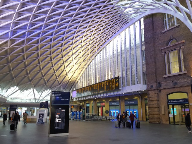
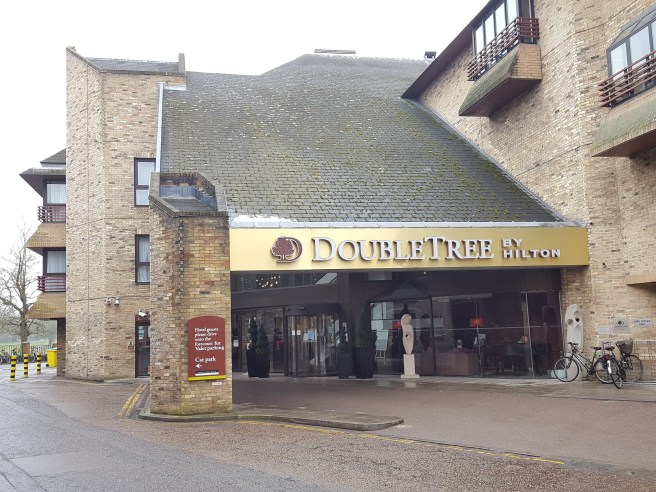
This was my first visit to the Cambridge pen show and I was much looking forward to it. Arriving early, I had time to walk from the station to the venue, the Doubletree Hilton Hotel, on the River Cam. This proved to be a good decision as those travelling by car were delayed by road closures and diversions for the Cambridge Half Marathon.

20180304_093219_001
The venue, situated next to the River Cam.

The enjoyment of the day was as much down to the people, as the pens. First, I was pleased to find Marisa (@illustriouscactus on Instagram) and Faisal, two members from our monthly London UK Fountain Pen Club gatherings, as we waited in the lounge for the show to open. Also I had arranged to meet Jon (@jonr1971 on Instagram) and he introduced me to two of his Instagram friends, @fountainpensandink and @theclumsypenman. Jon later guided me as to the features of some Montegrappa pens which we saw at the show.

20180304_111906
Bright and roomy venue.

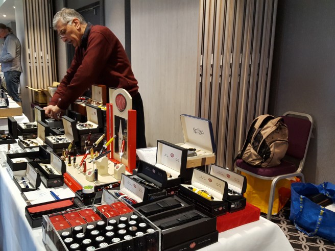
The venue was excellent, a bright, spacious ground floor room with rows of tables on three sides, and more down the middle, which lent itself to doing “laps”.

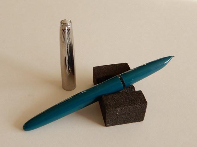
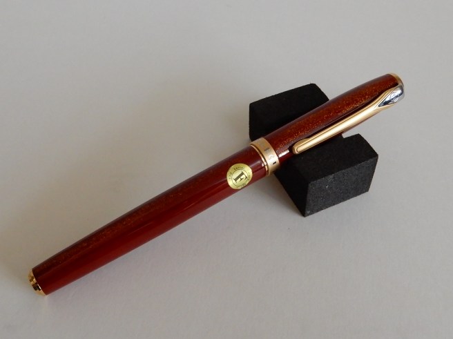
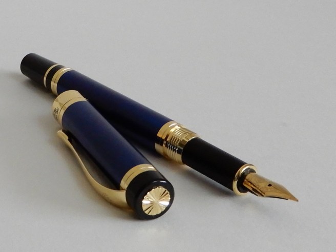
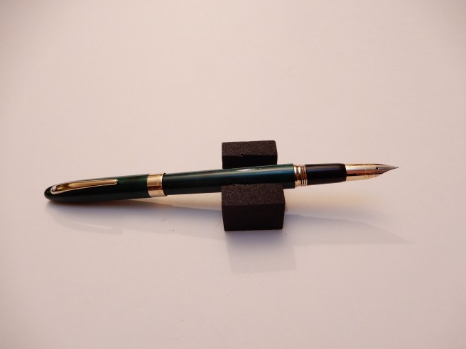
In prime position was Sarj Minhas, with several tables of enticing vintage and modern pens. Immediately, a green Sheaffer (a Crest, I believe) on his table caught my eye, as I already have the matching ball-point which I use daily. The fountain pen has a distinctive conical bi-colour nib in 18k gold. This proved irresistible and I thought it best to pick it up at my first pass, rather than risk losing out. Sarj also showed me some beautiful Sheaffer Balances, which will be added to the “wish list” as the price seemed a bit too high just for an impulse buy.  While at Sarj’s tables it was good to examine some Urushi lacquer pens and an Arco pen which hitherto I had seen only on the internet.

DSCN1782
A Sheaffer Crest with conical 18k bi-colour nib, for which I have the matching ball-point pen.

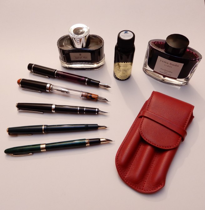
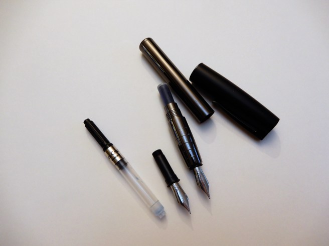
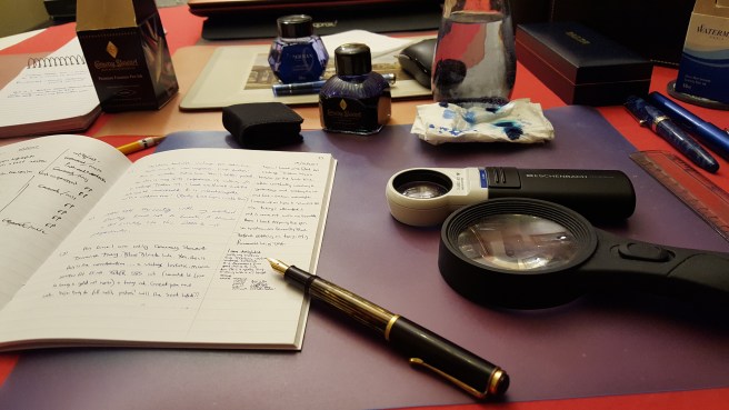
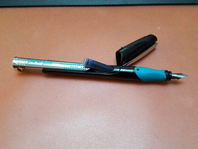
I had not planned to hunt for anything in particular although I was hoping that the vendor of my London Pen Show “mystery pen”, would be there so that I could buy another! He was. I learned that he is John Twiss of Twiss Pens (twisspens.co.uk) and that the blue and clear demonstrator eyedropper pen that I had bought at the London Show, (see blog post: Wanted: an identity for this pen. ) from his supplier is deliberatly left unbranded. John also sells his own handmade pens and produces these at his Nottinghamshire studio. I bought another of the eye-dropper pens as I liked the last one so much and also picked up a gorgeous purple and black cartridge/converter pen with a size 6 nib for my wife (purple being her colour).

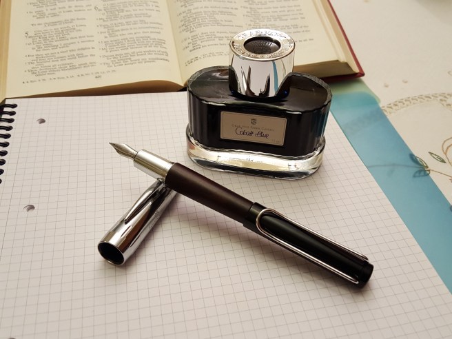
Having now attended the London pen show several years running, I now recognise many of the vendors and I enjoyed talking again to Graham Jasper (of Penestates) who had helped me to select one of his Parker 51 Aerometrics a few shows ago, and Kirit Dal who is a dealer for Aurora. I handled a beautiful Aurora 88 Mineralis demonstrator, but reluctantly put it down again and decided to content myself with a bottle of Robert Oster Aqua ink, at a show price of £10.00.

20180304_121024
The Aurora table.

John Hall of “Write Here” showed me a Scribo fountain pen and told me about the brand. Trying the smooth, wet nib was a revelation. Again, this would have to wait for another occasion but I did not leave his table before buying a bottle of Pilot Iroshizuku Yama-budo,  a beautiful magenta ink.

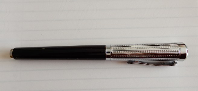
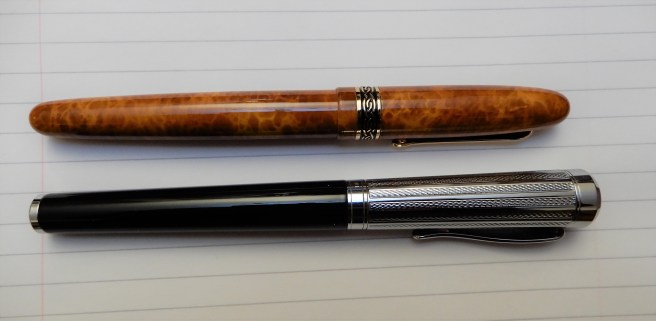
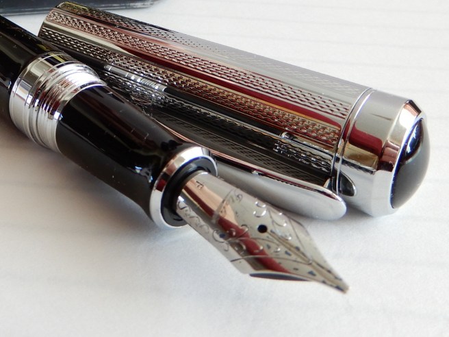
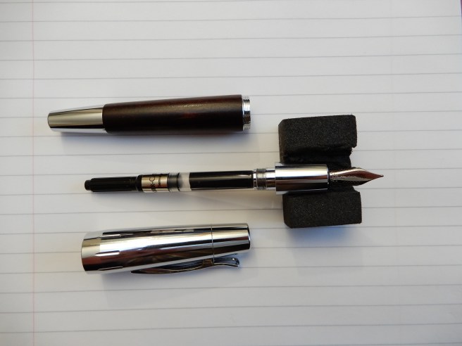
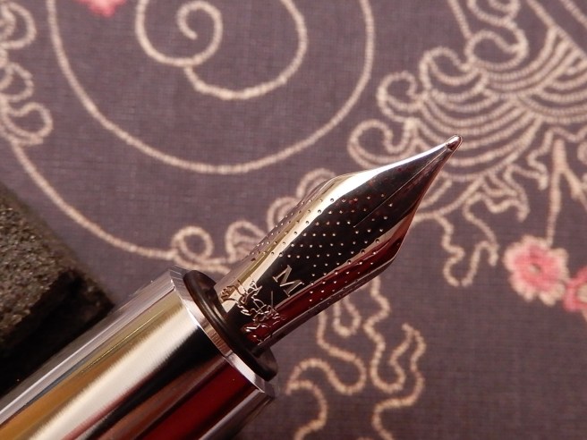
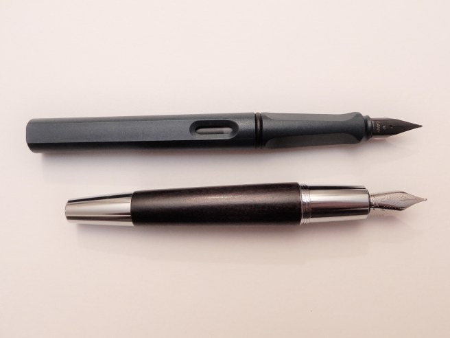
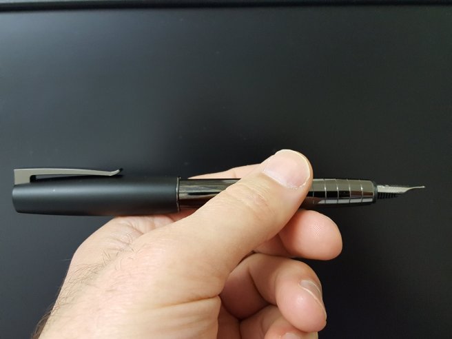
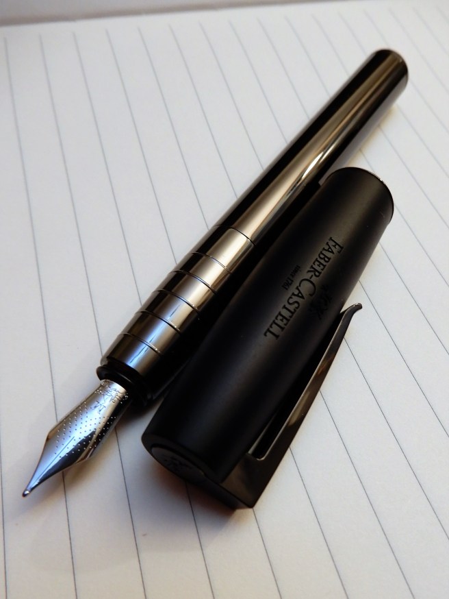
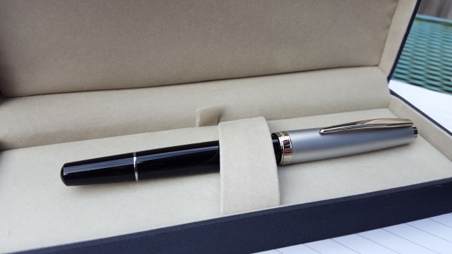
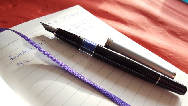
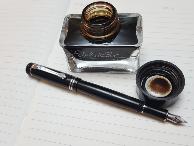
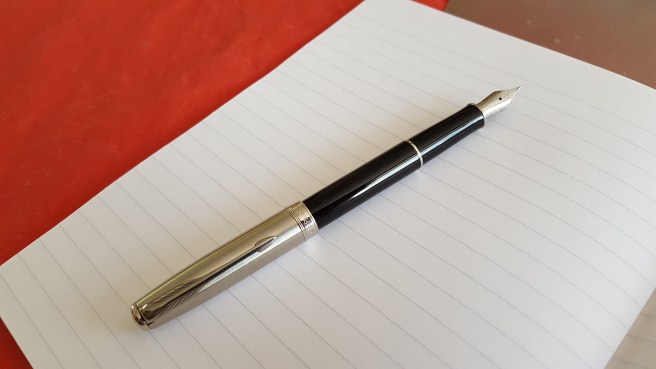
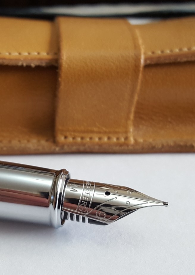
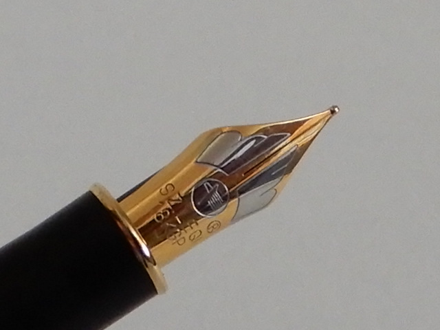
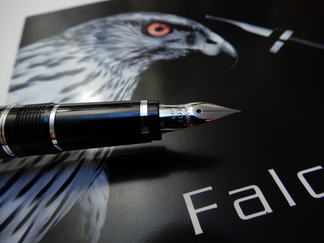
Next at the table of The Hamilton Pen Company, (Nigel Simpson-Stern) I was shown a Pilot Falcon, which I had seen online but was yet to handle. I have harboured an urge to pick up a Pilot (so to speak) and have tried the Custom 823 and the Custom 74 at our pen club gatherings and been impressed by the feel of the gold nibs. The Falcon is different and has a rather uniquely shaped flexible nib. The models for sale were of lacquer over a steel body and therefore heavier than the resin versions and also featured the interesting, large capacity, CON 70 push-button vacuum converter. With my resistance weakening, I chose the metal Falcon in black with a Soft Fine nib and was excited to try it out. I later spotted Marisa again and she kindly allowed me to dip my new Falcon in a blob of wet ink which she made, in her notebook. The smooth, fine, wet flexible nib was wonderful.

DSCN1776
Pilot metal Falcon with 14k Rhodium plated SF (soft fine) flexible nib. The most quill-like nib I have experienced.

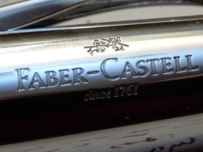
At the same table  I bought another ink, the Graf von Faber-Castell Garnet Red, which I have wanted for a long time, having enjoyed their Cobalt Blue and Moss Green very much.  Oh, and I could not resist a leather three-pen case and chose the red one.

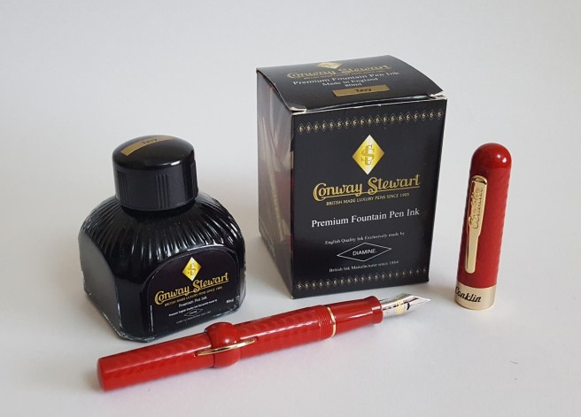
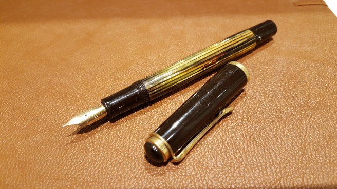
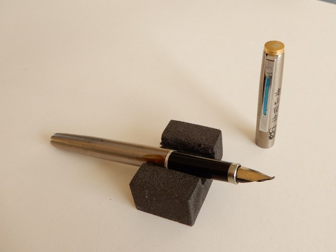
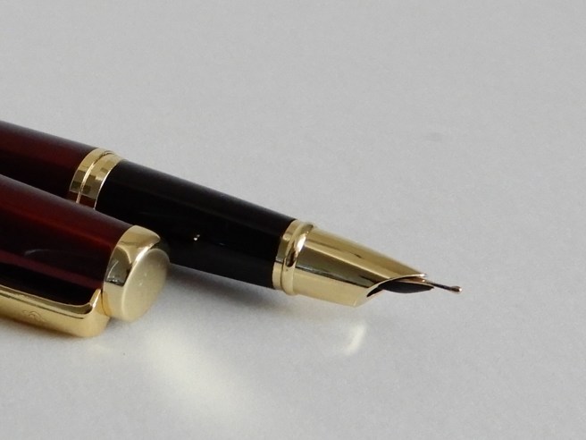
My final pen purchase of the show was a little green vintage Parker Junior Duofold with a broad, 14k gold nib and aero filler. Why? Because this is a close equivalent to the pen that my mother bought me in 1970, to take to my new boarding school and which I lost within the first few weeks. It was my first quality fountain pen and I remember to this day, the sales lady telling me that gold nibs give more expression to your handwriting. I was fascinated, although rather puzzled, knowing that the tipping material was not gold and so why did gold nibs matter? It was to be many more years before I began to appreciate the delights of line variation and inks that shade.

Outside the show I met Jon and his two friends again, for coffee in the hotel lounge where we had a very enjoyable time trying each other’s pens, and sharing our pen stories and experiences.

DSCN1799
Left to right: Sheaffer Crest, Parker Junior Duofold, Pilot Falcon, eye-dropper pen from John Twiss, another un-named pen from John Twiss and a Lanbitou give-away from @fountainpensandink.

All in all, I had a great show. It was somewhat smaller and quieter than the London pen show in October but considerably less crowded. The relaxed atmosphere was perhaps more conducive to some memorable conversations and purchases.

DSCN1791
My haul.

An admiring look at the Italix Captain’s Commission fountain pen.

I have a soft spot for pens with shiny chrome caps. This one is particularly handsome and comes from Mr Pen, an online pen maker and seller, based in Ruislip, on the outskirts of North West London (web site: mrpen.co.uk).

DSCN1707
The Italix Captain’s Commission

Mr Pen is the trading name of P J Ford & Associates Ltd. As well as selling pens of many  well-known brands, the firm also has its own brand, “Italix”,  manufactured in England, Germany and the Far East. As the guarantee states, all Italix pens are hand finished in the UK. The nibs are ground in their own workshops in Ruislip.

As I grew up in Ickenham, less than two miles from Ruislip, it feels nice to deal with a local company, which provides a high quality personal service, even though Italix pens are now known the world over. The Italix Parson’s Essential is very well-regarded and was one of the first pens that I bought online, when my interest in fountain pens began to expand into the world of the internet.

Appearance and design.

The Captain’s Commission, from the same stable as the Parson’s Essential, is a larger pen and quite heavy, with a brass barrel and cap. The barrel is finished in glossy black lacquer, whilst the cap has shiny chrome plating with a very attractive guilloche pattern and a black domed finial. A burgundy version is also available.

DSCN1758
The Italix Captain’s Commission, with the smaller Parson’s Essential above.

An unusual feature is that the pen when capped, tapers gently down from the top to the bottom, with the cap fitting perfectly flush with the barrel, to create a very smooth and elegant piece, rather suggestive of a silver topped walking cane. The pocket clip is firm and springy and should secure the pen in a jacket pocket, against the hazards of being pulled out accidently with other items (as I did recently with another pen, sending it scuttling across the floor of a busy airport terminal).

RSCN1713
Lovely detail in the cap.

Uncapping the pen was a surprise.  First, what looks like a cap band with the Italix name, is actually fixed to the barrel and so the cap separates above it. Secondly, there was an uncommonly smooth, cushioned feel to the uncapping. I think that this may be in part due to what appear to be, two rubber O rings on the inside of the cap. In any event, the cap unscrews very smoothly, although the cap needs about three and half full revolutions (or about five twists) before coming away from the threads. Some might have issues with this but I do not mind it at all. It adds to the feeling of handling a well made, good quality writing instrument. The cap does tighten with reassuring bite. However you do need to take care at first, not to put the cap on cross-threaded.

There seems to be no risk of inadvertently unscrewing the barrel  when you think you are unscrewing the cap, as can happen with some pens. The threads to unscrew the section, are on the underside of the threads which unscrew the cap; so you would have to remove the cap first, otherwise you could not anchor the nib and section while unscrewing the barrel.

Beneath the cap, is an impressive, large (size six) nib with attractive scroll work and the Italix brand name.

DSCN1702
Size 6 F nib, ground to Italic Fine by Mr Pen.

A Schmidt converter was included although the pen also takes standard international cartridges.

DSCN1700
Schmidt converter included. The nib and feed are friction fit.

Nib and performance.

Mr Pen offers a huge choice of nib options, (I think, 27), mostly steel but with one gold option. I chose the steel Italic Fine, having a width of approximately 0.85mm. I hoped that this might suit me better than a 1.1mm stub, given that my handwriting is not large and I have to be careful to avoid filling in all the loops when I use a broader nib. I was a little apprehensive that an italic nib would have sharp edges and dig into paper unless handled very carefully, whereas cursive, or stub options have more rounded edges. An hour or so after putting in my order online, I telephoned Mr Pen and spoke to proprietor Peter Ford who gave me further advice about the nib choices. By this time, my order had already been packed and franked ready for dispatch! However, he offers a nib exchange within 30 days and so there is no need to worry if you do change your mind.

My pen arrived in the post the following day.  I need not have worried about my nib choice. This was my first ever custom grind nib. The only previous experience that I had with italic nibs was on cheap calligraphy sets, where the nibs do have sharp edges that can dig into the paper unless held at a very  precise and consistent angle.

DSCN1764
With gift box.

There were no such problems with the Captain’s Commission. I flushed it first with water before filling with my usual Conway Stewart Tavy, blue-black ink. Putting pen to paper for the first time, was a delight and has been ever since. It was smooth from the word go, firm but with a decent flow which allowed me to write in my left-handed, overhand, slanting handwriting and still have a smooth writing experience, with suitable paper.

DSCN1753
From the hymn book. The words seemed appropriate.

I mention this as being left handed and writing the way I do, sometimes means a drier writing experience, as the pen is doing more pushing upwards and sideways, than down strokes where more ink is released. To cater for this, I have also developed an “elbows in”, upright style of writing too, but find it harder to write neatly in this way.

DSCN1729
From West Side Story.

Size and Weight (approximate).

The pen is 145mm long capped, 131mm when opened or 160mm when posted. It weighs around 53 grams in all (including converter and ink) or 28g uncapped. The cap weighs around 24.5 grams, by my scales.

The cap can be posted securely. (The rubber O rings inside the cap keep the cap from slipping off when posted and also protect the lacquer, I presume). However, in practice I would envisage the cap only being posted for ceremonial purposes or photo shoots. It adds a lot of weight to the back end and causes imbalance, unless you hold the pen quite high up. So in general, you have an uncapped pen of 131mm and 28 grams, which is very nice indeed.

Conclusions and value.

I have been using the pen for just a week now and have been thrilled with it. It looks stunning, feels weighty and substantial and writes among the best of steel nibs that I have experienced. I have had no hard starts. The writing experience will differ depending upon inks and papers chosen, as with any pen, but I have already found some winning combinations.

The cost (including the ground italic fine nib) with post and packaging and vat came to £57.22. My delight at the pen has been far in excess of what this price might warrant. For comparisons, there are many steel nibbed pens such as the Cross Bailey or Sheaffer 300  but none that I can readily think of, certainly at this price, which has the elegance and vast choice of ground nibs as the Captain’s Commission.

DSCN1706
Now, who shall I write to?


A look at the Faber-Castell E-motion fountain pen.

On a day of beautiful autumn sunshine in September 2015, I went into central London to look in a few pen shops. I bought a bottle of Waterman Harmonious Green ink at Pen Friend in the Burlington Arcade, before going into Fortnum & Mason to visit their fountain pen department.

As I hovered over the displays, the sales assistant Robert asked “What’s caught your eye?” I had found the Faber-Castells and was rather taken with the  striking looks of the E-motion, with its combination of natural wood and shiny metal.  A delivery had just come in and he went to find one in the dark Pearwood finish. I preferred this to the lighter brown version or the all black “stealth” model. After trying the pen on a pad of Graf von Faber-Castell paper, I bought one. It was rather an impulsive buy and at £87.99 was one of the more expensive pens that I had bought.

DSCN1613
Faber-Castell E-motion fountain pen.

I was delighted with my choice. Before leaving the shop, with my pen and a much appreciated complimentary Graf von Faber-Castell note pad, in a distinctive Fortnum and Mason carrier bag, I went to ink the pen with my new Harmonious Green, then went to the Royal Academy across the road, to try it out.

20150926_134711
First inking. Waterman Harmonious Green.

In the years that followed, it has been a pen for which I have mixed emotions. I have bought four more Faber-Castell fountain pens (an Ambition, two school pens and a Loom) and have always found their stainless steel nibs, even on the entry-level school pens, to be very pleasing. The Ambition, E-motion and Loom share the same nib unit. Today I will look back at the E-motion, my first foray into Faber-Castell fountain pens.

Construction and Appearance

This is a metal pen, rather short and tapering at each end, with a large, heavy, shiny polished metal cap. There is a smooth, curved pocket clip, which is sprung and can be operated one-handed.  The cap is tastefully embellished with the Faber-Castell name and logo and the words “since 1761”.

RSCN1607
Cap detail.

Removing the screw cap, in two short twists, you have the nib and section in shiny steel. There is also a tapered finial (perhaps nugget or lump of metal would be a better description) in shiny polished steel at the end of the barrel. The main part of the barrel is very attractively finished with a layer of dark brown Pearwood, with its beautiful, natural dark wood grain and patina. There is no discernible join around the wood and so I suppose it to be a carefully drilled tube of wood, slid over the metal barrel, before the end finial is put in place. Correct me if I am wrong.

The barrel unscrews to reveal metal threads on both the section and inside of the barrel. Everything fits together very well and gives an impression of sturdiness and good quality. A converter was included with my pen but it also takes standard international cartridges.

DSCN1642
With Faber-Castell converter.

The Nib

This is stainless steel, in an attractive shape and finish. There is no breather hole, but the nib features a pattern of dimples, which are subtle yet catch the light sometimes in a most pleasing way. My nib is a medium, but writes on the fine side of medium, which suits me. I later discovered that the nib and feed unit can be easily unscrewed from the section and that the nibs are interchangeable with those of the Ambition or Loom.

RSCN1617
That nib though. 🙂

Dimensions and weights

Length closed: 138mm

Length opened: 117mm

Length posted: 148mm

Weight capped or posted: 53g

Weight uncapped: 31g

Weight of cap: 22g.

DSCN1622 (2)
Faber-Castell E-motion, below a Lamy Safari, (the standard unit of pen measurement).

Handling and performance

The pen writes very well. The tines were level, the tipping material was symmetrical, and the ink flow on all the papers I tried, was just right, neither too dry nor too wet. The nib gives a smooth writing experience, but not overly so; there is enough tooth for the pen to cope with smoother paper and to give a pleasant degree of feedback. Of all the stainless steel nibs that I have used, I would say that these have been consistently among the best. It also provides good “cap-off” time, remaining ready to write even if the pen is left uncapped for a few minutes.

On the downside, for my hands, the pen is just too short to use comfortably unposted. If I were to use it unposted, I would try to grip it low down around the section, but this does not work for me because the shiny metal section is slippery to hold and cannot be gripped steadily.

The cap can be posted (although it needs a hard push and a twist – with a worry of cracking the inner cap or marking the lovely wood covered barrel) and whilst this solves the length problem, this makes for a very heavy pen. You are carrying the full 53 grams as you write.

Conclusion

I do like to be flexible and accommodating to my pens, to allow for their idiosyncrasies and to celebrate their diversity. In the case of the E-motion, I found that the best way to use it was to post a light weight cap from another pen. This means the pen is probably confined to home use, but I have used this method to good effect on at least three pens now  (the E-motion, the Faber-Castell Ambition and the Bic Easy-Click). You might have to rummage around to find the best match of size, weight (and even colour if you are lucky) and try several tops before you find the best fit.

DSCN1623 (2)
Not you Scary. I said try several tops.

It is a good idea to keep some pen tops when roller balls or marker pens such as the Sharpie run out, for this very reason. For the E-motion or the Bic Easy-Click, the Lamy Safari caps work well.  For the Faber-Castell Ambition, I use a Sharpie cap. Obviously it looks unfashionable and eccentric, but it is better than leaving the pen unfilled and unfulfilled.

I find that when I post a Safari cap on the E-motion, I naturally grip the pen higher up and around the warm wooden barrel with only my second finger used as a rest for the metal section. Consequently there is no issue of the section being slippery to hold. And the pen is not too heavy or too short, although still on the heavy side. Length with a Safari cap posted is a comfortable 152mm and the Safari cap weighs just 8.5g as opposed to the E-motion’s hefty 22g.

20150927_232235
E-motion with a cap from a Safari posted. It posts well to add length without adding much weight.

So this, for me, was the way to deal with my E-motions. YMMV. It is an attractive and good quality pen and it is worth persevering to make use of the excellent nib.


A look at the Faber-Castell Loom fountain pen.

If you are trying to resist the temptation to buy more fountain pens for a while, then drifting into Selfridges on London’s Oxford Street and heading for their new pen department, is probably not going to help.

The pen department has moved, from the ground floor to the lower ground floor, near Dolly’s cafe (for afternoon teas). There is a Mont Blanc area and then, next to it, another section with a generous area of brightly lit and enticing glass counters and wall displays, for all the other fountain pen brands that they stock.

As I was not looking for anything in particular, I made the customary lap of the cabinets, admiring but resisting the expensive offerings, but then hesitated at the display of Faber-Castells. These looked particularly good value, after a circuit of all the other brands. I asked to see the Loom fountain pen which I had not handled before. On a previous visit a year or two ago, I had looked at a Loom but at that time, they had only the roller ball version.

Now, there were numerous Loom fountain pens to chose from. Typically, these have a grey coloured metal barrel and section, with a coloured plastic cap in a range of colours. The section is reasonably wide but tapers towards the nib and has five raised rings, to aid grip.

In addition to several models like this, I saw one with a shiny silver chrome barrel and glossy black cap and another, with shiny gunmetal grey barrel and section, and matte black cap. It was this latter model that I was to go for.

20180108_115828862486705.jpg
Faber-Castell Loom, shiny gunmetal version.

I was particularly interested to try holding the pen and to see whether the metal section was slippy or whether the raised rings solved that.

What I found was that the standard, silver coloured metal sections are still a bit on the slippery side for me. However, the shiny gunmetal version was not slippery at all. It seems to have some sort of thin plastic coating over the barrel and section. If you press on it hard with your thumb and then try to slide your thumb on the section, it judders along and squeaks, as it overcomes the surface resistance.

The shiny gunmetal version cost a little more than the others, (£45.00 as opposed to £37.50, I think) but seemed the better option to me, both in aesthetics and handling. I have learned since, that there is also a matte gunmetal version which I have seen online only. I also bought a box of 20 Graf von Faber-Castell cartridges in Cobalt Blue because (a) I love this ink and (b) I loved the orderly ranks of five rows of four cartridges in this handy dispenser, like a box of bullets, and which can be used again.

DSCN1522
A box of 20 cartridges to go with your gunmetal pen.

The pen comes in a decent, white cardboard gift box with a slide out tray in a sleeve and also a cardboard outer sleeve. It comes with one royal blue cartridge plus a dummy cartridge, (showing that there is room for a spare in the barrel) but no converter. There is also a little instruction manual which is now date stamped, 6 January 2018, Selfridges, London. Naturally you pay a bit more than with online-only dealers, but you get personal service, an opportunity to handle the pen (and try it if you wish) and a memorable buying experience.

DSCN1530
Faber-Castell Loom with gift box

Examining it more closely at home, the shiny gunmetal finish is interesting, as it appears to have under the plastic coating, an oily finish of patches of dark red and dark green which reflect the light, like a gun that has just been oiled, except that the surface does not feel oily and on the contrary, can be gripped very well.

20180108_111509167645840.jpg
Loom posted, trying to show the oil-like reflections under the coating.

The pull-off cap is very stiff. (Lips pursed, eye-brows furrowed, elbows a quiver, “Pop” – there it goes!) and also snaps closed with a reassuring click. This stiffness of the cap, so far, is my only negative about the pen but I find that it can be “soft-capped” if in use for extended but intermittent note taking and which I now do. Also the nib and feed are much better than most, at remaining ready to perform, even when left uncapped for several minutes. The pocket clip is, I think, metal but plastic-coated and is hinged, although it lacks the ability to be opened one handed by pressing down at the top.

Unscrewing the relatively weighty metal section, I discovered a tiny code “f7” on mine. I have not yet been able to find any information about these codes but I am guessing it is a production date code, the 7 being for 2017. I think this because each of my 20 Cobalt Blue cartridges also has f7 stamped on them, in black. Also, I looked again at a Faber-Castell Ambition that I bought two years ago and discovered that it also had a stamp near the threads for the barrel, reading “d4” and so I guess that would indicate a manufacturing date in 2014. If anyone has any further information about these codes I would be interested to hear. I do like a production date code. Next best thing to a serial number.

DSCN1527
Loom section, showing code f7.

In use, the metal barrel and section initially feel cold to the touch but swiftly warm up. The cap posts quite deeply and securely, making for an extremely comfortable and nicely balanced pen. At 120mm opened and unposted, it could be used without posting but my preference is to post the cap, bringing the length to around 155mm. Weights are 33g in all (including two cartridges), or 26.5g uncapped. The cap alone weighs 6.5g.

The best thing about this pen though, is the Faber-Castell stainless steel nib. This is a traditional shape, but with an attractive dimpled pattern and no breather hole. There is the Faber-Castell logo of jousting knights (although you need a magnifying glass to make this out) and an M for medium. Mine performed perfectly, glassy smooth and with ideal ink flow, straight out of the box. This has also been my experience with the same medium nibs of the Faber-Castell e-motion and Ambition. Some reviewers find the nib to be too smooth, so that it runs away with you. I do not think this is a fault but you do need to slow down, particularly if you are used to writing with a ball pen. It is not a feedbacky nib and so it might skip on very smooth papers.

DSCN1510
Loom uncapped.

Incidentally, the nib and feed are within a black plastic collar and the whole nib unit can be easily unscrewed from the section. You may then extract the nib and feed from the collar, which are friction fit, if you ever need to. I refer to SBRE Brown’s useful Disassembly Line videos which demonstrate this process. When replacing, take care to a line up the nib and feed correctly with the air replacement channel.

DSCN1523
Disassembled. The additional nib and Faber-Castell converter were from previous purchases.

Using the pen extensively at work and at home this week I found that the weight, balance and feel of the pen in the hand were so comfortable, that I soon stopped being aware that I was holding a new pen and was aware only of what I was writing. It is rather like having a very comfortable new pair of shoes.

I used up the supplied royal blue cartridge first, rather impatient to get on to my Cobalt Blue cartridges. The Cobalt Blue is one of my all time favourite inks, being a rich dark blue but without being blue-black.

So, the New Year pen fast has been broken. But I have no regrets and am delighted with this pen, which I personally find more comfortable than both my Faber-Castell e-motion or Ambition. At this price level, other comparables for a metal-bodied, stainless steel nib cartridge converter pen would include a Lamy Aion, a new model Parker IM, or Sheaffer Sagaris, but which all use their own proprietary cartridges. But for handling and nib performance, I would recommend the shiny gunmetal Loom.

2017: Some of my fountain pen highlights.

20170218_140726
Cleo Skribent Classic Metal piston filler. Gorgeous.

As the year draws to a close, it is time to reflect on some of the year’s highlights of my fountain pen hobby.  In what was a busy and eventful year, this is a continuing source of relaxation and enjoyment. I include in this, not only using fountain pens but all the related activity of filling, cleaning and general tinkering with pens; hours of pen, ink and paper sampling; reading and writing about new pens, photographing them and shopping for pens and supplies.

Before writing this, I looked at my end of year review from 2016. During that year I had bought 40 new pens for myself and concluded that in 2017, I expected to buy a lot less. Oh dear. Let me admit right away that this did not happen.

I have kept a record of pen acquisitions. In 2017, the gross number acquired, was 52 (gasp). That sounds like one every week. I can imagine detectives in an incident room, huddled around a map and predicting when and where I am likely to strike next.

Well, it wasn’t quite like that. Two were for bought for other people. Another, a Visconti, I returned the following day as I decided that I was not suited to it, and so that doesn’t count. Then towards the end of the year, while on holiday in China I was given two pens by a cousin and eight, mostly Heroes, from an uncle who was a retired teacher, who insisted that he did not need them anymore.   So that brings it down to 39.

And of these, only three (the ones with gold nibs) cost over £100.00 and the most expensive was £159. These were the vintage Pelikan M400, Sailor Magellan Lapis Lazuli and the Cleo Skribent Classic Gold.  My total pen spend came to around £1,300.00. Many of the pens cost little more than a trip to a cinema or a meal out and have given me hours of enjoyment. Some were in sales at irresistible prices.

Anyway, without further excuses, here are some highlights, in no particular order.

New Pens

In view of the number, I am not going to post one photograph showing them all. It would be a bit like seeing all the food I have eaten in a year.

To summarise the main acquisitions by brand, these are:

  • Cleo Skribent: (2) – Classic Metal and Classic Gold. I am delighted with them both. The nibs, whether steel or gold, are wonderful.
  • 20170219_090125
    Cleo Skribent Classic Metal piston filler.
  • Conklin: (2) – Mark Twain Crescent Fillers, in coral chase and red chase, from the London pen show. Lovely to use and to fill.
  • 20171007_101513
    Conklin Mark Twain crescent filler, in red chase.
  • Faber Castell: (2) a pair of cheap school pens, one red and one blue, with good nibs.
  • Hero (9): either bought or given to me while in China.
  • Kaweco (5): I bought the Allrounder, the Dia2, two of the newly released Perkeos and one Sport Skyline Mint. Of these, the Dia2 is my favourite and one of the most comfortable and reliable pens I have, at any price. The Perkeos have grown on me, as I like the length and the slightly bouncy nibs. The aluminium Allrounder is well made and solid, but for just slightly more money, I would still prefer the Dia2.
  • 20171027_004044
    Kaweco Dia2. Pretty much the ideal pen for me and a firm favourite of 2017.
  • Lamy (5): I picked up the new 2017 special edition Safari in Petrol and AL-Star in Pacific Blue. Both came with a pack of matching cartridges. I was more thrilled with the Petrol (dark teal) with its lovely shading and closely matched pen and ink, although in practice, I did not use it very much. The Aion was a journey; I read and watched lots of online reviews, deliberated over the grip and then succumbed. I posted some thoughts on it at the time. I do like it but find that it needs a different way of writing; you need to “let go” and not grip too firmly as the surface won’t let you.
  • Parker (4): I bought three Sonnets, because they were greatly reduced in a Rymans sale. I got one in red and gold, one in black and one in brushed stainless steel. I rather like using the black one with the cap from the brushed stainless steel one. Then in November I picked up a simple, blue plastic Parker Reflex which writes effortlessly. I read that the caps are prone to cracking in time but I am not worried as I have already found several other pen caps which would fit if need be (such as a Kaweco Sport).
  • 20170902_144405
    Black Parker Sonnet, with the cap from the brushed stainless steel model. “Let me not to the marriage of two pens, admit impediments.”
  • Sheaffer (4): I bought a Sheaffer 100 with Translucent Blue barrel and steel cap, which I think looks stunning and has a good nib. It looks more attractive than its modest £35.00 cost would suggest. I also bought another Sagaris (medium) in black, since I like my burgundy one so much. Then I spotted the Sheaffer Pop in blister packs, reduced to half price and bought two.
  • 20170817_220846
    Sheaffer 100 translucent blue. That nib though!
  • TWSBI (2): I bought an Eco with a fine nib and a new Classic in white with medium nib. These are both great, as low-cost, high-capacity piston fillers and both perform well. I now have four different TWSBIs in all.

So, in number, Hero were the pens that I got the most of this year, although many were gifts. Of my purchases, Kaweco and Lamy were the brands that I bought the most of (with five of each) closely followed by Parker and Sheaffer both on four.

New old pens

I bought a vintage Pelikan M400 tortoise at auction, with a fine and rather flexy 14k gold Rover nib. I enjoyed cleaning this and was thrilled when after a night’s soaking in water, I was able to unscrew the nib and ebonite feed. At the same auction, buoyed by my newfound bidding success, I went on rather impulsively to bid for a Sailor Magellan Lapis Lazuli, limited edition, with a 21k zoom nib.

20170119_211024
Pelikan M400 vintage, tortoise. My first auction purchase.

Writing

I have kept a diary for years. This year, I used an A5 page a day diary from Rymans. I find that the best time for me to write is early in the morning, to write up my record of the previous day. I used my Pelikan M800, with Graf von Faber-Castell Cobalt Blue, a favourite combination.  I also finished writing up a volume of memories, purely for my own amusement, of being at boarding school in England in the 1970’s. For this I used a selection of different pens and inks over the year, really as a writing exercise and at the same time, to try out pens and inks for longer writing sessions with some sort of purpose, rather than writing “The quick brown fox jumps over the lazy dog.”   I also enjoy writing letters and picking up whatever pen I fancy from the pen cup.

One pen, one ink, one hour

I have struggled all year with the dilemma of having too many fountain pens inked at once. Do you keep them all in use until you write them dry, or strive for an impressively minimal number of pens in the cup at the expense of flushing away good ink ? I am now less fussy than I was, about washing pens half full of ink but even so, I think my pen cup occupancy peaked at around thirty at one point.  Part of me longed for the days when I possessed only one pen and one ink. As a break from having too many pens to hand, I made up an activity which I cleverly named “One pen, one ink, one hour” which involves retreating, generally to a coffee shop and then writing more or less continuously in a notebook for an hour, with one pen. It is a good test of how a pen feels, whether the shape or the weight make your hand ache, how the feed keeps up and how you like the nib and the ink. You can write about anything, the pen itself, the fellow customers or whatever you like. No one is going to read it, thankfully.

Giving pens and advice

I mentioned that I bought a couple of pens for other people. One was a Kaweco Dia2, for my neice’s birthday. I had bought one for myself earlier and was so utterly delighted with it that I wanted to spread the joy. It is one of my favourite new pens of the year, along with the two Cleo Skribents and Conklin Crescent fillers. Another pen bought for someone else, was a Manuscript Clarity, requested by a reader of my blog, living in Vietnam.

In the summer I was flattered to be asked secretly by a cousin, to advise her on buying a fountain pen for her husband on their wedding anniversary. That would be my dream question in an exam. I sent back rather a long reply but narrowed it down to about three suggestions, based on the budget. In the end, she ordered a Pelikan M600 in blue with a fine nib. Later she sent me the most beautifully written thank you note, in her cursive italic handwriting, written with the pen that she had chosen and which was a great success.

Fountain pen blog

This blog celebrated its first birthday on 5 November 2017. Born in a few hours of playing on the WordPress web site, it was a bold step into the unknown. I had aimed loosely to post about once a week, just writing about whatever pen-related topic interested me. Now, I have just passed 50 posts. The number of followers gradually grew, roughly in tandem with the number of posts. I find the whole experience, of writing and publishing posts and getting feedback from readers, most enjoyable. This week the total views nudged past 7,000 and from over 80 countries, which I find astonishing.  I am not trying to boast here as I am sure many reading this have far higher numbers, but I am genuinely amazed at this exposure. In the summer, I published two posts about the newly released Kaweco Perkeo and these have between them been viewed over 900 times, largely because someone on FPN kindly put a link to my post in his.

Meeting people

It is easy to spend too long online reading about pens, what with WordPress, Instagram, YouTube and various online pen shops, such as Cult Pens and The Writing Desk. So it is particularly nice when the opportunity arises to meet pen people. This year, I attended my first Pelikan Hub event in September, which I enjoyed, closely followed by the London Writing Equipment Show in October when I came away with five new pens. Then in November, I met some of the same people at the monthly gathering of the London UK Fountain Pen Club.

Travelling with ink

When the opportunity arises, I enjoy looking in stationery shops overseas to see a different range of pens. I was interested to shop in China while on a holiday earlier this month, as covered in my most recent posts.

Conclusions

For me, this is the continuation and escalation of a hobby that began when I was about ten years old. The fountain pen community, I find, are very decent and not judgmental of others. Perhaps we are our own fiercest critics and there is a lot of self-guilt which goes with buying too many pens. Our favourite pen, when asked, is often “the next one”. It is addictively enjoyable, when it goes well. But I am reminded of lines in the song Beauty for brokenness (Graham Kendrick), which read “Lord end our madness, carelessness, greed;  make us content with the things that we need.” I am aware that my accumulation of pens (I haven’t mentioned the thirty or more new notebooks that I have “in stock” and the drawer full of ink) is hard to justify, even to myself. Indeed there are times when I would prefer to have fewer and appreciate them more, as in my coffee shop exercise. For 2018, I will simply repeat 2017’s resolution, to aim to buy a lot less pens and use and appreciate those that I have, all the more. Wish me luck, everybody.

Happy New Year to all and thanks for reading.

20170119_221627
Tinkering with the tortoise.


Travelling with ink, China 2017. Part 3: The Pens from Uncle

During a recent holiday to visit my wife’s relatives in China, I was given a bag of eight old fountain pens, by an elderly uncle who assured me that he had no further use for them.

DSCN1460 (2)
From left to right: 1. Hero 716 (teal); 2. Hero 329 (grey); 3. Hero 616 (burgundy); 4. Hero, black (number unknown); 5. Hero 443 chrome; 6. Brushed stainless steel pen with fude nib, make unknown; 7. Jin Rong; 8 Jin Rong.

Over the Christmas holidays I have had a chance to have a play with these and try them all out. All were Chinese made pens, all with steel nibs and all with the Parker 51 Aerometric style (squeeze bar) filler. Four of them are what I loosely call Parker 51 copies, with the distinctive hooded nib, resin barrel and section and a metal cap. It is perhaps not correct to describe them as copies since they are unashamedly branded as Hero pens of various models and not all even have the arrow clip. However the origins of the design are unmistakable.

RSCN1463
Hero 716 fountain pen.

Then there were two metal pens, one being a Hero 443 in chrome finish with black section, the other a brushed stainless steel pen, with an attractive light blue reflective inlay and a letter “Y” on the pocket clip and an interesting looking curved nib. I do not know the make.

The final two were a pair of lacquered metal pens one cream coloured and one black, bearing the name Jin Rong.

I uncapped all the pens, posted the caps (taking care not to get the caps mixed up), unscrewed the barrels then took them all to be washed. With a sac filler, you do not immerse the sac in water but just the nib section and then operate the squeeze bar a few times to flush water in and out of the pen until the water runs clear. I was pleased to find that they all produced a small stream of air bubbles when I squeezed the bars, which I took to be sign that the sacs were air tight. Furthermore, all were clean. It was good to know that uncle had washed the pens before putting them away. Only the burgundy model produced a pale wisp of red ink in the water. This made me smile. So uncle also matched his pens and inks. I do that too. Perhaps this one had been used for marking school work.

After flushing and drying them all, I then tried dipping and testing each of the nibs and writing a few lines, to see which might be usable. I used Waterman Serenity Blue ink.  All of them wrote although they tended to be firm, feedbacky and not the smoothest of writing experiences that money can buy. But I was pleased that they all at least wrote and could be used.

I have since chosen to ink the teal Hero 716 and the stainless steel one with the curved nib both with KWZ Azure #4.

The curved nib pen is rather unusual. At first glance, the nib appears to be a gold coloured piece of metal with a fold down the centre. On closer inspection, this is not the bit that does the writing. Beneath this sits the stainless steel nib, with the tip curving upwards at about 45 degrees and beneath it, the feed unit. The gold coloured part serves to stop the nib from bending upwards any further. Perhaps it might also serve as an ink reservoir since there is a gap between it and the nib, if you are using this as a dip pen.

DSCN1467 (2)
Make unknown; a souvenir pen from a mountain beauty spot. Fude nib.

This nib produces a fine line on the downstroke and a broad line on the cross-stroke. This is rather unusual and is the opposite of what you get from a stub nib. This is similar to the writing experience from an “architect grind” nib. I found it fun to try although it takes a bit of experimenting to find the correct angle at which to hold the pen. Also, I need to write a little larger than usual to avoid loops all being blocked in.

RSCN1456
Fude nib on the brushed stainless steel pen.
DSCN1490 (2)
Writing sample from the fude nib. Ink is KWZ Azure #4.

As for the teal Hero 716, I am enjoying it, particularly with the KWZ Azure #4 ink that seems a good  match for the pen. My only reservation would be that the sac did not seem to be drawing up much ink. Perhaps the breather tube was blocked or the rubber sac had insufficient vacuum-pulling power when resuming its shape. Next time I will try to measure the ink up-take.

RSCN1489
Trying the Hero 716, with KWZ Azure #4. A good match.

It is a pity that original Parker 51s are no longer made and that you can no longer visit a local stationery store and purchase a brand new one with gold nib, but times have moved on. Fortunately, used models can readily be found at pen shows. I am told that the original aerometric filler sacs rarely have anything wrong with them, although if need be, the sac can be replaced.

It is rather old fashioned nowadays in this digital age to be using a fountain pen at all and particularly to be filling from a bottle with a squeeze bar. But as we know, this is all part of the joy of fountain pen ownership. The satisfaction of filling a pen from a bottle more than makes up for the inconvenience. For me, anyway.   I will enjoy picking up one of uncle’s old pens to use from time to time, along with my other pens. Thank you uncle. I will take good care of them.

Travelling with ink, China 2017. Part 2: Finding a Picasso.

DSCN1082
Terraced rice fields, Longji, near Guilin

Time now to conclude this two-part post, about shopping for fountain pens while on holiday in China. For Part 1: Meeting the Heroes”, follow link here: Part 1 . (Update: a Part 3 epilogue was later added).

After Shantou, we sped by bullet train at over 200 Kmph, southwards down the coast to Shenzhen, a city on the border of China and Hong Kong. Taking a short walk along a bustling shopping street near our hotel, we came to a shopping mall and department store and popped in to have a browse. The supermarket had a stationery section, with pens and exercise books. There were few fountain pens to be seen, but I picked up one which looked unusual.

This was the Maped Reload. In a blister pack, it was not possible to handle the pen before purchase, but at around £2.00 in our money, it seemed worth a shot. The name “Reload” is a reference to the filling mechanism, whereby you slide back a chamber in the barrel, insert a standard international cartridge, plus a spare one, and slam it home again, like cocking a Winchester. The closest thing I had seen to one of these before, was a Bic Easy-Click child’s pen. However, the Maped Reload appeared to have several advantages over the Bic, in that (1) at around 138mm uncapped, it is a full size pen and does not need posting; (in fact you cannot post the cap as it simply will not fit on the barrel); (2) you get a stainless steel nib with tipping material, rather than a butterfly, folded nib tip; (3) there is room to carry a spare cartridge in the barrel; (4) you get a strong, metal pocket clip.

20171216_220658847872412.jpg
Maped Reload. Look after your thumbs when removing the cap.

The pen has a snap-on cap and a rubberised grip section with three facets and is reasonably comfortable to hold. On the down side, the pen is very plasticky as you might expect at this price point. However, that was not my biggest complaint. What really turned me against the pen was the force required to pull off the cap. Holding the barrel with my thumbs at right-angles to the barrel, I found myself exerting an ever increasing amount of lateral force on my thumbs until eventually my joints almost gave way. Moral: look after your thumbs; keep them in line with the pen, not at right angles, when dealing with stiff caps or caps of untried stiffness!

Just as we were leaving the shopping centre, I spotted a pen shop on the ground floor. The signage advertised Parker, SJ Dupont and several other well-known brands although the stock in the glass display cabinets was for the most part, either Parker or local Chinese offerings. The prices of the Chinese fountain pens were very modest and furthermore, there was a 50% reduction on all marked prices.

The first to catch my eye, was a bright red and chrome pen, with stainless steel nib and brushed stainless steel section. This brand was called Picasso and featured a cubist face logo on the cap and nib and the Picasso signature etched in the section. A converter was included. Metal lacquered cap and barrel. Metal threads. A decent gift box and a colour booklet. The cost? 98 RMB reduced to 49 RMB, about £6.00. And it writes beautifully.

RSCN1403
Picasso fountain pen.
RSCN1408
Cubist logo on the Picasso fountain pen nib

In this sudden flurry of holiday shopping activity, I picked out another Picasso, a slightly different and larger model but again, a stainless steel nib pen with metal lacquered cap and barrel and a good quality feel. This cost a little more and was called the Pimio.

RSCN1410
Another Picasso, this one is the Pimio.
RSCN1161
Picasso Pimio finial

I later read on the included booklet, that Picasso pens are produced by the Shanghai Pafuluo Stationery Co Ltd (web site http://www.sh-picasso.com, which is worth visiting).

The last of my pen purchases, perhaps the most unusual and the one which had caught my wife’s eye in the display, was burgundy with three bands of gold glitter running down the cap and barrel. The pocket clip was of both silver and gold colour, nicely introducing the bi-colour 18K gold plated stainless steel nib within. This was the SZ LEQI 700. No, I had not heard of it either. It is crying out for a shimmering ink!

RSCN1418
SZ LEQI 700 fountain pen
RSCN1422
Bi-colour nib of the SZ LEQI 700

I hit upon this shop shortly before closing time and the lady was pleased to sell me three fountain pens in as many minutes. As well as the gift boxes that the two Picassos came in, she gave me one of her empty 10 pen plastic trays with see through lid which proved ideal for transporting the eight old pens that I had been given by an uncle a few days earlier.

Back at the hotel I enjoyed dipping the new additions and then inked them up with Aurora Blue Black, the only ink that I had on the trip. All wrote very well.

However, this was where my fountain pen spree came to an end. In Guilin, our next destination, after two full days of sightseeing, I was laid low with Sciatica for the remainder of the trip. Thus, once back in Hong Kong, I was not able to go searching for the elusive Pilot Custom 823. However, being incapacitated cured me from any urge for further pen shopping. So if you ever need a remedy for too much pen-purchasing, there it is. Sciatica.

Guilin, incidentally, is the place to go to see steep limestone pinnacles. A few hours’ drive from the city, we visited the Longji terraced rice fields which are spectacular even though the colours are not the best in December. We saw women of the Yoa minority whose custom is to not cut their hair. Many had hair of over 2 metres long and I end with a few more pictures.

DSCN1033
A display of long hair from the Yao women of Longji.
DSCN1259
Rafting on the Li River, near Guilin

Travelling with ink, China 2017. Part 1: Meeting the Heroes.

Our recent holiday in China saw us spending time in the cities of Shantou, Shenzhen and Guilin plus a brief stay in Hong Kong at each end.  Shantou and Hong Kong are where our Chinese friends and relatives live, whilst Guilin was purely for sightseeing, in a spectacular region of strange limestone hills, ancient terraced rice fields and quiet rivers.

DSCN1205
Conklin Mark Twain Crescent Filler having a selfie near Guilin.

My pens chosen for this trip were the humble blue plastic Parker Reflex, filled with Aurora Blue and a red Conklin Mark Twain crescent filler, in which I had put a Jinhao nib. I judged it best to fly with the Conklin empty but carried a bottle of Aurora Blue Black ink, a recent favourite, to use when I got there. The box makes a handy pen cup.

20171201_1252231439472817.jpg
Improvised pen cup. Traveling with the bare essentials.

I had rather hoped that there might be time to do a little pen shopping in Hong Kong and possibly track down a Pilot Custom 823 and had even noted down the address of a shop to look for. As it turned out, this did not happen, owing to unexpected events but I still managed to come home with a staggering seventeen additional fountain pens (old and new) that somehow attached themselves to me during our travels.

First, on arriving in Shantou some cousins presented me with a very smart, hefty, black lacquer and chrome fountain pen, a Hero 912.  Hero is a long-established and well regarded pen manufacturer in China. This model has a bi-colour stainless steel nib, a push on cap and a Hero branded, slider-type converter similar to those made by Parker. Nib and feed were friction fit. I inked it up with the Aurora Blue Black and was very pleased with the result.

DSCN1387
Hero 912 fountain pen

Also tucked into the box as an extra gift, was a brushed stainless steel pen, which looked at first glance to be a ball point but was also a fountain pen. There were swirly patterns on the barrel and cap and the words “Beijing 2008” and so this was presumably a souvenir from the Olympic games. The stainless steel nib had some scroll work and the word “CHINA” and an Aerometric style push bar filler. This one had been inked before and had a little corrosion at the end of the section. I took it apart and gave it a quick clean but found that the sac struggles to draw up ink. Still, an interesting specimen and I will enjoy tinkering with it.

It is customary to visit the older, senior relatives first and we arranged to visit my wife’s elderly uncle, whose flat was just a couple of blocks from our hotel in Shantou. He lives with his son and daughter in law and grand-daughter, a school student. In his younger days he had been fond of writing although his eye sight was now such that he had no further use for his pens. To my surprise, he gave me a bag of eight old fountain pens, assuring me that he did not need them any more, that no-one in the family would want them and that they would otherwise only be thrown out. I was thrilled at the prospect of giving them a new home and cleaning each of them and trying them out.

DSCN0612
Uncle passing on his fountain pens to the next generation.

Uncle’s pens were all Chinese and included four with hooded nibs and steel caps, of the Hero 616 type and similar – being a Parker 51 Aerometric copy.  He had one each in teal, burgundy, grey and black. Then there were a couple of brushed stainless steel pens and two laquered pens with the name “Jin Rong” and one which appears to have a fude nib. All eight pens had the Aerometric style push bar filler. I shall enjoy cleaning them up and seeing how they write.

I had an interesting chat to his grand-daughter, aged 17, who had studied English since the age of 10.  Her bedroom in the modern flat was a marvel of storage space solutions, with hidden compartments under the floor, under the bed and under the bench seat in the window. School starts at 8.00am each day and they have nine subjects for homework.

During our few days in Shantou, we did visit a modern shopping mall, on three floors with a huge Walmart supermarket and car park occupying the basement levels. We browsed around, what were mostly clothes and shoe shops. I did not find any stationery shops. However, in Walmart, to my delight, there was an entire aisle of stationery – with writing materials on one side and notebooks on the other. There I saw some Lamy Safari-style pens (shall we say, Safari tributes or homages), plus some other models not available at home in England and at very low prices, all hanging up in blister packs.

Perhaps the most inviting of these was a Hero 975, in a metallic blue finish and gold. Displayed in a sealed pack but in its opened gift box within, the pen appeared to have a screw on cap which appealed to me. Add to basket. I leafed through the other models behind it on the peg. One pack had been sliced open and the pen removed, which was sad to see, given its modest price.

RSCN1399
Hero 975. No, those are not cap threads; the cap just pushes on.

Also there was another Hero, the 2017. Again, I had not seen one before and it was notable for its very rich coloured laquered cap and barrel, (in blue or burgundy) and a hooded nib in a half metal section. At just a few pounds each, I took one in each colour. The blister pack also included a 15ml bottle of ink! I picked up a nice bound A5 notebook too.

RSCN1395
Hooded nib of the Hero 2017 fountain pen.

I may review these in due course. For now, I should add that the Hero 975 does not have a screw cap and that what appear to be cap threads are just part of the design. The cap simply slides on over them. Still, it is quite a handsome pen.

As for the Hero 2017, with its hooded nib, this came with a converter and performed reasonably well. The finish is lovely. However, the bottle of ink that it came with turned out to be almost useless. Instead of the jet black that I had expected, it was a very weak wishy washy sepia and barely legible and I threw it away. I cannot believe that this is how it was intended to be and so it was perhaps just a faulty batch or past its best.

More China pen stories to follow in Part 2.


The joy of macro.

RSCN0036
Staedtler Mars micro 0.7mm mechanical pencil

Who doesn’t love a mechanical pencil? I already have several but could not resist this one when it was less than half price in our local Rymans.

Recently, I have been enjoying a revitalised enthusiasm for photography, prompted by the acquisition of a new Nikon Coolpix A900. New camera day! I was attracted by a host of exciting features, particularly the articulated screen, the ability to shoot macro from 1cm, a massive x35 optical zoom with Vibration Reduction, (Nikon’s anti-shake), 4K video, 20 million pixels, Wi-Fi connectivity and many more. It was some years since I last bought a new camera, if you do not include mobile phones and things have move on a lot in that time.

There are a few things that it doesn’t have, such as the ability to shoot in RAW, or a touch screen, which I decided that I could live without. Exposure compensation settings are readily to hand, as are white balance settings and colour adjustment. It is wonderful to be able to have white paper looking white, even if taken under artificial light in the depths of winter.

It is the ability to take macro shots with such ease, that I have found most exciting. Even hand-held shots seem acceptably sharp but with a small tripod, combined with a two second self-timer delay setting it is better still. Here is my new pencil again.

RSCN0177
Getting up close with the Staedtler mars 0.7mm mechanical pencil.

Here is the production date stamp on the elegant black and chrome guilloche Cross Century II fountain pen:

RSCN0302
Date stamp on the collar of a Cross Century II fountain pen.

Obviously it is tempting to try the other extreme and see how the telephoto performs. I tried a quick shot of the moon, with a manual exposure and a few stops of under exposure. This was the result:

RSCN0073
The moon over London. The farthest subject that I have photographed so far.

Finally, one of the subjects that I wanted to photograph better, was paper. Not ideal with a mobile phone. I wanted to be able to capture the texture that you see, particularly under high magnification and with a low wintry sun slanting in to add contrast to the ups and downs of the paper surface. I shall continue experimenting with this but am always impressed and appreciative of the professional looking close-up photography that I see on fellow bloggers’ sites. Working during the week, there is limited time to enjoy the daylight hours at this time of year but sometimes it all comes together with a bit of sunlight at the weekend. Here was one of my early efforts. I used to think that Paperchase soft flexi notebooks had very smooth paper but under high magnification, the surface looks more like a newly plastered wall. Most of my fountain pens love it.

RSCN0115
Paperchase note book. Conklin Mark Twain Crescent Filler, with Jinhao X450 medium nib and Aurora Blue Black ink.


A quick look at the Parker Reflex fountain pen.

I spotted this pen in the window of a shop selling mostly greetings cards and only a few pens, most of which were ball points. It was in a small grey Parker gift box, with the clear plastic lid and appeared to be rather dusty and in need of rescue.

20171114_085544.jpg
Parker Reflex fountain pen

I was surprised to see this model currently for sale. I remembered the Parker ball point pens with this distinctive rubbery grip section. I had one which has lived in my camera bag, for some 10 years or so. It was good to use outdoors, for jotting down exposure details, when using old twin lens reflex cameras. I did not remember there being a fountain pen. I have had the ball point pen for so long that I had forgotten that it was called the Reflex and had to look that up.

I decided to liberate the pen which at just £11.00, was less than I had paid for two hours’ parking at London Gatwick Airport earlier that day. I was particularly attracted to the grip section, having been thinking a lot lately about the problem I am having in gripping the slippery but otherwise enjoyable Lamy aion. I had even toyed with the idea of buying rubber thimbles, as used by clerks in post offices for counting paper.

At home, I gave the Reflex a good wash. What I had thought was dust, was actually the result of the cap and barrel having faded in the sunlight, except where the barrel had been covered by the posted cap. You can see the tan lines. I flushed out the nib section with a bulb blower.

Examining the nib under a loupe, I was delighted to find that the tines were level, that the tipping material looked symmetrical and that all looked generally well. I have often found that inexpensive modern pens do not write well straight out of the box, due to poorly finished nibs. Not so with this Reflex though.

It did not come with a converter, or even a cartridge, or any paperwork, which makes me wonder about this one’s history. There is a date code, TII on the cap. This is a bit of a puzzle. I understand that T denotes a year ending in 5 (under the QUALITYPEN system, where Q is zero). The II means that there were two quarters of the year remaining and so this was made in the second quarter. The cap is also stamped PARKER, MADE IN UK. I have read that the Newhaven factory for Parker production in the UK was closed in 2011 and so if this pen was made in the UK, in a year ending in a 5, that would suggest 2005. Could it be that this new pen had not yet been sold in 12 years?

I inserted a basic Parker converter, with the slider fill and metal agitator ball. The converter pushed in nicely, but so deeply behind the long threaded collar that the entire clear plastic reservoir area was covered. Thus you could not see how much ink it was holding.

20171110_184722.jpg
With Parker converter inserted, (the ink reservoir being entirely covered by the threads)

I decided on a royal blue ink to match the barrel colour and chose Aurora Blue. It wrote nicely, smooth and with ideal ink flow! That is often the gamble, part of the risk and thrill of buying a fountain pen. I enjoyed trying it out on various notebooks. At 132mm long unposted, the pen is a good length and pleasant to use. However, the cap is very light and posts securely and deeply and I prefer to use it posted, for that extra length, weight and comfort.

The rubber grip section works well. It has an unusual finish, like cross-hatched tyre treads. If you want any more grip, add snow chains!

The nib appears to be the same as in the currently available Parker Vector fountain pen. You do not expect marvels at this price level but if you are lucky enough to have a Vector style nib that performs well, it can be a real joy, with lightweight and effortless writing, if you just want a simple writing tool, to write without much flex or character.

Viewed in profile, the nib and housing are reminiscent of the Parker 45 fountain pens that I used through my secondary school years and give a very similar writing experience.

Description

This is an entry level cartridge-converter type fountain pen (although neither cartridge nor converter was supplied in my case). The pen is a good size and has a light plastic body, but features an easy to grip rubbery section. The cap simply pushes on and off with a snug fit, over the chrome ring behind the rubber grip. The pocket clip features a modern look Parker Arrow. The clip is sprung, making it easy to use. The cap is not airtight and this might be due to a design decision to reduce risk of choking, or perhaps to avoid pushing air up through the nib each time the pen is capped. The stainless steel nib in my model is a Medium. The threads on the section are plastic and very long, needing about ten twists to unscrew the barrel.

Specifications (approximate)

Length closed: 141mm

Length opened: 132mm

Length posted: 155mm

Weight, capped and with converter: 14.5g

Uncapped: 10g

Cap: 4.5g

Conclusion

The Parker Reflex is a good answer for anyone who likes the Parker Vector nib but who wishes that the body was slightly wider and that the grip was fatter, easier to hold and more comfortable. I am delighted with mine and think it was excellent value.

20171110_185556.jpg
Parker Reflex fountain pen, next to a Lamy Safari